1 Visual Design Guidelines

Welcome message from author
This document is posted to help you gain knowledge. Please leave a comment to let me know what you think about it! Share it to your friends and learn new things together.
Transcript
1
VisualDesignGuidelines
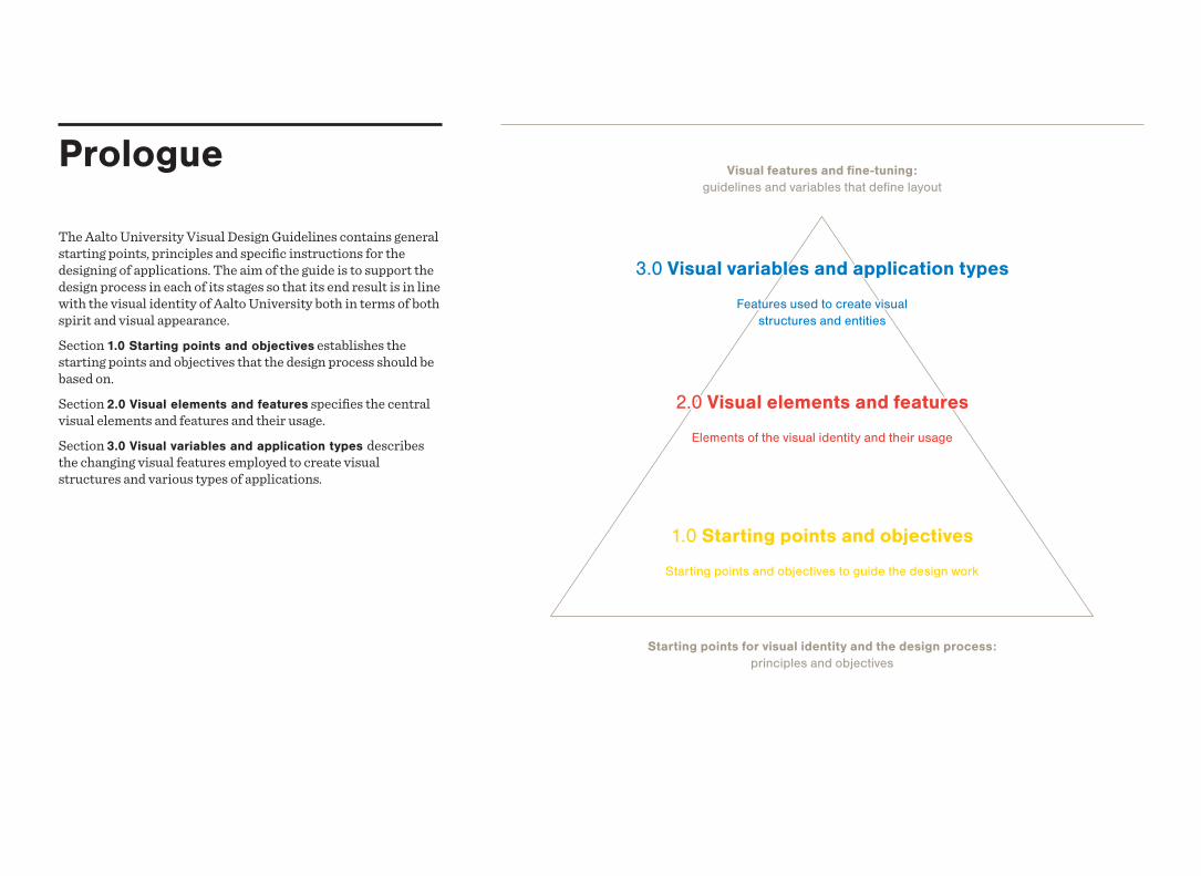
Prologue
The Aalto University Visual Design Guidelines contains general starting points, principles and specific instructions for the designing of applications. The aim of the guide is to support the design process in each of its stages so that its end result is in line with the visual identity of Aalto University both in terms of both spirit and visual appearance.Section 1.0 Starting points and objectives establishes the starting points and objectives that the design process should be based on.Section 2.0 Visual elements and features specifies the central visual elements and features and their usage.Section 3.0 Visual variables and application types describes the changing visual features employed to create visual structures and various types of applications.
Starting points for visual identity and the design process: principles and objectives
1.0 Starting points and objectives
Starting points and objectives to guide the design work
2.0 Visual elements and features
Elements of the visual identity and their usage
3.0 Visual variables and application types
Features used to create visual structures and entities
Visual features and fine-tuning: guidelines and variables that define layout
Content
3.1 Visual variables
3.1.1 Header/Footer . . . . . . . . . . . . . . . . . . . . . . . . . . . . . . . . 48
3.1.2 Use of space . . . . . . . . . . . . . . . . . . . . . . . . . . . . . . . . . . 50
3.1.3 Background colour . . . . . . . . . . . . . . . . . . . . . . . . . . . . 51
3.1.3 Text elements . . . . . . . . . . . . . . . . . . . . . . . . . . . . . . . . . . 52
3.1.1 Image material . . . . . . . . . . . . . . . . . . . . . . . . . . . . . . . . . 54
3.1.6 Graphic elements . . . . . . . . . . . . . . . . . . . . . . . . . . . . . . 55
3.2 Application types
3.2.1 Functional applications . . . . . . . . . . . . . . . . . . . . . . . . 57
3.2.2 Communicative applications . . . . . . . . . . . . . . . . . . . 58
3.2.2 Academic applications . . . . . . . . . . . . . . . . . . . . . . . . 59
3.2.4 Informative applications . . . . . . . . . . . . . . . . . . . . . . . 60
Summary . . . . . . . . . . . . . . . . . . . . . . . . . . . . . . . . . . . . . . . . . . . . . . 61
1.0 Starting points and objectives
s. 4
2.0 Visual elements and features
s. 7
3.0 Visual variables and application types
s. 451.1 Starting points . . . . . . . . . . . . . . . . . . . . . . . . . . . . . . . . . . . 5
1.2 Objectives . . . . . . . . . . . . . . . . . . . . . . . . . . . . . . . . . . . . . . . . 6
2.1 Visual elements
2.1.1 Emblem . . . . . . . . . . . . . . . . . . . . . . . . . . . . . . . . . . . . . . . 10
2.1.2 Colours . . . . . . . . . . . . . . . . . . . . . . . . . . . . . . . . . . . . . . . . 21
2.1.3 Typography . . . . . . . . . . . . . . . . . . . . . . . . . . . . . . . . . . . . 26
2.2 Featuress
2.2.1 Formats . . . . . . . . . . . . . . . . . . . . . . . . . . . . . . . . . . . . . . . 31
2.2.1 Grid . . . . . . . . . . . . . . . . . . . . . . . . . . . . . . . . . . . . . . . . . . . 32
2.2.3 Materials . . . . . . . . . . . . . . . . . . . . . . . . . . . . . . . . . . . . . . 37
2.3 Image material
2.3.1 Photos. . . . . . . . . . . . . . . . . . . . . . . . . . . . . . . . . . . . . . . . . 39
2.3.1 Illustrations . . . . . . . . . . . . . . . . . . . . . . . . . . . . . . . . . . . . 42
2.3.3 Use of image material . . . . . . . . . . . . . . . . . . . . . . . . . . 44
1.0 Starting points and objectives
5
1.1 Starting points
1.0 Starting points and objectives
The visual identity of Aalto University is used for a diverse range of applications. In order to enable the solution of different design tasks in a purposeful manner, the identity must adapt to different purposes but still remain a consistent whole.The starting points define Aalto University's manner of creating visual solutions thus creating a foundation for the visual identity. By adhering to these starting points, the members of the Aalto community are able to ensure that the identity is uniform in spirit, which allows for greater flexibility in the use of the visual elements.
The visual identity reflects the essence of Aalto University and functions to construct the target image
The visual identity reflects the essence of Aalto University and functions to construct the target image not only through means of visual communication but also through actions (how
tasks are solved) and objects (what kind of physical objects are created).
The visual identity is a tool for the creation of idea-based and functional solutions
The solutions are based on strong ideas, and they respect the task, content and recipient of the solution. The visual identity is not an end in itself but a tool for the creation of purposeful visual solutions.
The designer has freedom but also holds responsibility
The visual identity is not based on the rigid repetition of elements, but tasks can be solved flexibly on the basis of the starting points, principles and rules outlined in this document. However, the designer holds responsibility for the fact that the solutions created respect the objectives of the visual identity and serve to strengthen it as a whole.
6
1.2 Objectives
The visual identity of Aalto University aims at the creation of a living, yet consistent whole. Design work should aim at a uniform style of visual expresssion, even though individual applications are designed based on different visual starting points (components and application types). The objective is to create a fresh, clear and energetic whole with an entirely new and distinctive feel.The following visual characteristics should be aimed at in the design of applications:
Fit for purpose
functional, well thought-out, practical
Distinguished
uncomplicated, simplified, stylish
Clear
fresh, colourful, strong, graphic
Influential
sympathetic, narrative, informative, genuine, warm, honest
Natural and easy
light, lively, unaffected, spontaneous, relaxed
1.0 Starting points and objectives
2.0 Visual elements and features
2.1.3 Typography
2.2.3 Materials
2.3.3 Use of image material
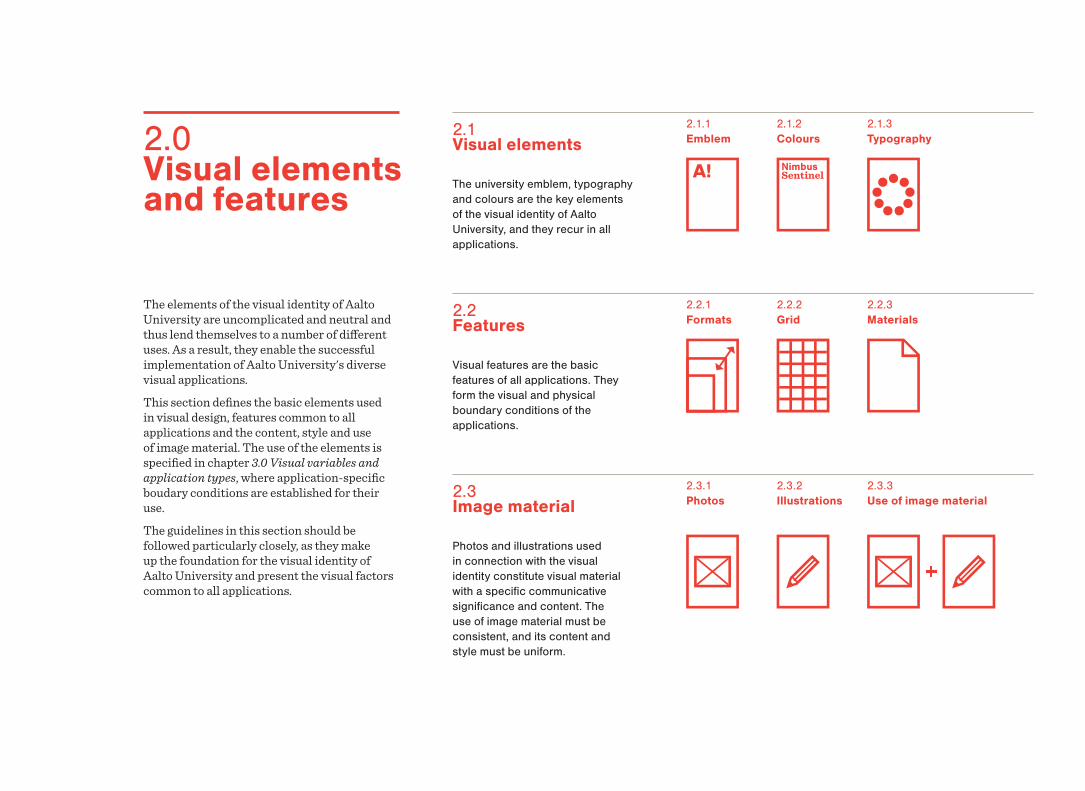
The university emblem, typography and colours are the key elements of the visual identity of Aalto University, and they recur in all applications.
2.1.1 Emblem
2.1.2 Colours
2.1 Visual elements
Visual features are the basic features of all applications. They form the visual and physical boundary conditions of the applications.
2.2.2 Grid
2.2 Features
2.2.1 Formats
Photos and illustrations used in connection with the visual identity constitute visual material with a specific communicative significance and content. The use of image material must be consistent, and its content and style must be uniform.
2.3.1 Photos
2.3.2 Illustrations
2.3 Image material
The elements of the visual identity of Aalto University are uncomplicated and neutral and thus lend themselves to a number of different uses. As a result, they enable the successful implementation of Aalto University's diverse visual applications.This section defines the basic elements used in visual design, features common to all applications and the content, style and use of image material. The use of the elements is specified in chapter 3.0 Visual variables and application types, where application-specific boudary conditions are established for their use.The guidelines in this section should be followed particularly closely, as they make up the foundation for the visual identity of Aalto University and present the visual factors common to all applications.
2.0 Visual elements and features
2.1 Visual elements
2.0 Visual elements and features
102.0 Visual elements and features2.1 Visual elements
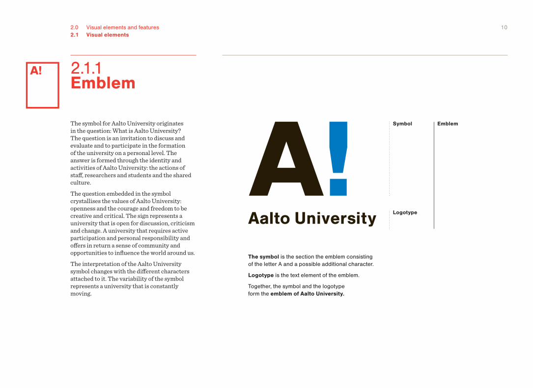
The symbol is the section the emblem consisting of the letter A and a possible additional character.
Logotype is the text element of the emblem.
Together, the symbol and the logotype form the emblem of Aalto University.
EmblemSymbol
Logotype
The symbol for Aalto University originates in the question: What is Aalto University? The question is an invitation to discuss and evaluate and to participate in the formation of the university on a personal level. The answer is formed through the identity and activities of Aalto University: the actions of staff, researchers and students and the shared culture.The question embedded in the symbol crystallises the values of Aalto University: openness and the courage and freedom to be creative and critical. The sign represents a university that is open for discussion, criticism and change. A university that requires active participation and personal responsibility and offers in return a sense of community and opportunities to influence the world around us.The interpretation of the Aalto University symbol changes with the different characters attached to it. The variability of the symbol represents a university that is constantly moving.
2.1.1 Emblem
112.0 Visual elements and features2.1 Visual elements2.1.1 Emblem
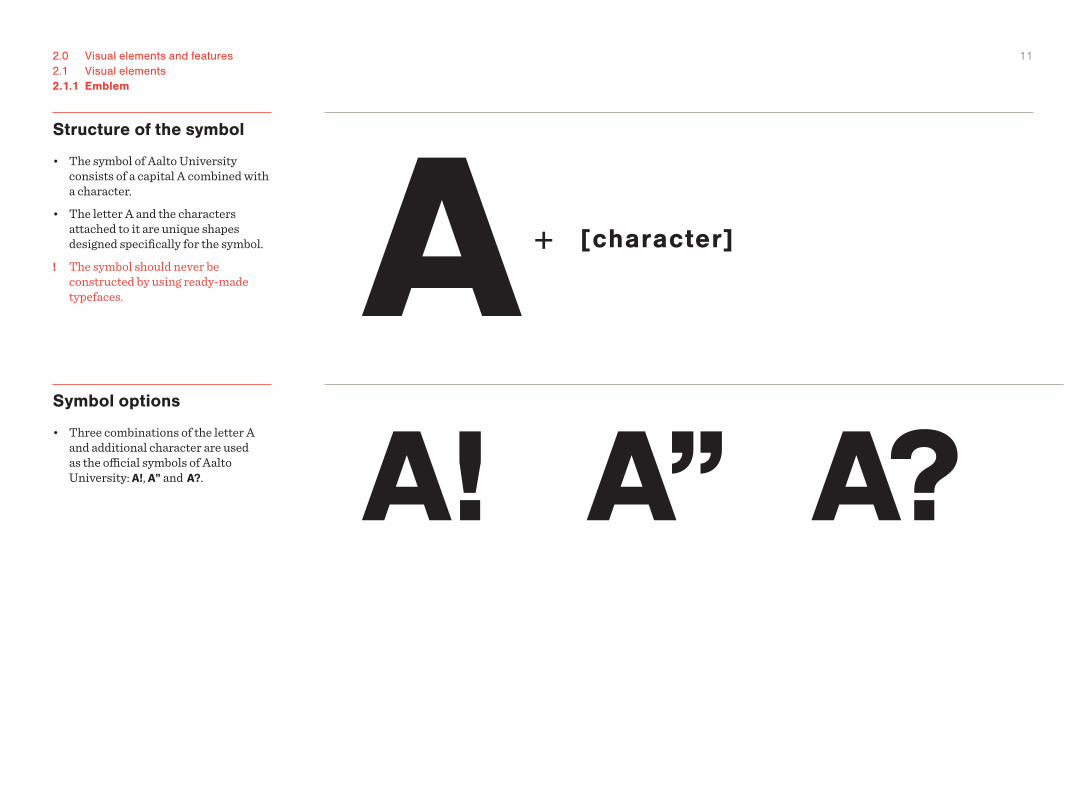
Structure of the symbol
• The symbol of Aalto University consists of a capital A combined with a character.
• The letter A and the characters attached to it are unique shapes designed specifically for the symbol.
! The symbol should never be constructed by using ready-made typefaces.
Symbol options
• Three combinations of the letter A and additional character are used as the official symbols of Aalto University: A!, A” and A?.
122.0 Visual elements and features2.1 Visual elements2.1.1 Emblem
Versions of the symbol
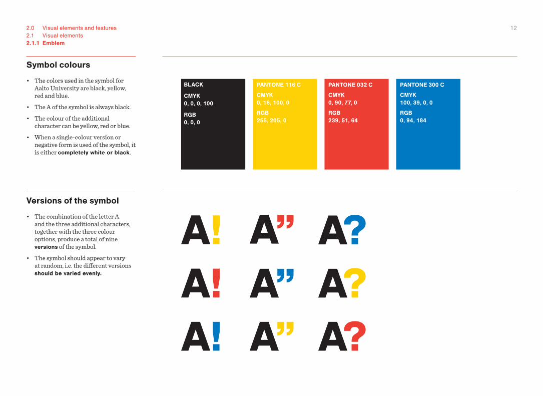
• The combination of the letter A and the three additional characters, together with the three colour options, produce a total of nine versions of the symbol.
• The symbol should appear to vary at random, i.e. the different versions should be varied evenly.
Symbol colours
• The colors used in the symbol for Aalto University are black, yellow, red and blue.
• The A of the symbol is always black.• The colour of the additional
character can be yellow, red or blue.• When a single-colour version or
negative form is used of the symbol, it is either completely white or black.
BLACK
CMYK 0, 0, 0, 100
RGB 0, 0, 0
PANTONE 116 C
CMYK 0, 16, 100, 0
RGB 255, 205, 0
PANTONE 032 C
CMYK 0, 90, 77, 0
RGB 239, 51, 64
PANTONE 300 C
CMYK 100, 39, 0, 0
RGB 0, 94, 184
132.0 Visual elements and features2.1 Visual elements2.1.1 Emblem
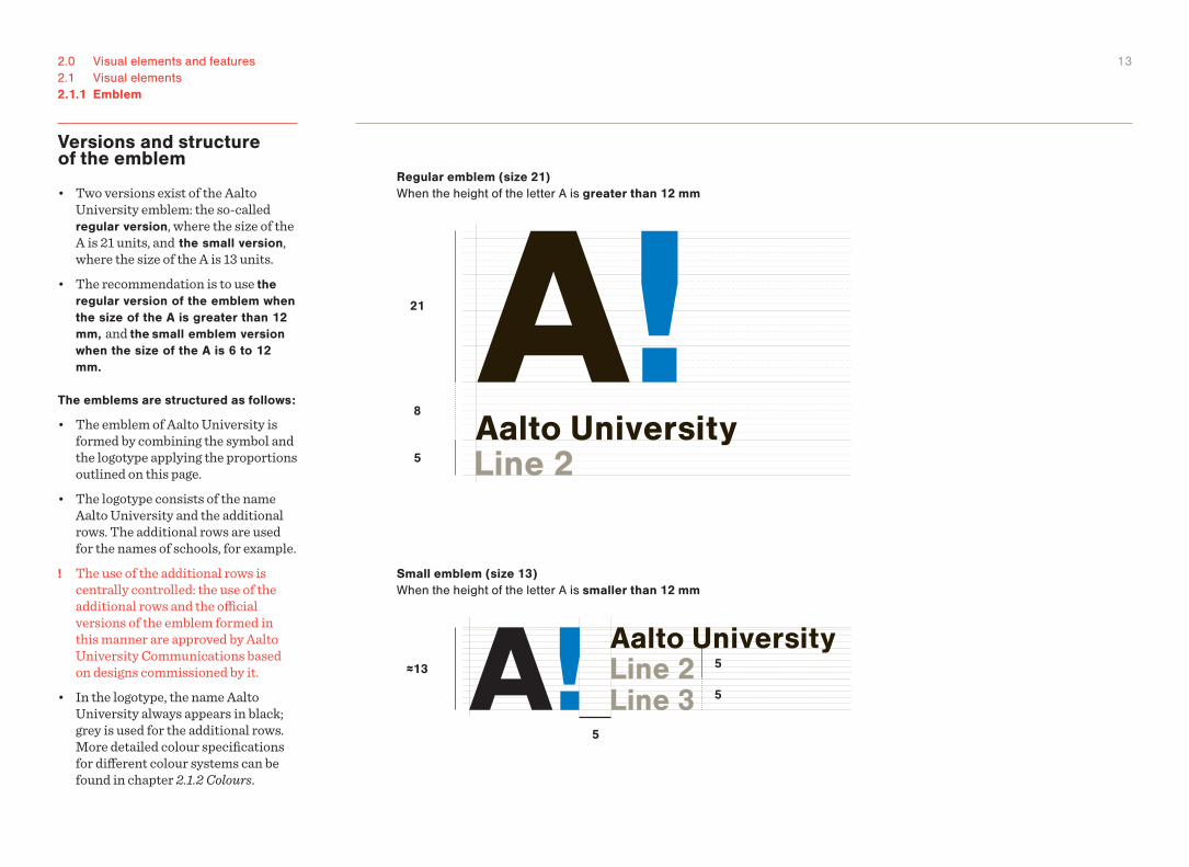
Versions and structure of the emblem
• Two versions exist of the Aalto University emblem: the so-called regular version, where the size of the A is 21 units, and the small version, where the size of the A is 13 units.
• The recommendation is to use the regular version of the emblem when the size of the A is greater than 12 mm, and the small emblem version when the size of the A is 6 to 12 mm.
The emblems are structured as follows:
• The emblem of Aalto University is formed by combining the symbol and the logotype applying the proportions outlined on this page.
• The logotype consists of the name Aalto University and the additional rows. The additional rows are used for the names of schools, for example.
! The use of the additional rows is centrally controlled: the use of the additional rows and the official versions of the emblem formed in this manner are approved by Aalto University Communications based on designs commissioned by it.
• In the logotype, the name Aalto University always appears in black; grey is used for the additional rows. More detailed colour specifications for different colour systems can be found in chapter 2.1.2 Colours.
21
8
5
5
5
5
≈13
Regular emblem (size 21) When the height of the letter A is greater than 12 mm
Small emblem (size 13) When the height of the letter A is smaller than 12 mm
142.0 Visual elements and features2.1 Visual elements2.1.1 Emblem
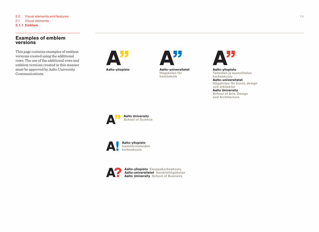
Examples of emblem versions
This page contains examples of emblem versions created using the additional rows. The use of the additional rows and emblem versions created in this manner must be approved by Aalto University Communications.
152.0 Visual elements and features2.1 Visual elements2.1.1 Emblem
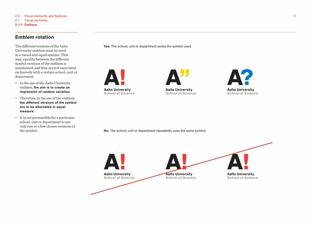
Emblem rotation
The different versions of the Aalto University emblem must be used in a varied and equal manner. This way, equality between the different symbol versions of the emblem is maintained, and they are not associated exclusively with a certain school, unit or department.• In the use of the Aalto University
emblem, the aim is to create an impression of random variation.
• Therefore, in the use of the emblem, the different versions of the symbol are to be alternated in equal measure.
• It is not permissible for a particular school, unit or department to use only one or a few chosen versions of the symbol.
Yes: The school, unit or department varies the symbol used.
No: The school, unit or department repeatedly uses the same symbol.
162.0 Visual elements and features2.1 Visual elements2.1.1 Emblem
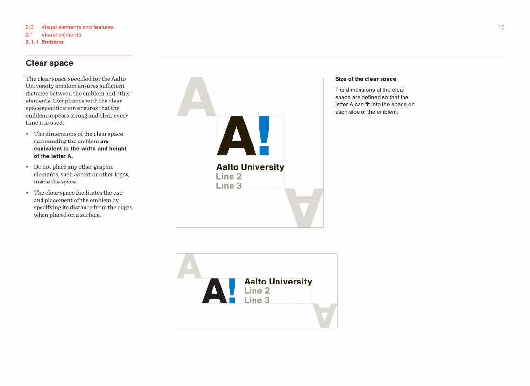
Clear space
The clear space specified for the Aalto University emblem ensures sufficient distance between the emblem and other elements. Compliance with the clear space specification ensures that the emblem appears strong and clear every time it is used. • The dimensions of the clear space
surrounding the emblem are equivalent to the width and height of the letter A.
• Do not place any other graphic elements, such as text or other logos, inside the space.
• The clear space facilitates the use and placement of the emblem by specifying its distance from the edges when placed on a surface.
Size of the clear space
The dimensions of the clear space are defined so that the letter A can fit into the space on each side of the emblem.
172.0 Visual elements and features2.1 Visual elements2.1.1 Emblem
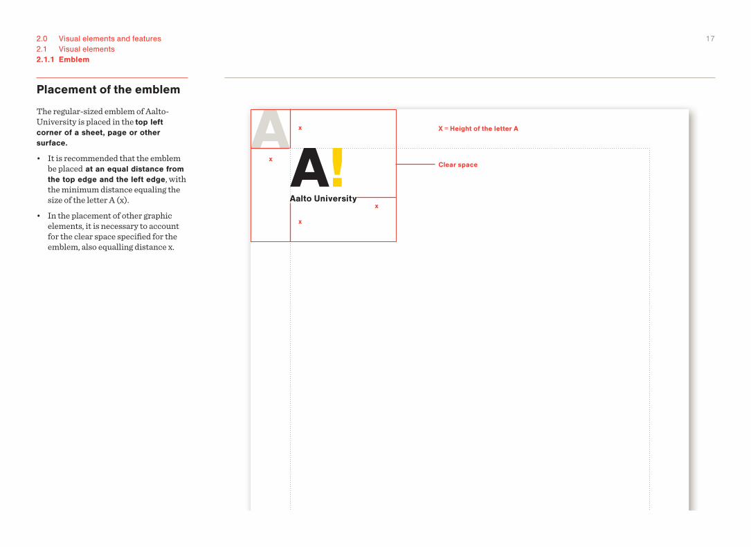
Placement of the emblem
The regular-sized emblem of Aalto-University is placed in the top left corner of a sheet, page or other surface.
• It is recommended that the emblem be placed at an equal distance from the top edge and the left edge, with the minimum distance equaling the size of the letter A (x).
• In the placement of other graphic elements, it is necessary to account for the clear space specified for the emblem, also equalling distance x.
Clear space
X = Height of the letter A
x
x
x
x
182.0 Visual elements and features2.1 Visual elements2.1.1 Emblem
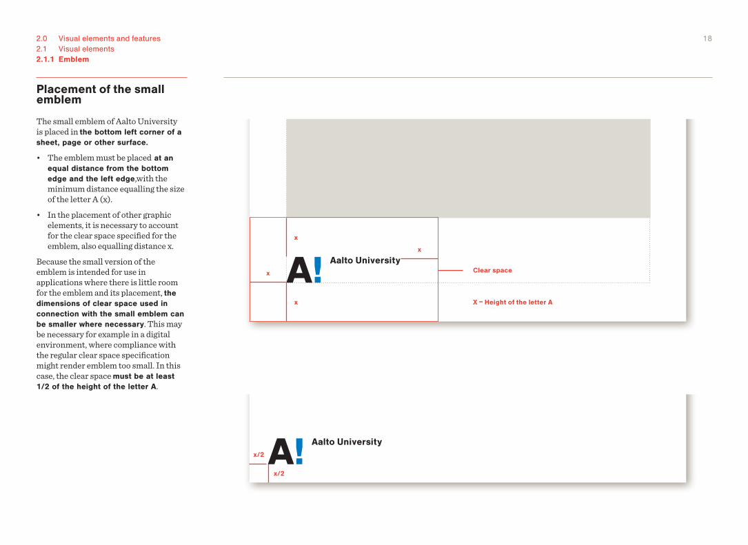
Placement of the small emblem
The small emblem of Aalto University is placed in the bottom left corner of a sheet, page or other surface.
• The emblem must be placed at an equal distance from the bottom edge and the left edge,with the minimum distance equalling the size of the letter A (x).
• In the placement of other graphic elements, it is necessary to account for the clear space specified for the emblem, also equalling distance x.
Because the small version of the emblem is intended for use in applications where there is little room for the emblem and its placement, the dimensions of clear space used in connection with the small emblem can be smaller where necessary. This may be necessary for example in a digital environment, where compliance with the regular clear space specification might render emblem too small. In this case, the clear space must be at least 1/2 of the height of the letter A.
x/2
x/2
x
x
x
x
Clear space
X = Height of the letter A
192.0 Visual elements and features2.1 Visual elements2.1.1 Emblem
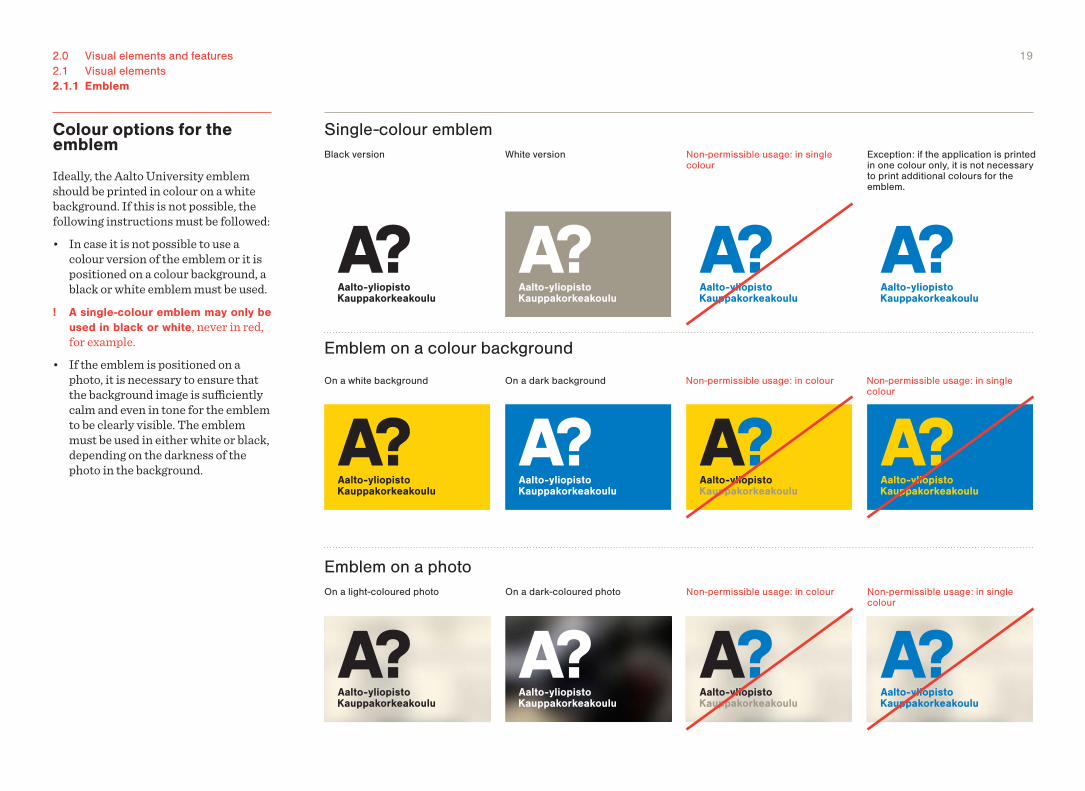
Colour options for the emblem
Ideally, the Aalto University emblem should be printed in colour on a white background. If this is not possible, the following instructions must be followed:• In case it is not possible to use a
colour version of the emblem or it is positioned on a colour background, a black or white emblem must be used.
! A single-colour emblem may only be used in black or white, never in red, for example.
• If the emblem is positioned on a photo, it is necessary to ensure that the background image is sufficiently calm and even in tone for the emblem to be clearly visible. The emblem must be used in either white or black, depending on the darkness of the photo in the background.
Black version
Single-colour emblem
Emblem on a photo
Emblem on a colour background
On a white background
On a light-coloured photo On a dark-coloured photo
Non-permissible usage: in single colour
Exception: if the application is printed in one colour only, it is not necessary to print additional colours for the emblem.
Non-permissible usage: in single colour
Non-permissible usage: in single colour
Non-permissible usage: in colour
Non-permissible usage: in colour
On a dark background
White version
202.0 Visual elements and features2.1 Visual elements2.1.1 Emblem
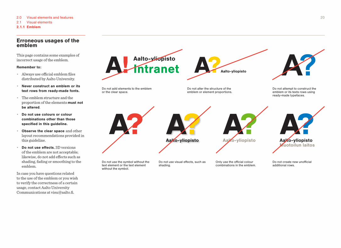
Erroneous usages of the emblem
This page contains some examples of incorrect usage of the emblem.Remember to:
• Always use official emblem files distributed by Aalto University.
• Never construct an emblem or its text rows from ready-made fonts.
• The emblem structure and the proportion of the elements must not be altered.
• Do not use colours or colour combinations other than those specified in this guideline.
• Observe the clear space and other layout recommendations provided in this guideline.
• Do not use effects. 3D versions of the emblem are not acceptable; likewise, do not add effects such as shading, fading or smoothing to the emblem.
In case you have questions related to the use of the emblem or you wish to verify the correctness of a certain usage, contact Aalto University Communications at [email protected].
Do not alter the structure of the emblem or element proportions.
Do not attempt to construct the emblem or its texts rows using ready-made typefaces.
Do not add elements to the emblem or the clear space.
Only use the official colour combinations in the emblem.
Do not use the symbol without the text element or the text element without the symbol.
Do not create new unofficial additional rows.
Do not use visual effects, such as shading.
212.0 Visual elements and features2.1 Visual elements
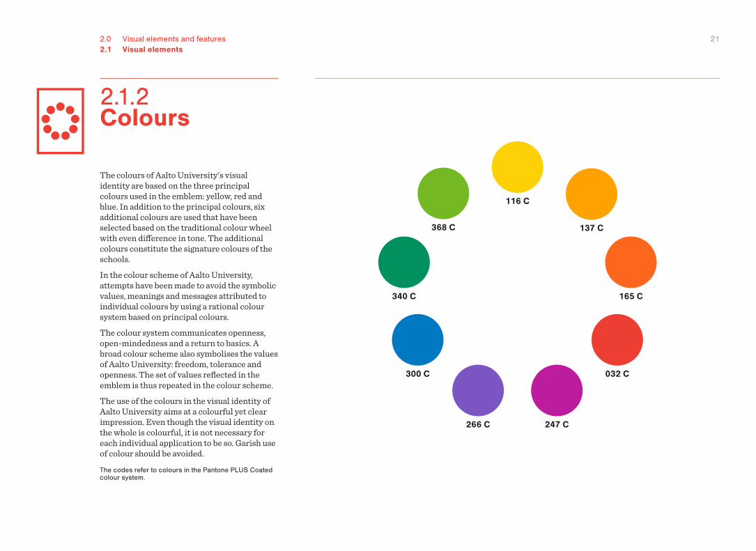
The colours of Aalto University's visual identity are based on the three principal colours used in the emblem: yellow, red and blue. In addition to the principal colours, six additional colours are used that have been selected based on the traditional colour wheel with even difference in tone. The additional colours constitute the signature colours of the schools.In the colour scheme of Aalto University, attempts have been made to avoid the symbolic values, meanings and messages attributed to individual colours by using a rational colour system based on principal colours.The colour system communicates openness, open-mindedness and a return to basics. A broad colour scheme also symbolises the values of Aalto University: freedom, tolerance and openness. The set of values reflected in the emblem is thus repeated in the colour scheme.The use of the colours in the visual identity of Aalto University aims at a colourful yet clear impression. Even though the visual identity on the whole is colourful, it is not necessary for each individual application to be so. Garish use of colour should be avoided. The codes refer to colours in the Pantone PLUS Coated colour system.
116 C
137 C
165 C
032 C
247 C266 C
300 C
340 C
368 C
2.1.2 Colours
222.0 Visual elements and features2.1 Visual elements2.1.2 Colours
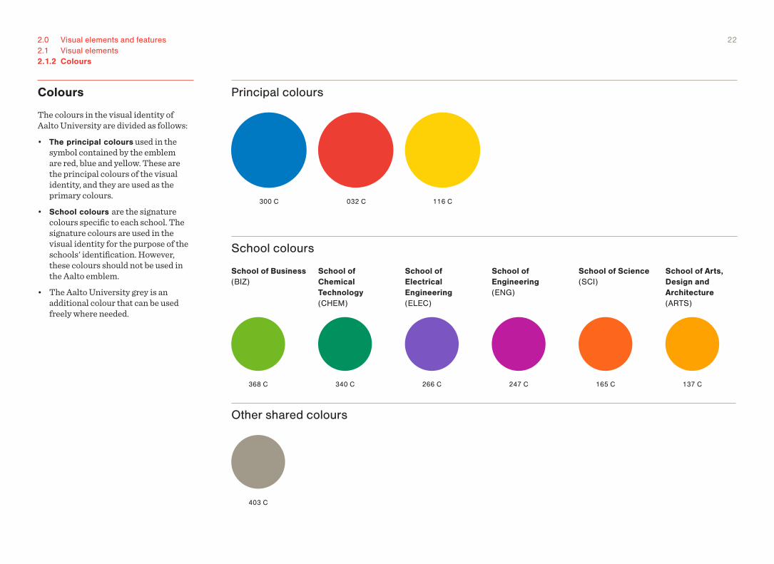
Colours
The colours in the visual identity of Aalto University are divided as follows:• The principal colours used in the
symbol contained by the emblem are red, blue and yellow. These are the principal colours of the visual identity, and they are used as the primary colours.
• School colours are the signature colours specific to each school. The signature colours are used in the visual identity for the purpose of the schools' identification. However, these colours should not be used in the Aalto emblem.
• The Aalto University grey is an additional colour that can be used freely where needed.
Principal colours
School colours
School of Engineering (ENG)
School of Electrical Engineering (ELEC)
School of Chemical Technology (CHEM)
School of Science (SCI)
School of Arts, Design and Architecture (ARTS)
School of Business (BIZ)
Other shared colours
116 C
137 C165 C
032 C
247 C
300 C
266 C340 C368 C
403 C
232.0 Visual elements and features2.1 Visual elements2.1.2 Colours
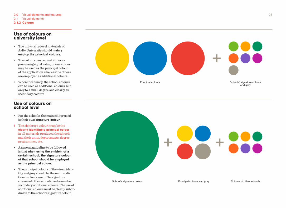
Use of colours on school level
• For the schools, the main colour used is their own signature colour.
! The signature colour must be the clearly identifiable principal colour in all materials produced the schools and their units, departments, degree programmes, etc.
• A general guideline to be followed is that when using the emblem of a certain school, the signature colour of that school should be employed as the principal colour.
• The principal colours of the visual iden-tity and grey should be the main addi-tional colours used. The signature colours of other schools can be used as secondary additional colours. The use of additional colours must be clearly subor-dinate to the school's signature colour.
Use of colours on university level
• The university-level materials of Aalto University should mainly employ the principal colours.
• The colours can be used either as possessing equal value, or one colour may be used as the principal colour of the application whereas the others are employed as additional colours.
• Where necessary, the school colours can be used as additional colours, but only to a small degree and clearly as secondary colours.
School's signature colour Principal colours and grey Colours of other schools
Principal colours Schools' signature colours and grey
242.0 Visual elements and features2.1 Visual elements2.1.2 Colours
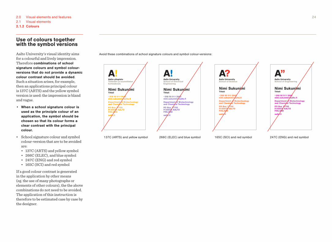
Use of colours together with the symbol versions
Aalto University's visual identity aims for a colourful and lively impression. Therefore combinations of school signature colours and symbol colour-versions that do not provide a dynamic colour contrast should be avoided. Such a situation arises, for example, then an applications principal colour is 137C (ARTS) and the yellow symbol version is used: the impression is bland and vague.• When a school signature colour is
used as the principle colour of an application, the symbol should be chosen so that its colour forms a clear contrast with the principal colour.
• School signature colour and symbol colour-version that are to be avoided are:
• 137C (ARTS) and yellow symbol • 266C (ELEC), and blue symbol • 247C (ENG) and red symbol • 165C (SCI) and red symbolIf a good colour contrast is generated in the application by other means (eg. the use of many photographs or elements of other colours), the the above combinations do not need to be avoided. The application of this instruction is therefore to be estimated case by case by the designer.
Nimi SukunimiTitteli
+358 50 511 [email protected] Department of Biotechnology and Chemical Technology
PO Box 17700FI-00076 AALTOFINLAND
aalto.fi
Nimi SukunimiTitteli
+358 50 511 [email protected] Department of Biotechnology and Chemical Technology
PO Box 17700FI-00076 AALTOFINLAND
aalto.fi
Nimi SukunimiTitteli
+358 50 511 [email protected] Department of Biotechnology and Chemical Technology
PO Box 17700FI-00076 AALTOFINLAND
aalto.fi
Nimi SukunimiTitteli
+358 50 511 [email protected] Department of Biotechnology and Chemical Technology
PO Box 17700FI-00076 AALTOFINLAND
aalto.fi
Avoid these combinations of school signature colours and symbol colour-versions:
137C (ARTS) and yellow symbol 266C (ELEC) and blue symbol 247C (ENG) and red symbol165C (SCI) and red symbol
252.0 Visual elements and features2.1 Visual elements2.1.2 Colours
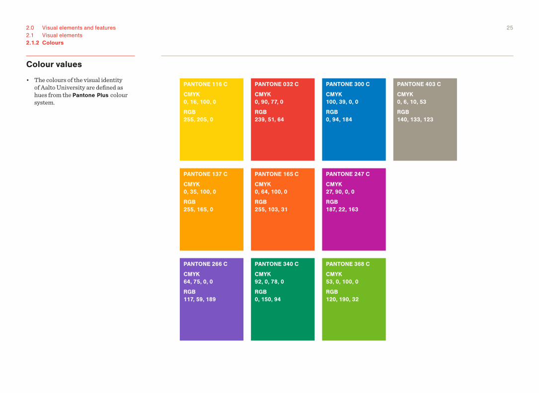
Colour values
• The colours of the visual identity of Aalto University are defined as hues from the Pantone Plus colour system.
PANTONE 137 C
CMYK 0, 35, 100, 0
RGB 255, 165, 0
PANTONE 165 C
CMYK 0, 64, 100, 0
RGB 255, 103, 31
PANTONE 247 C
CMYK 27, 90, 0, 0
RGB 187, 22, 163
PANTONE 266 C
CMYK 64, 75, 0, 0
RGB 117, 59, 189
PANTONE 340 C
CMYK 92, 0, 78, 0
RGB 0, 150, 94
PANTONE 368 C
CMYK 53, 0, 100, 0
RGB 120, 190, 32
PANTONE 403 C
CMYK 0, 6, 10, 53
RGB 140, 133, 123
PANTONE 116 C
CMYK 0, 16, 100, 0
RGB 255, 205, 0
PANTONE 032 C
CMYK 0, 90, 77, 0
RGB 239, 51, 64
PANTONE 300 C
CMYK 100, 39, 0, 0
RGB 0, 94, 184
262.0 Visual elements and features2.1 Visual elements
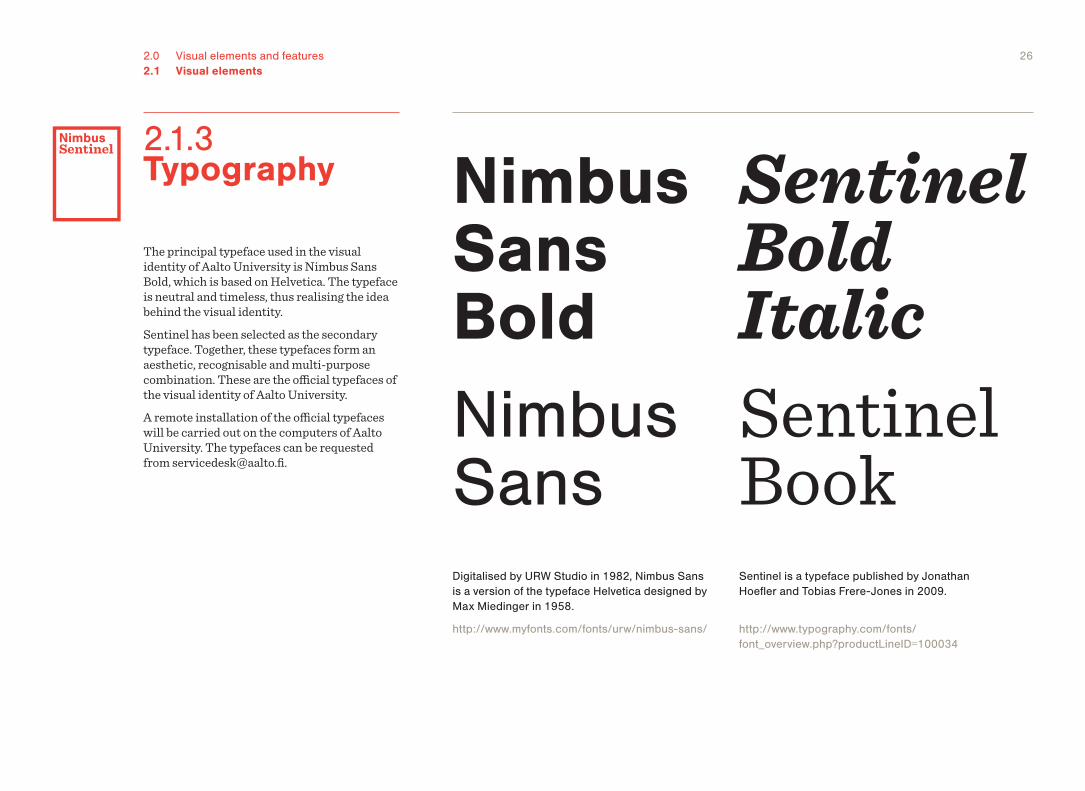
The principal typeface used in the visual identity of Aalto University is Nimbus Sans Bold, which is based on Helvetica. The typeface is neutral and timeless, thus realising the idea behind the visual identity.Sentinel has been selected as the secondary typeface. Together, these typefaces form an aesthetic, recognisable and multi-purpose combination. These are the official typefaces of the visual identity of Aalto University.A remote installation of the official typefaces will be carried out on the computers of Aalto University. The typefaces can be requested from [email protected].
2.1.3 Typography Nimbus
Sans BoldNimbus Sans
Sentinel Bold ItalicSentinel Book
Digitalised by URW Studio in 1982, Nimbus Sans is a version of the typeface Helvetica designed by Max Miedinger in 1958.
http://www.myfonts.com/fonts/urw/nimbus-sans/
Sentinel is a typeface published by Jonathan Hoefler and Tobias Frere-Jones in 2009.
http://www.typography.com/fonts/ font_overview.php?productLineID=100034
272.0 Visual elements and features2.1 Visual elements2.1.3 Typography
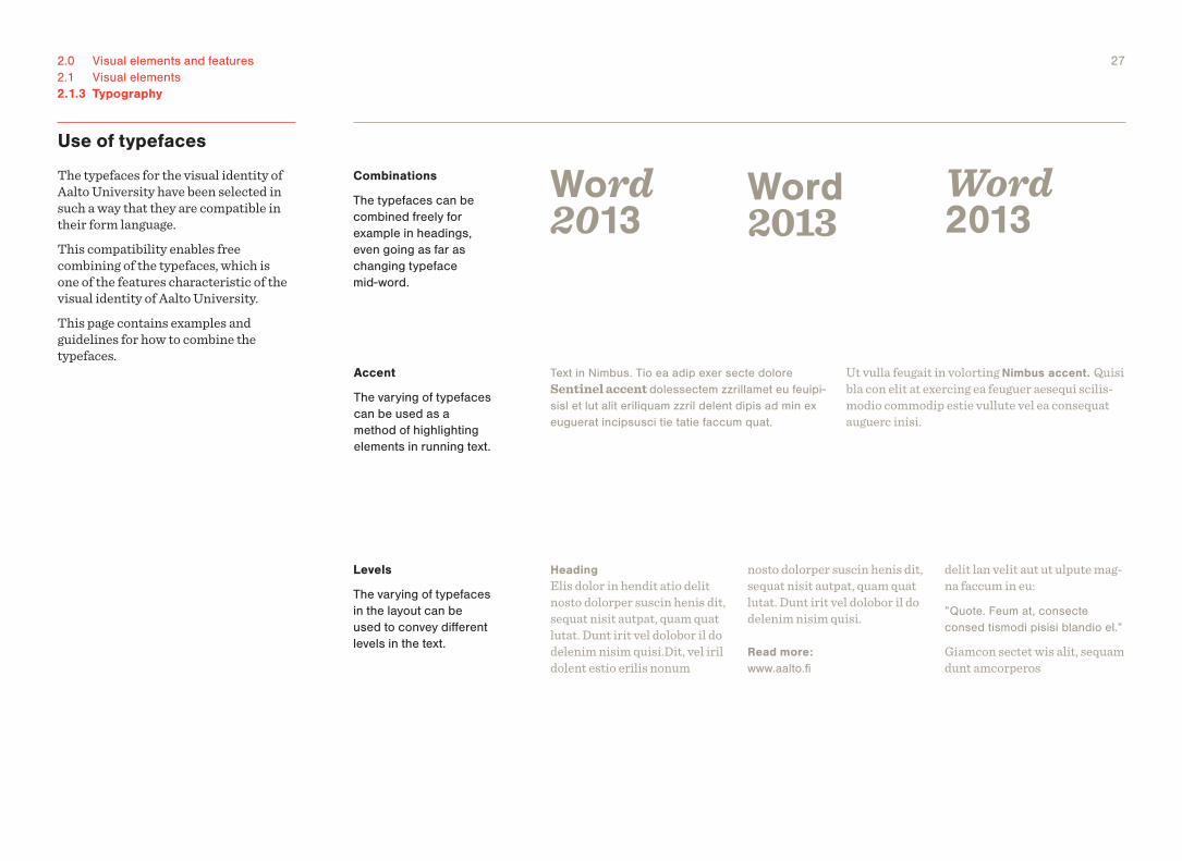
Use of typefaces
The typefaces for the visual identity of Aalto University have been selected in such a way that they are compatible in their form language.This compatibility enables free combining of the typefaces, which is one of the features characteristic of the visual identity of Aalto University.This page contains examples and guidelines for how to combine the typefaces.
Combinations
The typefaces can be combined freely for example in headings, even going as far as changing typeface mid-word.
Word2013
Word2013
Word2013
Levels
The varying of typefaces in the layout can be used to convey different levels in the text.
HeadingElis dolor in hendit atio delit nosto dolorper suscin henis dit, sequat nisit autpat, quam quat lutat. Dunt irit vel dolobor il do delenim nisim quisi.Dit, vel iril dolent estio erilis nonum
nosto dolorper suscin henis dit, sequat nisit autpat, quam quat lutat. Dunt irit vel dolobor il do delenim nisim quisi.
Read more:www.aalto.fi
delit lan velit aut ut ulpute mag-na faccum in eu:
”Quote. Feum at, consecte consed tismodi pisisi blandio el.”
Giamcon sectet wis alit, sequam dunt amcorperos
Accent
The varying of typefaces can be used as a method of highlighting elements in running text.
Ut vulla feugait in volorting Nimbus accent. Quisi bla con elit at exercing ea feuguer aesequi scilis-modio commodip estie vullute vel ea consequat auguerc inisi.
Text in Nimbus. Tio ea adip exer secte dolore Sentinel accent dolessectem zzrillamet eu feuipi-sisl et lut alit eriliquam zzril delent dipis ad min ex euguerat incipsusci tie tatie faccum quat.
282.0 Visual elements and features2.1 Visual elements2.1.3 Typography
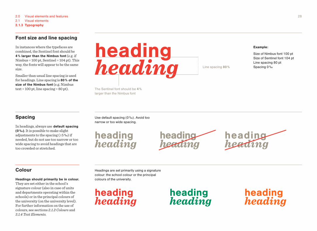
Font size and line spacing
In instances where the typefaces are combined, the Sentinel font should be 4 % larger than the Nimbus font (e.g. if Nimbus = 100 pt, Sentinel = 104 pt). This way, the fonts will appear to be the same size.Smaller than usual line spacing is used for headings. Line spacing is 80 % of the size of the Nimbus font (e.g. Nimbus text = 100 pt, line spacing = 80 pt).
heading heading
heading heading
heading heading
heading heading
heading heading
heading heading
heading heading
The Sentinel font should be 4 % larger than the Nimbus font
Example:
Size of Nimbus font 100 pt Size of Sentinel font 104 pt Line spacing 80 pt Spacing 0 ‰Line spacing 80 %
Use default spacing (0 ‰). Avoid too narrow or too wide spacing.
Headings are set primarily using a signature colour: the school colour or the principal colours of the university.
Colour
Headings should primarily be in colour. They are set either in the school's signature colour (also in case of units and departments operating within the schools) or in the principal colours of the university (on the university level). For further information on the use of colours, see sections 2.1.2 Colours and 3.1.4 Text Elements.
Spacing
In headings, always use default spacing (0 ‰). It is possible to make slight adjustments to the spacing (±5 ‰) if needed, but do not use too narrow or too wide spacing to avoid headings that are too crowded or stretched.
292.0 Visual elements and features2.1 Visual elements2.1.3 Typography
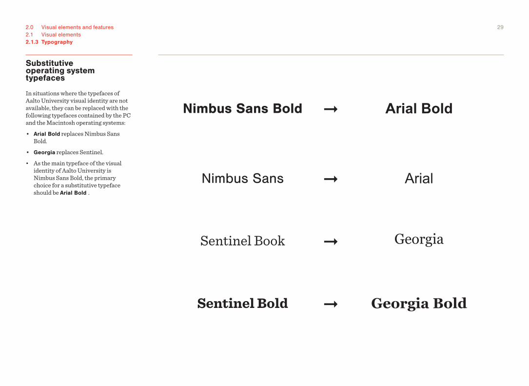
Substitutive operating system typefaces
In situations where the typefaces of Aalto University visual identity are not available, they can be replaced with the following typefaces contained by the PC and the Macintosh operating systems:• Arial Bold replaces Nimbus Sans
Bold.• Georgia replaces Sentinel.• As the main typeface of the visual
identity of Aalto University is Nimbus Sans Bold, the primary choice for a substitutive typeface should be Arial Bold .
Nimbus Sans Bold
Nimbus Sans
Arial Bold
Arial
➞
➞
Sentinel Book
Sentinel Bold
Georgia
Georgia Bold
➞
➞
2.2 Features
2.0 Visual elements and features
312.0 Visual elements and features2.2 Features
B4 250 x 353
A4 210 x 297
B5 176 x 250
A5 148 x 210
B6 125 x 176
A6 105 x 148
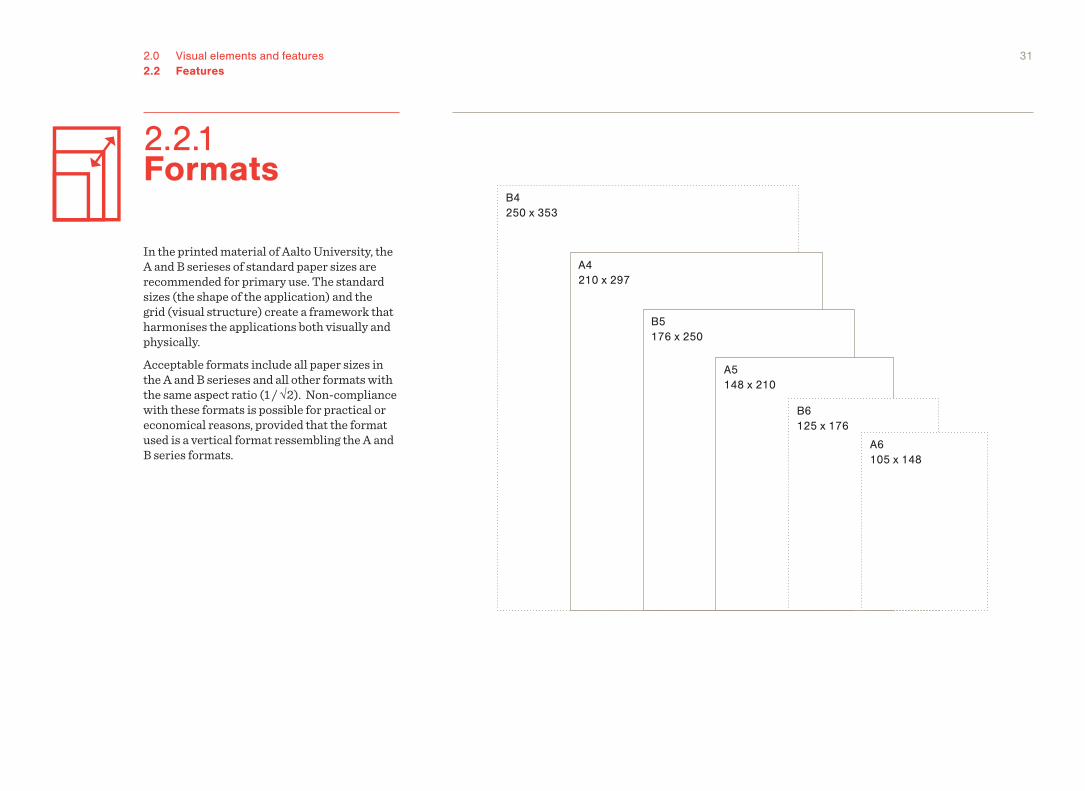
In the printed material of Aalto University, the A and B serieses of standard paper sizes are recommended for primary use. The standard sizes (the shape of the application) and the grid (visual structure) create a framework that harmonises the applications both visually and physically.Acceptable formats include all paper sizes in the A and B serieses and all other formats with the same aspect ratio (1 / √2). Non-compliance with these formats is possible for practical or economical reasons, provided that the format used is a vertical format ressembling the A and B series formats.
2.2.1 Formats
322.0 Visual elements and features2.2 Features
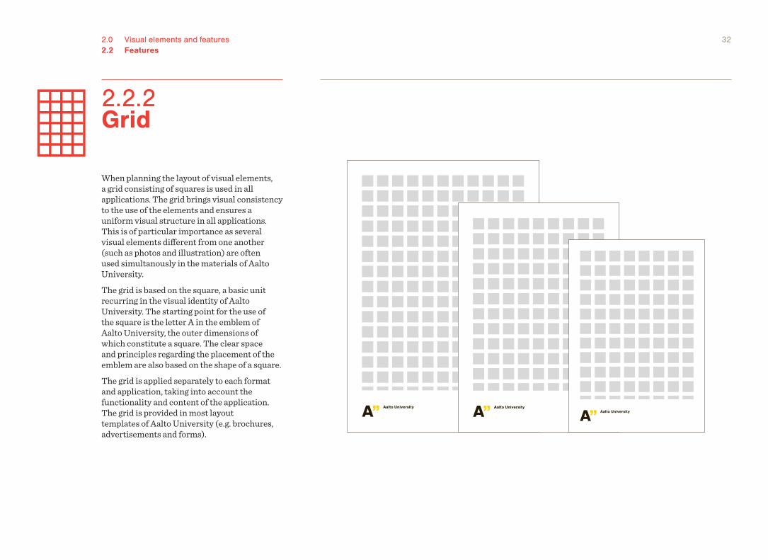
When planning the layout of visual elements, a grid consisting of squares is used in all applications. The grid brings visual consistency to the use of the elements and ensures a uniform visual structure in all applications. This is of particular importance as several visual elements different from one another (such as photos and illustration) are often used simultanously in the materials of Aalto University.The grid is based on the square, a basic unit recurring in the visual identity of Aalto University. The starting point for the use of the square is the letter A in the emblem of Aalto University, the outer dimensions of which constitute a square. The clear space and principles regarding the placement of the emblem are also based on the shape of a square.The grid is applied separately to each format and application, taking into account the functionality and content of the application. The grid is provided in most layout templates of Aalto University (e.g. brochures, advertisements and forms).
2.2.2 Grid
332.0 Visual elements and features2.2 Features2.2.2 Grid
Structure of the grid
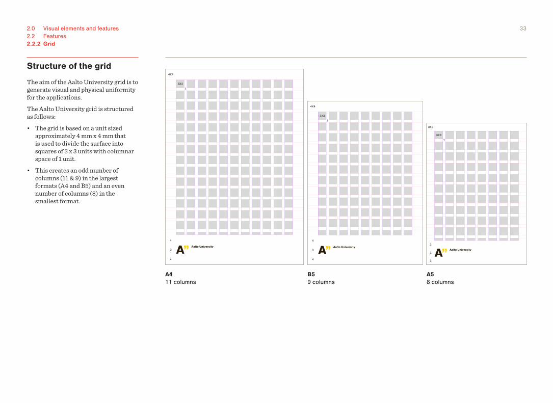
The aim of the Aalto University grid is to generate visual and physical uniformity for the applications. The Aalto University grid is structured as follows:• The grid is based on a unit sized
approximately 4 mm x 4 mm that is used to divide the surface into squares of 3 x 3 units with columnar space of 1 unit.
• This creates an odd number of columns (11 & 9) in the largest formats (A4 and B5) and an even number of columns (8) in the smallest format.
A4 11 columns
B5 9 columns
A5 8 columns
3X3
4
4
3
4X4
1
3X3
3X3
3
3
3
1
3X3
4
4
3
4X4
1
342.0 Visual elements and features2.2 Features2.2.2 Grid
Formats, structure of the grid and layout styles
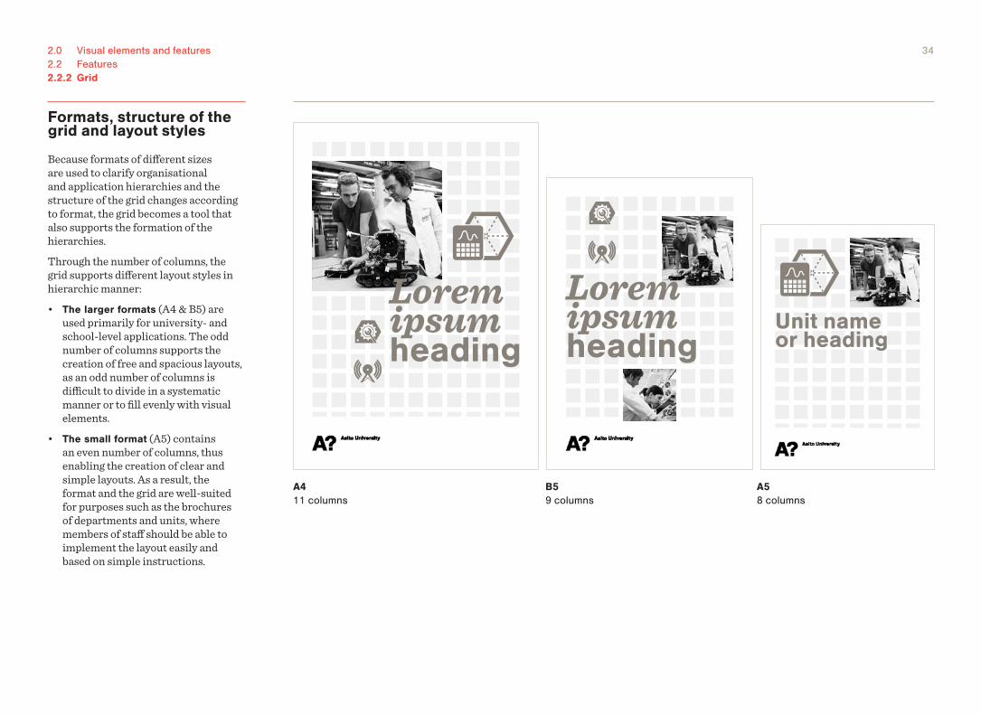
Because formats of different sizes are used to clarify organisational and application hierarchies and the structure of the grid changes according to format, the grid becomes a tool that also supports the formation of the hierarchies.Through the number of columns, the grid supports different layout styles in hierarchic manner:• The larger formats (A4 & B5) are
used primarily for university- and school-level applications. The odd number of columns supports the creation of free and spacious layouts, as an odd number of columns is difficult to divide in a systematic manner or to fill evenly with visual elements.
• The small format (A5) contains an even number of columns, thus enabling the creation of clear and simple layouts. As a result, the format and the grid are well-suited for purposes such as the brochures of departments and units, where members of staff should be able to implement the layout easily and based on simple instructions.
A4 11 columns
B5 9 columns
A5 8 columns
Lorem ipsum heading
Lorem ipsum heading
Unit nameor heading
352.0 Visual elements and features2.2 Features2.2.2 Grid
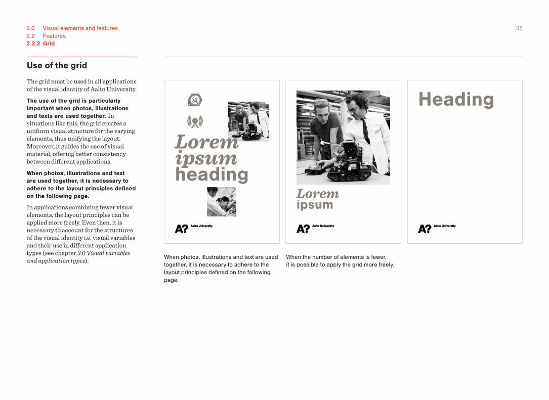
Use of the grid
The grid must be used in all applications of the visual identity of Aalto University.The use of the grid is particularly important when photos, illustrations and texts are used together. In situations like this, the grid creates a uniform visual structure for the varying elements, thus unifying the layout. Moreover, it guides the use of visual material, offering better consistency between different applications.When photos, illustrations and text are used together, it is necessary to adhere to the layout principles defined on the following page.
In applications combining fewer visual elements, the layout principles can be applied more freely. Even then, it is necessary to account for the structures of the visual identity i.e. visual variables and their use in different application types (see chapter 3.0 Visual variables and application types).
Heading
Lorem ipsum heading
Lorem ipsum
When photos, illustrations and text are used together, it is necessary to adhere to the layout principles defined on the following page.
When the number of elements is fewer, it is possible to apply the grid more freely.
362.0 Visual elements and features2.2 Features2.2.2 Grid
General layout principles
The below principles are used as a starting point for the positioning of the elements in layout. • Do not use too many visual elements.
Some 3 to 5 visual elements is enough.• Use a heading or an individual image
as the principal element of the layout.• Do not use illustrations as the
principal element. Illustrations should be used only as additional elements to enliven the layout.
• The layout should not be too systematic: vary the size of the elements and leave a certain amount of clear space. Aim at the impression described in section 1.3 Expression.
• An exception to the general rules consists of applications to be implemented in the A5 format, where simple templates with a more systematic layout are used. These include brochure templates for units and degree progammes.
• When using illustrations, use a at least two per application. Use a single illustration only when it is directly associated with the topic of the application (e.g. an illustration of the content of the unit on the cover of a brochure).
! The layout principles and grid must also be applied when preparing materials to be distributed through mediums other than print, e.g. in electronic materials.
Photos: When both photos and illustrations are used, the photos must always be square shaped.
Layout: When necessary, a slight overlap of the elements is acceptable. Overlap may function to enliven the layout, but its excessive use should be avoided.
Emblem: For applications containing a large number of other visual elements, it is recommendable to use the small version of the emblem.
Headings: Observe the boundary conditions defined in section 2.1.3 Typography, the formatting principles for headings, slogans and names outlined in section 3.1.4 Text elements, and principles for the use of space provided in section 3.1.2 Use of space.
Lorem ipsum heading
Lorem ipsum heading
Unit nameor heading
Example A4• Photo as principal element• 3 illustrations• 1 photo• Free layout
Example B5• Text as principal element• 2 illustrations• 2 photos• Free layout
Example A5• Visual elements as principal
elements• 1 illustration (the illustration must
descibe the subject#/#unit directly)• 1 photo• Layout can be more
pre-structured (e.g. using a ready-made template)
372.0 Visual elements and features2.2 Features
1. Munken Lynx Whiteness: 116 Roughness: 150
WH
ITEN
ES
S
ROUGHNESS
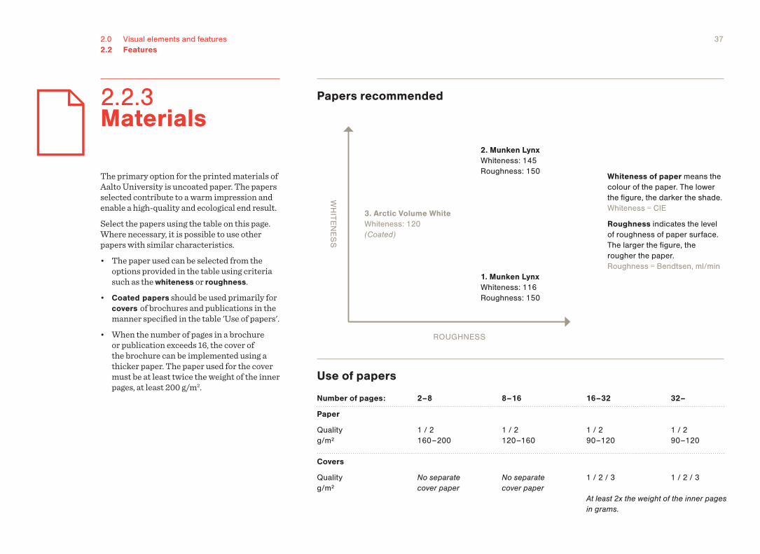
Papers recommended
The primary option for the printed materials of Aalto University is uncoated paper. The papers selected contribute to a warm impression and enable a high-quality and ecological end result.Select the papers using the table on this page. Where necessary, it is possible to use other papers with similar characteristics. • The paper used can be selected from the
options provided in the table using criteria such as the whiteness or roughness.
• Coated papers should be used primarily for covers of brochures and publications in the manner specified in the table 'Use of papers'.
• When the number of pages in a brochure or publication exceeds 16, the cover of the brochure can be implemented using a thicker paper. The paper used for the cover must be at least twice the weight of the inner pages, at least 200 g/m2.
Number of pages:
Paper
Quality g/m²
Covers
Quality g/m²
1 / 2 160 – 200
No separate cover paper
1 / 2 120 – 160
No separate cover paper
1 / 2 90 – 120
1 / 2 / 3
1 / 2 90 – 120
1 / 2 / 3
2 – 8 8 – 16 16 – 32 32 –
At least 2x the weight of the inner pages in grams.
Use of papers
Whiteness of paper means the colour of the paper. The lower the figure, the darker the shade. Whiteness = CIE
Roughness indicates the level of roughness of paper surface. The larger the figure, the rougher the paper. Roughness = Bendtsen, ml/min
3. Arctic Volume White Whiteness: 120 (Coated)
2. Munken Lynx Whiteness: 145 Roughness: 150
2.2.3 Materials
2.3 Image material
2.0 Visual elements and features
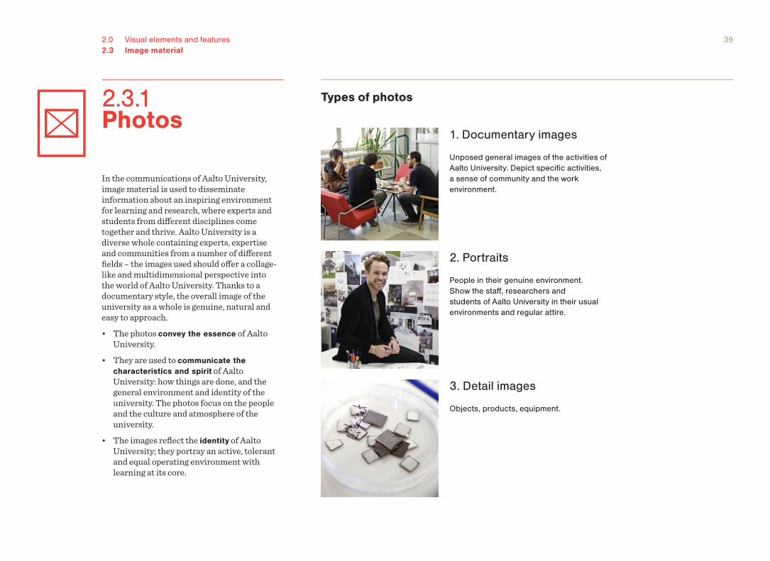
392.0 Visual elements and features2.3 Image material
In the communications of Aalto University, image material is used to disseminate information about an inspiring environment for learning and research, where experts and students from different disciplines come together and thrive. Aalto University is a diverse whole containing experts, expertise and communities from a number of different fields – the images used should offer a collage-like and multidimensional perspective into the world of Aalto University. Thanks to a documentary style, the overall image of the university as a whole is genuine, natural and easy to approach.• The photos convey the essence of Aalto
University. • They are used to communicate the
characteristics and spirit of Aalto University: how things are done, and the general environment and identity of the university. The photos focus on the people and the culture and atmosphere of the university.
• The images reflect the identity of Aalto University; they portray an active, tolerant and equal operating environment with learning at its core.
Types of photos
1. Documentary images
Unposed general images of the activities of Aalto University. Depict specific activities, a sense of community and the work environment.
2. Portraits
People in their genuine environment. Show the staff, researchers and students of Aalto University in their usual environments and regular attire.
3. Detail images
Objects, products, equipment.
2.3.1 Photos
402.0 Visual elements and features2.3 Image material2.3.1 Photos
Content of photos
Clear subject
• The subjects of the documentary and detail images should consist of the central activities of the department/unit in question: events, people, equipment, results of the work, etc.
• Avoid vague or irrelevant subjects.
Clear target
• The target of the photo must be easily perceived in the area of the image.
Style of the photos
Photos in line with the image concept of Aalto University are documentary, authentic and natural. The photos are documentation of everyday activities at Aalto University. People, events and topics central for the operations of Aalto University are chosen as subjects. The subjects are portrayed in an unambiguous and understandable fashion.Photos representing Aalto University should have
• Subjects that depict the operations of Aalto University in a clear manner
• easily identifiable subjects.
Correct Clear subject depicting the activities of Aalto University
Correct Photo has a clearly identifiable target.
IncorrectVague or irrelevat subject that does not depict the activities of Aalto University.
IncorrectNo clear target is identifiable in the image.
412.0 Visual elements and features2.3 Image material2.3.1 Photos
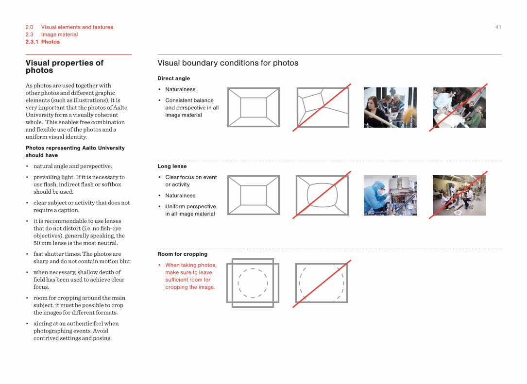
Visual boundary conditions for photos
Long lense
• Clear focus on event or activity
• Naturalness
• Uniform perspective in all image material
Direct angle
• Naturalness
• Consistent balance and perspective in all image material
Room for cropping
• When taking photos, make sure to leave sufficient room for cropping the image.
Visual properties of photos
As photos are used together with other photos and different graphic elements (such as illustrations), it is very important that the photos of Aalto University form a visually coherent whole. This enables free combination and flexible use of the photos and a uniform visual identity.Photos representing Aalto University should have
• natural angle and perspective.• prevailing light. If it is necessary to
use flash, indirect flash or softbox should be used.
• clear subject or activity that does not require a caption.
• it is recommendable to use lenses that do not distort (i.e. no fish-eye objectives). generally speaking, the 50 mm lense is the most neutral.
• fast shutter times. The photos are sharp and do not contain motion blur.
• when necessary, shallow depth of field has been used to achieve clear focus.
• room for cropping around the main subject. it must be possible to crop the images for different formats.
• aiming at an authentic feel when photographing events. Avoid contrived settings and posing.
422.0 Visual elements and features2.3 Image material
Illustration material employed as part of the visual identity of Aalto University is used to convey information on activities at the university. The aim is to create a general image of the content and multidisciplinary nature of the university's operations.• The illustrations depict specific topics,
such as fields of research, content of teaching and projects.
• The illustrations are concrete, representative and simple, never metaphorical, surrealist or abstract.
• The illustrations must be easily and immediately understandable in their context.
The boundary conditions for illustrations specified here apply to both photos and illustrations used as part of the visual identity with the aim of providing information on the activities of the university on a general level. It is not always purposeful to apply these guidelines to illustrations created for other purposes (e.g. for magazine articles), but even in those cases the visual style must be consistent with illustrations created based on these guidelines.
Starting points• The illustrations are simple, clear and understandable.
• The illustrations are independent visual elements that can be combined and used in a number of different ways.
• The use of illustrations supports the perception of the Aalto hierarchy through the construction of visual entitities specific to the university and its schools and departments.
Content• Depict the content and topics of teaching and research at Aalto
University in a concrete manner.
• Convey information on the activities of Aalto University through visual means.
Style• Consistent with the basic elements of visual identity: clear, timeless,
neutral.
• Used in a way that supports the expression of Aalto's visual identity: as an element that renders the products of Aalto University more colourful, fresh, informative and lively.
2.3.2 Illustrations
432.0 Visual elements and features2.3 Image material2.3.2 Illustrations
Illustrations: system and usage
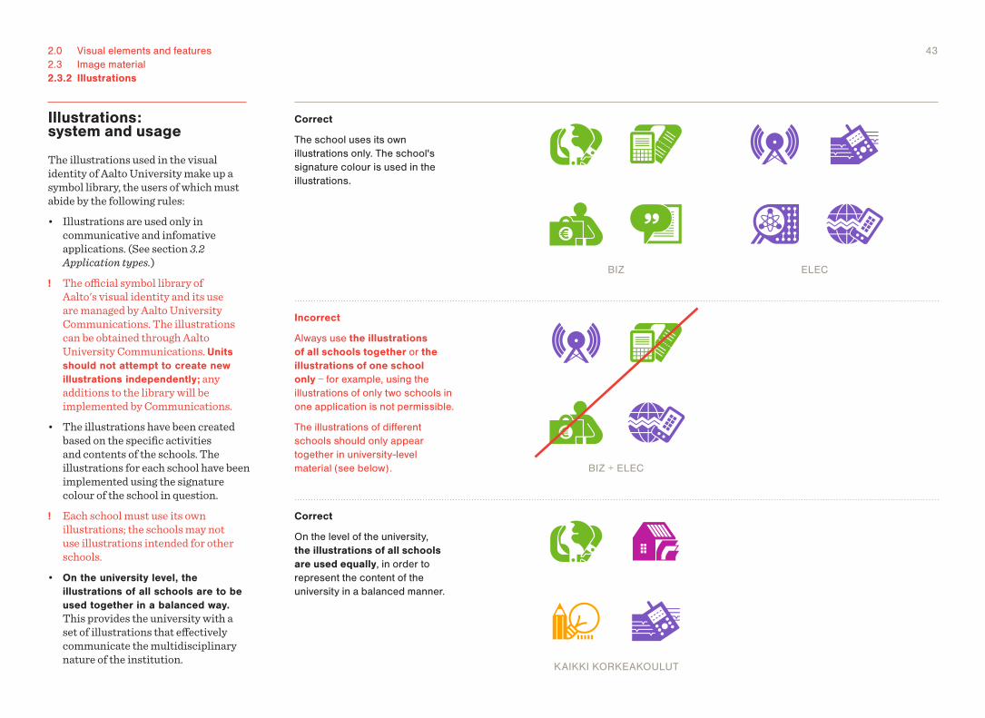
The illustrations used in the visual identity of Aalto University make up a symbol library, the users of which must abide by the following rules:• Illustrations are used only in
communicative and infomative applications. (See section 3.2 Application types.)
! The official symbol library of Aalto's visual identity and its use are managed by Aalto University Communications. The illustrations can be obtained through Aalto University Communications. Units should not attempt to create new illustrations independently; any additions to the library will be implemented by Communications.
• The illustrations have been created based on the specific activities and contents of the schools. The illustrations for each school have been implemented using the signature colour of the school in question.
! Each school must use its own illustrations; the schools may not use illustrations intended for other schools.
• On the university level, the illustrations of all schools are to be used together in a balanced way. This provides the university with a set of illustrations that effectively communicate the multidisciplinary nature of the institution.
Correct
The school uses its own illustrations only. The school's signature colour is used in the illustrations.
BIZ ELEC
Correct
On the level of the university, the illustrations of all schools are used equally, in order to represent the content of the university in a balanced manner.
Incorrect
Always use the illustrations of all schools together or the illustrations of one school only − for example, using the illustrations of only two schools in one application is not permissible.
The illustrations of different schools should only appear together in university-level material (see below). BIZ + ELEC
KAIKKI KORKEAKOULUT
442.0 Visual elements and features2.3 Image material
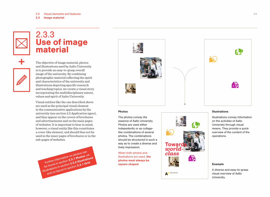
Photos
The photos convey the essence of Aalto University. Photos are used either indepedently or as collage-like combinations of several photos. The combinations should be structured in such a way as to create a diverse and lively impression.
When both photos and illustrations are used, the photos must always be square shaped.
Illustrations
Illustrations convey information on the activities of Aalto University through visual means. They provide a quick overview of the content of the operations.
The objective of image material, photos and illustrations used by Aalto University is to provide an easy-to-grasp overall image of the university. By combining photographic material reflecting the spirit and characteristics of the university and illustrations depicting specific research and teaching topics, we create a visual story incorporating the multidisciplinary nature, values and spirit of Aalto University.Visual entities like the one described above are used as the principal visual element in the communicative applications by the university (see section 3.2 Application types), and they appear on the covers of brochures and advertisements and on the main pages of websites. It is important to bear in mind, however, a visual entity like this constitutes a cover-like element, and should thus not be used in the inner pages of brochures or in the sub-pages of websites.
Example
A diverse and easy-to-grasp visual overview of Aalto University.
Towardsworld-class
2.3.3 Use of image material
Further information on photos can
be found in section 2.3.1 Photos, on
illustrations in section 2.3.2 Illustrations
and on layout in section 2.2.1 Grid.
3.0 Visual variables and application types
The visual identity of Aalto University is applied for a highly diverse set of needs and purposes, and the solutions for all of these cannot be created on the basis of the same visual boundary conditions. For this reason, the use of the visual identity is based on controlled visual variables applied based on application type. This allows for the purposeful use of the visual identy in different applications in a way that still produces a consistent whole.In addition to responding to the needs of different application types, the visual variables are used, for example, to construct hierarchies based on organisation stucture. The purpose of different application types and hierarchies is to structure the range of material produced by Aalto University in a way that makes it easier for the recipient to percieve the different elements that make up Aalto University. The application types specified here cover a wide range of potential applications, but certain wide-ranging aspects of communications (such as advertising and online environment) need to be treated as separate application types that use their own specific combination of visual variables.
Controlled variations of visual elements and features
3.1.1 Header/Footer
3.1.5 Image material
3.1.2 Use of space
3.1.6 Graphic elements
3.1.3 Background colour
3.1.4 Text elements
3.1 Visual variables
Concrete manifestations of the visual identity grouped according to needs and purpose
3.2.1 Functional applications
3.2.1 Communicative applications
3.2.3 Academic applications
3.2.1 Informative applications
3.2 Application types
3.0 Visual variables and application types
3.1 Visual variables
3.0 Visual variables and application types
483.0 Visual variables and application types3.1 Visual variables
A header/footer is a text element the purpose of which is to function as an element of identification for bodies with no symbol of their own (e.g. departments, units, degree programmes). When creating the header/footer, always use the Nimbus Sans Bold typeface in grey, and position the header/footer in the space reserved for it in the layout templates of Aalto University.
A. Use of header/footer possible
Header/footer can be used in the applications if needed.
B. Header/footer not used
Use of header/footer is not used in the applications.
3.1.1 Header/Footer
Header / footeridentifi cation
Content
sci.aalto.fi
Header / footer identifi cation
Content
Advertisement
In applications where it is required (Powerpoint presentations, websites, etc), the header/footer is implemented according to the above models.
Brochure
493.0 Visual variables and application types3.1 Visual variables3.1.1 Header/Footer
Placement of header/footer
In relation to the emblem, the header/footer is placedA. to the right of the emblem (bottom
right corner of the application) so that its top and bottom edge align with those of the emblem
B. above the emblem so that its left edge aligns with the left edge of the emblem.
Formatting of header/footer
Always use the Nimbus Sans Bold typeface in the grey (403C) listed in the visual identity manual for the header/footer. C. In some instances, Regular cut can
also be used for example to clarify a name consisting of two parts.
The font size in the header/footer should be such that it is clearly distinguished from both the text lines in the emblem and the headings in the application. The font size should thus be neither too small nor too large.
Positioning options for the header/footer
Department of Film, Television and Scenography
Center for Markets in Transition CEMAT
Department of Film, Television and Scenography
A. C.
B.
503.0 Visual variables and application types3.1 Visual variables
The principle for the use of space is defined by the purpose of the application. The use of space can be functional, aimed to clarify organisational or application hierarchies or dignified, and it constitutes a significant distinguishing factor between application types.
A. Functional
Maximal utilisation of space. Use of space aims at an application that is as clear, informative and economical as possible.
B. Hierarchical
Space is used to support organisational hierarchy. Use of space creates visually identifiable hierarchies that communicate information on the organisation structure of Aalto University.
C. Dignified
Spacious and controlled. Space is used to achieve an overall impression of dramatics, dignity and luxury. For example, the use of the emblem is well-thought out and understated.
A. Functional
C. Dignified
Letter template
Certificate, invitation, programme for festive occasions, etc.
University-level brochure Degree programme Unit Research group
B. Hierarchical
N.B. The current hierarchy of brochures and aspects such as use of space as a hierarchical feature are described in more detail elsewhere. For further information, contact Aalto University Communications.
3.1.2 Use of space
513.0 Visual variables and application types3.1 Visual variables
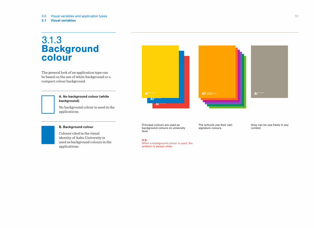
3.1.3 Background colour The general look of an application type can be based on the use of white background or a compact colour background.
A. No background colour (white background)
No background colour is used in the applications.
B. Background colour
Colours cited in the visual identity of Aalto University is used as background colours in the applications.
Principal colours are used as background colours on university level.
The schools use their own signature colours.
N.B. When a background colour is used, the emblem is always white.
Grey can be use freely in any context.
523.0 Visual variables and application types3.1 Visual variables
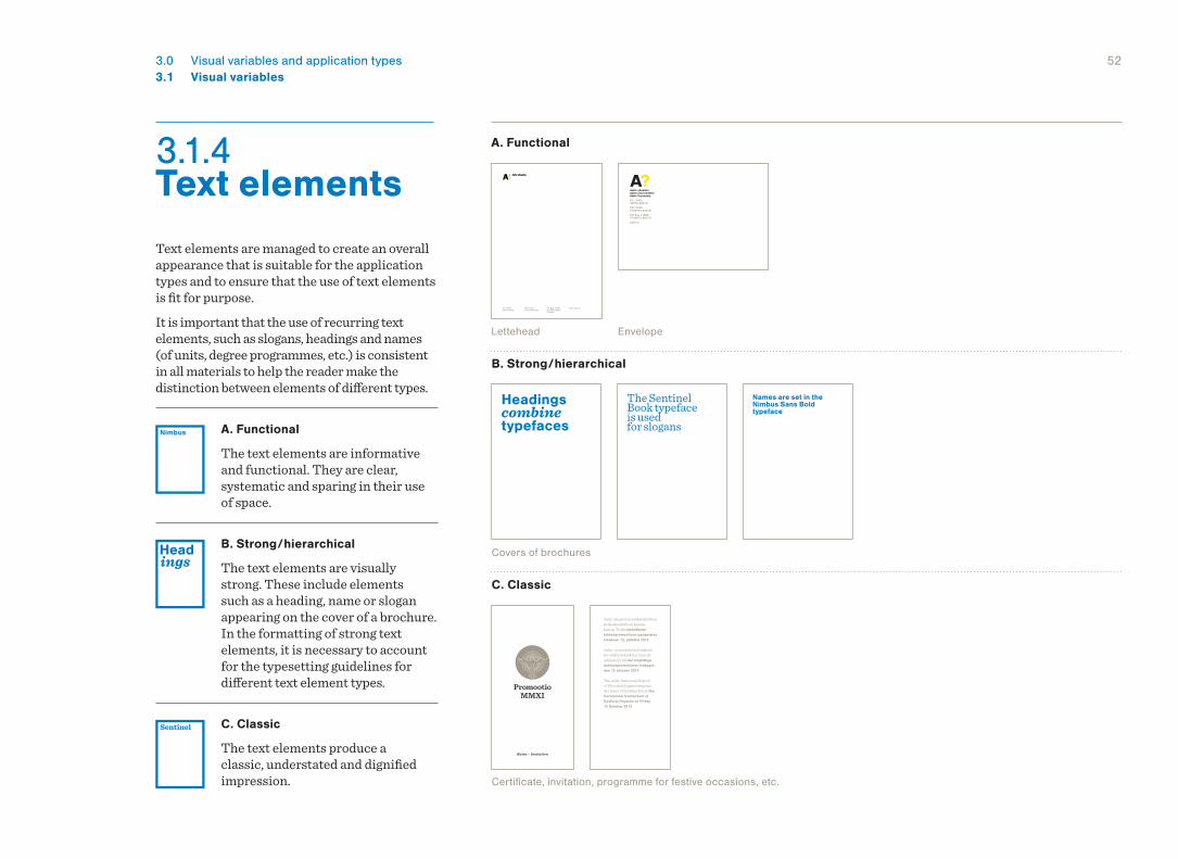
Text elements are managed to create an overall appearance that is suitable for the application types and to ensure that the use of text elements is fit for purpose. It is important that the use of recurring text elements, such as slogans, headings and names (of units, degree programmes, etc.) is consistent in all materials to help the reader make the distinction between elements of different types.
A. Functional
The text elements are informative and functional. They are clear, systematic and sparing in their use of space.
B. Strong / hierarchical
The text elements are visually strong. These include elements such as a heading, name or slogan appearing on the cover of a brochure. In the formatting of strong text elements, it is necessary to account for the typesetting guidelines for different text element types.
C. Classic
The text elements produce a classic, understated and dignified impression.
Lettehead Envelope
Certificate, invitation, programme for festive occasions, etc.
Covers of brochures
PL 1100000076 Aalto
PB 11000FI-00076 Aalto
PO Box 11000FI-00076 AaltoFinland
www.aalto.fi
PL 1100000076 AALTO
PB 11000FI-00076 AALTO
PO Box 11000FI-00076 AALTO
aalto.fi
A. Functional
C. Classic
B. Strong / hierarchical
3.1.4 Text elements
Headings combine typefaces
The Sentinel Book typeface is used for slogans
Names are set in the Nimbus Sans Bold typeface
533.0 Visual variables and application types3.1 Visual variables3.1.4 Text elements
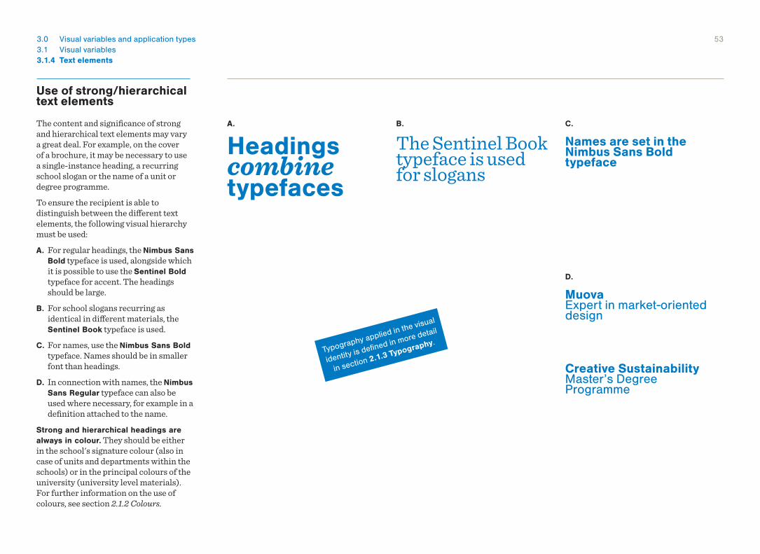
Use of strong/hierarchical text elements
The content and significance of strong and hierarchical text elements may vary a great deal. For example, on the cover of a brochure, it may be necessary to use a single-instance heading, a recurring school slogan or the name of a unit or degree programme.To ensure the recipient is able to distinguish between the different text elements, the following visual hierarchy must be used:A. For regular headings, the Nimbus Sans
Bold typeface is used, alongside which it is possible to use the Sentinel Bold typeface for accent. The headings should be large.
B. For school slogans recurring as identical in different materials, the Sentinel Book typeface is used.
C. For names, use the Nimbus Sans Bold typeface. Names should be in smaller font than headings.
D. In connection with names, the Nimbus Sans Regular typeface can also be used where necessary, for example in a definition attached to the name.
Strong and hierarchical headings are always in colour. They should be either in the school's signature colour (also in case of units and departments within the schools) or in the principal colours of the university (university level materials). For further information on the use of colours, see section 2.1.2 Colours.
A. B. C.
D.
Headings combine typefaces
The Sentinel Book typeface is used for slogans
Names are set in the Nimbus Sans Bold typeface
Creative Sustainability Master’s Degree Programme
Muova Expert in market-orienteddesign
Typography applied in the visual
identity is defined in more detail
in section 2.1.3 Typography.
543.0 Visual variables and application types3.1 Visual variables
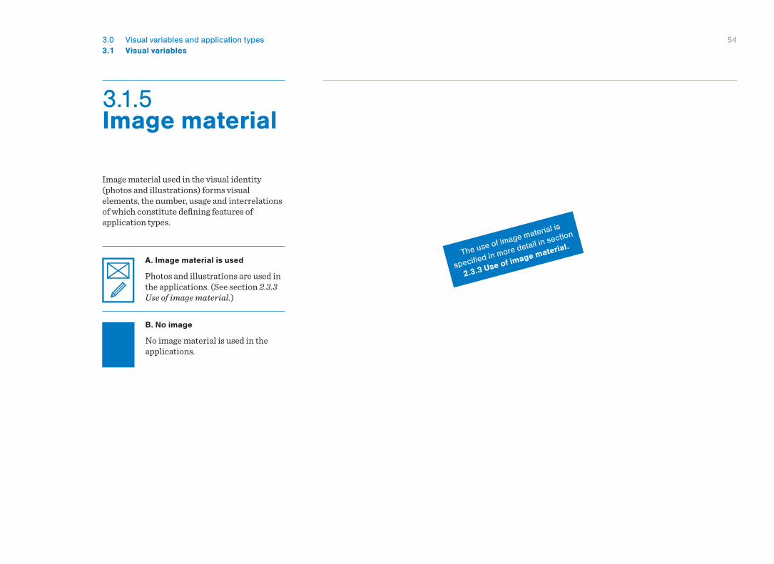
3.1.5 Image material
Image material used in the visual identity (photos and illustrations) forms visual elements, the number, usage and interrelations of which constitute defining features of application types.
A. Image material is used
Photos and illustrations are used in the applications. (See section 2.3.3 Use of image material.)
B. No image
No image material is used in the applications.
The use of image material is
specified in more detail in section
2.3.3 Use of image material.
553.0 Visual variables and application types3.1 Visual variables
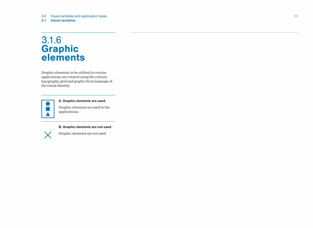
3.1.6 Graphic elementsGraphic elements, to be utilised in certain applications, are created using the colours, typography, grid and graphic form language of the visual identity.
A. Graphic elements are used
Graphic elements are used in the applications.
B. Graphic elements are not used
Graphic elements are not used
3.2 Application Types
3.0 Visual variables and application types
573.0 Visual variables and application types3.2 Application Types
Use of space
Text
Background colour
Image Graphics Materials
Starting points Header/footer
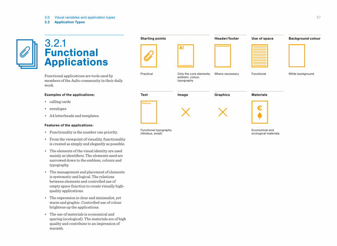
Functional applications are tools used by members of the Aalto community in their daily work.
Examples of the applications:
• calling cards• envelopes• A4 letterheads and templates.
Features of the applications:
• Functionality is the number one priority.• From the viewpoint of visuality, functionality
is created as simply and elegantly as possible. • The elements of the visual identity are used
mainly as identifiers. The elements used are narrowed down to the emblem, colours and typography.
• The management and placement of elements is systematic and logical. The relations between elements and controlled use of empty space function to create visually high-quality applications.
• The expression is clear and minimalist, yet warm and graphic. Controlled use of colour brightens up the applications.
• The use of materials is economical and sparing (ecological). The materials are of high quality and contribute to an impression of warmth.
Functional typography (Nimbus, small)
White backgroundFunctional
Economical and ecological materials
Only the core elements: emblem, colour, typography
Practical Where necessary
3.2.1 Functional Applications
583.0 Visual variables and application types3.2 Application Types
3.2.2 Communicative Applications
Use of space
Text
Background colour
Image Graphics Materials
Starting points Header/footer
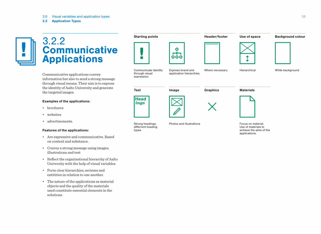
Communicative applications convey information but also to send a strong message through visual means. Their aim is to express the identity of Aalto University and generate the targeted images.
Examples of the applications:
• brochures• websites• advertisements.
Features of the applications:
• Are expressive and communicative. Based on content and substance.
• Convey a strong message using images, illustrations and text
• Reflect the organisational hierarchy of Aalto University with the help of visual variables.
• Form clear hierarchies, serieses and entitities in relation to one another.
• The nature of the applications as material objects and the quality of the materials used constitute essential elements in the solutions.
White background
Photos and illustrationsStrong headings, differrent heading types
Focus on material. Use of materials to achieve the aims of the applications.
Express brand and application hierarchies.
Communicate identity through visual expression.
Where necessary Hierarchical
593.0 Visual variables and application types3.2 Application Types
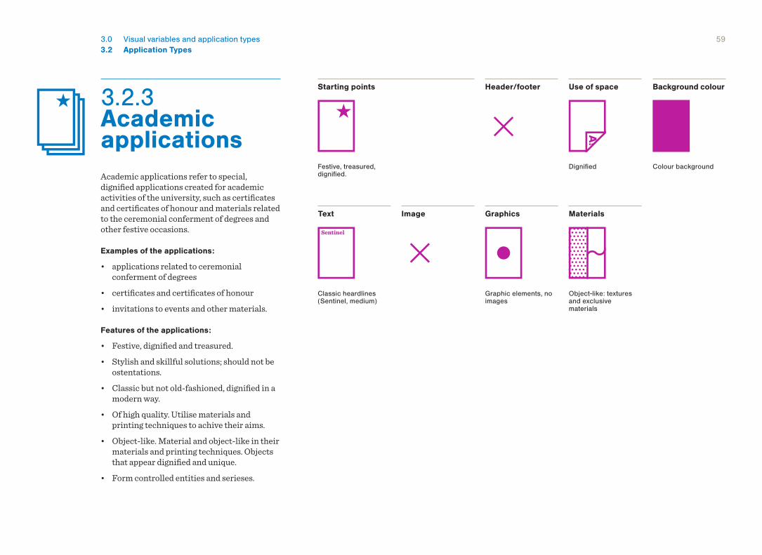
3.2.3 Academic applications
Use of space
Text
Background colour
Image Graphics Materials
Starting points Header/footer
Academic applications refer to special, dignified applications created for academic activities of the university, such as certificates and certificates of honour and materials related to the ceremonial conferment of degrees and other festive occasions.
Examples of the applications:
• applications related to ceremonial conferment of degrees
• certificates and certificates of honour• invitations to events and other materials.
Features of the applications:
• Festive, dignified and treasured.• Stylish and skillful solutions; should not be
ostentations.• Classic but not old-fashioned, dignified in a
modern way.• Of high quality. Utilise materials and
printing techniques to achive their aims.• Object-like. Material and object-like in their
materials and printing techniques. Objects that appear dignified and unique.
• Form controlled entities and serieses.
Colour background
Object-like: textures and exclusive materials
Classic heardlines (Sentinel, medium)
Dignified
Graphic elements, no images
Festive, treasured, dignified.
603.0 Visual variables and application types3.2 Application Types
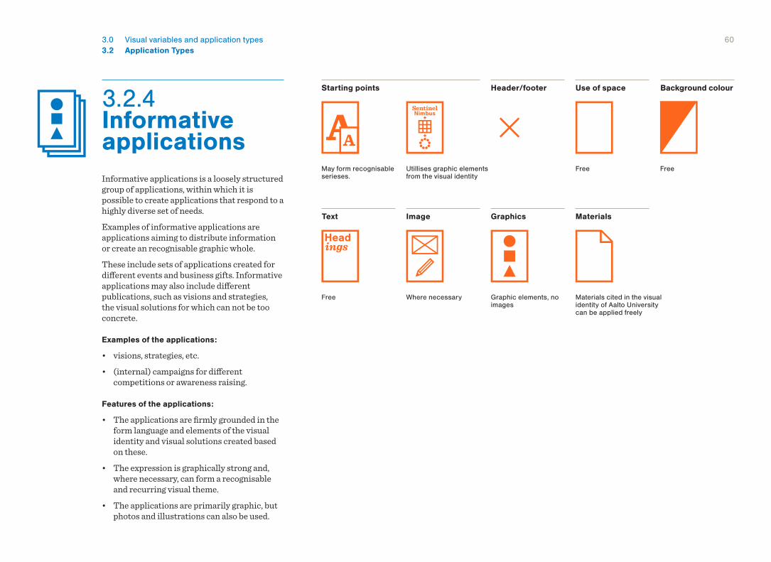
3.2.4 Informative applications
Use of space
Text
Background colour
Image Graphics Materials
Starting points Header/footer
Informative applications is a loosely structured group of applications, within which it is possible to create applications that respond to a highly diverse set of needs.Examples of informative applications are applications aiming to distribute information or create an recognisable graphic whole. These include sets of applications created for different events and business gifts. Informative applications may also include different publications, such as visions and strategies, the visual solutions for which can not be too concrete.
Examples of the applications:
• visions, strategies, etc.• (internal) campaigns for different
competitions or awareness raising.
Features of the applications:
• The applications are firmly grounded in the form language and elements of the visual identity and visual solutions created based on these.
• The expression is graphically strong and, where necessary, can form a recognisable and recurring visual theme.
• The applications are primarily graphic, but photos and illustrations can also be used.
FreeFreeUtillises graphic elements from the visual identity
May form recognisable serieses.
Graphic elements, no images
Free Materials cited in the visual identity of Aalto University can be applied freely
Where necessary
Informative applications
Academic applications
Functional applications
Communicative applications
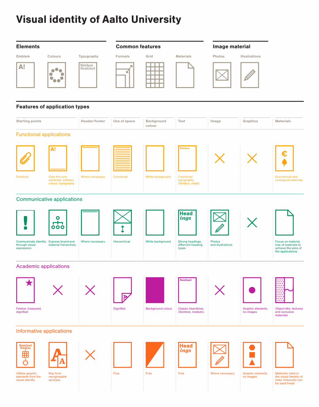
Features of application types
Elements Common features Image material
Visual identity of Aalto University
Emblem Colours Typography Grid MaterialsFormats Photos Illustrations
Functional typography (Nimbus, small)
White backgroundFunctional Economical and ecological materials
Only the core elements: emblem, colour, typography
Practical Where necessary
TextBackground colour
Use of space Image Graphics MaterialsStarting points Header/footer
White background Photos and illustrations
Strong headings, differrent heading types
Focus on material. Use of materials to achieve the aims of the applications.
Express brand and material hierarchies.
Communicate identity through visual expression.
Where necessary Hierarchical
Background colour Object-like: textures and exclusive materials
Classic heardlines (Sentinel, medium)
Dignified Graphic elements, no images
Festive, treasured, dignified
FreeFreeUtillise graphic elements from the visual identity
May form recognisable serieses.
Graphic elements, no images
Free Where necessary Materials cited in the visual identity of Aalto University can be used freely
© Aalto University 2013 Guideline updated on 15.4.2013
The emblem and visual identity of Aalto University were designed by Rasmus Snabb in 2009. This guideline was authored, compiled and laid out by Rasmus Snabb in cooperation with Aalto University Communications.
Further information:
Aalto University Communications [email protected]
Related Documents


