ALEKSANDRA HRISTOV | @alexhris Advanced Web Design @ FINKI | 11 Movember 2014 RWD

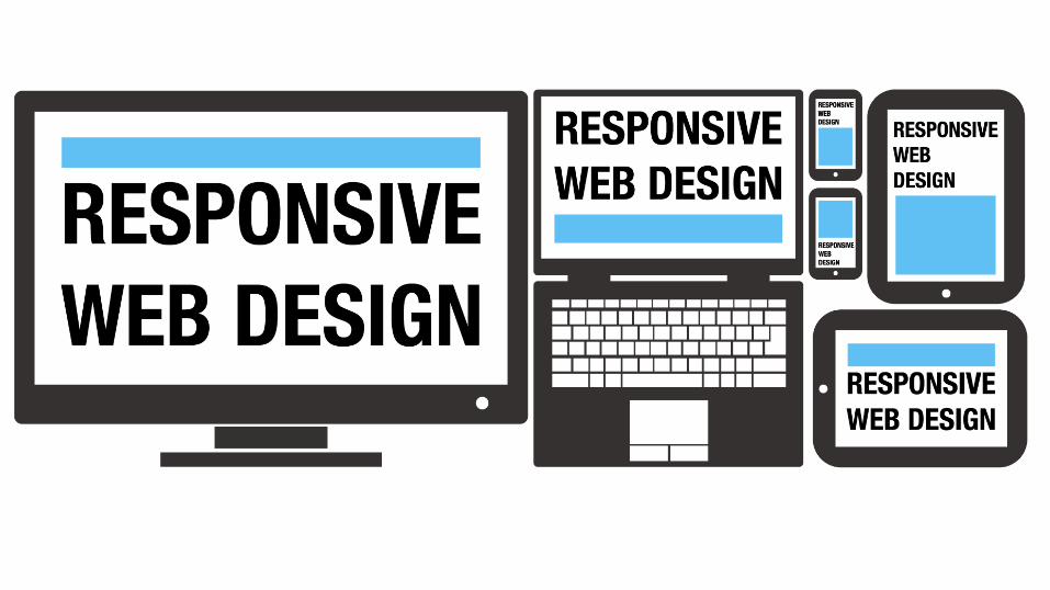
Responsive web design
Jul 14, 2015
Welcome message from author
This document is posted to help you gain knowledge. Please leave a comment to let me know what you think about it! Share it to your friends and learn new things together.
Transcript
ALEKSANDRA HRISTOV | @alexhris
Advanced Web Design @ FINKI | 11 Movember 2014
RWD

http://etc.ch/q8zS
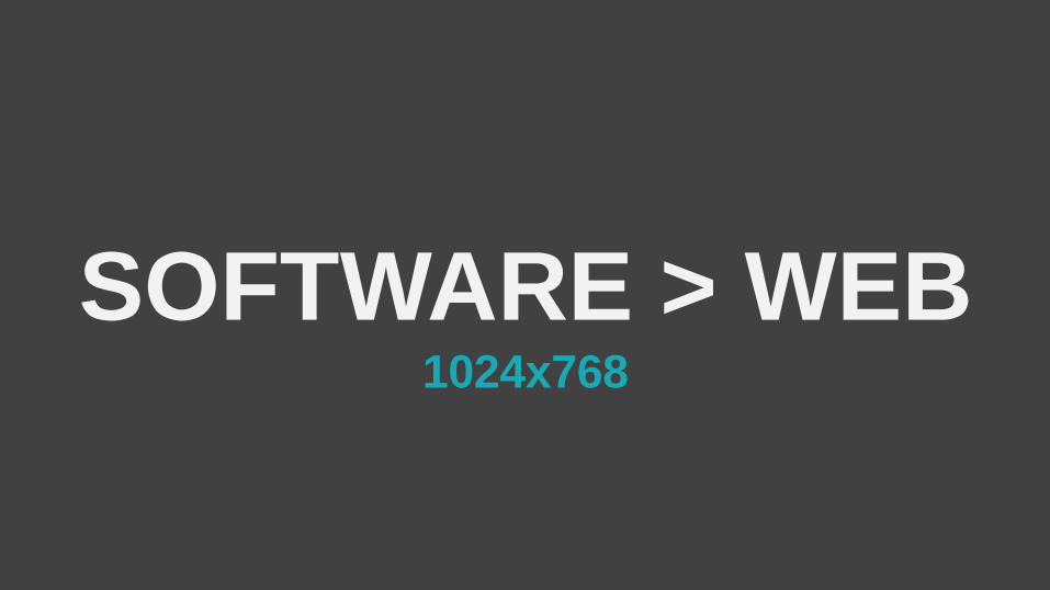
SOFTWARE > WEB1024x768
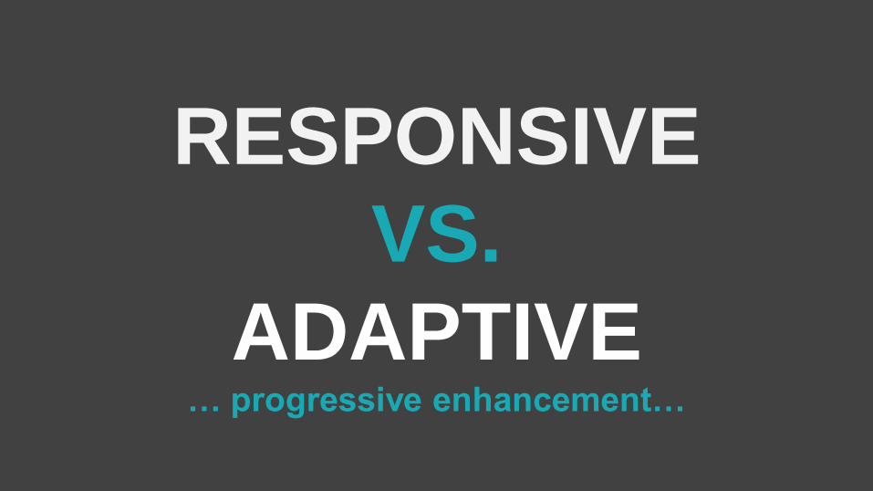
RESPONSIVE
VS.
ADAPTIVE… progressive enhancement…
TECHNIQUES
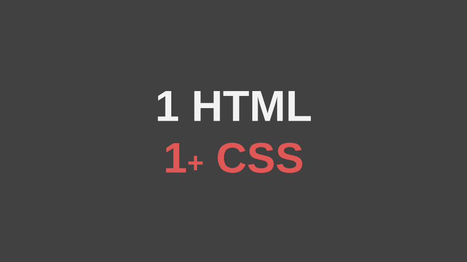
1 HTML
1+ CSS

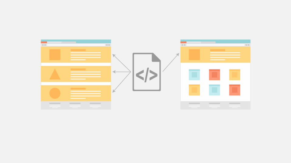
PLAN
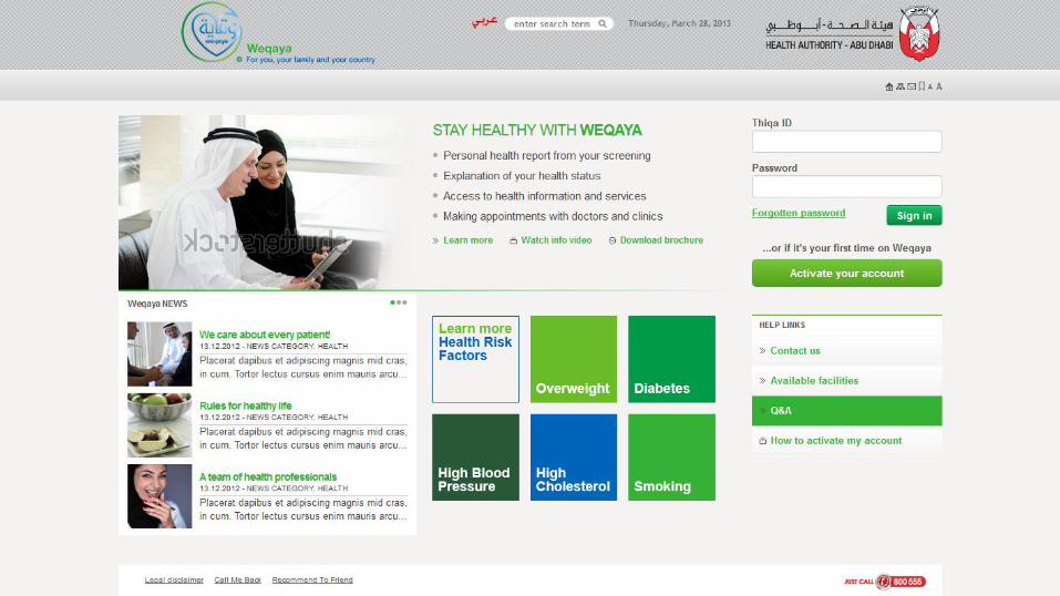
Order (no horizontal scrollbar)
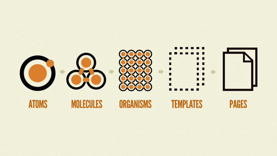
DESIGN
Elements (not layouts)

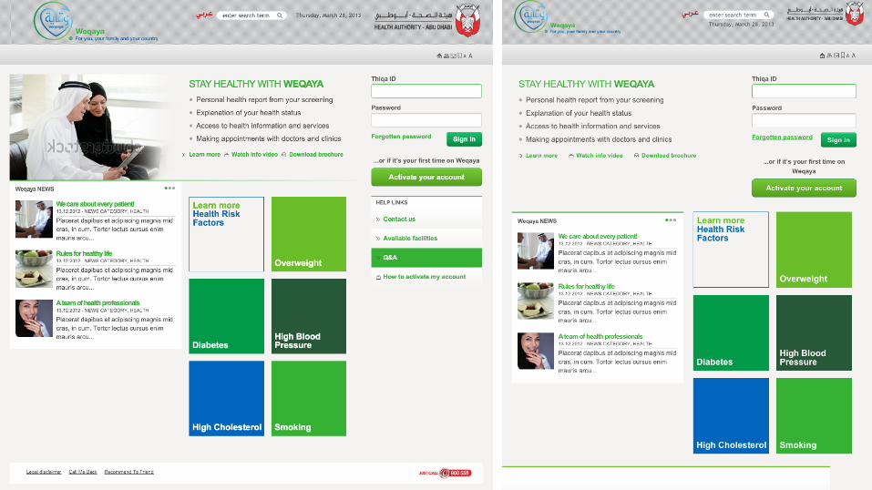
• desktop 3 columns
• tablets 2 columns
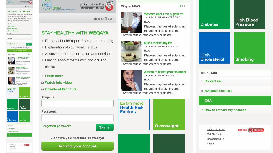
• phones 1 column
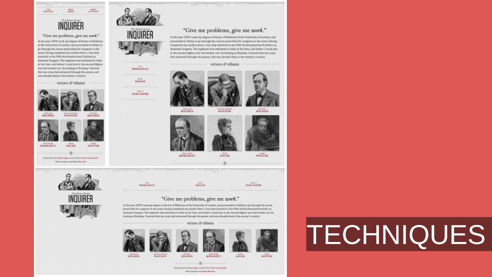
GRID (example)
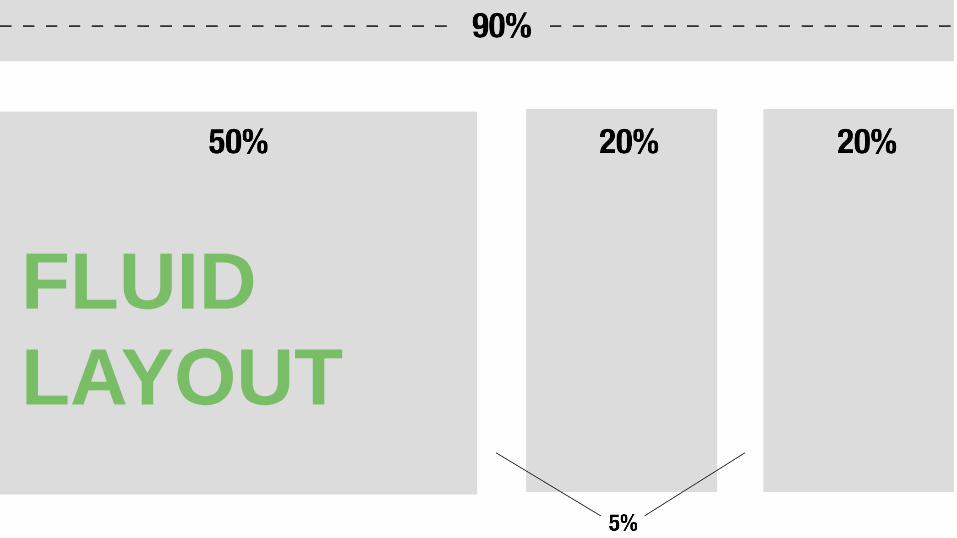
FLUID
LAYOUT
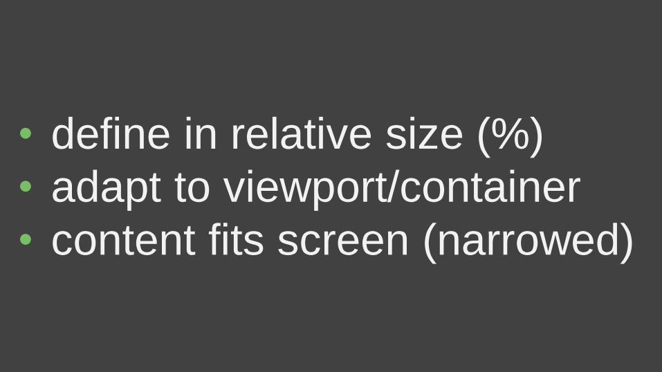
• define in relative size (%)
• adapt to viewport/container
• content fits screen (narrowed)
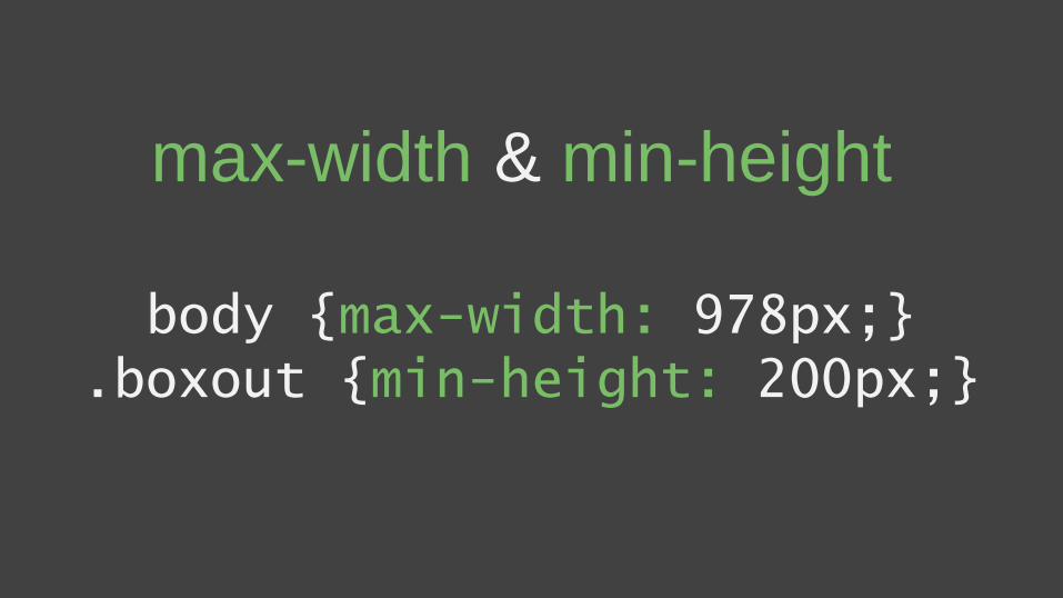
max-width & min-height
body {max-width: 978px;}.boxout {min-height: 200px;}
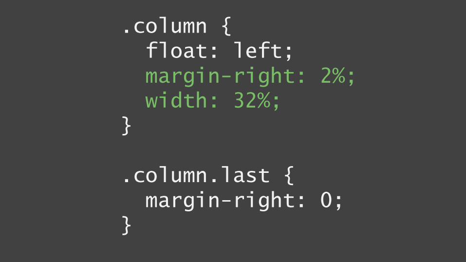
.column {float: left;margin-right: 2%;width: 32%;
}
.column.last {margin-right: 0;
}

OLD news
+
CSS3 media queries
=

FRAMEWORK
as BASIS
Bootstrap
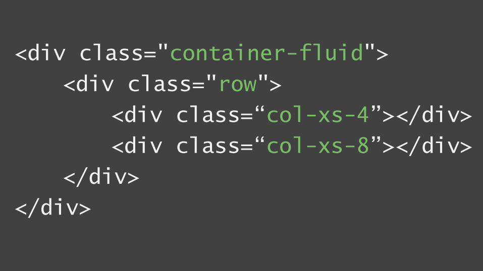
<div class="container-fluid">
<div class="row">
<div class=“col-xs-4”></div>
<div class=“col-xs-8”></div>
</div>
</div>
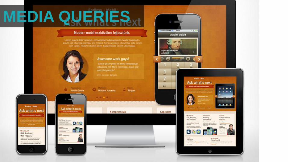
MEDIA QUERIES
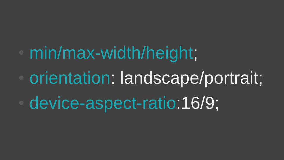
• min/max-width/height;
• orientation: landscape/portrait;
• device-aspect-ratio:16/9;
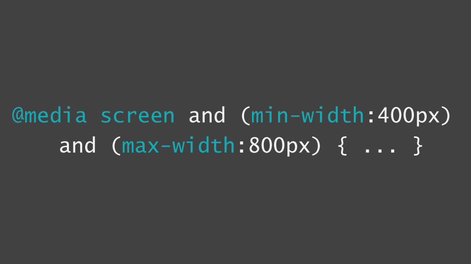
@media screen and (min-width:400px)
and (max-width:800px) { ... }
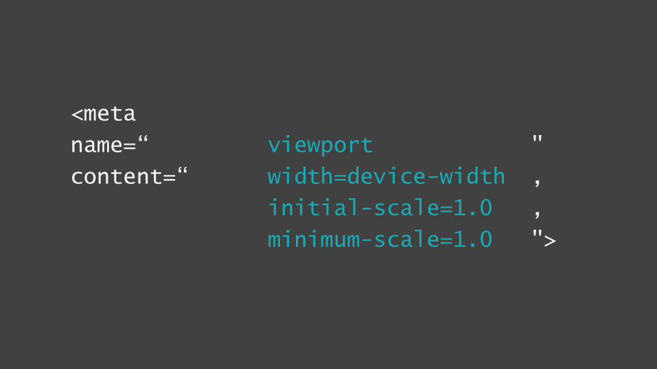
<meta
name=“ viewport "
content=“ width=device-width ,
initial-scale=1.0 ,
minimum-scale=1.0 ">
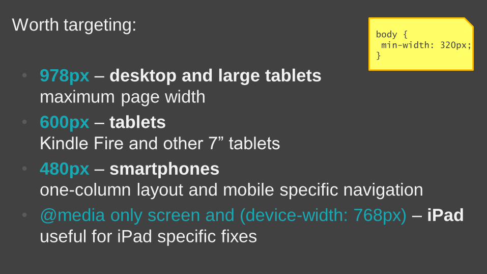
Worth targeting:
• 978px – desktop and large tablets
maximum page width
• 600px – tablets
Kindle Fire and other 7” tablets
• 480px – smartphones
one-column layout and mobile specific navigation
• @media only screen and (device-width: 768px) – iPad
useful for iPad specific fixes
body {min-width: 320px;
}
COMPROMISEUX
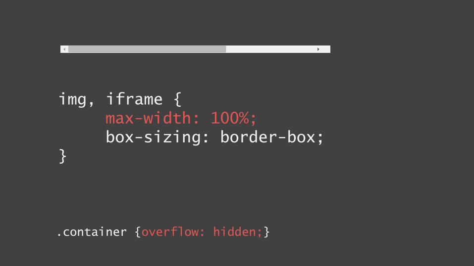
img, iframe {max-width: 100%;box-sizing: border-box;
}
.container {overflow: hidden;}
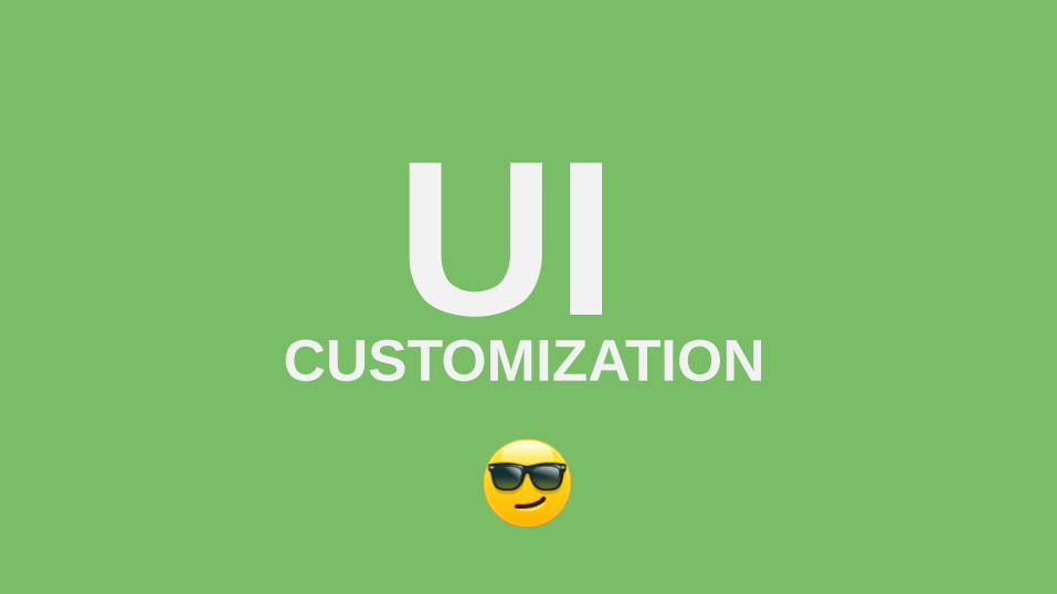
CUSTOMIZATIONUI

THINK!MOBILE
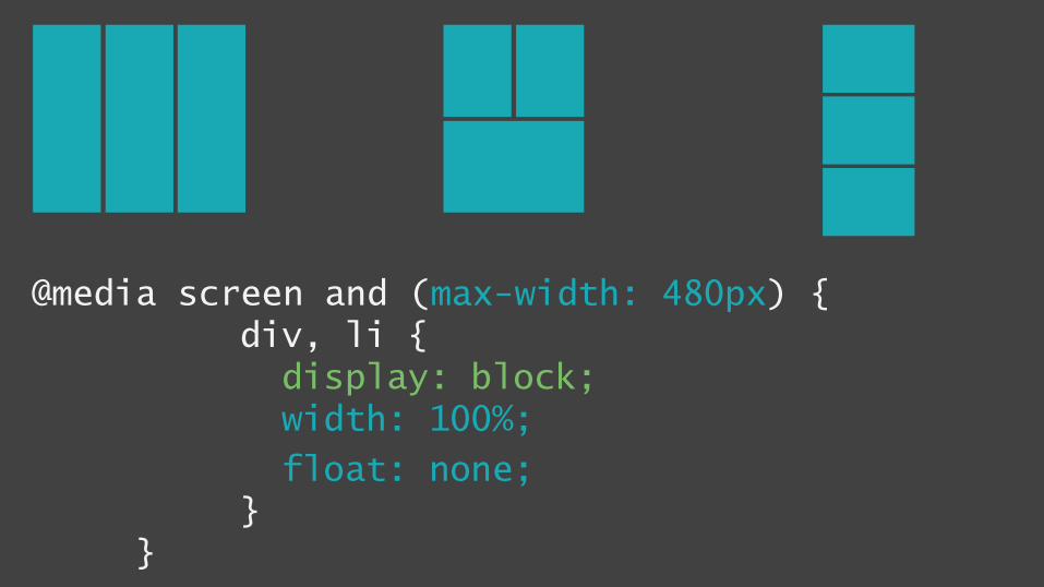
@media screen and (max-width: 480px) {div, li {display: block;width: 100%;
float: none;}
}
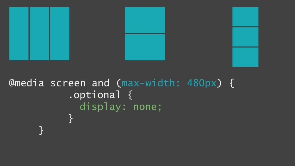
@media screen and (max-width: 480px) {.optional {display: none;
}}
x
RES
PON
SIVE
IMAGES
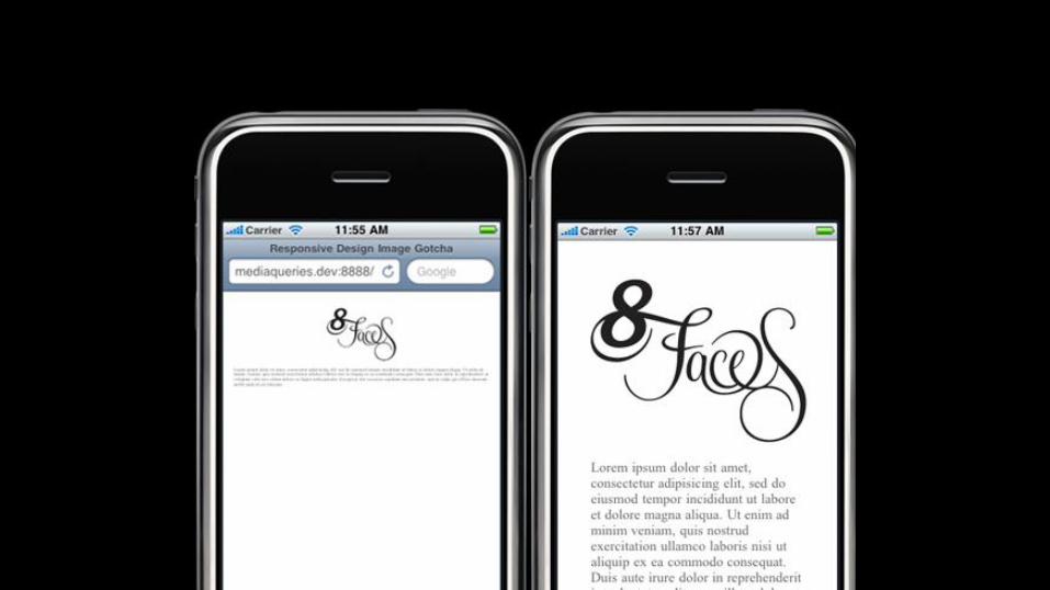
•Using max-width:100%;
•or for IE - scripts (imgsizer.js)
•Flex slider for galleries
• (including touch & swipe gestures)
•Scripts


•
•
img {width: 200px;}
•


<img srcset=“small.jpg 1x, medium.jpg 2x" src="small.jpg" alt="A rad wolf" />
medium.jpg (640 x 480) small.jpg (320 x 240)
device-pixel-ratio
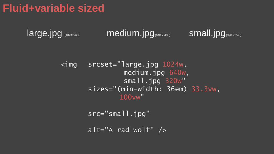
large.jpg (1024x768) medium.jpg (640 x 480) small.jpg (320 x 240)
<img srcset="large.jpg 1024w, medium.jpg 640w, small.jpg 320w"
sizes="(min-width: 36em) 33.3vw, 100vw"
src="small.jpg"
alt="A rad wolf" />
Fluid+variable sized
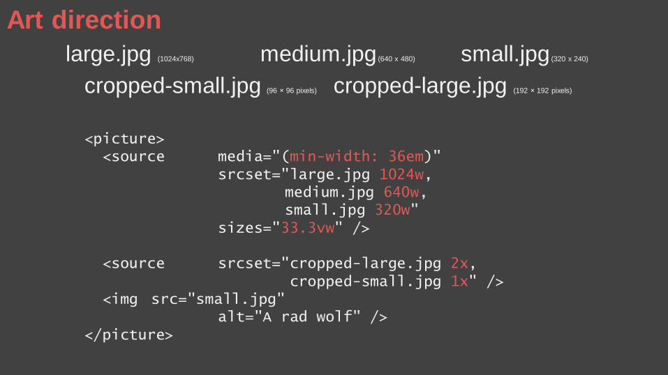
large.jpg (1024x768) medium.jpg (640 x 480) small.jpg (320 x 240)
cropped-small.jpg (96 × 96 pixels) cropped-large.jpg (192 × 192 pixels)
<picture><source media="(min-width: 36em)"
srcset="large.jpg 1024w, medium.jpg 640w, small.jpg 320w"
sizes="33.3vw" />
<source srcset="cropped-large.jpg 2x, cropped-small.jpg 1x" />
<img src="small.jpg" alt="A rad wolf" />
</picture>
Art direction
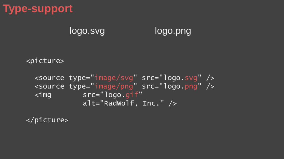
logo.svg logo.png
<picture>
<source type="image/svg" src="logo.svg" /> <source type="image/png" src="logo.png" /> <img src="logo.gif"
alt="RadWolf, Inc." />
</picture>
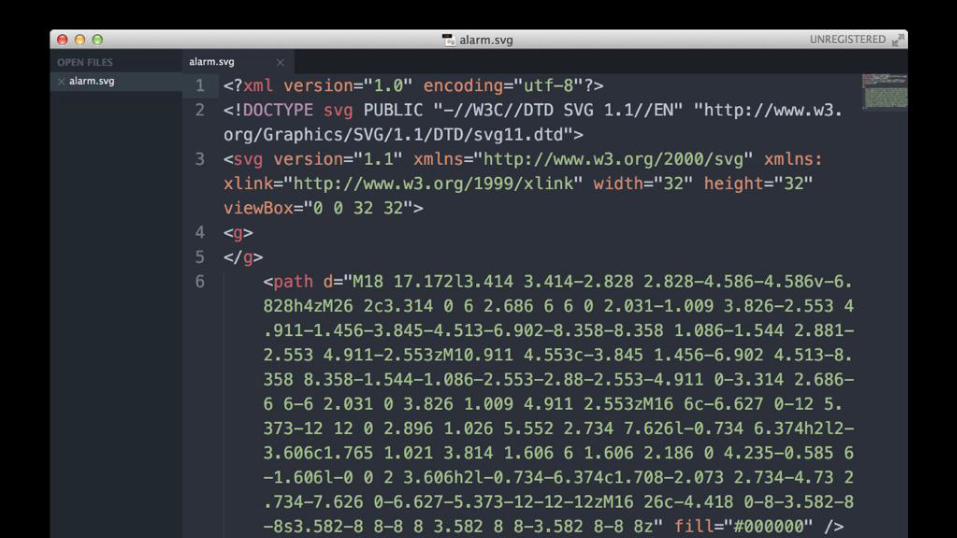
Type-support
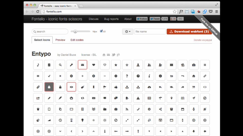
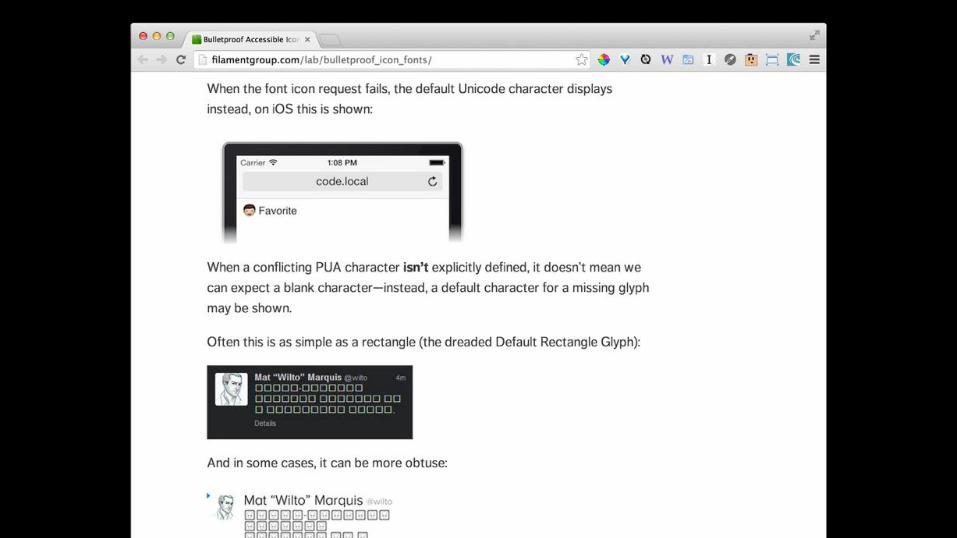
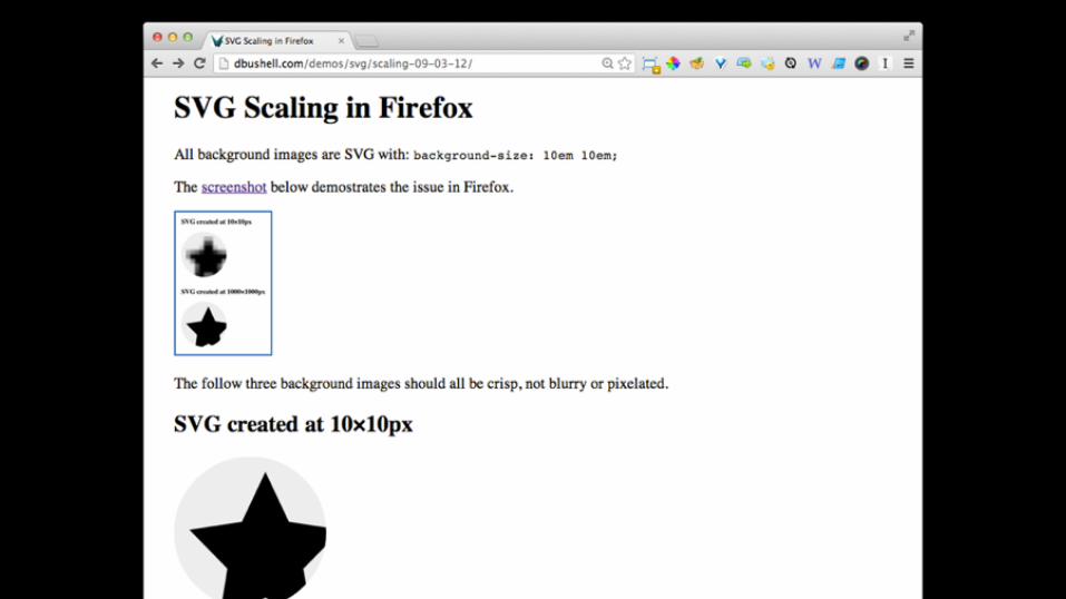
FONT ICONS
&
SVG

That’s not all folks! There’s also…
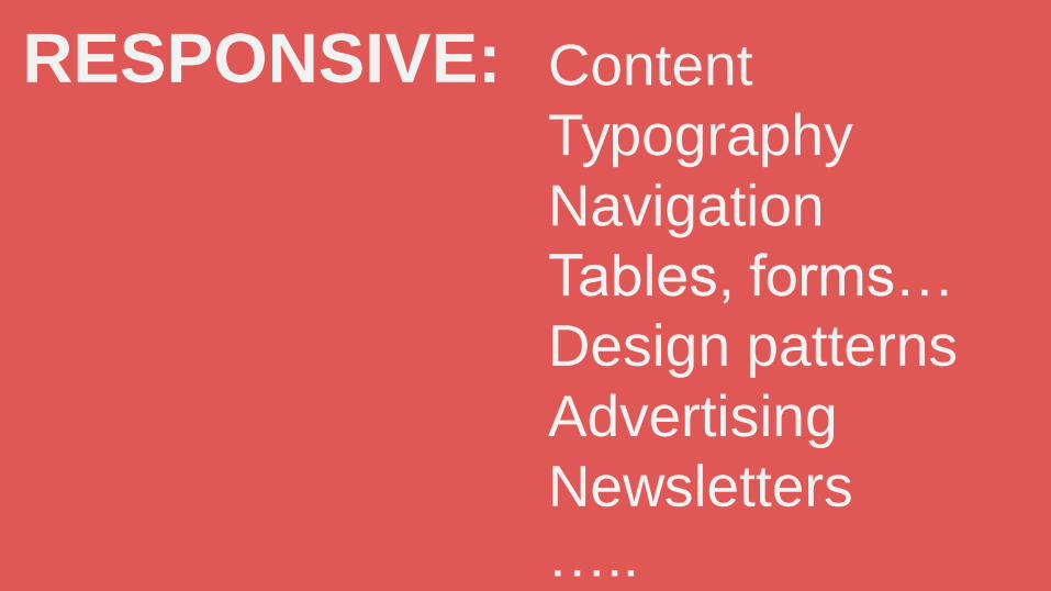
Content
Typography
Navigation
Tables, forms…
Design patterns
Advertising
Newsletters
…..
RESPONSIVE:
RECYCLE
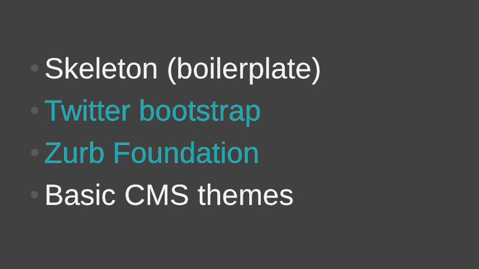
•Skeleton (boilerplate)
•Twitter bootstrap
•Zurb Foundation
•Basic CMS themes
•Skeleton (boilerplate)
•Twitter bootstrap
•Zurb Foundation
•Basic CMS themes

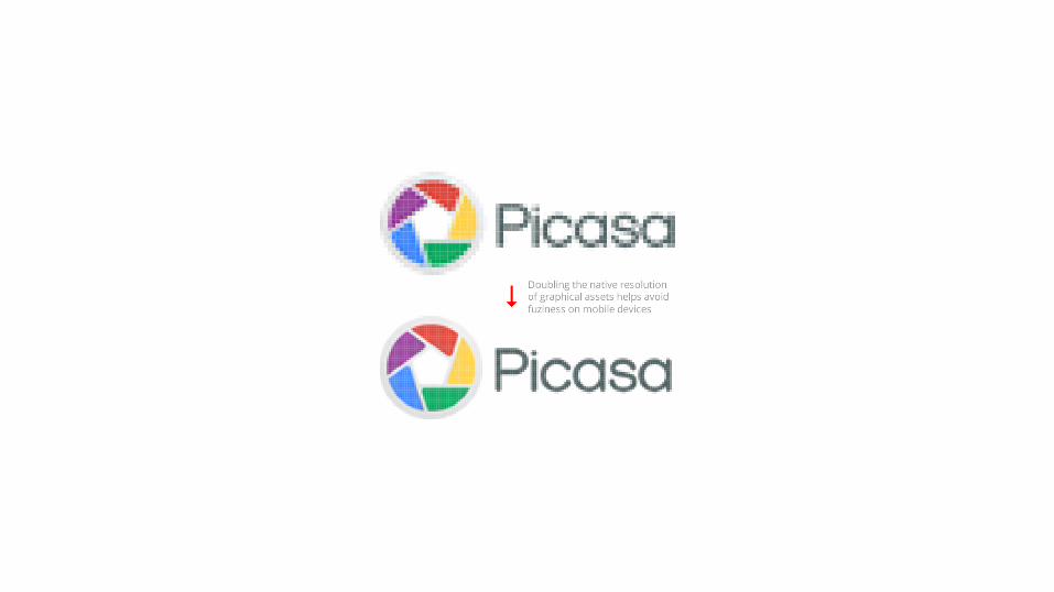
PERFORMANCE
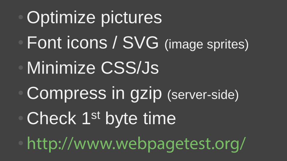
•Optimize pictures
•Font icons / SVG (image sprites)
•Minimize CSS/Js
•Compress in gzip (server-side)
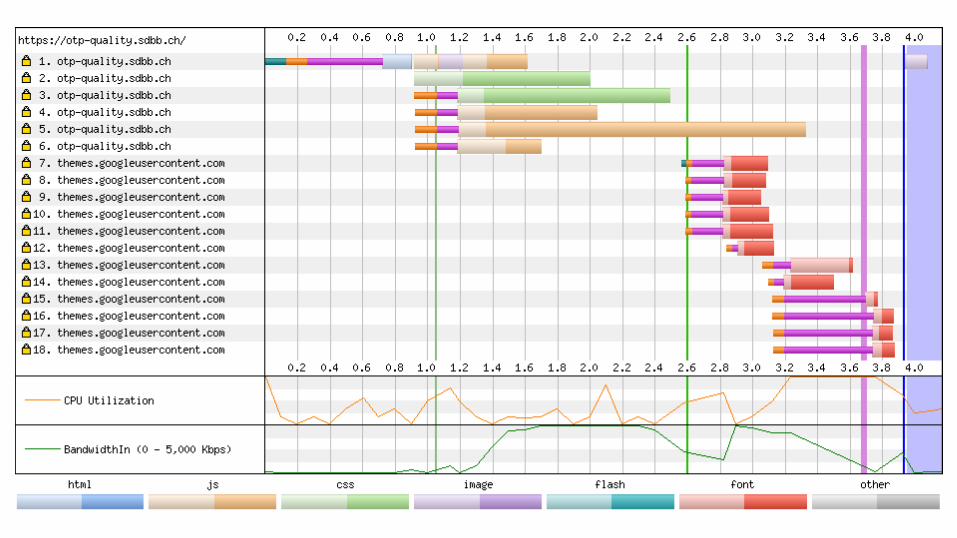
•Check 1st byte time
•

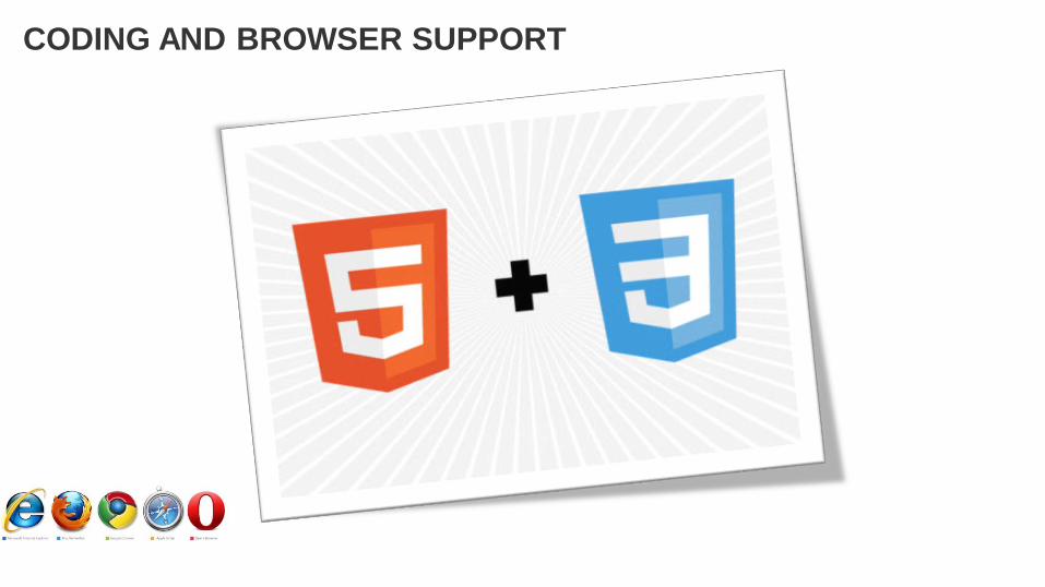
CODING AND BROWSER SUPPORT
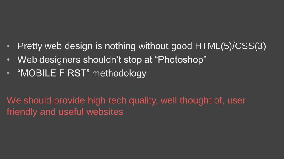
• Pretty web design is nothing without good HTML(5)/CSS(3)
• Web designers shouldn’t stop at “Photoshop”
• “MOBILE FIRST” methodology
We should provide high tech quality, well thought of, user
friendly and useful websites
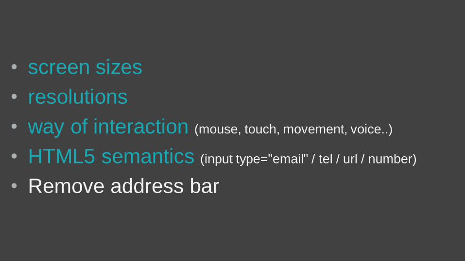
• screen sizes
• resolutions
• way of interaction (mouse, touch, movement, voice..)
• HTML5 semantics (input type="email" / tel / url / number)
• Remove address bar
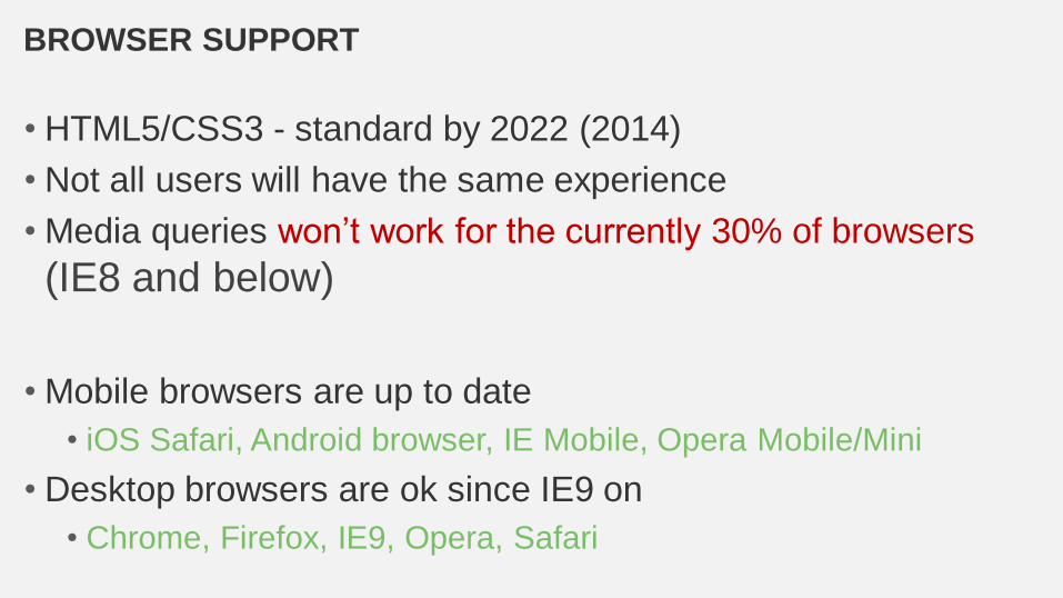
BROWSER SUPPORT
• HTML5/CSS3 - standard by 2022 (2014)
• Not all users will have the same experience
• Media queries won’t work for the currently 30% of browsers
(IE8 and below)
• Mobile browsers are up to date
• iOS Safari, Android browser, IE Mobile, Opera Mobile/Mini
• Desktop browsers are ok since IE9 on
• Chrome, Firefox, IE9, Opera, Safari

Related Documents