
Question 1 Evaluation
Jul 19, 2015
Welcome message from author
This document is posted to help you gain knowledge. Please leave a comment to let me know what you think about it! Share it to your friends and learn new things together.
Transcript
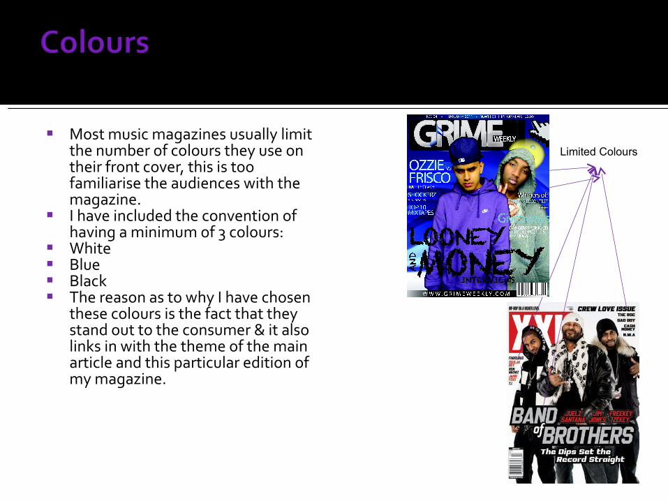
Most music magazines usually limit the number of colours they use on their front cover, this is too familiarise the audiences with the magazine.
I have included the convention of having a minimum of 3 colours:
White Blue Black The reason as to why I have chosen
these colours is the fact that they stand out to the consumer & it also links in with the theme of the main article and this particular edition of my magazine.
Limited Colours
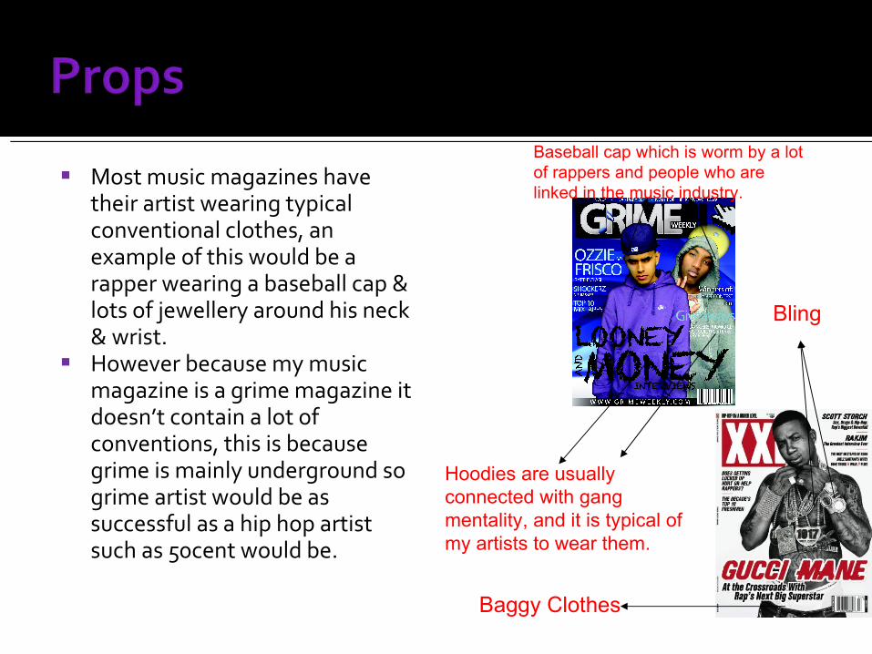
Most music magazines have their artist wearing typical conventional clothes, an example of this would be a rapper wearing a baseball cap & lots of jewellery around his neck & wrist.
However because my music magazine is a grime magazine it doesn’t contain a lot of conventions, this is because grime is mainly underground so grime artist would be as successful as a hip hop artist such as 50cent would be.
Baseball cap which is worm by a lot of rappers and people who are linked in the music industry.
Hoodies are usually connected with gang mentality, and it is typical of my artists to wear them.
Baggy Clothes
Bling
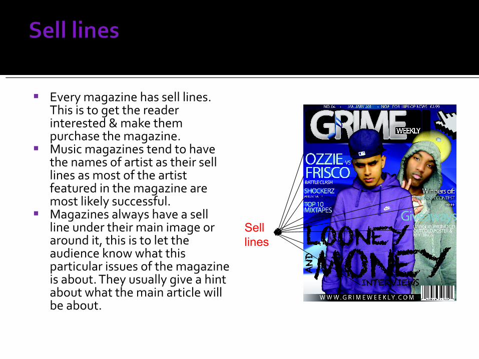
Every magazine has sell lines. This is to get the reader interested & make them purchase the magazine.
Music magazines tend to have the names of artist as their sell lines as most of the artist featured in the magazine are most likely successful.
Magazines always have a sell line under their main image or around it, this is to let the audience know what this particular issues of the magazine is about. They usually give a hint about what the main article will be about.
Sell lines
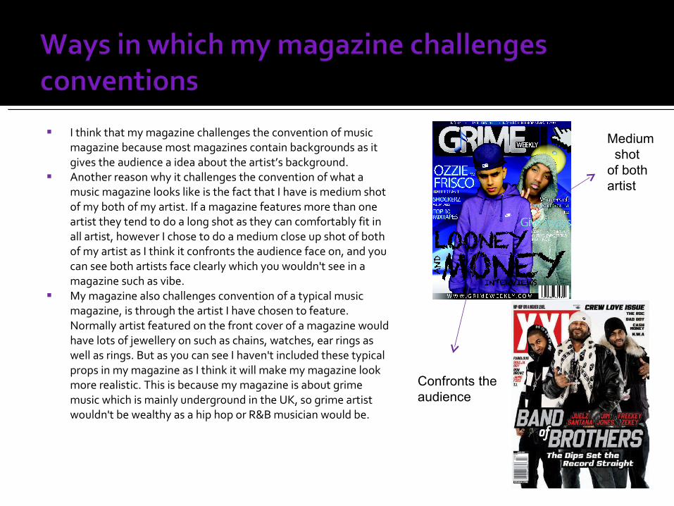
I think that my magazine challenges the convention of music magazine because most magazines contain backgrounds as it gives the audience a idea about the artist’s background.
Another reason why it challenges the convention of what a music magazine looks like is the fact that I have is medium shot of my both of my artist. If a magazine features more than one artist they tend to do a long shot as they can comfortably fit in all artist, however I chose to do a medium close up shot of both of my artist as I think it confronts the audience face on, and you can see both artists face clearly which you wouldn't see in a magazine such as vibe.
My magazine also challenges convention of a typical music magazine, is through the artist I have chosen to feature. Normally artist featured on the front cover of a magazine would have lots of jewellery on such as chains, watches, ear rings as well as rings. But as you can see I haven't included these typical props in my magazine as I think it will make my magazine look more realistic. This is because my magazine is about grime music which is mainly underground in the UK, so grime artist wouldn't be wealthy as a hip hop or R&B musician would be.
Medium shot of both artist
Confronts theaudience
Related Documents


