Welcome message from author
This document is posted to help you gain knowledge. Please leave a comment to let me know what you think about it! Share it to your friends and learn new things together.
Transcript
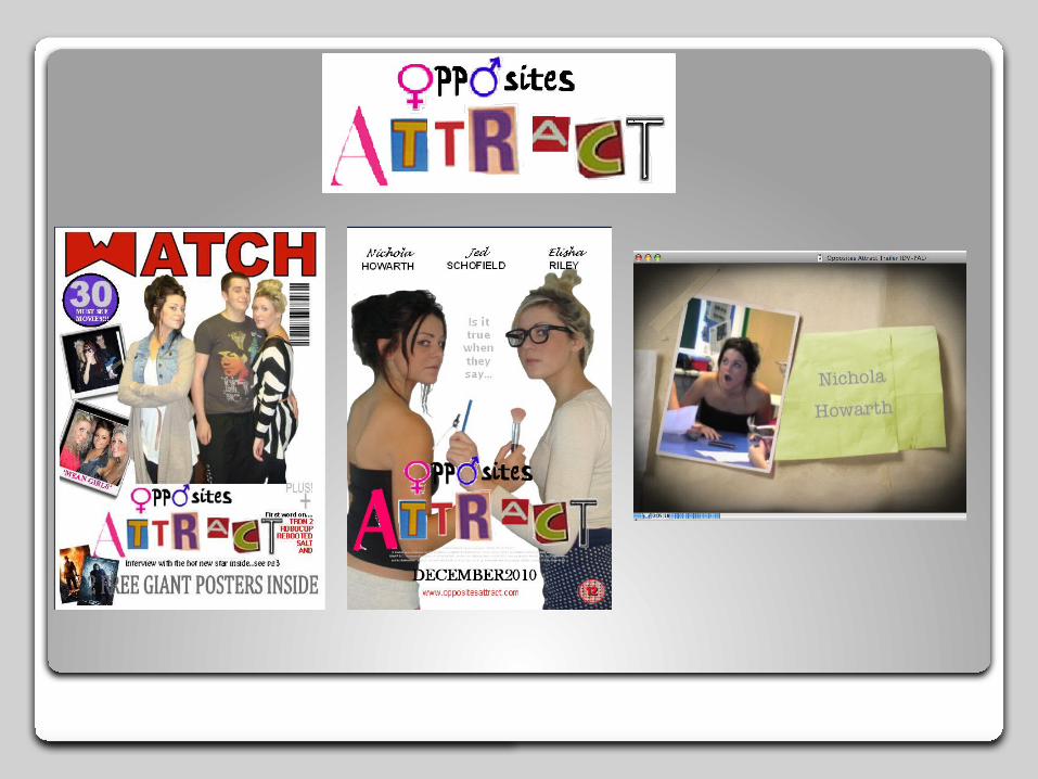
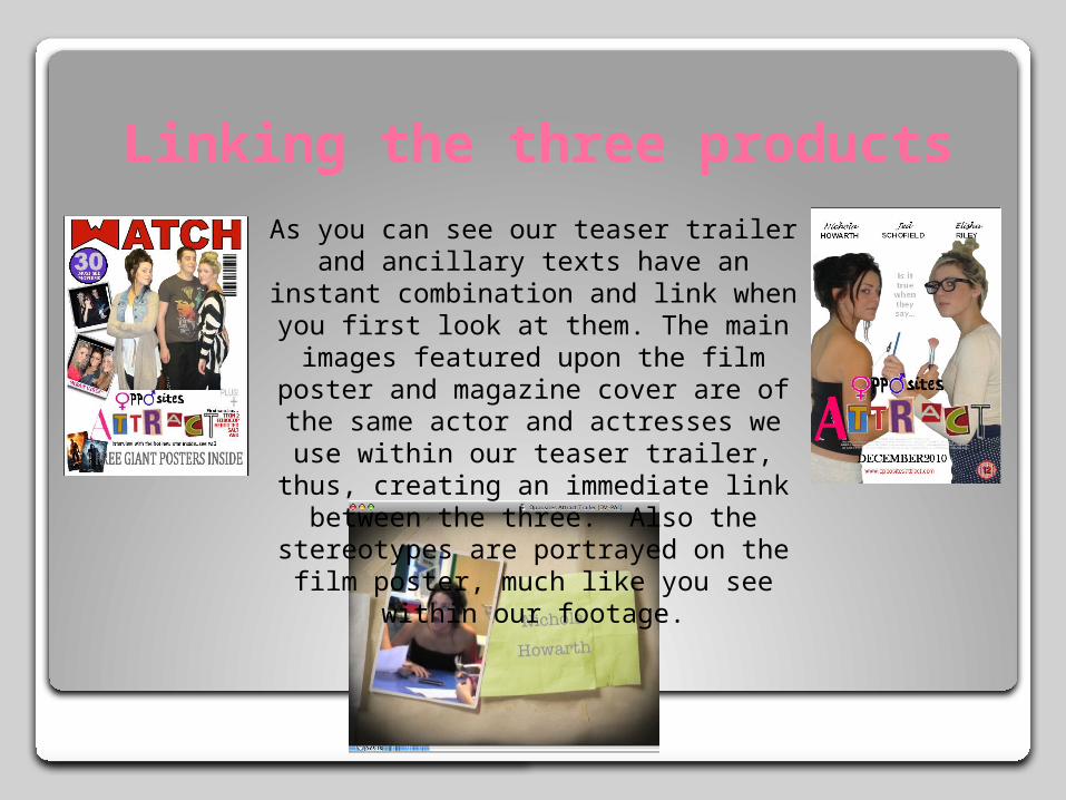
Linking the three productsAs you can see our teaser trailer and
ancillary texts have an instant combination and link when you first look at them. The main images featured upon the film poster and magazine cover are of the same actor and actresses we use within our teaser trailer, thus, creating an immediate link between the three. Also the stereotypes are portrayed on
the film poster, much like you see within our footage.
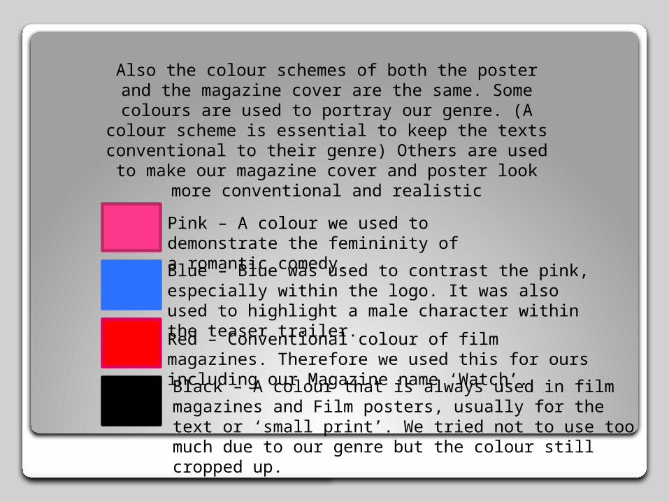
Also the colour schemes of both the poster and the magazine cover are the same. Some colours are used to portray our genre. (A colour scheme is
essential to keep the texts conventional to their genre) Others are used to make our magazine cover
and poster look more conventional and realistic
Pink – A colour we used to demonstrate the femininity of a romantic comedy.Blue – Blue was used to contrast the pink, especially within the logo. It was also used to highlight a male character within the teaser trailer.
Red – Conventional colour of film magazines. Therefore we used this for ours including our Magazine name ‘Watch’.Black – A colour that is always used in film magazines and Film posters, usually for the text or ‘small print’. We tried not to use too much due to our genre but the colour still cropped up.
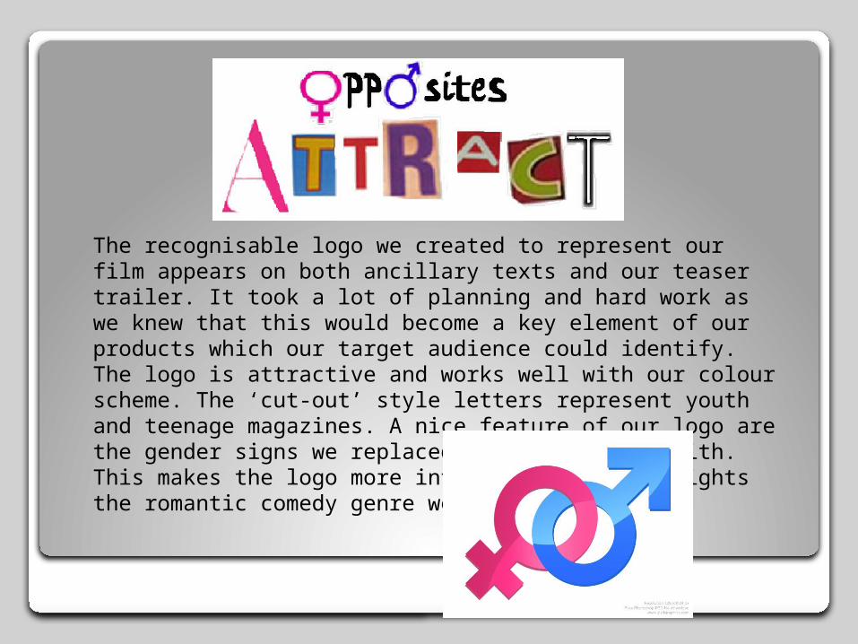
The recognisable logo we created to represent our film appears on both ancillary texts and our teaser trailer. It took a lot of planning and hard work as we knew that this would become a key element of our products which our target audience could identify. The logo is attractive and works well with our colour scheme. The ‘cut-out’ style letters represent youth and teenage magazines. A nice feature of our logo are the gender signs we replaced certain letters with. This makes the logo more interesting and highlights the romantic comedy genre we aimed for.
Related Documents