My Music Magazine

Welcome message from author
This document is posted to help you gain knowledge. Please leave a comment to let me know what you think about it! Share it to your friends and learn new things together.
Transcript

My Music Magazine
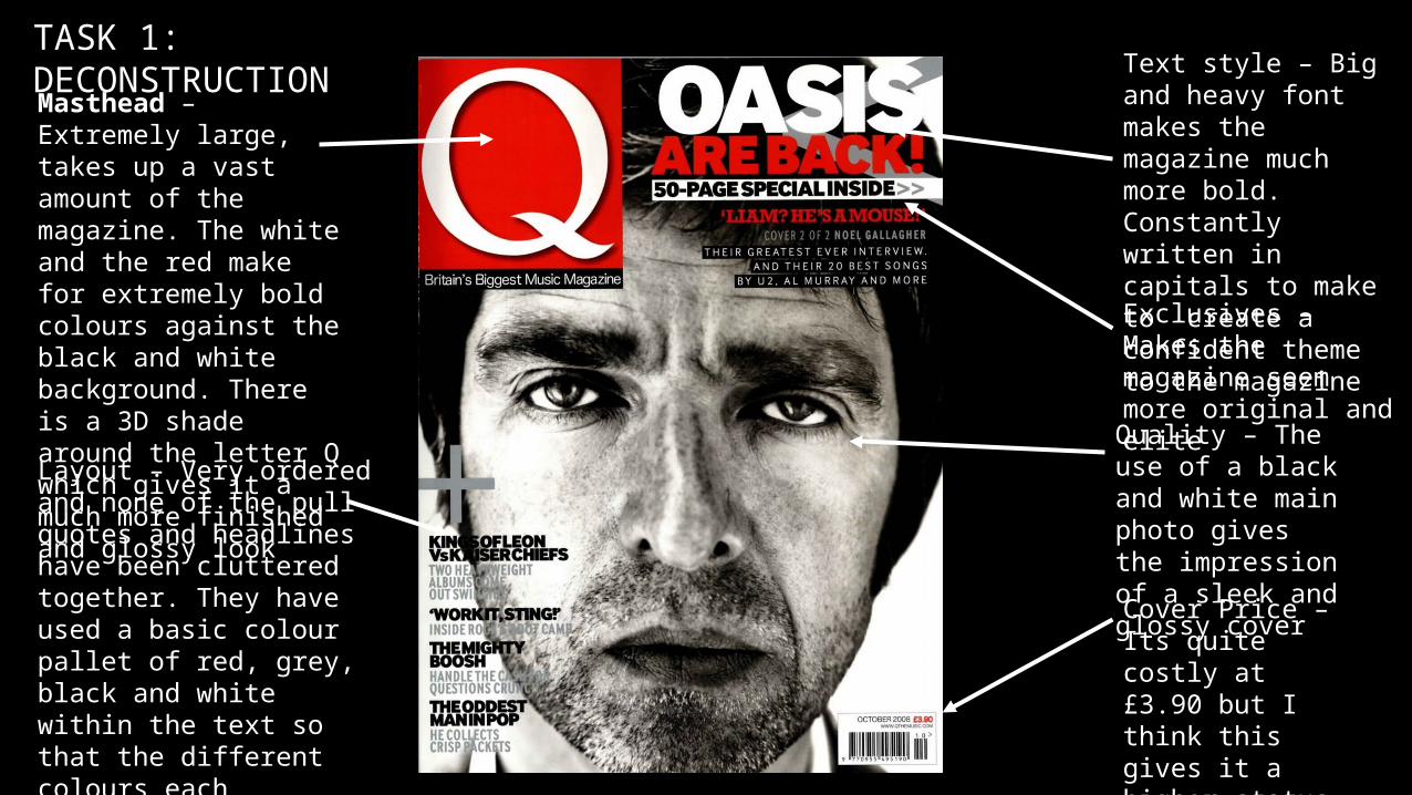
Masthead – Extremely large, takes up a vast amount of the magazine. The white and the red make for extremely bold colours against the black and white background. There is a 3D shade around the letter Q which gives it a much more finished and glossy look
Text style – Big and heavy font makes the magazine much more bold. Constantly written in capitals to make to create a confident theme to the magazine
Exclusives – Makes the magazine seem more original and elite
Quality – The use of a black and white main photo gives the impression of a sleek and glossy cover
Layout – Very ordered and none of the pull quotes and headlines have been cluttered together. They have used a basic colour pallet of red, grey, black and white within the text so that the different colours each represent a different story and cannot be confused with one another.
Cover Price – Its quite costly at £3.90 but I think this gives it a higher status and exclusivity against other magazines
TASK 1: DECONSTRUCTION

The pictures takes up the whole side of the page with layered text created on top
Text differing from Lower case to Upper case letters – give a unique and exclusive look
The text is extremely bold due to the thickness and the use of upper case letters. The red also looks daring against the white background
Basic black heading and a simple heading makes for a relaxed sense which will help calm the whole page
By using three columns instead of two makes the page look more sophisticated and neat as it gives more information with the small size of the letters
The massive ‘T’ helps to create more colour and boldness to the page which will overall attract the readers. As it is transparent we are still able to read the writing but it gives an original sense
By adding the small magazine masthead and page number at the bottom of the page, it creates a more cutting-edge theme
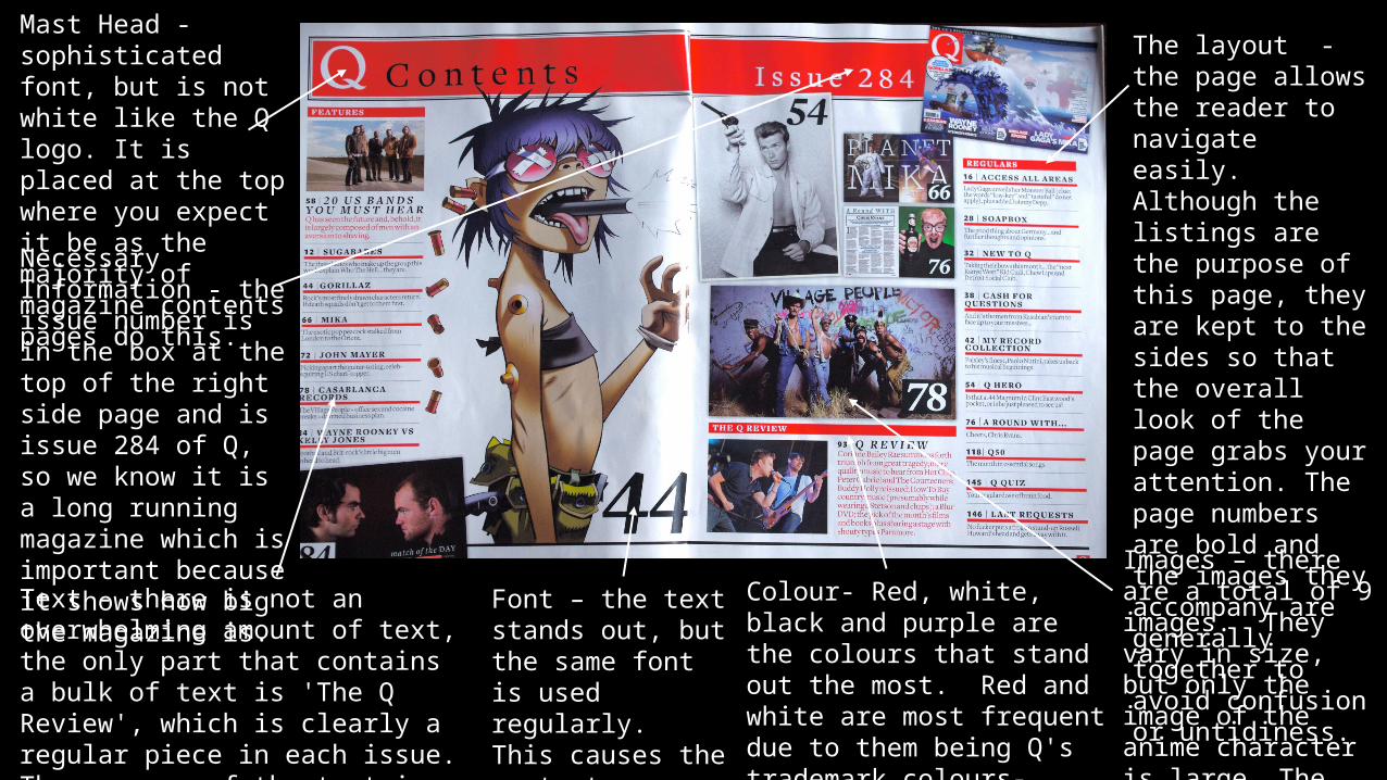
Mast Head -sophisticated font, but is not white like the Q logo. It is placed at the top where you expect it be as the majority of magazine contents pages do this.
The layout - the page allows the reader to navigate easily. Although the listings are the purpose of this page, they are kept to the sides so that the overall look of the page grabs your attention. The page numbers are bold and the images they accompany are generally together to avoid confusion or untidiness.
Necessary Information - the issue number is in the box at the top of the right side page and is issue 284 of Q, so we know it is a long running magazine which is important because it shows how big the magazine is.
Text - there is not an overwhelming amount of text, the only part that contains a bulk of text is 'The Q Review', which is clearly a regular piece in each issue. The purpose of the text is to inform the reader where they can find what interests them.
Font – the text stands out, but the same font is used regularly. This causes the contents page to appear sophisticated.
Images – there are a total of 9 images. They vary in size, but only the image of the anime character is large. The other images are of singers and bands.
Colour- Red, white, black and purple are the colours that stand out the most. Red and white are most frequent due to them being Q's trademark colours- making the contents page more warm.
Related Documents