KAIZEN PLATFORM allows brands, agencies, and freelancers to collaborate, create, and test the best experiences across the mobile customer journey. THE MOBILE OPTIMIZATION BEST PRACTICES EBOOK Apply Effective Mobile Landing Page Best Practices that Increase Conversions

Mobile Optimization Best Practices
Aug 14, 2015
Welcome message from author
This document is posted to help you gain knowledge. Please leave a comment to let me know what you think about it! Share it to your friends and learn new things together.
Transcript
KAIZEN PLATFORM allows brands, agencies, and freelancers to collaborate, create, and test the best experiences across the mobile customer journey.
THE MOBILE OPTIMIZATION BEST PRACTICES EBOOK
Apply Effective Mobile Landing Page Best Practices that Increase Conversions
2 KAIZENPLATFORM.COM
CONTENTS1. Executive Overview2. Optimizing Usability for Mobile 2.1. Layout, Size, and Colors3. Maximizing Conversions on Mobile 3.1. CTAs 3.2. Forms 3.3. Search4. Building Loyalty and Rewarding Mobile Customers 4.1. Gamification 4.2. Cross-Device Opportunities
KAIZENPLATFORM.COM 3
According to a study by Google, 67% of consumers are more likely to convert on a mobile optimized site, and 61% will move to another site if they can’t find what they are looking for right away.
EXECUTIVE OVERVIEW
By the end of 2015, mobile interactions will account for $2.2 trillion in retail sales. If you’re not optimizing your landing pages and site for mobile, you’re leaving money on the table.
In April 2015, Google announced a rollout of new mobile search ranking algorithms, boosting the ranking of mobile-friendly pages on mobile search results. Bing shortly followed suit with a similar announcement. Even with more Google searches happening on mobile than desktop, a recent Marketing Land article found that only 18% of sites have adopted and practice mobile responsive web design.
Customers look at content on their mobile devices in short, distracted sessions. They are action-driven, sometimes even spontaneous. Site content, layout, and functionality must be high-impact to hold customers’ attention.
According to a study by Google, 67% of consumers are more likely to convert on a mobile optimized site, and 61% will move to another site if they can’t find what they are looking for right away. Companies that will beat out their competition are those that are optimizing for mobile.
Generate more revenue through your mobile site with detailed tips and examples to drive more conversions.
In this ebook, you will discover the key to:
• Optimizing usability
• Maximizing conversions
• Building loyalty

KAIZENPLATFORM.COM 5
OPTIMIZING USABILITY FOR MOBILE The mobile environment is small and full of distractions:
calls, texts, meeting reminders, and news feed updates
all compete for the user’s attention. Understanding the
conditions under which your customers will be interacting
with your mobile site is key to providing a delightful and
frustration-free experience.
6 KAIZENPLATFORM.COM
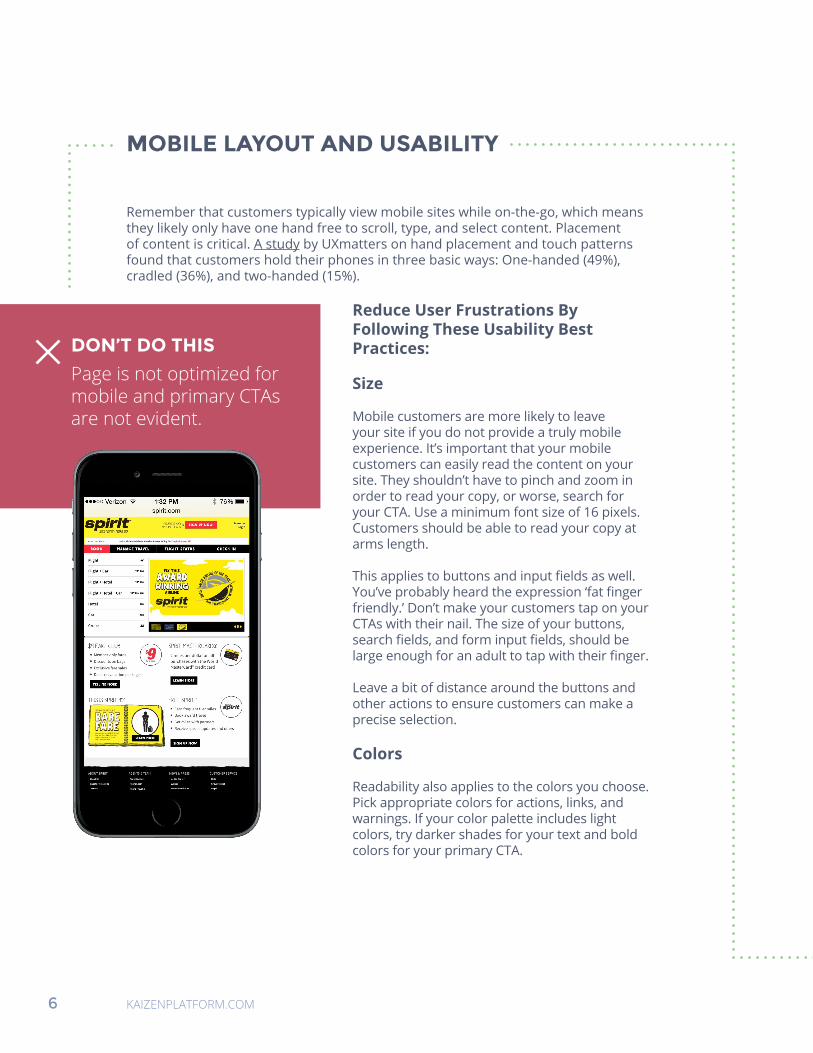
MOBILE LAYOUT AND USABILITY
Remember that customers typically view mobile sites while on-the-go, which means they likely only have one hand free to scroll, type, and select content. Placement of content is critical. A study by UXmatters on hand placement and touch patterns found that customers hold their phones in three basic ways: One-handed (49%), cradled (36%), and two-handed (15%).
Reduce User Frustrations By Following These Usability Best Practices:
Size
Mobile customers are more likely to leave your site if you do not provide a truly mobile experience. It’s important that your mobile customers can easily read the content on your site. They shouldn’t have to pinch and zoom in order to read your copy, or worse, search for your CTA. Use a minimum font size of 16 pixels. Customers should be able to read your copy at arms length.
This applies to buttons and input fields as well. You’ve probably heard the expression ‘fat finger friendly.’ Don’t make your customers tap on your CTAs with their nail. The size of your buttons, search fields, and form input fields, should be large enough for an adult to tap with their finger.
Leave a bit of distance around the buttons and other actions to ensure customers can make a precise selection.
Colors
Readability also applies to the colors you choose. Pick appropriate colors for actions, links, and warnings. If your color palette includes light colors, try darker shades for your text and bold colors for your primary CTA.
DON’T DO THIS
Page is not optimized for mobile and primary CTAs are not evident.
KAIZENPLATFORM.COM 7
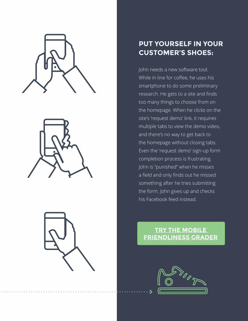
PUT YOURSELF IN YOUR CUSTOMER’S SHOES:
John needs a new software tool.
While in line for coffee, he uses his
smartphone to do some preliminary
research. He gets to a site and finds
too many things to choose from on
the homepage. When he clicks on the
site’s ‘request demo’ link, it requires
multiple tabs to view the demo video,
and there’s no way to get back to
the homepage without closing tabs.
Even the ‘request demo’ sign-up form
completion process is frustrating.
John is “punished” when he misses
a field and only finds out he missed
something after he tries submitting
the form. John gives up and checks
his Facebook feed instead.
TRY THE MOBILE FRIENDLINESS GRADER
8 KAIZENPLATFORM.COM
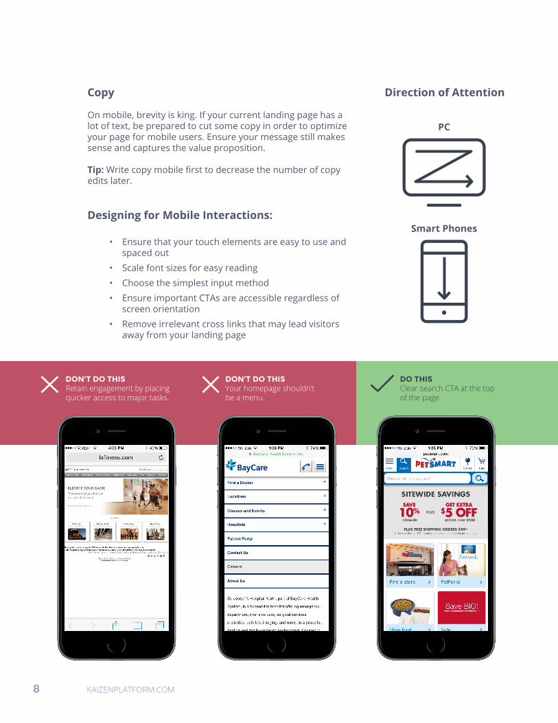
Copy
On mobile, brevity is king. If your current landing page has a lot of text, be prepared to cut some copy in order to optimize your page for mobile users. Ensure your message still makes sense and captures the value proposition.
Tip: Write copy mobile first to decrease the number of copy edits later.
Designing for Mobile Interactions:
• Ensure that your touch elements are easy to use and spaced out
• Scale font sizes for easy reading
• Choose the simplest input method
• Ensure important CTAs are accessible regardless of screen orientation
• Remove irrelevant cross links that may lead visitors away from your landing page
PC
Smart Phones
Direction of Attention
DON’T DO THIS Retain engagement by placing quicker access to major tasks.
DON’T DO THIS Your homepage shouldn’t be a menu.
DO THIS Clear search CTA at the top of the page.
KAIZENPLATFORM.COM 9
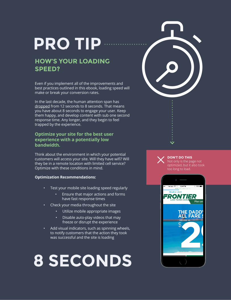
HOW’S YOUR LOADING SPEED?
Even if you implement all of the improvements and best practices outlined in this ebook, loading speed will make or break your conversion rates.
In the last decade, the human attention span has dropped from 12 seconds to 8 seconds. That means you have about 8 seconds to engage your user. Keep them happy, and develop content with sub one second response time. Any longer, and they begin to feel trapped by the experience.
Optimize your site for the best user experience with a potentially low bandwidth.
Think about the environment in which your potential customers will access your site. Will they have wifi? Will they be in a remote location with limited cell service? Optimize with these conditions in mind.
Optimization Recommendations:
• Test your mobile site loading speed regularly
• Ensure that major actions and forms have fast response times
• Check your media throughout the site
• Utilize mobile appropriate images
• Disable auto-play videos that may freeze or disrupt the experience
• Add visual indicators, such as spinning wheels, to notify customers that the action they took was successful and the site is loading
PRO TIP
DON’T DO THIS Not only is the page not optimized, but it also took too long to load.
8 SECONDS
10 KAIZENPLATFORM.COM
MAXIMIZING CONVERSIONS ON MOBILESo far this ebook has covered mobile usability essentials—
size, colors, layout, and the value of the right amount of
content. You’ve learned that the speed of your site can
negate any best practice.
Now let’s go beyond the basics.
Mobile experiences should be goal-orientated. Design
your site to be actionable and compelling by implementing
clear CTAs, shortening forms, and utilizing impactful search
capabilities.
KAIZENPLATFORM.COM 11
12 KAIZENPLATFORM.COM
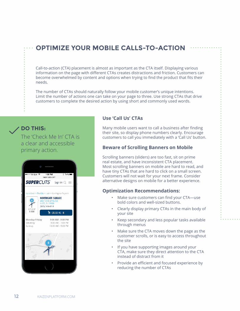
OPTIMIZE YOUR MOBILE CALLS-TO-ACTION
Call-to-action (CTA) placement is almost as important as the CTA itself. Displaying various information on the page with different CTAs creates distractions and friction. Customers can become overwhelmed by content and options when trying to find the product that fits their needs.
The number of CTAs should naturally follow your mobile customer’s unique intentions. Limit the number of actions one can take on your page to three. Use strong CTAs that drive customers to complete the desired action by using short and commonly used words.
DO THIS:
The ‘Check Me In’ CTA is a clear and accessible primary action.
Use ‘Call Us’ CTAs
Many mobile users want to call a business after finding their site, so display phone numbers clearly. Encourage customers to call you immediately with a ‘Call Us’ button.
Beware of Scrolling Banners on Mobile
Scrolling banners (sliders) are too fast, sit on prime real estate, and have inconsistent CTA placement. Most scrolling banners on mobile are hard to read, and have tiny CTAs that are hard to click on a small screen. Customers will not wait for your next frame. Consider alternative designs on mobile for a better experience.
Optimization Recommendations: • Make sure customers can find your CTA—use
bold colors and well-sized buttons.
• Clearly display primary CTAs in the main body of your site
• Keep secondary and less popular tasks available through menus
• Make sure the CTA moves down the page as the customer scrolls, or is easy to access throughout the site
• If you have supporting images around your CTA, make sure they direct attention to the CTA instead of distract from it
• Provide an efficient and focused experience by reducing the number of CTAs
KAIZENPLATFORM.COM 13
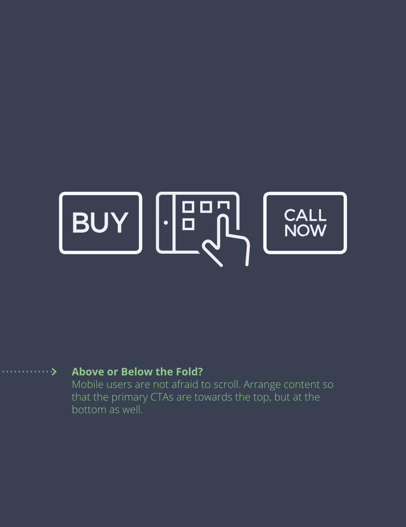
Above or Below the Fold? Mobile users are not afraid to scroll. Arrange content so that the primary CTAs are towards the top, but at the bottom as well.
BUY CALLNOW
14 KAIZENPLATFORM.COM
FORMS
Forms on mobile devices can be frustrating, long, and intimidating. It’s especially tough to fill out a desktop optimized form on a small mobile screen and can lead to high rate of abandonment. Make the form completion process clear and concise, and test often.
Keep copy, number of fields, and distractions to a minimum. Always match form content to the value proposition and CTAs the customer came from. Reinforce what they will gain upon form completion.
Keep your marketing funnel in mind whenever you create forms. Is it for a first touchpoint or a purchase transaction? If it’s early in the customer journey, stick to just a few form fields. The fewer fields, the better. If the customer is making a purchase, you may collect more detailed information. Only ask for what you need at each phase of the customer journey.
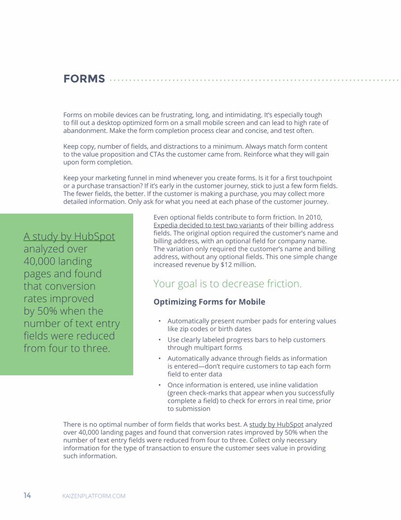
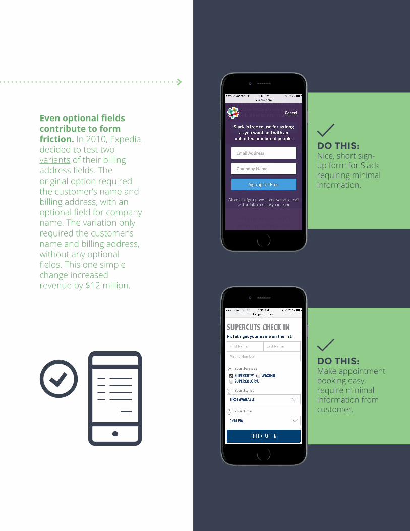
Even optional fields contribute to form friction. In 2010, Expedia decided to test two variants of their billing address fields. The original option required the customer’s name and billing address, with an optional field for company name. The variation only required the customer’s name and billing address, without any optional fields. This one simple change increased revenue by $12 million.
Your goal is to decrease friction.
Optimizing Forms for Mobile
• Automatically present number pads for entering values like zip codes or birth dates
• Use clearly labeled progress bars to help customers through multipart forms
• Automatically advance through fields as information is entered—don’t require customers to tap each form field to enter data
• Once information is entered, use inline validation (green check-marks that appear when you successfully complete a field) to check for errors in real time, prior to submission
There is no optimal number of form fields that works best. A study by HubSpot analyzed over 40,000 landing pages and found that conversion rates improved by 50% when the number of text entry fields were reduced from four to three. Collect only necessary information for the type of transaction to ensure the customer sees value in providing such information.
A study by HubSpot analyzed over 40,000 landing pages and found that conversion rates improved by 50% when the number of text entry fields were reduced from four to three.
KAIZENPLATFORM.COM 15
Even optional fields contribute to form friction. In 2010, Expedia decided to test two variants of their billing address fields. The original option required the customer’s name and billing address, with an optional field for company name. The variation only required the customer’s name and billing address, without any optional fields. This one simple change increased revenue by $12 million.
DO THIS: Nice, short sign-up form for Slack requiring minimal information.
DO THIS: Make appointment booking easy, require minimal information from customer.
16 KAIZENPLATFORM.COM
SEARCH RESULTS: NARROWING THE FIELD
People who use site search have higher buying intent and are more likely to purchase. Mobile customers looking for something specific will go right to your search tool. The search tool should be one of the first things a mobile customer sees when they visit your site—generally at the top of the page.
Search field placement can adversely affect conversions. If a user comes to your site for a specific product and can’t find the search bar, they’ll likely make their purchase on a competitor site. Test positioning your search box at the top or in the middle of your homepage.
Search Smarter
Implement smart search features like autocomplete and spell-check to help generate useful results. First results are key. Display best-selling products that relate to the query whenever possible. If the first few results don’t look relevant, you run the risk of losing customers. The images surrounding the results shown should match the keywords user searched for.
Use filters and refinement based on how many customers purchase products after using such refinement options. For example, best selling and price filters are important to customers looking to find a great deal.
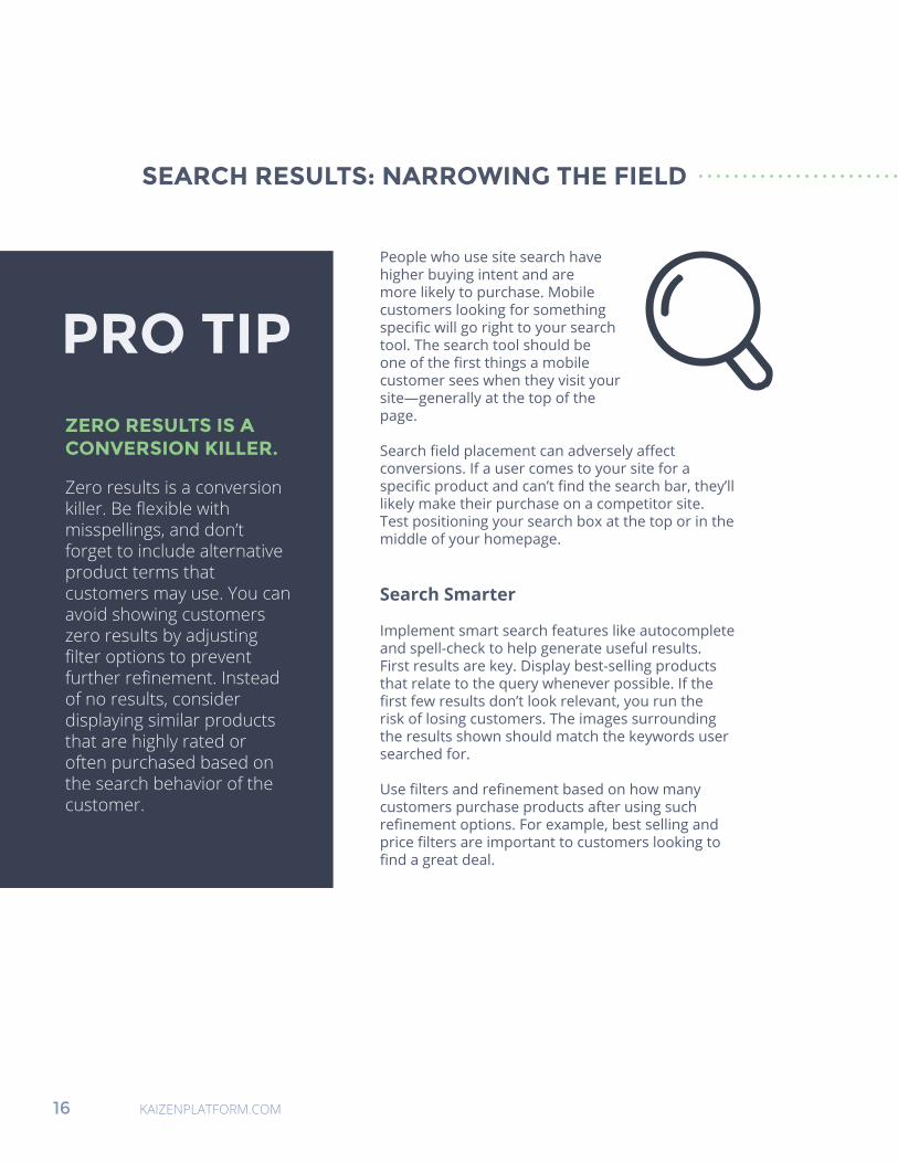
ZERO RESULTS IS A CONVERSION KILLER.
Zero results is a conversion killer. Be flexible with misspellings, and don’t forget to include alternative product terms that customers may use. You can avoid showing customers zero results by adjusting filter options to prevent further refinement. Instead of no results, consider displaying similar products that are highly rated or often purchased based on the search behavior of the customer.
PRO TIP
KAIZENPLATFORM.COM 17
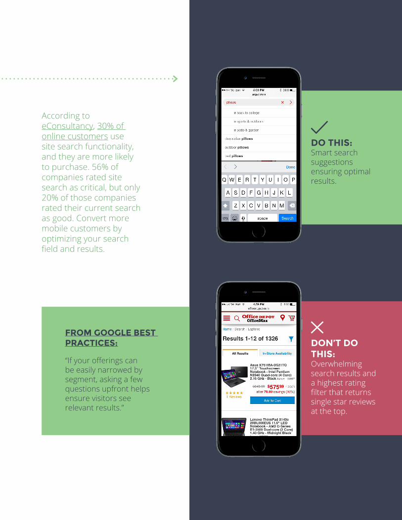
DO THIS: Smart search suggestions ensuring optimal results.
DON’T DO THIS: Overwhelming search results and a highest rating filter that returns single star reviews at the top.
FROM GOOGLE BEST PRACTICES:
“If your offerings can be easily narrowed by segment, asking a few questions upfront helps ensure visitors see relevant results.”
According to eConsultancy, 30% of online customers use site search functionality, and they are more likely to purchase. 56% of companies rated site search as critical, but only 20% of those companies rated their current search as good. Convert more mobile customers by optimizing your search field and results.

KAIZENPLATFORM.COM 19
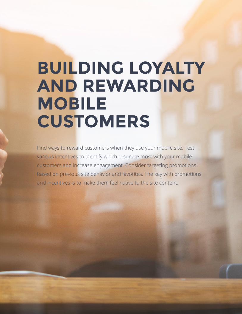
BUILDING LOYALTY AND REWARDING MOBILE CUSTOMERS Find ways to reward customers when they use your mobile site. Test
various incentives to identify which resonate most with your mobile
customers and increase engagement. Consider targeting promotions
based on previous site behavior and favorites. The key with promotions
and incentives is to make them feel native to the site content.
20 KAIZENPLATFORM.COM
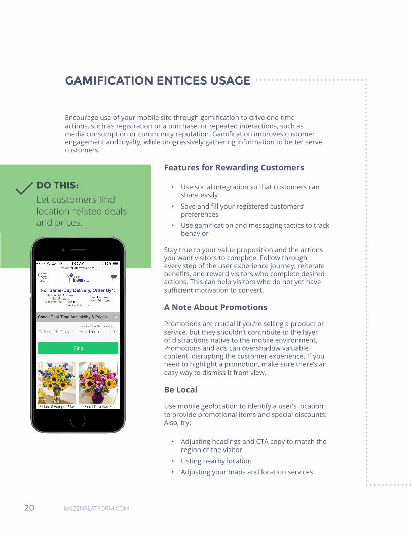
GAMIFICATION ENTICES USAGE
Encourage use of your mobile site through gamification to drive one-time actions, such as registration or a purchase, or repeated interactions, such as media consumption or community reputation. Gamification improves customer engagement and loyalty, while progressively gathering information to better serve customers.
Features for Rewarding Customers
• Use social integration so that customers can share easily
• Save and fill your registered customers’ preferences
• Use gamification and messaging tactics to track behavior
Stay true to your value proposition and the actions you want visitors to complete. Follow through every step of the user experience journey, reiterate benefits, and reward visitors who complete desired actions. This can help visitors who do not yet have sufficient motivation to convert.
A Note About Promotions
Promotions are crucial if you’re selling a product or service, but they shouldn’t contribute to the layer of distractions native to the mobile environment. Promotions and ads can overshadow valuable content, disrupting the customer experience. If you need to highlight a promotion, make sure there’s an easy way to dismiss it from view.
Be Local
Use mobile geolocation to identify a user’s location to provide promotional items and special discounts. Also, try:
• Adjusting headings and CTA copy to match the region of the visitor
• Listing nearby location
• Adjusting your maps and location services
DO THIS:
Let customers find location related deals and prices.
KAIZENPLATFORM.COM 21
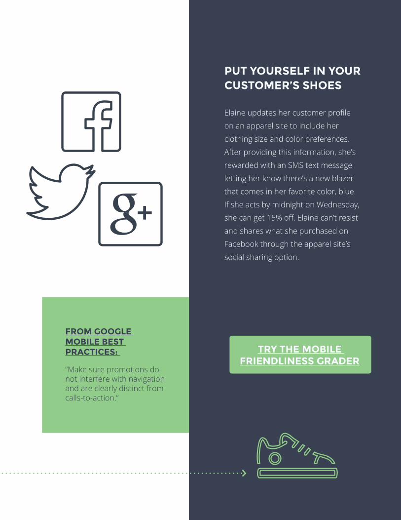
PUT YOURSELF IN YOUR CUSTOMER’S SHOES
Elaine updates her customer profile
on an apparel site to include her
clothing size and color preferences.
After providing this information, she’s
rewarded with an SMS text message
letting her know there’s a new blazer
that comes in her favorite color, blue.
If she acts by midnight on Wednesday,
she can get 15% off. Elaine can’t resist
and shares what she purchased on
Facebook through the apparel site’s
social sharing option.
FROM GOOGLE MOBILE BEST PRACTICES:
“Make sure promotions do not interfere with navigation and are clearly distinct from calls-to-action.”
TRY THE MOBILE FRIENDLINESS GRADER
22 KAIZENPLATFORM.COM
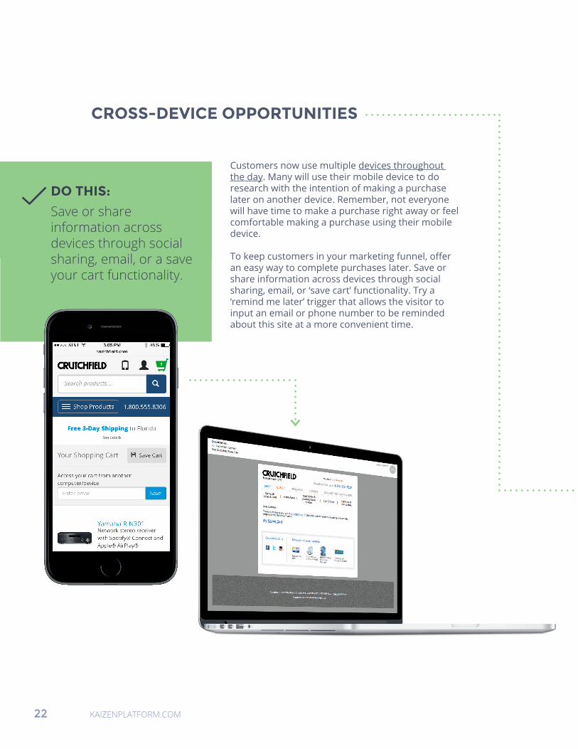
CROSS-DEVICE OPPORTUNITIES
Customers now use multiple devices throughout the day. Many will use their mobile device to do research with the intention of making a purchase later on another device. Remember, not everyone will have time to make a purchase right away or feel comfortable making a purchase using their mobile device.
To keep customers in your marketing funnel, offer an easy way to complete purchases later. Save or share information across devices through social sharing, email, or ‘save cart’ functionality. Try a ‘remind me later’ trigger that allows the visitor to input an email or phone number to be reminded about this site at a more convenient time.
DO THIS:
Save or share information across devices through social sharing, email, or a save your cart functionality.
KAIZENPLATFORM.COM 23
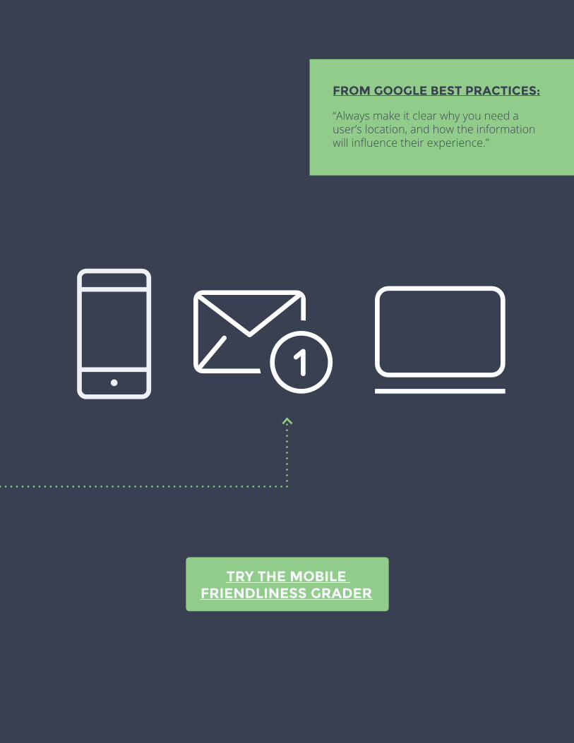
FROM GOOGLE BEST PRACTICES:
“Always make it clear why you need a user’s location, and how the information will influence their experience.”
TRY THE MOBILE FRIENDLINESS GRADER
24 KAIZENPLATFORM.COM
STOP LEAVING MONEY ON THE TABLE.
START OPTIMIZING YOUR MOBILE SITE.
Until recently, mobile sites were used primarily for preliminary
research, while desktop sites were used to actually complete
purchases. This is changing. There is an expected $2.2 trillion in
retail sales from mobile interactions alone before the end of 2015.
Starting with the mobile best practices outlined in this ebook, you
can capitalize on this trend quickly and beat out your competitors.
Like this ebook? Have Questions?
We have answers. Contact our professional Optimization Evangelist, Vera, with any questions you may have about user experience optimization and testing.
Email questions directly to [email protected].
Related Documents