Magazine analysis

Welcome message from author
This document is posted to help you gain knowledge. Please leave a comment to let me know what you think about it! Share it to your friends and learn new things together.
Transcript
Magazine analysis
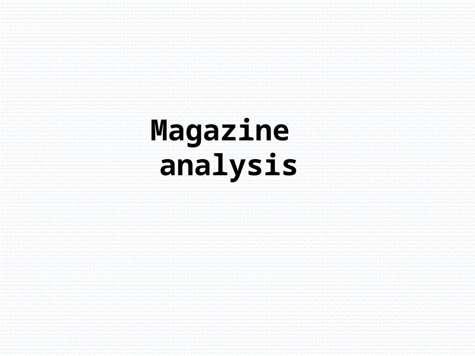
The Masthead uses bold white writing in contrast to the black and grey background to stand out, stretching across the whole magazine this draws the public attention to the title notifying them what magazine it is.
The freebie right at the top is free CD. The graphology of the capital black letters on a yellow background draws the reader in. And promotes the fact that there is a free CD inside which will make people want to buy it.
The main image is a medium close up of Bob Dylan. It takes up the majority of the magazine front cover and firmly promotes Bob Dylan. All the writing on the magazine ovoid’s covering his face. They made the image black and white adding definition to the red writing around it.
This is the date, it doesn’t promote the magazine in anyway it is purely for informative purposes. So that people know how old the magazine is. So they will know if it’s the most recent copy and so that they can catalogue the magazine
This is the barcode it is a common convention amongst magazines. Like the date it doesn’t persuade the reader but it is essential and will be on every magazine. In black and white, always in the bottom right corner, where it can be easily located.
The sub heading is the Word ‘Dylan’. The colour scheme runs in correlation with the masthead. White on a black background stands out and attracts the readers attention, to the word ‘Dylan’. With the picture and the subheading, this will inform any fans of Bob Dylan that there will be an article about him inside.
The sub image is located in the top right corner. The magazine uses a sub image so that at a glance if the reader is not interested In the person on the main image then you might be intrigued by the person on the sub image.
The buzz word is ’Revealed’. The red writing on a pale back ground stands out and the fact that it’s all in capitals as well. The word ‘revealed’ promotes exclusivity to the reader, making them wan to buy it.
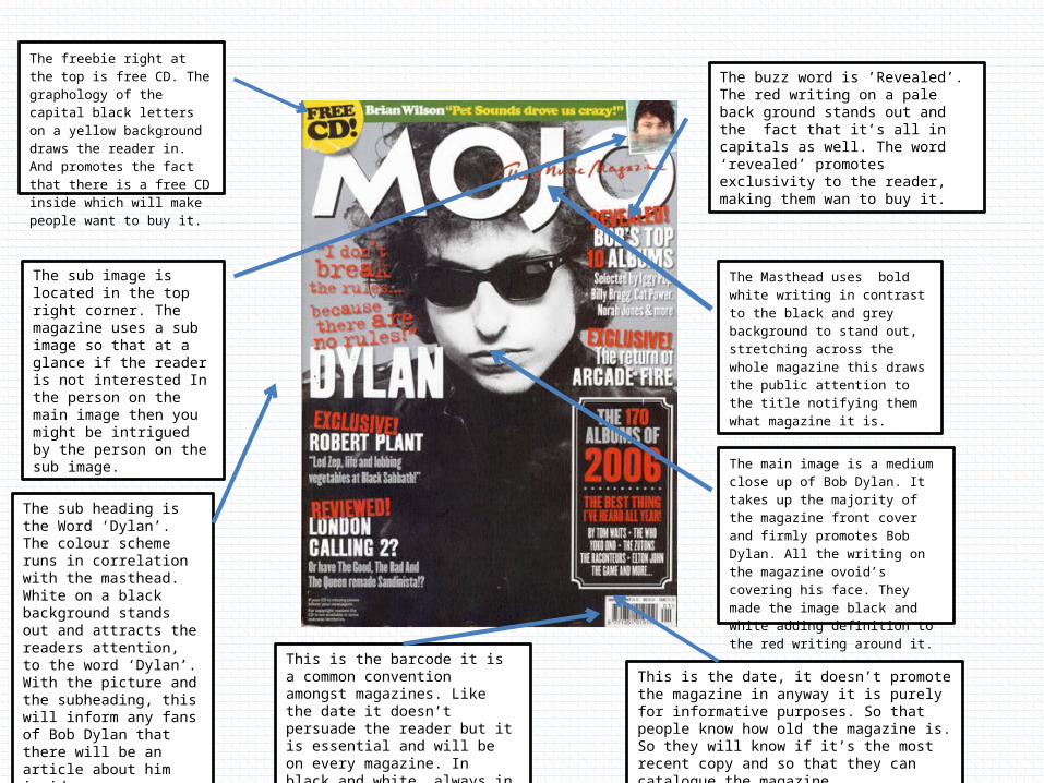
The masthead used I bold capital red writing on a light back ground standing out and attracting the reader to the magazine. The title is in the top right corner which is a recurring pattern with NME magazines.
The main image is of The band Arctic monkeys. This will inform any arctic monkeys fans that there will be an article on them inside. The main image is a medium long shot so that it can include all four members in rather than the usual medium close up when there is just one person. It is aesthetically pleasing for women because it has four men on and the men will aspire to be like them. It has palm trees in the background to portray arctic monkeys san Franciscan style sound. The four band members are looking directly into the camera creating a bond with audience.
The main cover line is ‘AM’. The line is in clear white on a darker background standing out and attracting the reader. It is in the same font as the masthead. If the audience doesn’t know who the main image is of ‘AM’ will give them an idea. The letter A is placed in front of the lead singer of arctic monkeys, whose name is also Alex Turner, this is placed here on purpose to make a reference to Arctic monkeys fans creating a bond between the editor and the reader.
The buzz word is verdict. Verdict implies importance to the reader making them think if they don’t buy it they are missing out. It also offers exclusivity to the reader as it implies that the magazines say is important. It is black writing on yellow background standing out. The yellow box is the most vibrant colour on the cover so it draws the reader into this point.
The barcode is in the bottom left it ads nothing to the promotion of the magazine but is a necessity and a convention in front covers. And is vital to buy the magazine.
The date is also in the bottom left corner and like the barcode offers nothing to promote the magazine but is important to archive the magazines and to know if it’s the most recent magazine for sale. The date sis also something you will find on every magazine.
The sub heading is ‘the final chapter’ this implies that this is the last you will see of The Arctic Monkeys, making the audience think it is important. The sub heading follows the colour scheme of the main cover line. ‘The final chapter’ implies the end of the arctic monkeys career but they use a reading metaphor as it’s in a magazine. This is subtle technique that the reader will relate too.
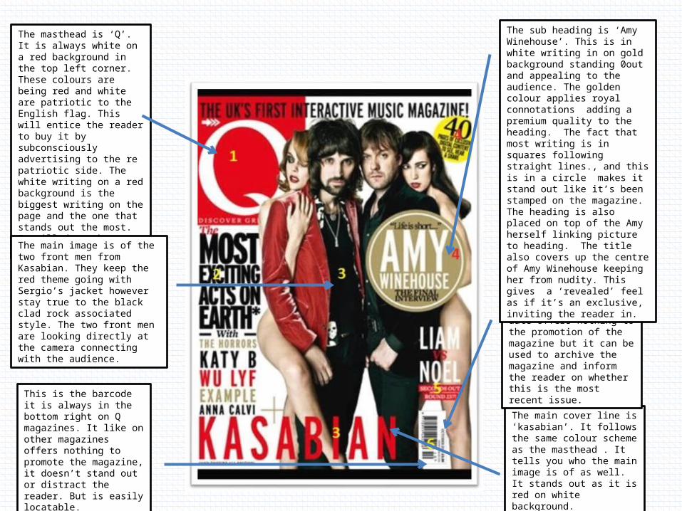
The masthead is ‘Q’. It is always white on a red background in the top left corner. These colours are being red and white are patriotic to the English flag. This will entice the reader to buy it by subconsciously advertising to the re patriotic side. The white writing on a red background is the biggest writing on the page and the one that stands out the most. It will draw the readers attention in.
The main cover line is ‘kasabian’. It follows the same colour scheme as the masthead . It tells you who the main image is of as well. It stands out as it is red on white background.
This is the barcode it is always in the bottom right on Q magazines. It like on other magazines offers nothing to promote the magazine, it doesn’t stand out or distract the reader. But is easily locatable.
The main image is of the two front men from Kasabian. They keep the red theme going with Sergio’s jacket however stay true to the black clad rock associated style. The two front men are looking directly at the camera connecting with the audience.
The date is located in the bottom right of the magazine , the date offers nothing to the promotion of the magazine but it can be used to archive the magazine and inform the reader on whether this is the most recent issue.
The sub heading is ‘Amy Winehouse’. This is in white writing in on gold background standing 0out and appealing to the audience. The golden colour applies royal connotations adding a premium quality to the heading. The fact that most writing is in squares following straight lines., and this is in a circle makes it stand out like it’s been stamped on the magazine. The heading is also placed on top of the Amy herself linking picture to heading. The title also covers up the centre of Amy Winehouse keeping her from nudity. This gives a ‘revealed’ feel as if it’s an exclusive, inviting the reader in.
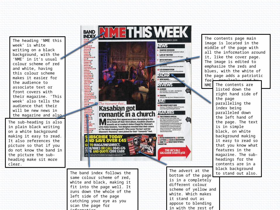
The contents page main image is located in the middle of the page with all the information around it, like the cover page. The image is edited to emphasize the reds and blues, with the white of the page adds a patriotic feel, regularly used by NME.
The heading ‘NME this week’ is white writing on a black background, with the ‘NME’ in it’s usual colour scheme of red and white, having this colour scheme makes it easier for the audience to associate text or front covers with their magazine. ‘This week’ also tells the audience that their will be new news in the magazine and also tells you that this magazine has been running for some period of time.
The band index follows the same colour scheme of red, white and black, making it fit into the page well. It runs down the whole of the left side of the page catching your eye as you scan the page for information.
The advert at the bottom of the page is in a completely different colour scheme of yellow and white. Which makes it stand out as appose to blending in with the rest of the page.
The contents are listed down the right hand side of the page paralleling the index being paralleled down the left hand of the page. The text is in simple black, on white background making it easy to read so that you know what features in the magazine. The sub-headings for the contents are in a black background to stand out also.
The sub-heading is also in plain black writing on a white background making it easy to read. It also references the picture so that if you do not know the band in the picture the sub-heading make sit more clear.
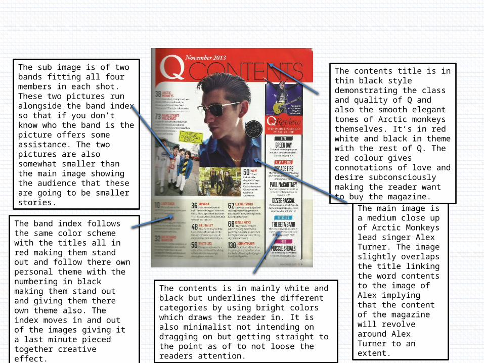
The main image is a medium close up of Arctic Monkeys lead singer Alex Turner. The image slightly overlaps the title linking the word contents to the image of Alex implying that the content of the magazine will revolve around Alex Turner to an extent.
The contents title is in thin black style demonstrating the class and quality of Q and also the smooth elegant tones of Arctic monkeys themselves. It’s in red white and black in theme with the rest of Q. The red colour gives connotations of love and desire subconsciously making the reader want to buy the magazine.
The sub image is of two bands fitting all four members in each shot. These two pictures run alongside the band index so that if you don’t know who the band is the picture offers some assistance. The two pictures are also somewhat smaller than the main image showing the audience that these are going to be smaller stories.
The band index follows the same color scheme with the titles all in red making them stand out and follow there own personal theme with the numbering in black making them stand out and giving them there own theme also. The index moves in and out of the images giving it a last minute pieced together creative effect.
The contents is in mainly white and black but underlines the different categories by using bright colors which draws the reader in. It is also minimalist not intending on dragging on but getting straight to the point as of to not loose the readers attention.
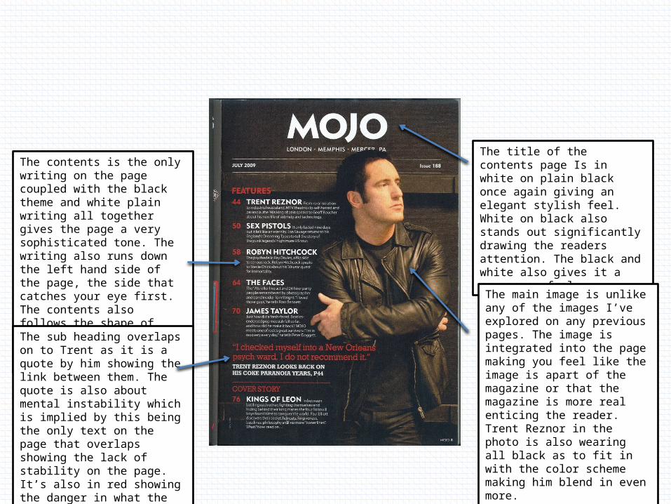
The title of the contents page Is in white on plain black once again giving an elegant stylish feel. White on black also stands out significantly drawing the readers attention. The black and white also gives it a newspaper feel
The main image is unlike any of the images I’ve explored on any previous pages. The image is integrated into the page making you feel like the image is apart of the magazine or that the magazine is more real enticing the reader. Trent Reznor in the photo is also wearing all black as to fit in with the color scheme making him blend in even more.
The contents is the only writing on the page coupled with the black theme and white plain writing all together gives the page a very sophisticated tone. The writing also runs down the left hand side of the page, the side that catches your eye first. The contents also follows the shape of Trent never overlapping, correlating the two together.
The sub heading overlaps on to Trent as it is a quote by him showing the link between them. The quote is also about mental instability which is implied by this being the only text on the page that overlaps showing the lack of stability on the page. It’s also in red showing the danger in what the quote is talking about.
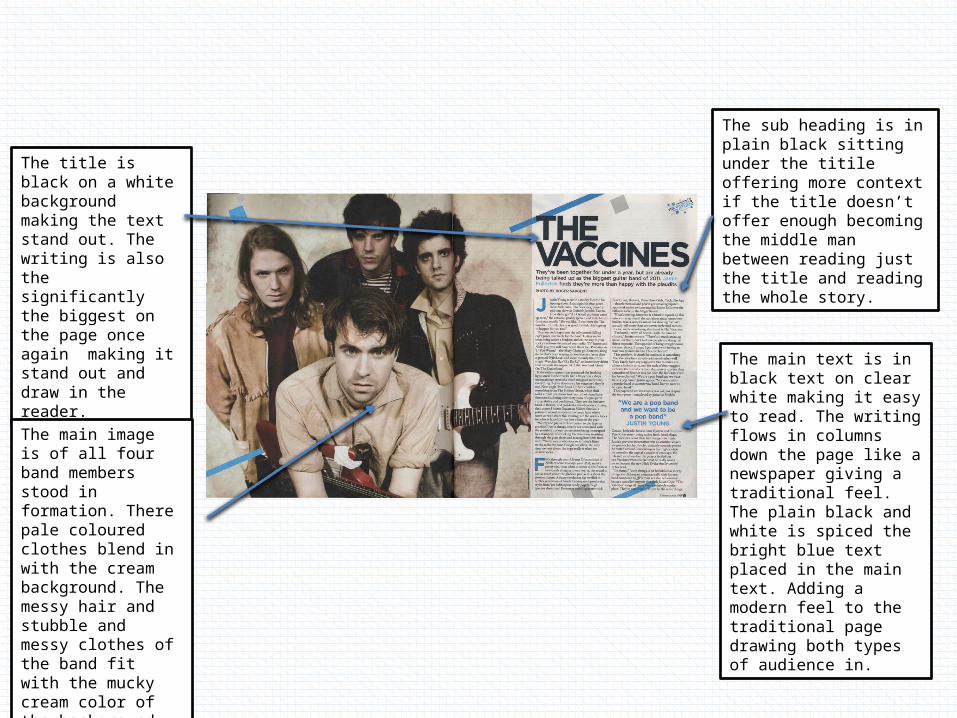
The sub heading is in plain black sitting under the titile offering more context if the title doesn’t offer enough becoming the middle man between reading just the title and reading the whole story.
The title is black on a white background making the text stand out. The writing is also the significantly the biggest on the page once again making it stand out and draw in the reader.
The main image is of all four band members stood in formation. There pale coloured clothes blend in with the cream background. The messy hair and stubble and messy clothes of the band fit with the mucky cream color of the background giving a old paper feel.
The main text is in black text on clear white making it easy to read. The writing flows in columns down the page like a newspaper giving a traditional feel. The plain black and white is spiced the bright blue text placed in the main text. Adding a modern feel to the traditional page drawing both types of audience in.
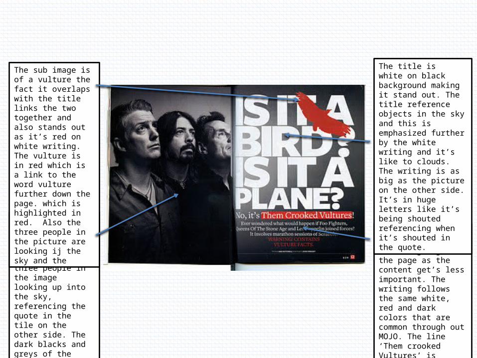
The main image is in black and white portraying a traditional feel. It has the three people in the image looking up into the sky, referencing the quote in the tile on the other side. The dark blacks and greys of the three people in the image underline the rock background of the three stars.
The sub image is of a vulture the fact it overlaps with the title links the two together and also stands out as it’s red on white writing. The vulture is in red which is a link to the word vulture further down the page. which is highlighted in red. Also the three people in the picture are looking ij the sky and the
The main text gets smaller and smaller going down the page as the content get’s less important. The writing follows the same white, red and dark colors that are common through out MOJO. The line ‘Them crooked Vultures’ is highlighted in red, conveying the danger behind the word vultures
The title is white on black background making it stand out. The title reference objects in the sky and this is emphasized further by the white writing and it’s like to clouds. The writing is as big as the picture on the other side. It’s in huge letters like it’s being shouted referencing when it’s shouted in the quote.
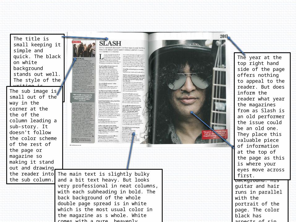
The title is small keeping it simple and quick. The black on white background stands out well. The style of the writing is elegant and classy.
The sub image is small out of the way in the corner at the the of the column leading a sub-story. It doesn’t follow the color scheme of the rest of the page or magazine so making it stand out and drawing the reader into the sub column.
The main text is slightly bulky and a bit text heavy. But looks very professional in neat columns, with each subheading in bold. The back background of the whole double page spread is in white which is the most usual color in the magazine as s whole. White comes with a pure, heavenly connotation.
The main image is of Slash, slash is heavily in black linking him to his rock background. His guitar and hair runs in parallel with the portrait of the page. The color black has aspects of sin which is opposite to the purity of the white.
The year at the top right hand side of the page offers nothing to appeal to the reader. But does inform the reader what year the magazines from as Slash is an old performer the issue could be an old one. They place this valuable piece of information at the top of the page as this is where your eyes move across first.
Related Documents