Document of the World Bank Report No: ACS12005 . Federal Democratic Republic of Ethiopia Ethiopia Poverty Assessment . January 2015 . GPVDR AFRICA . Public Disclosure Authorized Public Disclosure Authorized Public Disclosure Authorized Public Disclosure Authorized Public Disclosure Authorized Public Disclosure Authorized Public Disclosure Authorized Public Disclosure Authorized

Welcome message from author
This document is posted to help you gain knowledge. Please leave a comment to let me know what you think about it! Share it to your friends and learn new things together.
Transcript
Document of the World Bank
Report No: ACS12005
.
Federal Democratic Republic of Ethiopia Ethiopia Poverty Assessment
.
January 2015
.
GPVDR
AFRICA
.
Pub
lic D
iscl
osur
e A
utho
rized
Pub
lic D
iscl
osur
e A
utho
rized
Pub
lic D
iscl
osur
e A
utho
rized
Pub
lic D
iscl
osur
e A
utho
rized
Pub
lic D
iscl
osur
e A
utho
rized
Pub
lic D
iscl
osur
e A
utho
rized
Pub
lic D
iscl
osur
e A
utho
rized
Pub
lic D
iscl
osur
e A
utho
rized
.
Standard Disclaimer:
.
This volume is a product of the staff of the International Bank for Reconstruction and Development/ The World Bank. The findings, interpretations, and conclusions expressed in this paper do not necessarily reflect the views of the Executive Directors of The World Bank or the governments they represent. The World Bank does not guarantee the accuracy of the data included in this work. The boundaries, colors, denominations, and other information shown on any map in this work do not imply any judgment on the part of The World Bank concerning the legal status of any territory or the endorsement or acceptance of such boundaries.
.
Copyright Statement:
.
The material in this publication is copyrighted. Copying and/or transmitting portions or all of this work without permission may be a
violation of applicable law. The International Bank for Reconstruction and Development/ The World Bank encourages dissemination
of its work and will normally grant permission to reproduce portions of the work promptly.
For permission to photocopy or reprint any part of this work, please send a request with complete information to the Copyright
Clearance Center, Inc., 222 Rosewood Drive, Danvers, MA 01923, USA, telephone 978-750-8400, fax 978-750-4470,
http://www.copyright.com/.
All other queries on rights and licenses, including subsidiary rights, should be addressed to the Office of the Publisher, The World
Bank, 1818 H Street NW, Washington, DC 20433, USA, fax 202-522-2422, e-mail [email protected].
ETHIOPIA
POVERTY ASSESSMENT
Report No. AUS6744
January 2015
Poverty Global Practice
Africa Region
Document of the World Bank
For Official Use Only

iii
ACKNOWLEDGEMENTS ................................................................................................................................ xi
ABBREVIATIONS AND ACRONYMS .......................................................................................................... xiii
EXECUTIVE SUMMARY ..................................................................................................................................xv
INTRODUCTION ...........................................................................................................................................xxv
1. PROGRESS IN REDUCING POVERTY AND INCREASING WELLBEING, 1996-2011 ...................... 11.1 Recent progress in poverty reduction ..................................................................................................................21.2 Sensitivity of poverty estimates ...........................................................................................................................51.3 The incidence of progress and shared prosperity .................................................................................................9
Growth incidence ...............................................................................................................................................9Shared prosperity .............................................................................................................................................11Inequality .........................................................................................................................................................13Decomposing changes into growth and redistribution......................................................................................14
1.4 Who are the poor and poorest households in 2011? ..........................................................................................161.5 Outlook: Ending extreme poverty in Ethiopia ..................................................................................................21
2. MULTIDIMENSIONAL POVERTY IN ETHIOPIA ................................................................................. 252.1 Introduction .....................................................................................................................................................252.2 Trends in non-monetary dimensions of wellbeing .............................................................................................26
Education ........................................................................................................................................................28Health ..............................................................................................................................................................29Command over resources and access to information ........................................................................................29
2.3 Overlapping deprivations .................................................................................................................................302.4 Perceived improvements in wellbeing................................................................................................................352.5 Deprivations that particularly affect girls and women .......................................................................................352.6 Conclusion .......................................................................................................................................................37
3. THE CHANGING NATURE OF VULNERABILITY IN ETHIOPIA ...................................................... 393.1 Sources of risk in today’s Ethiopia .....................................................................................................................393.2 Measuring vulnerability in Ethiopia ..................................................................................................................423.3 Vulnerable places or vulnerable people? ............................................................................................................463.4 Summary and conclusion .................................................................................................................................50
TABLE OF CONTENTS
ETHIOPIA – POVERTY ASSESSMENTiv
4. DRIVERS OF POVERTY REDUCTION IN ETHIOPIA .......................................................................... 514.1 Decomposing poverty reduction .......................................................................................................................524.2 Drivers of poverty reduction .............................................................................................................................56
Has growth contributed to poverty reduction? .................................................................................................56Understanding the relationship between agricultural growth and poverty reduction .........................................58Safety nets and investments in public services ..................................................................................................63
4.3 Implications for future poverty reduction .........................................................................................................64
5. A FISCAL INCIDENCE ANALYSIS FOR ETHIOPIA ............................................................................... 675.1 Taxation incidence ............................................................................................................................................685.2 Incidence of public expenditure ........................................................................................................................73
Direct transfers made through the PSNP and food aid .....................................................................................74Education ........................................................................................................................................................75Health ..............................................................................................................................................................77Indirect subsidies .............................................................................................................................................78Overall incidence of public spending ...............................................................................................................79
5.3 Overall incidence of taxes and spending and impact on poverty and inequality ................................................80
6. NON-FARM ENTERPRISES AND POVERTY REDUCTION IN ETHIOPIA ...................................... 836.1 Introduction .....................................................................................................................................................836.2 Prevalence and nature of NFEs in Ethiopia .......................................................................................................846.3 The role of NFE in incomes of poor households ...............................................................................................866.4 Constraints to NFE activities ............................................................................................................................896.5 Conclusion .......................................................................................................................................................93
7. MIGRATION AND POVERTY IN ETHIOPIA ......................................................................................... 957.1 Introduction .....................................................................................................................................................957.2 Migration in Ethiopia .......................................................................................................................................967.3 Migration and poverty ....................................................................................................................................1007.4 What constrains migration in Ethiopia? ..........................................................................................................1047.5 Conclusion .....................................................................................................................................................106
8. UNDERSTANDING URBAN POVERTY ................................................................................................. 1078.1 Work and urban poverty .................................................................................................................................1088.2 Reducing poverty in urban centers through work: a framework ......................................................................1138.3 Urban poverty among those unable to work ...................................................................................................1188.4 Improving urban safety nets............................................................................................................................1208.5 Summary ........................................................................................................................................................123
9. GENDER AND AGRICULTURE ............................................................................................................... 1259.1 Introduction ...................................................................................................................................................1259.2 Gender productivity differentials: Ethiopia in a regional comparison ..............................................................1269.3 Zooming in: Refining the decomposition .......................................................................................................1289.4 Explaining gender differences in input-use ......................................................................................................1349.5 Conclusion .....................................................................................................................................................138
TABle OF CONTeNTS v
ANNEXES
ANNEX 1 .......................................................................................................................................................... 143
ANNEX 2 .......................................................................................................................................................... 155
ANNEX 3 .......................................................................................................................................................... 161
ANNEX 4 .......................................................................................................................................................... 165
ANNEX 5 .......................................................................................................................................................... 171
ANNEX 6 .......................................................................................................................................................... 179
REFERENCES ................................................................................................................................................. 181
LIST OF FIGURESFigure 1.1: Progress in health, education and living standards in Ethiopia from 2000 to 2011 .....................................2Figure 1.2: Poverty headcount by region from 1996 to 2011 .......................................................................................4Figure 1.3: Incidence of monetary poverty in Ethiopia compared with other African countries ...................................5Figure 1.4: Annual reduction of poverty headcount at US$$1.25 PPP poverty line for selected countries with
two poverty measurements in the last decade .............................................................................................5Figure 1.5: Food share per consumption percentile across time ....................................................................................7Figure 1.6: Growth Incidence Curves with 95% confidence intervals nation-wide, urban and rural ...........................10Figure 1.7: Consumption growth was negative in Addis Ababa from 2005 to 2011 ...................................................11Figure 1.8: Average growth for the bottom 10%, bottom 40% and the top 60% from 1995 to 2011 ........................11Figure 1.9: Average growth for the bottom 10%, bottom 40% and top 60% for 1996 to 2011, by rural and urban ..12Figure 1.10: Gini Coefficient in Ethiopia and other African Countries ........................................................................12Figure 1.11: Gini and Theil index for national, urban and rural Ethiopia, 1996–2011 ................................................13Figure 1.12: Relative and absolute income differences between different income percentiles ........................................15Figure 1.13: Growth and redistribution decomposition of poverty changes, 1996–2011 .............................................16Figure 1.14: Poverty headcount, depth and severity for children and adults .................................................................17Figure 1.15: Poverty incidence based on simulations with percentile-specific growth (solid lines) and
average growth (dotted line) ....................................................................................................................22Figure 1.16: Poverty statistics in 2030 compared to current values for different simulations ........................................22Figure 1.17: Simulation of income shares (relative to average income) for bottom 10%, bottom 40%, and
top 60% using percentile-specific growth rates. ........................................................................................23Figure 1.18: Alternate simulations ...............................................................................................................................23Figure 2.1: Monetary, education and sanitation deprivation in urban and rural areas, 2000–2011 .............................32Figure 2.2: Evolution of overlapping deprivations over time, 2000–2011 (rural Ethiopia) .........................................32Figure 2.3: Components of the MPI in 2011 and over time, 2000–2011 ..................................................................34Figure 2.4: Monetary and education deprivations and wellbeing perception, 2000–2011 ..........................................35Figure 2.5: Multiple deprivations affecting women, 2011 ..........................................................................................37Figure 3.1: Impact of Drought and food price shocks ................................................................................................41Figure 3.2: All Ethiopia: Meher crop losses ................................................................................................................41Figure 4.1: The contribution of rural and urban poverty reduction ............................................................................53
ETHIOPIA – POVERTY ASSESSMENTvi
Figure 4.2: The contribution of poverty reduction among different sectors ................................................................53Figure 4.3: The contribution of poverty reduction among the employed and self-employed.......................................53Figure 4.4: The contribution of demographics, education, occupational change and urbanization to consumption
growth, 1996–2011 .................................................................................................................................54Figure 4.5: The changing relationship between education and consumption, 1996–2011 ..........................................55Figure 4.6: The contribution of agricultural growth, services and safety nets to poverty reduction, 1996–2011 .........57Figure 4.7: Services growth is positively correlated with growth in agriculture ...........................................................58Figure 4.8: Increased fertilizer use reduced poverty when weather and prices were good ............................................61Figure 4.9: Proportion of farmers experiencing more than 30% crop loss, 1997–2011 ..............................................61Figure 4.10: Travel time to urban centers of 50,000 people or more in 1994 and 2007 ...............................................63Figure 5.1: Incidence of direct taxes by market income deciles ...................................................................................70Figure 5.2: Concentration curves and incidence of direct taxes ..................................................................................71Figure 5.3: Incidence of Indirect taxes by market income deciles ...............................................................................72Figure 5.4: Direct and indirect tax concentration curves in relation to market income Lorenz curve ..........................72Figure 5.5: Concentration of total taxes across socioeconomic groups, cross-country comparison ..............................73Figure 5.6: Ethiopia. Direct transfers by market income deciles .................................................................................75Figure 5.7: Effectiveness of direct transfers in comparison to direct transfers in other countries .................................76Figure 5.8: Ethiopia. Incidence and concentration shares of education ......................................................................76Figure 5.9: Ethiopia: Incidence and concentration shares of health ............................................................................77Figure 5.10: Health benefit incidence as percent of income by market income decile ..................................................78Figure 5.11: Incidence and concentration curves for indirect subsidies ........................................................................78Figure 5.12: Transfers and subsidies as a proportion of consumption in rural and urban Ethiopia ...............................79Figure 5.13: Proportion of household with electricity (%) by market income category ................................................79Figure 5.14: Ethiopia. Public expenditure programs (percent of spending included in analysis) ...................................79Figure 5.15: Concentration coefficients of public spending .........................................................................................80Figure 5.16: Ethiopia. Incidence of taxes and transfers (by market income deciles) ......................................................81Figure 6.1: Age of NFEs ............................................................................................................................................85Figure 6.2: Households’ reaction to shocks ................................................................................................................88Figure 6.3: Seasonality of NFE creation .....................................................................................................................89Figure 6.4: Highest months of NFE operation...........................................................................................................90Figure 6.5: Harvest season and NFE operation, by type NFE sector ..........................................................................90Figure 6.6: NFE activity for Farming and non-Farming households ..........................................................................92Figure 7.1: Migration Flow, 2007 ..............................................................................................................................97Figure 7.2: Migrants by duration of stay in current residence.....................................................................................97Figure 7.3: City size and migration ............................................................................................................................97Figure 7.4: Migration and employment .....................................................................................................................98Figure 7.5: Proportion of migrants and non-migrants that are male ...........................................................................98Figure 7.6: Age distribution of those who migrated in last 5 years .............................................................................99Figure 7.7: Education levels: Migrants and non-migrants, 2007 ................................................................................99Figure 7.8: Employment status of working migrants and non-migrants, 2007 .........................................................100Figure 7.9: Number of Rooms in the House ............................................................................................................101Figure 7.10: Access to tap water and electricity among migrants ................................................................................101Figure 7.11: Migration and poverty ...........................................................................................................................102
TABle OF CONTeNTS vii
Figure 7.12: Distribution of consumption for migrants and non-migrants ................................................................102Figure 7.13: Subjective measures of wellbeing ............................................................................................................103Figure 7.14: Housing ownership by duration of migration ........................................................................................103Figure 7.15: Ownership of radio and television .........................................................................................................104Figure 8.1: City size, poverty and inequality in Ethiopia ..........................................................................................107Figure 8.2: City size and the nature of jobs ..............................................................................................................109Figure 8.3: City size and unemployment .................................................................................................................109Figure 8.4: Median wages of employees in Addis Ababa, other big towns and small towns ......................................110Figure 8.5: Towns and cities with higher rates of employment are less poor .............................................................110Figure 8.6: Characteristics of the unemployed .........................................................................................................112Figure 8.7: Unemployment, self-employment and education in Addis Ababa (12 month definition) .......................113Figure 8.8: Rate of finding employment among unemployed youth in Addis Ababa ................................................116Figure 8.9: Labor markets in large cities: three types ................................................................................................117Figure 8.10: The urban poverty profile is similar to the rural poverty profile on some dimensions .............................119Figure 8.11: Being disabled, widowed, and elderly is more associated with poverty in urban areas .............................119Figure 8.12: The elderly and disabled are less able to cope with shocks in urban areas ................................................120Figure 8.13: Transfers and subsidies as a proportion of market income in rural and urban Ethiopia ..........................120Figure 8.14: Larger transfers have a larger effect on the poverty rate...........................................................................121Figure 8.15: Addis Ababa poverty map ......................................................................................................................123Figure 9.1: Gender Gap in Agricultural productivity, by country .............................................................................125Figure 9.2: Factors that widen the gender gap in agricultural productivity ...............................................................127Figure 9.3: Components of gender differentials in productivity ...............................................................................132Figure A1.1: Food share in total consumption across time for different deflators ........................................................143Figure A1.2:rowth Incidence Curve for 2005 to 2011 for full sample and for partial sample .....................................143Figure A4.1: Scatter of estimated and measured level of poverty by zone ....................................................................168Figure A5.1: Definitions of income concepts in CEQ methodology ...........................................................................172
LIST OF TABLESTable 1: Ethiopia then and now: a decade of progress from 2000 to 2011 ............................................................ xivTable 2: Poverty, inequality, wellbeing and sector of employment, 2000–2011 ..................................................... xxiTable 1.1: Poverty headcount ratio for national poverty line (per adult) and the US$1.25 PPP poverty line
(per capita) ................................................................................................................................................3Table 1.2: Poverty headcount ratio for national poverty line by region .......................................................................4Table 1.3: Poverty depth and severity from 1996 to 2011 (at national poverty line) ...................................................5Table 1.4: HICES and CPI measures of inflation over 1996 to 2011 .........................................................................6Table 1.5: Test of sensitivity of poverty rates to new survey methodology ...................................................................8Table 1.6: Profile of the poor for 1996, 2000, 2005 and 2011..................................................................................18Table 1.7: Differences in characteristics between consumption percentiles................................................................19Table 2.1: Deprivation indicators, definitions and their use for urban and rural overlap analysis ..............................27Table 2.2: Proportions of deprived households, 2000–2011 .....................................................................................28Table 2.3: Household’s perception about living standards and price shock, 2011 .....................................................36Table 2.4: Deprivation status for school aged children (aged 5–17) by relationship, 2011 ........................................37Table 3.1: Frequency of shocks .................................................................................................................................40
ETHIOPIA – POVERTY ASSESSMENTviii
Table 3.2: Measure of vulnerability ..........................................................................................................................43Table 3.3: 2011 vulnerability and poverty national overview ....................................................................................45Table 3.4: Vulnerability measures over time ..............................................................................................................45Table 3.5: Poverty and vulnerability across the “five Ethiopias” and urban centers, 2011Table 3.6: The proportion of individuals measured as poor and vulnerable by PSNP status, 2011 ............................48Table 3.7: The number of individuals measured as poor and vulnerable in PSNP woredas, 2011 (million) ...............48Table 3.8: Demographic characteristics of vulnerability ............................................................................................49Table 4.1: Growth, safety nets and infrastructure investments contributed to poverty reduction ..............................57Table 4.2: Agricultural growth and poverty reduction ..............................................................................................60Table 4.3: Annual food inflation in selected countries ..............................................................................................61Table 4.4: Favorable rainfall and improved producer prices contributed to agricultural growth ................................62Table 4.5: Food gap of poor households, 2005 and 2011 .........................................................................................65Table 5.1: Ethiopia: Tax revenue structure 2011 .......................................................................................................68Table 5.2: Average per capita direct taxes in Birr per year and concentration by decile ..............................................70Table 5.3: Ethiopia: General government expenditure 2011 .....................................................................................73Table 5.4: Poverty Indicators before and after PSNP and food aid transfers ..............................................................75Table 5.5: Poverty and inequality indicators before and after taxes and spending ......................................................81Table 5.6: Impoverishment and fiscal policy in Ethiopia...........................................................................................82Table 6.1: Types of NFEs 1 ......................................................................................................................................84Table 6.2: Proportion of households operating an NFE (%) .....................................................................................85Table 6.3: Prevalence of NFEs by per adult equivalent expenditures .........................................................................86Table 6.4: Annual agricultural profits per hectare .....................................................................................................88Table 6.5: Source of start-up funds for NFEs ...........................................................................................................91Table 6.6: The three main constraints to NFE growth ..............................................................................................92Table 7.1: Migration and agricultural productivity .................................................................................................104Table 8.1: Mean poverty measures and t-test results, by city size category ...............................................................108Table 8.2: National, urban and rural unemployment rates, various definitions .......................................................110Table 8.3: The relationship between poverty, city size and employment ..................................................................111Table 8.4: Poverty and unemployment in Addis Ababa ..........................................................................................112Table 8.5: Two types of unemployed ......................................................................................................................114Table 8.6: Permanent employment in Ethiopia: .....................................................................................................115Table 8.7: The simulated impact of introducing policies to address urban poverty ..................................................118Table 9.1: Descriptive statistics on the mean and differences, by gender and matching Status ................................130Table 9.2: Descriptive statistics on the mean and differences for matched farmers ..................................................133Table 9.3: Gender differences by different groups ...................................................................................................136Table A1.1: Difference in means, household characteristics by poverty status and consumption decile (1996–2011)
(Total) ...................................................................................................................................................144Table A1.2: Difference in means by percentile of consumption distribution (1996). .................................................147Table A1.3: Difference in means by percentile of consumption distribution (2000) ..................................................148Table A1.4: Difference in means by percentile of consumption distribution (2005) ..................................................150Table A1.5: Difference in means by percentile of consumption distribution (2011) ..................................................152Table A2.1: Deprivation Indicators ...........................................................................................................................155Table A2.2: Deprivation proportions by Venn diagram region in Figure 2.2: urban and rural populations ................158
TABle OF CONTeNTS ix
Table A2.3: Deprivation proportions by Venn diagram region in Figure 2.4: rural population ..................................158Table A2.4: Deprivation proportions by Venn diagram region in Figure 2.4: urban population ................................159Table A2.5: Deprivation proportions by Venn diagram region in Figure 2.5: urban and rural populations ................159Table A3.1: Full results of regression estimation of log of consumption per adult equivalent
(pooled across 2005 and 2011) ..............................................................................................................161Table A4.1: Zonal averages of key variables ...............................................................................................................167Table A5.1: Ethiopia. Tax rate schedules on Direct Taxes ..........................................................................................173Table A5.2: Oromia Regional State, land use fee and agricultural income tax rule ....................................................174Table A5.3: Ethiopia: Goods that are liable to excise tax when either produced locally or imported ..........................175Table A5.4: Current tariff for household electricity consumption (monthly) .............................................................177
LIST OF BOXESBox 1.1: Poverty measures ........................................................................................................................................3Box 1.2: Inequality measures .................................................................................................................................14Box 1.3: Poverty, growth, and inequality ................................................................................................................15Box 2.1: The WIDE-3 qualitative research program ...............................................................................................26Box 2.2: Aspirations and educational investments in rural Ethiopia .......................................................................31Box 2.3: The Multidimensional Poverty Index ......................................................................................................33Box 2.4: Learning how to provide education to out-of-school girls in Addis Ababa ................................................38Box 3.1: A measure of vulnerability to poverty using cross-sectional data ...............................................................44Box 4.1: What does decomposing changes in poverty entail? .................................................................................52Box 4.2: Agricultural growth in 12 rural communities ...........................................................................................59Box 5.1: Terminology ............................................................................................................................................69Box 8.1: Youth unemployment and job search in Addis Ababa ............................................................................114Box 9.1: Policy example: Government response and RCBP in Ethiopia ...............................................................139

xi
ACKNOWLEDGEMENTS
The World Bank greatly appreciates the close collaboration with the Government of Ethiopia (the Ministry of Finance and Economic
Development and the National Planning Commission, in particular) in the preparation of this report. The core team preparing this report consisted of Ruth Hill (Senior Economist, GPVDR) and Eyasu Tsehaye (Economist, GPVDR). Many people contributed to this report through the preparation and review of background papers that form the basis for Chapters 2 to 9 of this report. The list of background papers, authors and reviewers is provided below.
The core team received guidance and comments on the concept note, drafts of papers, chapters and presentations from Ana Revenga (Senior Director, GPVDR), Pablo Fajnzylber (Practice Manager, GPVDR), Lars Moller (Lead Economist and Program Leader, AFCE3), Stefan Dercon (Peer reviewer and Chief Economist, Department for International Development, UK (DFID)), Franciso Ferreira (Peer reviewer and Chief Economist, AFRCE), Andrew Dabalen (Peer reviewer and Lead Poverty Specialist, GPVDR), Ambar Narayan (Peer reviewer and Lead Economist, GPVDR), Pedro Olinto (Peer reviewer and Senior Economist, GPVDR), Eliana Carranza (Economist, GPVDR), Alemayehu Seyoum Taffesse (International Food Policy Research Institute (IFPRI)), Tassew Woldehanna (University of Addis Ababa), and Tim Conway (DFID).
Chapter 2: “Multidimensional Poverty in Ethiopia, 2000–2011” by Alemayehu Ambel (Economist, DECPI), Parendi Mehta (Consultant) and Biratu Yigezu (Deputy Director, Ethiopian Central Statistical Agency), and reviewed by Dean Jolliffe (Senior Economist, DECPI) and Maria Ana Lugo (Economist, GPVDR). In addition Laura Kim (Consultant), John
Hoddinott (IFPRI) and Alemayehu Seyoum Taffesse provided input for the boxes in Chapter 2.
Chapter 3: “A Vulnerability Assessment for Ethiopia” by Ruth Hill and Catherine Porter (Herriot-Watt University), and reviewed by Matthew Hobson (Senior Social Protection Specialist, GSPDR), Camilla Holmemo (Senior Economist, GSPDR), Tim Conway, and the PSNP working group.
Chapter 4: “Growth, Safety Nets and Poverty: Assessing Progress in Ethiopia from 1996 to 2011” by Ruth Hill and Eyasu Tsehaye, and reviewed by Luc Christiaensen (Senior Economist, AFRCE) and Alemayehu Seyoum Taffesse.
Chapter 5: “Fiscal Incidence in Ethiopia” by Tassew Woldehanna, Eyasu Tsehaye, Gabriela Inchauste (Senior Economist, GPVDR), Ruth Hill and Nora Lustig (University of Tulane), and reviewed by the Commitment to Equity team.
Chapter 6: “Nonfarm Enterprises in Rural Ethiopia: Improving Livelihoods by Generating Income and Smoothing Consumption?” by Julia Kowalski (LSE), Alina Lipcan (LSE), Katie McIntosh (LSE), Remy Smida (LSE), Signe Jung Sørensen (LSE), Dean Jolliffe, Gbemisola Oseni (Ecoomist, DECPI), Ilana Seff (Consultant, DECPI) and Alemayehu Ambel, and reviewed by Kathleen Beegle (Lead Economist, AFRCE) and Bob Rijkers (Economist, DECTI).
Chapter 7: “Internal Migration in Ethiopia: Stylized Facts from Population Census, 2007” by Forhad Shilpi (Senior Economist, DECAR) and Jiaxiong Yao (Consultant), and reviewed by Alan de Brauw (IFPRI). “Migration, Youth and Agricultural Productivity in Ethiopia” by Alan de Brauw (IFPRI), and reviewed by Daniel Ayalew Ali (Economist, DECAR) and Forhad Shilpi.
ETHIOPIA – POVERTY ASSESSMENTxii
Chapter 8: “Cities and Poverty in Ethiopia” by Ruth Hill, Parendi Mehta, Thomas Pave Sohnesen (Consultant), and reviewed by Celine Ferre and Megha Mukim (Economist, GTCDR). “Work, Unemployment and Job Search among the Youth in Urban Ethiopia” by Simon Franklin (University of Oxford), and reviewed by Patrick Premand (Senior Economist, GPVDR) and Pieter Serneels (University of East Anglia). “A Model of Entrepreneurship and Employment in Ethiopia: Simulating the Impact of an Urban Safety-net” by Markus Poschke (McGill University), and reviewed by Douglas Gollin (University of Oxford). “Targeting Assessment and Ex-Ante Impact Simulations of Addis Ababa Safety Net” by Pedro Olinto and Maya Sherpa (ET Consultant, GPVDR)
Chapter 9: “Gender disparities in Agricultural Production” by Arturo Aguilar (Instituto Tecnológico Autónomo de México), Nik Buehren (Economist,
GPVDR), Markus Goldstein (Practice Leader, AFRCE), and reviewed by Andrew Goodland (Practice Leader, AFCE3) and Gbemisola Oseni.
Funding for the background paper for Chapter 3 came from the Social Protection Global Practice. The zonal analysis undertaken for Chapter 4 benefited from funding provided through a Poverty and Social Impact Assessment grant. The background papers behind Chapters 7 and the first three background papers listed under Chapter 8 were funded by the CHYAO trust fund.
Utz Pape contributed to the analysis and writ-ing of Chapter 1. Jonathan Karver, Rhadika Goyal, Christopher Gaukler and Jill Bernstein provided research assistance for various chapters of the report. Martin Buchara, Senait Yifru, and Teshaynesh Michael Seltan helped in formatting the report and providing logistical support for travel and meetings undertaken in preparation of the report.
xiii
ABBREVIATIONS AND ACRONYMS
AAU Addis Ababa UniversityADLI Agricultural Development-Led
IndustrializationAGP Agricultural Growth ProgramBSG Benishangul-GumuzCEQ Commitment to EquityDAs Ethiopia’s Development AgentsDHS Demographic and Health SurveyEEPCO Ethiopian Electric Power
CorporationEGTE Ethiopian Grain Trade EnterpriseERHS Ethiopian Rural Household SurveyERSS Ethiopian Rural Socioeconomic
SurveyFDI Foreign Direct InvestmentFTC Farmer Training CentersGDP Gross Domestic ProductGoE Government of EthiopiaGTP Growth and Transformation PlanHCES Household Income and
Consumption Expenditure SurveyHH HouseholdHICES Income and Consumption
Expenditure SurveyHIV/AIDS Human Immunodeficiency Virus/
Acquired Immune Deficiency Syndrome
LEAP Livelihoods, Early Assessment and Protection project
LIAS Livelihoods Impact Analysis and Seasonality
MDGs Millennium Development GoalsMoARD Ministry of Agriculture and Rural
DevelopmentMoFED Ministry of Finance and Economic
DevelopmentMPI Multi-dimensional poverty indexNFEs Non-farm enterprisesPASDEP Plan for Accelerated and Sustained
Development to End PovertyPPP Purchasing Power ParityPSNP Productive Safety Net ProgramRCBP Rural Capacity Building ProjectRIF Recentered Influence FunctionsSNNPR Southern Nations, Nationalities and
People’s RegionUNICEF United Nations International
Children’s Emergency FundUSD United States DollarsWMS Welfare Monitoring Survey
Vice President: Makhtar Diop Senior Director: Ana Revenga Country Director: Guang Zhe Chen Practice Manager: Pablo Fajnzylber Task Team Leader: Ruth Hill

xv
EXECUTIVE SUMMARY
In 2000 Ethiopia had one of the highest poverty rates in the world, with 56% of the population living on less than US$1.25 PPP a day. Ethiopian households
experienced a decade of remarkable progress in wellbe-ing since then and by the start of this decade less than 30% of the population was counted as poor. This Poverty Assessment documents the nature of Ethiopia’s success and examines its drivers. Agricultural growth drove reductions in poverty, bolstered by pro-poor spending on basic services and effective rural safety nets. However, although there is some evidence of manufacturing growth starting to reduce poverty in urban centers at the end of the decade, struc-tural change has been remarkably absent from Ethiopia’s story of progress. The Poverty Assessment looks forward asking what would be needed to end extreme poverty in Ethiopia. In addition to the current successful recipe of agricultural growth and pro-poor spending, the role of the non-farm rural sector, migration, urban poverty reduction and agricultural productivity gains for women are considered.
1. Trends in poverty and shared prosperity
Since 2000, Ethiopian households have experienced a decade of progress in wellbeing. In 2000 Ethiopia had one of the highest poverty rates in the world, with 56% of the population living below US$1.25 PPP a day and 44% of its population below the national poverty line.1 In 2011 less than 30% of the popula-tion lived below the national poverty line and 31% lived on less than US$1.25 PPP a day.
The average household in Ethiopia also has better health, education and living standards today than in 2000. Life expectancy increased and progress was made towards the attainment of the Millennium
Development Goals (MDG), particularly in gender parity in primary education, child mortality, HIV/AIDS, and malaria. While in 2000 only one in five women in rural areas had an antenatal check-up, more than one in three women attended an antenatal check-up in 2011. Women are now having fewer births: the total fertility rate fell from almost seven children per women in 1995 to just over four in 2011. At the same time, the prevalence of stunting was reduced from 58% in 2000 to 44% in 2011. The share of popula-tion without education was also reduced considerably from 70% to less than 50%. Finally, the number of households with improved living standards measured by electricity, piped water, and water in residence doubled from 2000 to 2011.
The pace of poverty reduction in Ethiopia has been impressive and particularly so when com-pared to other African countries. Poverty incidence measured by the population living below the interna-tional extreme poverty line of US$1.25 PPP fell from 55% in 2000 to 31% in 11 years. This puts Ethiopia on par with Senegal with a GDP per capita (in PPP terms) double the size of Ethiopia. Only Uganda has had a higher annual poverty reduction during this time.
Ethiopia’s record of fast and consistent poverty reduction from 2000 to 2011 is robust to a number of sensitivity analyses that can be conducted on the 2011 poverty estimates. Price deflators allow com-parisons to be made across time, but during periods of high inflation such as experienced in Ethiopia from 2008 to 2011, estimating the right deflator to com-pare living standards across time can be challenging.
1 In 1999/2000 less than 10% of countries that conducted household surveys recorded a poverty rate higher than Ethiopia.
ETHIOPIA – POVERTY ASSESSMENTxvi
The official numbers of poverty reduction appropri-ately use a relatively high deflator and thus provide conservative estimates about the amount of progress that has been made.
Poverty reduction in Ethiopia has been faster in regions where poverty was highest a decade and a half ago. The proportion of households living in poverty has fallen in both rural and urban areas, with stronger reductions in urban poverty since 2005. In 1996 poverty rates differed greatly between regions. For example, 56% of the population in Tigray and SNNP were living in poverty compared to 34% of the population of Oromia. As a result of particularly strong agricultural growth and improvements in basic services, poverty reduction has been faster in those regions in which poverty was higher in 1996. Consequently, the proportion of the population liv-ing beneath the national poverty line has converged to around one in three in nearly all regions in 2011. Geography still matters; for example those who live in more remote locations are consistently poorer than those living in closer proximity to markets and services.
Ethiopia is one of the most equal countries in the world as a result of a very equal consumption
distribution in rural areas. Additionally, low levels of inequality have, by and large, been maintained throughout this period of economic development. In urban areas, all measures of inequality show a substantial increase in inequality from 1996 to 2005 and a substantial reduction in urban inequality from 2005 to 2011. In rural areas, all measures of inequality suggest there has been little change in inequality over time although inequality fell marginally from 1996 to 2005 and increased from 2005 to 2011. Nationally, urban and rural trends offset each other and many measures suggest inequality has stayed quite stable from 2005 to 2011. However, measures of inequal-ity that give more weight to poorer households show that national inequality has steadily increased from 2000 until 2011.
This progress is not without its challenges, poverty remains widespread and the very poorest have not seen improvements—to the contrary, even a worsening—of consumption since 2005, which poses a challenge to achieving shared prosperity in Ethiopia. Prior to 2005 the growth in consumption of the bottom 40% was higher than the growth in con-sumption of the top 60% in Ethiopia, but this trend was reversed in 2005 to 2011 with lower growth rates
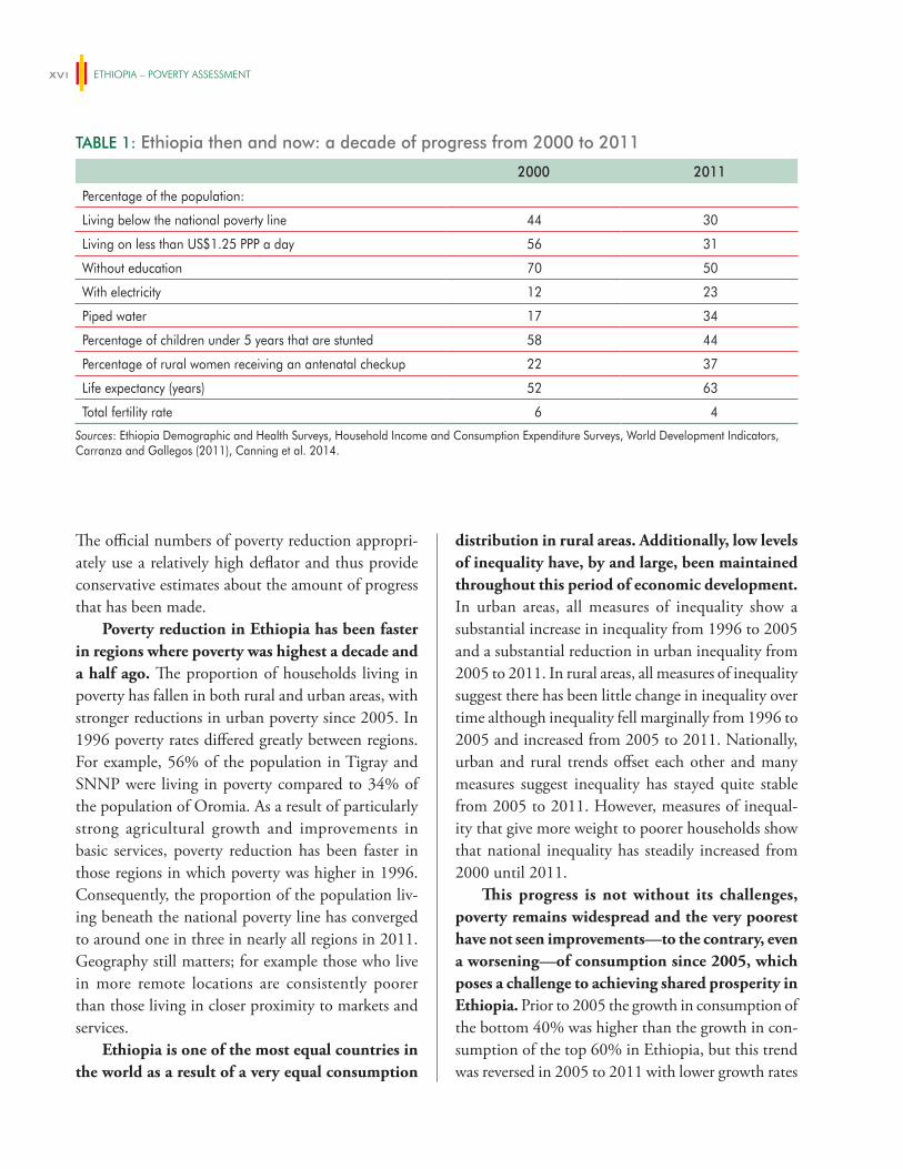
TABLE 1: Ethiopia then and now: a decade of progress from 2000 to 2011
2000 2011
Percentage of the population:
Living below the national poverty line 44 30
Living on less than US$1.25 PPP a day 56 31
Without education 70 50
With electricity 12 23
Piped water 17 34
Percentage of children under 5 years that are stunted 58 44
Percentage of rural women receiving an antenatal checkup 22 37
Life expectancy (years) 52 63
Total fertility rate 6 4
Sources: Ethiopia Demographic and Health Surveys, Household Income and Consumption Expenditure Surveys, World Development Indicators, Carranza and Gallegos (2011), Canning et al. 2014.
exeCUTive SUmmARy xvii
observed among the bottom 40 percent. Consumption growth benefited many poor households from 2005 to 2011, with the highest growth rates experienced by the decile below the poverty line. However, the poor-est decile did not experience an increase in consump-tion. As a result reductions in poverty rates were not matched by reductions in poverty depth and severity from 2005 to 2011. The negative growth rate of the consumption of the bottom decile is robust to the choice of deflator and is a concerning trend.
There has been considerable progress in reduc-ing the proportion of households experiencing multiple deprivations in health, education, and living standards at once, particularly in rural areas. In many cases, on any three indicators of deprivation considered—such as access to sanitation and clean water, education, and monetary poverty—the propor-tion of rural households deprived in all three dimen-sions fell from four in 10 to less than one in 10 rural households. In the case of education and sanitation, the proportion of households with improved access has increased, and increases have been largest among disadvantaged groups.
However deprivation in some dimensions is still quite high, for example Ethiopia still has rela-tively low rates of educational enrollment, access to sanitation, and attended births. Four in five rural households and two out of three urban households still experience at least one out of three selected depriva-tions. Although much progress has been made, con-tinued emphasis on investments in education. health. and improving living standards is needed. The need for continued further progress is reflected in a high and slowly moving Multidimensional Poverty Index (MPI). In 2011, 87% of the population was measured as MPI poor which means they were deprived in at least one third of the weighted MPI indicators. This put Ethiopia as the second poorest country in the world (OPHDI 2014). While the MPI is useful in drawing attention to the need for further progress in access to basic services in Ethiopia, it not a complete measure of deprivation in Ethiopia today. The higher rates of poverty and slow progress recorded in the MPI
arise largely because of the divergence between mon-etary poverty and the measure of living standards used in the MPI. This divergence is due, in part, because the assets considered in the MPI do not include assets important in Ethiopia and the cutoff used in some dimensions is too high to reflect recent progress.
2. Drivers of progress
In the last ten years Ethiopia has experienced high and consistent economic growth driven by high lev-els of public investment and growth in services and agriculture. Since the early 1990s Ethiopia has pur-sued a “developmental state” model with the objective of reducing poverty. The approach envisages a strong role for the Government of Ethiopia in many aspects of the economy and high levels of public investment to encourage growth and improve access to basic services. The model has been one of Agricultural Development-Led Industrialization in which growth in agriculture is emphasized in order to lead transformation of the economy. Since 2004, Ethiopia’s economy has had strong growth with annual per capita growth rates of 8.3% over the last decade (World Bank 2013). The contribution of agriculture to value added has been high throughout this period, however over time the importance of agriculture has fallen (from 52% in 2004 to 40% in 2014) and the importance of the service sec-tor has increased (from 37% in 2004 to 46% in 2014).
Growth was broad-based and has been the main driver of reductions in poverty over the fifteen-year period from 1996 to 2011. Growth has been impor-tant, but the average growth elasticity is quite low. Each 1% of growth resulted in 0.15% reduction in poverty, which, although better than the sub-Saharan African average, is lower than the global average.
Growth in agriculture was particularly inclusive and contributed significantly to poverty reduction. Ethiopia has a rural, agricultural-based labor force: more than four out of every five Ethiopians live in rural areas and are engaged in small-holder agricul-tural production. Poverty fell fastest when and where agricultural growth was strongest. For every 1% of
ETHIOPIA – POVERTY ASSESSMENTxviii
growth in agricultural output, poverty was reduced by 0.9% which implies that agricultural growth caused reductions in poverty of 4.0% per year on average post 2005 and 1.1% per year between 2000 and 2005.
There is some evidence that manufacturing growth and urban employment contributed to poverty reduction in more recent years. Although nationally growth in manufacturing or services did not contribute to poverty reduction, in urban Ethiopia, manufacturing growth played a significant role in reducing poverty from 2000 to 2011. For every 1% of growth in manufacturing output, urban poverty fell by 0.37%. Although manufacturing only employs 3% of the population nationally, the proportion of indi-viduals employed in manufacturing in urban centers is much higher.
The impact of service sector growth on poverty reduction was small relative to growth in value added by the service sector in national accounts. Growth in the service sector has been high in recent years, but few poor households are employed in the service sector, and as a result only a tenth of the poverty reduction in recent years took place among those in the service sector. While a shift to technical and pro-fessional occupations has helped increase consump-tion at all consumption levels, this shift has mainly contributed to increases in consumption among the richest. However there is some evidence that agricul-tural growth may drive poverty reduction in part by encouraging rural service sector activity. Service sector growth has been highest when and where agricultural growth has been highest, and agricultural income is the source of start-up funds for 64% of non-farm enterprises (often service sector).
Overall, poverty reduction among rural, self-employed, agricultural households accounts for the major share of poverty reduction from 1996 to 2011. Structural change has not contributed much to poverty reduction during this time. This is in contrast to some other economies in the region and elsewhere. In Uganda and Rwanda agricultural growth was accompanied by growth in the non-farm service sector, which in turn accounted for one third
and one sixth of poverty reduction respectively. In Bangladesh (from 2000 to 2005) and in Cambodia in recent years, growth in light manufacturing accom-panied agricultural growth and helped spur further poverty reduction.
However, although the direct impact of non-agricultural growth on poverty reduction may have been minimal, a more detailed examination of the role of agricultural growth in reducing pov-erty shows that increased access to urban centers has been an important part of Ethiopia’s progress. While agricultural growth had a strong impact on poverty reduction on average, the positive impact of agricultural growth was only found close to urban centers of 50,000 people or more. This indicates that infrastructure investment and growth in non-agricul-tural urban demand are essential complements to agri-cultural output growth to achieve poverty reduction.
High food prices have ensured high returns to investments in agricultural production for many of Ethiopia’s rural households that are connected to markets. Food inflation has been high in recent years and this has shaped the nature of development and poverty reduction during this period. In 2011 food inflation was 39%, three times both the sub-Saharan African average of 13%, and the approximate 12% food inflation in China and significantly higher than the 27% food inflation in Vietnam. High prices and good weather ensured that investments in input-use brought high returns and gains for poverty reduction during this period. Increased adoption of modern input-use in agriculture, such as fertilizer, has been important in reducing poverty but this has only increased agricultural incomes and reduced poverty when good prices and good weather has been pres-ent. Over time an increasing proportion of poor households have become self-sufficient in food or net producers and as a result high crop prices have helped poverty reduction.
However high food prices have hurt agricul-tural households in the poorest decile that produce very little; high food prices perhaps offer an expla-nation for the pattern of broad-based growth with
exeCUTive SUmmARy xix
losses in the bottom decile observed in Ethiopia from 2005 to 2011. The poorest decile are more likely to report producing less than three months of consumption than other poor households, and were more likely to report suffering from food price shocks than any other group. Broad based growth for the poor is aided by high food prices, but the high food prices that benefit the majority of the agricultural poor in Ethiopia hurt the very poorest decile that continue to purchase much of their food. This group of house-holds needs compensatory interventions. The majority (92%) of households own land, and as a result agri-cultural wage employment is more limited in Ethiopia than in other countries. Those in non-agricultural unskilled wage employment are negatively impacted as wages take four to five months to adjust to food price increases. As such high food prices do not help urban poverty reduction in large urban centers where the majority of the labor force is in wage employment. Indeed, consumption growth was negative for many households in Addis Ababa from 2005 to 2011. Urban households headed by someone with no education reduced their consumption by 12–14% as a result of food price shocks experienced in the 12 months prior to the household survey.
Consistently good rainfall has benefited agri-cultural production and poverty reduction in recent years, but the dependence of agricultural growth on good weather highlights a key vulnerability. Agricultural output is vulnerable to poor rains given the predominance of rain-fed production and the dependence of yield-increasing technologies (such as fertilizer) on the weather. Since 2003 the proportion of farmers experiencing crop losses greater than 30% has not been more than one standard deviation above the average. Were a drought similar to 2002 to be experi-enced in Ethiopia today, regression estimates suggest poverty would increase from 30% to 51%. Increasing uncertainty around climate change will need to be managed through increased irrigation, development of drought-resistant seed varieties and strengthened finan-cial markets. Further diversification of the Ethiopian economy out of agriculture is also important.
Public investment has been a central element of the development strategy of the Government of Ethiopia over the last decade and since 2005 redis-tribution has been an important contributor to pov-erty reduction. This coincides with the introduction of large-scale safety net program in rural areas and the expansion of basic services. Public spending is guided by the Growth and Transformation Plan (GTP) and is particularly targeted to agriculture and food-security, education, health, roads, and water. Accordingly 70% of total general government expenditure is allocated to these sectors. Education comprises a quarter of total spending followed by roads, agriculture, and health at 20%, 15%, and 7% respectively. About half of the agricultural budget is allocated to the Productive Safety Net Program (PSNP).
The Government of Ethiopia has reduced poverty through the direct transfers provided in the Productive Safety Net Program (PSNP) estab-lished in 2005. The PSNP comprised 1% of GDP in 2010/11, and it is the largest safety net program in Sub-Saharan Africa. The immediate direct effect of transfers provided to rural households in the PSNP has reduced the national poverty rate by two percent-age points. The PSNP has also had an effect on pov-erty reduction above and beyond the direct impact of transfers on poverty. PSNP transfers have been shown to increase agricultural input-use among some beneficiaries thereby supporting agricultural growth.
Large-scale public investments in the provision of basic services such as education and health have also contributed to poverty reduction both by con-tributing to growth and by preferentially increasing the welfare of the poor. Access to, and utilization of, education and health services has increased over the last decade in Ethiopia. From 2006 to 2013 the number of health posts increased by 159% and the number of health centers increased by 386%. In the education sector, from 2005 to 2011, the primary net attendance rate for 7–12 year olds increased from 42 to 62%. Spending on services that are well accessed by poor households such as primary education and preventative health services is pro-poor. However
ETHIOPIA – POVERTY ASSESSMENTxx
spending is less progressive on programs where chal-lenges remain in ensuring utilization by poor house-holds, such as enrollment in secondary and tertiary education or use of curative health services.
The Government of Ethiopia has reduced inequality and poverty through fiscal policy, however because Ethiopia is a poor country this reduction in inequality has come about at a cost to some households who are already poor. Poor households pay taxes—both direct and indirect— although the amounts paid may be small. For most poor households, the transfers and benefits received are higher than the amount paid in taxes. As a result, fiscal policy brings about poverty reduction. Good fis-cal policy is designed to meet a number of objectives, not just equity, and is also an important part of the social contract. However it is worth noting that one in 10 households are impoverished (either made poor or poor households made poorer) when all taxes paid and benefits received are taken into account. There are two means by which this negative impact could be reduced: (i) by reducing the incidence of direct tax on the bottom deciles and increasing the progressivity of direct taxes, particularly personal income tax and agricultural taxes, and (ii) by redirecting spending on subsidies to spending on direct transfers to the poorest.
3. Ending extreme poverty in Ethiopia
Ending extreme poverty in Ethiopia requires pro-tecting current progress. Many non-poor house-holds in Ethiopia today consume only just enough to live above the poverty line making reductions in poverty vulnerable to shocks: 14% of non-poor rural households are estimated to be vulnerable to falling into poverty. Weather shocks remain an important source of risk in rural areas, and food price shocks have become increasingly important in urban areas. However, although vulnerability does have a geographic footprint in Ethiopia today, it is not fully determined by location of residence. Factors such as individual access to assets, or lifecycle events are often defining features of vulnerable households.
The primacy of access to the labor market as a deter-minant of poverty and vulnerability in urban areas is particularly evident.
Individuals everywhere—in every woreda of Ethiopia—are vulnerable and as a result safety net programs targeted only to specific rural wore-das will necessarily result in many vulnerable Ethiopians being left without support. This has implications for how safety nets function in Ethiopia, suggesting that a move from geographically targeted programs to systems that provide specific support to individuals at defined points in time may be warranted as Ethiopia develops.
Further gains in reducing poverty are also needed: in an optimistic growth scenario, extreme poverty will be substantially reduced to 8%, but not eradicated, by 2030. In an optimistic growth scenario, all households will experience annual growth in consumption of 2.5%, which is higher and more equal than the growth Ethiopia experienced in the last decade. In a less optimistic scenario annual consump-tion growth rates might be lower, approaching the annual consumption growth rate for the last decade of 1.6%. Or consumption growth rates may vary for poorer and richer households as they did from 2005 to 2011. Achieving 8% extreme poverty by 2030 requires both high and more equal growth than experienced in the last ten years. Even very high rates of growth will not result in poverty falling below 12% if the pattern of income losses of the bottom decile from 2005 to 2011 is not reversed. Higher growth rates for the poorest households are also essential to ensuring shared prosperity. In the last five years incomes of the poorest 40% have, on average, not grown faster than average incomes.
In addition to continuing the successful mix of agricultural growth and investments in the provi-sion of basic services and direct transfers to rural households, additional drivers of poverty reduction will be needed, particularly those that encour-age the structural transformation of Ethiopia’s economy. Structural transformation will entail the transition of labor from agricultural activities into
exeCUTive SUmmARy xxi
non-agricultural activities and it may also entail the movement of people from rural to urban areas. However, although non-farm enterprise ownership in rural areas and rural to urban migration are important realities in Ethiopia today, both have remained quite limited. Neither have been significant contributors to poverty reduction as they have in some other coun-tries in the region (for example the role of non-farm enterprises in Rwanda and Uganda) and elsewhere (for example the role of rural to urban migration in China).
Self-employment in non-farm enterprises (NFEs) provides an additional income source for some poor, but the size of the sector is relatively small, constrained by limited demand for goods and services in rural areas. In addition to being the primary sector of activity for 11–14% of the popula-tion, a further 11% of rural households earn about a quarter of their income from operating non-farm enterprises in the service sector. In contrast, 67% of rural Rwandan households reported operating a non-farm enterprise (one of the highest rates in the region). While NFEs provide some secondary income in rural areas and a source of income for those unable to secure employment in rural towns, the contribution of this sector is small in comparison to other countries. Estimates from the 2011 Household Consumption Expenditure Survey suggest it comprises about 10% of household earnings in Ethiopia. In comparison, the rural non-farm sector is estimated to account for an average of 34% of rural earnings across Africa (Haggbalde et al. 2010).
An initial assessment of constraints to NFEs suggests that limited demand constrains the role of NFEs in rural income generation and poverty reduction. On the supply side, NFEs appear to depend on agricultural income for inputs and invest-ment capital. On the demand side, they rely heavily on increased local demand during the harvest period to generate household income. As a result they are most active during harvest and in the months imme-diately thereafter and are not an important a source of income in the lean season. The need for capital does not appear to be a major cause for the current
seasonality of NFEs, but many do report access to market demand as a major constraint. Interventions to increase demand—e.g. continued improvements in rural accessibility and agricultural productivity—will have the largest impact on increasing the vibrancy of this sector and its role in reducing poverty. However, growth in this sector may be more likely in areas that are more densely populated or proximate to such areas.
Migration from rural to urban areas is an inherent component of the development process, but since 1996 rural to urban migration contrib-uted very little to poverty reduction in Ethiopia because there was so little of it. About one in 10 rural workers migrates in Ethiopia, in contrast to one in five rural workers in China. Migration has been beneficial for poverty reduction when it occurred. On average, those that migrate experience substantial welfare benefits. The evidence is consistent with the notion that rural land policies and cash constraints limit the rate of migration. Land policy that has been so good for ensuring an equitable distribution of income in rural areas acts as a break on migration flows by prohibiting those planning on migrating from liquidating their land. The costs associated with migration and searching for a job in urban areas also limits the ability of liquidity-constrained poor house-holds to invest in migration. Policies that make it easier to transfer land and that reduce the costs of job search would likely increase migration. In addition policies that protect more vulnerable groups as they migrate would increase the poverty reducing effects of migration: young female migrants currently see much lower welfare gains from migration than their male counterparts.
Ethiopia is urbanizing and further agglomera-tion would likely enhance the pace of structural transformation. As Ethiopia urbanizes so too does poverty. In 2000, 11% of Ethiopia’s poor lived in cit-ies, but this rose to 14% in 2011. In Ethiopia, just as in other countries, poverty rates fall and inequality increases as city size increases, however poverty rates in the two largest cities of Addis Ababa and Dire Dawa are much higher than this trend would predict.
ETHIOPIA – POVERTY ASSESSMENTxxii
Improving welfare in large urban centers may in turn make further agglomeration more likely by making cities more attractive places to live.
Addressing poverty in large urban centers will thus become an increasingly important focus of development policy, and increasing the produc-tivity of urban work will be central to this. The nature of work is much different in larger urban centers than in rural Ethiopia and small towns. Rates of self-employment and work in family enterprises decrease and waged employment increases with city size. In urban centers where waged employment is higher, poverty rates are lower. However, as rates of waged employment increase so to do the number of people searching for these jobs, resulting in very high rates of unemployment in the largest urban centers in Ethiopia. In Addis Ababa unemployment is strongly correlated with poverty: nearly half of all households with an unemployed male in Addis Ababa live in pov-erty. Yet those with the lowest levels of education are more often engaged in informal self-employment, out of necessity, rather than being unemployed looking for a wage job. These individuals can be thought of as choosing self-employment not because it is more profitable but because the cost of being unemployed while searching for waged employment is too high relative to the expected benefit.
Poverty in large urban centers may be better addressed by encouraging the entry and growth of larger firms rather than by encouraging self-employment. Supporting small-scale entrepreneurs can reduce poverty by increasing the productivity of those who currently earn marginal profits from self-employment. However, supporting entrepreneurs that have larger firms can also be poverty reducing—and often to a greater degree. High productivity entre-preneurs earn substantial profits, but also employ many workers, and contribute to higher overall wage levels through their demand for labor. As the value of employment increases so does the value of job-search. This encourages those who are entrepreneurs by neces-sity to search for and gain employment. Where job search is costly, reducing its cost would also encourage
“necessity entrepreneurs” to upgrade to wage employ-ment and potentially reduce unemployment.
However, addressing urban poverty will take more than encouraging employment. Increased safety nets to support those who do not participate in the urban labor market are needed. The elderly, disabled, and female-headed households are much poorer in urban areas. Households with disabled members and headed by the elderly are also more vulnerable to shocks in urban areas than in rural areas. In part this is as a result of informal safety nets being weaker in urban areas, but also in part as a result of inadequate urban safety nets. Direct transfers are only provided to rural households, with subsidies in electricity, kerosene, and wheat in place to reach the urban poor. Although urban households do benefit more than rural households from subsidies this is not enough to compensate for the lack of direct transfers to urban households among the bottom percentiles. Poverty, particularly urban poverty, would be reduced further if spending on indirect subsidies (on electricity, kerosene and wheat) were converted to direct transfers.
An urban safety net can also have productive benefits. Introducing a safety net in large urban centers will have a direct effect on poverty. Evidence suggests that transfers can encourage income growth among recipients by increasing job search, increasing the productivity of the self-employed and encourag-ing some to upgrade from necessity self-employment to employment.
Finally, although accelerating poverty reduc-tion will require looking beyond agriculture for sources of pro-poor growth, agricultural growth will remain an important driver of poverty reduc-tion in the near future, and ensuring that all individuals in rural areas can participate in this growth is essential to poverty reduction. Female farm managers in Ethiopia are 23% less productive than their male counterparts. They have less time to spend on farm work and farm less land, more of which is rented. In addition, female managers obtain lower output from the productive factors that are employed compared to men. Differences in productivity arise, in
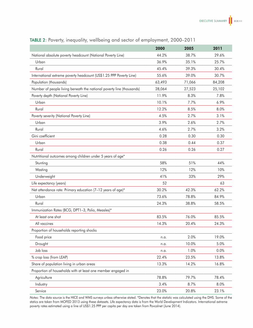
exeCUTive SUmmARy xxiii
TABLE 2: Poverty, inequality, wellbeing and sector of employment, 2000–2011
2000 2005 2011
National absolute poverty headcount (National Poverty Line) 44.2% 38.7% 29.6%
Urban 36.9% 35.1% 25.7%
Rural 45.4% 39.3% 30.4%
International extreme poverty headcount (US$1.25 PPP Poverty Line) 55.6% 39.0% 30.7%
Population (thousands) 63,493 71,066 84,208
Number of people living beneath the national poverty line (thousands) 28,064 27,523 25,102
Poverty depth (National Poverty Line) 11.9% 8.3% 7.8%
Urban 10.1% 7.7% 6.9%
Rural 12.2% 8.5% 8.0%
Poverty severity (National Poverty Line) 4.5% 2.7% 3.1%
Urban 3.9% 2.6% 2.7%
Rural 4.6% 2.7% 3.2%
Gini coefficient 0.28 0.30 0.30
Urban 0.38 0.44 0.37
Rural 0.26 0.26 0.27
Nutrtitional outcomes among children under 5 years of age*
Stunting 58% 51% 44%
Wasting 12% 12% 10%
Underweight 41% 33% 29%
Life expectancy (years) 52 63
Net attendance rate: Primary education (7–12 years of age)* 30.2% 42.3% 62.2%
Urban 73.6% 78.8% 84.9%
Rural 24.3% 38.8% 58.5%
Immunization Rates (BCG, DPT1–3, Polio, Measles)*
At least one shot 83.5% 76.0% 85.5%
All vaccines 14.3% 20.4% 24.3%
Proportion of households reporting shocks
Food price n.a. 2.0% 19.0%
Drought n.a. 10.0% 5.0%
Job loss n.a. 1.0% 0.0%
% crop loss (from LEAP) 22.4% 23.5% 13.8%
Share of population living in urban areas 13.3% 14.2% 16.8%
Proportion of households with at least one member engaged in
Agriculture 78.8% 79.7% 78.4%
Industry 3.4% 8.7% 8.0%
Service 23.0% 20.8% 23.1%
Notes: The data source is the HICE and WMS surveys unless otherwise stated. *Denotes that the statistic was calculated using the DHS. Some of the statics are taken from MOFED 2013 using these datasets. Life expectancy data is from the World Development Indicators. International extreme poverty rates estimated using a line of US$1.25 PPP per capita per day are taken from Povcalnet (June 2014).
ETHIOPIA – POVERTY ASSESSMENTxxiv
part because women are often relegated to, or choose, low-risk low-skilled activities while men choose high-risk, high-value crops and engage in commercializa-tion. Increasing women’s access to land, extension, oxen, and labor markets will help address gender-productivity differences, but policies that help change institutions and gender norms that keep female farm-ers in low-return activities are also needed.
In summary, the Government of Ethiopia’s focus on agricultural growth and investments in basic ser-vices for all has ensured improvements in wellbeing for many poor households in Ethiopia. The proportion of the population living below the national poverty line fell from 44% in 2000 to 30% in 2011. Looking forward, further investment in basic services are required to ensure that Ethiopia continues to make additional, needed, progress in education, health and living standards. The predominance of agriculture as a source of income for Ethiopia’s poor also suggests that agricultural growth will remain an important driver of poverty reduction in the future. Poverty reduction from agricultural productivity increases has occurred in places with better market access when cereals prices
have been high, underscoring the dependence of agricultural growth on increased urban demand for agricultural products in a land-locked country such as Ethiopia. However, the structural change in value addition that has occurred during the last decade has not been fully matched by structural change in employment and the analytical findings presented here are consistent with the idea that further agglomeration through urbanization would help increase poverty reduction. This will require policies that favor the entry and growth of firms, in addition to support to self-employment in non-agricultural activities. Further urbanization and growth in non-agricultural sectors would continue to exert upward pressure on food prices. This will need to be met by agricultural produc-tivity growth in order to keep labor costs competitive, but high prices incentivize the required agricultural investments. Although beneficial for many poor rural households, high food prices carry costs for the urban poor. Improving the fiscal position of poor urban households—such as through higher direct transfers or raising the minimum income above which personal income tax is levied—would help offset this effect.
xxv
INTRODUCTION
In 2005 the last Poverty Assessment documented wellbeing in Ethiopia from 1996 to 2000. It showed that little progress had been made in reduc-
ing poverty and that many households still experi-enced deprivation on many dimensions of wellbeing. Since then life in Ethiopia has been transformed with marked progress recorded in a number of surveys and qualitative studies, particularly since 2003. This Poverty Assessment documents Ethiopia’s progress in reducing poverty from 1996 to 2011 with a particular focus on progress since 2000.
Ethiopia has a wealth of data and surveys that have been used in this work. The core of the analysis uses the series of Household Income and Consumption Expenditure Surveys (HICES) under-taken in 1995/6, 1999/2000, 2004/5 and 2010/11 (henceforth referred to as 1996, 2000, 2005 and 2011). And it is from this series that the official consumption aggregates and monetary poverty esti-mates are derived. However additional nationally representative surveys such as the annual Agricultural Census Survey, the annual Medium and Large Scale Manufacturing Census, the Ethiopian Rural Socioeconomic Survey of 2012 (representative of rural Ethiopia), and the Urban Employment and Unemployment Survey of 2012 (representative of urban Ethiopia) are also used. Insights from the Ethiopian Rural Household Survey panel from 1994 to 2009 are also drawn on. Analysis undertaken with the Demographic and Health Surveys collected in 2000, 2005 and 2011 is also referenced. Throughout, the quantitative work is complemented with rich insights from the WIDE-3 (Wellbeing and Ill-being Dynamics in Ethiopia) longitudinal qualitative study undertaken in 20 rural communities in Ethiopia from 1996 to 2013.
Part I synthesizes progress since 1996, but with a focus on progress since 2000. This part of the report starts with a focus on monetary poverty in Chapter 1. It summarizes work undertaken by MOFED (2013) in measuring poverty and assessing progress in poverty reduction from 1996 and extends the work by undertaking some sensitivity analysis of the poverty estimates, examining additional indicators of distribu-tional change, profiling the bottom decile and simulat-ing future poverty trends. Chapter 2 takes as its focus progress in non-monetary dimensions of wellbeing and in particular assesses the degree to which house-holds in Ethiopia experience multiple deprivations of wellbeing. It draws on work undertaken in Carranza and Gallegos (2013) in assessing progress on many non-income measures of wellbeing and explores why, given so much progress, the Multidimensional Poverty Index ranks Ethiopia as the second poorest country in the world. Chapter 3 examines another dimension of wellbeing: that of vulnerability. Wellbeing in Ethiopia has historically been vulnerable to natural events beyond individual control and the chapter examines the extent to which this is still true in 2011.
The overwhelming conclusion of Part I is that there has been substantial progress in wellbeing in Ethiopia over the last decade. In Part II factors that have contributed to this progress are explored. Chapter 4 examines the drivers of poverty reduction through decomposition analysis, but also through regression analysis of a panel constructed for zones in Ethiopia from many different nationally represen-tative data sources. Agricultural growth emerges as a large contributing factor and the chapter explores the nature of agricultural growth that has reduced poverty in further detail. Chapter 5 focuses on the role of fis-cal policy in reducing poverty through redistribution.
ETHIOPIA – POVERTY ASSESSMENTxxvi
It summarizes work undertaken as part of a fiscal inci-dence analysis for Ethiopia using the Commitment to Equity framework. In documenting the impact of fiscal policy on inequality and poverty the chapter also points to a number of ways in which fiscal policy could be harnessed to reduce poverty further.
In looking back to explain drivers of progress Part II already points to a number of priorities for ending extreme poverty in Ethiopia. The importance of agri-cultural growth and good producer prices is empha-sized, and the potential for further fiscal redistribution is underscored. However, ending extreme poverty in Ethiopia will require more than repeating the past and in particular it will likely require further structural transformation than has been observed in the last decade. Part III of the Poverty Assessment examines areas that have not been major contributors to national poverty reduction in the past, but could be in the future. Structural transformation entails the transi-tion of labor from agricultural to non-agricultural
activities and the movement of people from rural to urban areas. However, although non-farm enterprise ownership and rural to urban migration feature in Ethiopia today, they have contributed little to poverty reduction. Chapter 6 and Chapter7 examine the role of non-farm enterprises and migration respectively, and document key constraints to both. Addressing poverty in large urban centers will be an increasingly important focus of development policy and Chapter 8 considers the nature of urban poverty and work, and strategies to further urban poverty reduction. Finally, although accelerating poverty reduction will require looking beyond agriculture, ensuring that all individuals in rural areas can participate in agricul-tural growth is essential to ensuring that the impact of agricultural growth on poverty reduction remains high. In this regard, Chapter 9 examines constraints to the productivity of female farm managers and the degree to which policy can help alleviate some of this inequality.
1
PROGRESS IN REDUCING POVERTY AND INCREASING WELLBEING, 1996-2011
Since the early 1990s Ethiopia has pursued a “developmental state” model with the objec-tive of reducing poverty in Ethiopia. The
strategy has its genesis in the policy of Agricultural Development-Led Industrialization (ADLI), which was first articulated in a paper by the then Ministry of Planning and Economic Development in 1993. The strategy was continued with some modifications in the Plan for Accelerated and Sustained Development to End Poverty (PASDEP) from 2005 to 2010 and, since 2010, in the Growth and Transformation Plan (GTP), which will end in 2015. The approach envis-ages a strong role for the Government of Ethiopia in many aspects of the economy and high levels of public sector investment to encourage growth and improve access to basic services.
In the last ten years Ethiopia has experienced high and consistent economic growth driven largely by growth in services and agriculture. Since 2004, Ethiopia’s economy has had strong growth with growth rates between 8–14%. GDP growth outpaced population growth (which has averaged about 3% during this period) and Ethiopia recorded annual per capita growth rates of 8.3% over the last decade (World Bank 2013). The contribution of agriculture to value added has been high throughout this period, however over time the importance of agriculture has fallen and the importance of the service sector has increased. The contribution of agriculture to value added fell from 52% in 2004 to 40% in 2014 while the contribution of the services sector increased from 37 to 46% during this time. However, although growth has been high, inflation has also been high and volatile at the end of this period.
This chapter documents that, since 2000, Ethiopian households also experienced a decade
of progress in wellbeing. As reported in the last Poverty Assessment (World Bank 2005), households experienced very little consumption growth between 1996 and 2000, and there had been little change in the national poverty rate. From 2000 to 2011 the wellbeing of Ethiopian households has improved on a number of dimensions and poverty has fallen. In 2000 Ethiopia had one of the highest poverty rates in the world, with 56% of the population living below US$1.25 PPP a day and 44% of its population below the national poverty line.2 In 2011 less than 30% of the population lives below the national poverty line.
However this progress is not without its challenges. Ethiopia started from a low base and attainment remains low on some dimensions. This chapter also documents that in recent years the very poorest have seen little improvement—even a wors-ening—of their wellbeing. New challenges such as food price shocks (during 2011 food price inflation was 39%) have been particularly difficult for house-holds who purchase much of the food they consume. Reversing this trend is essential for reducing extreme poverty and boosting shared prosperity.
This chapter synthesizes and extends existing analysis that documents progress in poverty reduc-tion and wellbeing since 2000. It builds on MOFED (2014) which presents the national poverty estimates for 2011, documents progress in reducing poverty over time and profiles households living beneath the national absolute poverty line. It summarizes the find-ings of MOFED (2014); conducts sensitivity analysis of the 2011 poverty estimates to document that the progress in poverty reduction is robust; and extends
2 In 1999/2000 less than 10% of countries that conducted household surveys recorded a poverty rate higher than Ethiopia.
1
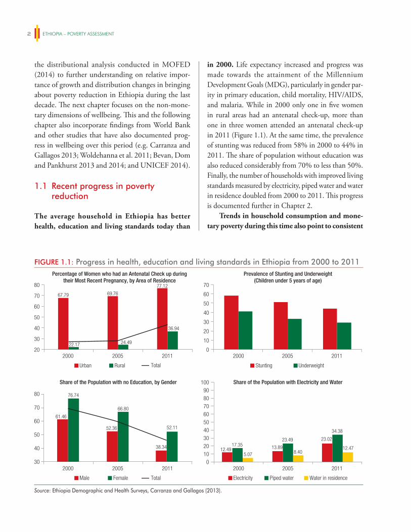
ETHIOPIA – POVERTY ASSESSMENT2
the distributional analysis conducted in MOFED (2014) to further understanding on relative impor-tance of growth and distribution changes in bringing about poverty reduction in Ethiopia during the last decade. The next chapter focuses on the non-mone-tary dimensions of wellbeing. This and the following chapter also incorporate findings from World Bank and other studies that have also documented prog-ress in wellbeing over this period (e.g. Carranza and Gallagos 2013; Woldehanna et al. 2011; Bevan, Dom and Pankhurst 2013 and 2014; and UNICEF 2014).
1.1 Recent progress in poverty reduction
The average household in Ethiopia has better health, education and living standards today than
in 2000. Life expectancy increased and progress was made towards the attainment of the Millennium Development Goals (MDG), particularly in gender par-ity in primary education, child mortality, HIV/AIDS, and malaria. While in 2000 only one in five women in rural areas had an antenatal check-up, more than one in three women attended an antenatal check-up in 2011 (Figure 1.1). At the same time, the prevalence of stunting was reduced from 58% in 2000 to 44% in 2011. The share of population without education was also reduced considerably from 70% to less than 50%. Finally, the number of households with improved living standards measured by electricity, piped water and water in residence doubled from 2000 to 2011. This progress is documented further in Chapter 2.
Trends in household consumption and mone-tary poverty during this time also point to consistent
FIGURE 1.1: Progress in health, education and living standards in Ethiopia from 2000 to 2011Percentage of Women who had an Antenatal Check up during
their Most Recent Pregnancy, by Area of ResidencePrevalence of Stunting and Underweight
(Children under 5 years of age)
Share of the Population with Electricity and WaterShare of the Population with no Education, by Gender
20
30
40
50
60
20
10
30
40
50
6070
80
2000 2005 2011
2000 2005 2011
2000 2005 2011
30
80
010
6050403020
708090
100
Urban Rural Total
Male Female Total Electricity Piped water Water in residence
0
70
2000 20112005
Underweight
52.36
66.80
38.34
52.11
12.4917.35
5.0713.89
23.49
8.40
23.02
34.38
12.47
61.46
76.74
Stunting
40
50
60
70
67.79 69.76
77.12
36.94
24.4922.17
Source: Ethiopia Demographic and Health Surveys, Carranza and Gallagos (2013).
PROgReSS iN ReDUCiNg POveRTy AND iNCReASiNg WellBeiNg, 1996-2011 3
progress. In Ethiopia, poverty is measured by assessing whether a household consumes enough to meet their basic food needs and other necessary expenditures. The national absolute poverty line is set at 3781 Birr per adult equivalent per year in 2011 prices.3 Those falling below this line are considered poor (Box 1.1). The proportion of Ethiopians living beneath this line was reduced from almost one in every two Ethiopians in 1996 (46%) to less than 30% in 2011 (Table 1.1). The reduction mainly took place between 2000 and 2011. The proportion of households living in poverty has fallen in both rural and urban areas, with stronger reductions in urban poverty since 2005.
Poverty reduction in Ethiopia has been faster in regions where poverty was highest a decade and a half ago. In 1996 regions differed strongly in terms
of poverty with 56% of the population in Tigray and SNNP living in poverty compared to 34% of the pop-ulation of Oromia. Poverty reduction has been faster in those regions in which poverty was higher and as a result the proportion of the population living beneath the national poverty line has converged to around one in 3 in all regions in 2011 (Figure 1.2 and Table 1.2). The reason for this convergence is explored in Chapter 4. Section 1.4 in this chapter and analysis in Chapter 2 point to the fact that poverty is still geographic in nature, but it is geographical characteristics such as remoteness rather than regional location that strongly correlates with poverty.
3 3781 Birr in 2011 prices is equivalent to 1.24 USD PPP using the 2005 International Comparison Project.
BOX 1.1: Poverty measures
In Ethiopia, absolute poverty is measured by comparing a household’s consumption per adult equivalent to the national poverty line defined as 3781 Birr in 2011. The poverty line indicates the minimum money required to afford the food covering the minimum required caloric intake and additional non-food items. The following three poverty measures are commonly used to assess poverty:
Incidence of poverty (headcount index): The headcount index for the incidence of poverty is the proportion of individuals in the population living below the poverty line.
Depth of poverty (poverty gap): The depth of poverty indicates how far, on average, poor households are from the poverty line. It captures the mean consumption shortfall relative to the poverty line across the whole population. It is obtained by adding up all the shortfalls of the poor (considering the non-poor are having a shortfall of zero) and dividing the total by the population. Thus, the depth of poverty shows the total resources needed per capita to eliminate poverty assuming that all poor individuals would obtain exactly the shortfall between their consumption and the poverty line.
Poverty severity (squared poverty gap): The poverty severity takes into account the distance separating the poor from the poverty line (the poverty gap) as well as the inequality among the poor. Conceptually, poverty severity puts a higher weight on households/individuals, who are further below the poverty line.
Source: World Bank’s Poverty Handbook.
TABLE 1.1: Poverty headcount ratio for national poverty line (per adult) and the US$1.25 PPP poverty line (per capita)
1996 2000 2005 2011
National Poverty Line 45.5% 44.2% 38.7% 29.6%
Urban 33.2% 36.9% 35.1% 25.7%
Rural 47.6% 45.4% 39.3% 30.4%
US$1.25 PPP Poverty Line 60.5% 55.6% 39.0% 30.7%
Source: Own calculations using HICES 1996, HICES 2000, HICES 2005, HCES 2011 and Povcalnet (June 2014).
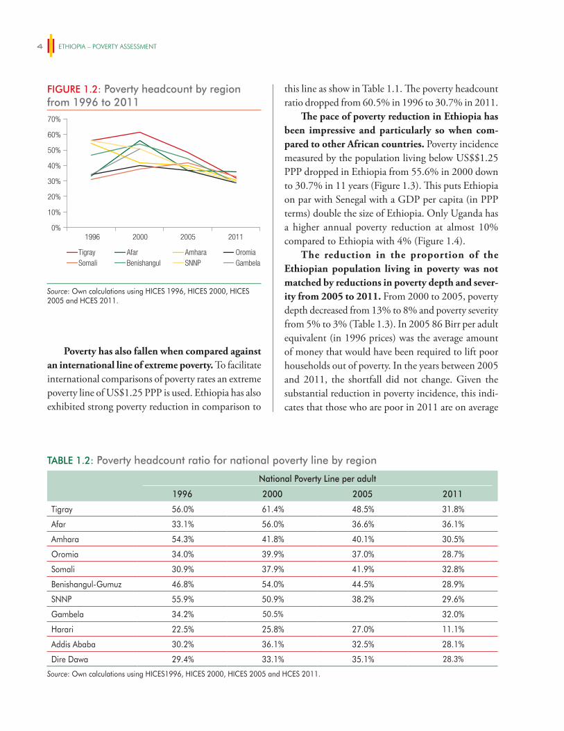
ETHIOPIA – POVERTY ASSESSMENT4
this line as show in Table 1.1. The poverty headcount ratio dropped from 60.5% in 1996 to 30.7% in 2011.
The pace of poverty reduction in Ethiopia has been impressive and particularly so when com-pared to other African countries. Poverty incidence measured by the population living below US$$1.25 PPP dropped in Ethiopia from 55.6% in 2000 down to 30.7% in 11 years (Figure 1.3). This puts Ethiopia on par with Senegal with a GDP per capita (in PPP terms) double the size of Ethiopia. Only Uganda has a higher annual poverty reduction at almost 10% compared to Ethiopia with 4% (Figure 1.4).
The reduction in the proportion of the Ethiopian population living in poverty was not matched by reductions in poverty depth and sever-ity from 2005 to 2011. From 2000 to 2005, poverty depth decreased from 13% to 8% and poverty severity from 5% to 3% (Table 1.3). In 2005 86 Birr per adult equivalent (in 1996 prices) was the average amount of money that would have been required to lift poor households out of poverty. In the years between 2005 and 2011, the shortfall did not change. Given the substantial reduction in poverty incidence, this indi-cates that those who are poor in 2011 are on average
Poverty has also fallen when compared against an international line of extreme poverty. To facilitate international comparisons of poverty rates an extreme poverty line of US$1.25 PPP is used. Ethiopia has also exhibited strong poverty reduction in comparison to
TABLE 1.2: Poverty headcount ratio for national poverty line by region
National Poverty Line per adult
1996 2000 2005 2011
Tigray 56.0% 61.4% 48.5% 31.8%
Afar 33.1% 56.0% 36.6% 36.1%
Amhara 54.3% 41.8% 40.1% 30.5%
Oromia 34.0% 39.9% 37.0% 28.7%
Somali 30.9% 37.9% 41.9% 32.8%
Benishangul-Gumuz 46.8% 54.0% 44.5% 28.9%
SNNP 55.9% 50.9% 38.2% 29.6%
Gambela 34.2% 50.5% 32.0%
Harari 22.5% 25.8% 27.0% 11.1%
Addis Ababa 30.2% 36.1% 32.5% 28.1%
Dire Dawa 29.4% 33.1% 35.1% 28.3%
Source: Own calculations using HICES1996, HICES 2000, HICES 2005 and HCES 2011.
FIGURE 1.2: Poverty headcount by region from 1996 to 2011
1996 2000 2005 20110%
10%
20%
30%
40%
50%
60%
70%
Tigray Afar Amhara OromiaSomali Benishangul SNNP Gambela
Source: Own calculations using HICES 1996, HICES 2000, HICES 2005 and HCES 2011.
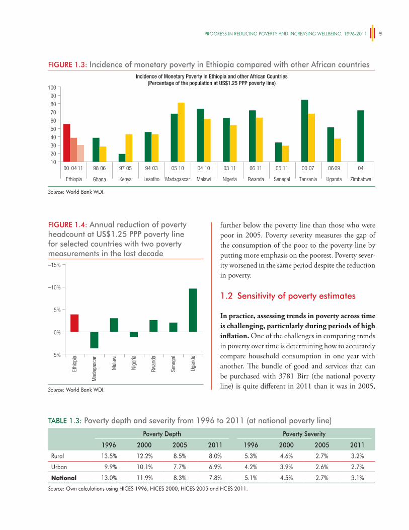
PROgReSS iN ReDUCiNg POveRTy AND iNCReASiNg WellBeiNg, 1996-2011 5
further below the poverty line than those who were poor in 2005. Poverty severity measures the gap of the consumption of the poor to the poverty line by putting more emphasis on the poorest. Poverty sever-ity worsened in the same period despite the reduction in poverty.
1.2 Sensitivity of poverty estimates
In practice, assessing trends in poverty across time is challenging, particularly during periods of high inflation. One of the challenges in comparing trends in poverty over time is determining how to accurately compare household consumption in one year with another. The bundle of good and services that can be purchased with 3781 Birr (the national poverty line) is quite different in 2011 than it was in 2005,
FIGURE 1.3: Incidence of monetary poverty in Ethiopia compared with other African countriesIncidence of Monetary Poverty in Ethiopia and other African Countries
(Percentage of the population at US$1.25 PPP poverty line)
10
20
30
40
50
60
80
90
70
100
00 04 11 98 06 97 05 94 03 05 10 04 10 03 11 06 11 05 11 00 07 06 09 04
Ethiopia Ghana Kenya Lesotho Madagascar Malawi Nigeria Rwanda Senegal Tanzania Uganda Zimbabwe
Source: World Bank WDI.
FIGURE 1.4: Annual reduction of poverty headcount at US$1.25 PPP poverty line for selected countries with two poverty measurements in the last decade
5%
0%
5%
–10%
–15%
Ethi
opia
Mad
agas
car
Mal
awi
Nige
ria
Rwan
da
Sene
gal
Ugan
da
Source: World Bank WDI.
TABLE 1.3: Poverty depth and severity from 1996 to 2011 (at national poverty line)
Poverty Depth Poverty Severity
1996 2000 2005 2011 1996 2000 2005 2011
Rural 13.5% 12.2% 8.5% 8.0% 5.3% 4.6% 2.7% 3.2%
Urban 9.9% 10.1% 7.7% 6.9% 4.2% 3.9% 2.6% 2.7%
National 13.0% 11.9% 8.3% 7.8% 5.1% 4.5% 2.7% 3.1%
Source: Own calculations using HICES 1996, HICES 2000, HICES 2005 and HCES 2011.
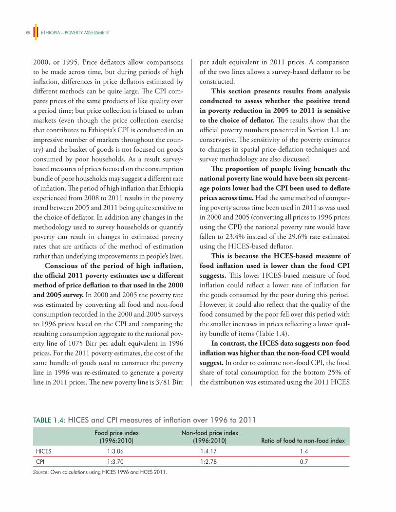
ETHIOPIA – POVERTY ASSESSMENT6
2000, or 1995. Price deflators allow comparisons to be made across time, but during periods of high inflation, differences in price deflators estimated by different methods can be quite large. The CPI com-pares prices of the same products of like quality over a period time; but price collection is biased to urban markets (even though the price collection exercise that contributes to Ethiopia’s CPI is conducted in an impressive number of markets throughout the coun-try) and the basket of goods is not focused on goods consumed by poor households. As a result survey-based measures of prices focused on the consumption bundle of poor households may suggest a different rate of inflation. The period of high inflation that Ethiopia experienced from 2008 to 2011 results in the poverty trend between 2005 and 2011 being quite sensitive to the choice of deflator. In addition any changes in the methodology used to survey households or quantify poverty can result in changes in estimated poverty rates that are artifacts of the method of estimation rather than underlying improvements in people’s lives.
Conscious of the period of high inflation, the official 2011 poverty estimates use a different method of price deflation to that used in the 2000 and 2005 survey. In 2000 and 2005 the poverty rate was estimated by converting all food and non-food consumption recorded in the 2000 and 2005 surveys to 1996 prices based on the CPI and comparing the resulting consumption aggregate to the national pov-erty line of 1075 Birr per adult equivalent in 1996 prices. For the 2011 poverty estimates, the cost of the same bundle of goods used to construct the poverty line in 1996 was re-estimated to generate a poverty line in 2011 prices. The new poverty line is 3781 Birr
per adult equivalent in 2011 prices. A comparison of the two lines allows a survey-based deflator to be constructed.
This section presents results from analysis conducted to assess whether the positive trend in poverty reduction in 2005 to 2011 is sensitive to the choice of deflator. The results show that the official poverty numbers presented in Section 1.1 are conservative. The sensitivity of the poverty estimates to changes in spatial price deflation techniques and survey methodology are also discussed.
The proportion of people living beneath the national poverty line would have been six percent-age points lower had the CPI been used to deflate prices across time. Had the same method of compar-ing poverty across time been used in 2011 as was used in 2000 and 2005 (converting all prices to 1996 prices using the CPI) the national poverty rate would have fallen to 23.4% instead of the 29.6% rate estimated using the HICES-based deflator.
This is because the HCES-based measure of food inflation used is lower than the food CPI suggests. This lower HCES-based measure of food inflation could reflect a lower rate of inflation for the goods consumed by the poor during this period. However, it could also reflect that the quality of the food consumed by the poor fell over this period with the smaller increases in prices reflecting a lower qual-ity bundle of items (Table 1.4).
In contrast, the HCES data suggests non-food inflation was higher than the non-food CPI would suggest. In order to estimate non-food CPI, the food share of total consumption for the bottom 25% of the distribution was estimated using the 2011 HCES
TABLE 1.4: HICES and CPI measures of inflation over 1996 to 2011
Food price index(1996:2010)
Non-food price index(1996:2010) Ratio of food to non-food index
HICES 1:3.06 1:4.17 1.4
CPI 1:3.70 1:2.78 0.7
Source: Own calculations using HICES 1996 and HCES 2011.
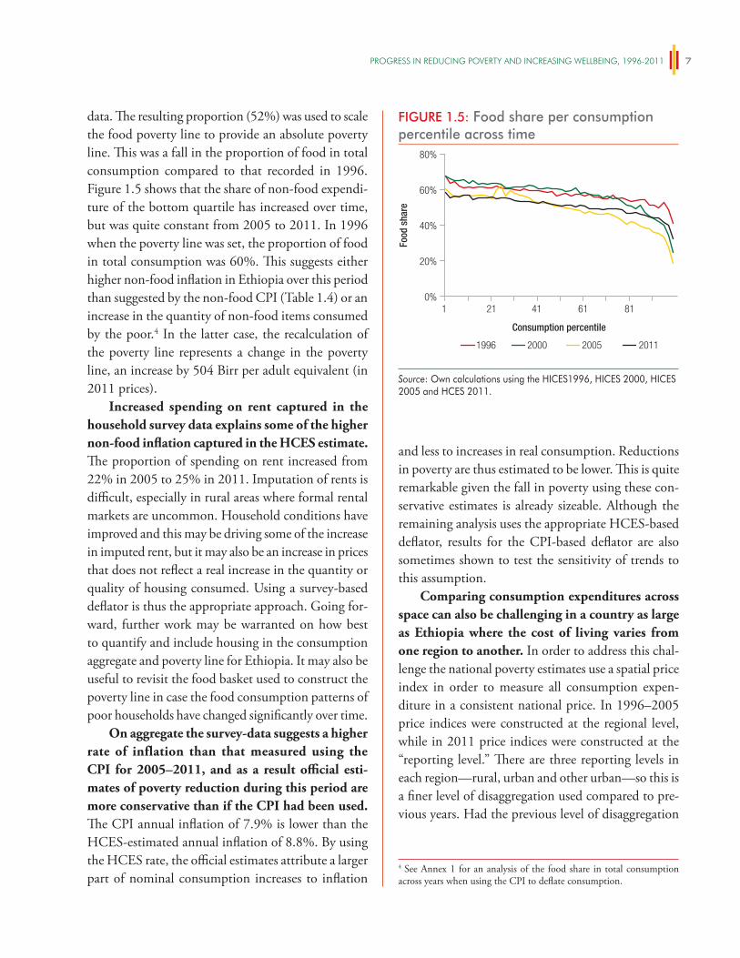
PROgReSS iN ReDUCiNg POveRTy AND iNCReASiNg WellBeiNg, 1996-2011 7
data. The resulting proportion (52%) was used to scale the food poverty line to provide an absolute poverty line. This was a fall in the proportion of food in total consumption compared to that recorded in 1996. Figure 1.5 shows that the share of non-food expendi-ture of the bottom quartile has increased over time, but was quite constant from 2005 to 2011. In 1996 when the poverty line was set, the proportion of food in total consumption was 60%. This suggests either higher non-food inflation in Ethiopia over this period than suggested by the non-food CPI (Table 1.4) or an increase in the quantity of non-food items consumed by the poor.4 In the latter case, the recalculation of the poverty line represents a change in the poverty line, an increase by 504 Birr per adult equivalent (in 2011 prices).
Increased spending on rent captured in the household survey data explains some of the higher non-food inflation captured in the HCES estimate. The proportion of spending on rent increased from 22% in 2005 to 25% in 2011. Imputation of rents is difficult, especially in rural areas where formal rental markets are uncommon. Household conditions have improved and this may be driving some of the increase in imputed rent, but it may also be an increase in prices that does not reflect a real increase in the quantity or quality of housing consumed. Using a survey-based deflator is thus the appropriate approach. Going for-ward, further work may be warranted on how best to quantify and include housing in the consumption aggregate and poverty line for Ethiopia. It may also be useful to revisit the food basket used to construct the poverty line in case the food consumption patterns of poor households have changed significantly over time.
On aggregate the survey-data suggests a higher rate of inflation than that measured using the CPI for 2005–2011, and as a result official esti-mates of poverty reduction during this period are more conservative than if the CPI had been used. The CPI annual inflation of 7.9% is lower than the HCES-estimated annual inflation of 8.8%. By using the HCES rate, the official estimates attribute a larger part of nominal consumption increases to inflation
and less to increases in real consumption. Reductions in poverty are thus estimated to be lower. This is quite remarkable given the fall in poverty using these con-servative estimates is already sizeable. Although the remaining analysis uses the appropriate HCES-based deflator, results for the CPI-based deflator are also sometimes shown to test the sensitivity of trends to this assumption.
Comparing consumption expenditures across space can also be challenging in a country as large as Ethiopia where the cost of living varies from one region to another. In order to address this chal-lenge the national poverty estimates use a spatial price index in order to measure all consumption expen-diture in a consistent national price. In 1996–2005 price indices were constructed at the regional level, while in 2011 price indices were constructed at the “reporting level.” There are three reporting levels in each region—rural, urban and other urban—so this is a finer level of disaggregation used compared to pre-vious years. Had the previous level of disaggregation
FIGURE 1.5: Food share per consumption percentile across time
0%
20%
40%
60%
80%
Food
sha
re
1 21 41 8161
1996 2000 2005 2011
Consumption percentile
Source: Own calculations using the HICES1996, HICES 2000, HICES 2005 and HCES 2011.
4 See Annex 1 for an analysis of the food share in total consumption across years when using the CPI to deflate consumption.
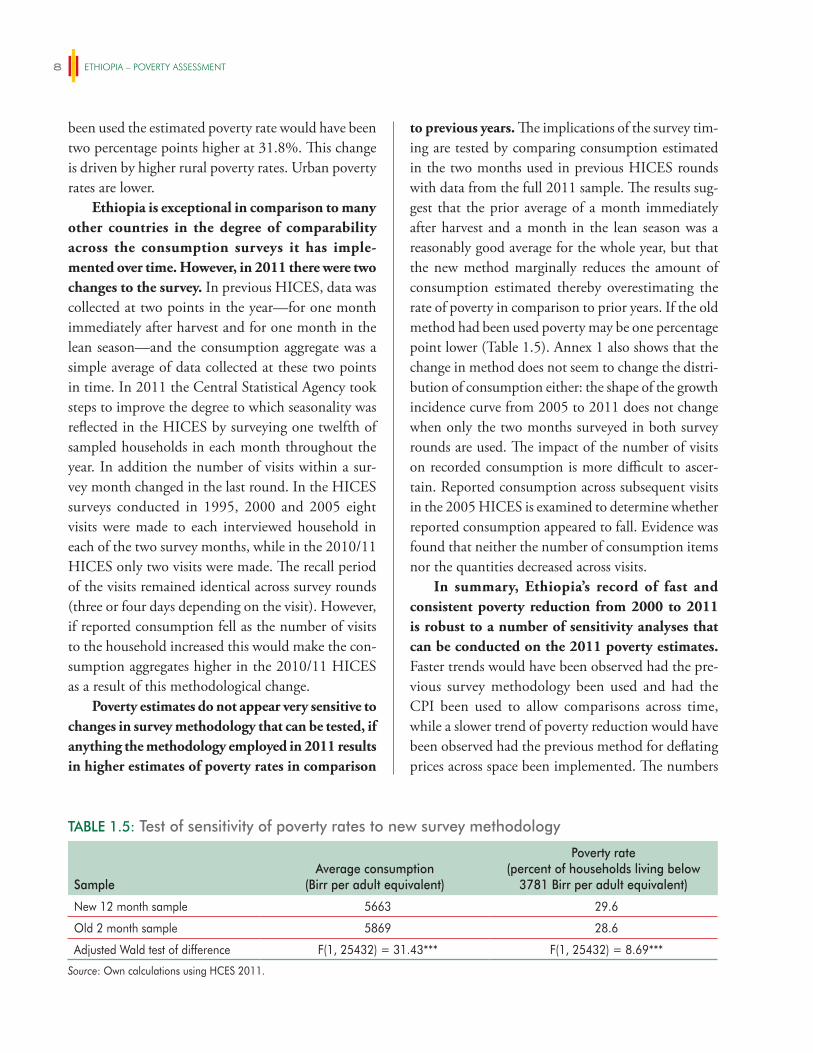
ETHIOPIA – POVERTY ASSESSMENT8
been used the estimated poverty rate would have been two percentage points higher at 31.8%. This change is driven by higher rural poverty rates. Urban poverty rates are lower.
Ethiopia is exceptional in comparison to many other countries in the degree of comparability across the consumption surveys it has imple-mented over time. However, in 2011 there were two changes to the survey. In previous HICES, data was collected at two points in the year—for one month immediately after harvest and for one month in the lean season—and the consumption aggregate was a simple average of data collected at these two points in time. In 2011 the Central Statistical Agency took steps to improve the degree to which seasonality was reflected in the HICES by surveying one twelfth of sampled households in each month throughout the year. In addition the number of visits within a sur-vey month changed in the last round. In the HICES surveys conducted in 1995, 2000 and 2005 eight visits were made to each interviewed household in each of the two survey months, while in the 2010/11 HICES only two visits were made. The recall period of the visits remained identical across survey rounds (three or four days depending on the visit). However, if reported consumption fell as the number of visits to the household increased this would make the con-sumption aggregates higher in the 2010/11 HICES as a result of this methodological change.
Poverty estimates do not appear very sensitive to changes in survey methodology that can be tested, if anything the methodology employed in 2011 results in higher estimates of poverty rates in comparison
to previous years. The implications of the survey tim-ing are tested by comparing consumption estimated in the two months used in previous HICES rounds with data from the full 2011 sample. The results sug-gest that the prior average of a month immediately after harvest and a month in the lean season was a reasonably good average for the whole year, but that the new method marginally reduces the amount of consumption estimated thereby overestimating the rate of poverty in comparison to prior years. If the old method had been used poverty may be one percentage point lower (Table 1.5). Annex 1 also shows that the change in method does not seem to change the distri-bution of consumption either: the shape of the growth incidence curve from 2005 to 2011 does not change when only the two months surveyed in both survey rounds are used. The impact of the number of visits on recorded consumption is more difficult to ascer-tain. Reported consumption across subsequent visits in the 2005 HICES is examined to determine whether reported consumption appeared to fall. Evidence was found that neither the number of consumption items nor the quantities decreased across visits.
In summary, Ethiopia’s record of fast and consistent poverty reduction from 2000 to 2011 is robust to a number of sensitivity analyses that can be conducted on the 2011 poverty estimates. Faster trends would have been observed had the pre-vious survey methodology been used and had the CPI been used to allow comparisons across time, while a slower trend of poverty reduction would have been observed had the previous method for deflating prices across space been implemented. The numbers
TABLE 1.5: Test of sensitivity of poverty rates to new survey methodology
SampleAverage consumption
(Birr per adult equivalent)
Poverty rate(percent of households living below
3781 Birr per adult equivalent)
New 12 month sample 5663 29.6
Old 2 month sample 5869 28.6
Adjusted Wald test of difference F(1, 25432) = 31.43*** F(1, 25432) = 8.69***
Source: Own calculations using HCES 2011.
PROgReSS iN ReDUCiNg POveRTy AND iNCReASiNg WellBeiNg, 1996-2011 9
are most sensitive to changes in the deflator used to assess progress across time. The official numbers of poverty reduction use a relatively high deflator and thus provide conservative estimates about the amount of progress that has been made.
1.3 The incidence of progress and shared prosperity
Reducing the number of people living below the national poverty line is a significant measure of progress. However, this is just one measure of how Ethiopian households have fared in the last decade and a half. Section 1.1 detailed how the depth and severity of poverty increased during the period from 2005 to 2011. This increase indicates that not all experienced equal progress during this time. This section takes a closer look at changes in the distribution of consump-tion in Ethiopia from 1996 to 2011 and sheds light on the role of growth and redistribution in bringing about changes in poverty.
Growth incidence
Although a small reduction in poverty was recorded from 1996 to 2000, household consumption stag-nated within this same period (Figure 1.6). In rural areas (which dominate the national distribution given Ethiopia has remained 85% rural throughout this time), the bottom half of the population benefited from growth of 0.81% annually; the income of the high middle-income population stagnated.5 The small reduction in national and rural poverty during this period was as a result of the low but broad growth for the poor rural population. In urban areas the pattern of progress was much different. The bottom 5% and the top 10% benefited from growth while the middle-income population in between had income losses of up to 2% per year (Figure 1.6). Negative growth for the 15% to 85% quantiles created additional urban poverty.
From 2000 to 2005 a period of broad-based growth in household consumption ensued. Rural
households experienced broad-based growth of 2.4% annually with slightly higher growth among the bot-tom decile. In urban areas, the household consump-tion of the bottom decile grew by 2.7% annually dropping down to almost zero at the 35th percentile before increasing again. The top 60% in urban areas had high consumption growth of 4.4% annually (Figure 1.6). The high growth in consumption at all points in the consumption distribution resulted in substantial poverty reduction, but as is discussed further below the pattern of consumption growth in urban areas resulted in increasing urban inequality.
High levels of broad-based consumption growth were also realized from 2005 to 2011, but the very poorest households did not participate in this growth. Consumption in the bottom 15 percen-tile contracted during this period while consumption growth for the remaining of the distribution averaged 1.2% (Figure 1.6).6 The deteriorating consumption for the poorest is reflected in the constant poverty depth between 2005 and 2011 while poverty incidence was reduced. While consumption growth in the bottom four deciles is similar in urban and rural areas, the pattern of growth is quite different in the top half of the distribution. In rural areas the consumption of the middle- and high-income population grew 1.4% annually while consumption contracted for the top half of the urban distribution. The very poorest and those better off in urban areas did not fare well dur-ing this period, despite large reductions in poverty as a result of the substantial consumption growth experienced by poor households living just below the poverty line. The contraction of consumption among the better-off urban population resulted in improve-ments in some measures of inequality.
The choice of deflator shifts the growth inci-dence curves along the growth-axis but does not
5 Only the top 5% gained income but growth estimation at the extreme quantiles is based on a very small sample and, thus, lacks credibility.6 Note that the survey in 2011 was carried out in all months while previ-ous surveys were only administered in selected months. However, the additional months included in 2011 do not introduce a bias into the growth incidence curve (see Annex 1).
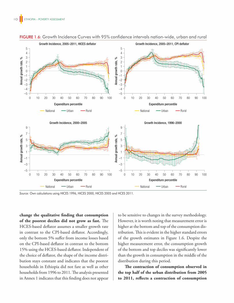
ETHIOPIA – POVERTY ASSESSMENT10
change the qualitative finding that consumption of the poorest deciles did not grow as fast. The HCES-based deflator assumes a smaller growth rate in contrast to the CPI-based deflator. Accordingly, only the bottom 5% suffer from income losses based on the CPI-based deflator in contrast to the bottom 15% using the HCES-based deflator. Independent of the choice of deflator, the shape of the income distri-bution stays constant and indicates that the poorest households in Ethiopia did not fare as well as other households from 1996 to 2011. The analysis presented in Annex 1 indicates that this finding does not appear
to be sensitive to changes in the survey methodology. However, it is worth noting that measurement error is higher at the bottom and top of the consumption dis-tribution. This is evident in the higher standard errors of the growth estimates in Figure 1.6. Despite the higher measurement error, the consumption growth of the bottom and top deciles was significantly lower than the growth in consumption in the middle of the distribution during this period.
The contraction of consumption observed in the top half of the urban distribution from 2005 to 2011, reflects a contraction of consumption
FIGURE 1.6: Growth Incidence Curves with 95% confidence intervals nation-wide, urban and ruralGrowth Incidence, 2005–2011, HICES deflator
–5
543210
–1–2–3–4
Annu
al g
row
th ra
te, %
Growth Incidence, 2005–2011, CPI deflator
–5
543210
–1–2–3–4
National Urban Rural National Urban Rural
Expenditure percentile Expenditure percentile
0 10 20 30 40 50 60 70 80 90 100 0 10 20 30 40 50 60 70 80 90 100
Annu
al g
row
th ra
te, %
Growth Incidence, 2000–2005
–5
–3
1
–1
3
5
7
9
0 10 20 30 40 50 60 70 80 90 100
National Urban Rural
Annu
al g
row
th ra
te, %
Growth Incidence, 1996–2000
–5
–3
1
–1
3
5
7
9
0 10 20 30 40 50 60 70 80 90 100
National Urban Rural
Expenditure percentile Expenditure percentile
Annu
al g
row
th ra
te, %
Source: Own calculations using HICES 1996, HICES 2000, HICES 2005 and HCES 2011.
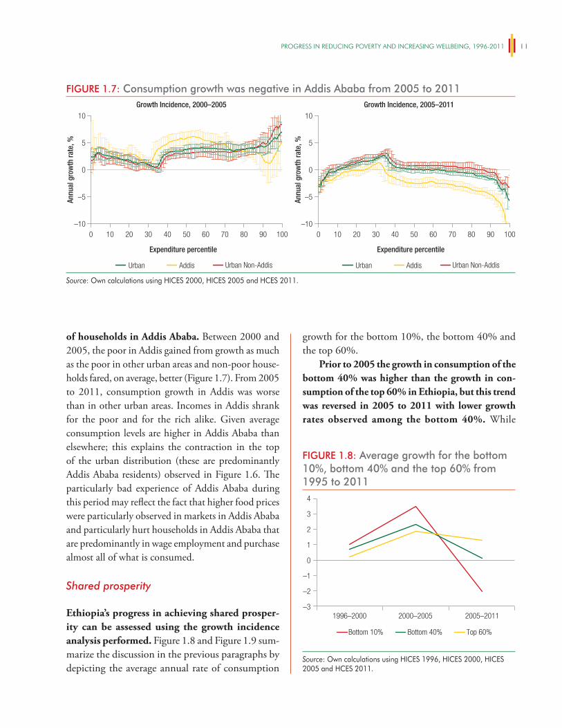
PROgReSS iN ReDUCiNg POveRTy AND iNCReASiNg WellBeiNg, 1996-2011 11
of households in Addis Ababa. Between 2000 and 2005, the poor in Addis gained from growth as much as the poor in other urban areas and non-poor house-holds fared, on average, better (Figure 1.7). From 2005 to 2011, consumption growth in Addis was worse than in other urban areas. Incomes in Addis shrank for the poor and for the rich alike. Given average consumption levels are higher in Addis Ababa than elsewhere; this explains the contraction in the top of the urban distribution (these are predominantly Addis Ababa residents) observed in Figure 1.6. The particularly bad experience of Addis Ababa during this period may reflect the fact that higher food prices were particularly observed in markets in Addis Ababa and particularly hurt households in Addis Ababa that are predominantly in wage employment and purchase almost all of what is consumed.
Shared prosperity
Ethiopia’s progress in achieving shared prosper-ity can be assessed using the growth incidence analysis performed. Figure 1.8 and Figure 1.9 sum-marize the discussion in the previous paragraphs by depicting the average annual rate of consumption
growth for the bottom 10%, the bottom 40% and the top 60%.
Prior to 2005 the growth in consumption of the bottom 40% was higher than the growth in con-sumption of the top 60% in Ethiopia, but this trend was reversed in 2005 to 2011 with lower growth rates observed among the bottom 40%. While
FIGURE 1.7: Consumption growth was negative in Addis Ababa from 2005 to 2011Growth Incidence, 2000–2005
Annu
al g
row
th ra
te, %
Growth Incidence, 2005–2011
–10
10
5
0
–5
–10
10
5
0
–5
Urban Addis Urban Non-Addis
Expenditure percentile Expenditure percentile
0 10 20 30 40 50 60 70 80 90 100 0 10 20 30 40 50 60 70 80 90 100
Annu
al g
row
th ra
te, %
Urban Addis Urban Non-Addis
Source: Own calculations using HICES 2000, HICES 2005 and HCES 2011.
FIGURE 1.8: Average growth for the bottom 10%, bottom 40% and the top 60% from 1995 to 2011
1996–2000 2000–2005 2005–2011–3
–2
–1
0
1
2
3
4
Bottom 10% Bottom 40% Top 60%
Source: Own calculations using HICES 1996, HICES 2000, HICES 2005 and HCES 2011.
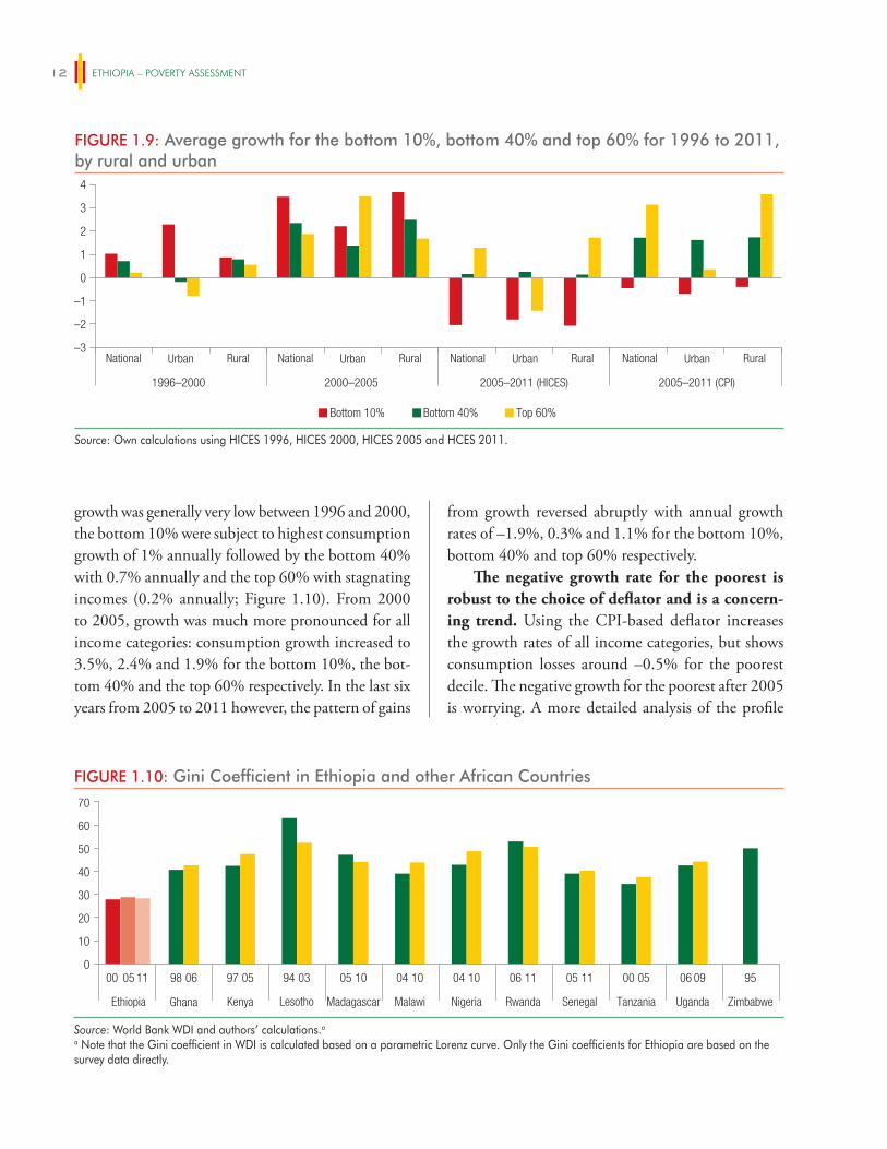
ETHIOPIA – POVERTY ASSESSMENT12
growth was generally very low between 1996 and 2000, the bottom 10% were subject to highest consumption growth of 1% annually followed by the bottom 40% with 0.7% annually and the top 60% with stagnating incomes (0.2% annually; Figure 1.10). From 2000 to 2005, growth was much more pronounced for all income categories: consumption growth increased to 3.5%, 2.4% and 1.9% for the bottom 10%, the bot-tom 40% and the top 60% respectively. In the last six years from 2005 to 2011 however, the pattern of gains
from growth reversed abruptly with annual growth rates of –1.9%, 0.3% and 1.1% for the bottom 10%, bottom 40% and top 60% respectively.
The negative growth rate for the poorest is robust to the choice of deflator and is a concern-ing trend. Using the CPI-based deflator increases the growth rates of all income categories, but shows consumption losses around –0.5% for the poorest decile. The negative growth for the poorest after 2005 is worrying. A more detailed analysis of the profile
FIGURE 1.9: Average growth for the bottom 10%, bottom 40% and top 60% for 1996 to 2011, by rural and urban
–3
–2
–1
0
2
3
1
4
National Urban Rural National Urban Rural National Urban Rural National Urban Rural
1996–2000 2000–2005 2005–2011 (HICES) 2005–2011 (CPI)
Bottom 10% Bottom 40% Top 60%
Source: Own calculations using HICES 1996, HICES 2000, HICES 2005 and HCES 2011.
FIGURE 1.10: Gini Coefficient in Ethiopia and other African Countries
0
10
20
30
40
50
60
70
00 05 11 98 06 97 05 94 03 05 10 04 10 04 10 06 11 05 11 00 05 06 09 95
Ethiopia Ghana Kenya Lesotho Madagascar Malawi Nigeria Rwanda Senegal Tanzania Uganda Zimbabwe
Source: World Bank WDI and authors’ calculations.a
a Note that the Gini coefficient in WDI is calculated based on a parametric Lorenz curve. Only the Gini coefficients for Ethiopia are based on the survey data directly.
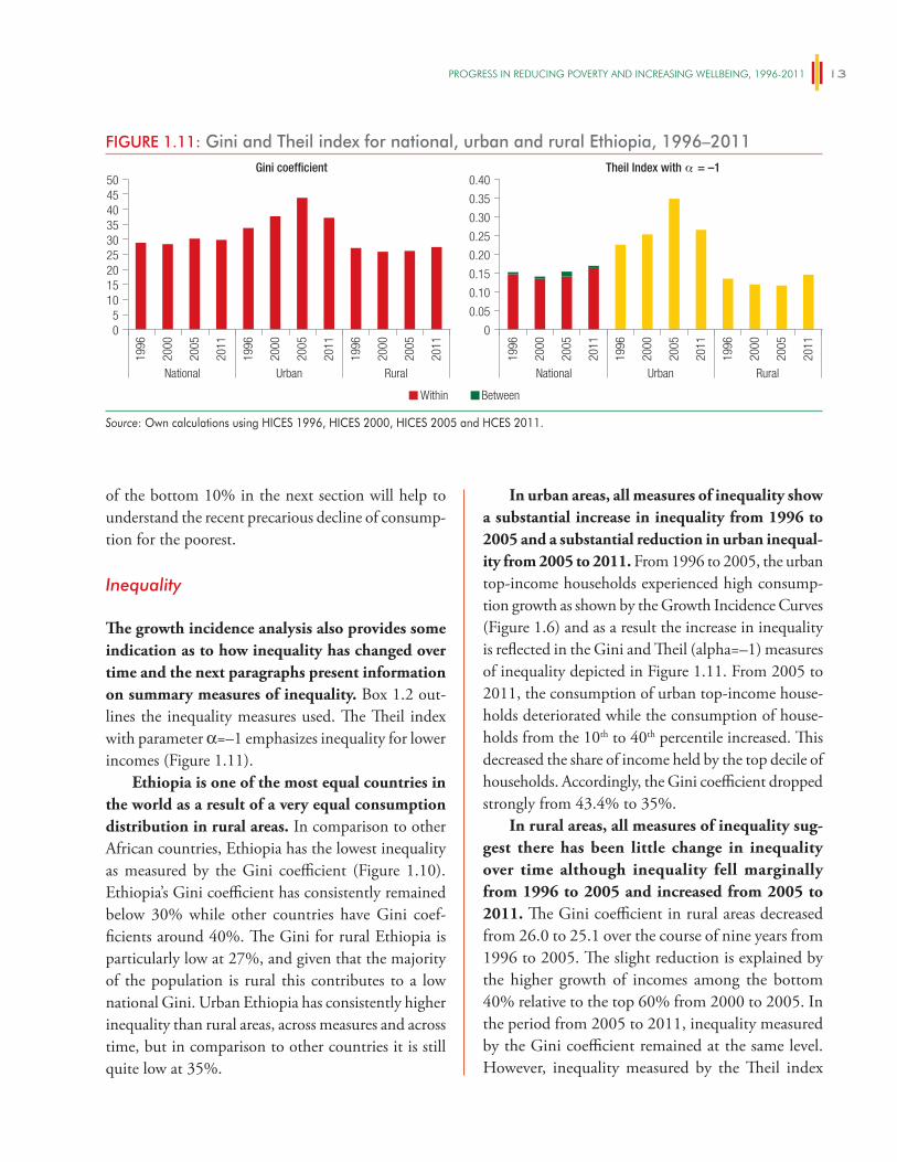
PROgReSS iN ReDUCiNg POveRTy AND iNCReASiNg WellBeiNg, 1996-2011 13
of the bottom 10% in the next section will help to understand the recent precarious decline of consump-tion for the poorest.
Inequality
The growth incidence analysis also provides some indication as to how inequality has changed over time and the next paragraphs present information on summary measures of inequality. Box 1.2 out-lines the inequality measures used. The Theil index with parameter α=–1 emphasizes inequality for lower incomes (Figure 1.11).
Ethiopia is one of the most equal countries in the world as a result of a very equal consumption distribution in rural areas. In comparison to other African countries, Ethiopia has the lowest inequality as measured by the Gini coefficient (Figure 1.10). Ethiopia’s Gini coefficient has consistently remained below 30% while other countries have Gini coef-ficients around 40%. The Gini for rural Ethiopia is particularly low at 27%, and given that the majority of the population is rural this contributes to a low national Gini. Urban Ethiopia has consistently higher inequality than rural areas, across measures and across time, but in comparison to other countries it is still quite low at 35%.
In urban areas, all measures of inequality show a substantial increase in inequality from 1996 to 2005 and a substantial reduction in urban inequal-ity from 2005 to 2011. From 1996 to 2005, the urban top-income households experienced high consump-tion growth as shown by the Growth Incidence Curves (Figure 1.6) and as a result the increase in inequality is reflected in the Gini and Theil (alpha=–1) measures of inequality depicted in Figure 1.11. From 2005 to 2011, the consumption of urban top-income house-holds deteriorated while the consumption of house-holds from the 10th to 40th percentile increased. This decreased the share of income held by the top decile of households. Accordingly, the Gini coefficient dropped strongly from 43.4% to 35%.
In rural areas, all measures of inequality sug-gest there has been little change in inequality over time although inequality fell marginally from 1996 to 2005 and increased from 2005 to 2011. The Gini coefficient in rural areas decreased from 26.0 to 25.1 over the course of nine years from 1996 to 2005. The slight reduction is explained by the higher growth of incomes among the bottom 40% relative to the top 60% from 2000 to 2005. In the period from 2005 to 2011, inequality measured by the Gini coefficient remained at the same level. However, inequality measured by the Theil index
FIGURE 1.11: Gini and Theil index for national, urban and rural Ethiopia, 1996–2011Gini coefficient
0
105
1520
3025
35404550
1996
2000
2005
2011
1996
2000
2005
2011
1996
2000
2005
2011
National Urban Rural
Theil Index with α = –1
0
0.05
0.10
0.20
0.15
0.25
0.30
0.35
0.40
1996
2000
2005
2011
1996
2000
2005
2011
1996
2000
2005
2011
National Urban Rural
Within Between
Source: Own calculations using HICES 1996, HICES 2000, HICES 2005 and HCES 2011.
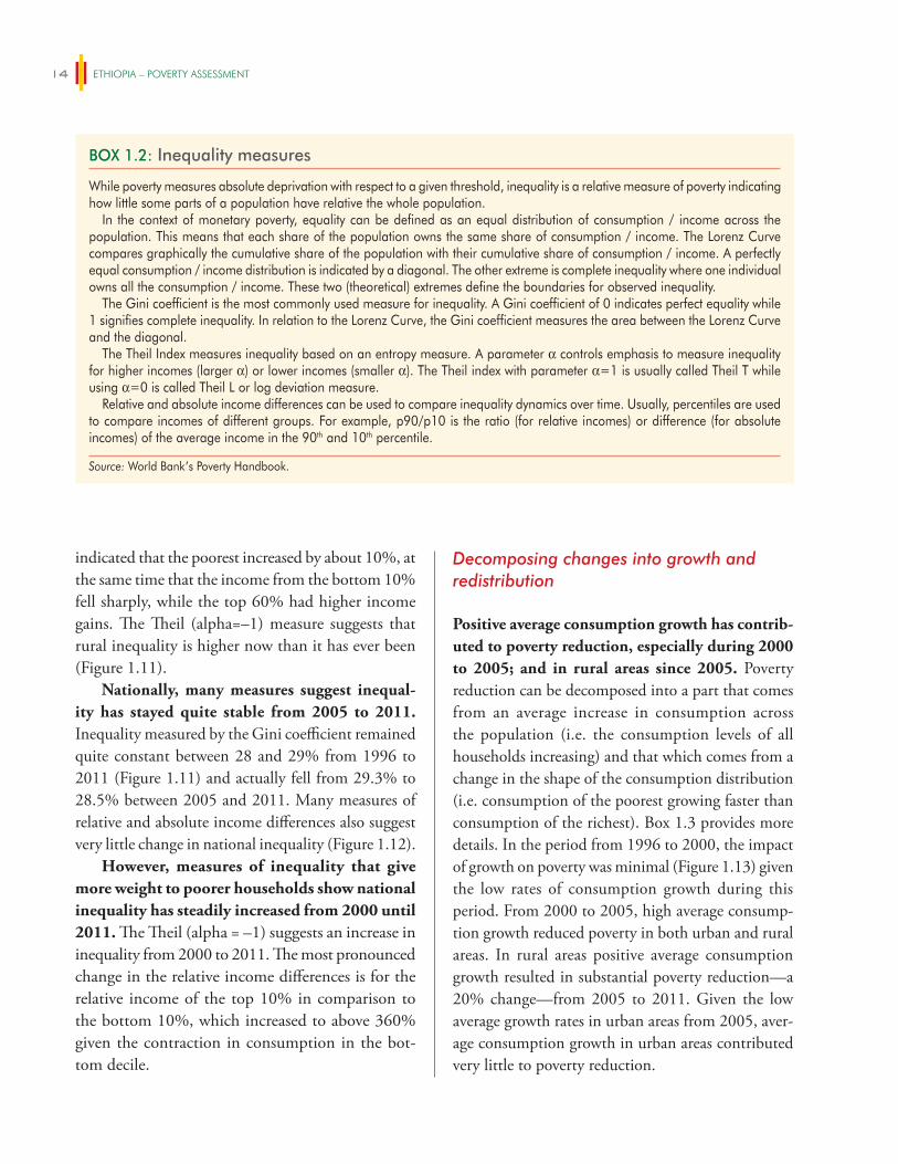
ETHIOPIA – POVERTY ASSESSMENT14
indicated that the poorest increased by about 10%, at the same time that the income from the bottom 10% fell sharply, while the top 60% had higher income gains. The Theil (alpha=–1) measure suggests that rural inequality is higher now than it has ever been (Figure 1.11).
Nationally, many measures suggest inequal-ity has stayed quite stable from 2005 to 2011. Inequality measured by the Gini coefficient remained quite constant between 28 and 29% from 1996 to 2011 (Figure 1.11) and actually fell from 29.3% to 28.5% between 2005 and 2011. Many measures of relative and absolute income differences also suggest very little change in national inequality (Figure 1.12).
However, measures of inequality that give more weight to poorer households show national inequality has steadily increased from 2000 until 2011. The Theil (alpha = –1) suggests an increase in inequality from 2000 to 2011. The most pronounced change in the relative income differences is for the relative income of the top 10% in comparison to the bottom 10%, which increased to above 360% given the contraction in consumption in the bot-tom decile.
Decomposing changes into growth and redistribution
Positive average consumption growth has contrib-uted to poverty reduction, especially during 2000 to 2005; and in rural areas since 2005. Poverty reduction can be decomposed into a part that comes from an average increase in consumption across the population (i.e. the consumption levels of all households increasing) and that which comes from a change in the shape of the consumption distribution (i.e. consumption of the poorest growing faster than consumption of the richest). Box 1.3 provides more details. In the period from 1996 to 2000, the impact of growth on poverty was minimal (Figure 1.13) given the low rates of consumption growth during this period. From 2000 to 2005, high average consump-tion growth reduced poverty in both urban and rural areas. In rural areas positive average consumption growth resulted in substantial poverty reduction—a 20% change—from 2005 to 2011. Given the low average growth rates in urban areas from 2005, aver-age consumption growth in urban areas contributed very little to poverty reduction.
BOX 1.2: Inequality measures
While poverty measures absolute deprivation with respect to a given threshold, inequality is a relative measure of poverty indicating how little some parts of a population have relative the whole population.
In the context of monetary poverty, equality can be defined as an equal distribution of consumption / income across the population. This means that each share of the population owns the same share of consumption / income. The Lorenz Curve compares graphically the cumulative share of the population with their cumulative share of consumption / income. A perfectly equal consumption / income distribution is indicated by a diagonal. The other extreme is complete inequality where one individual owns all the consumption / income. These two (theoretical) extremes define the boundaries for observed inequality.
The Gini coefficient is the most commonly used measure for inequality. A Gini coefficient of 0 indicates perfect equality while 1 signifies complete inequality. In relation to the Lorenz Curve, the Gini coefficient measures the area between the Lorenz Curve and the diagonal.
The Theil Index measures inequality based on an entropy measure. A parameter α controls emphasis to measure inequality for higher incomes (larger α) or lower incomes (smaller α). The Theil index with parameter α=1 is usually called Theil T while using α=0 is called Theil L or log deviation measure.
Relative and absolute income differences can be used to compare inequality dynamics over time. Usually, percentiles are used to compare incomes of different groups. For example, p90/p10 is the ratio (for relative incomes) or difference (for absolute incomes) of the average income in the 90th and 10th percentile.
Source: World Bank’s Poverty Handbook.
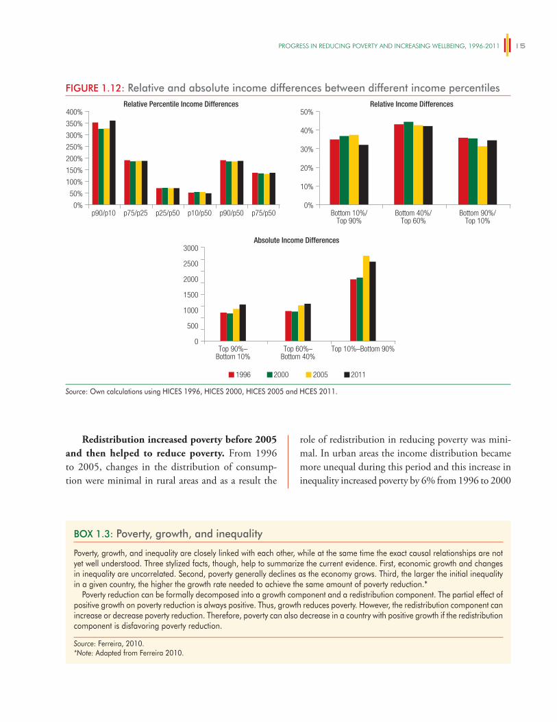
PROgReSS iN ReDUCiNg POveRTy AND iNCReASiNg WellBeiNg, 1996-2011 15
BOX 1.3: Poverty, growth, and inequality
Poverty, growth, and inequality are closely linked with each other, while at the same time the exact causal relationships are not yet well understood. Three stylized facts, though, help to summarize the current evidence. First, economic growth and changes in inequality are uncorrelated. Second, poverty generally declines as the economy grows. Third, the larger the initial inequality in a given country, the higher the growth rate needed to achieve the same amount of poverty reduction.*
Poverty reduction can be formally decomposed into a growth component and a redistribution component. The partial effect of positive growth on poverty reduction is always positive. Thus, growth reduces poverty. However, the redistribution component can increase or decrease poverty reduction. Therefore, poverty can also decrease in a country with positive growth if the redistribution component is disfavoring poverty reduction.
Source: Ferreira, 2010.*Note: Adapted from Ferreira 2010.
Redistribution increased poverty before 2005 and then helped to reduce poverty. From 1996 to 2005, changes in the distribution of consump-tion were minimal in rural areas and as a result the
role of redistribution in reducing poverty was mini-mal. In urban areas the income distribution became more unequal during this period and this increase in inequality increased poverty by 6% from 1996 to 2000
FIGURE 1.12: Relative and absolute income differences between different income percentilesRelative Percentile Income Differences
0%
200%
250%
300%
350%
50%
100%
150%
10%
20%
30%
400%
p90/p10 p75/p25 p25/p50 p10/p50 p90/p50 p75/p50
Absolute Income Differences
0
1000
500
1500
2000
2500
3000
Relative Income Differences
0%
40%
50%
1996 2000 2005 2011
Top 90%–Bottom 10%
Top 60%–Bottom 40%
Top 10%–Bottom 90%
Bottom 10%/Top 90%
Bottom 40%/Top 60%
Bottom 90%/Top 10%
Source: Own calculations using HICES 1996, HICES 2000, HICES 2005 and HCES 2011.
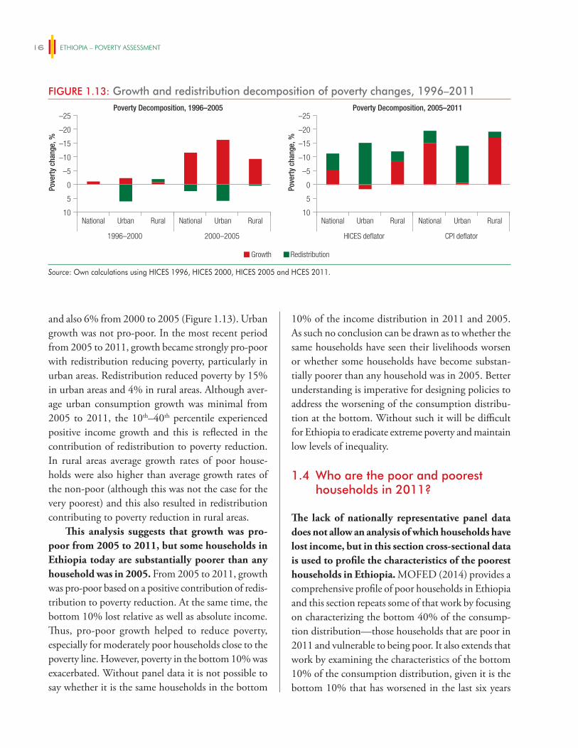
ETHIOPIA – POVERTY ASSESSMENT16
and also 6% from 2000 to 2005 (Figure 1.13). Urban growth was not pro-poor. In the most recent period from 2005 to 2011, growth became strongly pro-poor with redistribution reducing poverty, particularly in urban areas. Redistribution reduced poverty by 15% in urban areas and 4% in rural areas. Although aver-age urban consumption growth was minimal from 2005 to 2011, the 10th–40th percentile experienced positive income growth and this is reflected in the contribution of redistribution to poverty reduction. In rural areas average growth rates of poor house-holds were also higher than average growth rates of the non-poor (although this was not the case for the very poorest) and this also resulted in redistribution contributing to poverty reduction in rural areas.
This analysis suggests that growth was pro-poor from 2005 to 2011, but some households in Ethiopia today are substantially poorer than any household was in 2005. From 2005 to 2011, growth was pro-poor based on a positive contribution of redis-tribution to poverty reduction. At the same time, the bottom 10% lost relative as well as absolute income. Thus, pro-poor growth helped to reduce poverty, especially for moderately poor households close to the poverty line. However, poverty in the bottom 10% was exacerbated. Without panel data it is not possible to say whether it is the same households in the bottom
10% of the income distribution in 2011 and 2005. As such no conclusion can be drawn as to whether the same households have seen their livelihoods worsen or whether some households have become substan-tially poorer than any household was in 2005. Better understanding is imperative for designing policies to address the worsening of the consumption distribu-tion at the bottom. Without such it will be difficult for Ethiopia to eradicate extreme poverty and maintain low levels of inequality.
1.4 Who are the poor and poorest households in 2011?
The lack of nationally representative panel data does not allow an analysis of which households have lost income, but in this section cross-sectional data is used to profile the characteristics of the poorest households in Ethiopia. MOFED (2014) provides a comprehensive profile of poor households in Ethiopia and this section repeats some of that work by focusing on characterizing the bottom 40% of the consump-tion distribution—those households that are poor in 2011 and vulnerable to being poor. It also extends that work by examining the characteristics of the bottom 10% of the consumption distribution, given it is the bottom 10% that has worsened in the last six years
FIGURE 1.13: Growth and redistribution decomposition of poverty changes, 1996–2011Poverty Decomposition, 1996–2005
10
5
–5
0
–10
–15
–20
–25
1996–2000 2000–2005
National Urban Rural National Urban Rural
Poverty Decomposition, 2005–2011
Growth Redistribution
Pove
rty
chan
ge, %
10
5
–5
0
–10
–15
–20
–25
HICES deflator CPI deflator
National Urban Rural National Urban Rural
Pove
rty
chan
ge, %
Source: Own calculations using HICES 1996, HICES 2000, HICES 2005 and HCES 2011.
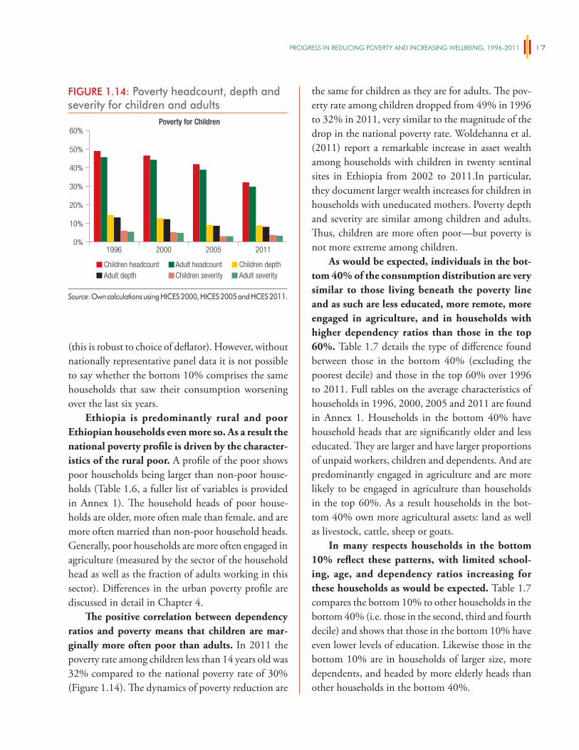
PROgReSS iN ReDUCiNg POveRTy AND iNCReASiNg WellBeiNg, 1996-2011 17
(this is robust to choice of deflator). However, without nationally representative panel data it is not possible to say whether the bottom 10% comprises the same households that saw their consumption worsening over the last six years.
Ethiopia is predominantly rural and poor Ethiopian households even more so. As a result the national poverty profile is driven by the character-istics of the rural poor. A profile of the poor shows poor households being larger than non-poor house-holds (Table 1.6, a fuller list of variables is provided in Annex 1). The household heads of poor house-holds are older, more often male than female, and are more often married than non-poor household heads. Generally, poor households are more often engaged in agriculture (measured by the sector of the household head as well as the fraction of adults working in this sector). Differences in the urban poverty profile are discussed in detail in Chapter 4.
The positive correlation between dependency ratios and poverty means that children are mar-ginally more often poor than adults. In 2011 the poverty rate among children less than 14 years old was 32% compared to the national poverty rate of 30% (Figure 1.14). The dynamics of poverty reduction are
the same for children as they are for adults. The pov-erty rate among children dropped from 49% in 1996 to 32% in 2011, very similar to the magnitude of the drop in the national poverty rate. Woldehanna et al. (2011) report a remarkable increase in asset wealth among households with children in twenty sentinal sites in Ethiopia from 2002 to 2011.In particular, they document larger wealth increases for children in households with uneducated mothers. Poverty depth and severity are similar among children and adults. Thus, children are more often poor—but poverty is not more extreme among children.
As would be expected, individuals in the bot-tom 40% of the consumption distribution are very similar to those living beneath the poverty line and as such are less educated, more remote, more engaged in agriculture, and in households with higher dependency ratios than those in the top 60%. Table 1.7 details the type of difference found between those in the bottom 40% (excluding the poorest decile) and those in the top 60% over 1996 to 2011. Full tables on the average characteristics of households in 1996, 2000, 2005 and 2011 are found in Annex 1. Households in the bottom 40% have household heads that are significantly older and less educated. They are larger and have larger proportions of unpaid workers, children and dependents. And are predominantly engaged in agriculture and are more likely to be engaged in agriculture than households in the top 60%. As a result households in the bot-tom 40% own more agricultural assets: land as well as livestock, cattle, sheep or goats.
In many respects households in the bottom 10% reflect these patterns, with limited school-ing, age, and dependency ratios increasing for these households as would be expected. Table 1.7 compares the bottom 10% to other households in the bottom 40% (i.e. those in the second, third and fourth decile) and shows that those in the bottom 10% have even lower levels of education. Likewise those in the bottom 10% are in households of larger size, more dependents, and headed by more elderly heads than other households in the bottom 40%.
FIGURE 1.14: Poverty headcount, depth and severity for children and adults
1996 2000 2005 20110%
10%
20%
30%
40%
50%
60%
Children headcount Adult headcount Children depthAdult depth Children severity Adult severity
Poverty for Children
Source: Own calculations using HICES 2000, HICES 2005 and HCES 2011.
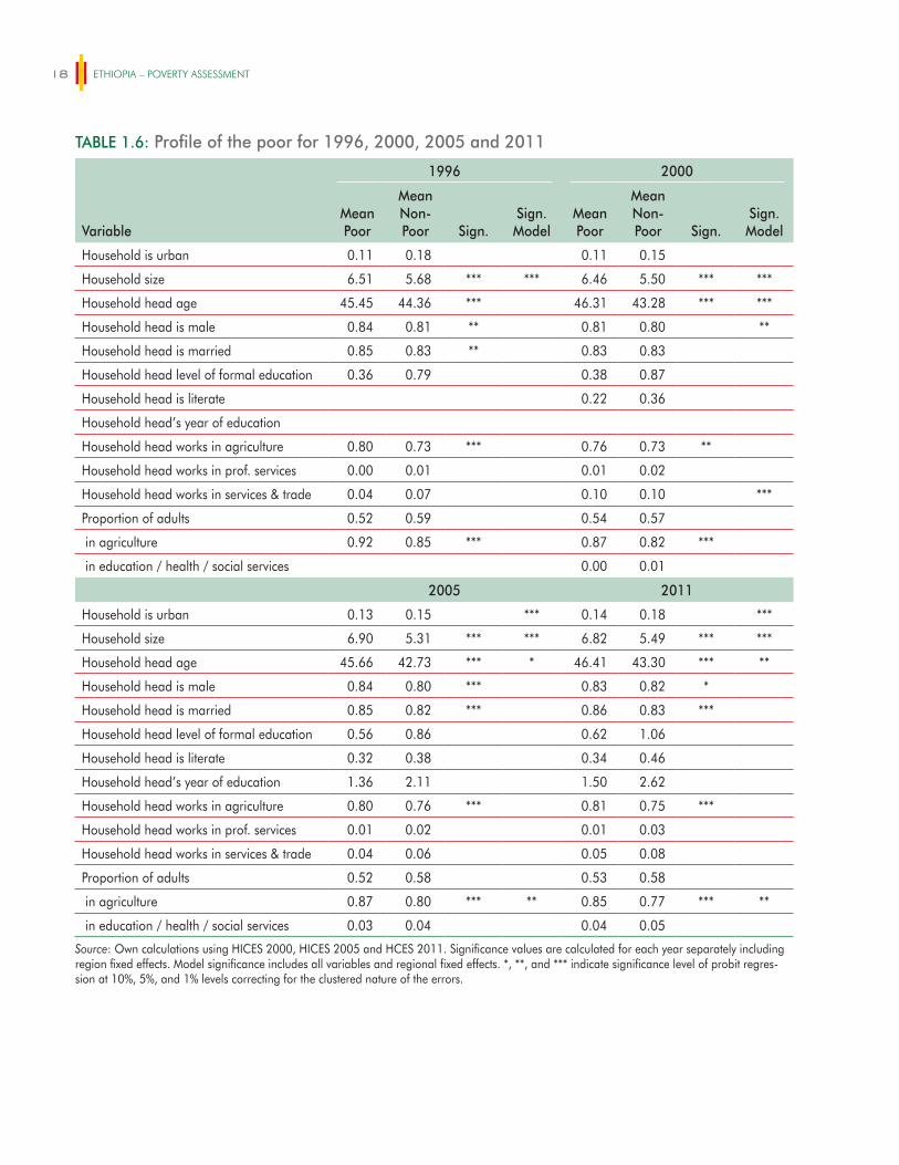
ETHIOPIA – POVERTY ASSESSMENT18
TABLE 1.6: Profile of the poor for 1996, 2000, 2005 and 2011
1996 2000
VariableMean Poor
Mean Non-Poor Sign.
Sign. Model
Mean Poor
Mean Non-Poor Sign.
Sign. Model
Household is urban 0.11 0.18 0.11 0.15
Household size 6.51 5.68 *** *** 6.46 5.50 *** ***
Household head age 45.45 44.36 *** 46.31 43.28 *** ***
Household head is male 0.84 0.81 ** 0.81 0.80 **
Household head is married 0.85 0.83 ** 0.83 0.83
Household head level of formal education 0.36 0.79 0.38 0.87
Household head is literate 0.22 0.36
Household head’s year of education
Household head works in agriculture 0.80 0.73 *** 0.76 0.73 **
Household head works in prof. services 0.00 0.01 0.01 0.02
Household head works in services & trade 0.04 0.07 0.10 0.10 ***
Proportion of adults 0.52 0.59 0.54 0.57
in agriculture 0.92 0.85 *** 0.87 0.82 ***
in education / health / social services 0.00 0.01
2005 2011
Household is urban 0.13 0.15 *** 0.14 0.18 ***
Household size 6.90 5.31 *** *** 6.82 5.49 *** ***
Household head age 45.66 42.73 *** * 46.41 43.30 *** **
Household head is male 0.84 0.80 *** 0.83 0.82 *
Household head is married 0.85 0.82 *** 0.86 0.83 ***
Household head level of formal education 0.56 0.86 0.62 1.06
Household head is literate 0.32 0.38 0.34 0.46
Household head’s year of education 1.36 2.11 1.50 2.62
Household head works in agriculture 0.80 0.76 *** 0.81 0.75 ***
Household head works in prof. services 0.01 0.02 0.01 0.03
Household head works in services & trade 0.04 0.06 0.05 0.08
Proportion of adults 0.52 0.58 0.53 0.58
in agriculture 0.87 0.80 *** ** 0.85 0.77 *** **
in education / health / social services 0.03 0.04 0.04 0.05
Source: Own calculations using HICES 2000, HICES 2005 and HCES 2011. Significance values are calculated for each year separately including region fixed effects. Model significance includes all variables and regional fixed effects. *, **, and *** indicate significance level of probit regres-sion at 10%, 5%, and 1% levels correcting for the clustered nature of the errors.
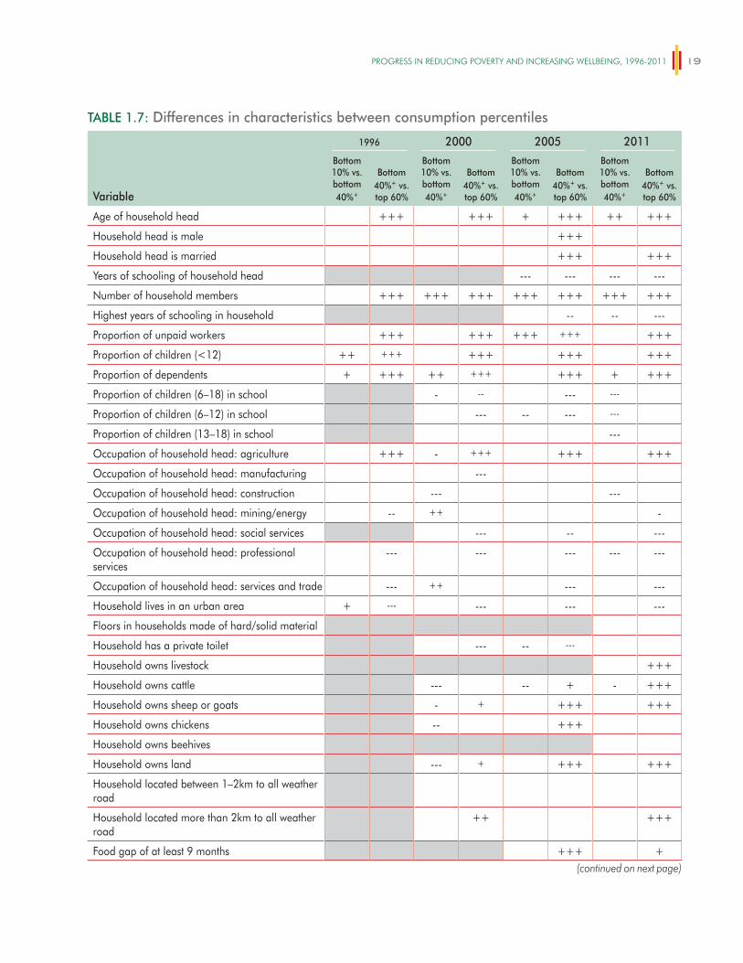
PROgReSS iN ReDUCiNg POveRTy AND iNCReASiNg WellBeiNg, 1996-2011 19
TABLE 1.7: Differences in characteristics between consumption percentiles
Variable
1996 2000 2005 2011
Bottom 10% vs. bottom 40%+
Bottom 40%+ vs. top 60%
Bottom 10% vs. bottom 40%+
Bottom 40%+ vs. top 60%
Bottom 10% vs. bottom 40%+
Bottom 40%+ vs. top 60%
Bottom 10% vs. bottom 40%+
Bottom 40%+ vs. top 60%
Age of household head +++ +++ + +++ ++ +++
Household head is male +++
Household head is married +++ +++
Years of schooling of household head --- --- --- ---
Number of household members +++ +++ +++ +++ +++ +++ +++
Highest years of schooling in household -- -- ---
Proportion of unpaid workers +++ +++ +++ +++ +++
Proportion of children (<12) ++ +++ +++ +++ +++
Proportion of dependents + +++ ++ +++ +++ + +++
Proportion of children (6–18) in school - -- --- ---
Proportion of children (6–12) in school --- -- --- ---
Proportion of children (13–18) in school ---
Occupation of household head: agriculture +++ - +++ +++ +++
Occupation of household head: manufacturing ---
Occupation of household head: construction --- ---
Occupation of household head: mining/energy -- ++ -
Occupation of household head: social services --- -- ---
Occupation of household head: professional services
--- --- --- --- ---
Occupation of household head: services and trade --- ++ --- ---
Household lives in an urban area + --- --- --- ---
Floors in households made of hard/solid material
Household has a private toilet --- -- ---
Household owns livestock +++
Household owns cattle --- -- + - +++
Household owns sheep or goats - + +++ +++
Household owns chickens -- +++
Household owns beehives
Household owns land --- + +++ +++
Household located between 1–2km to all weather road
Household located more than 2km to all weather road
++ +++
Food gap of at least 9 months +++ +(continued on next page)
ETHIOPIA – POVERTY ASSESSMENT20
However this is not always the case and on some key characteristics such as sector of occupation and remoteness, households in the bottom decile are no different from other households in the bottom 40%. For example individuals in the bottom 10% are no more likely engaged in agriculture than others in the bottom 40% and as such are not likely to own more agricultural assets. They are no more remote than others in the bottom 40%.
Children in households in the bottom decile are less likely to go to school even though there is no longer a difference between other households in the bottom 40% and those in the top 60% of the con-sumption distribution. Children of those in the sec-ond to fourth decile were historically less likely to be in school, however this changed in 2011. Large gains in school enrollment have been achieved between 2005
and 2011 in Ethiopia and with these gains, the his-toric disparity in enrollment rates between those in the second to fourth decile and wealthier households were no longer present. However the difference between the bottom decile and those in the 2nd to 4th increased dur-ing this time. Although barriers to school enrollment may not be a concern for many in the bottom 40% in today’s Ethiopia, they are still significant among the lowest decile. Woldehanna et al. (2011) document that parental poverty, a need to work, and illnesses are the main reason for non-attendance.
Broad based growth for the poor is aided by high food prices given that many of these house-holds are net-sellers, but the poorest decile has a significantly higher proportion of marginal agricul-tural producers (households that produce very little, i.e. not more than three months of consumption
TABLE 1.7: Differences in characteristics between consumption percentiles
Variable
1996 2000 2005 2011
Bottom 10% vs. bottom 40%+
Bottom 40%+ vs. top 60%
Bottom 10% vs. bottom 40%+
Bottom 40%+ vs. top 60%
Bottom 10% vs. bottom 40%+
Bottom 40%+ vs. top 60%
Bottom 10% vs. bottom 40%+
Bottom 40%+ vs. top 60%
Food gap of 6–8 months + +++ ++ +
Food gap of 3–5 months +++ +++ + +++
Food gap < 3 months --- --- --- ---
Household shock: drought ++ ++
Household shock to food prices (price rise) ++
Household shock: illness or death of member
Non-agricultural household --- ---
Months covered by crop production for agr. hh: 10+
--- --- --- --- - ---
Months covered by crop production for agr. hh: 7 to 9
-- +
Months covered by crop production for agr. hh: 4 to 6
+++ +++ ++ +++
Months covered by crop production for agr. hh: 0 to 3
+++ +++ +++ ++ ++
Source: Own calculations using HICES 2000, HICES 2005 and HCES 2011. Notes: Grey boxes indicate lack of data for estimation. +, ++ and +++ indicate a significant positive difference for the poorer group at a significance level of 10%, 5% and 1%. -, -- and --- denote negative differences accordingly. +Bottom 40% refers to those in the bottom 40% of the consumption distribution, without including the bottom 10%. The food gap refers to the number of months during which the household faced a food shortage during the last 12 months.
(continued)
PROgReSS iN ReDUCiNg POveRTy AND iNCReASiNg WellBeiNg, 1996-2011 21
needs) than other households in the bottom 40% and as a result they are more likely to report wel-fare losses as a result of price shocks. Although the HICES have typically not collected information on the size of agricultural production and income of a household, from 2000 to 2011 households were asked to state the number of months the household will be sustained from crop production or the income from crop sales. The number of months covered by crop production was categorized whether produced crops will last for 10 or more months of consumption, for 7–9 months of consumption, for 4–6 months of con-sumption or whether agricultural production covered only three or less months. In 2011, the production of agricultural households in the bottom 10% signifi-cantly more often covered not more than three months compared to the second to third deciles. Thus, a large number of highly marginal agricultural producers exist among the bottom 10%. As such the higher food prices that were present in 2011 specifically hurt the bottom 10% with their large number of marginal agricultural producers. Indeed the poorest 10% of households were more likely to report experiencing a food price shock compared to other households in the bottom 40%, who were no more likely to report experiencing a food price shock than households in the top 60% of the consumption distribution.
The higher proportion of marginal agricultural producers in the poorest decile offers an explana-tion as to why this decile fared badly during a period of high food inflation such as was experi-enced between 2005 to 2011; providing insight into the pattern of consumption growth observed during this period The high food prices that benefit the majority of the agricultural poor in Ethiopia hurt the very poorest decile that continue to be marginal agricultural producers and net consumers. This may well explain why consumption growth was negative for the bottom decile during 2005 to 2011 while other poor households experienced positive consumption growth during this period.
Higher food prices can also impose consider-able welfare costs for those in waged employment if
wages do not adapt. Nationally, few are wage laborers (just 8% of household heads) given the widespread ownership of land (92% of households own land), but in urban areas many more are in wage labor. Headey et al. (2012) examines the degree to which unskilled wages (maids, guards, and casual labor) in 120 urban centers and rural towns in Ethiopia adjusted to the price increases observed in 2008 and 2011. They show that in the short run, wages do not adjust, but that in the longer run they do. It is quite likely that for many the HCES survey was conducted before wages had fully adjusted to food price increases in 2011.
1.5 Outlook: Ending extreme poverty in Ethiopia
Is Ethiopia on a path to end extreme poverty by 2030? The Government of Ethiopia has set ambitious poverty targets in recent years, and it is likely to do so in the second Growth and Transformation Plan, which will be implemented from 2016. This section reports simulation results to examine what poverty rates may be in Ethiopia in the next 5, 10, and 15 years if recent patterns of growth continue. Three scenarios are iden-tified in which the average growth rate is estimated based on recent history:7
� Pessimistic scenario assumes annual average con-sumption growth of 0.8%. This is the consump-tion growth recorded from 2005–2011 when using HICES deflator;
� Intermediate scenario assumes annual average consumption growth of 1.6%. This is the aver-age annual consumption growth recorded from 2000–2011 when the HICES deflator is used; and
� Optimistic scenario assumes annual average consumption growth of 2.5%. This is the aver-age annual consumption growth recorded from 2005–2011 when the CPI deflator is used.
7 The label of the scenarios (pessimistic to optimistic) refers to the aver-age assumed growth rate. It does not imply that growth distribution across the population is ‘better’ in the optimistic scenario than in the pessimistic scenario.
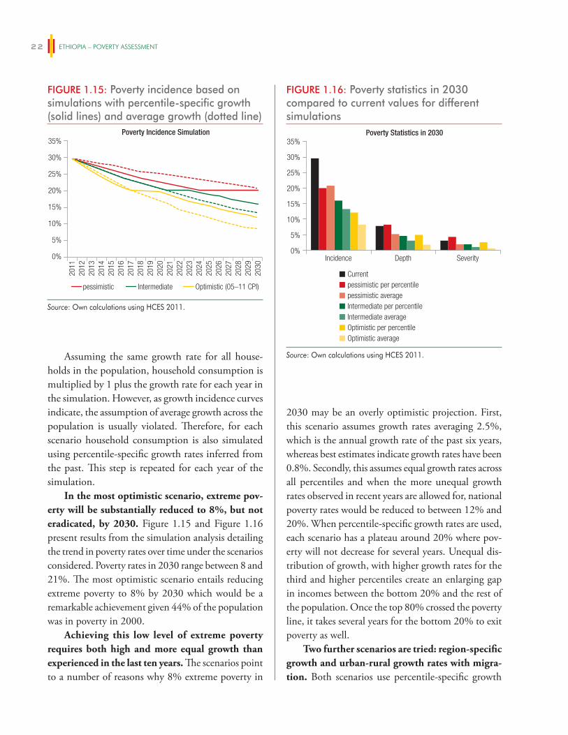
ETHIOPIA – POVERTY ASSESSMENT22
Assuming the same growth rate for all house-holds in the population, household consumption is multiplied by 1 plus the growth rate for each year in the simulation. However, as growth incidence curves indicate, the assumption of average growth across the population is usually violated. Therefore, for each scenario household consumption is also simulated using percentile-specific growth rates inferred from the past. This step is repeated for each year of the simulation.
In the most optimistic scenario, extreme pov-erty will be substantially reduced to 8%, but not eradicated, by 2030. Figure 1.15 and Figure 1.16 present results from the simulation analysis detailing the trend in poverty rates over time under the scenarios considered. Poverty rates in 2030 range between 8 and 21%. The most optimistic scenario entails reducing extreme poverty to 8% by 2030 which would be a remarkable achievement given 44% of the population was in poverty in 2000.
Achieving this low level of extreme poverty requires both high and more equal growth than experienced in the last ten years. The scenarios point to a number of reasons why 8% extreme poverty in
2030 may be an overly optimistic projection. First, this scenario assumes growth rates averaging 2.5%, which is the annual growth rate of the past six years, whereas best estimates indicate growth rates have been 0.8%. Secondly, this assumes equal growth rates across all percentiles and when the more unequal growth rates observed in recent years are allowed for, national poverty rates would be reduced to between 12% and 20%. When percentile-specific growth rates are used, each scenario has a plateau around 20% where pov-erty will not decrease for several years. Unequal dis-tribution of growth, with higher growth rates for the third and higher percentiles create an enlarging gap in incomes between the bottom 20% and the rest of the population. Once the top 80% crossed the poverty line, it takes several years for the bottom 20% to exit poverty as well.
Two further scenarios are tried: region-specific growth and urban-rural growth rates with migra-tion. Both scenarios use percentile-specific growth
FIGURE 1.15: Poverty incidence based on simulations with percentile-specific growth (solid lines) and average growth (dotted line)
2011
2012
2013
2014
2015
2016
2017
2018
2019
2020
2021
2022
2023
2024
2025
2026
2027
2028
2029
2030
pessimistic
Poverty Incidence Simulation
Intermediate Optimistic (05–11 CPI)
0%
5%
10%
15%
20%
25%
30%
35%
Source: Own calculations using HCES 2011.
FIGURE 1.16: Poverty statistics in 2030 compared to current values for different simulations
Incidence Depth Severity
Poverty Statistics in 2030
pessimistic per percentileCurrent
pessimistic averageIntermediate per percentileIntermediate averageOptimistic per percentileOptimistic average
0%
5%
10%
15%
20%
25%
30%
35%
Source: Own calculations using HCES 2011.
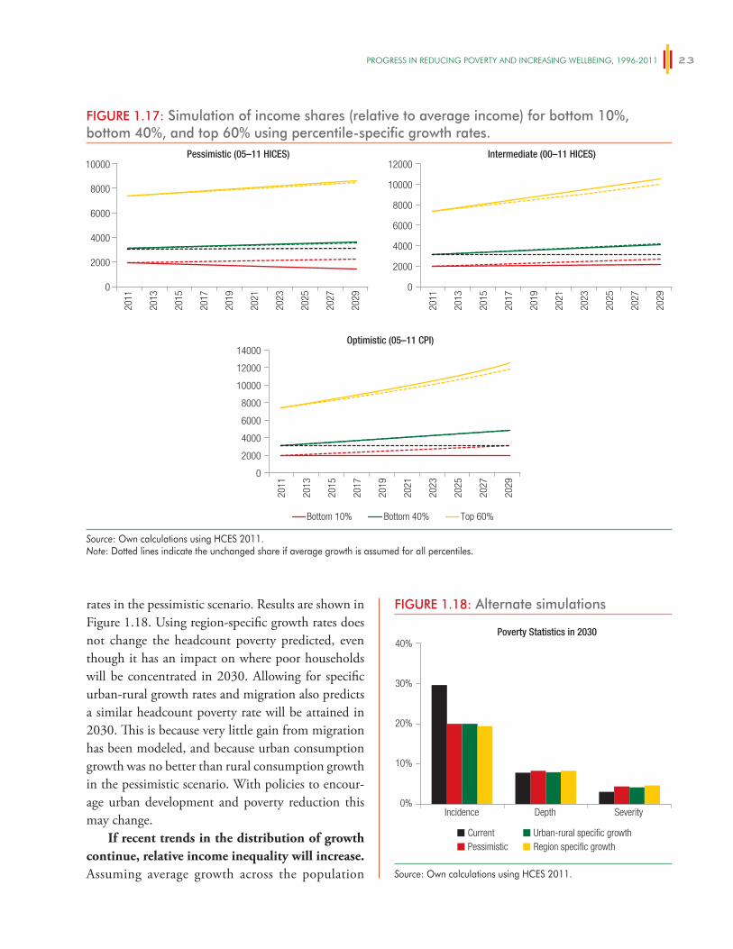
PROgReSS iN ReDUCiNg POveRTy AND iNCReASiNg WellBeiNg, 1996-2011 23
rates in the pessimistic scenario. Results are shown in Figure 1.18. Using region-specific growth rates does not change the headcount poverty predicted, even though it has an impact on where poor households will be concentrated in 2030. Allowing for specific urban-rural growth rates and migration also predicts a similar headcount poverty rate will be attained in 2030. This is because very little gain from migration has been modeled, and because urban consumption growth was no better than rural consumption growth in the pessimistic scenario. With policies to encour-age urban development and poverty reduction this may change.
If recent trends in the distribution of growth continue, relative income inequality will increase. Assuming average growth across the population
FIGURE 1.18: Alternate simulations
Incidence Depth Severity
Poverty Statistics in 2030
PessimisticCurrent Urban-rural specific growth
Region specific growth
0%
10%
20%
30%
40%
Source: Own calculations using HCES 2011.
FIGURE 1.17: Simulation of income shares (relative to average income) for bottom 10%, bottom 40%, and top 60% using percentile-specific growth rates.
Pessimistic (05–11 HICES)
0
2000
4000
6000
8000
2000
4000
6000
8000
10000
2011
2013
2015
2017
2019
2021
2023
2025
2027
2029
2011
2013
2015
2017
2019
2021
2023
2025
2027
2029
2011
2013
2015
2017
2019
2021
2023
2025
2027
2029
Optimistic (05–11 CPI)
0
14000
Intermediate (00–11 HICES)
0
10000
12000
Bottom 10% Bottom 40% Top 60%
2000
4000
6000
8000
10000
12000
Source: Own calculations using HCES 2011.Note: Dotted lines indicate the unchanged share if average growth is assumed for all percentiles.

ETHIOPIA – POVERTY ASSESSMENT24
conserves relative incomes within the population (Figure1.17; dotted lines). If growth is distributed across the population as in past periods, relative incomes can change over time. In fact, the incomes of the bottom 10% will deteriorate from 35% of the average income in 2011 to 21% in 2030 using growth
rates from 2005 to 2011. The bottom 40% are slightly better off but will still lose up to three percentage points from an initial share of 55% to 52% using the optimistic growth scenario. This emphasizes the chal-lenge Ethiopia faces to bring about structural change to ensure high growth, and growth for the poorest.
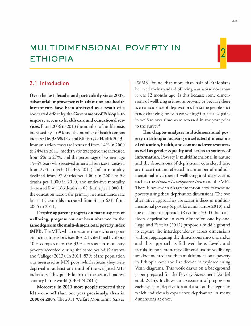
25
MULTIDIMENSIONAL POVERTY IN ETHIOPIA
2.1 Introduction
Over the last decade, and particularly since 2005, substantial improvements in education and health investments have been observed as a result of a concerted effort by the Government of Ethiopia to improve access to health care and educational ser-vices. From 2006 to 2013 the number of health posts increased by 159% and the number of health centers increased by 386% (Federal Ministry of Health 2013). Immunization coverage increased from 14% in 2000 to 24% in 2011, modern contraceptive use increased from 6% to 27%, and the percentage of women age 15–49 years who received antenatal services increased from 27% to 34% (EDHS 2011). Infant mortality declined from 97 deaths per 1,000 in 2000 to 59 deaths per 1,000 in 2010, and under-five mortality decreased from 166 deaths to 88 deaths per 1,000. In the education sector, the primary net attendance rate for 7–12 year olds increased from 42 to 62% from 2005 to 2011,.
Despite apparent progress on many aspects of wellbeing, progress has not been observed to the same degree in the multi-dimensional poverty index (MPI). The MPI, which measures those who are poor on many dimensions (see Box 2.1), declined by about 10% compared to the 33% decrease in monetary poverty recorded during the same period (Carranza and Gallegos 2013). In 2011, 87% of the population was measured as MPI poor, which means they were deprived in at least one third of the weighted MPI indicators. This put Ethiopia as the second poorest country in the world (OPHDI 2014).
Moreover, in 2011 more people reported they felt worse off than one year previously, than in 2000 or 2005. The 2011 Welfare Monitoring Survey
(WMS) found that more than half of Ethiopians believed their standard of living was worse now than it was 12 months ago. Is this because some dimen-sions of wellbeing are not improving or because there is a coincidence of deprivations for some people that is not changing, or even worsening? Or because gains in welfare over time were reversed in the year prior to the survey?
This chapter analyzes multidimensional pov-erty in Ethiopia focusing on selected dimensions of education, health, and command over resources as well as gender equality and access to sources of information. Poverty is multidimensional in nature and the dimensions of deprivation considered here are those that are reflected in a number of multidi-mensional measures of wellbeing and deprivation, such as the Human Development Index and the MPI. There is however a disagreement on how to measure poverty using these deprivation dimensions. The two alternative approaches are scalar indices of multidi-mensional poverty (e.g. Alkire and Santos 2010) and the dashboard approach (Ravallion 2011) that con-siders deprivation in each dimension one by one. Lugo and Ferreira (2012) propose a middle ground to capture the interdependency across dimensions without aggregating the dimensions into one index and this approach is followed here. Levels and trends in non-monetary dimensions of wellbeing are documented and then multidimensional poverty in Ethiopia over the last decade is explored using Venn diagrams. This work draws on a background paper prepared for the Poverty Assessment (Ambel et al. 2014). It allows an assessment of progress on each aspect of deprivation and also on the degree to which individuals experience deprivation in many dimensions at once.
2
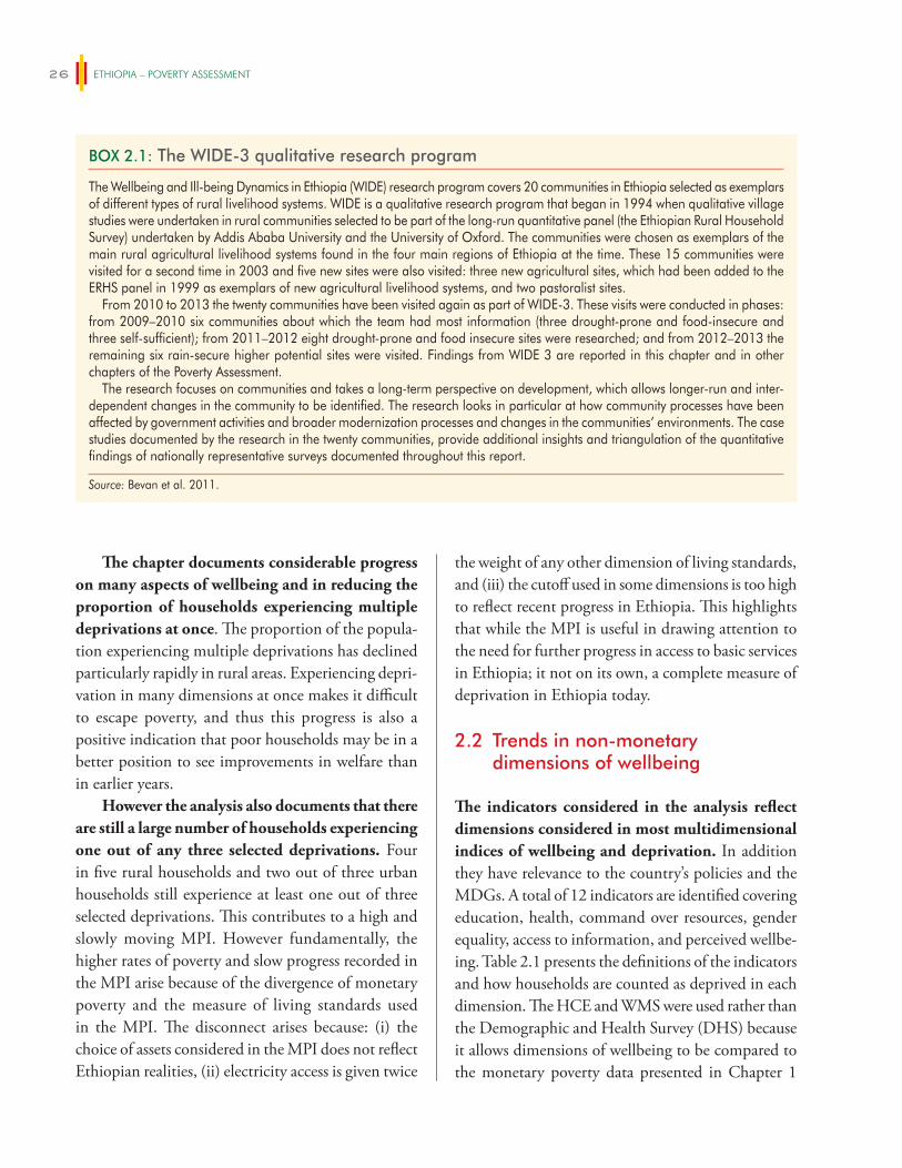
ETHIOPIA – POVERTY ASSESSMENT26
The chapter documents considerable progress on many aspects of wellbeing and in reducing the proportion of households experiencing multiple deprivations at once. The proportion of the popula-tion experiencing multiple deprivations has declined particularly rapidly in rural areas. Experiencing depri-vation in many dimensions at once makes it difficult to escape poverty, and thus this progress is also a positive indication that poor households may be in a better position to see improvements in welfare than in earlier years.
However the analysis also documents that there are still a large number of households experiencing one out of any three selected deprivations. Four in five rural households and two out of three urban households still experience at least one out of three selected deprivations. This contributes to a high and slowly moving MPI. However fundamentally, the higher rates of poverty and slow progress recorded in the MPI arise because of the divergence of monetary poverty and the measure of living standards used in the MPI. The disconnect arises because: (i) the choice of assets considered in the MPI does not reflect Ethiopian realities, (ii) electricity access is given twice
the weight of any other dimension of living standards, and (iii) the cutoff used in some dimensions is too high to reflect recent progress in Ethiopia. This highlights that while the MPI is useful in drawing attention to the need for further progress in access to basic services in Ethiopia; it not on its own, a complete measure of deprivation in Ethiopia today.
2.2 Trends in non-monetary dimensions of wellbeing
The indicators considered in the analysis reflect dimensions considered in most multidimensional indices of wellbeing and deprivation. In addition they have relevance to the country’s policies and the MDGs. A total of 12 indicators are identified covering education, health, command over resources, gender equality, access to information, and perceived wellbe-ing. Table 2.1 presents the definitions of the indicators and how households are counted as deprived in each dimension. The HCE and WMS were used rather than the Demographic and Health Survey (DHS) because it allows dimensions of wellbeing to be compared to the monetary poverty data presented in Chapter 1
BOX 2.1: The WIDE-3 qualitative research program
The Wellbeing and Ill-being Dynamics in Ethiopia (WIDE) research program covers 20 communities in Ethiopia selected as exemplars of different types of rural livelihood systems. WIDE is a qualitative research program that began in 1994 when qualitative village studies were undertaken in rural communities selected to be part of the long-run quantitative panel (the Ethiopian Rural Household Survey) undertaken by Addis Ababa University and the University of Oxford. The communities were chosen as exemplars of the main rural agricultural livelihood systems found in the four main regions of Ethiopia at the time. These 15 communities were visited for a second time in 2003 and five new sites were also visited: three new agricultural sites, which had been added to the ERHS panel in 1999 as exemplars of new agricultural livelihood systems, and two pastoralist sites.
From 2010 to 2013 the twenty communities have been visited again as part of WIDE-3. These visits were conducted in phases: from 2009–2010 six communities about which the team had most information (three drought-prone and food-insecure and three self-sufficient); from 2011–2012 eight drought-prone and food insecure sites were researched; and from 2012–2013 the remaining six rain-secure higher potential sites were visited. Findings from WIDE 3 are reported in this chapter and in other chapters of the Poverty Assessment.
The research focuses on communities and takes a long-term perspective on development, which allows longer-run and inter-dependent changes in the community to be identified. The research looks in particular at how community processes have been affected by government activities and broader modernization processes and changes in the communities’ environments. The case studies documented by the research in the twenty communities, provide additional insights and triangulation of the quantitative findings of nationally representative surveys documented throughout this report.
Source: Bevan et al. 2011.
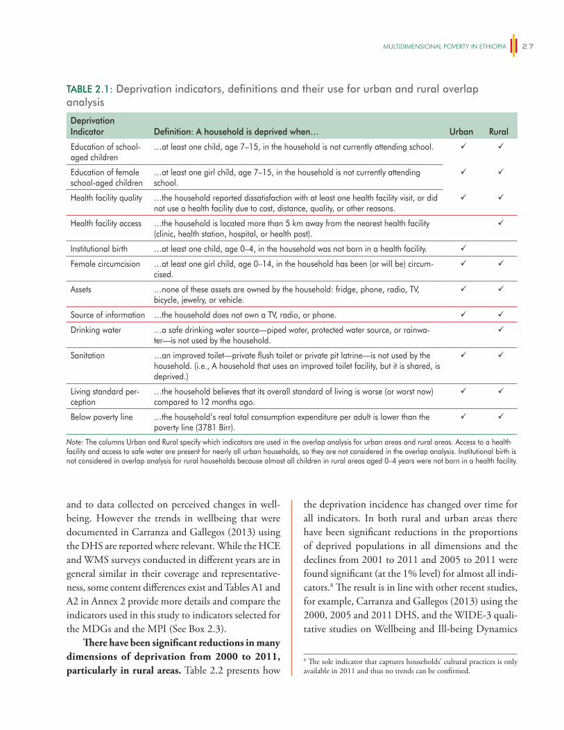
mUlTiDimeNSiONAl POveRTy iN eThiOPiA 27
and to data collected on perceived changes in well-being. However the trends in wellbeing that were documented in Carranza and Gallegos (2013) using the DHS are reported where relevant. While the HCE and WMS surveys conducted in different years are in general similar in their coverage and representative-ness, some content differences exist and Tables A1 and A2 in Annex 2 provide more details and compare the indicators used in this study to indicators selected for the MDGs and the MPI (See Box 2.3).
There have been significant reductions in many dimensions of deprivation from 2000 to 2011, particularly in rural areas. Table 2.2 presents how
the deprivation incidence has changed over time for all indicators. In both rural and urban areas there have been significant reductions in the proportions of deprived populations in all dimensions and the declines from 2001 to 2011 and 2005 to 2011 were found significant (at the 1% level) for almost all indi-cators.8 The result is in line with other recent studies, for example, Carranza and Gallegos (2013) using the 2000, 2005 and 2011 DHS, and the WIDE-3 quali-tative studies on Wellbeing and Ill-being Dynamics
TABLE 2.1: Deprivation indicators, definitions and their use for urban and rural overlap analysis
Deprivation Indicator Definition: A household is deprived when… Urban Rural
Education of school-aged children
…at least one child, age 7–15, in the household is not currently attending school.
Education of female school-aged children
…at least one girl child, age 7–15, in the household is not currently attending school.
Health facility quality …the household reported dissatisfaction with at least one health facility visit, or did not use a health facility due to cost, distance, quality, or other reasons.
Health facility access …the household is located more than 5 km away from the nearest health facility (clinic, health station, hospital, or health post).
Institutional birth …at least one child, age 0–4, in the household was not born in a health facility.
Female circumcision …at least one girl child, age 0–14, in the household has been (or will be) circum-cised.
Assets …none of these assets are owned by the household: fridge, phone, radio, TV, bicycle, jewelry, or vehicle.
Source of information …the household does not own a TV, radio, or phone.
Drinking water …a safe drinking water source—piped water, protected water source, or rainwa-ter—is not used by the household.
Sanitation …an improved toilet—private flush toilet or private pit latrine—is not used by the household. (i.e., A household that uses an improved toilet facility, but it is shared, is deprived.)
Living standard per-ception
…the household believes that its overall standard of living is worse (or worst now) compared to 12 months ago.
Below poverty line …the household’s real total consumption expenditure per adult is lower than the poverty line (3781 Birr).
Note: The columns Urban and Rural specify which indicators are used in the overlap analysis for urban areas and rural areas. Access to a health facility and access to safe water are present for nearly all urban households, so they are not considered in the overlap analysis. Institutional birth is not considered in overlap analysis for rural households because almost all children in rural areas aged 0–4 years were not born in a health facility.
8 The sole indicator that captures households’ cultural practices is only available in 2011 and thus no trends can be confirmed.
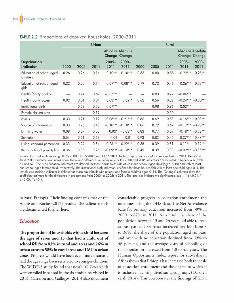
ETHIOPIA – POVERTY ASSESSMENT28
in rural Ethiopia. Their finding confirms that of the Alkire and Roche (2013) results. The salient trends are documented further here.
Education
The proportion of households with a child between the ages of seven and 15 that had a child out of school fell from 83% in rural and areas and 26% in urban areas to 58% in rural areas and 16% in urban areas. Progress would have been even more dramatic had the age range been restricted to younger children. The WIDE-3 study found that nearly all 7-year-olds were enrolled in school in the six study sites visited in 2013. Carranza and Gallegos (2013) also document
considerable progress in education enrollment and outcomes using the DHS data. The Net Attendance Rate for primary education increased from 30% in 2000 to 62% in 2011. As a result the share of the population between 15 and 24 years old able to read at least part of a sentence increased five-fold from 8 to 36%, the share of the population aged six years and over with no education declined from 69% to 46 percent, and the average years of schooling of this population increased from 4.0 to 4.5 years. The Human Opportunity Index report for sub-Saharan Africa shows that Ethiopia has increased both the scale of education enrollment and the degree to which it is inclusive, favoring disadvantaged groups (Dabalen et al. 2014). This corroborates the findings of Khan
TABLE 2.2: Proportions of deprived households, 2000–2011
Urban Rural
Deprivation Indicator 2000 2005 2011
Absolute Change
Absolute Change
2000 2005 2011
Absolute Change
AbsoluteChange
2005–2011
2000–2011
2005–2011
2000–2011
Education of school-aged children
0.26 0.26 0.16 –0.10*** –0.10*** 0.83 0.80 0.58 –0.22*** –0.25***
Education of school-aged girls
0.22 0.23 0.14 –0.09*** –0.08*** 0.79 0.72 0.46 –0.26*** –0.33***
Health facility quality — 0.74 0.67 –0.07*** — — 0.83 0.77 –0.06*** —
Health facility access 0.02 0.01 0.04 0.03*** 0.02** 0.62 0.56 0.32 –0.24*** –0.30***
Institutional birth — 0.59 0.52 –0.07*** — — 0.98 0.96 –0.02*** —
Female circumcision — — 0.19 — — — — 0.30 — —
Assets 0.33 0.21 0.12 –0.08*** –0.21*** 0.86 0.69 0.53 –0.16*** –0.33***
Source of information 0.33 0.25 0.15 –0.10*** –0.18*** 0.86 0.79 0.62 –0.17*** –0.25***
Drinking water 0.08 0.07 0.05 –0.02* –0.03** 0.82 0.77 0.59 –0.18*** –0.23***
Sanitation 0.54 0.51 0.53 0.02 –0.01 0.93 0.83 0.45 –0.37*** –0.48***
Living standard perception 0.33 0.29 0.54 0.26*** 0.22*** 0.38 0.39 0.51 0.11*** 0.12***
Below national poverty line 0.36 0.35 0.26 –0.09*** –0.10*** 0.45 0.39 0.30 –0.09*** –0.15***
Source: Own calculations using HICES 2000, HICES 2005, and HCES 2011. Notes: Deprivation indicators are specified for 2011. Details on these 2011 indicators and notes about the minor differences in definitions for the 2000 and 2005 indicators are included in Appendix A (Table A1 and A2). The two education indicators are defined for those households with at least one school-aged child (aged 7–15) and with at least one school-aged female child, respectively. The institutional birth indicator is defined for those households with at least one child aged 0–4. The female circumcision indicator is defined for those households with at least one female children aged 0–14. The “Change” columns show the coefficient estimate for the difference in proportions from 2000 (or 2005) to 2011. The asterisks indicate the significance level: *** p<0.01, ** p<0.05, * p<0.1.
mUlTiDimeNSiONAl POveRTy iN eThiOPiA 29
et al. (2014), which show that spending on education is higher in more historically disadvantaged areas.
The challenge for Ethiopia is increasing atten-dance rates at higher grades and ensuring that the quality of education received is adequate. The WIDE-3 studies document that student attendance is often irregular and interrupted, and that shortages of teachers and textbooks are common (Bevan, Dom, and Pankhurst 2013, 2014). Although attendance rates for secondary and post-secondary schooling are higher than they were in the past, they are still low. Distance to secondary school can be a major constraint: for those that live too far from a secondary school, attendance entails living away from home, which is expensive.
Health
Since 2000, life expectancy has increased by one year per year from 52 years to 63 years in 2011. Child mortality and morbidity rates improved: the share of children under five who were reported to have an episode of acute respiratory infection, fever, or diarrhea fell from 45 to 27% (Carranza and Gallegos 2013). Although health outcomes such as these are not calculated using the WMS and HCES, health inputs such as access to health centers, access to clean water and sanitation are recorded. These are used as proxies for improvements in health outcomes in the multidimensional analysis that follows.
The proportion of households living further than five km from the nearest health facility almost halved between 2005 and 2011, from 56% to 32 percent, driven largely in part by the establishment of health posts and a system of health extension workers. There have also been improvements in access to quality health facilities in rural areas, but progress has not been as fast as improvements in access and improvements have been slower in urban areas. This is probably due to the challenge associated with improving health facility quality in this short period of time.
There has also been vast improvement regard-ing sanitation and drinking water in rural areas.
The proportion of individuals without access to improved sanitation fell from 93% in 2000 to 45% in 2011 and the proportion of individuals without access to improved water sources fell from 82% to 59 percent. Not only has the proportion of households with improved sanitation increased, the expansion has favored underserved groups (Dabalen et al. 2014).
Government policies for rural areas seem to have been particularly successful in ensuring better access to private toilet facilities and safe drinking water sources. Indeed the WIDE-3 study (see Box 2.1 for more details) found that in all eight of the food insecure communities included in the study, provision of health services, drinking water, and education had expanded considerably since 2003. In the six commu-nities with agricultural potential, access to safe water had greatly improved although there were problems of poorer access for remote residents. Health extension workers had been effective at making people aware of hygiene and environmental sanitation.
However the substantial progress should not overshadow the substantial challenge that remains: almost six out of 10 rural households still do not have access to improved water sources. There were people in seven of the eight food insecure WIDE-3 sites without all-year access to clean water. In the six sites with agricultural potential, access to safe water had improved though there were problems of poorer access for remote residences and slow responses to water point failures. Those without access to clean water were more at risk of infections and there had been an outbreak of cholera in a number of the food insecure communities.
Command over resources and access to information
In addition to the higher levels of monetary expenditure documented in Chapter 1, Ethiopian households today hold more assets than a decade ago. Although taking a narrowly defined set of assets— fridge, phone, radio, TV, bicycle, jewelry, or vehicle—Table 2.2 documents considerable progress
ETHIOPIA – POVERTY ASSESSMENT30
in asset ownership, with deprivation (defined as own-ing none of these assets) among rural households fall-ing from 86% to 53% in rural areas and from 33 to 12% in urban areas. The proportion of households owning livestock has also increased from 74% in 2000 to 83% in 2011, largely representing an increase in ownership of sheep, goats, and poultry. The propor-tion of households owning sheep or goats increased from 39% in 2000 to 51% in 2011 and the proportion of households owning chicken increased from 47% in 2000 to 55% in 2011. This speaks well for vulner-ability in Ethiopia as households with more assets are likely more able to withstand shocks. This is discussed in further detail in Chapter 3.
However, ownership of some types of assets is still quite low: even in 2011 62% of rural house-holds did not have access to a TV, phone, or radio. This is despite the proportion of households owning a mobile phone increasing by almost fifteen times between 2005 and 2011 (Carranza and Gallegos 2013). The lack of access to these “information assets” limits access to outside information. This in turn limits the horizons and aspirations of rural households, especially those in remote places. The 2005 Ethiopia Poverty Assessment documented the high degree of remoteness for many households in Ethiopia. Although there have been improvements in this regard, this data suggests that for many access to outside sources of information remains difficult. This issue is discussed further in Box 2.2. Bernard et al. (2014) show that increased access to information that increases the aspirations window of households in a remote location in Ethiopia has a substantial impact on investments made in children’s education. This suggests that this aspect of deprivation also has substantial economic costs.
However, given the low base from which Ethiopia started, deprivation on some dimensions is still high, particularly in rural areas. Rural house-holds still have more children out of school; about one-third of them still live farther than five kilometers from a health facility, and the practice of female cir-cumcision is still more prevalent in rural areas. Rural
households own fewer assets, and have less access to information and safe drinking water.
2.3 Overlapping deprivations
In this section we look at the extent to which those who are monetarily poor are also deprived in other dimensions. Poverty is a multidimensional concept and this allows us to take a broader look at who is poor in Ethiopia today. Additionally this analysis can pro-vide some insight into the likelihood that households will be able to move out of poverty. In other contexts it has been shown that when a household experiences multiple deprivations at once it is more difficult for the household to move out of poverty.
The analysis examines sets of three indica-tors reflecting the three dimensions of depriva-tion in health, education and command over resources (measured as monetary poverty) used in the UNDP Human Development Index. In the absence of health outcomes, improved sanitation is first used as a measure of access to health. A Venn diagram is presented for sanitation, education, and monetary poverty in Figure 2.1. Circle areas in the diagram represent the proportion of the population with the deprivation. Intersection areas represent the proportion of the population with two, or all three, deprivations. Changes in deprivation are observed in two ways: the change in the size of the circles and the change in the overlap area. Improvements in terms of reduction in a deprivation over time are observed when the circle for the deprivation under consider-ation is smaller now (2011) than it was before (2000 or 2005). Likewise, improvements in reduction in multiple deprivations are illustrated as the three circles move apart.9
9 For example the top left panel in Figure 2.1 shows that 50% of the population was poor, 83% had a child out of school and 93% did not have improved access to sanitation; 43% of poor households were also without sanitation and this area is depicted by the intersecting red and green circles. The poverty rate fell in rural areas from 2000 to 2011 and this is depicted by the red circle decreasing in size. Fewer poor households have children out of school or lack improved sanitation and as a result the red, green and blue circles also move apart from 2000 to 2011.
mUlTiDimeNSiONAl POveRTy iN eThiOPiA 31
In 2000 nearly all rural households that experienced deprivation in monetary wellbeing, education or sanitation experienced it on mul-tiple dimensions, but by 2011 this was no longer the case. In 2000 four out of 10 rural households were deprived in all three dimensions considered; while in 2011 only one in 10 rural households was thus deprived.10 The contrast between rural Ethiopia in 2000 and 2011 is shown quite dramati-cally in the top panel of Figure 2.1. The reductions in deprivation on all three dimensions also resulted in a reduction in the number of households simul-taneously deprived.
Progress in reducing multidimensional depri-vation in urban areas is also evident, but prog-ress has been slower despite lower initial levels of deprivation. The proportion of households deprived in monetary wellbeing, education, and sanitation is much lower in urban areas. Only 9% of households
BOX 2.2: Aspirations and educational investments in rural Ethiopia
Aspirations express goals or desired future states. They have been shown to have an important influence on behavior and economic choices such as choice of occupation and educational investments. Aspirations evolve over time in response to life experience and circumstances and are largely formed by observing the outcomes of individuals whose behaviors they can observe and with whom they can identify.
Researchers from the International Food Policy Research Institute and the University of Oxford measured aspirations in Doba woreda in 2010–11 (Bernard et al. 2014). Doba is historically a food-insecure woreda and the majority of residents are subsistence farmers growing sorghum and maize. Aspirations were measured in four dimensions: income, wealth, social status and children’s educational attainment. For each of these dimensions, respondents were asked what level on this dimension they would like to achieve. Initial levels of aspirations of income and wealth were found to be quite high, 20 times current levels of income and wealth. Most parents aspired to provide 13 years of education for their children. Similarly high aspirations for education attainment have been found in other sites in Ethiopia.
The site selected was very remote—only 13% of surveyed individuals left the woreda more than once a month—and as a result exposure to experience of people outside of the local area was limited. To ascertain whether increasing information would impact aspirations and the sense of control people have about their lives, selected individuals were randomly invited to watch documentaries about people from similar communities who had succeeded in agriculture or small business, without help from government or NGOs. Immediately after the screening of the documentaries, aspirations had increased among those who watched the documentary. Aspirations on the educational attainment of children had increased and six months later aspirations were still higher. Individuals who saw the documentary were also less likely to agree with fatalistic explanations that attribute poverty to luck and fate after six months.
These changes in aspirations and attitudes had a significant effect on the investment behavior of households, particularly with regard to education. The number of children enrolled in school increased by 15% among those who had watched the documentary. These households also had more savings and took more credit (Bernard et al. 2014).
Using data collected as part of the evaluation of the Agricultural Growth Programme (AGP), analysis has also been undertaken to explore rural household’s attitudes to fate and whether they believe that their efforts can be rewarded (Hoddinott et al. 2014). Specifically, it applies the notion of “locus of control.” Someone with an internal locus of control believes that their actions influence events, while someone with an external locus of control believes that forces beyond their control largely shape life’s events. Those with stronger internal locus of control tend to be better-educated individuals, among those who are married and to be men. There is little difference across age until 60 years after which it declines. Although no experimental evaluation has been conducted to assess the causal relationship between locus of control and investment (as in the case of aspirations), individuals with higher internal locus of control were found to be more likely to ensure that girls are attending school and more willing to buy fertilizer and improved seeds.
Source: Bernard et al. 2014, Hoddinott et al. 2014.
10 The proportions of deprivations used to construct all the Venn diagrams in this section are presented in Appendix II. For example, Table A2.2 provides information used in Figure 2.1. The first three rows of Table A2.2 reflect the deprivation incidence for each indicator separately. The first three rows are similar to the values in Table 2.2 (single deprivation analysis). However, in the Venn diagrams the deprivations rates are calculated after having dropped those observations with missing data for any of the three indicators.
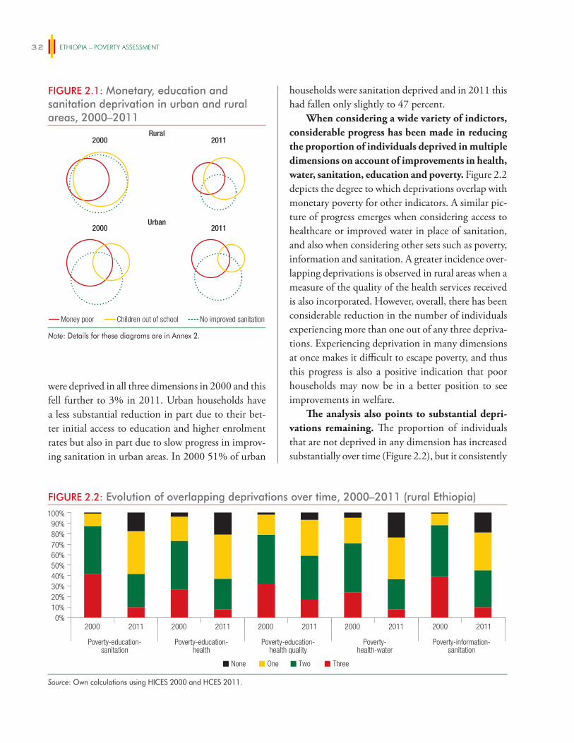
ETHIOPIA – POVERTY ASSESSMENT32
were deprived in all three dimensions in 2000 and this fell further to 3% in 2011. Urban households have a less substantial reduction in part due to their bet-ter initial access to education and higher enrolment rates but also in part due to slow progress in improv-ing sanitation in urban areas. In 2000 51% of urban
FIGURE 2.1: Monetary, education and sanitation deprivation in urban and rural areas, 2000–2011
2000Rural
2011
20112000Urban
Money poor No improved sanitationChildren out of school
Note: Details for these diagrams are in Annex 2.
households were sanitation deprived and in 2011 this had fallen only slightly to 47 percent.
When considering a wide variety of indictors, considerable progress has been made in reducing the proportion of individuals deprived in multiple dimensions on account of improvements in health, water, sanitation, education and poverty. Figure 2.2 depicts the degree to which deprivations overlap with monetary poverty for other indicators. A similar pic-ture of progress emerges when considering access to healthcare or improved water in place of sanitation, and also when considering other sets such as poverty, information and sanitation. A greater incidence over-lapping deprivations is observed in rural areas when a measure of the quality of the health services received is also incorporated. However, overall, there has been considerable reduction in the number of individuals experiencing more than one out of any three depriva-tions. Experiencing deprivation in many dimensions at once makes it difficult to escape poverty, and thus this progress is also a positive indication that poor households may now be in a better position to see improvements in welfare.
The analysis also points to substantial depri-vations remaining. The proportion of individuals that are not deprived in any dimension has increased substantially over time (Figure 2.2), but it consistently
FIGURE 2.2: Evolution of overlapping deprivations over time, 2000–2011 (rural Ethiopia)
0%10%20%30%40%50%60%
80%90%
70%
100%
20112000 20112000 20112000 20112000 20112000
Poverty-education-sanitation
Poverty-education-health
Poverty-education-health quality
Poverty-health-water
Poverty-information-sanitation
ThreeNone TwoOne
Source: Own calculations using HICES 2000 and HCES 2011.
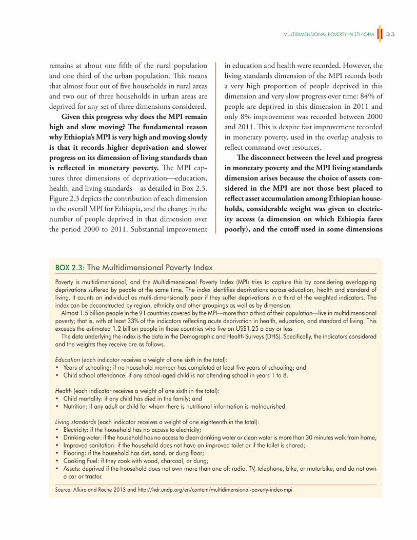
mUlTiDimeNSiONAl POveRTy iN eThiOPiA 33
remains at about one fifth of the rural population and one third of the urban population. This means that almost four out of five households in rural areas and two out of three households in urban areas are deprived for any set of three dimensions considered.
Given this progress why does the MPI remain high and slow moving? The fundamental reason why Ethiopia’s MPI is very high and moving slowly is that it records higher deprivation and slower progress on its dimension of living standards than is reflected in monetary poverty. The MPI cap-tures three dimensions of deprivation—education, health, and living standards—as detailed in Box 2.3. Figure 2.3 depicts the contribution of each dimension to the overall MPI for Ethiopia, and the change in the number of people deprived in that dimension over the period 2000 to 2011. Substantial improvement
in education and health were recorded. However, the living standards dimension of the MPI records both a very high proportion of people deprived in this dimension and very slow progress over time: 84% of people are deprived in this dimension in 2011 and only 8% improvement was recorded between 2000 and 2011. This is despite fast improvement recorded in monetary poverty, used in the overlap analysis to reflect command over resources.
The disconnect between the level and progress in monetary poverty and the MPI living standards dimension arises because the choice of assets con-sidered in the MPI are not those best placed to reflect asset accumulation among Ethiopian house-holds, considerable weight was given to electric-ity access (a dimension on which Ethiopia fares poorly), and the cutoff used in some dimensions
BOX 2.3: The Multidimensional Poverty Index
Poverty is multidimensional, and the Multidimensional Poverty Index (MPI) tries to capture this by considering overlapping deprivations suffered by people at the same time. The index identifies deprivations across education, health and standard of living. It counts an individual as multi-dimensionally poor if they suffer deprivations in a third of the weighted indicators. The index can be deconstructed by region, ethnicity and other groupings as well as by dimension.
Almost 1.5 billion people in the 91 countries covered by the MPI—more than a third of their population—live in multidimensional poverty; that is, with at least 33% of the indicators reflecting acute deprivation in health, education, and standard of living. This exceeds the estimated 1.2 billion people in those countries who live on US$1.25 a day or less
The data underlying the index is the data in the Demographic and Health Surveys (DHS). Specifically, the indicators considered and the weights they receive are as follows.
Education (each indicator receives a weight of one sixth in the total):• Years of schooling: if no household member has completed at least five years of schooling; and• Child school attendance: if any school-aged child is not attending school in years 1 to 8.
Health (each indicator receives a weight of one sixth in the total):• Child mortality: if any child has died in the family; and• Nutrition: if any adult or child for whom there is nutritional information is malnourished.
Living standards (each indicator receives a weight of one eighteenth in the total):• Electricity: if the household has no access to electricity;• Drinking water: if the household has no access to clean drinking water or clean water is more than 30 minutes walk from home;• Improved sanitation: if the household does not have an improved toilet or if the toilet is shared;• Flooring: if the household has dirt, sand, or dung floor;• Cooking Fuel: if they cook with wood, charcoal, or dung;• Assets: deprived if the household does not own more than one of: radio, TV, telephone, bike, or motorbike, and do not own
a car or tractor.
Source: Alkire and Roche 2013 and http://hdr.undp.org/en/content/multidimensional-poverty-index-mpi.
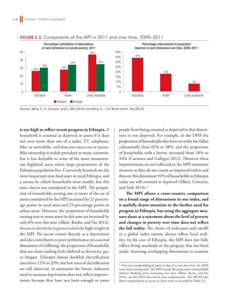
ETHIOPIA – POVERTY ASSESSMENT34
is too high to reflect recent progress in Ethiopia. A household is counted as deprived in assets if it does not own more than one of a radio, TV, telephone, bike, or motorbike, and does not own a car or tractor. Bike ownership is widely prevalent in many countries, but is less desirable in some of the more mountain-ous highland areas where large proportions of the Ethiopia population live. Conversely livestock are the most important non-land asset in rural Ethiopia, and a means by which households store wealth, but this asset class is not considered in the MPI. The propor-tion of households owning one or more of the set of assets considered by the MPI increased by 21 percent-age points in rural areas and 23 percentage points in urban areas. However, the proportion of households owning two or more assets in this asset set increased by only 6% over this time (Alkire, Roche, and Vaz 2014). Access to electricity is given a relatively high weight in the MPI. No access counts directly as a deprivation and also contributes to poor performance on a second dimension of wellbeing: the proportion of households that use clean cooking fuels (defined as electricity, gas, or biogas). Ethiopia almost doubled electrification rates from 12% to 23%, but low rates of electrification are still observed. In sanitation the binary indicator used to measure deprivation does not reflect improve-ments because they have not been enough to move
people from being counted as deprived in that dimen-sion to not deprived. For example, in the DHS the proportion of households that have no toilet has fallen substantially from 82% to 38%, and the proportion of households with a latrine increased from 18% to 54% (Carranza and Gallegos 2012). However these improvements are not reflected in the MPI sanitation measure as they do not count as improved toilets and thus on this dimension 91% of households in Ethiopia today are still counted as deprived (Alkire, Conconi, and Seth 2014).11
The MPI allows a cross-country comparison on a broad range of dimensions in one index, and it usefully draws attention to the further need for progress in Ethiopia, but using the aggregate mea-sure alone as a statement about the level of poverty and changes in poverty over time does not reflect the full reality. The choice of indicators and cutoffs in a global index cannot always reflect local reali-ties. In the case of Ethiopia, the MPI does not fully reflect living standards or the progress that has been made. Assessing overlapping dimensions to examine
11 One non-methodological point is that it is not clear how the DHS water data is being used. The MPI records the proportion of households without drinking water increasing over time (Alkire, Roche, and Vaz 2014), yet the DHS data shows clear improvement. The HICES also shows improvement in access to clean water as recorded in Table 2.2.
FIGURE 2.3: Components of the MPI in 2011 and over time, 2000–2011Percentage contribution of deprivations
of each dimension to overall poverty, 2011
0
10
20
30
40
50
Education Health Living standards Education Health Living standards
Percentage improvement in proportiondeprived in each dimension over time, 2000–2011
0
5%
10%
20%
15%
25%
30%
35%
40%
Ethiopia Average
26%30%
28%
34%
46%
34%
34%
18%
8%
Sources: Alkire, S., A. Conconi, and S. Seth (2014) and Alkire, S., J. M. Roche and A. Vaz (2014).
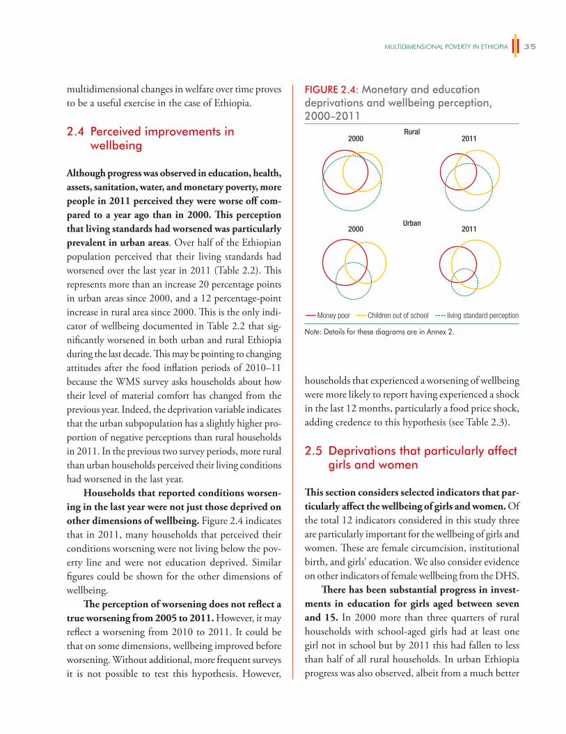
mUlTiDimeNSiONAl POveRTy iN eThiOPiA 35
multidimensional changes in welfare over time proves to be a useful exercise in the case of Ethiopia.
2.4 Perceived improvements in wellbeing
Although progress was observed in education, health, assets, sanitation, water, and monetary poverty, more people in 2011 perceived they were worse off com-pared to a year ago than in 2000. This perception that living standards had worsened was particularly prevalent in urban areas. Over half of the Ethiopian population perceived that their living standards had worsened over the last year in 2011 (Table 2.2). This represents more than an increase 20 percentage points in urban areas since 2000, and a 12 percentage-point increase in rural area since 2000. This is the only indi-cator of wellbeing documented in Table 2.2 that sig-nificantly worsened in both urban and rural Ethiopia during the last decade. This may be pointing to changing attitudes after the food inflation periods of 2010–11 because the WMS survey asks households about how their level of material comfort has changed from the previous year. Indeed, the deprivation variable indicates that the urban subpopulation has a slightly higher pro-portion of negative perceptions than rural households in 2011. In the previous two survey periods, more rural than urban households perceived their living conditions had worsened in the last year.
Households that reported conditions worsen-ing in the last year were not just those deprived on other dimensions of wellbeing. Figure 2.4 indicates that in 2011, many households that perceived their conditions worsening were not living below the pov-erty line and were not education deprived. Similar figures could be shown for the other dimensions of wellbeing.
The perception of worsening does not reflect a true worsening from 2005 to 2011. However, it may reflect a worsening from 2010 to 2011. It could be that on some dimensions, wellbeing improved before worsening. Without additional, more frequent surveys it is not possible to test this hypothesis. However,
households that experienced a worsening of wellbeing were more likely to report having experienced a shock in the last 12 months, particularly a food price shock, adding credence to this hypothesis (see Table 2.3).
2.5 Deprivations that particularly affect girls and women
This section considers selected indicators that par-ticularly affect the wellbeing of girls and women. Of the total 12 indicators considered in this study three are particularly important for the wellbeing of girls and women. These are female circumcision, institutional birth, and girls’ education. We also consider evidence on other indicators of female wellbeing from the DHS.
There has been substantial progress in invest-ments in education for girls aged between seven and 15. In 2000 more than three quarters of rural households with school-aged girls had at least one girl not in school but by 2011 this had fallen to less than half of all rural households. In urban Ethiopia progress was also observed, albeit from a much better
FIGURE 2.4: Monetary and education deprivations and wellbeing perception, 2000–2011
2000Rural
2011
20112000
Money poor living standard perceptionChildren out of school
Urban
Note: Details for these diagrams are in Annex 2.
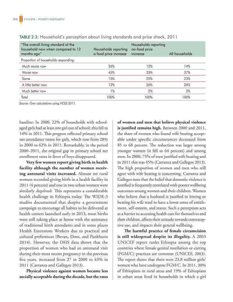
ETHIOPIA – POVERTY ASSESSMENT36
baseline: In 2000, 22% of households with school-aged girls had at least one girl out of school; this fell to 14% in 2011. This progress reflected primary school net attendance ratios for girls, which rose from 28% in 2000 to 62% in 2011. Remarkably, in the period 2000–2011, the original gap in primary school net enrollment rates in favor of boys disappeared.
Very few women report giving birth in health facility although the number of women receiv-ing antenatal visits increased. Almost no rural women recorded giving birth in a health facility in 2011 (4 percent) and one in two urban women were similarly deprived. This represents a considerable health challenge in Ethiopia today. The WIDE-3 studies documented that despite a government campaign to encourage all babies to be delivered at health centers launched early in 2013, most births were still taking place at home with the assistance of traditional birth attendants and in some places Health Extensions Workers due to practical and cultural preferences (Bevan, Dom, and Pankhurst 2014). However, the DHS data shows that the proportion of women who had an antenatal visit during their most recent pregnancy in the previous five years, increased from 27 in 2000 to 43% in 2011 (Carranza and Gallegos 2013).
Physical violence against women became less socially acceptable during the decade, but the rates
of women and men that believe physical violence is justified remains high. Between 2000 and 2011, the share of women who found wife beating accept-able under specific circumstances decreased from 85 to 68 percent. The reduction was larger among younger women (it fell to 64 percent) and among men. In 2000, 75% of men justified wife beating and in 2011 this was 45% (Carranza and Gallegos 2013). The high proportion of women and men who still agree with wife beating is concerning. Carranza and Gallegos note that the belief that domestic violence is justified is frequently correlated with poorer wellbeing outcomes among women and their children. Women who believe that a husband is justified in hitting or beating his wife tend to have a lower sense of entitle-ment, self-esteem, and status. Such a perception acts as a barrier to accessing health care for themselves and their children, affects their attitude towards contracep-tive use, and impacts their general wellbeing.
The harmful practice of female circumcision is still widespread despite its illegality. A 2003 UNICEF report ranks Ethiopia among the top countries where female genital mutilation or cutting (FGM/C) practices are common (UNICEF, 2003). The report shows that there were 23.8 million girls/women who have undergone FGM/C. In 2011, 30% of Ethiopians in rural areas and 19% of Ethiopians in urban areas lived in households in which a girl
TABLE 2.3: Household’s perception about living standards and price shock, 2011
“The overall living standard of the household now when compared to 12 months ago”
Households reportinga food price increase
Households reportingno-food price increase All households
Proportion of households responding:
Much worse now 26% 12% 14%
Worse now 45% 35% 37%
Same 15% 25% 23%
A little better now 13% 26% 24%
Much better now 1% 2% 2%
Total 100% 100% 100%
Source: Own calculations using HCES 2011.
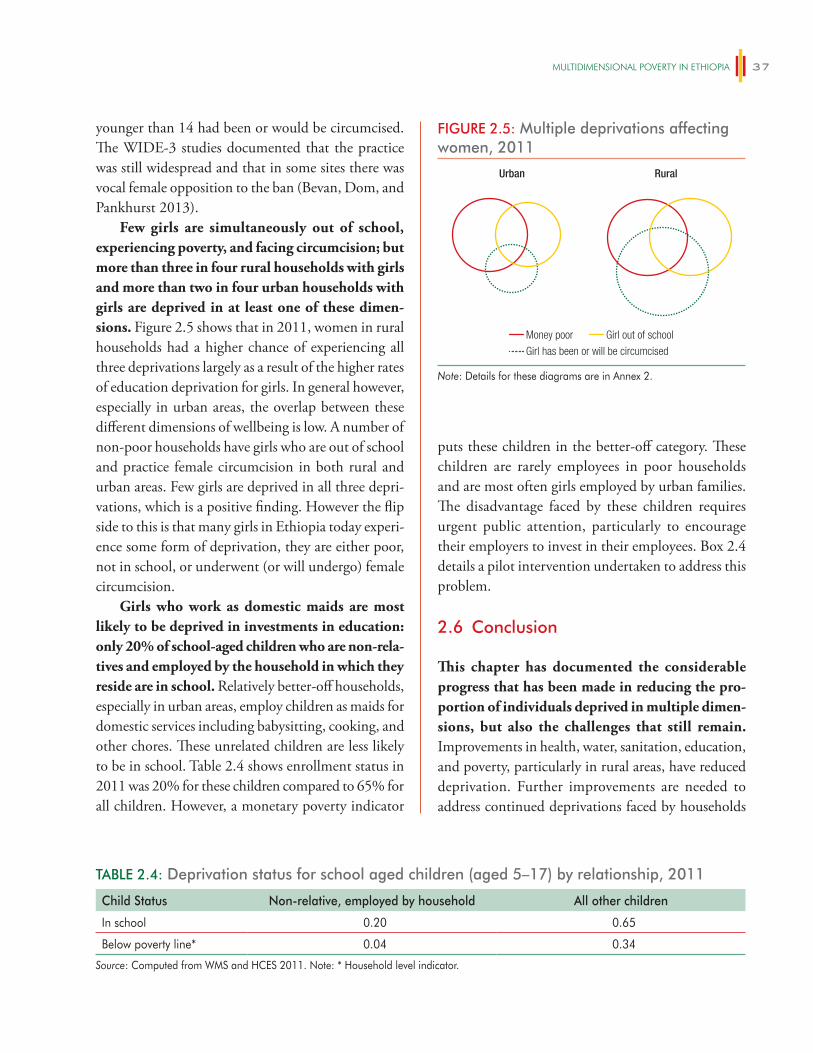
mUlTiDimeNSiONAl POveRTy iN eThiOPiA 37
younger than 14 had been or would be circumcised. The WIDE-3 studies documented that the practice was still widespread and that in some sites there was vocal female opposition to the ban (Bevan, Dom, and Pankhurst 2013).
Few girls are simultaneously out of school, experiencing poverty, and facing circumcision; but more than three in four rural households with girls and more than two in four urban households with girls are deprived in at least one of these dimen-sions. Figure 2.5 shows that in 2011, women in rural households had a higher chance of experiencing all three deprivations largely as a result of the higher rates of education deprivation for girls. In general however, especially in urban areas, the overlap between these different dimensions of wellbeing is low. A number of non-poor households have girls who are out of school and practice female circumcision in both rural and urban areas. Few girls are deprived in all three depri-vations, which is a positive finding. However the flip side to this is that many girls in Ethiopia today experi-ence some form of deprivation, they are either poor, not in school, or underwent (or will undergo) female circumcision.
Girls who work as domestic maids are most likely to be deprived in investments in education: only 20% of school-aged children who are non-rela-tives and employed by the household in which they reside are in school. Relatively better-off households, especially in urban areas, employ children as maids for domestic services including babysitting, cooking, and other chores. These unrelated children are less likely to be in school. Table 2.4 shows enrollment status in 2011 was 20% for these children compared to 65% for all children. However, a monetary poverty indicator
puts these children in the better-off category. These children are rarely employees in poor households and are most often girls employed by urban families. The disadvantage faced by these children requires urgent public attention, particularly to encourage their employers to invest in their employees. Box 2.4 details a pilot intervention undertaken to address this problem.
2.6 Conclusion
This chapter has documented the considerable progress that has been made in reducing the pro-portion of individuals deprived in multiple dimen-sions, but also the challenges that still remain. Improvements in health, water, sanitation, education, and poverty, particularly in rural areas, have reduced deprivation. Further improvements are needed to address continued deprivations faced by households
FIGURE 2.5: Multiple deprivations affecting women, 2011
Urban Rural
Money poor
Girl has been or will be circumcised
Girl out of school
Note: Details for these diagrams are in Annex 2.
TABLE 2.4: Deprivation status for school aged children (aged 5–17) by relationship, 2011
Child Status Non-relative, employed by household All other children
In school 0.20 0.65
Below poverty line* 0.04 0.34
Source: Computed from WMS and HCES 2011. Note: * Household level indicator.
ETHIOPIA – POVERTY ASSESSMENT38
and those that particularly affect women and girls. Few girls are simultaneously out of school, experiencing poverty and facing harmful traditional practices; but more than three in four rural households with girls and two in four urban households with girls are deprived in at least one of these dimensions.
Continued emphasis on the successful delivery of basic services in rural areas is required as well as further attention to the needs of urban households for whom progress has been slower. Khan et al.
BOX 2.4: Learning how to provide education to out-of-school girls in Addis Ababa
Ethiopia has made significant strides in expanding access to education through a range of initiatives, including the alleviation of school fees, social campaigns, and availability of non-formal education. While these initiatives have greatly increased enrollment rates, there is an interest in honing existing policies to extend equity and quality to vulnerable groups. Findings from a recent World Bank research project indicate that out-of-school migrant girls in urban areas are among the disadvantaged, and that it is indeed possible to mobilize them through a community-driven and government-supported approach.
From 2013 to 2014, the World Bank implemented “Powering Up: Social Empowerment for Vulnerable Girls” in partnership with the Addis Ababa City Administration Bureau of Women, Children and Youth Affairs and the Population Council. The project trained local female mentors to mobilize out-of-school, 12–18 year-old girls throughout 17 woredas (districts) in five sub-cities of Addis Ababa city into community-donated “safe spaces” (or girls clubs). The mentors made door-to-door visits to inquire about eligible girls and to convince the head of the household for their approval. At times, repeated visits were necessary to obtain consent. Within club settings, girls participated in non-formal education and life skills training. Where possible, they were mainstreamed into the formal education system with the aid of school material provision.
A demographic and livelihood profiling of the girls revealed that over 90% were rural-to-urban migrants. Two-thirds of the girls had some years of formal schooling, although none had attained education beyond primary school. Almost half were functionally illiterate. Two out of three stated that they had no friends, revealing a disturbing degree of social isolation.
Over a third of girls (34%) lived with their non-relative employers, primarily as domestic workers with an average income of 249 birr a month. One-fifth of these girls also received in-kind payment—mainly food and shelter—equivalent to a value of approximately 325 birr a month.
Project results revealed that constraints to formal school enrollment for a large share of the project participants were not as strong as expected. Substantial increases in enrollment can be achieved by strong nudging of household decision-makers, coupled with appropriate coverage of hidden school costs. Further, results also suggest that girls can easily be absorbed into existing alternative basic education centers as they provide a similarly flexible learning environment as the girls clubs.
Data was also collected on girls who declined participation in Powering Up. Much like the project participants, approximately one-third of the girls (32 out of 100) lived with their non-relative employers. For girls who lived with relatives, household poverty was cited as the major factor affecting the lack of participation, as coping mechanisms are manifested in high demand for child labor. As such, further pilot projects need to be carried to better understand the opportunity costs to education, and on how to strengthen delivery of existing services to ensure that girls receive an education that is suitable to their lifestyle. For those girls who lived with non-relatives as their employees, household heads stated that the girls’ domestic duties were too great for participation in the clubs, indicating minimal or no value placed in their employees’ education. Stronger government encouragement aimed at the employers of these girls is recommended to adequately address the needs of these girls who remain disenfranchised and invisible.
Source: World Bank (2014).
(2014) shows that decentralized spending on public services in Ethiopia is effective in improving outcomes. Expenditure is broadly equal across woredas with the exception that more goes to historically disadvantaged areas. The study also identified that spending on public services has not yet reached decreasing returns, sug-gesting that continued investments in service provision will continue to yield beneficial results. The incidence of public expenditure on education and health is con-sidered further in Chapter 5.
39
THE CHANGING NATURE OF VULNERABILITY IN ETHIOPIA
Wellbeing in Ethiopia has historically been vul-nerable to drought. Almost half of rural households in Ethiopia were affected by drought in a five-year period from 1999 to 2004 (Dercon, Hoddinott, and Woldehanna 2005), and drought had a significant impact on the welfare of these households. The con-sumption levels of those reporting a serious drought were found to be 16% lower than those of the families not affected, and the impact of drought was found to have long-term welfare consequences: those who had suffered the most in the 1984–85 famine were still experiencing lower growth rates in consumption in the 1990s compared to those who had not faced serious problems in the famine (Dercon 2004).
How vulnerable are households in Ethiopia today? Have improvements in many dimensions of wellbeing had an impact on the ability of households to respond to shocks in the future that might hit them? Asset ownership in rural areas is substantially higher today than 10–15 years ago; many more households report themselves being able to raise money to handle an emergency than in the past and markets have also improved, limiting the local price impact of local supply shocks. In addition in recent years, drought in Ethiopia has been increasingly well managed. During the last decade Ethiopia has transitioned from a sys-tem of emergency food aid to one in which many vulnerable households are covered under a safety net program, the Productive Safety Net Program (PSNP). The drought of the mid-1980s caused many deaths with estimates ranging from half a million to over a million (Dercon and Porter 2010). In comparison the drought in 2002 did not cause many deaths and this was similarly the case for 2011.
This chapter examines the extent of vulnerabil-ity in Ethiopia today and the nature of those who
are vulnerable, and what they are most vulnerable too. Section 3.1 discusses the main sources of vulner-ability reported by households in Ethiopia and their impact on consumption. In Section 3.2 approaches to measuring vulnerability are described and rates of vul-nerability are documented. Section 3.3 describes the characteristics of vulnerable households, and Section 3.4 draws conclusions.
3.1 Sources of risk in today’s Ethiopia
Unexpected events that cause ill health, a loss of assets, or a loss of income play a large role in deter-mining the fortunes of many people in the devel-oping world. A study exploring welfare dynamics in rural Kenya and Madagascar found that every poor household interviewed could ultimately trace its pov-erty to an asset or health shock (Barrett et al. 2006). Dercon et al. (2005) show that just under half of rural households in Ethiopia reported to have been affected by drought in a five-year period from 1999 to 2004. Additionally, 43% reported to have been affected by a death in the household and 28% were affected by a serious illness. Even in the absence of social safety nets or private insurance markets, rural households have some informal risk coping mechanisms with which they are able to manage some risk. In the absence of safety nets households accumulate and liquidate assets to smooth consumption and provide mutual support in the form of gifts and transfers. However, poorer households are less able to use their assets to manage risk and mutual support also has its limits. Yilma et al. (2013) find that only 2–5% of households received help from friends, relatives, or neighbors in the case of economic shocks or health shocks, whereas 22–30% reported selling assets, and 18% borrowed to meet the
3
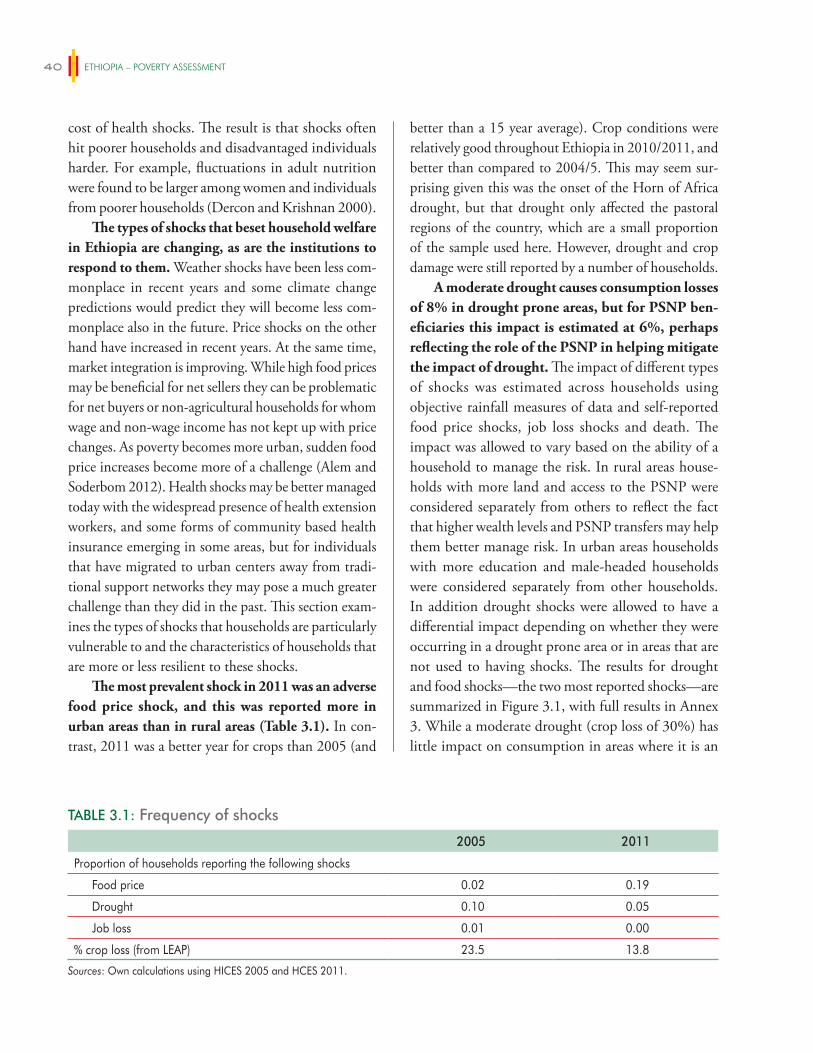
ETHIOPIA – POVERTY ASSESSMENT40
cost of health shocks. The result is that shocks often hit poorer households and disadvantaged individuals harder. For example, fluctuations in adult nutrition were found to be larger among women and individuals from poorer households (Dercon and Krishnan 2000).
The types of shocks that beset household welfare in Ethiopia are changing, as are the institutions to respond to them. Weather shocks have been less com-monplace in recent years and some climate change predictions would predict they will become less com-monplace also in the future. Price shocks on the other hand have increased in recent years. At the same time, market integration is improving. While high food prices may be beneficial for net sellers they can be problematic for net buyers or non-agricultural households for whom wage and non-wage income has not kept up with price changes. As poverty becomes more urban, sudden food price increases become more of a challenge (Alem and Soderbom 2012). Health shocks may be better managed today with the widespread presence of health extension workers, and some forms of community based health insurance emerging in some areas, but for individuals that have migrated to urban centers away from tradi-tional support networks they may pose a much greater challenge than they did in the past. This section exam-ines the types of shocks that households are particularly vulnerable to and the characteristics of households that are more or less resilient to these shocks.
The most prevalent shock in 2011 was an adverse food price shock, and this was reported more in urban areas than in rural areas (Table 3.1). In con-trast, 2011 was a better year for crops than 2005 (and
better than a 15 year average). Crop conditions were relatively good throughout Ethiopia in 2010/2011, and better than compared to 2004/5. This may seem sur-prising given this was the onset of the Horn of Africa drought, but that drought only affected the pastoral regions of the country, which are a small proportion of the sample used here. However, drought and crop damage were still reported by a number of households.
A moderate drought causes consumption losses of 8% in drought prone areas, but for PSNP ben-eficiaries this impact is estimated at 6%, perhaps reflecting the role of the PSNP in helping mitigate the impact of drought. The impact of different types of shocks was estimated across households using objective rainfall measures of data and self-reported food price shocks, job loss shocks and death. The impact was allowed to vary based on the ability of a household to manage the risk. In rural areas house-holds with more land and access to the PSNP were considered separately from others to reflect the fact that higher wealth levels and PSNP transfers may help them better manage risk. In urban areas households with more education and male-headed households were considered separately from other households. In addition drought shocks were allowed to have a differential impact depending on whether they were occurring in a drought prone area or in areas that are not used to having shocks. The results for drought and food shocks—the two most reported shocks—are summarized in Figure 3.1, with full results in Annex 3. While a moderate drought (crop loss of 30%) has little impact on consumption in areas where it is an
TABLE 3.1: Frequency of shocks
2005 2011
Proportion of households reporting the following shocks
Food price 0.02 0.19
Drought 0.10 0.05
Job loss 0.01 0.00
% crop loss (from LEAP) 23.5 13.8
Sources: Own calculations using HICES 2005 and HCES 2011.
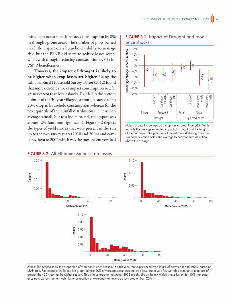
The ChANgiNg NATURe OF vUlNeRABiliTy iN eThiOPiA 41
infrequent occurrence it reduces consumption by 8% in drought-prone areas. The number of plots owned has little impact on a household’s ability to manage risk, but the PSNP did seem to reduce losses some-what, with drought reducing consumption by 6% for PSNP beneficiaries.
However, the impact of drought is likely to be higher when crop losses are higher. Using the Ethiopia Rural Household Survey, Porter (2012) found that more extreme shocks impact consumption to a far greater extent than lesser shocks. Rainfall in the bottom quintile of the 30-year village distribution caused up to 20% drop in household consumption, whereas for the next quintile of the rainfall distribution (i.e. less than average rainfall, but to a lesser extent), the impact was around 2% (and non-significant). Figure 3.2 depicts the types of yield shocks that were present in the run up to the two survey years (2010 and 2004) and com-pares them to 2002 which was the most recent very bad
FIGURE 3.1: Impact of Drought and food price shocks
Infreq Frequent
Drought High food prices
Land
rich
Land
poo
r,no
psn
p
Land
poo
r,ps
np
Educ
ated
Uned
ucat
ed,
fem
ale
Uned
ucat
ed,
mal
e
Rural Urban
Perc
enta
ge c
hang
e in
con
sum
ptio
n
–25%
–20%
–15%
–10%
–5%
0%
5%
10%
15%
–4%
–8%
–8% –6
% –2% 0%
–10%
–13%
Notes: Drought is defined as a crop loss of great than 30%. Points indicate the average estimated impact of drought and the length of the bar depicts the precision of the estimate stretching from one standard deviation below the average to one standard deviation above the average.
FIGURE 3.2: All Ethiopia: Meher crop losses
0
0.05
0.10
0.15
0.20
0 20 40 60
Dens
ity
0
0.05
0.10
0.15
0 20 40 60 80
Dens
ity
0
0.02
0.08
0.06
0.04
0.10
0 20 40 60 80
Dens
ity
Meher-Value 2010 Meher-Value 2005
Meher-Value 2002
Notes: The graphs show the proportion of woredas in each season, in each year, that experienced crop losses of between 0 and 100%, based on LEAP data. For example, in the top left graph, almost 20% of woredas experience no crop loss, and a very few woredas experience crop loss of greater than 20% during the Meher season. This is in contrast to the Meher 2002 graph, directly below, which shows just under 10% that experi-ence no crop loss, but a much higher proportion of woredas that have crop loss greater than 20%.
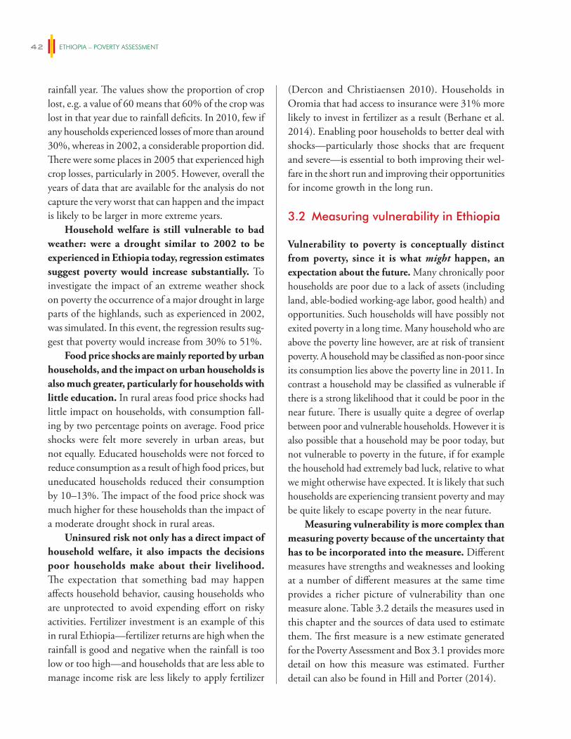
ETHIOPIA – POVERTY ASSESSMENT42
rainfall year. The values show the proportion of crop lost, e.g. a value of 60 means that 60% of the crop was lost in that year due to rainfall deficits. In 2010, few if any households experienced losses of more than around 30%, whereas in 2002, a considerable proportion did. There were some places in 2005 that experienced high crop losses, particularly in 2005. However, overall the years of data that are available for the analysis do not capture the very worst that can happen and the impact is likely to be larger in more extreme years.
Household welfare is still vulnerable to bad weather: were a drought similar to 2002 to be experienced in Ethiopia today, regression estimates suggest poverty would increase substantially. To investigate the impact of an extreme weather shock on poverty the occurrence of a major drought in large parts of the highlands, such as experienced in 2002, was simulated. In this event, the regression results sug-gest that poverty would increase from 30% to 51%.
Food price shocks are mainly reported by urban households, and the impact on urban households is also much greater, particularly for households with little education. In rural areas food price shocks had little impact on households, with consumption fall-ing by two percentage points on average. Food price shocks were felt more severely in urban areas, but not equally. Educated households were not forced to reduce consumption as a result of high food prices, but uneducated households reduced their consumption by 10–13%. The impact of the food price shock was much higher for these households than the impact of a moderate drought shock in rural areas.
Uninsured risk not only has a direct impact of household welfare, it also impacts the decisions poor households make about their livelihood. The expectation that something bad may happen affects household behavior, causing households who are unprotected to avoid expending effort on risky activities. Fertilizer investment is an example of this in rural Ethiopia—fertilizer returns are high when the rainfall is good and negative when the rainfall is too low or too high—and households that are less able to manage income risk are less likely to apply fertilizer
(Dercon and Christiaensen 2010). Households in Oromia that had access to insurance were 31% more likely to invest in fertilizer as a result (Berhane et al. 2014). Enabling poor households to better deal with shocks—particularly those shocks that are frequent and severe—is essential to both improving their wel-fare in the short run and improving their opportunities for income growth in the long run.
3.2 Measuring vulnerability in Ethiopia
Vulnerability to poverty is conceptually distinct from poverty, since it is what might happen, an expectation about the future. Many chronically poor households are poor due to a lack of assets (including land, able-bodied working-age labor, good health) and opportunities. Such households will have possibly not exited poverty in a long time. Many household who are above the poverty line however, are at risk of transient poverty. A household may be classified as non-poor since its consumption lies above the poverty line in 2011. In contrast a household may be classified as vulnerable if there is a strong likelihood that it could be poor in the near future. There is usually quite a degree of overlap between poor and vulnerable households. However it is also possible that a household may be poor today, but not vulnerable to poverty in the future, if for example the household had extremely bad luck, relative to what we might otherwise have expected. It is likely that such households are experiencing transient poverty and may be quite likely to escape poverty in the near future.
Measuring vulnerability is more complex than measuring poverty because of the uncertainty that has to be incorporated into the measure. Different measures have strengths and weaknesses and looking at a number of different measures at the same time provides a richer picture of vulnerability than one measure alone. Table 3.2 details the measures used in this chapter and the sources of data used to estimate them. The first measure is a new estimate generated for the Poverty Assessment and Box 3.1 provides more detail on how this measure was estimated. Further detail can also be found in Hill and Porter (2014).
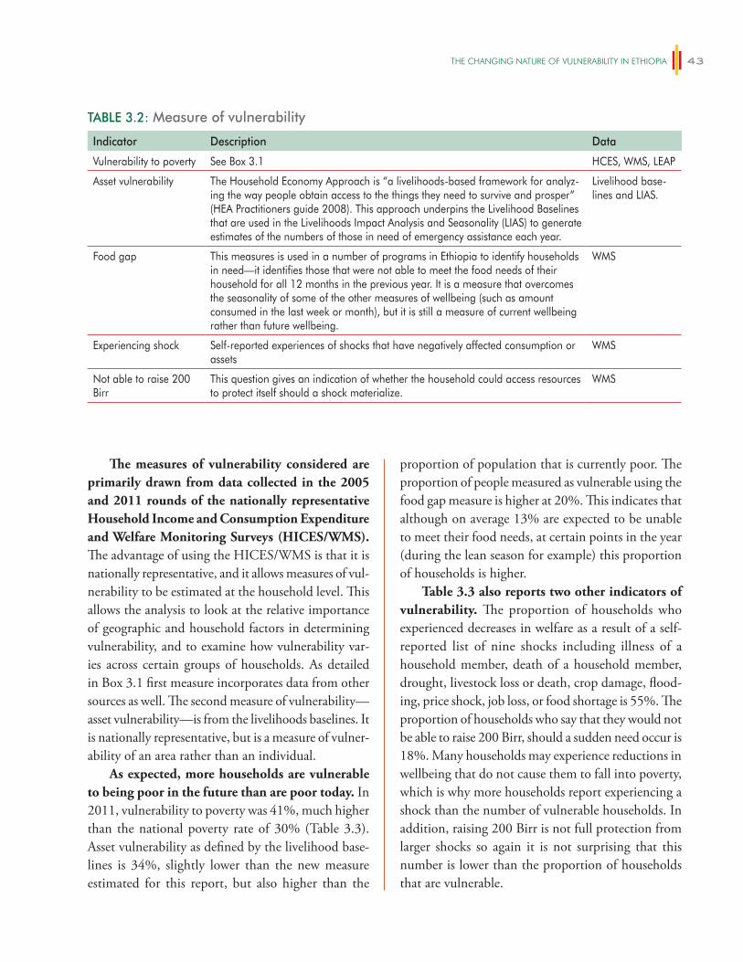
The ChANgiNg NATURe OF vUlNeRABiliTy iN eThiOPiA 43
The measures of vulnerability considered are primarily drawn from data collected in the 2005 and 2011 rounds of the nationally representative Household Income and Consumption Expenditure and Welfare Monitoring Surveys (HICES/WMS). The advantage of using the HICES/WMS is that it is nationally representative, and it allows measures of vul-nerability to be estimated at the household level. This allows the analysis to look at the relative importance of geographic and household factors in determining vulnerability, and to examine how vulnerability var-ies across certain groups of households. As detailed in Box 3.1 first measure incorporates data from other sources as well. The second measure of vulnerability—asset vulnerability—is from the livelihoods baselines. It is nationally representative, but is a measure of vulner-ability of an area rather than an individual.
As expected, more households are vulnerable to being poor in the future than are poor today. In 2011, vulnerability to poverty was 41%, much higher than the national poverty rate of 30% (Table 3.3). Asset vulnerability as defined by the livelihood base-lines is 34%, slightly lower than the new measure estimated for this report, but also higher than the
proportion of population that is currently poor. The proportion of people measured as vulnerable using the food gap measure is higher at 20%. This indicates that although on average 13% are expected to be unable to meet their food needs, at certain points in the year (during the lean season for example) this proportion of households is higher.
Table 3.3 also reports two other indicators of vulnerability. The proportion of households who experienced decreases in welfare as a result of a self-reported list of nine shocks including illness of a household member, death of a household member, drought, livestock loss or death, crop damage, flood-ing, price shock, job loss, or food shortage is 55%. The proportion of households who say that they would not be able to raise 200 Birr, should a sudden need occur is 18%. Many households may experience reductions in wellbeing that do not cause them to fall into poverty, which is why more households report experiencing a shock than the number of vulnerable households. In addition, raising 200 Birr is not full protection from larger shocks so again it is not surprising that this number is lower than the proportion of households that are vulnerable.
TABLE 3.2: Measure of vulnerability
Indicator Description Data
Vulnerability to poverty See Box 3.1 HCES, WMS, LEAP
Asset vulnerability The Household Economy Approach is “a livelihoods-based framework for analyz-ing the way people obtain access to the things they need to survive and prosper” (HEA Practitioners guide 2008). This approach underpins the Livelihood Baselines that are used in the Livelihoods Impact Analysis and Seasonality (LIAS) to generate estimates of the numbers of those in need of emergency assistance each year.
Livelihood base-lines and LIAS.
Food gap This measures is used in a number of programs in Ethiopia to identify households in need—it identifies those that were not able to meet the food needs of their household for all 12 months in the previous year. It is a measure that overcomes the seasonality of some of the other measures of wellbeing (such as amount consumed in the last week or month), but it is still a measure of current wellbeing rather than future wellbeing.
WMS
Experiencing shock Self-reported experiences of shocks that have negatively affected consumption or assets
WMS
Not able to raise 200 Birr
This question gives an indication of whether the household could access resources to protect itself should a shock materialize.
WMS
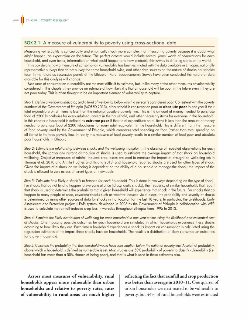
ETHIOPIA – POVERTY ASSESSMENT44
Across most measures of vulnerability, rural households appear more vulnerable than urban households; and relative to poverty rates, rates of vulnerability in rural areas are much higher
reflecting the fact that rainfall and crop production was better than average in 2010–11. One quarter of urban households were estimated to be vulnerable to poverty, but 44% of rural households were estimated
BOX 3.1: A measure of vulnerability to poverty using cross-sectional data
Measuring vulnerability is conceptually and empirically much more complex than measuring poverty because it is about what might happen, an expectation on the future. The perfect dataset would include several years’ worth of observations for each household, and even better, information on what could happen and how probable this is/was in differing states of the world.
This box details how a measure of consumption vulnerability has been estimated with the data available in Ethiopia: nationally representative surveys that do not survey the same household twice, and other data sources on the nature of shocks households face. In the future as successive panels of the Ethiopian Rural Socioeconomic Survey have been conducted the nature of data available for this analysis will change.
Measures of consumption vulnerability are the most difficult to estimate, but unlike many of the other measures of vulnerability considered in this chapter; they provide an estimate of how likely it is that a household will be poor in the future even if they are not poor today. This is often thought to be an important element of vulnerability to capture.
Step 1: Define a wellbeing indicator, and a level of wellbeing, below which a person is considered poor. Consistent with the poverty numbers of the Government of Ethiopia (MOFED 2013), a household is consumption poor or absolute poor in one year if their total expenditure on all items is less than the national absolute poverty line. This is the amount of money needed to purchase food of 2200 kilocalories for every adult-equivalent in the household, and other necessary items for everyone in the household. In this chapter a household is defined as extreme poor if their total expenditure on all items is less than the amount of money needed to purchase food of 2200 kilocalories for every adult-equivalent in the household. This is different from the measure of food poverty used by the Government of Ethiopia, which compares total spending on food (rather than total spending on all items) to the food poverty line. In reality this measure of food poverty results in a similar number of food poor and absolute poor households in Ethiopia.
Step 2: Estimate the relationship between shocks and the wellbeing indicator. In the absence of repeated observations for each household, the spatial and historic distribution of shocks is used to estimate the average impact of that shock on household wellbeing. Objective measures of rainfall-induced crop losses are used to measure the impact of drought on wellbeing (as in Thomas et al. 2010 and Anttila Hughes and Hsiang 2013) and household reported shocks are used for other types of shock. Given the impact of a shock on wellbeing is dependent on the ability of a household to manage the shock; the impact of the shock is allowed to vary across different types of individuals.
Step 3: Calculate how likely a shock is to happen for each household. This is done in two ways depending on the type of shock. For shocks that do not tend to happen to everyone at once (idiosyncratic shocks), the frequency of similar households that report that shock is used to determine the probability that a given household will experience that shock in the future. For shocks that do happen to many people at once, covariate shocks such as weather-induced yield losses, the probability and severity of shocks is determined by using other sources of data for shocks in that location for the last 18 years. In particular, the Livelihoods, Early Assessment and Protection project (LEAP) system, developed in 2008 by the Government of Ethiopia in collaboration with WFP, is used to calculate the rainfall-induced crop loss in woredas throughout Ethiopia from 1995 to 2012.
Step 4: Simulate the likely distribution of wellbeing for each household in one year’s time using the likelihood and estimated cost of shocks. One thousand possible outcomes for each household are simulated in which households experience these shocks according to how likely they are. Each time a household experiences a shock its impact on consumption is calculated using the regression estimates of the impact these shocks have on households. The result is a distribution of likely consumption outcomes for a given household.
Step 5: Calculate the probability that the household would have consumption below the national poverty line. A cutoff of probability, above which a household is defined as vulnerable is set. Most studies use 50% probability of poverty to classify vulnerability (i.e. household has more than a 50% chance of being poor), and that is what is used in these estimates also.
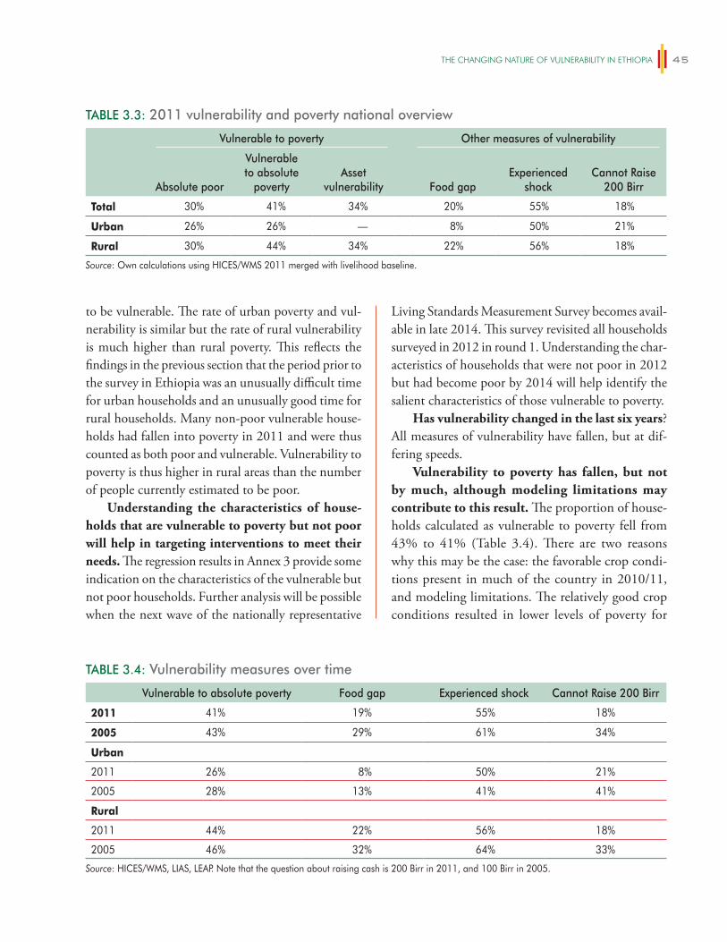
The ChANgiNg NATURe OF vUlNeRABiliTy iN eThiOPiA 45
Living Standards Measurement Survey becomes avail-able in late 2014. This survey revisited all households surveyed in 2012 in round 1. Understanding the char-acteristics of households that were not poor in 2012 but had become poor by 2014 will help identify the salient characteristics of those vulnerable to poverty.
Has vulnerability changed in the last six years? All measures of vulnerability have fallen, but at dif-fering speeds.
Vulnerability to poverty has fallen, but not by much, although modeling limitations may contribute to this result. The proportion of house-holds calculated as vulnerable to poverty fell from 43% to 41% (Table 3.4). There are two reasons why this may be the case: the favorable crop condi-tions present in much of the country in 2010/11, and modeling limitations. The relatively good crop conditions resulted in lower levels of poverty for
to be vulnerable. The rate of urban poverty and vul-nerability is similar but the rate of rural vulnerability is much higher than rural poverty. This reflects the findings in the previous section that the period prior to the survey in Ethiopia was an unusually difficult time for urban households and an unusually good time for rural households. Many non-poor vulnerable house-holds had fallen into poverty in 2011 and were thus counted as both poor and vulnerable. Vulnerability to poverty is thus higher in rural areas than the number of people currently estimated to be poor.
Understanding the characteristics of house-holds that are vulnerable to poverty but not poor will help in targeting interventions to meet their needs. The regression results in Annex 3 provide some indication on the characteristics of the vulnerable but not poor households. Further analysis will be possible when the next wave of the nationally representative
TABLE 3.3: 2011 vulnerability and poverty national overview
Vulnerable to poverty Other measures of vulnerability
Absolute poor
Vulnerable to absolute
povertyAsset
vulnerability Food gapExperienced
shockCannot Raise
200 Birr
Total 30% 41% 34% 20% 55% 18%
Urban 26% 26% — 8% 50% 21%
Rural 30% 44% 34% 22% 56% 18%
Source: Own calculations using HICES/WMS 2011 merged with livelihood baseline.
TABLE 3.4: Vulnerability measures over time
Vulnerable to absolute poverty Food gap Experienced shock Cannot Raise 200 Birr
2011 41% 19% 55% 18%
2005 43% 29% 61% 34%
Urban
2011 26% 8% 50% 21%
2005 28% 13% 41% 41%
Rural
2011 44% 22% 56% 18%
2005 46% 32% 64% 33%
Source: HICES/WMS, LIAS, LEAP. Note that the question about raising cash is 200 Birr in 2011, and 100 Birr in 2005.
ETHIOPIA – POVERTY ASSESSMENT46
many households as higher crop incomes allowed them to consume more. However, the measure of vulnerability to poverty presented here captures the risk of being poor in the future, for example if crop incomes are low. It may be the case that although households were less poor in 2010/11 they were still quite vulnerable to poverty in the future. In the model used to measure vulnerability, vulnerability can only fall between 2005 and 2011 as a result of changes in household characteristics—such as accu-mulation of assets or changing sectors of employ-ment over time—because the model assumes that the returns to these assets (i.e. the relationship between these characteristics and poverty) and the distribution of shocks did not change in these five years. The level of asset accumulation by households between 2005 and 2011 has been enough to reduce vulnerability to absolute poverty, but not by much.
The proportion of rural households experi-encing a shock fell from 64% in 2005 to 56% of households in 2011; however the proportion of urban households experiencing a shock increased from 41% to 50% during this period. Compared to five years ago, the likelihood of reporting a shock has fallen across many regions in the rural areas, with the exception of Somali and SNNP regions. The increase in the proportion of urban households reporting a shock is almost entirely driven by food price shocks.
A very different picture is observed when look-ing at vulnerability measured by the food gap. This perspective suggests that vulnerability has fallen by a third during this five-year period: the proportion of households unable to meet their food during the last 12 months has fallen from 29% to 19%. This may reflect better crop conditions present in 2010/11, but it may also reflect an improvement in asset accumula-tion among households.
3.3 Vulnerable places or vulnerable people?
Unreliable rainfall has historically underpinned much of the discussion on vulnerability in Ethiopia
given the widespread predominance of livelihoods that are dependent on rainfed production systems. This characterization of vulnerability has resulted in a widespread understanding of a geographic footprint of vulnerability. Until recently the Government of Ethiopia framed rural policy discussions around “three Ethiopias:” drought-prone highlands, moisture-reli-able highlands, and pastoral lowlands. This classifica-tion was recently been expanded to a concept of “five Ethiopias” according to agricultural productivity and agroecological conditions (EDRI 2009). The five areas are: drought prone highlands, moisture-reliable cereals areas, moisture-reliable enset areas, humid moisture-reliable lowlands, and pastoral areas.
The idea of a geographic footprint of vulner-ability in Ethiopia has been refined further in the Livelihoods Atlas of Ethiopia. This atlas presents the results of considerable investment in understanding the livelihoods and assets of households in different parts of the country and their vulnerability to different types of risks. Communities are grouped in 173 liveli-hood zones. The atlas also allows mapping of many of the household characteristics that are understood to be deeply related to a vulnerable life, such as the length of the hunger season.
The geographical nature of vulnerability in Ethiopia has influenced the targeting of develop-ment interventions. The PSNP is targeted to address vulnerability in the most food insecure districts in Ethiopia. Interventions in less food insecure woredas have typically not focused on providing a safety net but instead on how to improve agricultural productivity and non-farm income earning enterprises.
Is resilience in Ethiopia primarily driven by geography and in particular, by access to good land and reliable rainfall? How do the food price shocks in recent years fit with this understanding, do they change the geographic centers of vulnerability or is there a case for abandoning a geographical under-standing of vulnerability altogether?
The analysis presented in the following tables suggests that vulnerability does have a geographi-cal footprint in Ethiopia, but that it is not fully
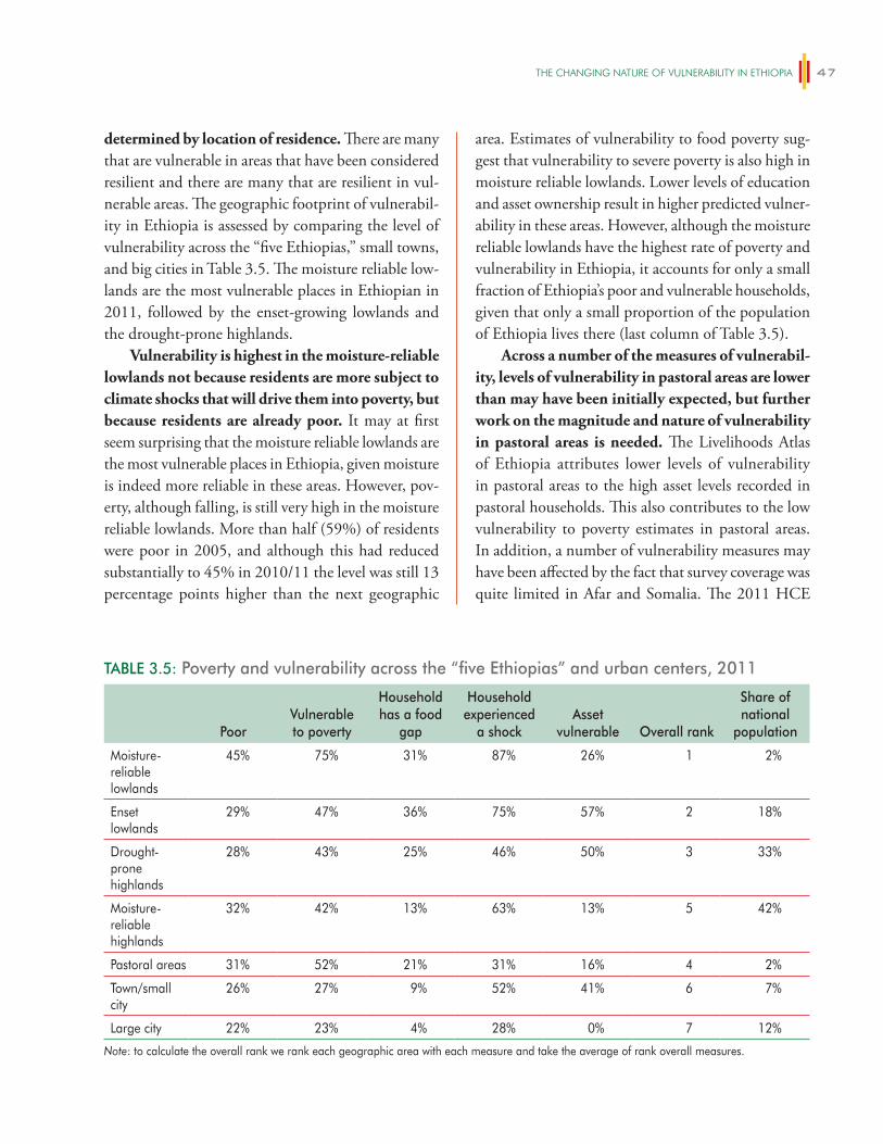
The ChANgiNg NATURe OF vUlNeRABiliTy iN eThiOPiA 47
determined by location of residence. There are many that are vulnerable in areas that have been considered resilient and there are many that are resilient in vul-nerable areas. The geographic footprint of vulnerabil-ity in Ethiopia is assessed by comparing the level of vulnerability across the “five Ethiopias,” small towns, and big cities in Table 3.5. The moisture reliable low-lands are the most vulnerable places in Ethiopian in 2011, followed by the enset-growing lowlands and the drought-prone highlands.
Vulnerability is highest in the moisture-reliable lowlands not because residents are more subject to climate shocks that will drive them into poverty, but because residents are already poor. It may at first seem surprising that the moisture reliable lowlands are the most vulnerable places in Ethiopia, given moisture is indeed more reliable in these areas. However, pov-erty, although falling, is still very high in the moisture reliable lowlands. More than half (59%) of residents were poor in 2005, and although this had reduced substantially to 45% in 2010/11 the level was still 13 percentage points higher than the next geographic
area. Estimates of vulnerability to food poverty sug-gest that vulnerability to severe poverty is also high in moisture reliable lowlands. Lower levels of education and asset ownership result in higher predicted vulner-ability in these areas. However, although the moisture reliable lowlands have the highest rate of poverty and vulnerability in Ethiopia, it accounts for only a small fraction of Ethiopia’s poor and vulnerable households, given that only a small proportion of the population of Ethiopia lives there (last column of Table 3.5).
Across a number of the measures of vulnerabil-ity, levels of vulnerability in pastoral areas are lower than may have been initially expected, but further work on the magnitude and nature of vulnerability in pastoral areas is needed. The Livelihoods Atlas of Ethiopia attributes lower levels of vulnerability in pastoral areas to the high asset levels recorded in pastoral households. This also contributes to the low vulnerability to poverty estimates in pastoral areas. In addition, a number of vulnerability measures may have been affected by the fact that survey coverage was quite limited in Afar and Somalia. The 2011 HCE
TABLE 3.5: Poverty and vulnerability across the “five Ethiopias” and urban centers, 2011
PoorVulnerable to poverty
Household has a food
gap
Household experienced
a shockAsset
vulnerable Overall rank
Share of national
population
Moisture-reliable lowlands
45% 75% 31% 87% 26% 1 2%
Enset lowlands
29% 47% 36% 75% 57% 2 18%
Drought-prone highlands
28% 43% 25% 46% 50% 3 33%
Moisture-reliable highlands
32% 42% 13% 63% 13% 5 42%
Pastoral areas 31% 52% 21% 31% 16% 4 2%
Town/small city
26% 27% 9% 52% 41% 6 7%
Large city 22% 23% 4% 28% 0% 7 12%
Note: to calculate the overall rank we rank each geographic area with each measure and take the average of rank overall measures.
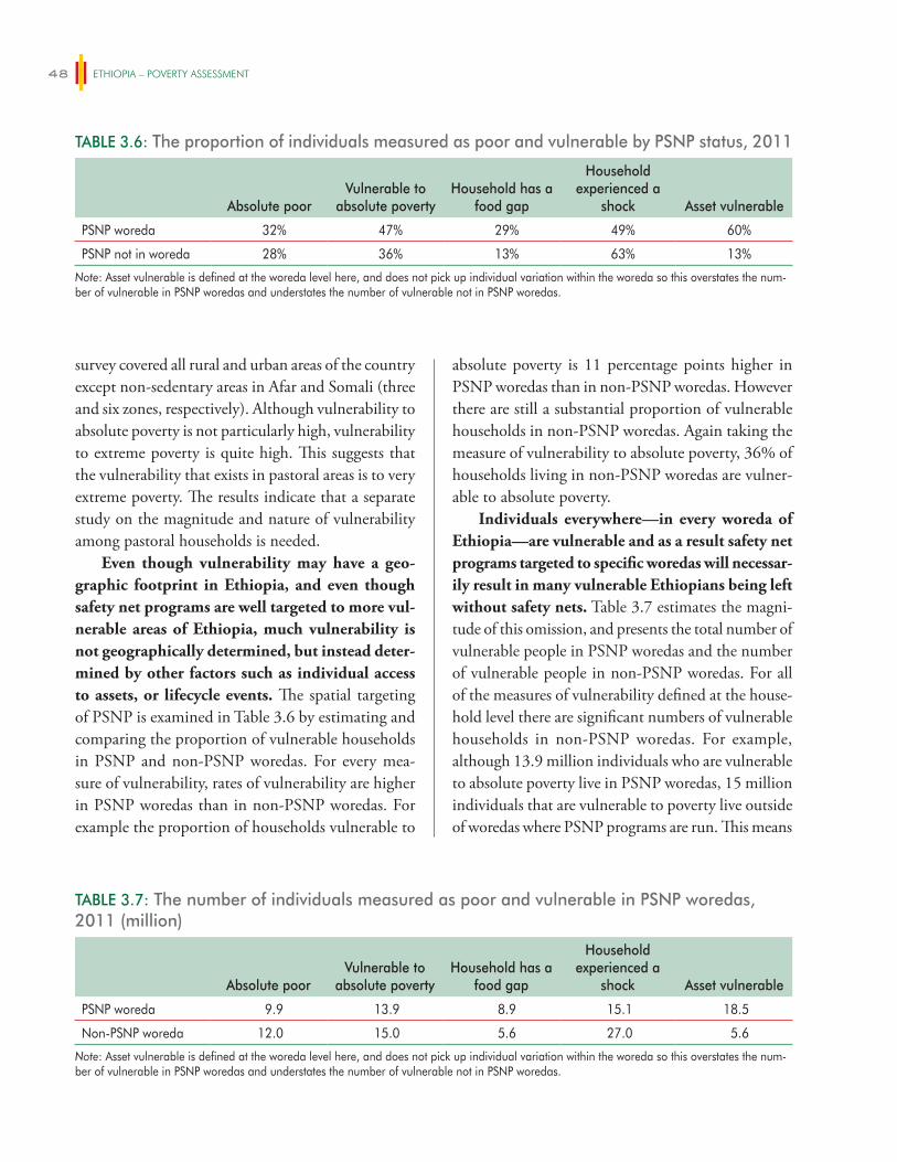
ETHIOPIA – POVERTY ASSESSMENT48
survey covered all rural and urban areas of the country except non-sedentary areas in Afar and Somali (three and six zones, respectively). Although vulnerability to absolute poverty is not particularly high, vulnerability to extreme poverty is quite high. This suggests that the vulnerability that exists in pastoral areas is to very extreme poverty. The results indicate that a separate study on the magnitude and nature of vulnerability among pastoral households is needed.
Even though vulnerability may have a geo-graphic footprint in Ethiopia, and even though safety net programs are well targeted to more vul-nerable areas of Ethiopia, much vulnerability is not geographically determined, but instead deter-mined by other factors such as individual access to assets, or lifecycle events. The spatial targeting of PSNP is examined in Table 3.6 by estimating and comparing the proportion of vulnerable households in PSNP and non-PSNP woredas. For every mea-sure of vulnerability, rates of vulnerability are higher in PSNP woredas than in non-PSNP woredas. For example the proportion of households vulnerable to
absolute poverty is 11 percentage points higher in PSNP woredas than in non-PSNP woredas. However there are still a substantial proportion of vulnerable households in non-PSNP woredas. Again taking the measure of vulnerability to absolute poverty, 36% of households living in non-PSNP woredas are vulner-able to absolute poverty.
Individuals everywhere—in every woreda of Ethiopia—are vulnerable and as a result safety net programs targeted to specific woredas will necessar-ily result in many vulnerable Ethiopians being left without safety nets. Table 3.7 estimates the magni-tude of this omission, and presents the total number of vulnerable people in PSNP woredas and the number of vulnerable people in non-PSNP woredas. For all of the measures of vulnerability defined at the house-hold level there are significant numbers of vulnerable households in non-PSNP woredas. For example, although 13.9 million individuals who are vulnerable to absolute poverty live in PSNP woredas, 15 million individuals that are vulnerable to poverty live outside of woredas where PSNP programs are run. This means
TABLE 3.6: The proportion of individuals measured as poor and vulnerable by PSNP status, 2011
Absolute poorVulnerable to
absolute povertyHousehold has a
food gap
Household experienced a
shock Asset vulnerable
PSNP woreda 32% 47% 29% 49% 60%
PSNP not in woreda 28% 36% 13% 63% 13%
Note: Asset vulnerable is defined at the woreda level here, and does not pick up individual variation within the woreda so this overstates the num-ber of vulnerable in PSNP woredas and understates the number of vulnerable not in PSNP woredas.
TABLE 3.7: The number of individuals measured as poor and vulnerable in PSNP woredas, 2011 (million)
Absolute poorVulnerable to
absolute povertyHousehold has a
food gap
Household experienced a
shock Asset vulnerable
PSNP woreda 9.9 13.9 8.9 15.1 18.5
Non-PSNP woreda 12.0 15.0 5.6 27.0 5.6
Note: Asset vulnerable is defined at the woreda level here, and does not pick up individual variation within the woreda so this overstates the num-ber of vulnerable in PSNP woredas and understates the number of vulnerable not in PSNP woredas.
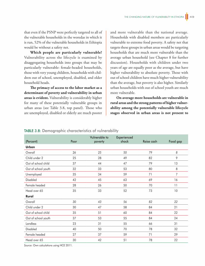
The ChANgiNg NATURe OF vUlNeRABiliTy iN eThiOPiA 49
that even if the PSNP were perfectly targeted to all of the vulnerable households in the woredas in which it is run, 52% of the vulnerable households in Ethiopia would be without a safety net.
Which people are particularly vulnerable? Vulnerability across the lifecycle is examined by disaggregating households into groups that may be particularly vulnerable: female-headed households, those with very young children, households with chil-dren out of school, unemployed, disabled, and older household heads.
The primacy of access to the labor market as a determinant of poverty and vulnerability in urban areas is evident. Vulnerability is considerably higher for many of these potentially vulnerable groups in urban areas (see Table 3.8, top panel). Those who are unemployed, disabled or elderly are much poorer
and more vulnerable than the national average. Households with disabled members are particularly vulnerable to extreme food poverty. A safety net that targets these groups in urban areas would be targeting households that are much more vulnerable than the average urban household (see Chapter 8 for further discussion). Households with children under two years of age are equally poor as the average, but have higher vulnerability to absolute poverty. Those with out of school children have much higher vulnerability than the average, but poverty is also higher. Similarly urban households with out of school youth are much more vulnerable.
On average more households are vulnerable in rural areas and the strong patterns of higher vulner-ability among the potentially vulnerable lifecycle stages observed in urban areas is not present to
TABLE 3.8: Demographic characteristics of vulnerability
(Percent) PoorVulnerable to
povertyExperienced
shock Raise cash Food gap
Urban
Overall 26 25 50 79 8
Child under 2 25 28 49 82 9
Out of school child 37 44 47 79 13
Out of school youth 32 33 53 80 8
Unemployed 35 34 59 71 7
Disabled 42 45 63 69 16
Female headed 28 26 50 70 11
Head over 65 35 33 52 73 10
Rural
Overall 30 43 56 82 22
Child under 2 30 47 58 84 21
Out of school child 35 51 60 84 22
Out of school youth 37 53 55 84 24
Landless 23 31 55 66 31
Disabled 40 50 70 78 32
Female headed 27 37 59 71 29
Head over 65 30 42 51 78 22
Source: Own calculations using HCE 2011.
ETHIOPIA – POVERTY ASSESSMENT50
the same degree in rural areas. The bottom panel of Table 3.8 presents results for rural Ethiopia. The age of the household head is only associated with increased vulnerability in urban areas, not in rural areas. Female-headed households do not appear much poorer or vulnerable in rural areas. This is the same finding as in MOFED (2013) and in Chapter 1. Landless households are also not poorer or vulnerable by any measure, but these are also few in number (4.6% of the population weighted sample).
Vulnerability of households with disabled members (those unable to work due to disability or illness) is an issue in both rural and urban areas, slightly more in urban areas. There is also evidence that those with children under two, and those with out of school youth and out-of-school children are also more vulnerable than the average rural household.
3.4 Summary and conclusion
Vulnerability does have a geographic footprint in Ethiopia and the PSNP is targeted to many of the most vulnerable woredas in Ethiopia. The moisture reliable lowlands are the poorest and most vulnerable places in Ethiopia in 2011, followed by the enset-growing lowlands and the drought-prone highlands. However, much vulnerability is not geographically determined, but instead determined by other factors such as individual access to assets, or lifecycle events. This causes individuals everywhere—in every woreda of Ethiopia—to be vulnerable. For all of the measures of vulnerability defined at the household many vulner-able households are found in non-PSNP woredas. For example, although 13.9 million individuals who are vulnerable to poverty live in PSNP woredas, 15 million individuals that are vulnerable to poverty live outside of woredas where PSNP programs are run. A safety
net program that is targeted to specific woredas will necessarily result in many vulnerable Ethiopians being left without safety nets. Additional interventions will be needed to reduce their vulnerability to shocks.
Rural vulnerability is higher than urban vul-nerability, and higher than rural poverty measures for 2011 might suggest in light of the good rains in the run up to the survey. Some projections of the likely impact of climate change suggest changing weather conditions may bring about improvements in yields and wellbeing (for example see Robinson et al. 2013) but variability in yields will also increase. This is likely to be particularly high as farmers learn about new weather patterns and adapt their produc-tion technologies to the changes they bring. Helping farmers mitigate the impact of production losses on consumption is essential for reducing vulnerability. Further strengthening of rural safety nets through broadening the geographical reach of the PSNP (particularly to vulnerable areas in the lowlands) and ensuring the PSNP can scale up effectively at times of drought will increase the resilience of rural house-holds. However other mechanisms are also needed to help provide additional insurance to farmers, as it is not realistic to expect a publicly financed safety net to fully insure households against weather risk.
Although urban vulnerability is much lower than rural vulnerability, one quarter of urban households are vulnerable. The nature of risk faced by rural households is quite different. Food price shocks comprise a major risk—and the types of house-holds that are vulnerable in rural areas are also differ-ent in urban areas, with labor market access being a primary determinant of vulnerability. An urban safety net can reduce the vulnerability of urban households, but it will need to be a very different type of safety net than the rural-based PSNP.

51
DRIVERS OF POVERTY REDUCTION IN ETHIOPIA
There are many possible factors that could have contributed to Ethiopia’s impressive performance in reducing poverty in recent years. Ethiopia has experienced high and consistent economic growth, recording annual per capita growth rates of 8.3% in the last decade, driven largely by growth in services and agriculture (World Bank 2013). Substantial improvements in the provision of safety nets and basic services were also taking place at this time. Ethiopia introduced the Productive Safety Net Programme in 2005, a large rural safety net targeted to those parts of Ethiopia where reliance on food aid had been highest. Expansion of the provision of education and health services also increased from a low base during this time, supported by the Provision of Basic Services Program. In addition, Ethiopia witnessed tremendous investment in infrastructure and market development during this period. Road networks expanded reducing remoteness, integrating markets and reducing market-ing margins (Minten et al. 2012).
This chapter explores the type of growth and investments in public goods that drove reductions in poverty and improvements in wellbeing. It exploits variation in poverty reduction, sectoral output growth and provision of public goods across zones and time to examine what has been driving changes in poverty over the period of 1996 to 2011 in Ethiopia. The analysis examines the extent to which growth drove changes in poverty reduction, and what type of growth—output growth in agriculture, manufacturing or services—was more effective at reducing poverty. The analysis also examines whether safety nets and public good provi-sion more broadly, had an additional effect on poverty reduction by increasing redistribution.
Ethiopia is a country rich in data, which allows an approach to understanding the drivers
of poverty reduction that is not usually possible in sub-Saharan Africa. As described in the previous chapter, the Ethiopian Central Statistical Agency has collected consumption data four times between 1996 and 2011, and in a comparable manner allow-ing changes in poverty to be measured for three time periods for nearly all of Ethiopia’s zones. Multiple surveys and census data are used to construct annual zonal estimates of poverty, economic output, safety net beneficiaries and access to public services and markets. Panel analysis is then used to identify what has been driving changes in poverty over time. This approach has been used in China (Montalvo and Ravallion 2009), India (Datt and Ravallion 1996) and Brazil (Ferreira et al. 2011) but not for any African country. Weather shocks are used to further examine the causal nature of agricultural growth and poverty reduction.
The chapter also examines what type of agri-cultural growth has been most effective at reducing poverty. Agriculture has remained the primary occu-pation of a large proportion of Ethiopian households during this period (Martins 2014). There has been a strong policy focus by the Ethiopian government on encouraging productivity growth in small-holder cereal farming during this period in the Agricultural Development Led Industrialization strategy (ADLI), and its later formulation in the PASDEP and GTP. As part of this strategy the government has spent considerable resources supporting cereal intensifica-tion of smallholder farmers, for example through investments in agricultural extension services and supporting fertilizer distribution. Understanding the effectiveness of this focus and the impact of this strategy on the spatial nature of poverty in Ethiopia is thus important. The results suggest that the
4
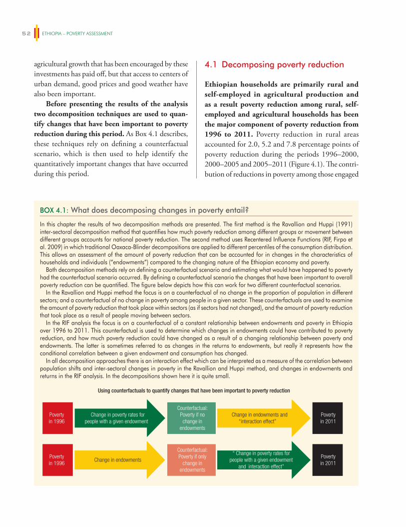
ETHIOPIA – POVERTY ASSESSMENT52
agricultural growth that has been encouraged by these investments has paid off, but that access to centers of urban demand, good prices and good weather have also been important.
Before presenting the results of the analysis two decomposition techniques are used to quan-tify changes that have been important to poverty reduction during this period. As Box 4.1 describes, these techniques rely on defining a counterfactual scenario, which is then used to help identify the quantitatively important changes that have occurred during this period.
4.1 Decomposing poverty reduction
Ethiopian households are primarily rural and self-employed in agricultural production and as a result poverty reduction among rural, self-employed and agricultural households has been the major component of poverty reduction from 1996 to 2011. Poverty reduction in rural areas accounted for 2.0, 5.2 and 7.8 percentage points of poverty reduction during the periods 1996–2000, 2000–2005 and 2005–2011 (Figure 4.1). The contri-bution of reductions in poverty among those engaged
BOX 4.1: What does decomposing changes in poverty entail?
In this chapter the results of two decomposition methods are presented. The first method is the Ravallion and Huppi (1991) inter-sectoral decomposition method that quantifies how much poverty reduction among different groups or movement between different groups accounts for national poverty reduction. The second method uses Recentered Influence Functions (RIF, Firpo et al. 2009) in which traditional Oaxaca-Blinder decompositions are applied to different percentiles of the consumption distribution. This allows an assessment of the amount of poverty reduction that can be accounted for in changes in the characteristics of households and individuals (“endowments”) compared to the changing nature of the Ethiopian economy and poverty.
Both decomposition methods rely on defining a counterfactual scenario and estimating what would have happened to poverty had the counterfactual scenario occurred. By defining a counterfactual scenario the changes that have been important to overall poverty reduction can be quantified. The figure below depicts how this can work for two different counterfactual scenarios.
In the Ravallion and Huppi method the focus is on a counterfactual of no change in the proportion of population in different sectors; and a counterfactual of no change in poverty among people in a given sector. These counterfactuals are used to examine the amount of poverty reduction that took place within sectors (as if sectors had not changed), and the amount of poverty reduction that took place as a result of people moving between sectors.
In the RIF analysis the focus is on a counterfactual of a constant relationship between endowments and poverty in Ethiopia over 1996 to 2011. This counterfactual is used to determine which changes in endowments could have contributed to poverty reduction, and how much poverty reduction could have changed as a result of a changing relationship between poverty and endowments. The latter is sometimes referred to as changes in the returns to endowments, but really it represents how the conditional correlation between a given endowment and consumption has changed.
In all decomposition approaches there is an interaction effect which can be interpreted as a measure of the correlation between population shifts and inter-sectoral changes in poverty in the Ravallion and Huppi method, and changes in endowments and returns in the RIF analysis. In the decompositions shown here it is quite small.
Povertyin 1996
Change in poverty rates forpeople with a given endowment
Counterfactual:Poverty if nochange in
endowments
Change in endowments and“interaction effect”
Povertyin 2011
Povertyin 1996
Change in endowments
Counterfactual:Poverty if only
change inendowments
“ Change in poverty rates forpeople with a given endowment
and interaction effect”
Povertyin 2011
Using counterfactuals to quantify changes that have been important to poverty reduction
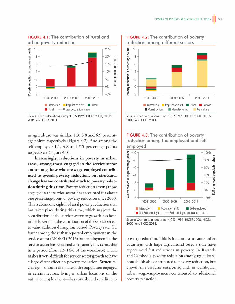
DRiveRS OF POveRTy ReDUCTiON iN eThiOPiA 53
poverty reduction. This is in contrast to some other countries with large agricultural sectors that have experienced fast reductions in poverty. In Rwanda and Cambodia, poverty reduction among agricultural households also contributed to poverty reduction, but growth in non-farm enterprises and, in Cambodia, urban wage-employment contributed to additional poverty reduction.
in agriculture was similar: 1.9, 3.8 and 6.9 percent-age points respectively (Figure 4.2). And among the self-employed: 1.1, 4.8 and 7.5 percentage points respectively (Figure 4.3).
Increasingly, reductions in poverty in urban areas, among those engaged in the service sector and among those who are wage-employed contrib-uted to overall poverty reduction, but structural change has not contributed much to poverty reduc-tion during this time. Poverty reduction among those engaged in the service sector has accounted for about one percentage point of poverty reduction since 2000. This is about one eighth of total poverty reduction that has taken place during this time, which suggests the contribution of the service sector to growth has been much lower than the contribution of the service sector to value addition during this period. Poverty rates fell faster among those that reported employment in the service sector (MOFED 2013) but employment in the service sector has remained consistently low across this time period (from 12–14% of the workforce) which makes it very difficult for service sector growth to have a large direct effect on poverty reduction. Structural change—shifts in the share of the population engaged in certain sectors, living in urban locations or the nature of employment—has contributed very little to
FIGURE 4.1: The contribution of rural and urban poverty reduction
2
0
–2
–4
–6
–8
–10
–5%
0%
5%
10%
15%
20%
25%
Pove
rty
redu
ctio
n in
per
cent
age
poin
ts
Urba
n po
pula
tion
shar
e
1996–2000 2000–2005 2005–2011
Interaction Population shift UrbanRural Urban population share
Source: Own calculations using HICES 1996, HICES 2000, HICES 2005, and HCES 2011.
FIGURE 4.3: The contribution of poverty reduction among the employed and self-employed
2
0
–2
–4
–6
–8
–10
–20%
0%
20%
40%
60%
80%
100%
Pove
rty
redu
ctio
n in
per
cent
age
poin
ts
Self-
empl
oyed
pop
ula6
on s
hare
1996–2000 2000–2005 2005–2011
Interaction Population shift Self-employedSelf-employed population shareNot Self-employed
Source: Own calculations using HICES 1996, HICES 2000, HICES 2005, and HCES 2011.
FIGURE 4.2: The contribution of poverty reduction among different sectors
2
0
–2
–4
–6
–8
–10
Pove
rty
redu
ctio
n in
per
cent
age
poin
ts
1996–2000 2000–2005 2005–2011
Interaction Population shift Other ServiceManufacturing AgricultureConstruction
Source: Own calculations using HICES 1996, HICES 2000, HICES 2005, and HCES 2011.
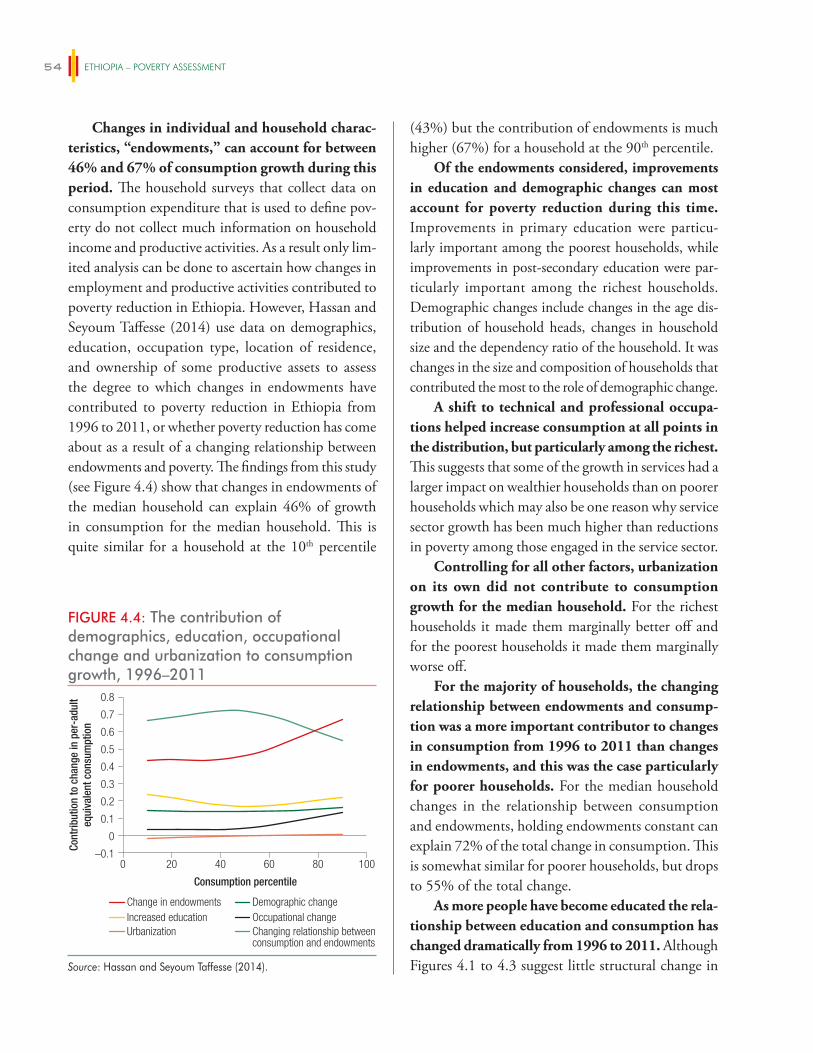
ETHIOPIA – POVERTY ASSESSMENT54
Changes in individual and household charac-teristics, “endowments,” can account for between 46% and 67% of consumption growth during this period. The household surveys that collect data on consumption expenditure that is used to define pov-erty do not collect much information on household income and productive activities. As a result only lim-ited analysis can be done to ascertain how changes in employment and productive activities contributed to poverty reduction in Ethiopia. However, Hassan and Seyoum Taffesse (2014) use data on demographics, education, occupation type, location of residence, and ownership of some productive assets to assess the degree to which changes in endowments have contributed to poverty reduction in Ethiopia from 1996 to 2011, or whether poverty reduction has come about as a result of a changing relationship between endowments and poverty. The findings from this study (see Figure 4.4) show that changes in endowments of the median household can explain 46% of growth in consumption for the median household. This is quite similar for a household at the 10th percentile
(43%) but the contribution of endowments is much higher (67%) for a household at the 90th percentile.
Of the endowments considered, improvements in education and demographic changes can most account for poverty reduction during this time. Improvements in primary education were particu-larly important among the poorest households, while improvements in post-secondary education were par-ticularly important among the richest households. Demographic changes include changes in the age dis-tribution of household heads, changes in household size and the dependency ratio of the household. It was changes in the size and composition of households that contributed the most to the role of demographic change.
A shift to technical and professional occupa-tions helped increase consumption at all points in the distribution, but particularly among the richest. This suggests that some of the growth in services had a larger impact on wealthier households than on poorer households which may also be one reason why service sector growth has been much higher than reductions in poverty among those engaged in the service sector.
Controlling for all other factors, urbanization on its own did not contribute to consumption growth for the median household. For the richest households it made them marginally better off and for the poorest households it made them marginally worse off.
For the majority of households, the changing relationship between endowments and consump-tion was a more important contributor to changes in consumption from 1996 to 2011 than changes in endowments, and this was the case particularly for poorer households. For the median household changes in the relationship between consumption and endowments, holding endowments constant can explain 72% of the total change in consumption. This is somewhat similar for poorer households, but drops to 55% of the total change.
As more people have become educated the rela-tionship between education and consumption has changed dramatically from 1996 to 2011. Although Figures 4.1 to 4.3 suggest little structural change in
FIGURE 4.4: The contribution of demographics, education, occupational change and urbanization to consumption growth, 1996–2011
–0.1
0
0.1
0.2
0.3
0.4
0.5
0.6
0.7
0.8
Cont
ribut
ion
to c
hang
e in
per
-adu
lteq
uiva
lent
con
sum
ptio
n
Consumption percentile
200 40 60 80 100
Change in endowments Demographic changeIncreased education Occupational changeUrbanization Changing relationship between
consumption and endowments
Source: Hassan and Seyoum Taffesse (2014).
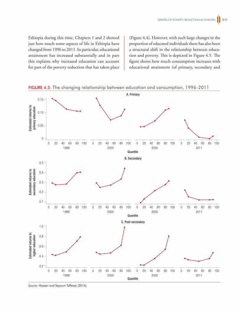
DRiveRS OF POveRTy ReDUCTiON iN eThiOPiA 55
Ethiopia during this time, Chapters 1 and 2 showed just how much some aspects of life in Ethiopia have changed from 1996 to 2011. In particular, educational attainment has increased substantially and in part this explains why increased education can account for part of the poverty reduction that has taken place
(Figure 4.4). However, with such large changes in the proportion of educated individuals there has also been a structural shift in the relationship between educa-tion and poverty. This is depicted in Figure 4.5. The figure shows how much consumption increases with educational attainment (of primary, secondary and
FIGURE 4.5: The changing relationship between education and consumption, 1996–2011
Quantile
Quantile
Quantile
A. Primary
0
0.05
0.10
0.15
0 20 40 60 80 100 0 20 40 60 80 100 0 20 40 60 80 100 0 20 40 601996 2000 2005 2011
1996 2000 2005 2011
1996 2000 2005 2011
80 100
Estim
ated
retu
rns
topr
imar
y ed
ucat
ion
B. Secondary
0.1
0.3
0.2
0.4
0.5
0 20 40 60 80 100 0 20 40 60 80 100 0 20 40 60 80 100 0 20 40 60 80 100
Estim
ated
retu
rns
tose
cond
ary
educ
atio
n
C. Post-secondary
0.2
0.8
0.6
0.4
1.0
0 20 40 60 80 100 0 20 40 60 80 100 0 20 40 60 80 100 0 20 40 60 80 100
Estim
ated
retu
rns
tohi
gher
edu
catio
n
Source: Hassan and Seyoum Taffesse (2014).
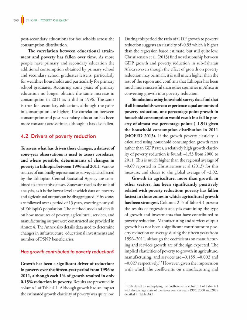
ETHIOPIA – POVERTY ASSESSMENT56
post-secondary education) for households across the consumption distribution.
The correlation between educational attain-ment and poverty has fallen over time. As more people have primary and secondary education the additional consumption obtained by primary school and secondary school graduates lessens, particularly for wealthier households and particularly for primary school graduates. Acquiring some years of primary education no longer obtains the same increase in consumption in 2011 as it did in 1996. The same is true for secondary education, although the gains in consumption are higher. The correlation between consumption and post-secondary education has been more constant across time, although it has also fallen.
4.2 Drivers of poverty reduction
To assess what has driven these changes, a dataset of zone-year observations is used to assess correlates, and where possible, determinants of changes in poverty in Ethiopia between 1996 and 2011. Various sources of nationally representative survey data collected by the Ethiopian Central Statistical Agency are com-bined to create this dataset. Zones are used as the unit of analysis, as it is the lowest level at which data on poverty and agricultural output can be disaggregated. Fifty zones are followed over a period of 15 years, covering nearly all of Ethiopia’s population. The method used and details on how measures of poverty, agricultural, services, and manufacturing output were constructed are provided in Annex 4. The Annex also details data used to determine changes in infrastructure, educational investments and number of PSNP beneficiaries.
Has growth contributed to poverty reduction?
Growth has been a significant driver of reductions in poverty over the fifteen-year period from 1996 to 2011, although each 1% of growth resulted in only 0.15% reduction in poverty. Results are presented in column 1 of Table 4.1. Although growth had an impact the estimated growth elasticity of poverty was quite low.
During this period the ratio of GDP growth to poverty reduction suggests an elasticity of -0.55 which is higher than the regression based estimate, but still quite low. Christiaensen et al. (2013) find no relationship between GDP growth and poverty reduction in sub-Saharan Africa so even though the effect of growth on poverty reduction may be small, it is still much higher than the rest of the region and confirms that Ethiopia has been much more successful than other countries in Africa in converting growth into poverty reduction.
Simulations using household survey data find that if all households were to experience equal amounts of poverty reduction, one percentage point growth in household consumption would result in a fall in pov-erty of almost two percentage points (–1.94) given the household consumption distribution in 2011 (MOFED 2013). If the growth poverty elasticity is calculated using household consumption growth rates rather than GDP rates, a relatively high growth elastic-ity of poverty reduction is found: –1.53 from 2000 to 2011. This is much higher than the regional average of –0.69 reported in Christiaensen et al (2013) for this measure, and closer to the global average of –2.02.
Growth in agriculture, more than growth in other sectors, has been significantly positively related with poverty reduction; poverty has fallen fastest in those zones in which agricultural growth has been strongest. Columns 2–5 of Table 4.1 present the results of regression analysis examining the type of growth and investments that have contributed to poverty reduction. Manufacturing and services output growth has not been a significant contributor to pov-erty reduction on average during the fifteen years from 1996–2011, although the coefficients on manufactur-ing and services growth are of the sign expected. The implied elasticities of poverty to growth in agriculture, manufacturing, and services are –0.155, –0.002 and –0.027 respectively.12 However, given the imprecision with which the coefficients on manufacturing and
12 Calculated by multiplying the coefficients in column 1 of Table 4.1 with the average share of the sector over the years 1996, 2000 and 2005 detailed in Table A4.1.
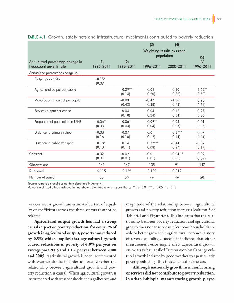
DRiveRS OF POveRTy ReDUCTiON iN eThiOPiA 57
services sector growth are estimated, a test of equal-ity of coefficients across the three sectors (cannot be rejected.
Agricultural output growth has had a strong causal impact on poverty reduction: for every 1% of growth in agricultural output, poverty was reduced by 0.9% which implies that agricultural growth caused reductions in poverty of 4.0% per year on average post 2005 and 1.1% per year between 2000 and 2005. Agricultural growth is been instrumented with weather shocks in order to assess whether the relationship between agricultural growth and pov-erty reduction is causal. When agricultural growth is instrumented with weather shocks the significance and
magnitude of the relationship between agricultural growth and poverty reduction increases (column 5 of Table 4.1 and Figure 4.6). This indicates that the rela-tionship between poverty reduction and agricultural growth does not arise because less poor households are able to better grow their agricultural incomes (a story of reverse causality). Instead it indicates that either measurement error might affect agricultural growth estimates (what is called “attenuation bias”) or agricul-tural growth induced by good weather was particularly poverty reducing. This indeed could be the case.
Although nationally growth in manufacturing or services did not contribute to poverty reduction, in urban Ethiopia, manufacturing growth played
TABLE 4.1: Growth, safety nets and infrastructure investments contributed to poverty reduction
(3) (4)
(1)1996–2011
(2)1996–2011
Weighting results by urban population (5)
IV1996–2011
Annualized percentage change in headcount poverty rate 1996–2011 2000–2011
Annualized percentage change in….
Output per capita –0.15*(0.09)
Agricultural output per capita –0.29**(0.14)
–0.04(0.20)
0.30(0.32)
–1.66**(0.70)
Manufacturing output per capita –0.03(0.42)
–0.47(0.38)
–1.36*(0.73)
0.20(0.61)
Services output per capita –0.04(0.18)
0.04(0.24)
–0.17(0.34)
0.27(0.30)
Proportion of population in PSNP –0.06**(0.03)
–0.06*(0.03)
–0.09**(0.04)
–0.03(0.05)
–0.01(0.05)
Distance to primary school –0.08(0.16)
–0.07(0.16)
0.01(0.12)
0.37**(0.14)
0.07(0.24)
Distance to public transport 0.18*(0.10)
0.14(0.11)
0.22***(0.08)
–0.44(0.37)
–0.02(0.17)
Constant –0.02(0.01)
–0.02**(0.01)
–0.01*(0.01)
–0.04***(0.01)
0.02(0.09)
Observations 147 147 135 91 147
R-squared 0.115 0.129 0.169 0.312
Number of zones 50 50 46 46 50
Source: regression results using data described in Annex 4. Notes: Zonal fixed effects included but not shown. Standard errors in parentheses. *** p<0.01, ** p<0.05, * p<0.1.
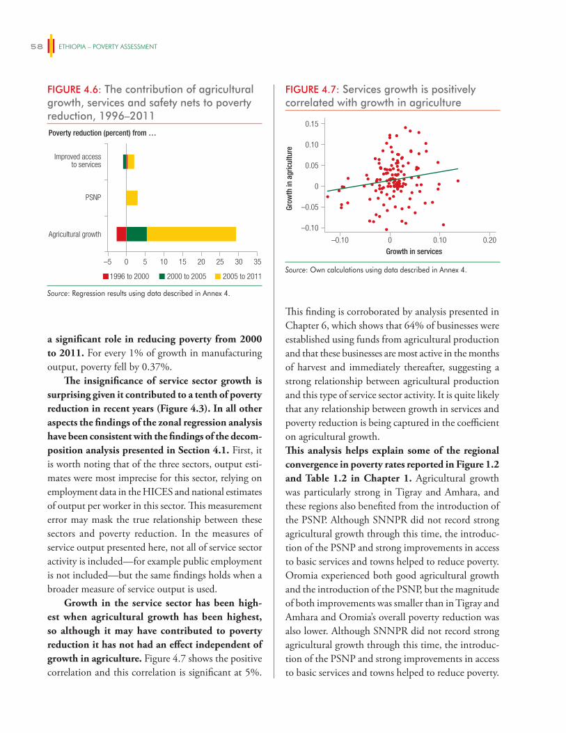
ETHIOPIA – POVERTY ASSESSMENT58
a significant role in reducing poverty from 2000 to 2011. For every 1% of growth in manufacturing output, poverty fell by 0.37%.
The insignificance of service sector growth is surprising given it contributed to a tenth of poverty reduction in recent years (Figure 4.3). In all other aspects the findings of the zonal regression analysis have been consistent with the findings of the decom-position analysis presented in Section 4.1. First, it is worth noting that of the three sectors, output esti-mates were most imprecise for this sector, relying on employment data in the HICES and national estimates of output per worker in this sector. This measurement error may mask the true relationship between these sectors and poverty reduction. In the measures of service output presented here, not all of service sector activity is included—for example public employment is not included—but the same findings holds when a broader measure of service output is used.
Growth in the service sector has been high-est when agricultural growth has been highest, so although it may have contributed to poverty reduction it has not had an effect independent of growth in agriculture. Figure 4.7 shows the positive correlation and this correlation is significant at 5%.
This finding is corroborated by analysis presented in Chapter 6, which shows that 64% of businesses were established using funds from agricultural production and that these businesses are most active in the months of harvest and immediately thereafter, suggesting a strong relationship between agricultural production and this type of service sector activity. It is quite likely that any relationship between growth in services and poverty reduction is being captured in the coefficient on agricultural growth.This analysis helps explain some of the regional convergence in poverty rates reported in Figure 1.2 and Table 1.2 in Chapter 1. Agricultural growth was particularly strong in Tigray and Amhara, and these regions also benefited from the introduction of the PSNP. Although SNNPR did not record strong agricultural growth through this time, the introduc-tion of the PSNP and strong improvements in access to basic services and towns helped to reduce poverty. Oromia experienced both good agricultural growth and the introduction of the PSNP, but the magnitude of both improvements was smaller than in Tigray and Amhara and Oromia’s overall poverty reduction was also lower. Although SNNPR did not record strong agricultural growth through this time, the introduc-tion of the PSNP and strong improvements in access to basic services and towns helped to reduce poverty.
FIGURE 4.7: Services growth is positively correlated with growth in agriculture
–0.10 0 0.10 0.20
Growth in services
–0.10
–0.05
0
0.05
0.10
0.15
Grow
th in
agr
icul
ture
Source: Own calculations using data described in Annex 4.
FIGURE 4.6: The contribution of agricultural growth, services and safety nets to poverty reduction, 1996–2011
–5 0 5 10 15 20 25 30 35
2005 to 20112000 to 20051996 to 2000
Agricultural growth
PSNP
Improved accessto services
Poverty reduction (percent) from …
Source: Regression results using data described in Annex 4.
DRiveRS OF POveRTy ReDUCTiON iN eThiOPiA 59
of improved inputs. The type of agricultural growth that is most associated with poverty reduction is quantitatively explored in Figure 4.8 and Table 4.2 and indicates similar findings.
Recent years have seen high food prices and good rainfall conditions in much of Ethiopia. Food prices increased in Ethiopia over the period 2000–2011 and particularly in the year prior to the survey during which annual food price inflation was 39.2%. Table 4.3 compares food prices increases to other countries and shows that the food price Ethiopia experienced in 2011 was relatively high. In general, weather has been good in Ethiopia in recent years. Figure 4.9 indicates the proportion of farmers
The pastoral regions of Afar and Somali did not experi-ence agricultural growth, and although safety nets were introduced there this alone was not enough for these regions to realize strong gains in poverty reduction.
Understanding the relationship between agricultural growth and poverty reduction
What drove the relationship between agricultural growth and poverty reduction? Box 4.2 presents findings on the type of economic growth that mat-tered in 12 rural communities of the WIDE-3 study in Ethiopia. The findings highlight the importance of good prices, access to markets and increased use
BOX 4.2: Agricultural growth in 12 rural communities
The WIDE research covers 20 communities in Ethiopia selected as exemplars of different types of rural livelihood systems. Research was conducted in 1995, 2003 and 2010–2013. Findings are reported here for six sites with agricultural potential and six agriculturalist food insecure sites for which research was conducted in 2012–13.
In the six communities with agricultural potential, large changes in the local economies since the early 1990s were documented with economic growth in evidence in all. Growth was not driven solely by increasing agricultural incomes but also by increasing involved in trade and other non-farm activities, wage employment in nearby towns, and remittances. Agricultural growth has been driven by improvements in agricultural productivity, increased demand for crops and livestock products, better access to markets, food price increases, and new aspirations.
Economic growth had also been experienced in all six agriculturalist but food-insecure communities as a result of improvements in roads, increases in agricultural and no-farm incomes, and the PSNP. Improvements in agricultural incomes were related to agricultural productivity increases, food price inflation, better road access to markets, and diversification into higher-value products, many of which depended on irrigation. Cash-crop production and sale had increased everywhere. Failure to maintain a road had reduced access to markets in one site. Improved seeds, fertilizer, and new planting techniques had contributed to improvements in agricultural productivity.
The analysis also highlighted the vulnerability of agricultural growth as a sole driver of improvements in wellbeing. Although economic growth had been experienced, all food insecure communities had suffered at least one severe drought since 2003. Annual rain shortages were experienced although the severity varied by year. Irrigation schemes were of varying importance in the sites but demand for irrigation was high.
Finally, the research provides insights on what has been effective in encouraging agricultural growth in the agricultural sites, and what had not been effective:
• Minimal agricultural extensions services were available in the mid 1990s but by 2013 the services covered crops, livestock and natural resource management and the government was supporting and monitoring farming activities.
• Although limited credit was available in the early 1990s in 2013 most communities had credit for farm and non-farm activities though regional MFIs
• Nearly all government investment in rural economic development had gone to adult male farmers, mostly richer ones. This strategy was successful but this group of leading farmers is now sufficiently well-established and aspiring that it does not need nudging anymore.
• The engine of growth is the hard work of private individuals trying to change their lives and most cooperatives had failed to work effectively.
Source: Bevan, Dom and Pankhurst 2012 and 2013.
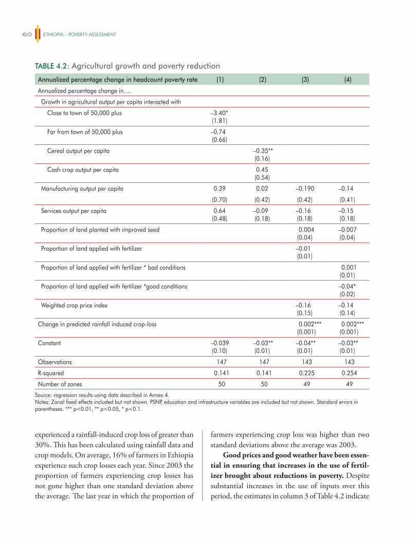
ETHIOPIA – POVERTY ASSESSMENT60
experienced a rainfall-induced crop loss of greater than 30%. This has been calculated using rainfall data and crop models. On average, 16% of farmers in Ethiopia experience such crop losses each year. Since 2003 the proportion of farmers experiencing crop losses has not gone higher than one standard deviation above the average. The last year in which the proportion of
farmers experiencing crop loss was higher than two standard deviations above the average was 2003.
Good prices and good weather have been essen-tial in ensuring that increases in the use of fertil-izer brought about reductions in poverty. Despite substantial increases in the use of inputs over this period, the estimates in column 3 of Table 4.2 indicate
TABLE 4.2: Agricultural growth and poverty reduction
Annualized percentage change in headcount poverty rate (1) (2) (3) (4)
Annualized percentage change in….
Growth in agricultural output per capita interacted with
Close to town of 50,000 plus –3.40*(1.81)
Far from town of 50,000 plus –0.74(0.66)
Cereal output per capita –0.35**(0.16)
Cash crop output per capita 0.45(0.54)
Manufacturing output per capita 0.39 0.02 –0.190 –0.14
(0.70) (0.42) (0.42) (0.41)
Services output per capita 0.64(0.48)
–0.09(0.18)
–0.16(0.18)
–0.15(0.18)
Proportion of land planted with improved seed 0.004(0.04)
–0.007(0.04)
Proportion of land applied with fertilizer –0.01(0.01)
Proportion of land applied with fertilizer * bad conditions 0.001(0.01)
Proportion of land applied with fertilizer *good conditions –0.04*(0.02)
Weighted crop price index –0.16(0.15)
–0.14(0.14)
Change in predicted rainfall induced crop-loss 0.002***(0.001)
0.002***(0.001)
Constant –0.039(0.10)
–0.03**(0.01)
–0.04**(0.01)
–0.03**(0.01)
Observations 147 147 143 143
R-squared 0.141 0.141 0.225 0.254
Number of zones 50 50 49 49
Source: regression results using data described in Annex 4. Notes: Zonal fixed effects included but not shown. PSNP, education and infrastructure variables are included but not shown. Standard errors in parentheses. *** p<0.01, ** p<0.05, * p<0.1.
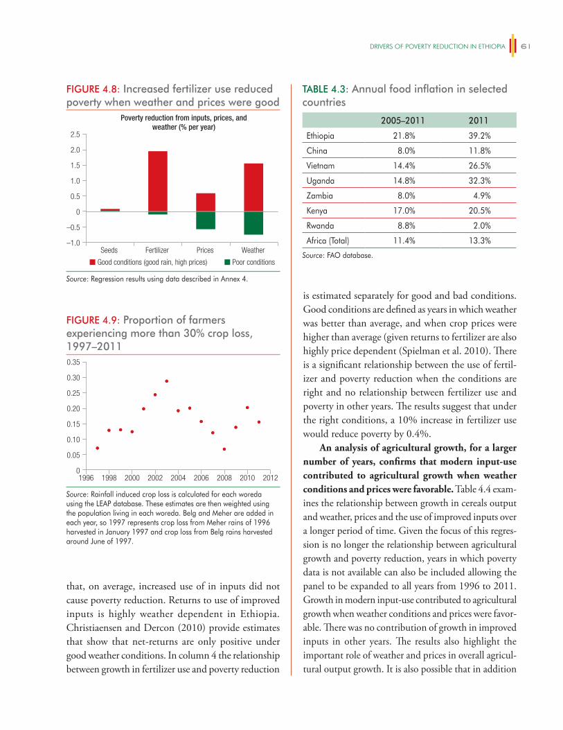
DRiveRS OF POveRTy ReDUCTiON iN eThiOPiA 61
that, on average, increased use of in inputs did not cause poverty reduction. Returns to use of improved inputs is highly weather dependent in Ethiopia. Christiaensen and Dercon (2010) provide estimates that show that net-returns are only positive under good weather conditions. In column 4 the relationship between growth in fertilizer use and poverty reduction
is estimated separately for good and bad conditions. Good conditions are defined as years in which weather was better than average, and when crop prices were higher than average (given returns to fertilizer are also highly price dependent (Spielman et al. 2010). There is a significant relationship between the use of fertil-izer and poverty reduction when the conditions are right and no relationship between fertilizer use and poverty in other years. The results suggest that under the right conditions, a 10% increase in fertilizer use would reduce poverty by 0.4%.
An analysis of agricultural growth, for a larger number of years, confirms that modern input-use contributed to agricultural growth when weather conditions and prices were favorable. Table 4.4 exam-ines the relationship between growth in cereals output and weather, prices and the use of improved inputs over a longer period of time. Given the focus of this regres-sion is no longer the relationship between agricultural growth and poverty reduction, years in which poverty data is not available can also be included allowing the panel to be expanded to all years from 1996 to 2011. Growth in modern input-use contributed to agricultural growth when weather conditions and prices were favor-able. There was no contribution of growth in improved inputs in other years. The results also highlight the important role of weather and prices in overall agricul-tural output growth. It is also possible that in addition
FIGURE 4.8: Increased fertilizer use reduced poverty when weather and prices were good
–1.0
0
0.5
–0.5
1.0
1.5
2.0
2.5
Poverty reduction from inputs, prices, andweather (% per year)
Seeds Fertilizer WeatherPrices
Poor conditionsGood conditions (good rain, high prices)
Source: Regression results using data described in Annex 4.
FIGURE 4.9: Proportion of farmers experiencing more than 30% crop loss, 1997–2011
0
0.10
0.15
0.05
0.20
0.25
0.30
0.35
1996 1998 20122000 2002 2004 2006 2008 2010
Source: Rainfall induced crop loss is calculated for each woreda using the LEAP database. These estimates are then weighted using the population living in each woreda. Belg and Meher are added in each year, so 1997 represents crop loss from Meher rains of 1996 harvested in January 1997 and crop loss from Belg rains harvested around June of 1997.
TABLE 4.3: Annual food inflation in selected countries
2005–2011 2011
Ethiopia 21.8% 39.2%
China 8.0% 11.8%
Vietnam 14.4% 26.5%
Uganda 14.8% 32.3%
Zambia 8.0% 4.9%
Kenya 17.0% 20.5%
Rwanda 8.8% 2.0%
Africa (Total) 11.4% 13.3%
Source: FAO database.
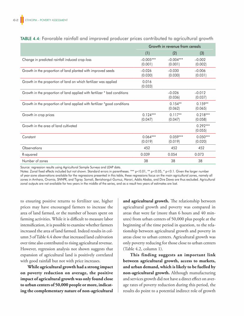
ETHIOPIA – POVERTY ASSESSMENT62
to ensuring positive returns to fertilizer use, higher prices may have encouraged farmers to increase the area of land farmed, or the number of hours spent on farming activities. While it is difficult to measure labor intensification, it is possible to examine whether farmers increased the area of land farmed. Indeed results in col-umn 3 of Table 4.4 show that increased land cultivation over time also contributed to rising agricultural revenue. However, regression analysis not shown suggests that expansion of agricultural land is positively correlated with good rainfall but not with price increases.
While agricultural growth had a strong impact on poverty reduction on average, the positive impact of agricultural growth was only found close to urban centers of 50,000 people or more, indicat-ing the complementary nature of non-agricultural
and agricultural growth. The relationship between agricultural growth and poverty was compared in areas that were far (more than 6 hours and 40 min-utes) from urban centers of 50,000 plus people at the beginning of the time period in question, to the rela-tionship between agricultural growth and poverty in areas close to urban centers. Agricultural growth was only poverty reducing for those close to urban centers (Table 4.2, column 1).
This finding suggests an important link between agricultural growth, access to markets, and urban demand, which is likely to be fuelled by non-agricultural growth. Although manufacturing and services growth did not have a direct effect on aver-age rates of poverty reduction during this period, the results do point to a potential indirect role of growth
TABLE 4.4: Favorable rainfall and improved producer prices contributed to agricultural growth
Growth in revenue from cereals
(1) (2) (3)
Change in predicted rainfall induced crop-loss –0.005***(0.001)
–0.004***(0.001)
–0.002(0.002)
Growth in the proportion of land planted with improved seeds –0.026(0.030)
–0.030(0.030)
–0.006(0.031)
Growth in the proportion of land on which fertilizer was applied 0.016(0.033)
Growth in the proportion of land applied with fertilizer * bad conditions –0.026(0.036)
–0.012(0.037)
Growth in the proportion of land applied with fertilizer *good conditions 0.154**(0.062)
0.159**(0.065)
Growth in crop prices 0.124***(0.047)
0.117**(0.047)
0.218***(0.058)
Growth in the area of land cultivated 0.292***(0.055)
Constant 0.064***(0.019)
0.059***(0.019)
0.050***(0.020)
Observations 452 452 452
R-squared 0.039 0.054 0.073
Number of zones 38 38 38
Source: regression results using Agricultural Sample Surveys and LEAP data. Notes: Zonal fixed effects included but not shown. Standard errors in parentheses. *** p<0.01, ** p<0.05, * p<0.1. Given the larger number of year-zone observations available for the regressions presented in this table, these regressions focus on the main agricultural zones, namely all zones in Amhara, Oromia, SNNPR, and Tigray. Somali, Benishangul-Gumuz, Harari, Addis Ababa, and Dire Dawa are thus excluded. Agricultural zonal outputs are not available for two years in the middle of the series, and as a result two years of estimates are lost.
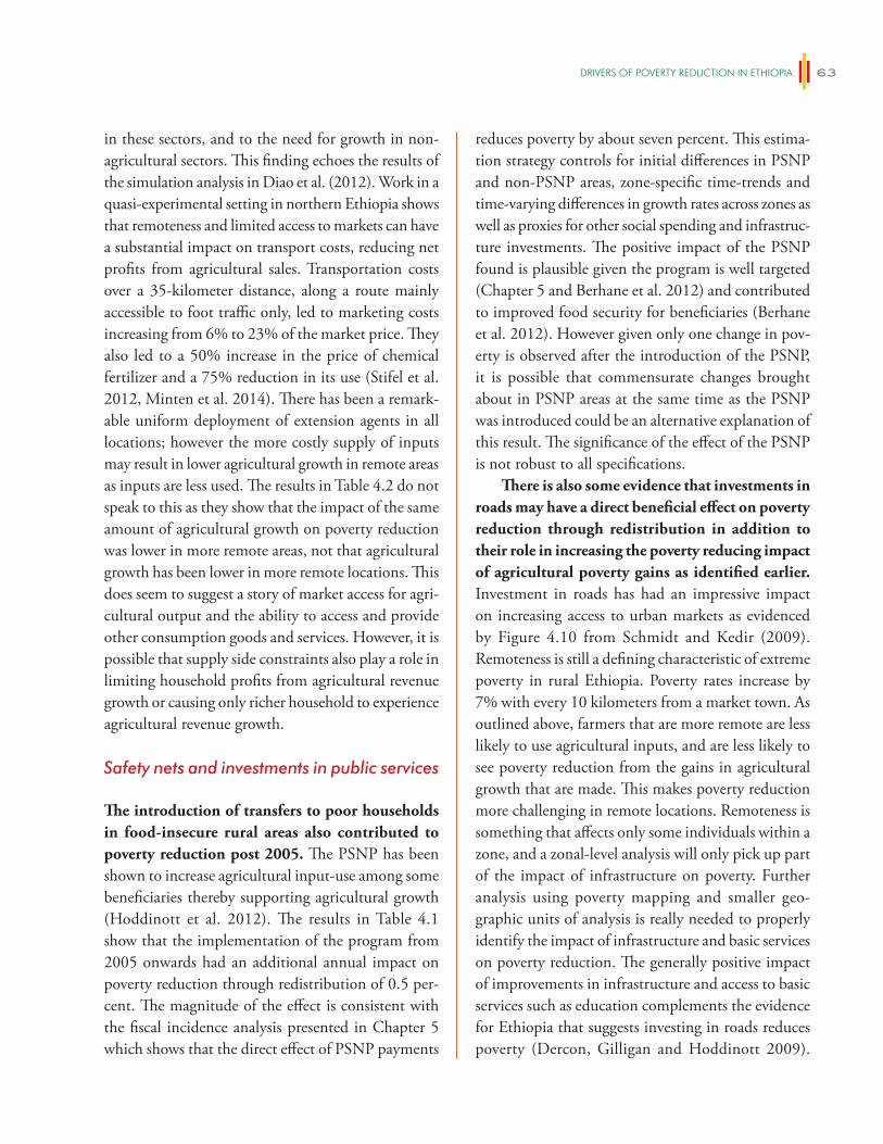
DRiveRS OF POveRTy ReDUCTiON iN eThiOPiA 63
in these sectors, and to the need for growth in non-agricultural sectors. This finding echoes the results of the simulation analysis in Diao et al. (2012). Work in a quasi-experimental setting in northern Ethiopia shows that remoteness and limited access to markets can have a substantial impact on transport costs, reducing net profits from agricultural sales. Transportation costs over a 35-kilometer distance, along a route mainly accessible to foot traffic only, led to marketing costs increasing from 6% to 23% of the market price. They also led to a 50% increase in the price of chemical fertilizer and a 75% reduction in its use (Stifel et al. 2012, Minten et al. 2014). There has been a remark-able uniform deployment of extension agents in all locations; however the more costly supply of inputs may result in lower agricultural growth in remote areas as inputs are less used. The results in Table 4.2 do not speak to this as they show that the impact of the same amount of agricultural growth on poverty reduction was lower in more remote areas, not that agricultural growth has been lower in more remote locations. This does seem to suggest a story of market access for agri-cultural output and the ability to access and provide other consumption goods and services. However, it is possible that supply side constraints also play a role in limiting household profits from agricultural revenue growth or causing only richer household to experience agricultural revenue growth.
Safety nets and investments in public services
The introduction of transfers to poor households in food-insecure rural areas also contributed to poverty reduction post 2005. The PSNP has been shown to increase agricultural input-use among some beneficiaries thereby supporting agricultural growth (Hoddinott et al. 2012). The results in Table 4.1 show that the implementation of the program from 2005 onwards had an additional annual impact on poverty reduction through redistribution of 0.5 per-cent. The magnitude of the effect is consistent with the fiscal incidence analysis presented in Chapter 5 which shows that the direct effect of PSNP payments
reduces poverty by about seven percent. This estima-tion strategy controls for initial differences in PSNP and non-PSNP areas, zone-specific time-trends and time-varying differences in growth rates across zones as well as proxies for other social spending and infrastruc-ture investments. The positive impact of the PSNP found is plausible given the program is well targeted (Chapter 5 and Berhane et al. 2012) and contributed to improved food security for beneficiaries (Berhane et al. 2012). However given only one change in pov-erty is observed after the introduction of the PSNP, it is possible that commensurate changes brought about in PSNP areas at the same time as the PSNP was introduced could be an alternative explanation of this result. The significance of the effect of the PSNP is not robust to all specifications.
There is also some evidence that investments in roads may have a direct beneficial effect on poverty reduction through redistribution in addition to their role in increasing the poverty reducing impact of agricultural poverty gains as identified earlier. Investment in roads has had an impressive impact on increasing access to urban markets as evidenced by Figure 4.10 from Schmidt and Kedir (2009). Remoteness is still a defining characteristic of extreme poverty in rural Ethiopia. Poverty rates increase by 7% with every 10 kilometers from a market town. As outlined above, farmers that are more remote are less likely to use agricultural inputs, and are less likely to see poverty reduction from the gains in agricultural growth that are made. This makes poverty reduction more challenging in remote locations. Remoteness is something that affects only some individuals within a zone, and a zonal-level analysis will only pick up part of the impact of infrastructure on poverty. Further analysis using poverty mapping and smaller geo-graphic units of analysis is really needed to properly identify the impact of infrastructure and basic services on poverty reduction. The generally positive impact of improvements in infrastructure and access to basic services such as education complements the evidence for Ethiopia that suggests investing in roads reduces poverty (Dercon, Gilligan and Hoddinott 2009).
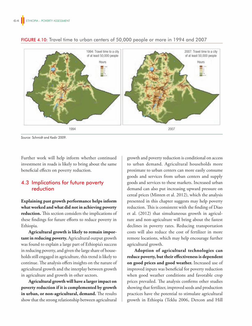
ETHIOPIA – POVERTY ASSESSMENT64
Further work will help inform whether continued investment in roads is likely to bring about the same beneficial effects on poverty reduction.
4.3 Implications for future poverty reduction
Explaining past growth performance helps inform what worked and what did not in achieving poverty reduction. This section considers the implications of these findings for future efforts to reduce poverty in Ethiopia.
Agricultural growth is likely to remain impor-tant in reducing poverty. Agricultural output growth was found to explain a large part of Ethiopia’s success in reducing poverty, and given the large share of house-holds still engaged in agriculture, this trend is likely to continue. The analysis offers insights on the nature of agricultural growth and the interplay between growth in agriculture and growth in other sectors.
Agricultural growth will have a larger impact on poverty reduction if it is complemented by growth in urban, or non-agricultural, demand. The results show that the strong relationship between agricultural
growth and poverty reduction is conditional on access to urban demand. Agricultural households more proximate to urban centers can more easily consume goods and services from urban centers and supply goods and services to these markets. Increased urban demand can also put increasing upward pressure on cereal prices (Minten et al. 2012), which the analysis presented in this chapter suggests may help poverty reduction. This is consistent with the finding of Diao et al. (2012) that simultaneous growth in agricul-ture and non-agriculture will bring about the fastest declines in poverty rates. Reducing transportation costs will also reduce the cost of fertilizer in more remote locations, which may help encourage further agricultural growth.
Adoption of agricultural technologies can reduce poverty, but their effectiveness is dependent on good prices and good weather. Increased use of improved inputs was beneficial for poverty reduction when good weather conditions and favorable crop prices prevailed. The analysis confirms other studies showing that fertilizer, improved seeds and production practices have the potential to stimulate agricultural growth in Ethiopia (Teklu 2006, Dercon and Hill
FIGURE 4.10: Travel time to urban centers of 50,000 people or more in 1994 and 2007
1994 2007
1994: Travel time to a cityof at least 50,000 people
Hours Hours
2007: Travel time to a cityof at least 50,000 people
Source: Schmidt and Kedir 2009.
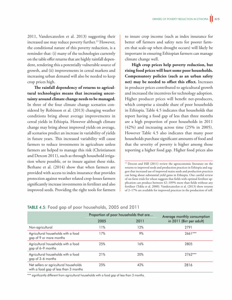
DRiveRS OF POveRTy ReDUCTiON iN eThiOPiA 65
2011, Vandercateelen et al. 2013) suggesting their increased use may reduce poverty further.13 However, the conditional nature of this poverty reduction, is a reminder that: (i) many of the technologies currently on the table offer returns that are highly rainfall depen-dent, rendering this a potentially vulnerable source of growth, and (ii) improvements in cereal markets and increasing urban demand will also be needed to keep crop prices high.
The rainfall dependency of returns to agricul-tural technologies means that increasing uncer-tainty around climate change needs to be managed. In three of the four climate change scenarios con-sidered by Robinson et al. (2013) changing weather conditions bring about average improvements in cereal yields in Ethiopia. However although climate change may bring about improved yields on average, all scenarios predict an increase in variability of yields in future years. This increased variability will cause farmers to reduce investments in agriculture unless farmers are helped to manage this risk (Christiansen and Dercon 2011), such as through household irriga-tion where possible, or to insure against these risks. Berhane et al. (2014) show that when farmers are provided with access to index insurance that provides protection against weather related crop-losses farmers significantly increase investments in fertilizer and also improved seeds. Providing the right tools for farmers
to insure crop income (such as index insurance for better off farmers and safety nets for poorer farm-ers that scale-up when drought occurs) will likely be important in ensuring Ethiopian farmers can manage climate change well.
High crop prices help poverty reduction, but rising food prices will hurt some poor households. Compensatory policies (such as an urban safety net) may be needed to offset this effect. Increases in producer prices contributed to agricultural growth and increased the incentives for technology adoption. Higher producer prices will benefit net-producers, which comprise a sizeable share of poor households in Ethiopia. Table 4.5 indicates that households that report having a food gap of less than three months are a high proportion of poor households in 2011 (42%) and increasing across time (25% in 2005). However Table 4.5 also indicates that many poor households purchase significant amounts of food and that the severity of poverty is higher among those reporting a higher food gap. Higher food prices also
13 Dercon and Hill (2011) review the agroeconomic literature on the returns to improved seeds and production practices in Ethiopia and sug-gest that increased use of improved maize seeds and production practices can bring about substantial yield gains in Ethiopia. One careful review of on-farm trials for wheat suggests that fields with optimal fertilizer ap-plication can produce between 42–109% more than fields without any fertilizer (Teklu et al. 2000). Vandercateelen et al. (2013) show returns of 2–17% are available for improved practices in the production of teff.
TABLE 4.5: Food gap of poor households, 2005 and 2011
Proportion of poor households that are… Average monthly consumption in 2011 (Birr per adult)2005 2011
Non-agricultural 11% 12% 2791
Agricultural households with a food gap of 9 or more months
17% 9% 2661***
Agricultural households with a food gap of 6–9 months
25% 16% 2805
Agricultural households with a food gap of 3–6 months
21% 20% 2762***
Net sellers or agricultural households with a food gap of less than 3 months
25% 42% 2816
*** significantly different from agricultural households with a food gap of less than 3 months.
ETHIOPIA – POVERTY ASSESSMENT66
hurt wage employees in the short run if wages do not increase. Few household heads (8%) report being wage employees, however households that do rely on wage labor income are impacted by rising food prices in the short run until wages adjust some 4–5 months later (Headey et al. 2012). If higher producer prices are also reflected in higher retail prices, they will hurt food buyers unless there is compensatory intervention to improve their wellbeing. Improvements in market efficiency can help both net producers and consum-ers by increasing producer’s share of the retail price. Minten et al. (2012) show that improvements in market efficiency increased farmers’ share of the final teff retail price by 7% from 2001 to 2011. Further infrastructure investments and improvements in competition in cereal markets will further improve market efficiency. Minten et al. (2014) suggests that in particular, investments that allow the last miles of access to be improved are needed.
Reducing the gender agricultural productivity gap in Ethiopia is another way in which inclusive agricultural growth can be encouraged in Ethiopia. Chapter 9 details the types of interventions that will help ensure that female-headed households are able to see increases in agricultural productivity. In particular, the analysis shows that interventions that help female farmers access land for cultivation and hire agricultural labor will help lower the gender productivity gap. It also shows that addressing sources of gender-bias in the types of crops women and men market may be important, and would help female farmers realize higher returns on inputs such as fertilizer.
Manufacturing growth may play an increasing role in poverty reduction as Ethiopia urbanizes. In urban areas, manufacturing output growth was a more important driver of poverty reduction in recent years indicating that growth in this sector may be important for poverty reduction.
Poverty reduction in the service sector has contributed to overall poverty reduction, but its contribution has been somewhat lower than its large contribution to GDP growth would indicate. Service sector growth has not had an independent
effect on poverty reduction perhaps because service sector growth has been strongly correlated with agri-cultural growth. Growth in agriculture and services has gone hand in hand. This complements the findings in Chapter 6 that show that the non-farm sector in rural Ethiopia is driven by agricultural gains: agricultural profits finance their operation and they tend to oper-ate at times when fellow residents have cash in-hand from recent harvests.
The effect of safety nets on poverty reduction, even controlling for the sectoral composition of growth, suggests that they hold potential in help-ing reach the poorest households that have not been participating in economic growth in recent years. Hoddinott et al. (2013) provides evidence that safety nets have supported agricultural growth in Ethiopia. The analysis presented here shows that the introduction of the PSNP also reduced poverty through redistribution, in addition to any impact through supporting growth. The effect of PSNP coverage on zonal poverty reduction corroborates evidence from impact assessments of the PSNP (Gilligan, Hoddinott, and Seyoum Taffesse 2010; Berhane et al. 2012) which suggests that the program has been well targeted to poor households and has enabled households to acquire and protect assets, particularly when safety net payments have been large and reliable. The evidence provided in the fis-cal incidence analysis in Chapter 5 suggests that the transfers reduce poverty by 6%. Expanding safety nets may reduce poverty further. Hill and Porter (2014) show that although the PSNP is well targeted, almost half of the poor households in Ethiopia live in woredas in which the PSNP is not functioning, and some very vulnerable areas of the country are not covered (such as some lowland areas in Gambela and Benishangul-Gumez). In addition no urban areas are covered by a safety net.
Further analysis on the relative cost of investing in safety nets, roads, education or public invest-ments to support growth is needed to ascertain which investments would bring about the largest reductions in poverty per Birr invested.
67
A FISCAL INCIDENCE ANALYSIS FOR ETHIOPIA
Public investment has been a central element of the Government of Ethiopia’s development strategy over the last decade. Since the early 1990s Ethiopia has pursued a “developmental state” model with the objective of reducing poverty in Ethiopia. In this model, high levels of public sector investment encour-age growth and improve access to basic services. As Chapter 4 indicated, growth has been the primary driver of reductions in poverty over the last decade.
In recent years redistribution has also been an important contributor to poverty reduction. This chapter assesses the role of fiscal policy in contributing to that trend. It is an open question as to how much fiscal policy has contributed to redis-tribution. Although Ethiopia has reduced poverty while maintaining low levels of inequality, the poor-est have not fared well in recent years (as documented in Chapter 1). Poverty depth did not fall in Ethiopia between 2005 and 2011 and the poverty severity index increased. This chapter assesses the impact of fiscal policy on poverty incidence, depth and severity and examines whether there is room for an increased role for fiscal policy in improving the wellbeing of the very poorest.
This chapter summarizes findings from the first comprehensive analysis of the incidence of fis-cal policy in Ethiopia. It applies the Commitment to Equity (CEQ) methodology (Lustig and Higgins 2013) to analyze the distributional impact of fiscal pol-icy in a holistic and standardized way. This facilitates comparison with other countries in which the CEQ methodology has been applied. The analysis assesses the incidence of fiscal policy in 2011, the same year for which poverty estimates were calculated, and includes 83% of tax revenue and 43% of government spending. Woldehanna et al. (2014) discusses the full results.
The analysis shows that income in Ethiopia is very equally distributed, prior to any redistribu-tion by the state through taxes, transfers and sub-sidies. This suggests that other factors in Ethiopia contribute to keeping the distribution of incomes relatively equal. One such factor is the relatively equal distribution of land in rural Ethiopia as a result of a land policy that allocates land according to need and makes the consolidation of land in the hands of a few very difficult. It may be that this policy has other less beneficial effects on poverty reduction (such as hindering migration and structural change—Chapter 7) but it likely also contributes to the equal distri-bution of pre-fiscal redistribution income that this chapter documents.
Even though income inequality is low, fiscal policy still reduces inequality. Fiscal policy has improved the welfare of those in the bottom decile, and both the poverty gap and the severity of poverty are also lower as a result. Taxes are progressive (the proportion paid increases as income increases) and direct transfers are made to the poorest households. Subsidies are not always progressive, and the largest subsidy (on electricity) is regressive (comprising a lower share of income for poorer households), but in general spending is progressive. In many cases spending is also pro-poor, providing more to poorer households in absolute terms.
However, because Ethiopia is a poor country this reduction in inequality has come about at a cost to many households who are already poor. Poor house-holds pay taxes—both direct and indirect—and the transfers and benefits they receive do not compensate all households for the taxes they have paid. As a result, although poverty falls as a result of fiscal policy, one in four households are impoverished (either made poor
5
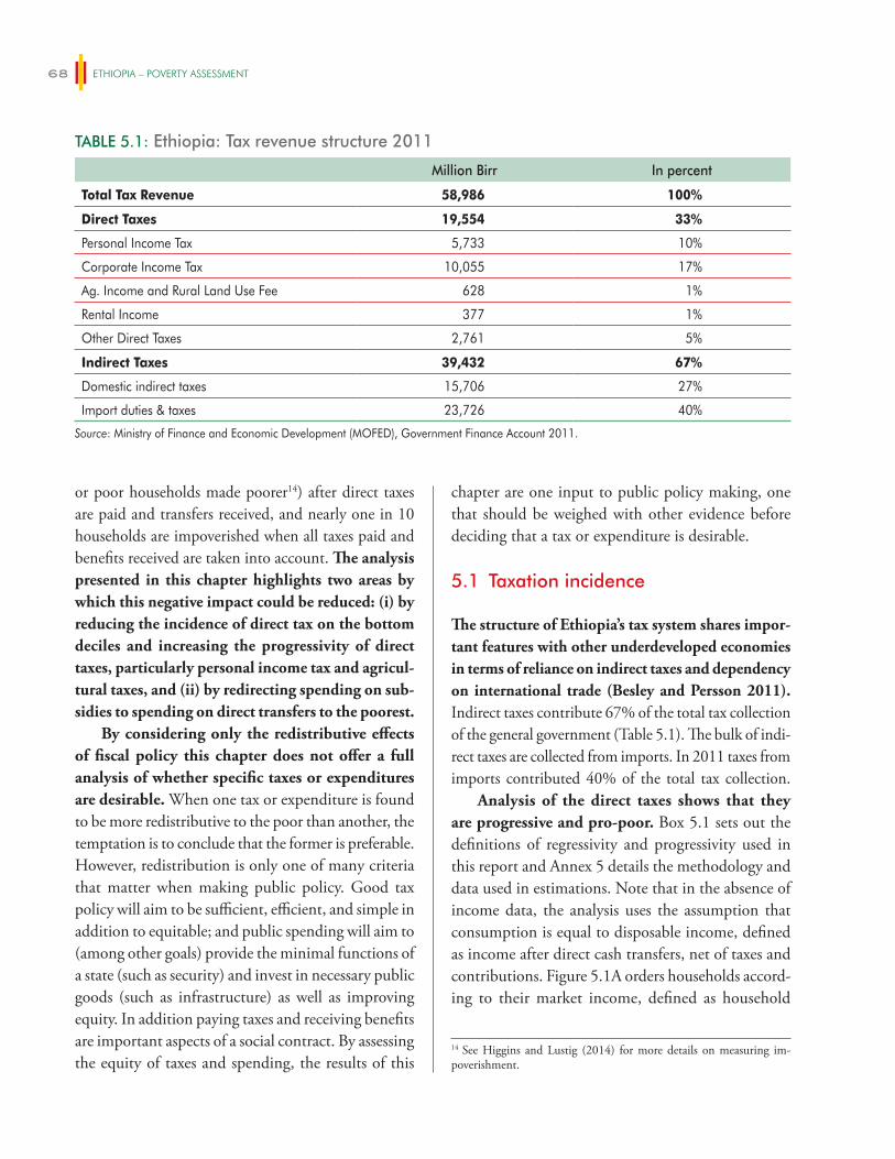
ETHIOPIA – POVERTY ASSESSMENT68
or poor households made poorer14) after direct taxes are paid and transfers received, and nearly one in 10 households are impoverished when all taxes paid and benefits received are taken into account. The analysis presented in this chapter highlights two areas by which this negative impact could be reduced: (i) by reducing the incidence of direct tax on the bottom deciles and increasing the progressivity of direct taxes, particularly personal income tax and agricul-tural taxes, and (ii) by redirecting spending on sub-sidies to spending on direct transfers to the poorest.
By considering only the redistributive effects of fiscal policy this chapter does not offer a full analysis of whether specific taxes or expenditures are desirable. When one tax or expenditure is found to be more redistributive to the poor than another, the temptation is to conclude that the former is preferable. However, redistribution is only one of many criteria that matter when making public policy. Good tax policy will aim to be sufficient, efficient, and simple in addition to equitable; and public spending will aim to (among other goals) provide the minimal functions of a state (such as security) and invest in necessary public goods (such as infrastructure) as well as improving equity. In addition paying taxes and receiving benefits are important aspects of a social contract. By assessing the equity of taxes and spending, the results of this
chapter are one input to public policy making, one that should be weighed with other evidence before deciding that a tax or expenditure is desirable.
5.1 Taxation incidence
The structure of Ethiopia’s tax system shares impor-tant features with other underdeveloped economies in terms of reliance on indirect taxes and dependency on international trade (Besley and Persson 2011). Indirect taxes contribute 67% of the total tax collection of the general government (Table 5.1). The bulk of indi-rect taxes are collected from imports. In 2011 taxes from imports contributed 40% of the total tax collection.
Analysis of the direct taxes shows that they are progressive and pro-poor. Box 5.1 sets out the definitions of regressivity and progressivity used in this report and Annex 5 details the methodology and data used in estimations. Note that in the absence of income data, the analysis uses the assumption that consumption is equal to disposable income, defined as income after direct cash transfers, net of taxes and contributions. Figure 5.1A orders households accord-ing to their market income, defined as household
TABLE 5.1: Ethiopia: Tax revenue structure 2011
Million Birr In percent
Total Tax Revenue 58,986 100%
Direct Taxes 19,554 33%
Personal Income Tax 5,733 10%
Corporate Income Tax 10,055 17%
Ag. Income and Rural Land Use Fee 628 1%
Rental Income 377 1%
Other Direct Taxes 2,761 5%
Indirect Taxes 39,432 67%
Domestic indirect taxes 15,706 27%
Import duties & taxes 23,726 40%
Source: Ministry of Finance and Economic Development (MOFED), Government Finance Account 2011.
14 See Higgins and Lustig (2014) for more details on measuring im-poverishment.
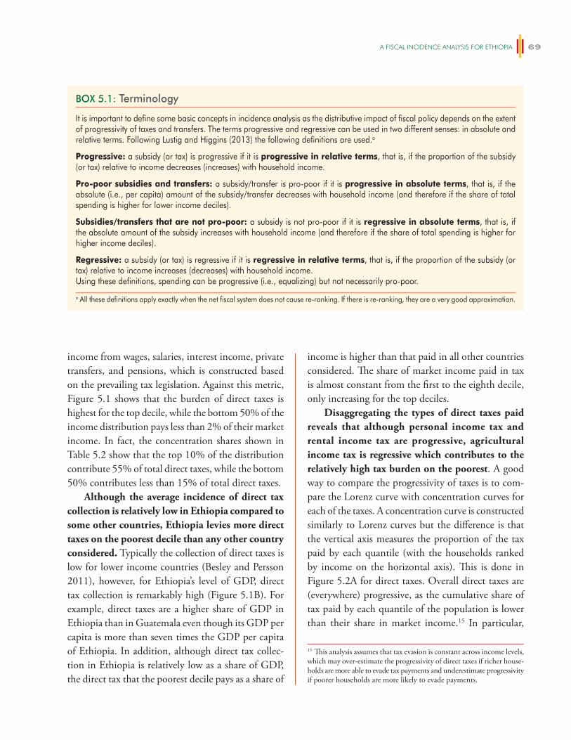
A FiSCAl iNCiDeNCe ANAlySiS FOR eThiOPiA 69
income from wages, salaries, interest income, private transfers, and pensions, which is constructed based on the prevailing tax legislation. Against this metric, Figure 5.1 shows that the burden of direct taxes is highest for the top decile, while the bottom 50% of the income distribution pays less than 2% of their market income. In fact, the concentration shares shown in Table 5.2 show that the top 10% of the distribution contribute 55% of total direct taxes, while the bottom 50% contributes less than 15% of total direct taxes.
Although the average incidence of direct tax collection is relatively low in Ethiopia compared to some other countries, Ethiopia levies more direct taxes on the poorest decile than any other country considered. Typically the collection of direct taxes is low for lower income countries (Besley and Persson 2011), however, for Ethiopia’s level of GDP, direct tax collection is remarkably high (Figure 5.1B). For example, direct taxes are a higher share of GDP in Ethiopia than in Guatemala even though its GDP per capita is more than seven times the GDP per capita of Ethiopia. In addition, although direct tax collec-tion in Ethiopia is relatively low as a share of GDP, the direct tax that the poorest decile pays as a share of
income is higher than that paid in all other countries considered. The share of market income paid in tax is almost constant from the first to the eighth decile, only increasing for the top deciles.
Disaggregating the types of direct taxes paid reveals that although personal income tax and rental income tax are progressive, agricultural income tax is regressive which contributes to the relatively high tax burden on the poorest. A good way to compare the progressivity of taxes is to com-pare the Lorenz curve with concentration curves for each of the taxes. A concentration curve is constructed similarly to Lorenz curves but the difference is that the vertical axis measures the proportion of the tax paid by each quantile (with the households ranked by income on the horizontal axis). This is done in Figure 5.2A for direct taxes. Overall direct taxes are (everywhere) progressive, as the cumulative share of tax paid by each quantile of the population is lower than their share in market income.15 In particular,
BOX 5.1: Terminology
It is important to define some basic concepts in incidence analysis as the distributive impact of fiscal policy depends on the extent of progressivity of taxes and transfers. The terms progressive and regressive can be used in two different senses: in absolute and relative terms. Following Lustig and Higgins (2013) the following definitions are used.a
Progressive: a subsidy (or tax) is progressive if it is progressive in relative terms, that is, if the proportion of the subsidy (or tax) relative to income decreases (increases) with household income.
Pro-poor subsidies and transfers: a subsidy/transfer is pro-poor if it is progressive in absolute terms, that is, if the absolute (i.e., per capita) amount of the subsidy/transfer decreases with household income (and therefore if the share of total spending is higher for lower income deciles).
Subsidies/transfers that are not pro-poor: a subsidy is not pro-poor if it is regressive in absolute terms, that is, if the absolute amount of the subsidy increases with household income (and therefore if the share of total spending is higher for higher income deciles).
Regressive: a subsidy (or tax) is regressive if it is regressive in relative terms, that is, if the proportion of the subsidy (or tax) relative to income increases (decreases) with household income.Using these definitions, spending can be progressive (i.e., equalizing) but not necessarily pro-poor.
a All these definitions apply exactly when the net fiscal system does not cause re-ranking. If there is re-ranking, they are a very good approximation.
15 This analysis assumes that tax evasion is constant across income levels, which may over-estimate the progressivity of direct taxes if richer house-holds are more able to evade tax payments and underestimate progressivity if poorer households are more likely to evade payments.
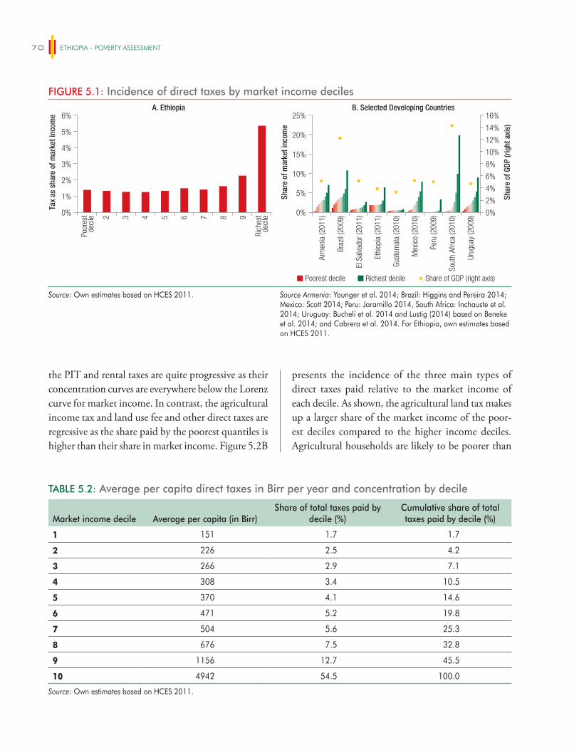
ETHIOPIA – POVERTY ASSESSMENT70
the PIT and rental taxes are quite progressive as their concentration curves are everywhere below the Lorenz curve for market income. In contrast, the agricultural income tax and land use fee and other direct taxes are regressive as the share paid by the poorest quantiles is higher than their share in market income. Figure 5.2B
presents the incidence of the three main types of direct taxes paid relative to the market income of each decile. As shown, the agricultural land tax makes up a larger share of the market income of the poor-est deciles compared to the higher income deciles. Agricultural households are likely to be poorer than
FIGURE 5.1: Incidence of direct taxes by market income decilesA. Ethiopia
6%
5%
4%
3%
2%
1%
0%
Poor
est
deci
le
Rich
est
deci
le2 3 4 5 6 7 8 9
Arm
enia
(201
1)
Braz
il (2
009)
El S
alva
dor (
2011
)
Ethi
opia
(201
1)
Guat
emal
a (2
010)
Mex
ico
(201
0)
Peru
(200
9)
Sout
h Af
rica
(201
0)
Urug
uay
(200
9)
Tax
as s
hare
of m
arke
t inc
ome
B. Selected Developing Countries
Shar
e of
mar
ket i
ncom
e
Shar
e of
GDP
(rig
ht a
xis)
0%
2%
4%
6%
8%
10%
12%
14%
16%
0%
5%
10%
15%
20%
25%
Poorest decile Richest decile Share of GDP (right axis)
Source: Own estimates based on HCES 2011. Source Armenia: Younger et al. 2014; Brazil: Higgins and Pereira 2014; Mexico: Scott 2014; Peru: Jaramillo 2014, South Africa: Inchauste et al. 2014; Uruguay: Bucheli et al. 2014 and Lustig (2014) based on Beneke et al. 2014; and Cabrera et al. 2014. For Ethiopia, own estimates based on HCES 2011.
TABLE 5.2: Average per capita direct taxes in Birr per year and concentration by decile
Market income decile Average per capita (in Birr)Share of total taxes paid by
decile (%)Cumulative share of total taxes paid by decile (%)
1 151 1.7 1.7
2 226 2.5 4.2
3 266 2.9 7.1
4 308 3.4 10.5
5 370 4.1 14.6
6 471 5.2 19.8
7 504 5.6 25.3
8 676 7.5 32.8
9 1156 12.7 45.5
10 4942 54.5 100.0
Source: Own estimates based on HCES 2011.
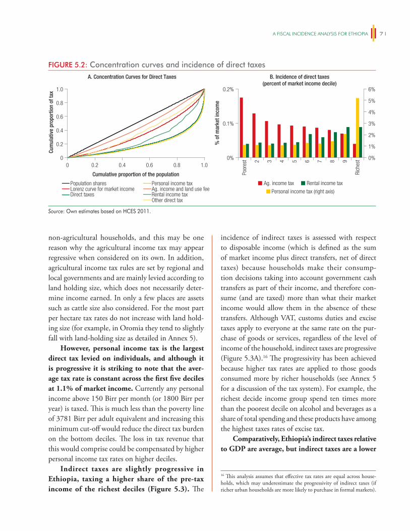
A FiSCAl iNCiDeNCe ANAlySiS FOR eThiOPiA 71
non-agricultural households, and this may be one reason why the agricultural income tax may appear regressive when considered on its own. In addition, agricultural income tax rules are set by regional and local governments and are mainly levied according to land holding size, which does not necessarily deter-mine income earned. In only a few places are assets such as cattle size also considered. For the most part per hectare tax rates do not increase with land hold-ing size (for example, in Oromia they tend to slightly fall with land-holding size as detailed in Annex 5).
However, personal income tax is the largest direct tax levied on individuals, and although it is progressive it is striking to note that the aver-age tax rate is constant across the first five deciles at 1.1% of market income. Currently any personal income above 150 Birr per month (or 1800 Birr per year) is taxed. This is much less than the poverty line of 3781 Birr per adult equivalent and increasing this minimum cut-off would reduce the direct tax burden on the bottom deciles. The loss in tax revenue that this would comprise could be compensated by higher personal income tax rates on higher deciles.
Indirect taxes are slightly progressive in Ethiopia, taxing a higher share of the pre-tax income of the richest deciles (Figure 5.3). The
incidence of indirect taxes is assessed with respect to disposable income (which is defined as the sum of market income plus direct transfers, net of direct taxes) because households make their consump-tion decisions taking into account government cash transfers as part of their income, and therefore con-sume (and are taxed) more than what their market income would allow them in the absence of these transfers. Although VAT, customs duties and excise taxes apply to everyone at the same rate on the pur-chase of goods or services, regardless of the level of income of the household, indirect taxes are progressive (Figure 5.3A).16 The progressivity has been achieved because higher tax rates are applied to those goods consumed more by richer households (see Annex 5 for a discussion of the tax system). For example, the richest decide income group spend ten times more than the poorest decile on alcohol and beverages as a share of total spending and these products have among the highest taxes rates of excise tax.
Comparatively, Ethiopia’s indirect taxes relative to GDP are average, but indirect taxes are a lower
FIGURE 5.2: Concentration curves and incidence of direct taxesA. Concentration Curves for Direct Taxes
1.0
0.8
0.6
0.4
0.2
0
6%
5%
4%
3%
2%
1%
0%0 0.2 0.4 0.6 0.8 1.0
Cum
ulat
ive
prop
ortio
n of
tax 0.2%
0.1%
0%
Poor
est
Rich
est2 3 4 5 6 7 8 9
% o
f mar
ket i
ncom
e
B. Incidence of direct taxes(percent of market income decile)
Ag. income tax Rental income tax
Personal income tax (right axis)
Cumulative proportion of the population
Population sharesLorenz curve for market incomeDirect taxes
Personal income taxAg. income and land use feeRental income taxOther direct tax
Source: Own estimates based on HCES 2011.
16 This analysis assumes that effective tax rates are equal across house-holds, which may underestimate the progressivity of indirect taxes (if richer urban households are more likely to purchase in formal markets).
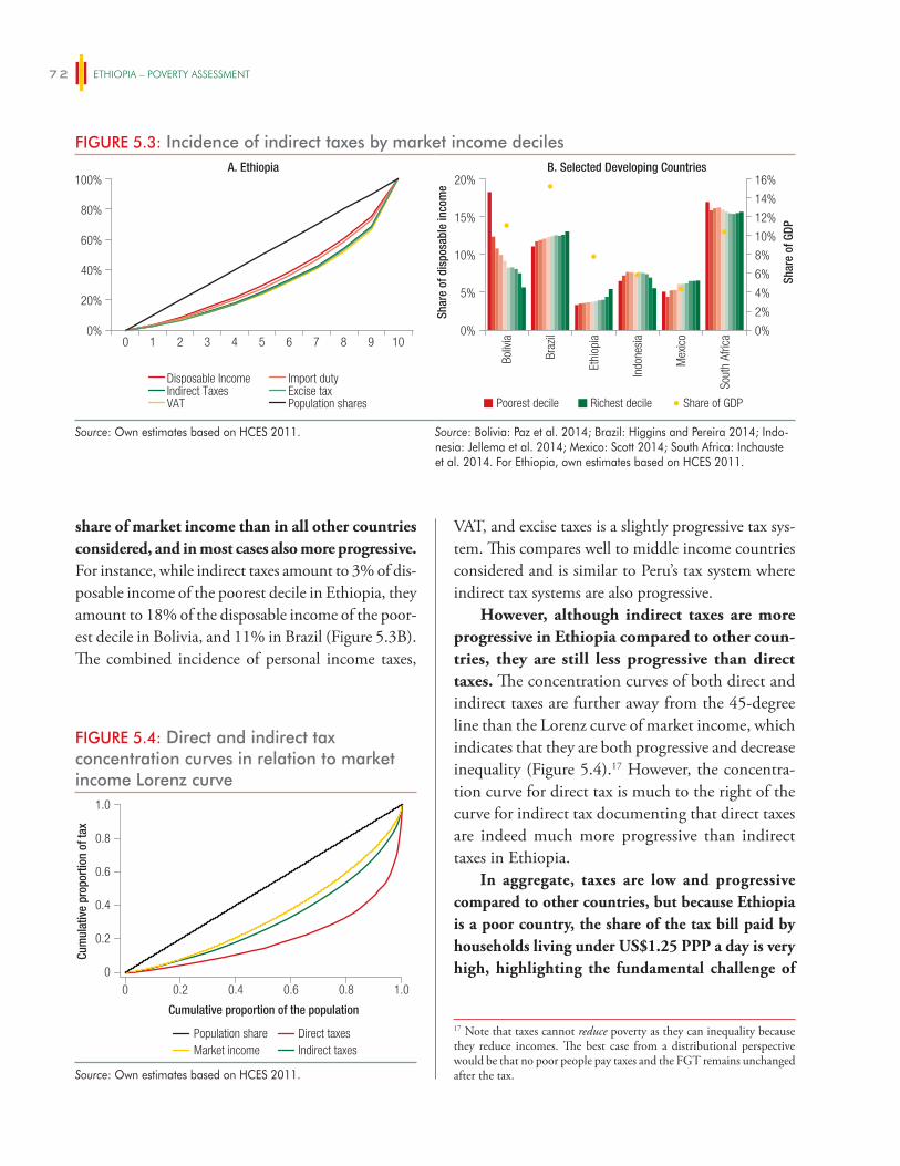
ETHIOPIA – POVERTY ASSESSMENT72
share of market income than in all other countries considered, and in most cases also more progressive. For instance, while indirect taxes amount to 3% of dis-posable income of the poorest decile in Ethiopia, they amount to 18% of the disposable income of the poor-est decile in Bolivia, and 11% in Brazil (Figure 5.3B). The combined incidence of personal income taxes,
VAT, and excise taxes is a slightly progressive tax sys-tem. This compares well to middle income countries considered and is similar to Peru’s tax system where indirect tax systems are also progressive.
However, although indirect taxes are more progressive in Ethiopia compared to other coun-tries, they are still less progressive than direct taxes. The concentration curves of both direct and indirect taxes are further away from the 45-degree line than the Lorenz curve of market income, which indicates that they are both progressive and decrease inequality (Figure 5.4).17 However, the concentra-tion curve for direct tax is much to the right of the curve for indirect tax documenting that direct taxes are indeed much more progressive than indirect taxes in Ethiopia.
In aggregate, taxes are low and progressive compared to other countries, but because Ethiopia is a poor country, the share of the tax bill paid by households living under US$1.25 PPP a day is very high, highlighting the fundamental challenge of
FIGURE 5.3: Incidence of indirect taxes by market income decilesA. Ethiopia
100%
80%
60%
40%
20%
0%
Boliv
ia
Braz
il
Ethi
opia
Indo
nesi
a
Mex
ico
Sout
h Af
rica
B. Selected Developing Countries
Shar
e of
dis
posa
ble
inco
me
Shar
e of
GDP
0%
2%
4%
6%
8%
10%
12%
14%
16%
0%
5%
10%
15%
20%
Poorest decile Richest decile Share of GDP
0 1 2 3 4 5 6 7 8 9 10
Disposable Income Indirect Taxes VAT
Import duty Excise tax Population shares
Source: Own estimates based on HCES 2011. Source: Bolivia: Paz et al. 2014; Brazil: Higgins and Pereira 2014; Indo-nesia: Jellema et al. 2014; Mexico: Scott 2014; South Africa: Inchauste et al. 2014. For Ethiopia, own estimates based on HCES 2011.
17 Note that taxes cannot reduce poverty as they can inequality because they reduce incomes. The best case from a distributional perspective would be that no poor people pay taxes and the FGT remains unchanged after the tax.
FIGURE 5.4: Direct and indirect tax concentration curves in relation to market income Lorenz curve
0
0.4
0.6
0.2
0.8
1.0
0 1.00.2 0.4 0.6 0.8
Population shareMarket income
Direct taxesIndirect taxes
Cum
ulat
ive
prop
ortio
n of
tax
Cumulative proportion of the population
Source: Own estimates based on HCES 2011.
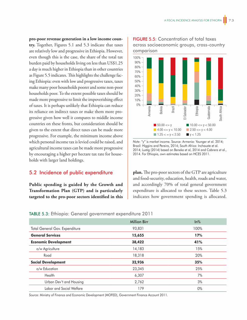
A FiSCAl iNCiDeNCe ANAlySiS FOR eThiOPiA 73
pro-poor revenue generation in a low income coun-try. Together, Figures 5.1 and 5.3 indicate that taxes are relatively low and progressive in Ethiopia. However, even though this is the case, the share of the total tax burden paid by households living on less than US$1.25 a day is much higher in Ethiopia than in other countries as Figure 5.5 indicates. This highlights the challenge fac-ing Ethiopia: even with low and progressive taxes, taxes make many poor households poorer and some non-poor households poor. To the extent possible taxes should be made more progressive to limit the impoverishing effect of taxes. It is perhaps unlikely that Ethiopia can reduce its reliance on indirect taxes or make them more pro-gressive given how well it compares to middle income countries on these fronts, but consideration should be given to the extent that direct taxes can be made more progressive. For example, the minimum income above which personal income tax is levied could be raised, and agricultural income taxes can be made more progressive by encouraging a higher per hectare tax rate for house-holds with larger land holdings.
5.2 Incidence of public expenditure
Public spending is guided by the Growth and Transformation Plan (GTP) and is particularly targeted to the pro-poor sectors identified in this
plan. The pro-poor sectors of the GTP are agriculture and food-security, education, health, roads and water, and accordingly 70% of total general government expenditure is allocated to these sectors. Table 5.3 indicates how government spending is allocated.
FIGURE 5.5: Concentration of total taxes across socioeconomic groups, cross-country comparison
Arm
enia
Boliv
ia
Braz
il
El S
alva
dor
Ethi
opia
Guat
emal
a
Sout
h Af
rica
4.00 <= y < 10.0050.00 <= y 10.00 <= y < 50.00
2.50 <= y < 4.001.25 < = y < 2.50 y < 1.25
0%10%20%
90%80%70%60%50%40%30%
100%
Note: “y” is market income. Source: Armenia: Younger et al. 2014; Brazil: Higgins and Pereira, 2014; South Africa: Inchauste et al. 2014; Lustig (2014) based on Beneke et al, 2014 and Cabrera et al., 2014. For Ethiopia, own estimates based on HCES 2011.
TABLE 5.3: Ethiopia: General government expenditure 2011
Million Birr In%
Total General Gov. Expenditure 93,831 100%
General Services 15,655 17%
Economic Development 38,422 41%
o/w Agriculture 14,183 15%
Road 18,318 20%
Social Development 32,936 35%
o/w Education 23,345 25%
Health 6,307 7%
Urban Dev’t and Housing 2,762 3%
Labor and Social Welfare 179 0%
Source: Ministry of Finance and Economic Development (MOFED), Government Finance Account 2011.
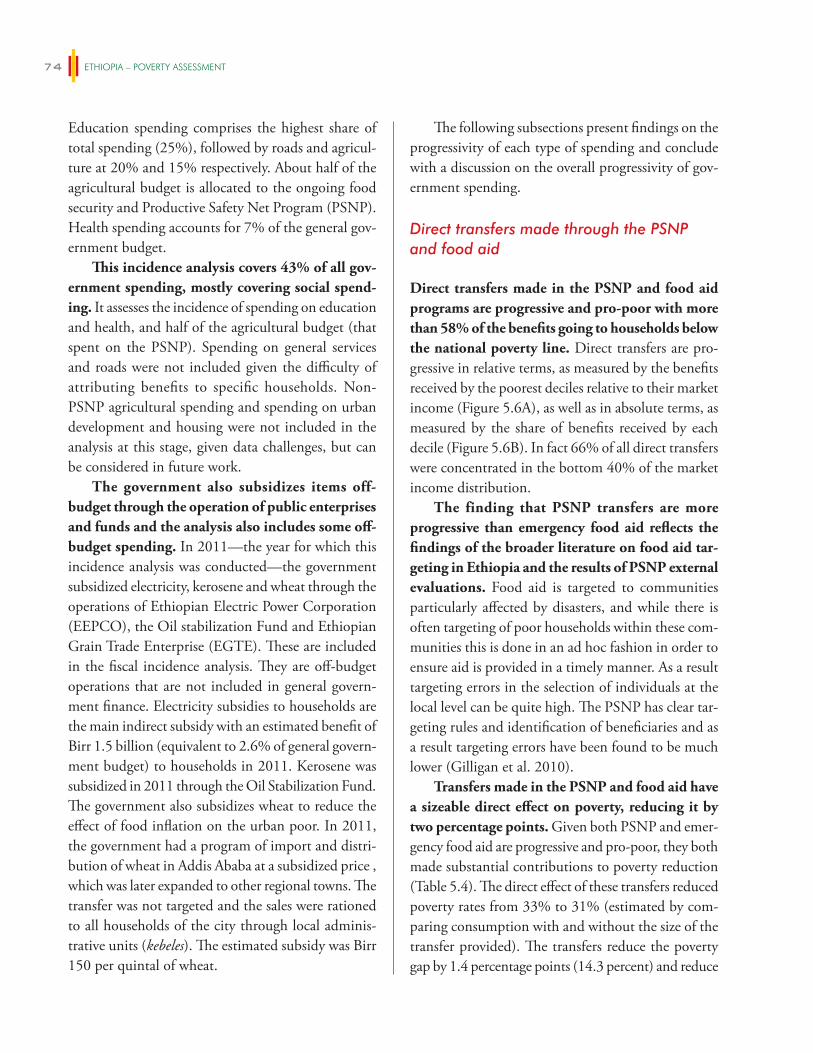
ETHIOPIA – POVERTY ASSESSMENT74
Education spending comprises the highest share of total spending (25%), followed by roads and agricul-ture at 20% and 15% respectively. About half of the agricultural budget is allocated to the ongoing food security and Productive Safety Net Program (PSNP). Health spending accounts for 7% of the general gov-ernment budget.
This incidence analysis covers 43% of all gov-ernment spending, mostly covering social spend-ing. It assesses the incidence of spending on education and health, and half of the agricultural budget (that spent on the PSNP). Spending on general services and roads were not included given the difficulty of attributing benefits to specific households. Non-PSNP agricultural spending and spending on urban development and housing were not included in the analysis at this stage, given data challenges, but can be considered in future work.
The government also subsidizes items off-budget through the operation of public enterprises and funds and the analysis also includes some off-budget spending. In 2011—the year for which this incidence analysis was conducted—the government subsidized electricity, kerosene and wheat through the operations of Ethiopian Electric Power Corporation (EEPCO), the Oil stabilization Fund and Ethiopian Grain Trade Enterprise (EGTE). These are included in the fiscal incidence analysis. They are off-budget operations that are not included in general govern-ment finance. Electricity subsidies to households are the main indirect subsidy with an estimated benefit of Birr 1.5 billion (equivalent to 2.6% of general govern-ment budget) to households in 2011. Kerosene was subsidized in 2011 through the Oil Stabilization Fund. The government also subsidizes wheat to reduce the effect of food inflation on the urban poor. In 2011, the government had a program of import and distri-bution of wheat in Addis Ababa at a subsidized price , which was later expanded to other regional towns. The transfer was not targeted and the sales were rationed to all households of the city through local adminis-trative units (kebeles). The estimated subsidy was Birr 150 per quintal of wheat.
The following subsections present findings on the progressivity of each type of spending and conclude with a discussion on the overall progressivity of gov-ernment spending.
Direct transfers made through the PSNP and food aid
Direct transfers made in the PSNP and food aid programs are progressive and pro-poor with more than 58% of the benefits going to households below the national poverty line. Direct transfers are pro-gressive in relative terms, as measured by the benefits received by the poorest deciles relative to their market income (Figure 5.6A), as well as in absolute terms, as measured by the share of benefits received by each decile (Figure 5.6B). In fact 66% of all direct transfers were concentrated in the bottom 40% of the market income distribution.
The finding that PSNP transfers are more progressive than emergency food aid reflects the findings of the broader literature on food aid tar-geting in Ethiopia and the results of PSNP external evaluations. Food aid is targeted to communities particularly affected by disasters, and while there is often targeting of poor households within these com-munities this is done in an ad hoc fashion in order to ensure aid is provided in a timely manner. As a result targeting errors in the selection of individuals at the local level can be quite high. The PSNP has clear tar-geting rules and identification of beneficiaries and as a result targeting errors have been found to be much lower (Gilligan et al. 2010).
Transfers made in the PSNP and food aid have a sizeable direct effect on poverty, reducing it by two percentage points. Given both PSNP and emer-gency food aid are progressive and pro-poor, they both made substantial contributions to poverty reduction (Table 5.4). The direct effect of these transfers reduced poverty rates from 33% to 31% (estimated by com-paring consumption with and without the size of the transfer provided). The transfers reduce the poverty gap by 1.4 percentage points (14.3 percent) and reduce
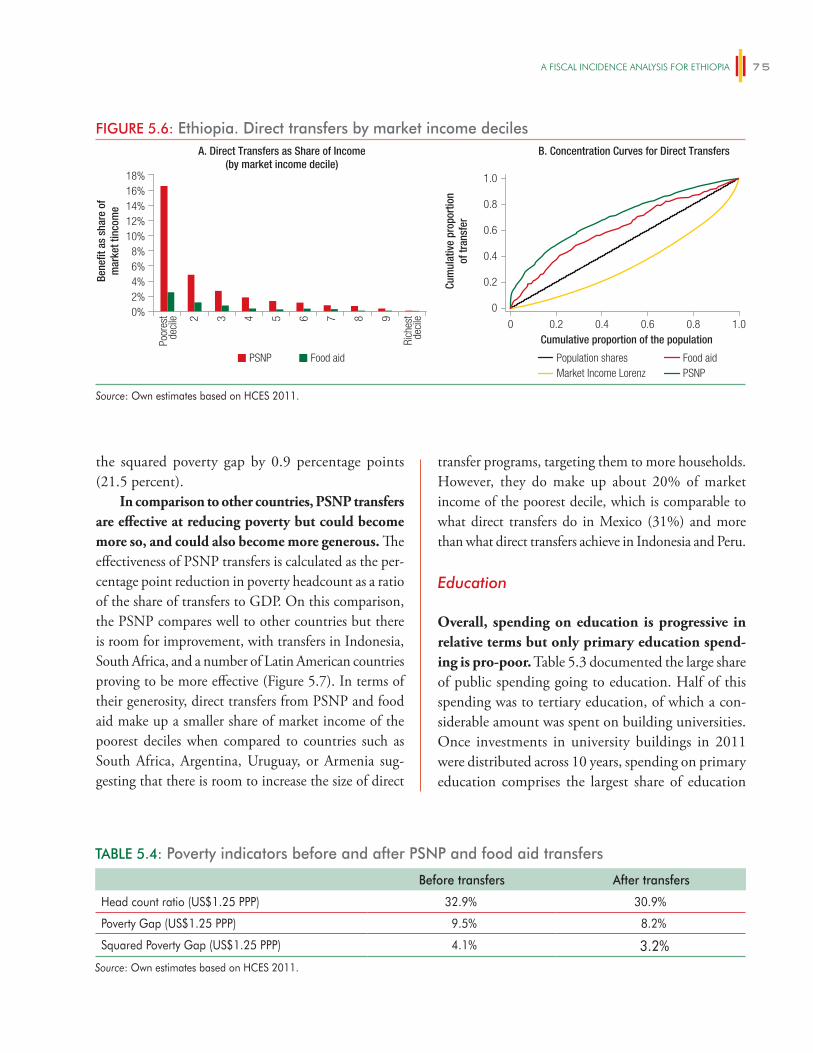
A FiSCAl iNCiDeNCe ANAlySiS FOR eThiOPiA 75
the squared poverty gap by 0.9 percentage points (21.5 percent).
In comparison to other countries, PSNP transfers are effective at reducing poverty but could become more so, and could also become more generous. The effectiveness of PSNP transfers is calculated as the per-centage point reduction in poverty headcount as a ratio of the share of transfers to GDP. On this comparison, the PSNP compares well to other countries but there is room for improvement, with transfers in Indonesia, South Africa, and a number of Latin American countries proving to be more effective (Figure 5.7). In terms of their generosity, direct transfers from PSNP and food aid make up a smaller share of market income of the poorest deciles when compared to countries such as South Africa, Argentina, Uruguay, or Armenia sug-gesting that there is room to increase the size of direct
transfer programs, targeting them to more households. However, they do make up about 20% of market income of the poorest decile, which is comparable to what direct transfers do in Mexico (31%) and more than what direct transfers achieve in Indonesia and Peru.
Education
Overall, spending on education is progressive in relative terms but only primary education spend-ing is pro-poor. Table 5.3 documented the large share of public spending going to education. Half of this spending was to tertiary education, of which a con-siderable amount was spent on building universities. Once investments in university buildings in 2011 were distributed across 10 years, spending on primary education comprises the largest share of education
TABLE 5.4: Poverty indicators before and after PSNP and food aid transfers
Before transfers After transfers
Head count ratio (US$1.25 PPP) 32.9% 30.9%
Poverty Gap (US$1.25 PPP) 9.5% 8.2%
Squared Poverty Gap (US$1.25 PPP) 4.1% 3.2%Source: Own estimates based on HCES 2011.
FIGURE 5.6: Ethiopia. Direct transfers by market income deciles
PSNP Food aid
A. Direct Transfers as Share of Income(by market income decile)
18%16%14%12%10%
8%6%4%2%0%
Poor
est
deci
le
Rich
est
deci
le2 3 4 5 6 7 8
0 0.2 0.4 0.6 0.8 1.0
9
Bene
fit a
s sh
are
ofm
arke
t tin
com
e
B. Concentration Curves for Direct Transfers
Cum
ulat
ive
prop
ortio
nof
tran
sfer
0
0.2
0.4
0.6
0.8
1.0
Cumulative proportion of the population
Population sharesMarket Income Lorenz
Food aidPSNP
Source: Own estimates based on HCES 2011.
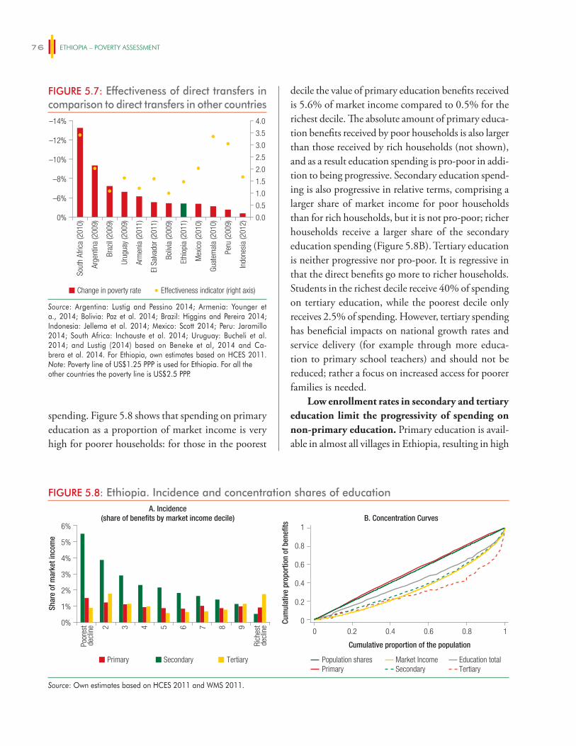
ETHIOPIA – POVERTY ASSESSMENT76
spending. Figure 5.8 shows that spending on primary education as a proportion of market income is very high for poorer households: for those in the poorest
decile the value of primary education benefits received is 5.6% of market income compared to 0.5% for the richest decile. The absolute amount of primary educa-tion benefits received by poor households is also larger than those received by rich households (not shown), and as a result education spending is pro-poor in addi-tion to being progressive. Secondary education spend-ing is also progressive in relative terms, comprising a larger share of market income for poor households than for rich households, but it is not pro-poor; richer households receive a larger share of the secondary education spending (Figure 5.8B). Tertiary education is neither progressive nor pro-poor. It is regressive in that the direct benefits go more to richer households. Students in the richest decile receive 40% of spending on tertiary education, while the poorest decile only receives 2.5% of spending. However, tertiary spending has beneficial impacts on national growth rates and service delivery (for example through more educa-tion to primary school teachers) and should not be reduced; rather a focus on increased access for poorer families is needed.
Low enrollment rates in secondary and tertiary education limit the progressivity of spending on non-primary education. Primary education is avail-able in almost all villages in Ethiopia, resulting in high
FIGURE 5.7: Effectiveness of direct transfers in comparison to direct transfers in other countries
Sout
h Af
rica
(201
0)
Arge
ntin
a (2
009)
Braz
il (2
009)
Urug
uay
(200
9)
Arm
enia
(201
1)
El S
alva
dor (
2011
)
Boliv
ia (2
009)
Ethi
opia
(201
1)
Indo
nesi
a (2
012)
Guat
emal
a (2
010)
Mex
ico
(201
0)
Peru
(200
9)0.0
0.5
1.0
1.5
2.0
2.5
3.0
3.5
4.0
0%
–6%
–8%
–10%
–12%
–14%
Change in poverty rate Effectiveness indicator (right axis)
Source: Argentina: Lustig and Pessino 2014; Armenia: Younger et a., 2014; Bolivia: Paz et al. 2014; Brazil: Higgins and Pereira 2014; Indonesia: Jellema et al. 2014; Mexico: Scott 2014; Peru: Jaramillo 2014; South Africa: Inchauste et al. 2014; Uruguay: Bucheli et al. 2014; and Lustig (2014) based on Beneke et al, 2014 and Ca-brera et al. 2014. For Ethiopia, own estimates based on HCES 2011.Note: Poverty line of US$1.25 PPP is used for Ethiopia. For all the other countries the poverty line is US$2.5 PPP.
FIGURE 5.8: Ethiopia. Incidence and concentration shares of educationA. Incidence
(share of benefits by market income decile)6%
5%
4%
3%
2%
1%
0%
Poor
est
decl
ine
Rich
est
decl
ine2 3 4 5 6 7 8 9
Shar
e of
mar
ket i
ncom
e
Cum
ulat
ive
prop
ortio
n of
ben
efits
B. Concentration Curves
Primary Secondary Tertiary
Cumulative proportion of the population
0
0.2
0.4
0.6
0.8
1
0 0.2 0.4 0.6 0.8 1
Population shares Market Income Education totalPrimary Secondary Tertiary
Source: Own estimates based on HCES 2011 and WMS 2011.
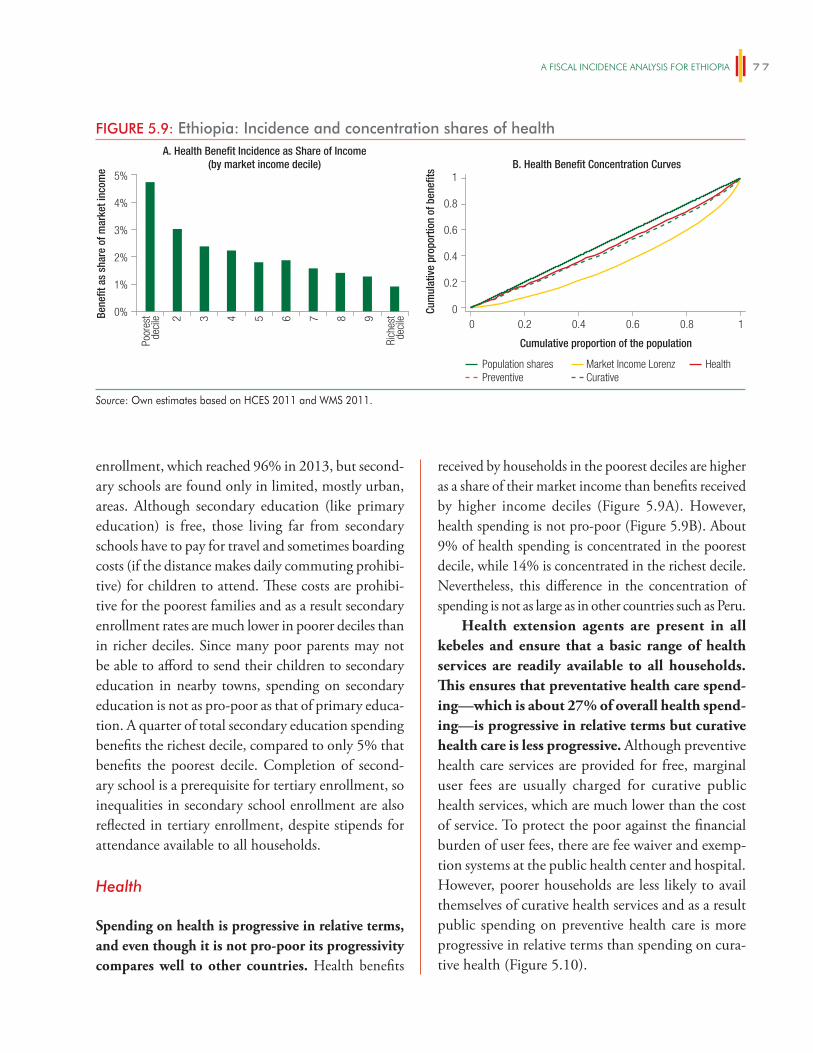
A FiSCAl iNCiDeNCe ANAlySiS FOR eThiOPiA 77
enrollment, which reached 96% in 2013, but second-ary schools are found only in limited, mostly urban, areas. Although secondary education (like primary education) is free, those living far from secondary schools have to pay for travel and sometimes boarding costs (if the distance makes daily commuting prohibi-tive) for children to attend. These costs are prohibi-tive for the poorest families and as a result secondary enrollment rates are much lower in poorer deciles than in richer deciles. Since many poor parents may not be able to afford to send their children to secondary education in nearby towns, spending on secondary education is not as pro-poor as that of primary educa-tion. A quarter of total secondary education spending benefits the richest decile, compared to only 5% that benefits the poorest decile. Completion of second-ary school is a prerequisite for tertiary enrollment, so inequalities in secondary school enrollment are also reflected in tertiary enrollment, despite stipends for attendance available to all households.
Health
Spending on health is progressive in relative terms, and even though it is not pro-poor its progressivity compares well to other countries. Health benefits
received by households in the poorest deciles are higher as a share of their market income than benefits received by higher income deciles (Figure 5.9A). However, health spending is not pro-poor (Figure 5.9B). About 9% of health spending is concentrated in the poorest decile, while 14% is concentrated in the richest decile. Nevertheless, this difference in the concentration of spending is not as large as in other countries such as Peru.
Health extension agents are present in all kebeles and ensure that a basic range of health services are readily available to all households. This ensures that preventative health care spend-ing—which is about 27% of overall health spend-ing—is progressive in relative terms but curative health care is less progressive. Although preventive health care services are provided for free, marginal user fees are usually charged for curative public health services, which are much lower than the cost of service. To protect the poor against the financial burden of user fees, there are fee waiver and exemp-tion systems at the public health center and hospital. However, poorer households are less likely to avail themselves of curative health services and as a result public spending on preventive health care is more progressive in relative terms than spending on cura-tive health (Figure 5.10).
FIGURE 5.9: Ethiopia: Incidence and concentration shares of healthA. Health Benefit Incidence as Share of Income
(by market income decile)5%
4%
3%
2%
1%
0%
Poor
est
deci
le
Rich
est
deci
le2 3 4 5 6 7 8 9Bene
fit a
s sh
are
of m
arke
t inc
ome B. Health Benefit Concentration Curves
Cumulative proportion of the population
0
0.2
0.4
0.6
0.8
1
0 0.2 0.4 0.6 0.8 1
Population shares Market Income Lorenz HealthPreventive Curative
Cum
ulat
ive
prop
ortio
n of
ben
efits
Source: Own estimates based on HCES 2011 and WMS 2011.
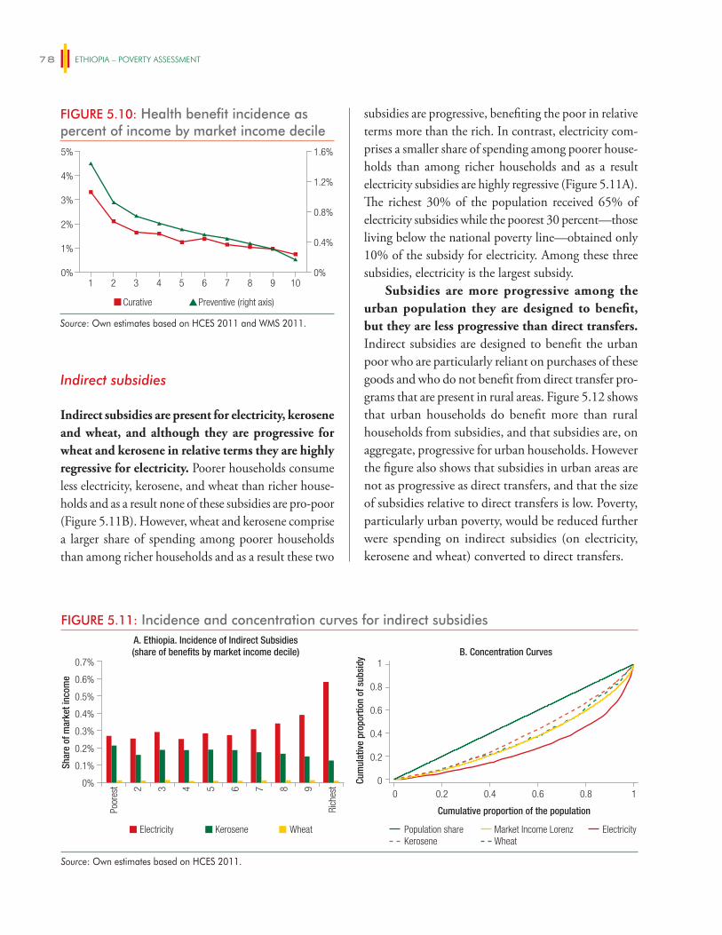
ETHIOPIA – POVERTY ASSESSMENT78
Indirect subsidies
Indirect subsidies are present for electricity, kerosene and wheat, and although they are progressive for wheat and kerosene in relative terms they are highly regressive for electricity. Poorer households consume less electricity, kerosene, and wheat than richer house-holds and as a result none of these subsidies are pro-poor (Figure 5.11B). However, wheat and kerosene comprise a larger share of spending among poorer households than among richer households and as a result these two
subsidies are progressive, benefiting the poor in relative terms more than the rich. In contrast, electricity com-prises a smaller share of spending among poorer house-holds than among richer households and as a result electricity subsidies are highly regressive (Figure 5.11A). The richest 30% of the population received 65% of electricity subsidies while the poorest 30 percent—those living below the national poverty line—obtained only 10% of the subsidy for electricity. Among these three subsidies, electricity is the largest subsidy.
Subsidies are more progressive among the urban population they are designed to benefit, but they are less progressive than direct transfers. Indirect subsidies are designed to benefit the urban poor who are particularly reliant on purchases of these goods and who do not benefit from direct transfer pro-grams that are present in rural areas. Figure 5.12 shows that urban households do benefit more than rural households from subsidies, and that subsidies are, on aggregate, progressive for urban households. However the figure also shows that subsidies in urban areas are not as progressive as direct transfers, and that the size of subsidies relative to direct transfers is low. Poverty, particularly urban poverty, would be reduced further were spending on indirect subsidies (on electricity, kerosene and wheat) converted to direct transfers.
FIGURE 5.10: Health benefit incidence as percent of income by market income decile
0%
0.4%
0.8%
1.2%
1.6%
0%1 2 3 4 65 7 8 9 10
1%
2%
3%
4%
5%
Curative Preventive (right axis)
Source: Own estimates based on HCES 2011 and WMS 2011.
FIGURE 5.11: Incidence and concentration curves for indirect subsidiesA. Ethiopia. Incidence of Indirect Subsidies(share of benefits by market income decile)
0.7%
0.6%
0.5%
0.4%
0.3%
0.2%
0.1%
0%
Poor
est
Rich
est2 3 4 5 6 7 8 9
Shar
e of
mar
ket i
ncom
e
B. Concentration Curves
Cumulative proportion of the population
0
0.2
0.4
0.6
0.8
1
0 0.2 0.4 0.6 0.8 1
Population share Market Income Lorenz ElectricityKerosene Wheat
Electricity Kerosene Wheat
Cum
ulat
ive
prop
ortio
n of
sub
sidy
Source: Own estimates based on HCES 2011.
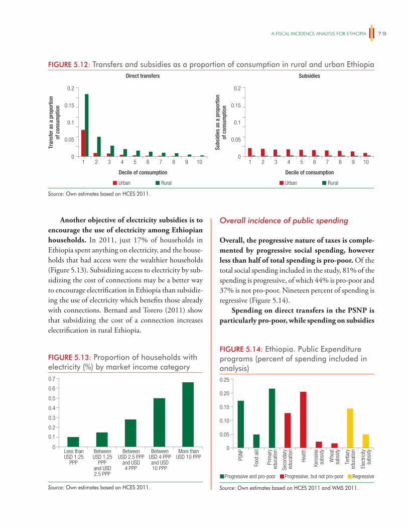
A FiSCAl iNCiDeNCe ANAlySiS FOR eThiOPiA 79
Another objective of electricity subsidies is to encourage the use of electricity among Ethiopian households. In 2011, just 17% of households in Ethiopia spent anything on electricity, and the house-holds that had access were the wealthier households (Figure 5.13). Subsidizing access to electricity by sub-sidizing the cost of connections may be a better way to encourage electrification in Ethiopia than subsidiz-ing the use of electricity which benefits those already with connections. Bernard and Torero (2011) show that subsidizing the cost of a connection increases electrification in rural Ethiopia.
Overall incidence of public spending
Overall, the progressive nature of taxes is comple-mented by progressive social spending, however less than half of total spending is pro-poor. Of the total social spending included in the study, 81% of the spending is progressive, of which 44% is pro-poor and 37% is not pro-poor. Nineteen percent of spending is regressive (Figure 5.14).
Spending on direct transfers in the PSNP is particularly pro-poor, while spending on subsidies
FIGURE 5.12: Transfers and subsidies as a proportion of consumption in rural and urban EthiopiaDirect transfers
0.2
0.15
0.1
0.05
021 3 4 5 6 7 8 9 10
Tran
sfer
as
a pr
opor
tion
of c
onsu
mpt
ion
Decile of consumption
Urban Rural
Subsidies
0.2
0.15
0.1
0.05
021 3 4 5 6 7 8 9 10
Subs
idie
s as
a p
ropo
rtio
nof
con
sum
ptio
n
Decile of consumption
Urban Rural
Source: Own estimates based on HCES 2011.
FIGURE 5.13: Proportion of households with electricity (%) by market income category
0
0.2
0.1
0.3
0.4
0.5
0.6
0.7
Less thanUSD 1.25
PPP
BetweenUSD 1.25
PPPand USD2.5 PPP
BetweenUSD 2.5 PPP
and USD 4 PPP
BetweenUSD 4 PPPand USD10 PPP
More thanUSD 10 PPP
Source: Own estimates based on HCES 2011.
FIGURE 5.14: Ethiopia. Public Expenditure programs (percent of spending included in analysis)
0
PSNP
Food
aid
Prim
ary
educ
atio
n
Seco
ndar
yed
ucat
ion
Heal
th
Kero
sine
subs
idy
Whe
atsu
bsid
y
Terti
ary
educ
atio
n
Elec
trici
tysu
bsid
y
0.05
0.10
0.15
0.20
0.25
Progressive and pro-poor Progressive, but not pro-poor Regressive
Source: Own estimates based on HCES 2011 and WMS 2011.
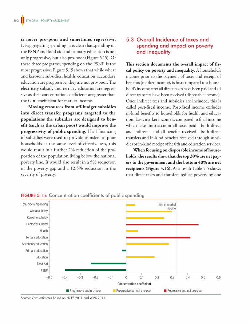
ETHIOPIA – POVERTY ASSESSMENT80
is never pro-poor and sometimes regressive. Disaggregating spending, it is clear that spending on the PSNP and food aid and primary education is not only progressive, but also pro-poor (Figure 5.15). Of these three programs, spending on the PSNP is the most progressive. Figure 5.15 shows that while wheat and kerosene subsidies, health, education, secondary education are progressive, they are not pro-poor. The electricity subsidy and tertiary education are regres-sive as their concentration coefficients are greater than the Gini coefficient for market income.
Moving resources from off-budget subsidies into direct transfer programs targeted to the populations the subsidies are designed to ben-efit (such as the urban poor) would improve the progressivity of public spending. If all financing of subsidies were used to provide transfers to poor households at the same level of effectiveness, this would result in a further 2% reduction of the pro-portion of the population living below the national poverty line. It would also result in a 5% reduction in the poverty gap and a 12.5% reduction in the severity of poverty.
5.3 Overall Incidence of taxes and spending and impact on poverty and inequality
This section documents the overall impact of fis-cal policy on poverty and inequality. A household’s income prior to the payment of taxes and receipt of benefits (market income), is first compared to a house-hold’s income after all direct taxes have been paid and all direct transfers have been received (disposable income). Once indirect txes and subsidies are included, this is called post-fiscal income. Post-fiscal income excludes in-kind benefits to households for health and educa-tion. Last, market income is compared to final income which takes into account all taxes paid—both direct and indirect—and all benefits received—both direct transfers and in-kind benefits received through subsi-dies or in-kind receipt of health and education services.
When focusing on disposable income of house-holds, the results show that the top 30% are net pay-ers to the government and the bottom 40% are net recipients (Figure 5.16). As a result Table 5.5 shows that direct taxes and transfers reduce poverty by one
FIGURE 5.15: Concentration coefficients of public spending
Progressive and pro-poor Progressive but not pro-poor Regressive and not pro-poor
Concentration coefficient
–0.5 –0.4 –0.3 –0.2 –0.1 0 0.1 0.2 0.3 0.4 0.5 0.6
PSNP
Food Aid
Education
Primary education
Secondary education
Tertiary education
Health
Electricity subsidy
Kerosine subsidy
Wheat subsidy
Total Social Spending Gini of market income
Source: Own estimates based on HCES 2011 and WMS 2011.
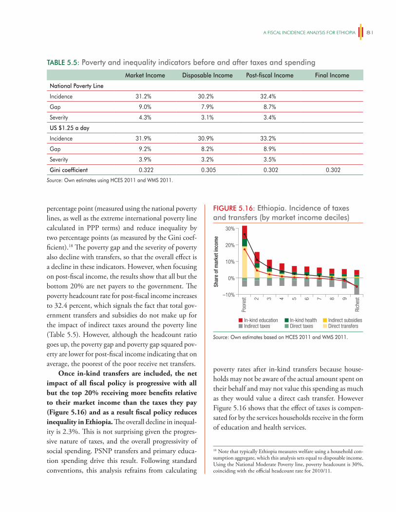
A FiSCAl iNCiDeNCe ANAlySiS FOR eThiOPiA 81
percentage point (measured using the national poverty lines, as well as the extreme international poverty line calculated in PPP terms) and reduce inequality by two percentage points (as measured by the Gini coef-ficient).18 The poverty gap and the severity of poverty also decline with transfers, so that the overall effect is a decline in these indicators. However, when focusing on post-fiscal income, the results show that all but the bottom 20% are net payers to the government. The poverty headcount rate for post-fiscal income increases to 32.4 percent, which signals the fact that total gov-ernment transfers and subsidies do not make up for the impact of indirect taxes around the poverty line (Table 5.5). However, although the headcount ratio goes up, the poverty gap and poverty gap squared pov-erty are lower for post-fiscal income indicating that on average, the poorest of the poor receive net transfers.
Once in-kind transfers are included, the net impact of all fiscal policy is progressive with all but the top 20% receiving more benefits relative to their market income than the taxes they pay (Figure 5.16) and as a result fiscal policy reduces inequality in Ethiopia. The overall decline in inequal-ity is 2.3%. This is not surprising given the progres-sive nature of taxes, and the overall progressivity of social spending. PSNP transfers and primary educa-tion spending drive this result. Following standard conventions, this analysis refrains from calculating
poverty rates after in-kind transfers because house-holds may not be aware of the actual amount spent on their behalf and may not value this spending as much as they would value a direct cash transfer. However Figure 5.16 shows that the effect of taxes is compen-sated for by the services households receive in the form of education and health services.
TABLE 5.5: Poverty and inequality indicators before and after taxes and spending
Market Income Disposable Income Post-fiscal Income Final Income
National Poverty Line
Incidence 31.2% 30.2% 32.4%
Gap 9.0% 7.9% 8.7%
Severity 4.3% 3.1% 3.4%
US $1.25 a day
Incidence 31.9% 30.9% 33.2%
Gap 9.2% 8.2% 8.9%
Severity 3.9% 3.2% 3.5%
Gini coefficient 0.322 0.305 0.302 0.302
Source: Own estimates using HCES 2011 and WMS 2011.
18 Note that typically Ethiopia measures welfare using a household con-sumption aggregate, which this analysis sets equal to disposable income. Using the National Moderate Poverty line, poverty headcount is 30%, coinciding with the official headcount rate for 2010/11.
FIGURE 5.16: Ethiopia. Incidence of taxes and transfers (by market income deciles)
30%
20%
10%
0%
–10%
Shar
e of
mar
ket i
ncom
e
In-kind education In-kind health Indirect subsidiesIndirect taxes Direct taxes Direct transfers
Poor
est
Rich
est2 3 4 5 6 7 8 9Source: Own estimates based on HCES 2011 and WMS 2011.
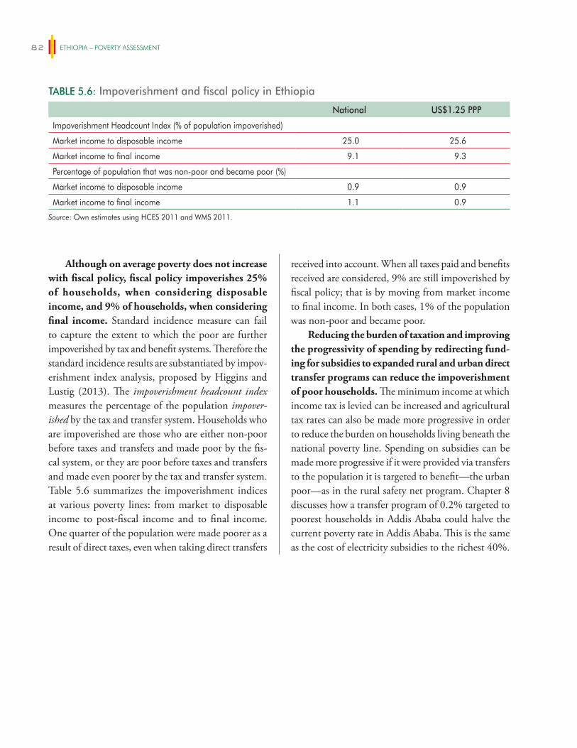
ETHIOPIA – POVERTY ASSESSMENT82
received into account. When all taxes paid and benefits received are considered, 9% are still impoverished by fiscal policy; that is by moving from market income to final income. In both cases, 1% of the population was non-poor and became poor.
Reducing the burden of taxation and improving the progressivity of spending by redirecting fund-ing for subsidies to expanded rural and urban direct transfer programs can reduce the impoverishment of poor households. The minimum income at which income tax is levied can be increased and agricultural tax rates can also be made more progressive in order to reduce the burden on households living beneath the national poverty line. Spending on subsidies can be made more progressive if it were provided via transfers to the population it is targeted to benefit—the urban poor—as in the rural safety net program. Chapter 8 discusses how a transfer program of 0.2% targeted to poorest households in Addis Ababa could halve the current poverty rate in Addis Ababa. This is the same as the cost of electricity subsidies to the richest 40%.
Although on average poverty does not increase with fiscal policy, fiscal policy impoverishes 25% of households, when considering disposable income, and 9% of households, when considering final income. Standard incidence measure can fail to capture the extent to which the poor are further impoverished by tax and benefit systems. Therefore the standard incidence results are substantiated by impov-erishment index analysis, proposed by Higgins and Lustig (2013). The impoverishment headcount index measures the percentage of the population impover-ished by the tax and transfer system. Households who are impoverished are those who are either non-poor before taxes and transfers and made poor by the fis-cal system, or they are poor before taxes and transfers and made even poorer by the tax and transfer system. Table 5.6 summarizes the impoverishment indices at various poverty lines: from market to disposable income to post-fiscal income and to final income. One quarter of the population were made poorer as a result of direct taxes, even when taking direct transfers
TABLE 5.6: Impoverishment and fiscal policy in Ethiopia
National US$1.25 PPP
Impoverishment Headcount Index (% of population impoverished)
Market income to disposable income 25.0 25.6
Market income to final income 9.1 9.3
Percentage of population that was non-poor and became poor (%)
Market income to disposable income 0.9 0.9
Market income to final income 1.1 0.9
Source: Own estimates using HCES 2011 and WMS 2011.
83
NON-FARM ENTERPRISES AND POVERTY REDUCTION IN ETHIOPIA
6.1 Introduction
In addition to being the primary sector of activ-ity for 11–14% of the population, a further 11% of rural households earn about a quarter of their income from operating non-farm enterprises (NFEs) in the service sector. This income is earned largely during harvest months and months immedi-ately following harvest. The income earned from these activities improves the wellbeing of households and its role in reducing poverty can be missed in the standard decomposition and growth regression techniques used in Chapter 4 of this report.
Ascertaining the impact of these types of service sector activities on poverty reduction is difficult but this chapter provides more information on the amount of income these activities generate and for which types of households. These individuals often have a primary categorization in agriculture and the non-farm income they earn is highly correlated with agricultural income, causing growth analyses to attri-bute this impact to agricultural growth. Simply ascer-taining whether households with NFEs are poorer or richer than other households also does not address this question. If households with NFEs are richer it could be that operating NFEs is a means by which some poor, uneducated households grow their incomes and escape poverty. On the other hand, it could simply be the case that it these households are already better off and are able to invest in high-return NFE activities, and are thus more likely to operate them.
While NFEs provide some secondary income in rural areas and a source of income for those unable to secure employment in rural towns, the contribution of this sector is small in comparison to other countries. In comparison to other countries,
the proportion of households engaged in non-farm activities is very low and there is no clear evidence of recent growth in this sector since 2008 when 25% of households reported owning a non-farm enterprise. The rural non-farm sector is estimated to account for between 35–50% of household earnings in the devel-oping world and an average of 34% of rural earnings across Africa (Haggbalde et al. 2010). The numbers reported in this chapter from 2011–12 suggests it com-prises about 10% of household earnings in Ethiopia. Additionally NFEs in Ethiopia are largely complemen-tary to agriculture and driven by growth in this sector. As a result they are not able to provide any activity and income for households during the lean season and they do not allow households to manage any agricultural losses they might experience. The close dependence of NFE activity on agricultural income means that this is not a driver of poverty reduction on its own.
An initial assessment of constraints to NFEs suggests that interventions to increase demand will have the largest impact on increasing the vibrancy of this sector and its role in reducing poverty. On the supply side, NFEs appear to depend on agri-cultural income for inputs and investment capital. On the demand side, they rely heavily on increased local demand during the harvest period to generate household income. The need for capital does not appear to be a major cause for the current seasonal-ity of NFEs, but many do report access to market demand as a major constraint. Increasing demand will require further investments in infrastructure, increased employment the manufacturing sector on non-seasonal service sector activities, and increased agricultural revenues.
The chapter uses detailed data on the liveli-hoods of households in rural and small-town
6
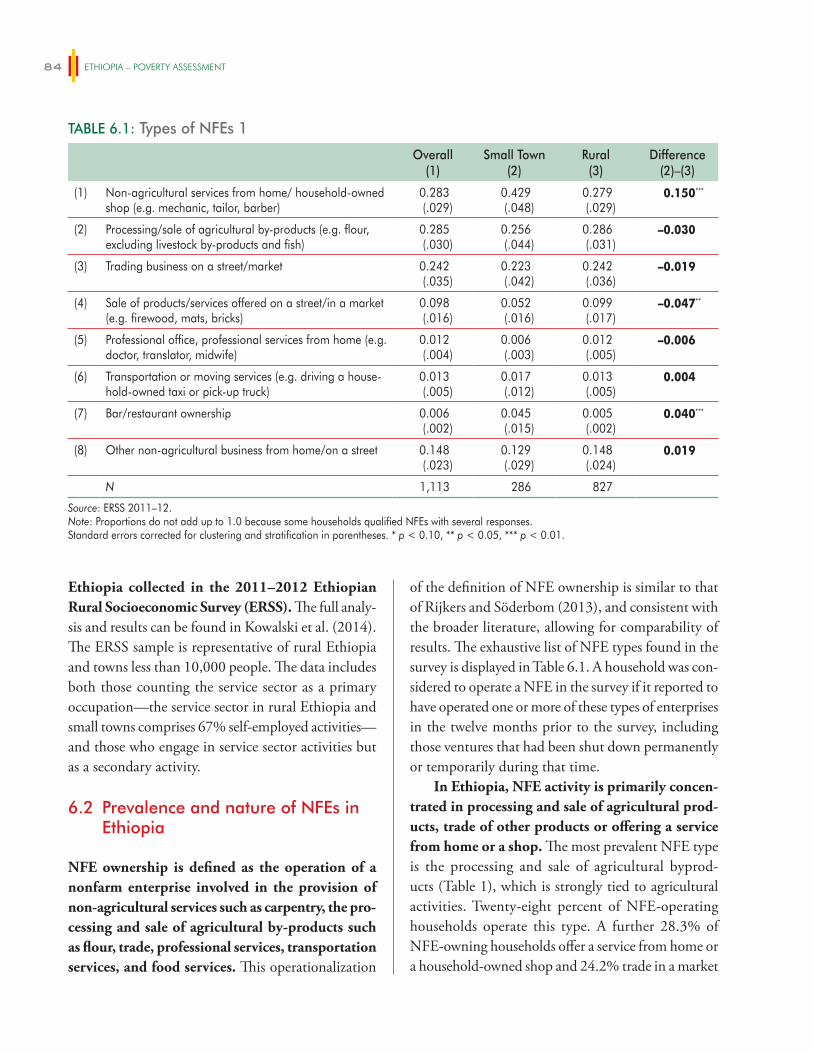
ETHIOPIA – POVERTY ASSESSMENT84
Ethiopia collected in the 2011–2012 Ethiopian Rural Socioeconomic Survey (ERSS). The full analy-sis and results can be found in Kowalski et al. (2014). The ERSS sample is representative of rural Ethiopia and towns less than 10,000 people. The data includes both those counting the service sector as a primary occupation—the service sector in rural Ethiopia and small towns comprises 67% self-employed activities—and those who engage in service sector activities but as a secondary activity.
6.2 Prevalence and nature of NFEs in Ethiopia
NFE ownership is defined as the operation of a nonfarm enterprise involved in the provision of non-agricultural services such as carpentry, the pro-cessing and sale of agricultural by-products such as flour, trade, professional services, transportation services, and food services. This operationalization
of the definition of NFE ownership is similar to that of Rijkers and Söderbom (2013), and consistent with the broader literature, allowing for comparability of results. The exhaustive list of NFE types found in the survey is displayed in Table 6.1. A household was con-sidered to operate a NFE in the survey if it reported to have operated one or more of these types of enterprises in the twelve months prior to the survey, including those ventures that had been shut down permanently or temporarily during that time.
In Ethiopia, NFE activity is primarily concen-trated in processing and sale of agricultural prod-ucts, trade of other products or offering a service from home or a shop. The most prevalent NFE type is the processing and sale of agricultural byprod-ucts (Table 1), which is strongly tied to agricultural activities. Twenty-eight percent of NFE-operating households operate this type. A further 28.3% of NFE-owning households offer a service from home or a household-owned shop and 24.2% trade in a market
TABLE 6.1: Types of NFEs 1
Overall(1)
Small Town(2)
Rural(3)
Difference(2)–(3)
(1) Non-agricultural services from home/ household-owned shop (e.g. mechanic, tailor, barber)
0.283(.029)
0.429(.048)
0.279(.029)
0.150***
(2) Processing/sale of agricultural by-products (e.g. flour, excluding livestock by-products and fish)
0.285(.030)
0.256(.044)
0.286(.031)
–0.030
(3) Trading business on a street/market 0.242(.035)
0.223(.042)
0.242(.036)
–0.019
(4) Sale of products/services offered on a street/in a market (e.g. firewood, mats, bricks)
0.098(.016)
0.052(.016)
0.099(.017)
–0.047**
(5) Professional office, professional services from home (e.g. doctor, translator, midwife)
0.012(.004)
0.006(.003)
0.012(.005)
–0.006
(6) Transportation or moving services (e.g. driving a house-hold-owned taxi or pick-up truck)
0.013(.005)
0.017(.012)
0.013(.005)
0.004
(7) Bar/restaurant ownership 0.006(.002)
0.045(.015)
0.005(.002)
0.040***
(8) Other non-agricultural business from home/on a street 0.148(.023)
0.129(.029)
0.148(.024)
0.019
N 1,113 286 827
Source: ERSS 2011–12.Note: Proportions do not add up to 1.0 because some households qualified NFEs with several responses.Standard errors corrected for clustering and stratification in parentheses. * p < 0.10, ** p < 0.05, *** p < 0.01.
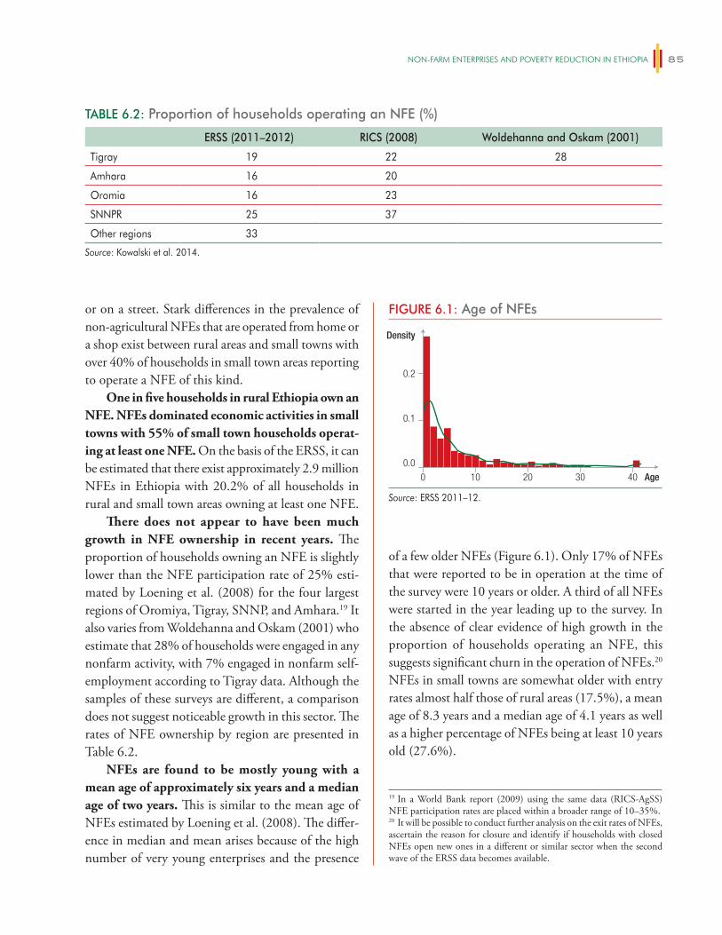
NON-FARm eNTeRPRiSeS AND POveRTy ReDUCTiON iN eThiOPiA 85
or on a street. Stark differences in the prevalence of non-agricultural NFEs that are operated from home or a shop exist between rural areas and small towns with over 40% of households in small town areas reporting to operate a NFE of this kind.
One in five households in rural Ethiopia own an NFE. NFEs dominated economic activities in small towns with 55% of small town households operat-ing at least one NFE. On the basis of the ERSS, it can be estimated that there exist approximately 2.9 million NFEs in Ethiopia with 20.2% of all households in rural and small town areas owning at least one NFE.
There does not appear to have been much growth in NFE ownership in recent years. The proportion of households owning an NFE is slightly lower than the NFE participation rate of 25% esti-mated by Loening et al. (2008) for the four largest regions of Oromiya, Tigray, SNNP, and Amhara.19 It also varies from Woldehanna and Oskam (2001) who estimate that 28% of households were engaged in any nonfarm activity, with 7% engaged in nonfarm self-employment according to Tigray data. Although the samples of these surveys are different, a comparison does not suggest noticeable growth in this sector. The rates of NFE ownership by region are presented in Table 6.2.
NFEs are found to be mostly young with a mean age of approximately six years and a median age of two years. This is similar to the mean age of NFEs estimated by Loening et al. (2008). The differ-ence in median and mean arises because of the high number of very young enterprises and the presence
of a few older NFEs (Figure 6.1). Only 17% of NFEs that were reported to be in operation at the time of the survey were 10 years or older. A third of all NFEs were started in the year leading up to the survey. In the absence of clear evidence of high growth in the proportion of households operating an NFE, this suggests significant churn in the operation of NFEs.20 NFEs in small towns are somewhat older with entry rates almost half those of rural areas (17.5%), a mean age of 8.3 years and a median age of 4.1 years as well as a higher percentage of NFEs being at least 10 years old (27.6%).
TABLE 6.2: Proportion of households operating an NFE (%)
ERSS (2011–2012) RICS (2008) Woldehanna and Oskam (2001)
Tigray 19 22 28
Amhara 16 20
Oromia 16 23
SNNPR 25 37
Other regions 33
Source: Kowalski et al. 2014.
19 In a World Bank report (2009) using the same data (RICS-AgSS) NFE participation rates are placed within a broader range of 10–35%.20 It will be possible to conduct further analysis on the exit rates of NFEs, ascertain the reason for closure and identify if households with closed NFEs open new ones in a different or similar sector when the second wave of the ERSS data becomes available.
FIGURE 6.1: Age of NFEs
0.0
0.2
0.1
0 10 20 30 40
Density
Age
Source: ERSS 2011–12.
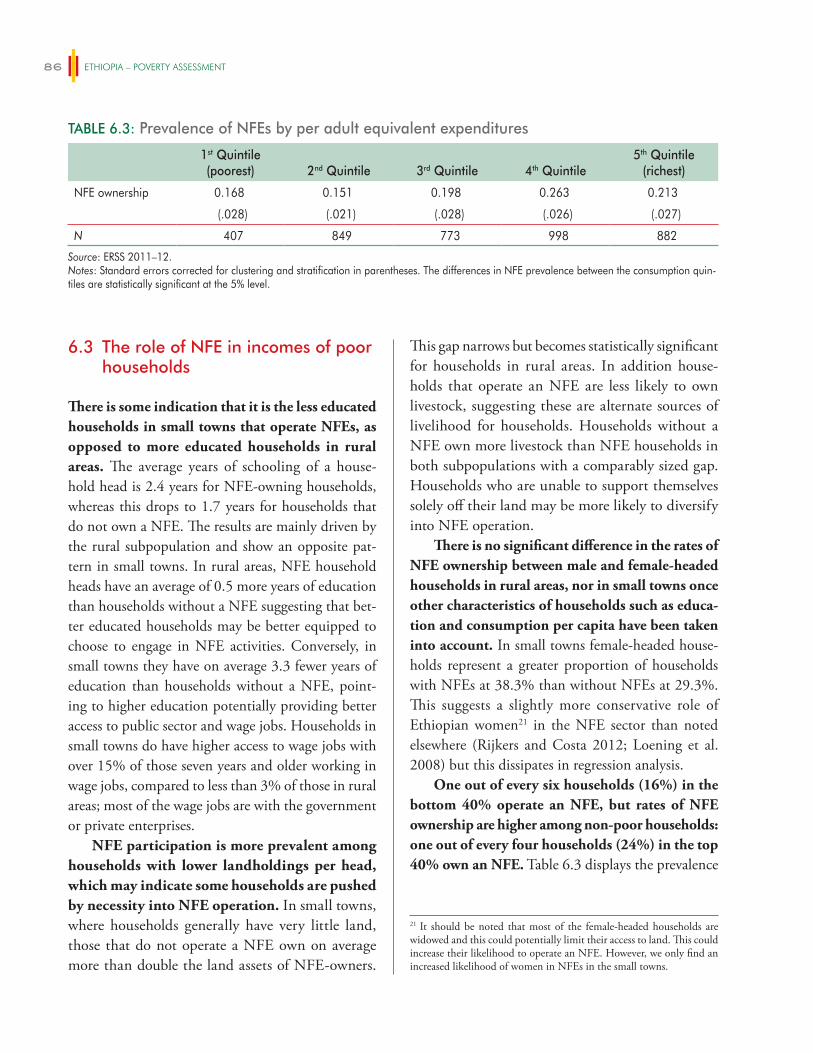
ETHIOPIA – POVERTY ASSESSMENT86
6.3 The role of NFE in incomes of poor households
There is some indication that it is the less educated households in small towns that operate NFEs, as opposed to more educated households in rural areas. The average years of schooling of a house-hold head is 2.4 years for NFE-owning households, whereas this drops to 1.7 years for households that do not own a NFE. The results are mainly driven by the rural subpopulation and show an opposite pat-tern in small towns. In rural areas, NFE household heads have an average of 0.5 more years of education than households without a NFE suggesting that bet-ter educated households may be better equipped to choose to engage in NFE activities. Conversely, in small towns they have on average 3.3 fewer years of education than households without a NFE, point-ing to higher education potentially providing better access to public sector and wage jobs. Households in small towns do have higher access to wage jobs with over 15% of those seven years and older working in wage jobs, compared to less than 3% of those in rural areas; most of the wage jobs are with the government or private enterprises.
NFE participation is more prevalent among households with lower landholdings per head, which may indicate some households are pushed by necessity into NFE operation. In small towns, where households generally have very little land, those that do not operate a NFE own on average more than double the land assets of NFE-owners.
This gap narrows but becomes statistically significant for households in rural areas. In addition house-holds that operate an NFE are less likely to own livestock, suggesting these are alternate sources of livelihood for households. Households without a NFE own more livestock than NFE households in both subpopulations with a comparably sized gap. Households who are unable to support themselves solely off their land may be more likely to diversify into NFE operation.
There is no significant difference in the rates of NFE ownership between male and female-headed households in rural areas, nor in small towns once other characteristics of households such as educa-tion and consumption per capita have been taken into account. In small towns female-headed house-holds represent a greater proportion of households with NFEs at 38.3% than without NFEs at 29.3%. This suggests a slightly more conservative role of Ethiopian women21 in the NFE sector than noted elsewhere (Rijkers and Costa 2012; Loening et al. 2008) but this dissipates in regression analysis.
One out of every six households (16%) in the bottom 40% operate an NFE, but rates of NFE ownership are higher among non-poor households: one out of every four households (24%) in the top 40% own an NFE. Table 6.3 displays the prevalence
TABLE 6.3: Prevalence of NFEs by per adult equivalent expenditures
1st Quintile(poorest) 2nd Quintile 3rd Quintile 4th Quintile
5th Quintile(richest)
NFE ownership 0.168 0.151 0.198 0.263 0.213
(.028) (.021) (.028) (.026) (.027)
N 407 849 773 998 882
Source: ERSS 2011–12. Notes: Standard errors corrected for clustering and stratification in parentheses. The differences in NFE prevalence between the consumption quin-tiles are statistically significant at the 5% level.
21 It should be noted that most of the female-headed households are widowed and this could potentially limit their access to land. This could increase their likelihood to operate an NFE. However, we only find an increased likelihood of women in NFEs in the small towns.
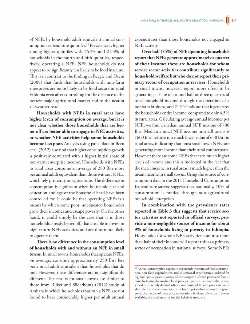
NON-FARm eNTeRPRiSeS AND POveRTy ReDUCTiON iN eThiOPiA 87
of NFEs by household adult equivalent annual con-sumption expenditure quintiles.22 Prevalence is higher among higher quintiles with 26.3% and 21.3% of households in the fourth and fifth quintiles, respec-tively, operating a NFE. NFE households do not appear to be significantly less likely to be food insecure. This is in contrast to the finding in Beegle and Oseni (2008) that finds that households with non-farm enterprises are more likely to be food secure in rural Ethiopia even after controlling for the distance to the nearest major agricultural market and to the nearest all-weather road.
Households with NFEs in rural areas have higher levels of consumption on average, but it is not clear whether those households that are bet-ter off are better able to engage in NFE activities, or whether NFE activities help some households become less poor. Analysis using panel data in Bezu et al. (2012) also find that higher consumption growth is positively correlated with a higher initial share of non-farm enterprise income. Households with NFEs in rural areas consume an average of 280 Birr more per annual adult equivalent than those without NFEs, which rely primarily on agriculture. The difference in consumption is significant when household size and education and age of the household head have been controlled for. It could be that operating NFEs is a means by which some poor, uneducated households grow their incomes and escape poverty. On the other hand, it could simply be the case that it is those households already better off, that are able to invest in high-return NFE activities, and are thus more likely to operate them.
There is no difference in the consumption level of households with and without an NFE in small towns. In small towns, households that operate NFEs, on average, consume approximately 250 Birr less per annual adult equivalent than households that do not. However, these differences are not significantly different. The results for small towns are similar to those from Rijker and Söderbom’s (2012) study of Amhara in which households that run a NFE are not found to have considerably higher per adult annual
expenditures than those households not engaged in NFE activity.
Over half (54%) of NFE operating households report that NFEs generate approximately a quarter of their income: these are households for whom service sector activities contribute significantly to household welfare but who do not report their pri-mary sector of occupation as services. Households in small towns, however, report more often to be generating a share of around half or three quarters of total household income through the operation of a nonfarm business, and 21.9% indicate that it generates the household’s entire income, compared to only 4.5% in rural areas. Calculating average annual incomes per NFE, we find a median annual NFE income of 700 Birr. Median annual NFE income in small towns is 1600 Birr, relative to a much lower value of 650 Birr in rural areas, indicating that most small town NFEs are generating more income than their rural counterparts. However there are some NFEs that earn much higher levels of income and this is indicated in the fact that the mean income in rural areas is much higher than the mean income in small towns. Using the source of con-sumption data in the 2011 Household Consumption Expenditure survey suggests that nationally, 10% of consumption is funded through non-agricultural household enterprises.
In combination with the prevalence rates reported in Table 3 this suggests that service sec-tor activities not reported in official surveys, pro-vide a non-negligible source of income for about 9% of households living in poverty in Ethiopia. Households for whom NFE activities comprise more than half of their income will report this as a primary sector of occupation in national surveys. Some NFEs
22 Annual consumption expenditures include measures of food consump-tion, non-food expenditures, and educational expenditures, indexed for regional spatial price. Costing of consumption of own produced food is done by taking the median local price per gram. To ensure stable prices, a local price is only defined when a minimum of 10 unit prices are avail-able. Hence, if an enumeration area has 10 price observations for a given good, the median of these price observations is taken. If less than 10 were available, the median price for the kebele is used, etc.
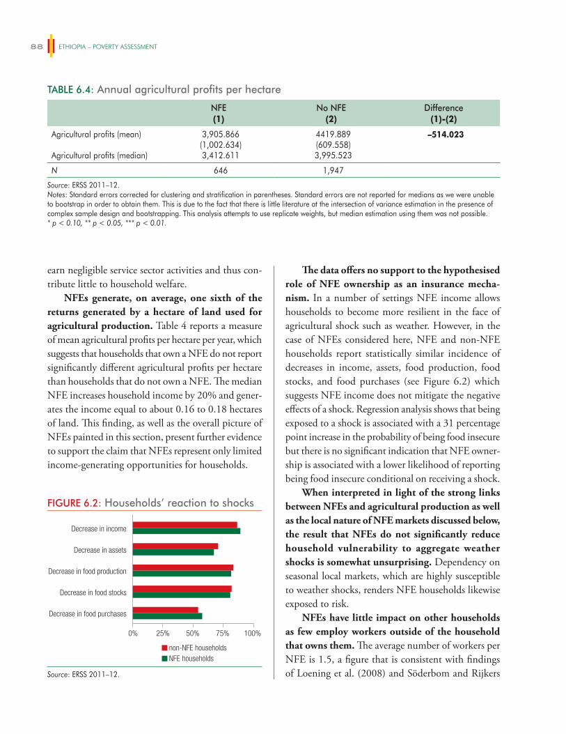
ETHIOPIA – POVERTY ASSESSMENT88
earn negligible service sector activities and thus con-tribute little to household welfare.
NFEs generate, on average, one sixth of the returns generated by a hectare of land used for agricultural production. Table 4 reports a measure of mean agricultural profits per hectare per year, which suggests that households that own a NFE do not report significantly different agricultural profits per hectare than households that do not own a NFE. The median NFE increases household income by 20% and gener-ates the income equal to about 0.16 to 0.18 hectares of land. This finding, as well as the overall picture of NFEs painted in this section, present further evidence to support the claim that NFEs represent only limited income-generating opportunities for households.
The data offers no support to the hypothesised role of NFE ownership as an insurance mecha-nism. In a number of settings NFE income allows households to become more resilient in the face of agricultural shock such as weather. However, in the case of NFEs considered here, NFE and non-NFE households report statistically similar incidence of decreases in income, assets, food production, food stocks, and food purchases (see Figure 6.2) which suggests NFE income does not mitigate the negative effects of a shock. Regression analysis shows that being exposed to a shock is associated with a 31 percentage point increase in the probability of being food insecure but there is no significant indication that NFE owner-ship is associated with a lower likelihood of reporting being food insecure conditional on receiving a shock.
When interpreted in light of the strong links between NFEs and agricultural production as well as the local nature of NFE markets discussed below, the result that NFEs do not significantly reduce household vulnerability to aggregate weather shocks is somewhat unsurprising. Dependency on seasonal local markets, which are highly susceptible to weather shocks, renders NFE households likewise exposed to risk.
NFEs have little impact on other households as few employ workers outside of the household that owns them. The average number of workers per NFE is 1.5, a figure that is consistent with findings of Loening et al. (2008) and Söderbom and Rijkers
TABLE 6.4: Annual agricultural profits per hectare
NFE(1)
No NFE(2)
Difference(1)-(2)
Agricultural profits (mean)
Agricultural profits (median)
3,905.866(1,002.634)3,412.611
4419.889(609.558)3,995.523
–514.023
N 646 1,947
Source: ERSS 2011–12. Notes: Standard errors corrected for clustering and stratification in parentheses. Standard errors are not reported for medians as we were unable to bootstrap in order to obtain them. This is due to the fact that there is little literature at the intersection of variance estimation in the presence of complex sample design and bootstrapping. This analysis attempts to use replicate weights, but median estimation using them was not possible.* p < 0.10, ** p < 0.05, *** p < 0.01.
FIGURE 6.2: Households’ reaction to shocks
non-NFE householdsNFE households
Decrease in food purchases
Decrease in food stocks
Decrease in food production
Decrease in assets
Decrease in income
0% 25% 50% 75% 100%
Source: ERSS 2011–12.
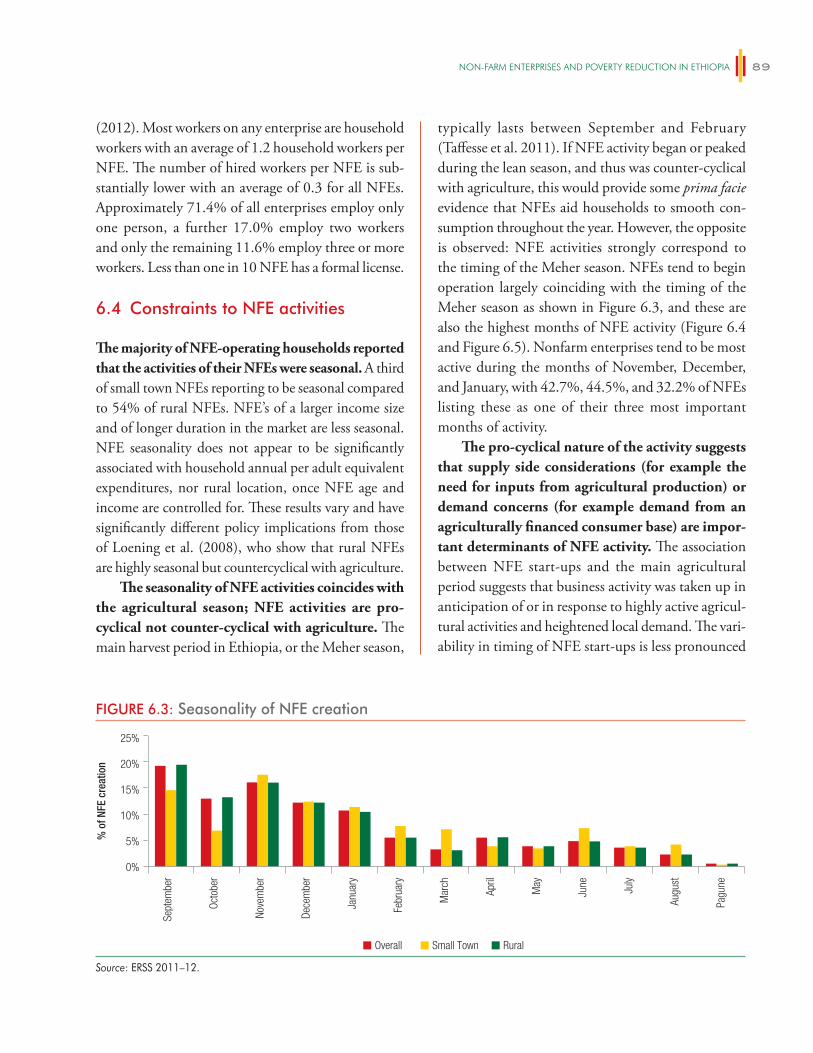
NON-FARm eNTeRPRiSeS AND POveRTy ReDUCTiON iN eThiOPiA 89
(2012). Most workers on any enterprise are household workers with an average of 1.2 household workers per NFE. The number of hired workers per NFE is sub-stantially lower with an average of 0.3 for all NFEs. Approximately 71.4% of all enterprises employ only one person, a further 17.0% employ two workers and only the remaining 11.6% employ three or more workers. Less than one in 10 NFE has a formal license.
6.4 Constraints to NFE activities
The majority of NFE-operating households reported that the activities of their NFEs were seasonal. A third of small town NFEs reporting to be seasonal compared to 54% of rural NFEs. NFE’s of a larger income size and of longer duration in the market are less seasonal. NFE seasonality does not appear to be significantly associated with household annual per adult equivalent expenditures, nor rural location, once NFE age and income are controlled for. These results vary and have significantly different policy implications from those of Loening et al. (2008), who show that rural NFEs are highly seasonal but countercyclical with agriculture.
The seasonality of NFE activities coincides with the agricultural season; NFE activities are pro-cyclical not counter-cyclical with agriculture. The main harvest period in Ethiopia, or the Meher season,
typically lasts between September and February (Taffesse et al. 2011). If NFE activity began or peaked during the lean season, and thus was counter-cyclical with agriculture, this would provide some prima facie evidence that NFEs aid households to smooth con-sumption throughout the year. However, the opposite is observed: NFE activities strongly correspond to the timing of the Meher season. NFEs tend to begin operation largely coinciding with the timing of the Meher season as shown in Figure 6.3, and these are also the highest months of NFE activity (Figure 6.4 and Figure 6.5). Nonfarm enterprises tend to be most active during the months of November, December, and January, with 42.7%, 44.5%, and 32.2% of NFEs listing these as one of their three most important months of activity.
The pro-cyclical nature of the activity suggests that supply side considerations (for example the need for inputs from agricultural production) or demand concerns (for example demand from an agriculturally financed consumer base) are impor-tant determinants of NFE activity. The association between NFE start-ups and the main agricultural period suggests that business activity was taken up in anticipation of or in response to highly active agricul-tural activities and heightened local demand. The vari-ability in timing of NFE start-ups is less pronounced
FIGURE 6.3: Seasonality of NFE creation
0%
5%
10%
15%
20%
25%
Sept
embe
r
Octo
ber
Nove
mbe
r
Dece
mbe
r
Janu
ary
Febr
uary
Mar
ch
April
May
June July
Augu
st
Pagu
ne
Overall Small Town Rural
% o
f NFE
cre
atio
n
Source: ERSS 2011–12.
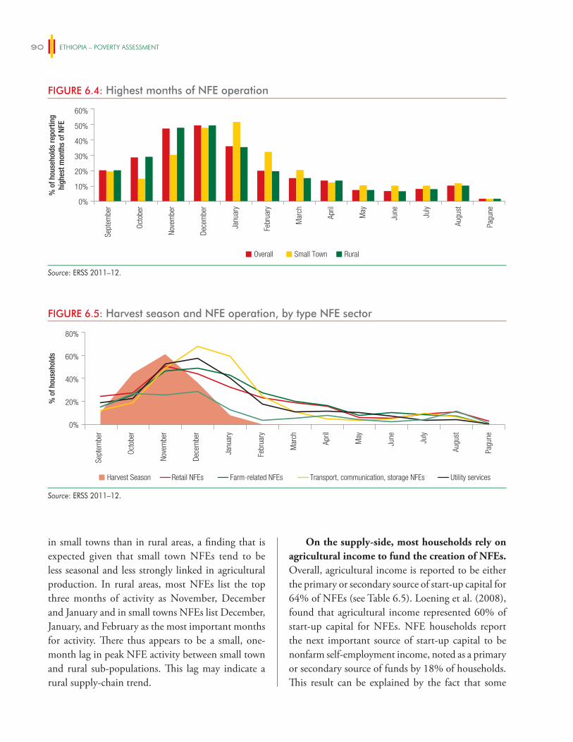
ETHIOPIA – POVERTY ASSESSMENT90
in small towns than in rural areas, a finding that is expected given that small town NFEs tend to be less seasonal and less strongly linked in agricultural production. In rural areas, most NFEs list the top three months of activity as November, December and January and in small towns NFEs list December, January, and February as the most important months for activity. There thus appears to be a small, one-month lag in peak NFE activity between small town and rural sub-populations. This lag may indicate a rural supply-chain trend.
On the supply-side, most households rely on agricultural income to fund the creation of NFEs. Overall, agricultural income is reported to be either the primary or secondary source of start-up capital for 64% of NFEs (see Table 6.5). Loening et al. (2008), found that agricultural income represented 60% of start-up capital for NFEs. NFE households report the next important source of start-up capital to be nonfarm self-employment income, noted as a primary or secondary source of funds by 18% of households. This result can be explained by the fact that some
FIGURE 6.4: Highest months of NFE operation
0%
10%
20%
30%
40%
50%
60%Se
ptem
ber
Octo
ber
Nove
mbe
r
Dece
mbe
r
Janu
ary
Febr
uary
Mar
ch
April
May
June July
Augu
st
Pagu
ne
Overall Small Town Rural
% o
f hou
seho
lds
repo
rtin
ghi
ghes
t mon
ths
of N
FE
Source: ERSS 2011–12.
FIGURE 6.5: Harvest season and NFE operation, by type NFE sector
0%
20%
40%
60%
80%
Sept
embe
r
Octo
ber
Nove
mbe
r
Dece
mbe
r
Janu
ary
Febr
uary
Mar
ch
April
May
June July
Augu
st
Pagu
ne
% o
f hou
seho
lds
Retail NFEs Farm-related NFEs Transport, communication, storage NFEs Utility servicesHarvest Season
Source: ERSS 2011–12.
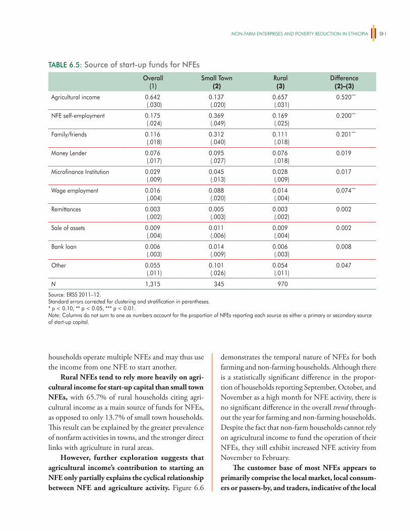
NON-FARm eNTeRPRiSeS AND POveRTy ReDUCTiON iN eThiOPiA 91
demonstrates the temporal nature of NFEs for both farming and non-farming households. Although there is a statistically significant difference in the propor-tion of households reporting September, October, and November as a high month for NFE activity, there is no significant difference in the overall trend through-out the year for farming and non-farming households. Despite the fact that non-farm households cannot rely on agricultural income to fund the operation of their NFEs, they still exhibit increased NFE activity from November to February.
The customer base of most NFEs appears to primarily comprise the local market, local consum-ers or passers-by, and traders, indicative of the local
households operate multiple NFEs and may thus use the income from one NFE to start another.
Rural NFEs tend to rely more heavily on agri-cultural income for start-up capital than small town NFEs, with 65.7% of rural households citing agri-cultural income as a main source of funds for NFEs, as opposed to only 13.7% of small town households. This result can be explained by the greater prevalence of nonfarm activities in towns, and the stronger direct links with agriculture in rural areas.
However, further exploration suggests that agricultural income’s contribution to starting an NFE only partially explains the cyclical relationship between NFE and agriculture activity. Figure 6.6
TABLE 6.5: Source of start-up funds for NFEs
Overall(1)
Small Town(2)
Rural(3)
Difference(2)–(3)
Agricultural income 0.642(.030)
0.137(.020)
0.657(.031)
0.520***
NFE self-employment 0.175(.024)
0.369(.049)
0.169(.025)
0.200***
Family/friends 0.116(.018)
0.312(.040)
0.111(.018)
0.201***
Money Lender 0.076(.017)
0.095(.027)
0.076(.018)
0.019
Microfinance Institution 0.029(.009)
0.045(.013)
0.028(.009)
0.017
Wage employment 0.016(.004)
0.088(.020)
0.014(.004)
0.074***
Remittances 0.003(.002)
0.005(.003)
0.003(.002)
0.002
Sale of assets 0.009(.004)
0.011(.006)
0.009(.004)
0.002
Bank loan 0.006(.003)
0.014(.009)
0.006(.003)
0.008
Other 0.055(.011)
0.101(.026)
0.054(.011)
0.047
N 1,315 345 970
Source: ERSS 2011–12. Standard errors corrected for clustering and stratification in parentheses.* p < 0.10, ** p < 0.05, *** p < 0.01.Note: Columns do not sum to one as numbers account for the proportion of NFEs reporting each source as either a primary or secondary source of start-up capital.
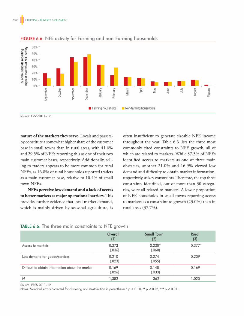
ETHIOPIA – POVERTY ASSESSMENT92
nature of the markets they serve. Locals and passers-by constitute a somewhat higher share of the customer base in small towns than in rural areas, with 41.6% and 29.5% of NFEs reporting this as one of their two main customer bases, respectively. Additionally, sell-ing to traders appears to be more common for rural NFEs, as 16.8% of rural households reported traders as a main customer base, relative to 10.4% of small town NFEs.
NFEs perceive low demand and a lack of access to better markets as major operational barriers. This provides further evidence that local market demand, which is mainly driven by seasonal agriculture, is
often insufficient to generate sizeable NFE income throughout the year. Table 6.6 lists the three most commonly cited constraints to NFE growth, all of which are related to markets. While 37.3% of NFEs identified access to markets as one of three main obstacles, another 21.0% and 16.9% viewed low demand and difficulty to obtain market information, respectively, as key constraints. Therefore, the top three constraints identified, out of more than 30 catego-ries, were all related to markets. A lower proportion of NFE households in small towns reporting access to markets as a constraint to growth (23.0%) than in rural areas (37.7%).
TABLE 6.6: The three main constraints to NFE growth
Overall(1)
Small Town(2)
Rural(3)
Access to markets 0.373(.036)
0.230**
(.060)0.377**
Low demand for goods/services 0.210(.023)
0.274(.055)
0.209
Difficult to obtain information about the market 0.169(.026)
0.148(.033)
0.169
N 1,382 362 1,020
Source: ERSS 2011–12. Notes: Standard errors corrected for clustering and stratification in parentheses * p < 0.10, ** p < 0.05, *** p < 0.01.
FIGURE 6.6: NFE activity for Farming and non-Farming households
0%
10%
20%
30%
40%
50%
60%Se
ptem
ber
Octo
ber
Nove
mbe
r
Dece
mbe
r
Janu
ary
Febr
uary
Mar
ch
April
May
June July
Augu
st
Pagu
ne
Farming households Non-farming households
% o
f hou
seho
lds
repo
rtin
ghi
ghes
t mon
ths
of N
FE a
ctiv
ty
Source: ERSS 2011–12.

NON-FARm eNTeRPRiSeS AND POveRTy ReDUCTiON iN eThiOPiA 93
6.5 Conclusion
NFE activity is seasonal and pro-cyclical with agricul-ture. On the supply side, NFEs appear to depend on agricultural income for inputs and investment capital. On the demand side, they rely heavily on increased
local demand during the harvest period to generate household income. The need for capital does not appear to be a major cause for the current seasonality of NFEs, but many do report access to market demand as a major constraint.

95
MIGRATION AND POVERTY IN ETHIOPIA
7.1 Introduction
Migration from rural to urban areas is an inherent component of the development process. As such, it has long been a focus of the development literature (Lewis 1954; Fei and Ranis 1964). Whereas initial theories effectively suggested that migration took place primarily so that migrants could obtain higher returns to their human capital (“pull” migration), more recent theory suggests that migration may also arise as part of a household strategy to overcome other constraints (“push” migration, Lucas and Stark 1985). Such con-straints can include credit constraints, liquidity con-straints, or a lack of insurance against risk. In either case, consistent with higher returns to human capital outside of agriculture, migration should be poverty reducing. As an example of its potential poverty reducing effects, Beegle, de Weerdt, and Dercon (2011) report that in Tanzania, the poverty rate among those who moved out of Kagera region dropped by 23 percentage points compared with a 12 percentage point drop among those who moved within the region and a four percentage point drop among those who did not move.
However, since 1996, migration and the struc-tural change that it brings contributed very little to poverty reduction in Ethiopia (see Chapter 4). This chapter examines why the role of migration in poverty reduction in Ethiopia has been so limited. Have migration rates been too low to have an impact? Has migration had positive or negative effects when it has taken place—on those migrating or on families being left behind? If beneficial effects are found, what constrains migration and limits the beneficial role it could potentially play?
First the chapter documents the speed and nature of migration in Ethiopia and the
characteristics of migrants. It shows that one of the main reasons migration has not contributed to poverty reduction is that there is so little of it. The evidence presented in this section is however consis-tent with “pull” forces driving migration in Ethiopia, suggesting it should have positive effects when it takes place.
Second, the chapter examines the poverty and welfare effects of migration. It examines whether the limited effect of migration on poverty is because migration has been welfare reducing when it occurs. Instead of “pull” migration, which is usually beneficial for both the origins and desti-nations, “push” migration due to adverse income and other shocks in the origins can lead to growth of slums in urban areas (World Bank 2009; Fay and Opal 2000; Barrios, Bertinelli, and Strobl 2010; Gollin, Jedwab, and Vollrath 2012). However, the evidence indicates that although migrants may suffer welfare losses in the initial year after transi-tion, there do appear to be substantial benefits to migration.
Finally the chapter reviews current evidence on constraints to migration in Ethiopia. The very focus of government policy that has been so beneficial for rural poverty reduction in Ethiopia may act as an implicit barrier to migration by improving produc-tivity and safety nets in rural areas preferentially over urban locales. However, this would not explain why in the presence of welfare gains few still choose to migrate. There is some evidence that credit constraints may limit the ability of poor households to invest in migration. Limited land markets in rural areas also act as a break on migration flows.
Various data sources are used in the evi-dence presented. The Household Consumption
7
ETHIOPIA – POVERTY ASSESSMENT96
Expenditure Survey and the Urban Employment and Unemployment Surveys do not collect information on the migration status of respondents. This considerably limits analysis of the employment and welfare status of migrants and their sending households. The 2013 Labor Force Survey did collect some information on this and this is likely to provide some additional key evidence on migration but the data is not yet available. This chapter thus draws on two background papers commissioned for the Poverty Assessment which draw on two alternative sources of information: (i) the pub-licly available sample data of the long-form of the 2007 Ethiopian Population and Housing Census which identified which respondents are migrants (Shilpi and Yao 2014), and (ii) a unique panel dataset from 18 villages in which migrants were tracked over time (de Brauw 2014).23 This second data set is the Ethiopian Rural Household Survey (ERHS) from 2004 and 2009, and the migrant tracking survey conducted after the 2009 round of data collection in which all migrants from these villages between 2004 and 2009 were tracked. The data was collected by Addis Ababa University, the International Food Policy Research Institute and the University of Oxford and uniquely provides information on sending households before and after they sent a migrant, and on migrants them-selves. Together the nationally representative 2007 census and the in-depth data of the ERHS allow a fairly comprehensive assessment of migration and poverty in Ethiopia at the end of the last decade. Additional insights are provided from literature on poverty and wellbeing in Ethiopia.
7.2 Migration in Ethiopia
The migration rate in Ethiopia is low compared with most developing countries. Counting a migrant as any individual who resides in a different woreda or city to the one of their birth (a definition of migration that is considered most expansive), the Intercensal Population Survey conducted by CSA in 2012 reveals that migrants comprise 13.7% and 16.2% of the male and female population, respectively. This is quite
small relative to other countries. For example, using a similar definition, about 30% of India’s population can be classified as migrants, and India is a country known for low population mobility. In Vietnam in 1992, 22% of the population were migrants and in Uganda in 2001, 25% of people aged 25 to 49 were not living in the district of their birth (World Bank 2009, World Bank 2012). A relatively large proportion of the Ethiopian population continues to live in rural areas (Taylor and Martin 2001) for its per capita GDP. There is little data on temporary migration within Ethiopia. The ERSS 2012 data suggests temporary migration flows are not large.
Migration between rural areas accounts for nearly half of all who migrate for work. It is useful to distinguish between those who migrate for work and those who migrate for other reasons such as marriage. Although the census data did not collect information on the reasons for migration, employment status is used to define those who migrated for work. A migrant is defined as “working” if he or she was employed in productive activities during the last 12 months even if partially. Nearly all migrants in Ethiopia (86%) are working migrants. As shown in Figure 7.1, nearly half of all migrants are rural-to-rural migrants. Migrants from rural to urban areas comprise about 25% of all migrants in Ethiopia. This suggests about one in ten rural residents migrate, in contrast to one in five rural workers in China (World Bank 2009). As expected, urban to rural migration is very small whereas there is considerable migration between urban areas. The ERHS migrant panel was able to identify those who migrated for work and finds very similar patters: 50% of migrants from these rural villages moved to other rural areas, 31% moved to urban areas and 18% moved outside of Ethiopia (a category of migrant that is not found in the census data).
23 The publicly available data consists of 2% of the entire sample survey data and thus has about 1.3 million individual records from 289345 households. Such a large dataset is useful in portraying the pattern of migration with statistical precision. Most household surveys have a very small sample of migrants and are thus ill-suited for the analysis of migra-tion at finer geographical details.

migRATiON AND POveRTy iN eThiOPiA 97
Despite the low overall migration rate, migra-tion rates have been increasing. Migrants in the census are categorized as short-term migrants who are in their current residence for less than five years, medium-term migrants who came to their current residence between five and nine years ago, and long-term migrants who migrated 10 or more years ago. Short-term migrants account for 40% of all and 43% of all migrants to urban areas (Figure 7.2). Migration rates in the five years prior to that had been much
smaller: medium-term migrants are 15% and 18% for all and urban migrants respectively.
In Addis Ababa migrants represent nearly half of the population, but recent migration to urban centers has favored smaller cities. Addis Ababa accounts for 4% of Ethiopia’s population but 10% of all migrants (all those not residing in the woreda or city of their birth) and 22% of urban migrants. However, smaller towns have had higher rates of recent migra-tion than large cities. Figure 7.3 shows that migration
FIGURE 7.1: Migration Flow, 2007
All Migrants Working Migrants
Rural to Rural Rural to Urban Urban to Rural Urban to Urban0%
10%
20%
30%
40%
50%
60%
Source: 2007 census.
FIGURE 7.2: Migrants by duration of stay in current residence
All Migrants Urban Migrants
Short-term Medium Term Long Term0%5%
10%15%20%25%30%35%40%45%50%
Source: 2007 census.
FIGURE 7.3: City size and migration
10 11 12 13 14
Addis Ababa
15
In(city size)
Fitted values of quadratic prediction do not include Addis Ababa
0.00
0.05
0.10
0.15
0.20
0.25
Mig
ratio
n w
ithin
the
past
yea
r
10 11 12 13 14
Addis Ababa
15
In(city size)
0.0
0.1
0.2
0.3
0.4
0.5
Mig
ratio
n ov
er 5
yea
rs a
go
Those who migrated in the last 12 months Those who migrated 5+ years ago
Source: 2007 census.
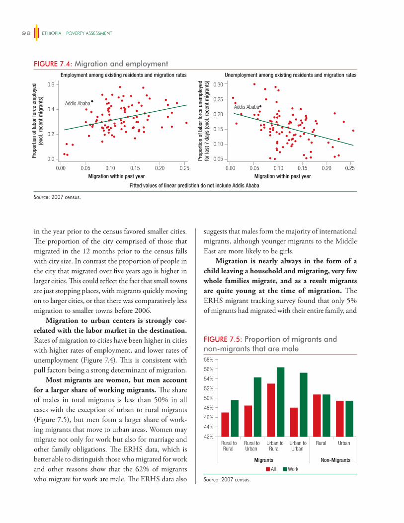
ETHIOPIA – POVERTY ASSESSMENT98
in the year prior to the census favored smaller cities. The proportion of the city comprised of those that migrated in the 12 months prior to the census falls with city size. In contrast the proportion of people in the city that migrated over five years ago is higher in larger cities. This could reflect the fact that small towns are just stopping places, with migrants quickly moving on to larger cities, or that there was comparatively less migration to smaller towns before 2006.
Migration to urban centers is strongly cor-related with the labor market in the destination. Rates of migration to cities have been higher in cities with higher rates of employment, and lower rates of unemployment (Figure 7.4). This is consistent with pull factors being a strong determinant of migration.
Most migrants are women, but men account for a larger share of working migrants. The share of males in total migrants is less than 50% in all cases with the exception of urban to rural migrants (Figure 7.5), but men form a larger share of work-ing migrants that move to urban areas. Women may migrate not only for work but also for marriage and other family obligations. The ERHS data, which is better able to distinguish those who migrated for work and other reasons show that the 62% of migrants who migrate for work are male. The ERHS data also
suggests that males form the majority of international migrants, although younger migrants to the Middle East are more likely to be girls.
Migration is nearly always in the form of a child leaving a household and migrating, very few whole families migrate, and as a result migrants are quite young at the time of migration. The ERHS migrant tracking survey found that only 5% of migrants had migrated with their entire family, and
FIGURE 7.4: Migration and employment
0.00 0.05 0.10 0.15 0.20
Addis AbabaAddis Ababa
0.25
Migration within past year
Fitted values of linear prediction do not include Addis Ababa
0.0
0.2
0.4
0.6
Prop
ortio
n of
labo
r for
ce e
mpl
oyed
(exc
l. re
cent
mig
rant
s)
0.00 0.05 0.10 0.15 0.20 0.25
Migration within past year
0.05
0.10
0.15
0.20
0.25
0.30
Prop
ortio
n of
labo
r for
ce u
nem
ploy
edfo
r las
t 7 d
ays
(exc
l. re
cent
mig
rant
s)
Employment among existing residents and migration rates Unemployment among existing residents and migration rates
Source: 2007 census.
FIGURE 7.5: Proportion of migrants and non-migrants that are male
All Work
42%
44%
46%
48%
50%
52%
54%
56%
58%
Rural toRural
Rural toUrban
Urban toRural
Urban toUrban
Rural Urban
Migrants Non-Migrants
Source: 2007 census.
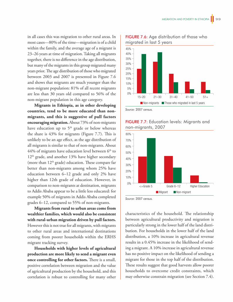
migRATiON AND POveRTy iN eThiOPiA 99
in all cases this was migration to other rural areas. In most cases—80% of the time—migration is of a child within the family, and the average age of a migrant is 23–26 years at time of migration. Taking all migrants together, there is no difference in the age distribution, but many of the migrants in this group migrated many years prior. The age distribution of those who migrated between 2003 and 2007 is presented in Figure 7.6 and shows that migrants are much younger than the non-migrant population: 81% of all recent migrants are less than 30 years old compared to 56% of the non-migrant population in this age category.
Migrants in Ethiopia, as in other developing countries, tend to be more educated than non-migrants, and this is suggestive of pull factors encouraging migration. About 73% of non-migrants have education up to 5th grade or below whereas the share is 43% for migrants (Figure 7.7). This is unlikely to be an age effect, as the age distribution of all migrants is similar to that of non-migrants. About 44% of migrants have education level between 6th to 12th grade, and another 13% have higher secondary (more than 12th grade) education. These compare far better than non-migrants among whom 25% have education between 6–12 grade and only 2% have higher than 12th grade of education. However, in comparison to non-migrants at destination, migrants to Addis Ababa appear to be a little less educated: for example 50% of migrants in Addis Ababa completed grades 6–12, compared to 55% of non-migrants.
Migrants from rural to urban areas come from wealthier families, which would also be consistent with rural-urban migration driven by pull factors. However this is not true for all migrants, with migrants to other rural areas and international destinations coming from poorer households within the ERHS migrant tracking survey.
Households with higher levels of agricultural production are more likely to send a migrant even once controlling for other factors. There is a small, positive correlation between migration and the value of agricultural production by the household, and this correlation is robust to controlling for many other
characteristics of the household. The relationship between agricultural productivity and migration is particularly strong in the lower half of the land distri-bution. For households in the lower half of the land distribution, a 10% increase in agricultural revenue results in a 0.45% increase in the likelihood of send-ing a migrant. A 10% increase in agricultural revenue has no positive impact on the likelihood of sending a migrant for those in the top half of the distribution. These results suggest that good harvests allow poorer households to overcome credit constraints, which may otherwise constrain migration (see Section 7.4).
FIGURE 7.6: Age distribution of those who migrated in last 5 years
Non-migrants Those who migrated in last 5 years
0%
5%
10%
15%
20%
25%
30%
35%
40%
45%
15–20 21–30 31–40 41–50 51+
Source: 2007 census.
FIGURE 7.7: Education levels: Migrants and non-migrants, 2007
<=Grade 5 Grade 6–12 Higher Education
Migrant Non-migrant
0%
10%
20%
30%
40%
50%
60%
70%
80%
Source: 2007 census.
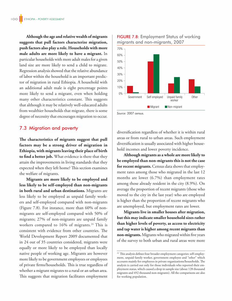
ETHIOPIA – POVERTY ASSESSMENT100
Although the age and relative wealth of migrants suggests that pull factors characterize migration, push factors also play a role. Households with more male adults are more likely to have a migrant. In particular households with more adult males for a given land size are more likely to send a child to migrate. Regression analysis showed that the relative abundance of labor within the household is an important predic-tor of migration in rural Ethiopia. A household with an additional adult male is eight percentage points more likely to send a migrant, even when holding many other characteristics constant. This suggests that although it may be relatively well-educated adults from wealthier households that migrate, there is some degree of necessity that encourages migration to occur.
7.3 Migration and poverty
The characteristics of migrants suggest that pull factors may be a strong driver of migration in Ethiopia, with migrants leaving their place of birth to find a better job. What evidence is there that they attain the improvements in living standards that they expected when they left home? This section examines the welfare of migrants.
Migrants are more likely to be employed and less likely to be self-employed than non-migrants in both rural and urban destinations. Migrants are less likely to be employed as unpaid family work-ers and self-employed compared with non-migrants (Figure 7.8). For instance, more than 60% of non-migrants are self-employed compared with 50% of migrants; 27% of non-migrants are unpaid family workers compared to 16% of migrants.24 This is consistent with evidence from other countries. The World Development Report 2009 documented that in 24 out of 35 countries considered, migrants were equally or more likely to be employed than locally native people of working age. Migrants are however more likely to be government employees or employees of private firms/households. This is true regardless of whether a migrant migrates to a rural or an urban area. This suggests that migration facilitates employment
diversification regardless of whether it is within rural areas or from rural to urban areas. Such employment diversification is usually associated with higher house-hold incomes and lower poverty incidence.
Although migrants as a whole are more likely to be employed than non-migrants this is not the case for recent migrants. Census data shows that employ-ment rates among those who migrated in the last 12 months are lower (6.7%) than employment rates among those already resident in the city (8.9%). On average the proportion of recent migrants (those who moved to the city in the last year) who are employed is higher than the proportion of recent migrants who are unemployed, but employment rates are lower.
Migrants live in smaller houses after migration, but this may indicate smaller household sizes rather than higher levels of poverty, as access to electricity and tap water is higher among recent migrants than non-migrants. Migrants who migrated within five years of the survey to both urban and rural areas were more
FIGURE 7.8: Employment Status of working migrants and non-migrants, 2007
Migrant Non-migrant
0%
10%
20%
30%
40%
50%
60%
70%
Government Self employed Unpaid familyworker
Other
Source: 2007 census.
24 This analysis defines four broader employment categories: self-employ-ment, unpaid family worker, government employee and “other” which accounts mainly for employees in private organizations/households. The analysis is carried out only for those individuals who reported their em-ployment status, which caused a drop in sample size (about 128 thousand migrants and 492 thousand non-migrants). All the comparisons are also for working population.
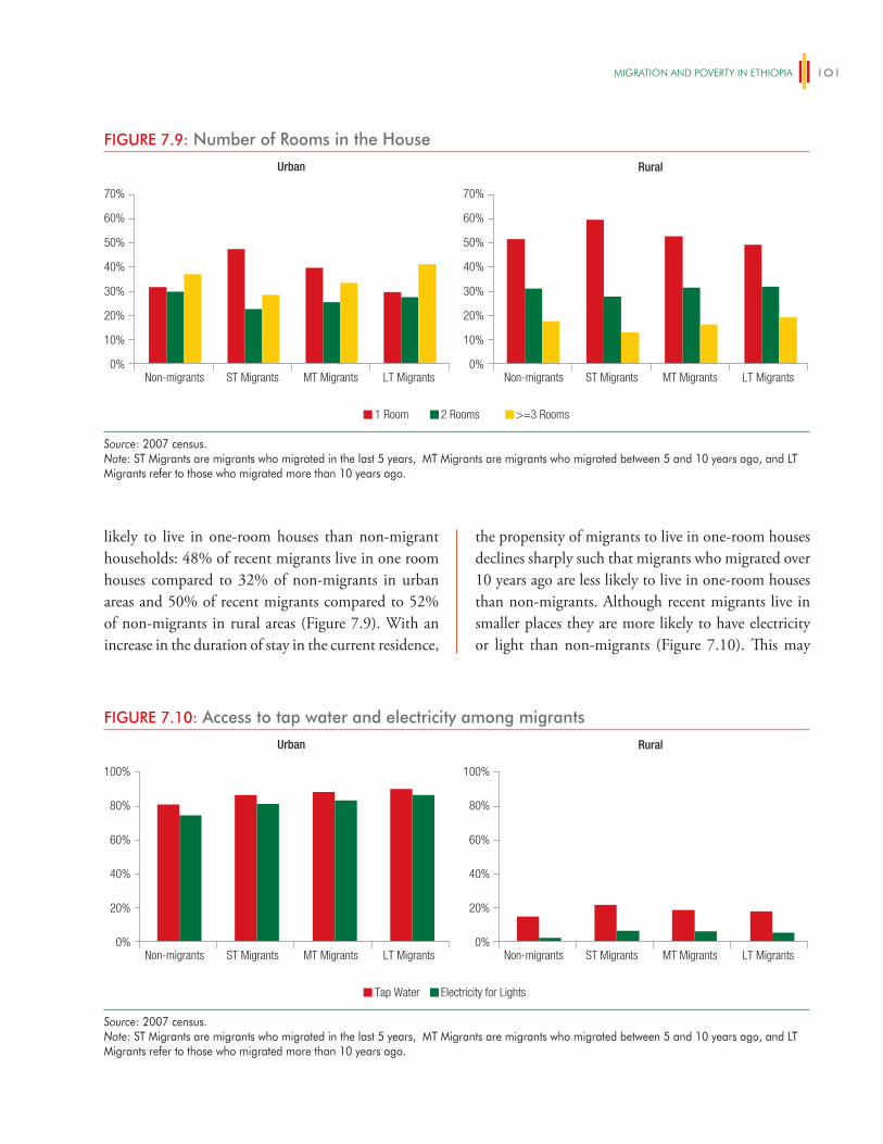
migRATiON AND POveRTy iN eThiOPiA 101
likely to live in one-room houses than non-migrant households: 48% of recent migrants live in one room houses compared to 32% of non-migrants in urban areas and 50% of recent migrants compared to 52% of non-migrants in rural areas (Figure 7.9). With an increase in the duration of stay in the current residence,
the propensity of migrants to live in one-room houses declines sharply such that migrants who migrated over 10 years ago are less likely to live in one-room houses than non-migrants. Although recent migrants live in smaller places they are more likely to have electricity or light than non-migrants (Figure 7.10). This may
FIGURE 7.9: Number of Rooms in the House
1 Room 2 Rooms >=3 Rooms
0%
10%
20%
30%
40%
50%
60%
70%
Non-migrants ST Migrants MT Migrants LT Migrants0%
10%
20%
30%
40%
50%
60%
70%
Non-migrants ST Migrants MT Migrants LT Migrants
Urban Rural
Source: 2007 census.Note: ST Migrants are migrants who migrated in the last 5 years, MT Migrants are migrants who migrated between 5 and 10 years ago, and LT Migrants refer to those who migrated more than 10 years ago.
FIGURE 7.10: Access to tap water and electricity among migrants
Tap Water Electricity for Lights
0%
20%
40%
60%
80%
100%
Non-migrants ST Migrants MT Migrants LT Migrants0%
20%
40%
60%
80%
100%
Non-migrants ST Migrants MT Migrants LT Migrants
Urban Rural
Source: 2007 census.Note: ST Migrants are migrants who migrated in the last 5 years, MT Migrants are migrants who migrated between 5 and 10 years ago, and LT Migrants refer to those who migrated more than 10 years ago.
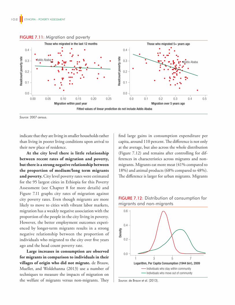
ETHIOPIA – POVERTY ASSESSMENT102
indicate that they are living in smaller households rather than living in poorer living conditions upon arrival to their new place of residence.
At the city level there is little relationship between recent rates of migration and poverty, but there is a strong negative relationship between the proportion of medium/long term migrants and poverty. City level poverty rates were estimated for the 95 largest cities in Ethiopia for this Poverty Assessment (see Chapter 8 for more details) and Figure 7.11 graphs city rates of migration against city poverty rates. Even though migrants are more likely to move to cities with vibrant labor markets, migration has a weakly negative association with the proportion of the people in the city living in poverty. However, the better employment outcomes experi-enced by longer-term migrants results in a strong negative relationship between the proportion of individuals who migrated to the city over five years ago and the head count poverty rate.
Large increases in consumption are observed for migrants in comparison to individuals in their villages of origin who did not migrate. de Brauw, Mueller, and Woldehanna (2013) use a number of techniques to measure the impacts of migration on the welfare of migrants versus non-migrants. They
find large gains in consumption expenditure per capita, around 110 percent. The difference is not only at the average, but also across the whole distribution (Figure 7.12) and remains after controlling for dif-ferences in characteristics across migrants and non-migrants. Migrants eat more meat (41% compared to 18%) and animal products (68% compared to 48%). The difference is larger for urban migrants. Migrants
FIGURE 7.11: Migration and poverty
0.00 0.05 0.10 0.15 0.20
Addis AbabaAddis Ababa
0.25
Migration within past year
Fitted values of linear prediction do not include Addis Ababa
0.0
0.1
0.2
0.3
0.4
0.0
0.1
0.2
0.3
0.4
Head
coun
t pov
erty
rate
Head
coun
t pov
erty
rate
0.0 0.1 0.2 0.3 0.4 0.5
Migration over 5 years ago
Those who migrated in the last 12 months Those who migrated 5+ years ago
Source: 2007 census.
FIGURE 7.12: Distribution of consumption for migrants and non-migrants
0.0
0.4
0.2
0.6
1 3 5 7
Individuals who stay within communityIndividuals who move out of community
Dens
ity
Logarithm, Per Capita Consumption (1944 birr), 2009
Source: de Brauw et al. (2013).
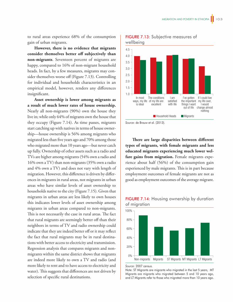
migRATiON AND POveRTy iN eThiOPiA 103
to rural areas experience 68% of the consumption gain of urban migrants.
However, there is no evidence that migrants consider themselves better off subjectively than non-migrants. Seventeen percent of migrants are happy, compared to 16% of non-migrant household heads. In fact, by a few measures, migrants may con-sider themselves worse off (Figure 7.13). Controlling for individual and households characteristics in an empirical model, however, renders any differences insignificant.
Asset ownership is lower among migrants as a result of much lower rates of house ownership. Nearly all non-migrants (90%) own the house they live in; while only 64% of migrants own the house that they occupy (Figure 7.14). As time passes, migrants start catching up with natives in terms of house owner-ship—house ownership is 56% among migrants who migrated less than five years ago and 70% among those who migrated more than 10 years ago—but never catch up fully. Ownership of other assets such as a radio and TVs are higher among migrants (54% own a radio and 16% own a TV) than non-migrants (35% own a radio and 4% own a TV) and does not vary with length of migration. However, this difference is driven by differ-ences in migrants in rural areas, not migrants in urban areas who have similar levels of asset ownership to households native to the city (Figure 7.15). Given that migrants in urban areas are less likely to own houses this indicates lower levels of asset ownership among migrants in urban areas compared to non-migrants. This is not necessarily the case in rural areas. The fact that rural migrants are seemingly better off than their neighbors in terms of TV and radio ownership could indicate that they are indeed better off or it may reflect the fact that rural migrants may be in rural destina-tions with better access to electricity and transmission. Regression analysis that compares migrants and non-migrants within the same district shows that migrants are indeed more likely to own a TV and radio (and more likely to rent and to have access to electricity and water). This suggests that differences are not driven by selection of specific rural destinations.
There are large disparities between different types of migrants, with female migrants and less educated migrants experiencing much lower wel-fare gains from migration. Female migrants expe-rience about half (56%) of the consumption gain experienced by male migrants. This is in part because employment outcomes of female migrants are not as good as employment outcomes of the average migrant.
FIGURE 7.14: Housing ownership by duration of migration
0%
20%
40%
60%
80%
100%
Non-migrants Migrants ST Migrants MT Migrants LT Migrants
Source: 2007 census.Note: ST Migrants are migrants who migrated in the last 5 years, MT Migrants are migrants who migrated between 5 and 10 years ago, and LT Migrants refer to those who migrated more than 10 years ago.
FIGURE 7.13: Subjective measures of wellbeing
Household Heads Migrants
1.0
1.5
2.0
2.5
3.0
3.5
4.0
4.5
In mostways, my life
is ideal
The conditionsof my life are
excellent
I amsatisfiedwith life
I’ve gottenthe importantthings I want
out of life
If I could livemy life over,
I wouldchange almost
nothing
Source: de Brauw et al. (2013).
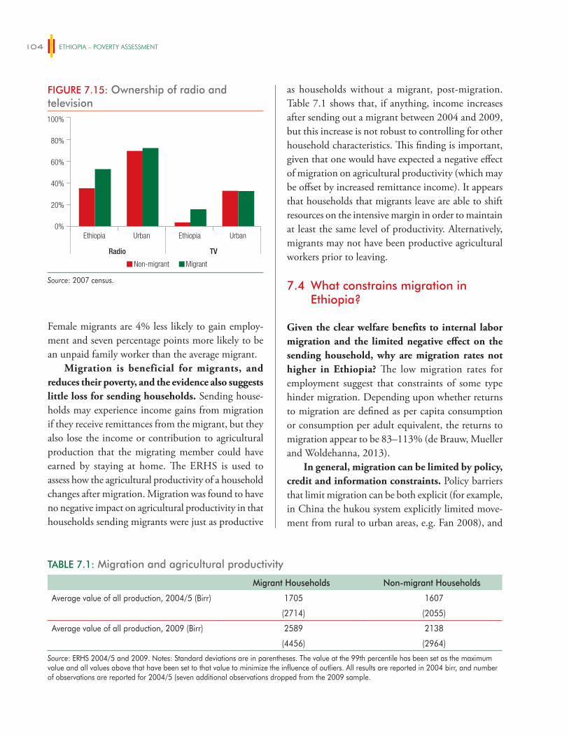
ETHIOPIA – POVERTY ASSESSMENT104
Female migrants are 4% less likely to gain employ-ment and seven percentage points more likely to be an unpaid family worker than the average migrant.
Migration is beneficial for migrants, and reduces their poverty, and the evidence also suggests little loss for sending households. Sending house-holds may experience income gains from migration if they receive remittances from the migrant, but they also lose the income or contribution to agricultural production that the migrating member could have earned by staying at home. The ERHS is used to assess how the agricultural productivity of a household changes after migration. Migration was found to have no negative impact on agricultural productivity in that households sending migrants were just as productive
as households without a migrant, post-migration. Table 7.1 shows that, if anything, income increases after sending out a migrant between 2004 and 2009, but this increase is not robust to controlling for other household characteristics. This finding is important, given that one would have expected a negative effect of migration on agricultural productivity (which may be offset by increased remittance income). It appears that households that migrants leave are able to shift resources on the intensive margin in order to maintain at least the same level of productivity. Alternatively, migrants may not have been productive agricultural workers prior to leaving.
7.4 What constrains migration in Ethiopia?
Given the clear welfare benefits to internal labor migration and the limited negative effect on the sending household, why are migration rates not higher in Ethiopia? The low migration rates for employment suggest that constraints of some type hinder migration. Depending upon whether returns to migration are defined as per capita consumption or consumption per adult equivalent, the returns to migration appear to be 83–113% (de Brauw, Mueller and Woldehanna, 2013).
In general, migration can be limited by policy, credit and information constraints. Policy barriers that limit migration can be both explicit (for example, in China the hukou system explicitly limited move-ment from rural to urban areas, e.g. Fan 2008), and
TABLE 7.1: Migration and agricultural productivity
Migrant Households Non-migrant Households
Average value of all production, 2004/5 (Birr) 1705 1607
(2714) (2055)
Average value of all production, 2009 (Birr) 2589 2138
(4456) (2964)
Source: ERHS 2004/5 and 2009. Notes: Standard deviations are in parentheses. The value at the 99th percentile has been set as the maximum value and all values above that have been set to that value to minimize the influence of outliers. All results are reported in 2004 birr, and number of observations are reported for 2004/5 (seven additional observations dropped from the 2009 sample.
FIGURE 7.15: Ownership of radio and television
Non-migrant Migrant
Ethiopia Urban Ethiopia Urban
Radio TV
0%
20%
40%
60%
80%
100%
Source: 2007 census.
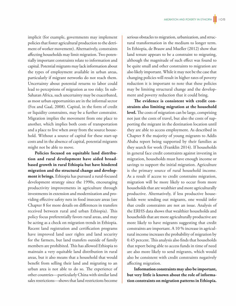
migRATiON AND POveRTy iN eThiOPiA 105
implicit (for example, governments may implement policies that foster agricultural production to the detri-ment of worker movement). Alternatively, constraints affecting households may limit migration. Two poten-tially important constraints relate to information and capital. Potential migrants may lack information about the types of employment available in urban areas, particularly if migrant networks do not reach them. Uncertainty about potential returns to labor could lead to perceptions of migration as too risky. In sub-Saharan Africa, such uncertainty may be exacerbated, as most urban opportunities are in the informal sector (Fox and Gaal, 2008). Capital, in the form of credit or liquidity constraints, may be a further constraint. Migration implies the movement from one place to another, which implies both costs of transportation and a place to live when away from the source house-hold. Without a source of capital for these start-up costs and in the absence of capital, potential migrants might not be able to move.
Policies focused on equitable land distribu-tion and rural development have aided broad-based growth in rural Ethiopia but have hindered migration and the structural change and develop-ment it brings. Ethiopia has pursued a rural-focused development strategy since the 1990s, encouraging productivity improvements in agriculture through investments in extension and modernization and pro-viding effective safety nets in food insecure areas (see Chapter 8 for more details on differences in transfers received between rural and urban Ethiopia). This policy focus preferentially favors rural areas, and may be acting as a check on migration trends in Ethiopia. Recent land registration and certification programs have improved land user rights and land security for the farmers, but land transfers outside of family members are prohibited. This has allowed Ethiopia to maintain a very equitable land distribution in rural areas, but it also means that a household that would benefit from selling their land and migrating to an urban area is not able to do so. The experience of other countries—particularly China with similar land sales restrictions—shows that land restrictions become
serious obstacles to migration, urbanization, and struc-tural transformation in the medium to longer term. In Ethiopia, de Brauw and Mueller (2012) show that land tenure appears to be a constraint to migrating, although the magnitude of such effect was found to be quite small and other constraints to migration are also likely important. While it may not be the case that changing policies will result in higher rates of poverty reduction it is important to note that these policies may be limiting structural change and the develop-ment and poverty reduction that it could bring.
The evidence is consistent with credit con-straints also limiting migration at the household level. The costs of migration can be large, comprising not just the costs of travel, but also the costs of sup-porting the migrant in the destination location until they are able to access employment. As described in Chapter 8 the majority of young migrants to Addis Ababa report being supported by their families as they search for work (Franklin 2014). If households in general face credit constraints against investing in migration, households must have enough income or savings to support the initial migration. Agriculture is the primary source of rural household income. As a result if access to credit constrains migration, migration will be more likely to occur from more households that are wealthier and more agriculturally productive. Alternatively, if less productive house-holds were sending out migrants, one would infer that credit constraints are not an issue. Analysis of the ERHS data shows that wealthier households and households that are more agriculturally productive are more likely to have migrants suggesting that credit constraints are important. A 10 % increase in agricul-tural income increases the probability of migration by 0.45 percent. This analysis also finds that households that report being able to access funds in time of need are also more likely to send migrants, which would also be consistent with credit constraints negatively affecting migration.
Information constraints may also be important, but very little is known about the role of informa-tion constraints on migration patterns in Ethiopia.
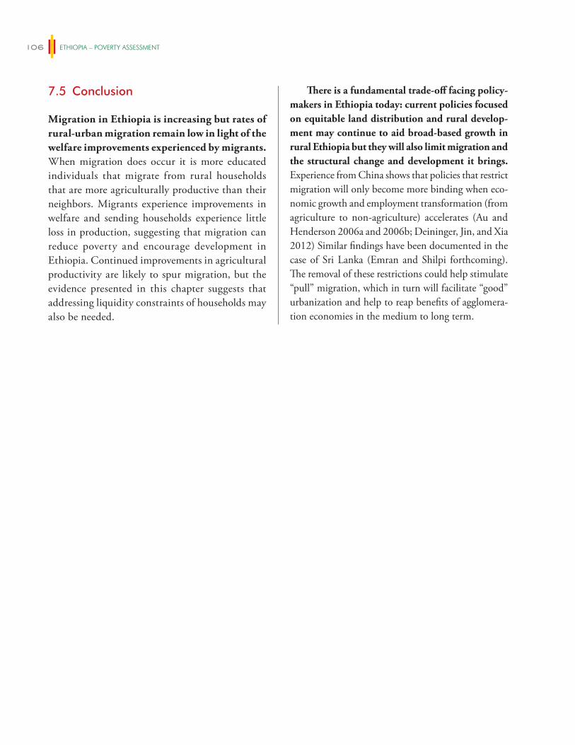
ETHIOPIA – POVERTY ASSESSMENT106
7.5 Conclusion
Migration in Ethiopia is increasing but rates of rural-urban migration remain low in light of the welfare improvements experienced by migrants. When migration does occur it is more educated individuals that migrate from rural households that are more agriculturally productive than their neighbors. Migrants experience improvements in welfare and sending households experience little loss in production, suggesting that migration can reduce poverty and encourage development in Ethiopia. Continued improvements in agricultural productivity are likely to spur migration, but the evidence presented in this chapter suggests that addressing liquidity constraints of households may also be needed.
There is a fundamental trade-off facing policy-makers in Ethiopia today: current policies focused on equitable land distribution and rural develop-ment may continue to aid broad-based growth in rural Ethiopia but they will also limit migration and the structural change and development it brings. Experience from China shows that policies that restrict migration will only become more binding when eco-nomic growth and employment transformation (from agriculture to non-agriculture) accelerates (Au and Henderson 2006a and 2006b; Deininger, Jin, and Xia 2012) Similar findings have been documented in the case of Sri Lanka (Emran and Shilpi forthcoming). The removal of these restrictions could help stimulate “pull” migration, which in turn will facilitate “good” urbanization and help to reap benefits of agglomera-tion economies in the medium to long term.
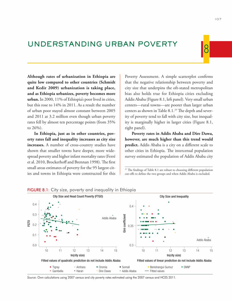
107
UNDERSTANDING URBAN POVERTY
Although rates of urbanization in Ethiopia are quite low compared to other countries (Schmidt and Kedir 2009) urbanization is taking place, and as Ethiopia urbanizes, poverty becomes more urban. In 2000, 11% of Ethiopia’s poor lived in cities, but this rose to 14% in 2011. As a result the number of urban poor stayed almost constant between 2005 and 2011 at 3.2 million even though urban poverty rates fell by almost ten percentage points (from 35% to 26%).
In Ethiopia, just as in other countries, pov-erty rates fall and inequality increases as city size increases. A number of cross-country studies have shown that smaller towns have deeper, more wide-spread poverty and higher infant mortality rates (Ferré et al. 2010, Brockerhoff and Brennan 1998). The first small areas estimates of poverty for the 95 largest cit-ies and towns in Ethiopia were constructed for this
Poverty Assessment. A simple scatterplot confirms that the negative relationship between poverty and city size that underpins the oft-stated metropolitan bias also holds true for Ethiopia cities excluding Addis Ababa (Figure 8.1, left panel). Very small urban centers—rural towns—are poorer than larger urban centers as shown in Table 8.1.25 The depth and sever-ity of poverty tend to fall with city size, but inequal-ity is marginally higher in larger cities (Figure 8.1, right panel).
Poverty rates in Addis Ababa and Dire Dawa, however, are much higher than this trend would predict. Addis Ababa is a city on a different scale to other cities in Ethiopia. The intercensal population survey estimated the population of Addis Ababa city
8
25 The findings of Table 8.1 are robust to choosing different population cut-offs to define the two groups and when Addis Ababa is excluded.
FIGURE 8.1: City size, poverty and inequality in Ethiopia
10 11 12 13 14
Addis Ababa
Addis Ababa
15 10 11 12 13 14 15
In(city size)
Fitted values of quadratic prediction do not include Addis Ababa Fitted values of linear prediction do not include Addis Ababa
0.0
0.1
0.2
0.3
0.4
0.3
0.35
0.4
FGTO
Gini
coe
ffici
ent
In(city size)
Tigray Amhara Oromia Somali Benishangui Gumuz SNNPGambella Harari Dire Dawa Addis Ababa Fitted values
City Size and Head Count Poverty (FTGO) City Size and Inequality
Source: Own calculations using 2007 census and city poverty rates estimated using the 2007 census and HCES 2011.
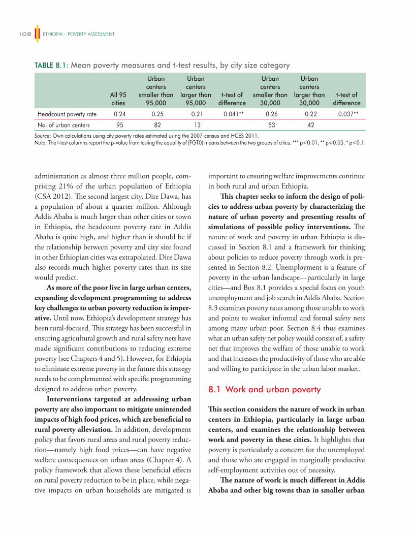
ETHIOPIA – POVERTY ASSESSMENT108
administration as almost three million people, com-prising 21% of the urban population of Ethiopia (CSA 2012). The second largest city, Dire Dawa, has a population of about a quarter million. Although Addis Ababa is much larger than other cities or town in Ethiopia, the headcount poverty rate in Addis Ababa is quite high, and higher than it should be if the relationship between poverty and city size found in other Ethiopian cities was extrapolated. Dire Dawa also records much higher poverty rates than its size would predict.
As more of the poor live in large urban centers, expanding development programming to address key challenges to urban poverty reduction is imper-ative. Until now, Ethiopia’s development strategy has been rural-focused. This strategy has been successful in ensuring agricultural growth and rural safety nets have made significant contributions to reducing extreme poverty (see Chapters 4 and 5). However, for Ethiopia to eliminate extreme poverty in the future this strategy needs to be complemented with specific programming designed to address urban poverty.
Interventions targeted at addressing urban poverty are also important to mitigate unintended impacts of high food prices, which are beneficial to rural poverty alleviation. In addition, development policy that favors rural areas and rural poverty reduc-tion—namely high food prices—can have negative welfare consequences on urban areas (Chapter 4). A policy framework that allows these beneficial effects on rural poverty reduction to be in place, while nega-tive impacts on urban households are mitigated is
important to ensuring welfare improvements continue in both rural and urban Ethiopia.
This chapter seeks to inform the design of poli-cies to address urban poverty by characterizing the nature of urban poverty and presenting results of simulations of possible policy interventions. The nature of work and poverty in urban Ethiopia is dis-cussed in Section 8.1 and a framework for thinking about policies to reduce poverty through work is pre-sented in Section 8.2. Unemployment is a feature of poverty in the urban landscape—particularly in large cities—and Box 8.1 provides a special focus on youth unemployment and job search in Addis Ababa. Section 8.3 examines poverty rates among those unable to work and points to weaker informal and formal safety nets among many urban poor. Section 8.4 thus examines what an urban safety net policy would consist of, a safety net that improves the welfare of those unable to work and that increases the productivity of those who are able and willing to participate in the urban labor market.
8.1 Work and urban poverty
This section considers the nature of work in urban centers in Ethiopia, particularly in large urban centers, and examines the relationship between work and poverty in these cities. It highlights that poverty is particularly a concern for the unemployed and those who are engaged in marginally productive self-employment activities out of necessity.
The nature of work is much different in Addis Ababa and other big towns than in smaller urban
TABLE 8.1: Mean poverty measures and t-test results, by city size category
All 95 cities
Urban centers
smaller than 95,000
Urban centers
larger than 95,000
t-test of difference
Urban centers
smaller than 30,000
Urban centers
larger than 30,000
t-test of difference
Headcount poverty rate 0.24 0.25 0.21 0.041** 0.26 0.22 0.037**
No. of urban centers 95 82 13 53 42
Source: Own calculations using city poverty rates estimated using the 2007 census and HCES 2011.Note: The t-test columns report the p-value from testing the equality of (FGT0) means between the two groups of cities. *** p<0.01, ** p<0.05, * p<0.1.
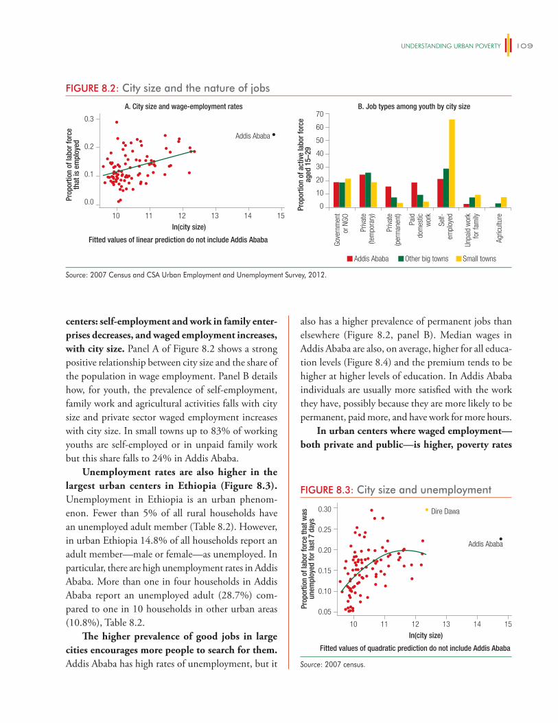
UNDeRSTANDiNg URBAN POveRTy 109
centers: self-employment and work in family enter-prises decreases, and waged employment increases, with city size. Panel A of Figure 8.2 shows a strong positive relationship between city size and the share of the population in wage employment. Panel B details how, for youth, the prevalence of self-employment, family work and agricultural activities falls with city size and private sector waged employment increases with city size. In small towns up to 83% of working youths are self-employed or in unpaid family work but this share falls to 24% in Addis Ababa.
Unemployment rates are also higher in the largest urban centers in Ethiopia (Figure 8.3). Unemployment in Ethiopia is an urban phenom-enon. Fewer than 5% of all rural households have an unemployed adult member (Table 8.2). However, in urban Ethiopia 14.8% of all households report an adult member—male or female—as unemployed. In particular, there are high unemployment rates in Addis Ababa. More than one in four households in Addis Ababa report an unemployed adult (28.7%) com-pared to one in 10 households in other urban areas (10.8%), Table 8.2.
The higher prevalence of good jobs in large cities encourages more people to search for them. Addis Ababa has high rates of unemployment, but it
also has a higher prevalence of permanent jobs than elsewhere (Figure 8.2, panel B). Median wages in Addis Ababa are also, on average, higher for all educa-tion levels (Figure 8.4) and the premium tends to be higher at higher levels of education. In Addis Ababa individuals are usually more satisfied with the work they have, possibly because they are more likely to be permanent, paid more, and have work for more hours.
In urban centers where waged employment—both private and public—is higher, poverty rates
FIGURE 8.2: City size and the nature of jobs
A. City size and wage-employment rates B. Job types among youth by city size
0
Gove
rnm
ent
or N
GO
Priva
te(te
mpo
rary
)
Priva
te(p
erm
anen
t)
Paid
dom
estic
wor
k
Self-
empl
oyed
Unpa
id w
ork
for f
amily
Agric
ultu
re10 11 12 13 14
Addis Ababa
15
In(city size)
Fitted values of linear prediction do not include Addis Ababa
0.0
0.1
0.2
0.3
Prop
ortio
n of
labo
r for
ceth
at is
em
ploy
ed
Prop
ortio
n of
act
ive
labo
r for
ceag
ed 1
5–29
10
20
30
40
50
60
70
Addis Ababa Other big towns Small towns
Source: 2007 Census and CSA Urban Employment and Unemployment Survey, 2012.
FIGURE 8.3: City size and unemployment
10 11 12 13 14
Addis Ababa
Dire Dawa
15
In(city size)
Fitted values of quadratic prediction do not include Addis Ababa
0.05
0.10
0.15
0.20
0.25
0.30
Prop
ortio
n of
labo
r for
ce th
at w
asun
empl
oyed
for l
ast 7
day
s
Source: 2007 census.
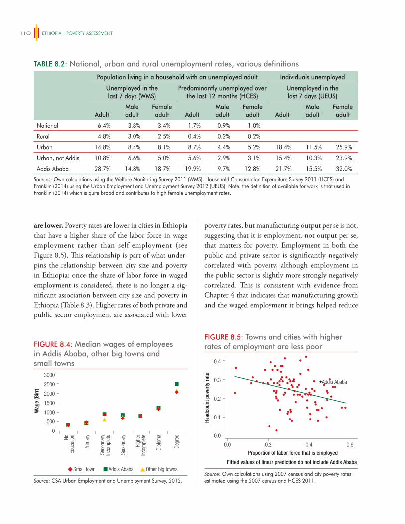
ETHIOPIA – POVERTY ASSESSMENT110
are lower. Poverty rates are lower in cities in Ethiopia that have a higher share of the labor force in wage employment rather than self-employment (see Figure 8.5). This relationship is part of what under-pins the relationship between city size and poverty in Ethiopia: once the share of labor force in waged employment is considered, there is no longer a sig-nificant association between city size and poverty in Ethiopia (Table 8.3). Higher rates of both private and public sector employment are associated with lower
poverty rates, but manufacturing output per se is not, suggesting that it is employment, not output per se, that matters for poverty. Employment in both the public and private sector is significantly negatively correlated with poverty, although employment in the public sector is slightly more strongly negatively correlated. This is consistent with evidence from Chapter 4 that indicates that manufacturing growth and the waged employment it brings helped reduce
TABLE 8.2: National, urban and rural unemployment rates, various definitions
Population living in a household with an unemployed adult Individuals unemployed
Unemployed in the last 7 days (WMS)
Predominantly unemployed over the last 12 months (HCES)
Unemployed in the last 7 days (UEUS)
AdultMale adult
Female adult Adult
Male adult
Female adult Adult
Male adult
Female adult
National 6.4% 3.8% 3.4% 1.7% 0.9% 1.0%
Rural 4.8% 3.0% 2.5% 0.4% 0.2% 0.2%
Urban 14.8% 8.4% 8.1% 8.7% 4.4% 5.2% 18.4% 11.5% 25.9%
Urban, not Addis 10.8% 6.6% 5.0% 5.6% 2.9% 3.1% 15.4% 10.3% 23.9%
Addis Ababa 28.7% 14.8% 18.7% 19.9% 9.7% 12.8% 21.7% 15.5% 32.0%
Sources: Own calculations using the Welfare Monitoring Survey 2011 (WMS), Household Consumption Expenditure Survey 2011 (HCES) and Franklin (2014) using the Urban Employment and Unemployment Survey 2012 (UEUS). Note: the definition of available for work is that used in Franklin (2014) which is quite broad and contributes to high female unemployment rates.
FIGURE 8.4: Median wages of employees in Addis Ababa, other big towns and small towns
Small town Addis Ababa Other big towns
0
NoEd
ucat
ion
Prim
ary
Seco
ndar
yIn
com
plet
e
Seco
ndar
y
Dipl
oma
Degr
ee
High
erIn
com
plet
e
Wag
e (B
irr)
500
1000
1500
2000
2500
3000
Source: CSA Urban Employment and Unemployment Survey, 2012.
FIGURE 8.5: Towns and cities with higher rates of employment are less poor
0.0 0.2 0.4
Addis Ababa
0.6
Proportion of labor force that is employed
Fitted values of linear prediction do not include Addis Ababa
0.0
0.1
0.2
0.3
0.4
Head
coun
t pov
erty
rate
Source: Own calculations using 2007 census and city poverty rates estimated using the 2007 census and HCES 2011.
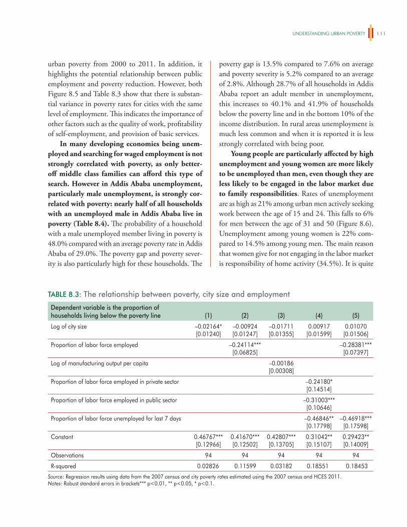
UNDeRSTANDiNg URBAN POveRTy 111
urban poverty from 2000 to 2011. In addition, it highlights the potential relationship between public employment and poverty reduction. However, both Figure 8.5 and Table 8.3 show that there is substan-tial variance in poverty rates for cities with the same level of employment. This indicates the importance of other factors such as the quality of work, profitability of self-employment, and provision of basic services.
In many developing economies being unem-ployed and searching for waged employment is not strongly correlated with poverty, as only better-off middle class families can afford this type of search. However in Addis Ababa unemployment, particularly male unemployment, is strongly cor-related with poverty: nearly half of all households with an unemployed male in Addis Ababa live in poverty (Table 8.4). The probability of a household with a male unemployed member living in poverty is 48.0% compared with an average poverty rate in Addis Ababa of 29.0%. The poverty gap and poverty sever-ity is also particularly high for these households. The
poverty gap is 13.5% compared to 7.6% on average and poverty severity is 5.2% compared to an average of 2.8%. Although 28.7% of all households in Addis Ababa report an adult member in unemployment, this increases to 40.1% and 41.9% of households below the poverty line and in the bottom 10% of the income distribution. In rural areas unemployment is much less common and when it is reported it is less strongly correlated with being poor.
Young people are particularly affected by high unemployment and young women are more likely to be unemployed than men, even though they are less likely to be engaged in the labor market due to family responsibilities. Rates of unemployment are as high as 21% among urban men actively seeking work between the age of 15 and 24. This falls to 6% for men between the age of 31 and 50 (Figure 8.6). Unemployment among young women is 22% com-pared to 14.5% among young men. The main reason that women give for not engaging in the labor market is responsibility of home activity (34.5%). It is quite
TABLE 8.3: The relationship between poverty, city size and employment
Dependent variable is the proportion of households living below the poverty line (1) (2) (3) (4) (5)
Log of city size –0.02164*[0.01240]
–0.00924[0.01247]
–0.01711[0.01355]
0.00917[0.01599]
0.01070[0.01506]
Proportion of labor force employed –0.24114***[0.06825]
–0.28381***[0.07397]
Log of manufacturing output per capita –0.00186[0.00308]
Proportion of labor force employed in private sector –0.24180*[0.14514]
Proportion of labor force employed in public sector –0.31003***[0.10646]
Proportion of labor force unemployed for last 7 days –0.46846**[0.17798]
–0.46918***[0.17598]
Constant 0.46767***[0.12966]
0.41670***[0.12502]
0.42807***[0.13705]
0.31042**[0.15107]
0.29423**[0.14009]
Observations 94 94 94 94 94
R-squared 0.02826 0.11599 0.03182 0.18551 0.18453
Source: Regression results using data from the 2007 census and city poverty rates estimated using the 2007 census and HCES 2011.Notes: Robust standard errors in brackets*** p<0.01, ** p<0.05, * p<0.1.
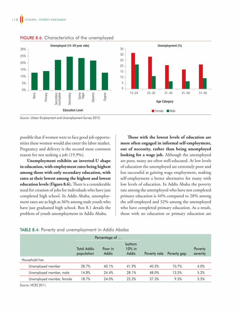
ETHIOPIA – POVERTY ASSESSMENT112
possible that if women were to face good job opportu-nities these women would also enter the labor market. Pregnancy and delivery is the second most common reason for not seeking a job (19.9%).
Unemployment exhibits an inverted-U shape in education, with employment rates being highest among those with only secondary education, with rates at their lowest among the highest and lowest education levels (Figure 8.6). There is a considerable need for creation of jobs for individuals who have just completed high school. In Addis Ababa, unemploy-ment rates are as high as 36% among male youth who have just graduated high school. Box 8.1 details the problem of youth unemployment in Addis Ababa.
Those with the lowest levels of education are more often engaged in informal self-employment, out of necessity, rather than being unemployed looking for a wage job. Although the unemployed are poor, many are often well-educated. At low levels of education the unemployed are extremely poor and less successful at gaining wage employment, making self-employment a better alternative for many with low levels of education. In Addis Ababa the poverty rate among the unemployed who have not completed primary education is 44% compared to 28% among the self-employed and 32% among the unemployed who have completed primary education. As a result, those with no education or primary education are
FIGURE 8.6: Characteristics of the unemployed
Unemployment (%)
0
5
10
15–24 25–30 31–40 51–6541–50
15
20
25
30
35
Female Male
Unemployed (15–29 year olds)
Education Level
Age Category
0%
None
Prim
ary
Seco
ndar
yin
com
plet
e
Seco
ndar
y
Som
eHi
ger
Dipl
oma
Degr
ee
5%
10%
15%
20%
25%
30%
Source: Urban Employment and Unemployment Survey 2012.
TABLE 8.4: Poverty and unemployment in Addis Ababa
Percentage of …
Poverty rate Poverty gapPoverty severity
Total Addis population
Poor in Addis
bottom 10% in Addis
Household has
Unemployed member 28.7% 40.1% 41.9% 40.5% 10.7% 4.0%
Unemployed member, male 14.8% 24.4% 28.1% 48.0% 13.5% 5.2%
Unemployed member, female 18.7% 24.0% 22.2% 37.3% 9.5% 3.5%
Source: HCES 2011.
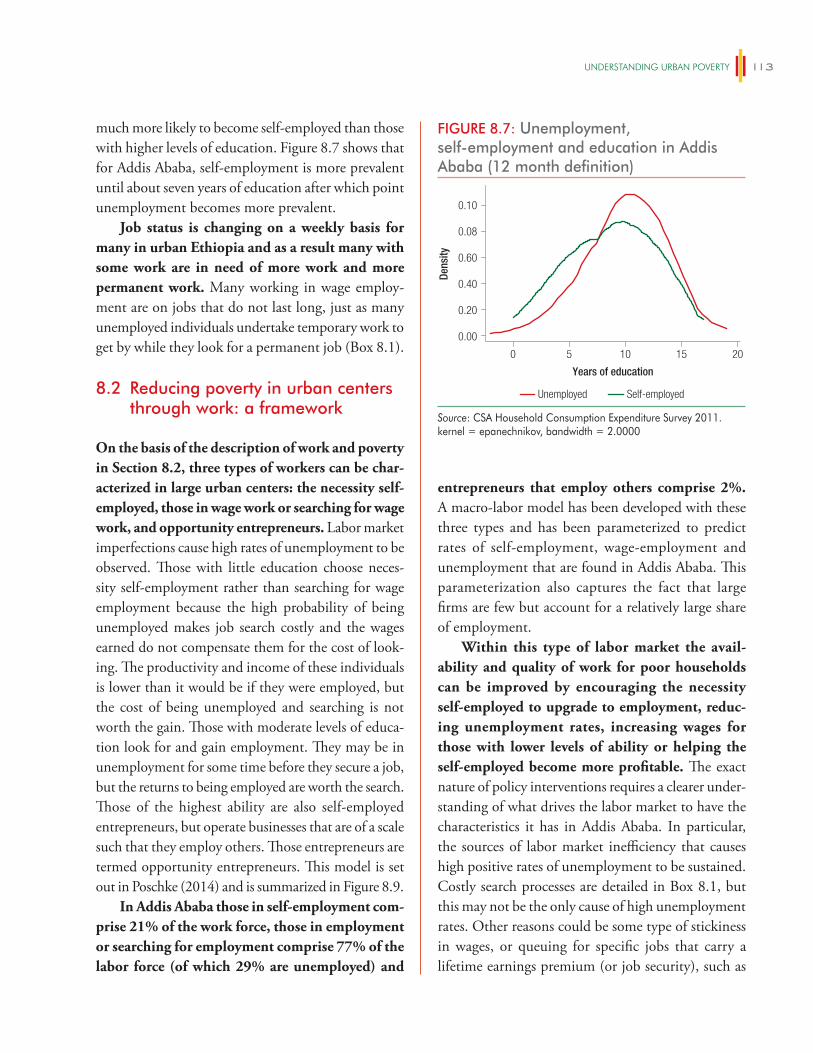
UNDeRSTANDiNg URBAN POveRTy 113
much more likely to become self-employed than those with higher levels of education. Figure 8.7 shows that for Addis Ababa, self-employment is more prevalent until about seven years of education after which point unemployment becomes more prevalent.
Job status is changing on a weekly basis for many in urban Ethiopia and as a result many with some work are in need of more work and more permanent work. Many working in wage employ-ment are on jobs that do not last long, just as many unemployed individuals undertake temporary work to get by while they look for a permanent job (Box 8.1).
8.2 Reducing poverty in urban centers through work: a framework
On the basis of the description of work and poverty in Section 8.2, three types of workers can be char-acterized in large urban centers: the necessity self-employed, those in wage work or searching for wage work, and opportunity entrepreneurs. Labor market imperfections cause high rates of unemployment to be observed. Those with little education choose neces-sity self-employment rather than searching for wage employment because the high probability of being unemployed makes job search costly and the wages earned do not compensate them for the cost of look-ing. The productivity and income of these individuals is lower than it would be if they were employed, but the cost of being unemployed and searching is not worth the gain. Those with moderate levels of educa-tion look for and gain employment. They may be in unemployment for some time before they secure a job, but the returns to being employed are worth the search. Those of the highest ability are also self-employed entrepreneurs, but operate businesses that are of a scale such that they employ others. Those entrepreneurs are termed opportunity entrepreneurs. This model is set out in Poschke (2014) and is summarized in Figure 8.9.
In Addis Ababa those in self-employment com-prise 21% of the work force, those in employment or searching for employment comprise 77% of the labor force (of which 29% are unemployed) and
entrepreneurs that employ others comprise 2%. A macro-labor model has been developed with these three types and has been parameterized to predict rates of self-employment, wage-employment and unemployment that are found in Addis Ababa. This parameterization also captures the fact that large firms are few but account for a relatively large share of employment.
Within this type of labor market the avail-ability and quality of work for poor households can be improved by encouraging the necessity self-employed to upgrade to employment, reduc-ing unemployment rates, increasing wages for those with lower levels of ability or helping the self-employed become more profitable. The exact nature of policy interventions requires a clearer under-standing of what drives the labor market to have the characteristics it has in Addis Ababa. In particular, the sources of labor market inefficiency that causes high positive rates of unemployment to be sustained. Costly search processes are detailed in Box 8.1, but this may not be the only cause of high unemployment rates. Other reasons could be some type of stickiness in wages, or queuing for specific jobs that carry a lifetime earnings premium (or job security), such as
FIGURE 8.7: Unemployment, self-employment and education in Addis Ababa (12 month definition)
0.00
0.08
0.20
0.40
0.60
0.10
Unemployed Self-employed
Dens
ity
Years of education
0 5 10 15 20
Source: CSA Household Consumption Expenditure Survey 2011.kernel = epanechnikov, bandwidth = 2.0000
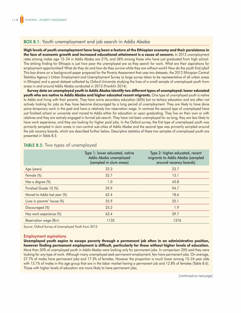
ETHIOPIA – POVERTY ASSESSMENT114
BOX 8.1: Youth unemployment and job search in Addis Ababa
High levels of youth unemployment have long been a feature of the Ethiopian economy and their persistence in the face of economic growth and increased educational attainment is a cause of concern. In 2012 unemployment rates among males age 15–24 in Addis Ababa are 21%, and 36% among those who have just graduated from high school. The striking finding for Ethiopia is just how poor the unemployed are as they search for work. What are their aspirations for employment opportunities? What do they do and how do they survive while they are without work? How do the youth find jobs? This box draws on a background paper prepared for the Poverty Assessment that uses two datasets, the 2012 Ethiopian Central Statistics Agency’s Urban Employment and Unemployment Survey (a large survey taken to be representative of all urban areas in Ethiopia) and a panel dataset collected by Oxford University studying the lives of a small sample of unemployed youth from areas in and around Addis Ababa conducted in 2013 (Franklin 2014).
Survey data on unemployed youth in Addis Ababa identify two different types of unemployed: lower educated youth who are native to Addis Ababa and higher educated recent migrants. One type of unemployed youth is native to Addis and living with their parents. They have some secondary education (60%) but no tertiary education and are often not actively looking for jobs as they have become discouraged by a long period of unemployment. They are likely to have done some temporary work in the past and have a relatively low reservation wage. In contrast the second type of unemployed have just finished school or university and moved to Addis either for education or upon graduating. They live on their own or with relatives and they are actively engaged in formal job search. They have not been unemployed for as long, they are less likely to have work experience, and they are looking for higher paid jobs. In the Oxford survey, the first type of unemployed youth was primarily sampled in slum areas in non-central sub-cities of Addis Ababa and the second type was primarily sampled around the job vacancy boards, which are described further below. Descriptive statistics of these two samples of unemployed youth are presented in Table 8.5.
TABLE 8.5: Two types of unemployed
Type 1: lower educated, native Addis Ababa unemployed (sampled in slum areas)
Type 2: higher educated, recent migrants to Addis Ababa (sampled
around vacancy boards)
Age (years) 23.3 23.7
Female (%) 32.7 13.1
Has a degree (%) 1.0 43.8
Finished Grade 10 (%) 59.9 94.7
Moved to Addis last year (%) 62.4 18.6
Lives in parents’ house (%) 55.9 20.1
Discouraged (%) 25.2 1.9
Has work experience (%) 63.4 39.7
Reservation wage (Birr) 1135 1376
Source: Oxford Survey of Unemployed Youth from 2013.
Employment aspirationsUnemployed youth aspire to escape poverty through a permanent job often in an administrative position, however finding permanent employment is difficult, particularly for those without higher levels of education. More than 50% of unemployed youth in Addis Ababa were looking only for permanent jobs. In comparison 35% said they were looking for any type of work. Although many unemployed seek permanent employment, few have permanent jobs. On average, 27.7% of males have permanent jobs and 17.3% of females. However the proportion is much lower among 15–24 year olds with 13.1% of males in this age group that are in the labor market having a permanent job and 12.8% of females (Table 8.6). Those with higher levels of education are more likely to have permanent jobs.
(continued on next page)
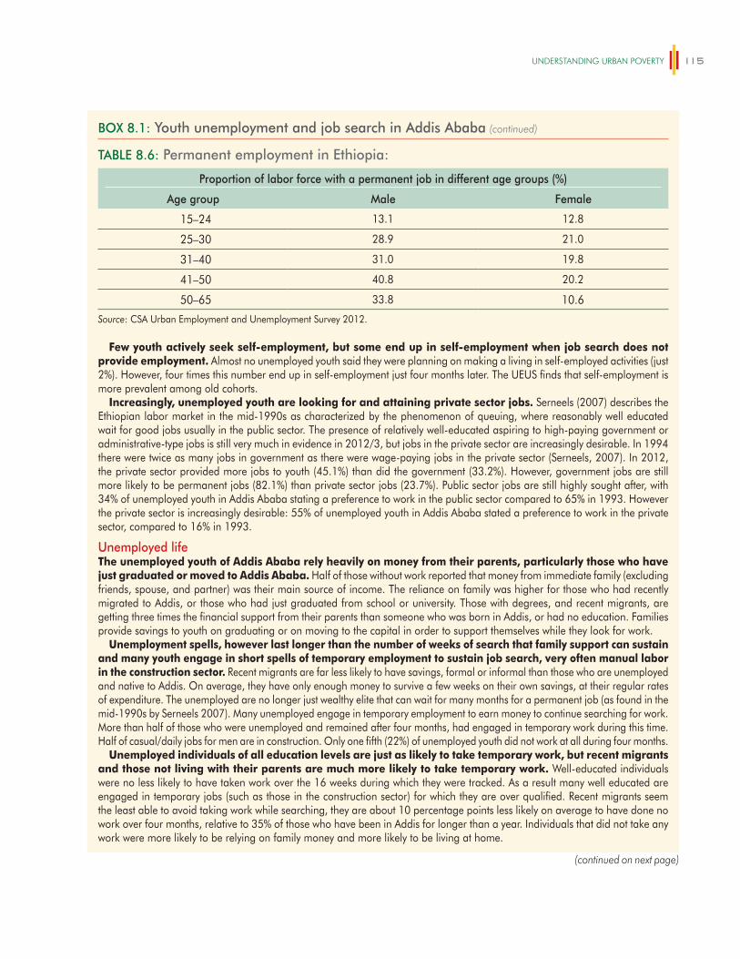
UNDeRSTANDiNg URBAN POveRTy 115
TABLE 8.6: Permanent employment in Ethiopia:
Proportion of labor force with a permanent job in different age groups (%)
Age group Male Female
15–24 13.1 12.8
25–30 28.9 21.0
31–40 31.0 19.8
41–50 40.8 20.2
50–65 33.8 10.6
Source: CSA Urban Employment and Unemployment Survey 2012.
Few youth actively seek self-employment, but some end up in self-employment when job search does not provide employment. Almost no unemployed youth said they were planning on making a living in self-employed activities (just 2%). However, four times this number end up in self-employment just four months later. The UEUS finds that self-employment is more prevalent among old cohorts.
Increasingly, unemployed youth are looking for and attaining private sector jobs. Serneels (2007) describes the Ethiopian labor market in the mid-1990s as characterized by the phenomenon of queuing, where reasonably well educated wait for good jobs usually in the public sector. The presence of relatively well-educated aspiring to high-paying government or administrative-type jobs is still very much in evidence in 2012/3, but jobs in the private sector are increasingly desirable. In 1994 there were twice as many jobs in government as there were wage-paying jobs in the private sector (Serneels, 2007). In 2012, the private sector provided more jobs to youth (45.1%) than did the government (33.2%). However, government jobs are still more likely to be permanent jobs (82.1%) than private sector jobs (23.7%). Public sector jobs are still highly sought after, with 34% of unemployed youth in Addis Ababa stating a preference to work in the public sector compared to 65% in 1993. However the private sector is increasingly desirable: 55% of unemployed youth in Addis Ababa stated a preference to work in the private sector, compared to 16% in 1993.
Unemployed lifeThe unemployed youth of Addis Ababa rely heavily on money from their parents, particularly those who have just graduated or moved to Addis Ababa. Half of those without work reported that money from immediate family (excluding friends, spouse, and partner) was their main source of income. The reliance on family was higher for those who had recently migrated to Addis, or those who had just graduated from school or university. Those with degrees, and recent migrants, are getting three times the financial support from their parents than someone who was born in Addis, or had no education. Families provide savings to youth on graduating or on moving to the capital in order to support themselves while they look for work.
Unemployment spells, however last longer than the number of weeks of search that family support can sustain and many youth engage in short spells of temporary employment to sustain job search, very often manual labor in the construction sector. Recent migrants are far less likely to have savings, formal or informal than those who are unemployed and native to Addis. On average, they have only enough money to survive a few weeks on their own savings, at their regular rates of expenditure. The unemployed are no longer just wealthy elite that can wait for many months for a permanent job (as found in the mid-1990s by Serneels 2007). Many unemployed engage in temporary employment to earn money to continue searching for work. More than half of those who were unemployed and remained after four months, had engaged in temporary work during this time. Half of casual/daily jobs for men are in construction. Only one fifth (22%) of unemployed youth did not work at all during four months.
Unemployed individuals of all education levels are just as likely to take temporary work, but recent migrants and those not living with their parents are much more likely to take temporary work. Well-educated individuals were no less likely to have taken work over the 16 weeks during which they were tracked. As a result many well educated are engaged in temporary jobs (such as those in the construction sector) for which they are over qualified. Recent migrants seem the least able to avoid taking work while searching, they are about 10 percentage points less likely on average to have done no work over four months, relative to 35% of those who have been in Addis for longer than a year. Individuals that did not take any work were more likely to be relying on family money and more likely to be living at home.
BOX 8.1: Youth unemployment and job search in Addis Ababa (continued)
(continued on next page)
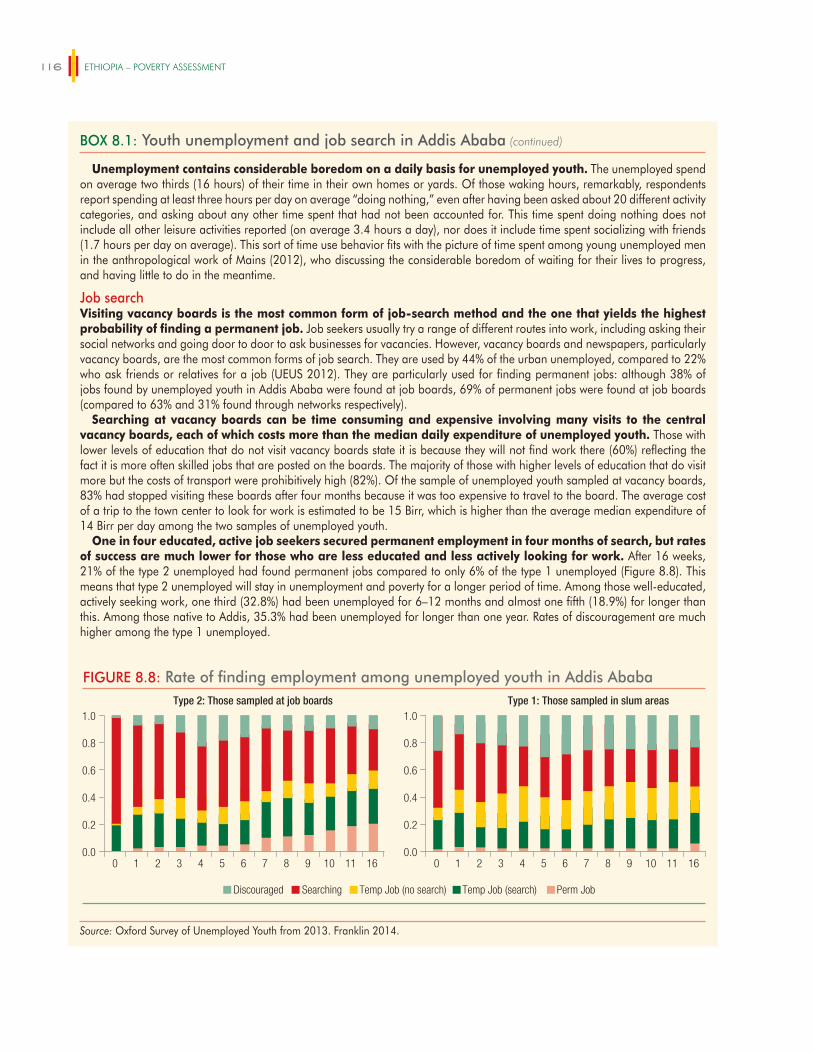
ETHIOPIA – POVERTY ASSESSMENT116
Unemployment contains considerable boredom on a daily basis for unemployed youth. The unemployed spend on average two thirds (16 hours) of their time in their own homes or yards. Of those waking hours, remarkably, respondents report spending at least three hours per day on average “doing nothing,” even after having been asked about 20 different activity categories, and asking about any other time spent that had not been accounted for. This time spent doing nothing does not include all other leisure activities reported (on average 3.4 hours a day), nor does it include time spent socializing with friends (1.7 hours per day on average). This sort of time use behavior fits with the picture of time spent among young unemployed men in the anthropological work of Mains (2012), who discussing the considerable boredom of waiting for their lives to progress, and having little to do in the meantime.
Job searchVisiting vacancy boards is the most common form of job-search method and the one that yields the highest probability of finding a permanent job. Job seekers usually try a range of different routes into work, including asking their social networks and going door to door to ask businesses for vacancies. However, vacancy boards and newspapers, particularly vacancy boards, are the most common forms of job search. They are used by 44% of the urban unemployed, compared to 22% who ask friends or relatives for a job (UEUS 2012). They are particularly used for finding permanent jobs: although 38% of jobs found by unemployed youth in Addis Ababa were found at job boards, 69% of permanent jobs were found at job boards (compared to 63% and 31% found through networks respectively).
Searching at vacancy boards can be time consuming and expensive involving many visits to the central vacancy boards, each of which costs more than the median daily expenditure of unemployed youth. Those with lower levels of education that do not visit vacancy boards state it is because they will not find work there (60%) reflecting the fact it is more often skilled jobs that are posted on the boards. The majority of those with higher levels of education that do visit more but the costs of transport were prohibitively high (82%). Of the sample of unemployed youth sampled at vacancy boards, 83% had stopped visiting these boards after four months because it was too expensive to travel to the board. The average cost of a trip to the town center to look for work is estimated to be 15 Birr, which is higher than the average median expenditure of 14 Birr per day among the two samples of unemployed youth.
One in four educated, active job seekers secured permanent employment in four months of search, but rates of success are much lower for those who are less educated and less actively looking for work. After 16 weeks, 21% of the type 2 unemployed had found permanent jobs compared to only 6% of the type 1 unemployed (Figure 8.8). This means that type 2 unemployed will stay in unemployment and poverty for a longer period of time. Among those well-educated, actively seeking work, one third (32.8%) had been unemployed for 6–12 months and almost one fifth (18.9%) for longer than this. Among those native to Addis, 35.3% had been unemployed for longer than one year. Rates of discouragement are much higher among the type 1 unemployed.
Source: Oxford Survey of Unemployed Youth from 2013. Franklin 2014.
BOX 8.1: Youth unemployment and job search in Addis Ababa (continued)
FIGURE 8.8: Rate of finding employment among unemployed youth in Addis AbabaType 2: Those sampled at job boards
0.0
0.2
0.4
0.6
0.8
1.0
0 1 2 3 4 5 6 7 8 9 10 11 160.0
0.2
0.4
0.6
0.8
1.0
0 1 2 3 4 5 6 7 8 9 10 11 16
Type 1: Those sampled in slum areas
Searching Temp Job (search)Discouraged Temp Job (no search) Perm Job
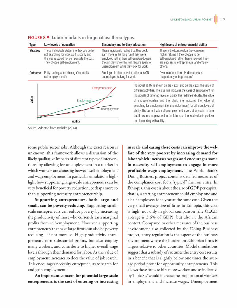
UNDeRSTANDiNg URBAN POveRTy 117
some public sector jobs. Although the exact reason is unknown, this framework allows a discussion of the likely qualitative impacts of different types of interven-tions, by allowing for unemployment in a market in which workers are choosing between self-employment and wage employment. In particular simulations high-light how supporting large-scale entrepreneurs can be very beneficial for poverty reduction, perhaps more so than supporting necessity entrepreneurship.
Supporting entrepreneurs, both large and small, can be poverty reducing. Supporting small-scale entrepreneurs can reduce poverty by increasing the productivity of those who currently earn marginal profits from self-employment. However, supporting entrepreneurs that have large firms can also be poverty reducing—if not more so. High productivity entre-preneurs earn substantial profits, but also employ many workers, and contribute to higher overall wage levels through their demand for labor. As the value of employment increases so does the value of job search. This encourages necessity entrepreneurs to search for and gain employment.
An important concern for potential large-scale entrepreneurs is the cost of entering or increasing
in scale and easing these costs can improve the wel-fare of the very poorest by increasing demand for labor which increases wages and encourages some in necessity self-employment to engage in more profitable wage employment. The World Bank’s Doing Business project contains detailed measures of the compliance cost for a “typical” firm on entry. In Ethiopia, this cost is about the size of GDP per capita, that is, a starting entrepreneur could employ one and a half employees for a year at the same cost. Given the very small average size of firms in Ethiopia, this cost is high, not only in global comparison (the OECD average is 3.6% of GDP), but also in the African context. Compared to other measures of the business environment also collected by the Doing Business project, entry regulation is the aspect of the business environment where the burden on Ethiopian firms is largest relative to other countries. Model simulations suggest that a subsidy of six times the entry cost results in a benefit that is slightly below one times the aver-age period profit for opportunity entrepreneurs. This allows these firms to hire more workers and as indicated by Table 8.7 would increase the proportion of workers in employment and increase wages. Unemployment
FIGURE 8.9: Labor markets in large cities: three types
Ability
Entrepreneurship
Employment
Unemployment
Valu
e
Type Low levels of education Secondary and tertiary education High levels of entrepreneurial ability
Strategy
Outcome
Individual ability is shown on the x axis, and on the y axis the value of different activities. The blue line indicates the value of employment for individuals of differing levels of ability. The red line indicates the value of entrepreneurship and the black line indicates the value of searching for employment (i.e. unemploy-ment) for different levels of ability. The current value of unemployment is zero at any point in time but it secures employment in the future, so the total value is positive and increasing with ability.
These individuals determine they are better not searching for work as it is costly and the wages would not compensate the cost. They choose self-employment.
These individuals realize they can earn higher returns if they choose to be self-employed rather than employed. They are successful entrepreneurs and employ others.
Petty trading, shoe-shining (“necessity self-employ-ment”)
Employed in blue or white collar jobs OR unemployed looking for work
Owners of medium-sized enterprises (“opportunity entrepreneurs”)
These individuals realize that they could earn more in the long run if they were employed rather than self-employed, even though they know this will require spells of unemployment while they look for work.
Source: Adapted from Poshcke (2014).
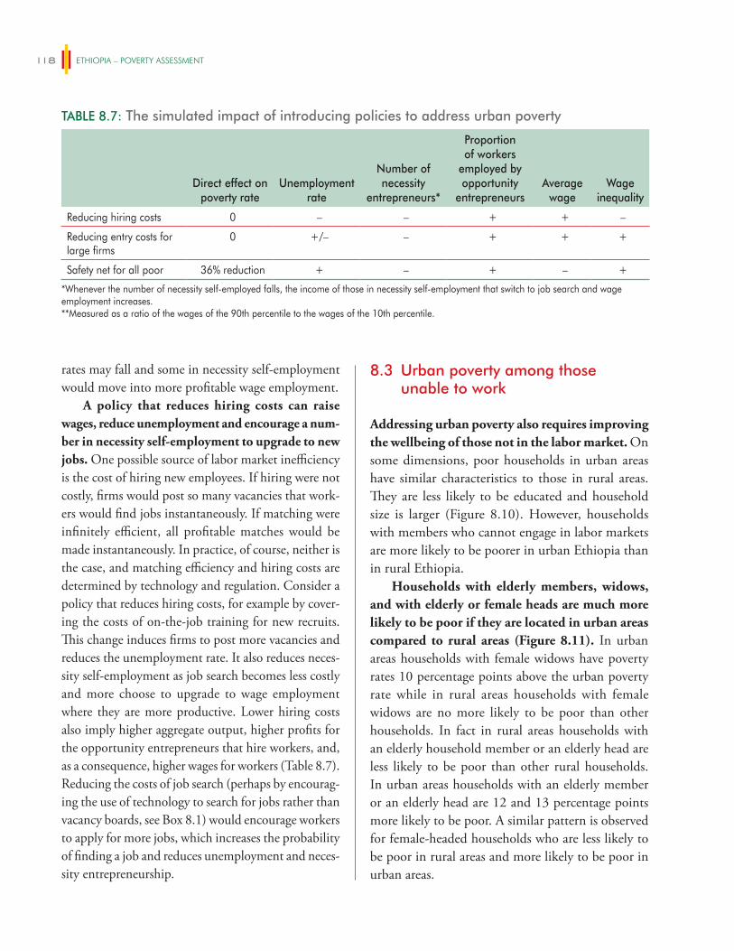
ETHIOPIA – POVERTY ASSESSMENT118
rates may fall and some in necessity self-employment would move into more profitable wage employment.
A policy that reduces hiring costs can raise wages, reduce unemployment and encourage a num-ber in necessity self-employment to upgrade to new jobs. One possible source of labor market inefficiency is the cost of hiring new employees. If hiring were not costly, firms would post so many vacancies that work-ers would find jobs instantaneously. If matching were infinitely efficient, all profitable matches would be made instantaneously. In practice, of course, neither is the case, and matching efficiency and hiring costs are determined by technology and regulation. Consider a policy that reduces hiring costs, for example by cover-ing the costs of on-the-job training for new recruits. This change induces firms to post more vacancies and reduces the unemployment rate. It also reduces neces-sity self-employment as job search becomes less costly and more choose to upgrade to wage employment where they are more productive. Lower hiring costs also imply higher aggregate output, higher profits for the opportunity entrepreneurs that hire workers, and, as a consequence, higher wages for workers (Table 8.7). Reducing the costs of job search (perhaps by encourag-ing the use of technology to search for jobs rather than vacancy boards, see Box 8.1) would encourage workers to apply for more jobs, which increases the probability of finding a job and reduces unemployment and neces-sity entrepreneurship.
8.3 Urban poverty among those unable to work
Addressing urban poverty also requires improving the wellbeing of those not in the labor market. On some dimensions, poor households in urban areas have similar characteristics to those in rural areas. They are less likely to be educated and household size is larger (Figure 8.10). However, households with members who cannot engage in labor markets are more likely to be poorer in urban Ethiopia than in rural Ethiopia.
Households with elderly members, widows, and with elderly or female heads are much more likely to be poor if they are located in urban areas compared to rural areas (Figure 8.11). In urban areas households with female widows have poverty rates 10 percentage points above the urban poverty rate while in rural areas households with female widows are no more likely to be poor than other households. In fact in rural areas households with an elderly household member or an elderly head are less likely to be poor than other rural households. In urban areas households with an elderly member or an elderly head are 12 and 13 percentage points more likely to be poor. A similar pattern is observed for female-headed households who are less likely to be poor in rural areas and more likely to be poor in urban areas.
TABLE 8.7: The simulated impact of introducing policies to address urban poverty
Direct effect on poverty rate
Unemployment rate
Number of necessity
entrepreneurs*
Proportion of workers
employed by opportunity
entrepreneursAverage
wageWage
inequality
Reducing hiring costs 0 – – + + –
Reducing entry costs for large firms
0 +/– – + + +
Safety net for all poor 36% reduction + – + – +
*Whenever the number of necessity self-employed falls, the income of those in necessity self-employment that switch to job search and wage employment increases.**Measured as a ratio of the wages of the 90th percentile to the wages of the 10th percentile.
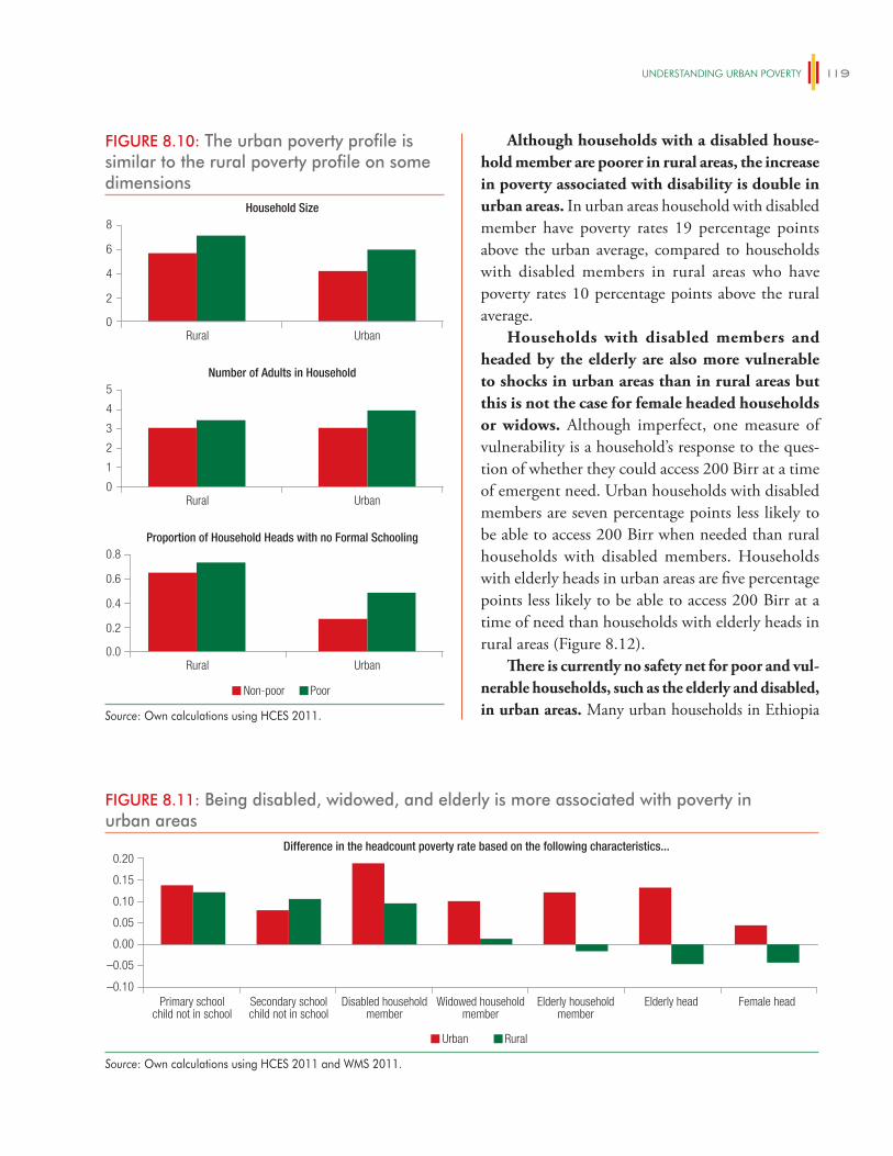
UNDeRSTANDiNg URBAN POveRTy 119
Although households with a disabled house-hold member are poorer in rural areas, the increase in poverty associated with disability is double in urban areas. In urban areas household with disabled member have poverty rates 19 percentage points above the urban average, compared to households with disabled members in rural areas who have poverty rates 10 percentage points above the rural average.
Households with disabled members and headed by the elderly are also more vulnerable to shocks in urban areas than in rural areas but this is not the case for female headed households or widows. Although imperfect, one measure of vulnerability is a household’s response to the ques-tion of whether they could access 200 Birr at a time of emergent need. Urban households with disabled members are seven percentage points less likely to be able to access 200 Birr when needed than rural households with disabled members. Households with elderly heads in urban areas are five percentage points less likely to be able to access 200 Birr at a time of need than households with elderly heads in rural areas (Figure 8.12).
There is currently no safety net for poor and vul-nerable households, such as the elderly and disabled, in urban areas. Many urban households in Ethiopia
FIGURE 8.10: The urban poverty profile is similar to the rural poverty profile on some dimensions
0
2
4
6
8
0.0
0.2
0.4
0.6
0.8
Rural Urban
Household Size
0
1
2
3
4
5
Rural Urban
Number of Adults in Household
Non-poor Poor
Rural Urban
Proportion of Household Heads with no Formal Schooling
Source: Own calculations using HCES 2011.
FIGURE 8.11: Being disabled, widowed, and elderly is more associated with poverty in urban areas
–0.10
–0.05
0.00
0.05
0.10
0.15
0.20
Urban Rural
Primary schoolchild not in school
Secondary schoolchild not in school
Disabled householdmember
Widowed householdmember
Elderly householdmember
Elderly head Female head
Difference in the headcount poverty rate based on the following characteristics...
Source: Own calculations using HCES 2011 and WMS 2011.
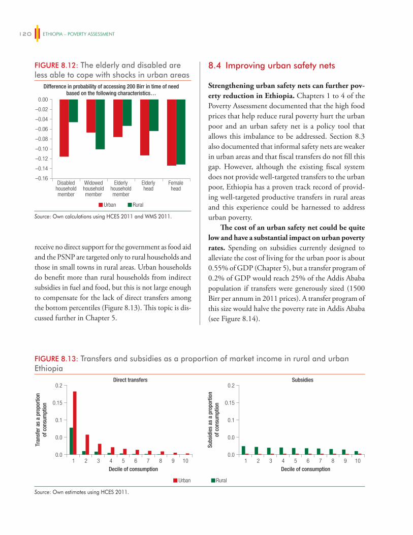
ETHIOPIA – POVERTY ASSESSMENT120
receive no direct support for the government as food aid and the PSNP are targeted only to rural households and those in small towns in rural areas. Urban households do benefit more than rural households from indirect subsidies in fuel and food, but this is not large enough to compensate for the lack of direct transfers among the bottom percentiles (Figure 8.13). This topic is dis-cussed further in Chapter 5.
8.4 Improving urban safety nets
Strengthening urban safety nets can further pov-erty reduction in Ethiopia. Chapters 1 to 4 of the Poverty Assessment documented that the high food prices that help reduce rural poverty hurt the urban poor and an urban safety net is a policy tool that allows this imbalance to be addressed. Section 8.3 also documented that informal safety nets are weaker in urban areas and that fiscal transfers do not fill this gap. However, although the existing fiscal system does not provide well-targeted transfers to the urban poor, Ethiopia has a proven track record of provid-ing well-targeted productive transfers in rural areas and this experience could be harnessed to address urban poverty.
The cost of an urban safety net could be quite low and have a substantial impact on urban poverty rates. Spending on subsidies currently designed to alleviate the cost of living for the urban poor is about 0.55% of GDP (Chapter 5), but a transfer program of 0.2% of GDP would reach 25% of the Addis Ababa population if transfers were generously sized (1500 Birr per annum in 2011 prices). A transfer program of this size would halve the poverty rate in Addis Ababa (see Figure 8.14).
FIGURE 8.12: The elderly and disabled are less able to cope with shocks in urban areas
–0.12
–0.14
–0.16
–0.10
–0.08
–0.06
–0.04
–0.02
0.00
Urban Rural
Disabledhouseholdmember
Widowedhouseholdmember
Elderlyhouseholdmember
Elderlyhead
Femalehead
Difference in probability of accessing 200 Birr in time of needbased on the following characteristics…
Source: Own calculations using HCES 2011 and WMS 2011.
FIGURE 8.13: Transfers and subsidies as a proportion of market income in rural and urban Ethiopia
Direct transfers
1 2 3 4 5 6 7 8 9 10
Decile of consumption
0.0
0.0
0.1
0.15
0.2
Tran
sfer
as
a pr
opor
tion
of c
onsu
mpt
ion
Subsidies
1 2 3 4 5 6 7 8 9 10
Decile of consumption
0.0
0.0
0.1
0.15
0.2
Subs
idie
s as
a p
ropo
rtio
nof
con
sum
ptio
n
Urban Rural
Source: Own estimates using HCES 2011.
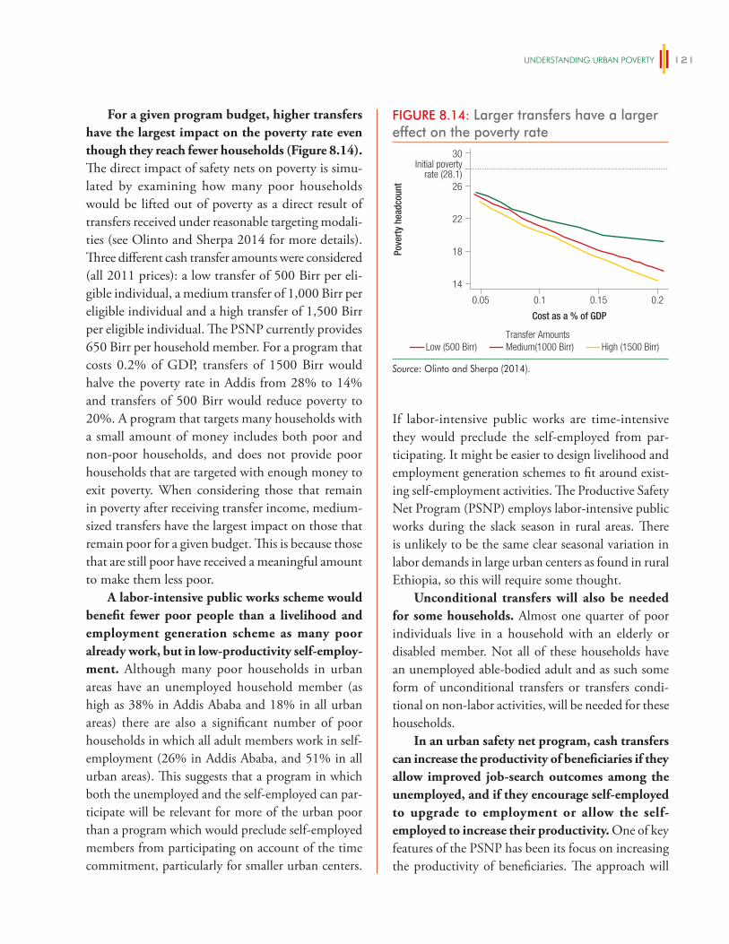
UNDeRSTANDiNg URBAN POveRTy 121
For a given program budget, higher transfers have the largest impact on the poverty rate even though they reach fewer households (Figure 8.14). The direct impact of safety nets on poverty is simu-lated by examining how many poor households would be lifted out of poverty as a direct result of transfers received under reasonable targeting modali-ties (see Olinto and Sherpa 2014 for more details). Three different cash transfer amounts were considered (all 2011 prices): a low transfer of 500 Birr per eli-gible individual, a medium transfer of 1,000 Birr per eligible individual and a high transfer of 1,500 Birr per eligible individual. The PSNP currently provides 650 Birr per household member. For a program that costs 0.2% of GDP, transfers of 1500 Birr would halve the poverty rate in Addis from 28% to 14% and transfers of 500 Birr would reduce poverty to 20%. A program that targets many households with a small amount of money includes both poor and non-poor households, and does not provide poor households that are targeted with enough money to exit poverty. When considering those that remain in poverty after receiving transfer income, medium-sized transfers have the largest impact on those that remain poor for a given budget. This is because those that are still poor have received a meaningful amount to make them less poor.
A labor-intensive public works scheme would benefit fewer poor people than a livelihood and employment generation scheme as many poor already work, but in low-productivity self-employ-ment. Although many poor households in urban areas have an unemployed household member (as high as 38% in Addis Ababa and 18% in all urban areas) there are also a significant number of poor households in which all adult members work in self-employment (26% in Addis Ababa, and 51% in all urban areas). This suggests that a program in which both the unemployed and the self-employed can par-ticipate will be relevant for more of the urban poor than a program which would preclude self-employed members from participating on account of the time commitment, particularly for smaller urban centers.
If labor-intensive public works are time-intensive they would preclude the self-employed from par-ticipating. It might be easier to design livelihood and employment generation schemes to fit around exist-ing self-employment activities. The Productive Safety Net Program (PSNP) employs labor-intensive public works during the slack season in rural areas. There is unlikely to be the same clear seasonal variation in labor demands in large urban centers as found in rural Ethiopia, so this will require some thought.
Unconditional transfers will also be needed for some households. Almost one quarter of poor individuals live in a household with an elderly or disabled member. Not all of these households have an unemployed able-bodied adult and as such some form of unconditional transfers or transfers condi-tional on non-labor activities, will be needed for these households.
In an urban safety net program, cash transfers can increase the productivity of beneficiaries if they allow improved job-search outcomes among the unemployed, and if they encourage self-employed to upgrade to employment or allow the self-employed to increase their productivity. One of key features of the PSNP has been its focus on increasing the productivity of beneficiaries. The approach will
FIGURE 8.14: Larger transfers have a larger effect on the poverty rate
Pove
rty
head
coun
t
Cost as a % of GDP
14
18
22
26
30
0.05 0.1 0.15 0.2
Low (500 Birr) Medium(1000 Birr) High (1500 Birr)Transfer Amounts
Initial povertyrate (28.1)
Source: Olinto and Sherpa (2014).
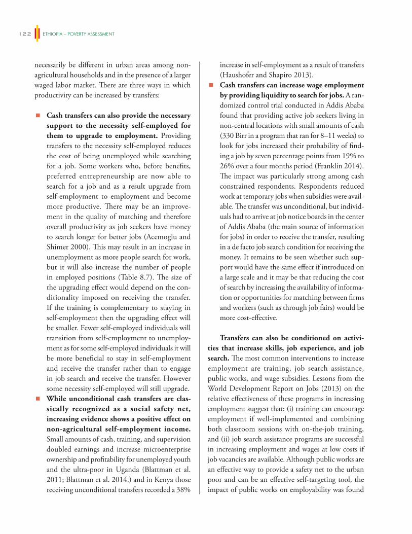
ETHIOPIA – POVERTY ASSESSMENT122
necessarily be different in urban areas among non-agricultural households and in the presence of a larger waged labor market. There are three ways in which productivity can be increased by transfers:
� Cash transfers can also provide the necessary support to the necessity self-employed for them to upgrade to employment. Providing transfers to the necessity self-employed reduces the cost of being unemployed while searching for a job. Some workers who, before benefits, preferred entrepreneurship are now able to search for a job and as a result upgrade from self-employment to employment and become more productive. There may be an improve-ment in the quality of matching and therefore overall productivity as job seekers have money to search longer for better jobs (Acemoglu and Shimer 2000). This may result in an increase in unemployment as more people search for work, but it will also increase the number of people in employed positions (Table 8.7). The size of the upgrading effect would depend on the con-ditionality imposed on receiving the transfer. If the training is complementary to staying in self-employment then the upgrading effect will be smaller. Fewer self-employed individuals will transition from self-employment to unemploy-ment as for some self-employed individuals it will be more beneficial to stay in self-employment and receive the transfer rather than to engage in job search and receive the transfer. However some necessity self-employed will still upgrade.
� While unconditional cash transfers are clas-sically recognized as a social safety net, increasing evidence shows a positive effect on non-agricultural self-employment income. Small amounts of cash, training, and supervision doubled earnings and increase microenterprise ownership and profitability for unemployed youth and the ultra-poor in Uganda (Blattman et al. 2011; Blattman et al. 2014.) and in Kenya those receiving unconditional transfers recorded a 38%
increase in self-employment as a result of transfers (Haushofer and Shapiro 2013).
� Cash transfers can increase wage employment by providing liquidity to search for jobs. A ran-domized control trial conducted in Addis Ababa found that providing active job seekers living in non-central locations with small amounts of cash (330 Birr in a program that ran for 8–11 weeks) to look for jobs increased their probability of find-ing a job by seven percentage points from 19% to 26% over a four months period (Franklin 2014). The impact was particularly strong among cash constrained respondents. Respondents reduced work at temporary jobs when subsidies were avail-able. The transfer was unconditional, but individ-uals had to arrive at job notice boards in the center of Addis Ababa (the main source of information for jobs) in order to receive the transfer, resulting in a de facto job search condition for receiving the money. It remains to be seen whether such sup-port would have the same effect if introduced on a large scale and it may be that reducing the cost of search by increasing the availability of informa-tion or opportunities for matching between firms and workers (such as through job fairs) would be more cost-effective.
Transfers can also be conditioned on activi-ties that increase skills, job experience, and job search. The most common interventions to increase employment are training, job search assistance, public works, and wage subsidies. Lessons from the World Development Report on Jobs (2013) on the relative effectiveness of these programs in increasing employment suggest that: (i) training can encourage employment if well-implemented and combining both classroom sessions with on-the-job training, and (ii) job search assistance programs are successful in increasing employment and wages at low costs if job vacancies are available. Although public works are an effective way to provide a safety net to the urban poor and can be an effective self-targeting tool, the impact of public works on employability was found
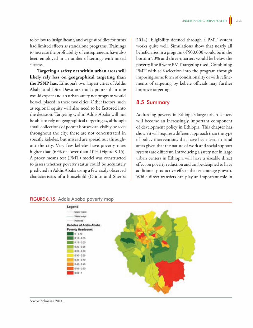
UNDeRSTANDiNg URBAN POveRTy 123
to be low to insignificant, and wage subsidies for firms had limited effects as standalone programs. Trainings to increase the profitability of entrepreneurs have also been employed in a number of settings with mixed success.
Targeting a safety net within urban areas will likely rely less on geographical targeting than the PSNP has. Ethiopia’s two largest cities of Addis Ababa and Dire Dawa are much poorer than one would expect and an urban safety net program would be well placed in these two cities. Other factors, such as regional equity will also need to be factored into the decision. Targeting within Addis Ababa will not be able to rely on geographical targeting as, although small collections of poorer houses can visibly be seen throughout the city, these are not concentrated in specific kebeles, but instead are spread out through-out the city. Very few kebeles have poverty rates higher than 50% or lower than 10% (Figure 8.15). A proxy means test (PMT) model was constructed to assess whether poverty status could be accurately predicted in Addis Ababa using a few easily observed characteristics of a household (Olinto and Sherpa
2014). Eligibility defined through a PMT system works quite well. Simulations show that nearly all beneficiaries in a program of 500,000 would be in the bottom 50% and three-quarters would be below the poverty line if were PMT targeting used. Combining PMT with self-selection into the program through imposing some form of conditionality or with refine-ments of targeting by kebele officials may further improve targeting.
8.5 Summary
Addressing poverty in Ethiopia’s large urban centers will become an increasingly important component of development policy in Ethiopia. This chapter has shown it will require a different approach than the type of policy interventions that have been used in rural areas given that the nature of work and social support systems are different. Introducing a safety net in large urban centers in Ethiopia will have a sizeable direct effect on poverty reduction and can be designed to have additional productive effects that encourage growth. While direct transfers can play an important role in
FIGURE 8.15: Addis Ababa poverty map
Source: Sohnesen 2014.

ETHIOPIA – POVERTY ASSESSMENT124
reducing poverty in large cities in Ethiopia policies that encourage the entry and growth of large firms and
reduce labor market inefficiencies will also contribute a lot to poverty reduction in large urban centers.
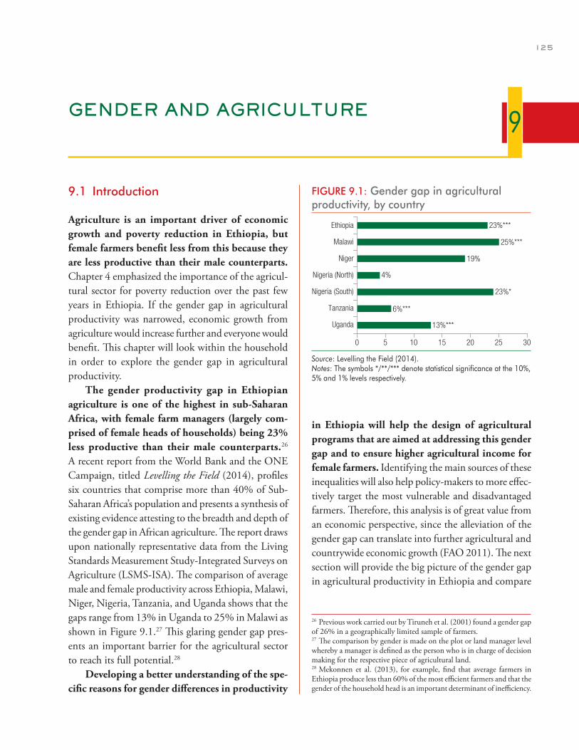
125
GENDER AND AGRICULTURE
9.1 Introduction
Agriculture is an important driver of economic growth and poverty reduction in Ethiopia, but female farmers benefit less from this because they are less productive than their male counterparts. Chapter 4 emphasized the importance of the agricul-tural sector for poverty reduction over the past few years in Ethiopia. If the gender gap in agricultural productivity was narrowed, economic growth from agriculture would increase further and everyone would benefit. This chapter will look within the household in order to explore the gender gap in agricultural productivity.
The gender productivity gap in Ethiopian agriculture is one of the highest in sub-Saharan Africa, with female farm managers (largely com-prised of female heads of households) being 23% less productive than their male counterparts.26 A recent report from the World Bank and the ONE Campaign, titled Levelling the Field (2014), profiles six countries that comprise more than 40% of Sub-Saharan Africa’s population and presents a synthesis of existing evidence attesting to the breadth and depth of the gender gap in African agriculture. The report draws upon nationally representative data from the Living Standards Measurement Study-Integrated Surveys on Agriculture (LSMS-ISA). The comparison of average male and female productivity across Ethiopia, Malawi, Niger, Nigeria, Tanzania, and Uganda shows that the gaps range from 13% in Uganda to 25% in Malawi as shown in Figure 9.1.27 This glaring gender gap pres-ents an important barrier for the agricultural sector to reach its full potential.28
Developing a better understanding of the spe-cific reasons for gender differences in productivity
in Ethiopia will help the design of agricultural programs that are aimed at addressing this gender gap and to ensure higher agricultural income for female farmers. Identifying the main sources of these inequalities will also help policy-makers to more effec-tively target the most vulnerable and disadvantaged farmers. Therefore, this analysis is of great value from an economic perspective, since the alleviation of the gender gap can translate into further agricultural and countrywide economic growth (FAO 2011). The next section will provide the big picture of the gender gap in agricultural productivity in Ethiopia and compare
9
26 Previous work carried out by Tiruneh et al. (2001) found a gender gap of 26% in a geographically limited sample of farmers.27 The comparison by gender is made on the plot or land manager level whereby a manager is defined as the person who is in charge of decision making for the respective piece of agricultural land.28 Mekonnen et al. (2013), for example, find that average farmers in Ethiopia produce less than 60% of the most efficient farmers and that the gender of the household head is an important determinant of inefficiency.
FIGURE 9.1: Gender gap in agricultural productivity, by country
0 5 10 15 20 25 30
Uganda
Tanzania
Nigeria (South)
Nigeria (North)
Niger
Malawi
Ethiopia 23%***
25%***
19%
4%
23%*
6%***
13%***
Source: Levelling the Field (2014).Notes: The symbols */**/*** denote statistical significance at the 10%, 5% and 1% levels respectively.
ETHIOPIA – POVERTY ASSESSMENT126
the findings with those obtained from other African countries. Then, the analysis of the gender gap will zoom in and distinguish between different groups of farmers, which will provide additional, targeted policy implications.
9.2 Gender productivity differentials: Ethiopia in a regional comparison
In Ethiopia, almost half (43 percent) of the gender gap in agricultural productivity is as a result of differ-ences between the amount of productive inputs used by men and women, a difference in endowments. The size of this endowment effect is relatively small com-pared to other countries. In Malawi, for example, this effect was found to explain 82% of the gender produc-tivity gap (Kilic et al. 2013).29 In Ethiopia, the remain-ing 57% of the gender gap is frequently attributed to differences in the returns women receive from the use of the same quantity of the same inputs, stemming from structural disadvantages (Aguilar et al. 2014).30 These could include, for example, the unequal treatment of men and women within formal and informal societal institutions, markets, or social programs. If such struc-tural issues are a key constraint, then policies would need to address broader issues of disadvantage (includ-ing factors such as discrimination) that hinder women’s productivity in the agricultural sector. However, it is important to note that the differences in returns can also capture differences in other unobservable or omit-ted explanatory variables and other factors including errors related to measurement.
Although the factors accounting for the gender gap vary by country, Levelling the Field (2014) reveals several key determinants of particu-lar relevance across countries. Figure 9.2 indicates that most factors considered in standard models of agricultural production, with the notable exception of credit, are also decisive in explaining the gender gap. Levels of labor and non-labor (seeds, chemicals, and fertilizer) productive factors appear to have the great-est influence across the studied sample of countries, including Ethiopia.
In Ethiopia female farmers own less land, rent less land and have fewer hours to allocate to agri-cultural production than male-headed households, all of which contributes significantly to lower levels of productivity. On average, women plot managers spend 8.2 hours less per week on agricultural activi-ties, hold 41% fewer hectares of land and have a 7.4 percentage point lower likelihood of working on rented fields compared to men. These three factors are the main driving forces behind the endowment effect estimated in Aguilar et al. (2014).
In Ethiopia, differences in returns to inputs are primarily related to the benefits female managers reap from fertilizer, extension services, land certi-fication, land under agricultural production, and oxen availability. These differences in returns may be explained by several aspects: complementarities with other productive factors (e.g. women may need one type of productive factor to get the most out of another factor), differences in input quality (e.g. women access lower quality fertilizers or land that is less fertile), and gender discrimination, as well as other unobservable determinants.
The regional comparison shows that returns to labor and fertilizer are important drivers of the gender gap. These factors were already identified as key factors contributing to the gender productivity gap in terms of the differing amounts used by men and women. However, they also appear to be key factors in terms of the returns men and women are able to get from their use. Therefore, a focus on these factors may offer a particularly promising avenue for policies aimed at narrowing the gender gap.
Land characteristics are additional factors that contribute to the gender gap through unequal returns. It is not only simple access to land that is
29 For Nigeria, Oseni et al. (2014) report that the structural effect is larger than the endowment effect in the North but that the opposite is true in the South.30 These estimates are based on data from the 2011–2012 Ethiopia Rural Socioeconomic Survey and the Oaxaca-Blinder decomposition methodol-ogy which is widely used in labor economics and equally offers significant value for understanding gender productivity gaps in agriculture.
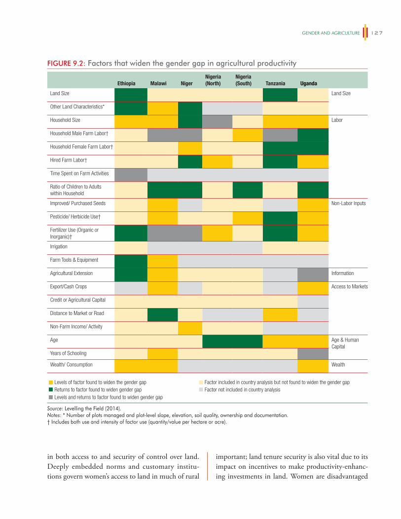
geNDeR AND AgRiCUlTURe 127
in both access to and security of control over land. Deeply embedded norms and customary institu-tions govern women’s access to land in much of rural
important; land tenure security is also vital due to its impact on incentives to make productivity-enhanc-ing investments in land. Women are disadvantaged
FIGURE 9.2: Factors that widen the gender gap in agricultural productivity
Ethiopia Malawi NigerNigeria (North)
Nigeria (South) Tanzania Uganda
Land Size Land Size
Other Land Characteristics*
Household Size Labor
Household Male Farm Labor†
Household Female Farm Labor†
Hired Farm Labor†
Time Spent on Farm Activities
Ratio of Children to Adults within Household
Improved/ Purchased Seeds Non-Labor Inputs
Pesticide/ Herbicide Use†
Fertilizer Use (Organic or Inorganic)†
Irrigation
Farm Tools & Equipment
Agricultural Extension Information
Export/Cash Crops Access to Markets
Credit or Agricultural Capital
Distance to Market or Road
Non-Farm Income/ Activity
Age Age & Human Capital
Years of Schooling
Wealth/ Consumption Wealth
Levels of factor found to widen the gender gap Factor included in country analysis but not found to widen the gender gap Returns to factor found to widen gender gap Factor not included in country analysisLevels and returns to factor found to widen gender gap
Source: Levelling the Field (2014).Notes: * Number of plots managed and plot-level slope, elevation, soil quality, ownership and documentation.† Includes both use and intensity of factor use (quantity/value per hectare or acre).
ETHIOPIA – POVERTY ASSESSMENT128
sub-Saharan Africa, and women are often disadvan-taged under both statutory and customary land tenure systems. Insecure tenure is shown to reduce investment in land, leading to lower agricultural productivity. The empirical literature has established strong links between the security of land tenure and the level of investment in that land. For example, research in Ethiopia found that the threat of expropriation tends to reduce investment in soil conservation measures, whereas land certification (which increases security of tenure) boosts investment and rental market activity (Deininger et al. 2011). Similarly, soil quality is a major determinant of crop productivity in Africa, and it is often claimed that land managed by women may, on average, have poorer soil quality than that managed by men. However, the high cost and the logistics of large-scale soil testing has limited the availability of quality data at the farm level.
Informal social networks also play a critical role in the exchange of agricultural information and the adoption of agricultural technologies among farm-ers. Detailed data on the role of social networks is beyond the scope of the LSMS-ISA surveys, but existing literature has suggested that women’s social networks tend to differ from men’s. Moreover, women and men appear to use their social networks differently, which has implications for their agricultural productivity. For example, Kondylis and Mueller (2012) find that female extension agents in a pilot study in Mozambique were successful in terms of both teaching farmers modern agricultural techniques and to induce a process of peer-to-peer learning in the targeted communities. In addition, evidence for the advantage of function-ing network structures is presented in a recent Oxfam (2013) publication where collective action groups (co-operatives) were found to provide substantial eco-nomic benefits to female farmers particularly in terms of revenues and prices when marketing their produce.
A distinct characteristic that separates Ethiopia from the other countries in the regional compari-son is the fact that women are rarely reported as managing a plot unless they are also the household head. Survey results from Tanzania and Uganda,
for example, shows that more than one household member manages a large proportion of plots in those countries. For instance, in Uganda 1,711 out of 2,224 of the plots managed by more than one house-hold member are under male-headed households. In Ethiopia, by comparison, plots are usually only managed by the household head: the large majority of male plot managers (1,268 out of 1,277) in the sur-veyed sample reside in male-headed households, while most female plot managers (231 out of 241) reside in female-headed households. Therefore, the comparison of productivity in Ethiopia is almost equivalent to a comparison of the productivity of female- and male-headed households. This finding may explain why the productivity gap is so high in Ethiopia, something that is explored further in this chapter.
Marital status appears to be an important determinant throughout the decomposition analyses. In the decomposition estimation, most of the gender difference results from the disadvan-tage of non-married females with respect to males. This group of women farmers exhibits agricultural productivity that is 30.2% lower than for their male counterparts, with most of the difference explained by the structural effect (80 percent). Within the sample of non-married females, divorced women are the most disadvantaged.
9.3 Zooming in: Refining the decomposition
The gender productivity differences discussed in the previous section assume that female farmers can be compared to male farmers as long as farmer and household characteristics are taken into account. This analysis followed the classical approach used in the labor economics literature that describes gender wage differentials and decomposes the gender pro-ductivity differential into two parts: (i) the part of the differential explained by different levels of pro-ductive inputs, and (ii) the part explained by unequal returns. Recently, Ñopo (2008) proposed an alterna-tive method to relax the assumption that all farmers
geNDeR AND AgRiCUlTURe 129
are comparable.31 The data reveals that, for example, females tend to produce in gardens close to their homes, focus on staple food crops and perform specific tasks in the production chain (e.g. weeding), while males dominate cash crop production and marketing. These differences are clearly important determinants of agricultural productivity. Hence, using the alter-native method, farmers are classified in two groups: (i) the matched: those that have an individual in the other gender group with similar characteristics, and (ii) the unmatched: those that do not have a similar counterpart in the other gender group. The aim of applying this methodology is to investigate whether the contribution of unequal returns to the gender gap (which amount to a staggering 57% in Ethiopia) is at least partially driven by those farmers that do not have adequate counterfactuals in the opposite gen-der group. To the best of our knowledge this is the first time that this alternative methodology has been employed in the agricultural context.
Applying the alternative method, the two tradi-tional terms that describe the part of the gender gap explained by unequal levels of productive inputs or by differences in returns to these inputs are derived using only the matched group of individuals only. To match plot managers, a set of preexisting condi-tions were employed. The selected variables include: age of the manager, types of crops produced, agro-eco-logical regions, and household demographic character-istics (number of household members and dependency ratio).32 The notion of matched and unmatched male and female farmers, however, additionally allows the identification of and comparison of different sub-groups to each other. This analysis uses three groups: matched men and women, unmatched men, and unmatched women. The analysis shows that they are quite different from each other, not only in charac-teristics, but also in terms of agricultural outcomes.
Female managers that can be matched to male mangers are more productive than female managers that cannot be matched to male managers, whereas the opposite result is found for male managers. Together, this explains 20% of the overall gender
differential in productivity. This suggests that the seg-regation of males and females into specific agricultural products, based on their characteristics, is an impor-tant component in explaining gender differentials. In particular, the group of males that are the most pro-ductive (on average) cannot be compared (matched) to any females based on their characteristics. In contrast, the analysis also identifies a group of female plot managers comprised of the most disadvantaged in terms of productivity, and that cannot be compared to any male manager based on their characteristics. Table 9.1 shows the average difference in a select group of characteristics between the matched and unmatched groups on a gender basis. From this information we can conclude that female matched managers are 9.8% more productive than their unmatched counterparts. This difference accounts for three percentage points of the overall 21% gender productivity differential. In contrast, unmatched male managers are 1.75% more productive than the matched male group, explaining 1.1 percentage points of the overall gender differential.
Female matched and unmatched managers differ in terms of intercropping, availability of agricultural tools, access to female labor, income levels, and household size. Meanwhile, the male groups differ in terms of age, years of schooling, disabilities, use of agricultural inputs, house-hold size, and of the proportion of output that is consumed. Overall, 77 female managers (32% of the female managers) form the unmatched group. Table 9.1 shows that the unmatched managers (com-pared to the matched group) practice intercropping to a lower extent, use less female household labor and agricultural tools, and have a lower value of household weekly consumption. In regards to the male managers, 743 (59% of male managers) were left unmatched. The unmatched male group is advan-taged in most dimensions with respect to the matched male group: they are, on average, 3.7 years younger,
31 The methodology proposed by Ñopo (2008) is detailed in Annex 9.32 Crops were classified in eight different categories: cereals, pulses, oil seeds, spices, root crops, fruits, vegetables, and cash crops.
ETHIOPIA – POVERTY ASSESSMENT130
TABLE 9.1: Descriptive statistics on the mean and differences, by gender and matching status
Variable
Female sample Male sample
Unmatched Matched Difference Unmatched Matched Difference
Outcome Variable
Log (Self-Reported Productivity) 8.197 8.295 0.0980 8.481 8.464 –0.0175
Holder Characteristics
Age (years) 49.99 47.57 –2.415 43.37 47.03 3.662***
Marital Status: Married † 0.219 0.274 0.0552 0.950 0.949 –0.00114
Years of Schooling 0.503 0.516 0.0133 1.985 1.424 –0.560***
Holder Disability † 0.0755 0.133 0.0576 0.022 0.077 0.0542***
Hours per Week for Agriculture Activities 15.49 14.11 –1.384 23.49 21.77 –1.720
Access to Extension Program † 0.245 0.356 0.111 0.354 0.375 0.0215
Access to Credit Services † 0.187 0.197 0.00956 0.249 0.309 0.0601*
Holder Land Tenancy
Total Land Managed (Hectares) 0.990 1.199 0.209 1.421 1.509 0.0878
Number of Fields Managed by Holder 11.18 12.32 1.141 13.43 13.04 –0.389
Total Number of Crops Produced 6.164 7.100 0.936 7.702 7.248 –0.454*
Fields for which HH has a Certificate 0.681 0.528 –0.153* 0.512 0.543 0.0305
Holder’s Plot Occupation: Rented (% of parcels)
0.0143 0.0376 0.0233* 0.112 0.0933 –0.0190
Holder’s Plot Characteristics
Intercropping (% of fields) 0.129 0.243 0.114*** 0.251 0.245 –0.00610
Slope 12.33 11.83 –0.502 12.91 13.82 0.916
Distance to Household 1.114 0.634 –0.480 1.241 1.768 0.526
Holder’s Agricultural Non-Labor Input-use (for Season)
Fields that Use (% of Total)
Irrigation 0.0199 0.0133 –0.00662 0.0272 0.0331 0.00593
Organic Fertilizer 0.351 0.343 –0.00794 0.289 0.269 –0.0200
Pesticide, Herbicide, or Fungicide 0.0796 0.108 0.0286 0.0792 0.132 0.0530***
Improved Seeds 0.0633 0.0431 –0.0202 0.0476 0.0461 –0.00143
Chemical Fertilizer Used per Hectare (KG/HA)
37.38 41.24 3.859 35.81 40.25 4.434
Oxen per Hectare 0.797 0.989 0.192 0.989 1.365 0.376***
Agricultural Implement Access Index –0.389 0.116 0.505** 0.270 0.457 0.187*
Holder’s Agricultural Labor Input-use (for Season)
Household Male Labor Use (Hours/HA) 824.0 1096.1 272.1 420.9 349.6 –71.26
Household Female Labor Use (Hours/HA) 214.2 979.6 765.4*** 1227 1255 27.89
Household Child Labor Use (Hours/HA) 17.55 33.69 16.14 6.330 18.15 11.82
Total Hired Labor Use (Days/HA) 37.08 13.25 –23.83 23.14 11.67 –11.47
Total Exchange Labor Use (Days/HA) 37.65 41.64 3.981 24.30 27.73 3.434
(continued on next page)
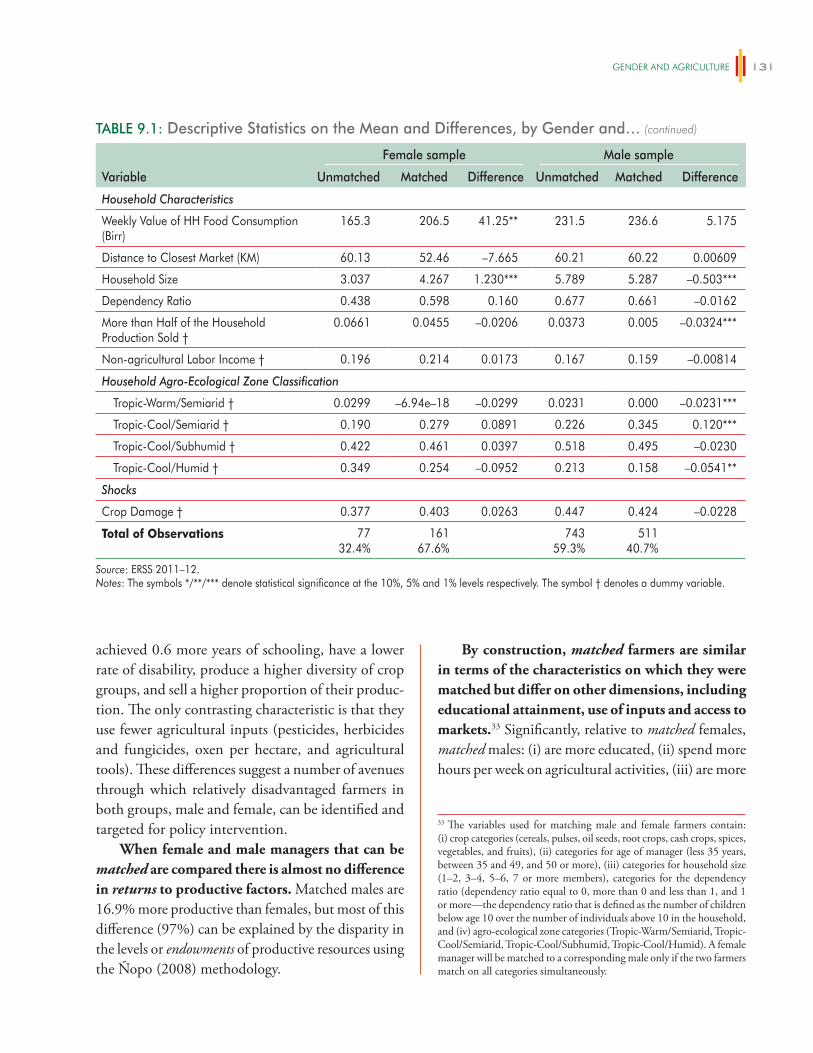
geNDeR AND AgRiCUlTURe 131
By construction, matched farmers are similar in terms of the characteristics on which they were matched but differ on other dimensions, including educational attainment, use of inputs and access to markets.33 Significantly, relative to matched females, matched males: (i) are more educated, (ii) spend more hours per week on agricultural activities, (iii) are more
TABLE 9.1: Descriptive Statistics on the Mean and Differences, by Gender and…
Variable
Female sample Male sample
Unmatched Matched Difference Unmatched Matched Difference
Household Characteristics
Weekly Value of HH Food Consumption (Birr)
165.3 206.5 41.25** 231.5 236.6 5.175
Distance to Closest Market (KM) 60.13 52.46 –7.665 60.21 60.22 0.00609
Household Size 3.037 4.267 1.230*** 5.789 5.287 –0.503***
Dependency Ratio 0.438 0.598 0.160 0.677 0.661 –0.0162
More than Half of the Household Production Sold †
0.0661 0.0455 –0.0206 0.0373 0.005 –0.0324***
Non-agricultural Labor Income † 0.196 0.214 0.0173 0.167 0.159 –0.00814
Household Agro-Ecological Zone Classification
Tropic-Warm/Semiarid † 0.0299 –6.94e–18 –0.0299 0.0231 0.000 –0.0231***
Tropic-Cool/Semiarid † 0.190 0.279 0.0891 0.226 0.345 0.120***
Tropic-Cool/Subhumid † 0.422 0.461 0.0397 0.518 0.495 –0.0230
Tropic-Cool/Humid † 0.349 0.254 –0.0952 0.213 0.158 –0.0541**
Shocks
Crop Damage † 0.377 0.403 0.0263 0.447 0.424 –0.0228
Total of Observations 7732.4%
16167.6%
74359.3%
51140.7%
Source: ERSS 2011–12.Notes: The symbols */**/*** denote statistical significance at the 10%, 5% and 1% levels respectively. The symbol † denotes a dummy variable.
achieved 0.6 more years of schooling, have a lower rate of disability, produce a higher diversity of crop groups, and sell a higher proportion of their produc-tion. The only contrasting characteristic is that they use fewer agricultural inputs (pesticides, herbicides and fungicides, oxen per hectare, and agricultural tools). These differences suggest a number of avenues through which relatively disadvantaged farmers in both groups, male and female, can be identified and targeted for policy intervention.
When female and male managers that can be matched are compared there is almost no difference in returns to productive factors. Matched males are 16.9% more productive than females, but most of this difference (97%) can be explained by the disparity in the levels or endowments of productive resources using the Ñopo (2008) methodology.
33 The variables used for matching male and female farmers contain: (i) crop categories (cereals, pulses, oil seeds, root crops, cash crops, spices, vegetables, and fruits), (ii) categories for age of manager (less 35 years, between 35 and 49, and 50 or more), (iii) categories for household size (1–2, 3–4, 5–6, 7 or more members), categories for the dependency ratio (dependency ratio equal to 0, more than 0 and less than 1, and 1 or more—the dependency ratio that is defined as the number of children below age 10 over the number of individuals above 10 in the household, and (iv) agro-ecological zone categories (Tropic-Warm/Semiarid, Tropic-Cool/Semiarid, Tropic-Cool/Subhumid, Tropic-Cool/Humid). A female manager will be matched to a corresponding male only if the two farmers match on all categories simultaneously.
(continued)
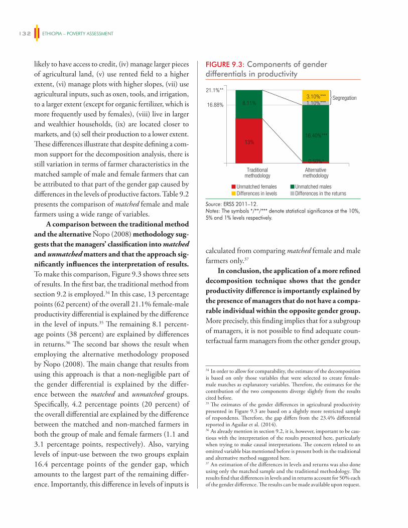
ETHIOPIA – POVERTY ASSESSMENT132
likely to have access to credit, (iv) manage larger pieces of agricultural land, (v) use rented field to a higher extent, (vi) manage plots with higher slopes, (vii) use agricultural inputs, such as oxen, tools, and irrigation, to a larger extent (except for organic fertilizer, which is more frequently used by females), (viii) live in larger and wealthier households, (ix) are located closer to markets, and (x) sell their production to a lower extent. These differences illustrate that despite defining a com-mon support for the decomposition analysis, there is still variation in terms of farmer characteristics in the matched sample of male and female farmers that can be attributed to that part of the gender gap caused by differences in the levels of productive factors. Table 9.2 presents the comparison of matched female and male farmers using a wide range of variables.
A comparison between the traditional method and the alternative Ñopo (2008) methodology sug-gests that the managers’ classification into matched and unmatched matters and that the approach sig-nificantly influences the interpretation of results. To make this comparison, Figure 9.3 shows three sets of results. In the first bar, the traditional method from section 9.2 is employed.34 In this case, 13 percentage points (62 percent) of the overall 21.1% female-male productivity differential is explained by the difference in the level of inputs.35 The remaining 8.1 percent-age points (38 percent) are explained by differences in returns.36 The second bar shows the result when employing the alternative methodology proposed by Ñopo (2008). The main change that results from using this approach is that a non-negligible part of the gender differential is explained by the differ-ence between the matched and unmatched groups. Specifically, 4.2 percentage points (20 percent) of the overall differential are explained by the difference between the matched and non-matched farmers in both the group of male and female farmers (1.1 and 3.1 percentage points, respectively). Also, varying levels of input-use between the two groups explain 16.4 percentage points of the gender gap, which amounts to the largest part of the remaining differ-ence. Importantly, this difference in levels of inputs is
calculated from comparing matched female and male farmers only.37
In conclusion, the application of a more refined decomposition technique shows that the gender productivity difference is importantly explained by the presence of managers that do not have a compa-rable individual within the opposite gender group. More precisely, this finding implies that for a subgroup of managers, it is not possible to find adequate coun-terfactual farm managers from the other gender group,
34 In order to allow for comparability, the estimate of the decomposition is based on only those variables that were selected to create female-male matches as explanatory variables. Therefore, the estimates for the contribution of the two components diverge slightly from the results cited before.35 The estimates of the gender differences in agricultural productivity presented in Figure 9.3 are based on a slightly more restricted sample of respondents. Therefore, the gap differs from the 23.4% differential reported in Aguilar et al. (2014).36 As already mention in section 9.2, it is, however, important to be cau-tious with the interpretation of the results presented here, particularly when trying to make causal interpretations. The concern related to an omitted variable bias mentioned before is present both in the traditional and alternative method suggested here.37 An estimation of the differences in levels and returns was also done using only the matched sample and the traditional methodology. The results find that differences in levels and in returns account for 50% each of the gender difference. The results can be made available upon request.
FIGURE 9.3: Components of gender differentials in productivity
16.88%
21.1%**
Unmatched females Unmatched malesDifferences in levels Differences in the returns
Traditionalmethodology
Alternativemethodology
Segregation
16.40%***
0.50%*
13%
3.10%***1.10%***8.11%
Source: ERSS 2011–12.Notes: The symbols */**/*** denote statistical significance at the 10%, 5% and 1% levels respectively.
geNDeR AND AgRiCUlTURe 133
TABLE 9.2: Descriptive statistics on the mean and differences for matched farmers
Variable
Matched sample
Total Male Female Difference
Outcome Variable
Log (Self-Reported Productivity) 8.422 8.464 8.295 –0.169
Holder Characteristics
Age (years) 47.17 47.03 47.57 0.539
Marital Status: Married † 0.782 0.949 0.274 –0.675***
Years of Schooling 1.200 1.424 0.516 –0.908***
Holder Disability † 0.0906 0.0767 0.133 0.0564
Hours per Week for Agriculture Activities 19.88 21.77 14.11 –7.663***
Access to Extension Program † 0.370 0.375 0.356 –0.0193
Access to Credit Services † 0.281 0.309 0.197 –0.112**
Holder Land Tenancy
Total Land Managed (Hectares) 1.432 1.509 1.199 –0.310**
Number of Fields Managed by Holder 12.86 13.04 12.32 –0.714
Total Number of Crops Produced 7.212 7.248 7.100 –0.148
Fields for which HH has a Certificate 0.539 0.543 0.528 –0.0152
Holder’s Plot Occupation: Rented (% of parcels) 0.0795 0.0933 0.0376 –0.0557***
Holder’s Plot Characteristics
Intercropping (% of fields) 0.244 0.245 0.243 –0.00184
Slope 13.33 13.82 11.83 –1.993**
Distance to Household 1.488 1.768 0.634 –1.133
Holder’s Agricultural Non-Labor Input-use (for Season)
Fields that Use (% of Total)
Irrigation 0.0282 0.0331 0.0133 –0.0198**
Organic Fertilizer 0.287 0.269 0.343 0.0744**
Pesticide, Herbicide, or Fungicide 0.126 0.132 0.108 –0.0241
Improved Seeds 0.0454 0.0461 0.0431 –0.00301
Chemical Fertilizer Used per Hectare (KG/HA) 40.49 40.25 41.24 0.995
Oxen per Hectare 1.272 1.365 0.989 –0.376**
Agricultural Implement Access Index 0.373 0.457 0.116 –0.341**
Holder’s Agricultural Labor Input-use (for Season)
Household Male Labor Use (Hours/HA) 534.1 349.6 1096.1 746.5***
Household Female Labor Use (Hours/HA) 1186.8 1254.9 979.6 –275.3
Household Child Labor Use (Hours/HA) 21.99 18.15 33.69 15.54
Total Hired Labor Use (Days/HA) 12.06 11.67 13.25 1.580
Total Exchange Labor Use (Days/HA) 31.17 27.73 41.64 13.90
(continued on next page)
ETHIOPIA – POVERTY ASSESSMENT134
are discussed in more detail in the next section. For the least productive female farmers (the unmatched women), inputs play a role, but crop choice and other factors matter. Therefore, policies targeting the institutions and gender norms that trap some women farmers at the bottom of the productivity distribution may be of particular relevance. These policies will not only have the greatest potential for poverty reduction but could also benefit female farmers who have already reached higher productivity levels.
9.4 Explaining gender differences in input-use
Differences in endowments matter as almost half of the gender gap in agricultural productivity (43% considering all farmers in the compari-son) in Ethiopia is explained by differences in man-agers’ characteristics, land attributes and access to
since their unique characteristics cannot be matched to any individual in that group. Adding these individu-als to the classical decomposition analyses violates the common support assumption.
In conclusion, the application of a more refined decomposition technique delivers three distinct groups: (1) unmatched women (who are the least productive); (2) unmatched men (who are the most productive); and (3) matched male and female farmers. Focusing on these groups separately provides us with critical insights into what drives the gender gap in agricultural productivity. More precisely, this novel approach suggests that when matched men and women are compared, the vast majority of the gender gap in productivity can be explained by differences in levels of productive factors. Therefore, for this group, interventions that increase women’s access to inputs such as land, labor, and technology are critical. The factors that may be constraining access to these inputs
TABLE 9.2: Descriptive statistics on the mean and differences for matched farmers
Variable
Matched sample
Total Male Female Difference
Household Characteristics
Weekly Value of HH Food Consumption (Birr) 229.2 236.6 206.5 –30.11*
Distance to Closest Market (KM) 58.30 60.22 52.46 –7.755*
Household Size 5.035 5.287 4.267 –1.019***
Dependency Ratio 0.645 0.661 0.598 –0.0630
More than Half of the Household Production Sold † 0.0149 0.00488 0.0455 0.0406*
Non-agricultural Labor Income † 0.173 0.159 0.214 0.0547
Household Agro-Ecological Zone Classification
Tropic-Warm/Semiarid † 0 0 0 0
Tropic-Cool/Semiarid † 0.329 0.345 0.279 –0.0661
Tropic-Cool/Subhumid † 0.487 0.495 0.461 –0.0336
Tropic-Cool/Humid † 0.182 0.158 0.254 0.0950**
Shocks
Crop Damage † 0.419 0.424 0.403 –0.0213
Total of Observations 67276.0%
51124.0%
16124.2%
Source: ERSS 2011–12.Notes: The symbols */**/*** denote statistical significance at the 10%, 5% and 1% levels respectively. The symbol † denotes a dummy variable.
(continued)
geNDeR AND AgRiCUlTURe 135
productive resources. On average, female managers farm smaller plots, spend less time on agricultural activities, are less likely to use rented fields, use less non-labor inputs, and tend to inhabit smaller households with lower average income. The purpose of this section is to further analyze the gender difference in levels of use of some of these variables. A more detailed understand-ing of disparities in these variables is valuable from a policy perspective since it allows us to characterize the most disadvantaged female farm managers. This section specifically focuses on those variables that were found to be the most decisive in explaining the gender gap in terms of their level of use by male and female farm-ers: managers’ time allocated to agricultural activities, land size, and the proportion of fields that are rented.
On average, female managers spend 8.39 fewer hours in agricultural activities, manage 42.9% less land, and a lower proportion of such managed land is rented (7.7 percentage points less). Table 9.3 allows the identification of differences in the size of the gender gap for a range of subgroups of female farm managers. These subgroups were formed using personal, household, and community characteristics. Table 9.3 shows the average gender differences in agricultural productivity for each subgroup, as well as gender differences in the level of the selected endow-ments used (hours of agricultural activity, land man-aged and proportion of land rented). The differences are useful from a descriptive perspective, though no causal relationship can be inferred.
Marital status is one of the key determinants of the gender gap and the analysis shows that widowed females are the most disadvantaged group in terms of time available to spend on agricultural activities. Widowed females are not only 29% less productive than the average male (which echoes the evidence pre-sented in Section 9.2) but they also spent 11 hours less on agricultural activities, manage 29% less land, 7.5 percentage points less of which was rented. Divorced females were 24% less productive than the average man and are the most disadvantaged group in terms of land tenancy, since they manage 80% less land than the average male. Although it is likely that there are a
variety of underlying causes for these findings, formal and informal institutions that govern how women are treated according to their marital status are likely to be of significant importance. However, it is worth not-ing that the evidence also indicates that even married females are also restricted in terms of endowment levels.
Gender differences in productivity and hours spent on agricultural activities are largest for the oldest farmers, while disparities in land tenancy are greater for the youngest farmers. Table 9.3 suggests that for older age cohorts the gender gap in productivity is particularly severe, ranging from a negligible 2.8% difference in productivity among the youngest group to a 38% difference for the oldest cohort. In contrast, the youngest group of females are most disadvantaged in their access to land: the youngest group of females holds 72% less land and rents 13.4 percentage points less of their land with respect to same-aged males, while the corresponding difference for the oldest group indicates a 39% difference in land farmed and a 4.6 percentage point lower proportion of land rented.38
Gender differences in productivity and use of productive factors (except for land managed) are the largest for female farmers in small households. Females in the smallest sized households (one to three members) are 33.4% less productive than males in the same group. The gender gap for those in the next household size group (four to six members) is a non-significant 22.7 percent. Finally, for the largest sized households (seven members or more) the gender gap in productivity is only 15.1 percent. Gender differ-ences in hours spent on agricultural activities and the rented proportion of land follow a similar pattern ranging from a 9.9 hour and 10.7 percentage point differential for the smallest households to a 6 hour and 1.4 percentage point differential for the largest households.39
38 A separate analysis (not shown in the table) finds that the differences for the oldest group, except for land holding, are significantly reduced after taking into account marital status.39 A similar systematic pattern is not found in the differences of land managed. Yet, the gender difference for the largest and smallest household size is 44 and 38% in detriment of females.
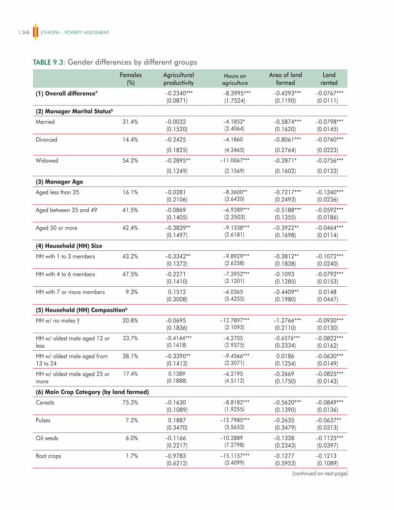
ETHIOPIA – POVERTY ASSESSMENT136
TABLE 9.3: Gender differences by different groups
Females (%)
Agricultural productivity
Hours on agriculture
Area of land farmed
Land rented
(1) Overall differenceᵃ –0.2340***(0.0871)
–8.3995***(1.7524)
–0.4293***(0.1190)
–0.0767***(0.0111)
(2) Manager Marital Statusb
Married 31.4% –0.0032(0.1520)
–4.1852*(2.4064)
–0.5874***(0.1620)
–0.0798***(0.0145)
Divorced 14.4% –0.2425 –4.1860 –0.8061*** –0.0760***
(0.1825) (4.3465) (0.2764) (0.0223)
Widowed 54.2% –0.2895** –11.0067*** –0.2871* –0.0756***
(0.1249) (2.1569) (0.1602) (0.0122)
(3) Manager Age
Aged less than 35 16.1% –0.0281(0.2106)
–8.3600**(3.6420)
–0.7217***(0.2493)
–0.1340***(0.0236)
Aged between 35 and 49 41.5% –0.0869(0.1405)
–6.9289***(2.3503)
–0.5188***(0.1355)
–0.0592***(0.0186)
Aged 50 or more 42.4% –0.3839**(0.1497)
–9.1338***(2.6181)
–0.3922**(0.1698)
–0.0464***(0.0114)
(4) Household (HH) Size
HH with 1 to 3 members 43.2% –0.3342**(0.1372)
–9.8929***(2.6258)
–0.3812**(0.1838)
–0.1072***(0.0240)
HH with 4 to 6 members 47.5% –0.2271(0.1410)
–7.3952***(2.1201)
–0.1093(0.1285)
–0.0792***(0.0153)
HH with 7 or more members 9.3% 0.1512(0.3008)
–6.0365(5.4255)
–0.4409**(0.1980)
0.0148(0.0447)
(5) Household (HH) Compositionb
HH w/ no males † 20.8% –0.0695(0.1836)
–12.7897***(2.1093)
–1.2766***(0.2110)
–0.0930***(0.0130)
HH w/ oldest male aged 12 or less
23.7% –0.4144***(0.1418)
–4.2705(2.9375)
–0.6376***(0.2334)
–0.0822***(0.0162)
HH w/ oldest male aged from 13 to 24
38.1% –0.3390**(0.1413)
–9.4566***(2.3071)
0.0186(0.1254)
–0.0630***(0.0149)
HH w/ oldest male aged 25 or more
17.4% 0.1389(0.1888)
–6.2195(4.5112)
–0.2669(0.1750)
–0.0825***(0.0143)
(6) Main Crop Category (by land farmed)
Cereals 75.3% –0.1630(0.1089)
–8.8182***(1.9255)
–0.5620***(0.1390)
–0.0849***(0.0136)
Pulses 7.2% 0.1887(0.3470)
–12.7985***(3.5653)
–0.2635(0.3479)
–0.0637**(0.0313)
Oil seeds 6.0% –0.1166(0.2217)
–10.2889(7.2798)
–0.1338(0.2343)
–0.1125***(0.0397)
Root crops 1.7% –0.9783(0.6212)
–15.1157***(3.4099)
–0.1277(0.5953)
–0.1213(0.1089)
(continued on next page)
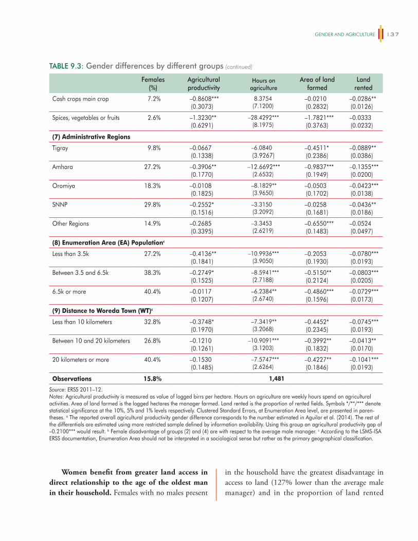
geNDeR AND AgRiCUlTURe 137
in the household have the greatest disadvantage in access to land (127% lower than the average male manager) and in the proportion of land rented
Women benefit from greater land access in direct relationship to the age of the oldest man in their household. Females with no males present
TABLE 9.3: Gender differences by different groups
Females (%)
Agricultural productivity
Hours on agriculture
Area of land farmed
Land rented
Cash crops main crop 7.2% –0.8608***(0.3073)
8.3754(7.1200)
–0.0210(0.2832)
–0.0286**(0.0126)
Spices, vegetables or fruits 2.6% –1.3230**(0.6291)
–28.4292***(8.1975)
–1.7821***(0.3763)
–0.0333(0.0232)
(7) Administrative Regions
Tigray 9.8% –0.0667(0.1338)
–6.0840(3.9267)
–0.4511*(0.2386)
–0.0889**(0.0386)
Amhara 27.2% –0.3906**(0.1770)
–12.6692***(2.6532)
–0.9837***(0.1949)
–0.1355***(0.0200)
Oromiya 18.3% –0.0108(0.1825)
–8.1829**(3.9650)
–0.0503(0.1702)
–0.0423***(0.0138)
SNNP 29.8% –0.2552*(0.1516)
–3.3150(3.2092)
–0.0258(0.1681)
–0.0436**(0.0186)
Other Regions 14.9% –0.2685(0.3395)
–3.3453(2.6219)
–0.6550***(0.1483)
–0.0524(0.0497)
(8) Enumeration Area (EA) Populationc
Less than 3.5k 27.2% –0.4136**(0.1841)
–10.9936***(3.9050)
–0.2053(0.1930)
–0.0780***(0.0193)
Between 3.5 and 6.5k 38.3% –0.2749*(0.1525)
–8.5941***(2.7188)
–0.5150**(0.2124)
–0.0803***(0.0205)
6.5k or more 40.4% –0.0117(0.1207)
–6.2384**(2.6740)
–0.4860***(0.1596)
–0.0729***(0.0173)
(9) Distance to Woreda Town (WT)c
Less than 10 kilometers 32.8% –0.3748*(0.1970)
–7.3419**(3.2068)
–0.4452*(0.2345)
–0.0745***(0.0193)
Between 10 and 20 kilometers 26.8% –0.1210(0.1261)
–10.9091***(3.1203)
–0.3992**(0.1832)
–0.0413**(0.0170)
20 kilometers or more 40.4% –0.1530(0.1485)
–7.5747***(2.6264)
–0.4227**(0.1846)
–0.1041***(0.0193)
Observations 15.8% 1,481
Source: ERSS 2011–12.Notes: Agricultural productivity is measured as value of logged birrs per hectare. Hours on agriculture are weekly hours spend on agricultural activities. Area of land farmed is the logged hectares the manager farmed. Land rented is the proportion of rented fields. Symbols */**/*** denote statistical significance at the 10%, 5% and 1% levels respectively. Clustered Standard Errors, at Enumeration Area level, are presented in paren-theses. a The reported overall agricultural productivity gender difference corresponds to the number estimated in Aguilar et al. (2014). The rest of the differentials are estimated using more restricted sample defined by information availability. Using this group an agricultural productivity gap of –0.2100*** would result. b Female disadvantage of groups (2) and (4) are with respect to the average male manager. c According to the LSMS-ISA ERSS documentation, Enumeration Area should not be interpreted in a sociological sense but rather as the primary geographical classification.
(continued)
ETHIOPIA – POVERTY ASSESSMENT138
(9.3 percentage points less than the average male). Interestingly, these differences remain after taking into account marital status. Again, this set of results suggest that gender norms play an important role in determining the extent to which women have access to productive resources.
The largest gender productivity differentials by crop groups are found for two categories: (i) cash crops; and (ii) spices, vegetables or fruits. Table 9.3 indicates that for these groups, women are 86% and 132% less productive, respectively. Interestingly, the former group does not show big disparities in the endowment levels, which suggests that structural factors are the most important cause of the gender productivity gap for cash crops. The only endowment difference that is significant (though small) for cash crops is the proportion of land rented (a 2.8 percent-age point gap). In contrast, women mainly growing “spices, vegetables or fruits” experience significant disadvantages with respect to males in the same group for two endowments: hours spent on agriculture (28.4 fewer hours for females) and land managed (178% less for females). Considering these results, it is no sur-prise that many interventions targeting the economic empowerment of women are aimed at transitioning women into higher-value and more commercially ori-ented production. It is important, however, that this approach takes into account that female farmers who already transitioned at least partially face disadvantages in terms of access to productive factors that constrain them from reaping equal benefits.
Finally, in geographical terms, females in less populated locations are more disadvantaged. In particular, those female managers living in less inhab-ited enumeration areas are 41% less productive than males in the same areas. This difference is reflected in 10 fewer hours spent on agricultural activities.
9.5 Conclusion
This evidence presented in this chapter builds on a variety of decomposition techniques to assess the gender gap in agricultural productivity and
suggests that closing this gap requires both types of policies: (i) changing gender norms and institutions in order to economically empower female farmers; and (ii) ensuring that differences in endowments between male and female farmers are addressed. This conclusion draws on findings from two recent World Bank publication, Aguilar et al. (2014) and Levelling the Field (2014), as well as on novel analyti-cal work that builds on decomposition methods used to determine the extent to which the differences in productivity are explained by: (i) gender disparity in the levels of productive inputs (endowment effect); and/or (ii) gender inequality in the returns to those inputs (structural effect).
The results suggest that endowments par-ticularly matter in determining the gender gap in agricultural productivity among male and female farmers who share similar characteristics. For this group (as well as for the others) interventions that increase access to labor, land, and other inputs, as well as how effectively they are used, are critical. For some of these interventions, evidence exists on what approaches may work. For example, Rwanda’s expe-rience with joint land titling has been documented to increase women’s control over land. However, other interventions are promising, but have yet to be proven. For example, to address women’s labor shortages, possible interventions include financing mechanisms such as vouchers to hire labor or coop-erative labor pools. Given the importance of the gender gap for agricultural productivity in Ethiopia, piloting and learning which works best will have significant payoffs.
In contrast to the farmers who share charac-teristics, the disadvantage captured by the struc-tural effect appears to be especially relevant when considering male and female farmers who are observationally too different to include in the pro-ductivity decomposition: within this group, women are found at the bottom and men at the top of the productivity distribution on average. This result sug-gests that for this group of female farmers (the low level producers) disadvantages caused by gender norms and
geNDeR AND AgRiCUlTURe 139
institutions matter relatively more. Relative to address-ing the gaps in endowments, there are fewer proven policy interventions for addressing gender norms and institutions. Pilot interventions, for example, to help female farmers move into higher value/cash crops and marketing, can help provide valuable lessons that can be taken to scale.
One example of a project in Ethiopia that tried to address both dimensions, namely through the
provision of extension services that are more gender sensitive, is detailed in Box 9.1.
Finally, focusing on the most important endow-ments, the analysis highlights a number of socio-eco-nomic and community characteristics, in particular the marital status of farmers, which correlate with differences in the level of endowments between men and women in order to help identify and target the most disadvantaged groups of female farmers.
BOX 9.1: Policy example: Government response and RCBP in Ethiopia
The Rural Capacity Building Project (RCBP), implemented between 2006 and 2012, was designed to strengthen agricultural services and systems and make them more responsive to clients’ needs. The project encompassed five major components: (1) Assisting Agricultural TVET colleges in training Ethiopia’s Development Agents (DAs); (2) Improving and scaling up the effectiveness of this agricultural extension system’s capacity to respond to farmers’ demands to enhance women’s participation; (3) Strengthening agricultural research, through institutional strengthening of the National Agricultural Research System (NARS); (4) Improving Ministry of Agriculture and Rural Development (MoARD) capacity; and (5) Assisting with analytical work. The RCBP was implemented in 10 regions, 127 woredas, 635 kebeles and 2,500 Farmer Training Centers (FTC) in the country, beginning in 2007.
From the beginning, it was decided to make an impact evaluation an integral part of the RCBP in order to rigorously assess its effectiveness. The evaluation carried out by Buehren et al. (2014) primarily relied on two rounds of survey data collected from farming households in both RCBP project and non-project woredas. The first round of data collection was carried out soon after the launch of project implementation, and efforts were made to revisit all baseline respondents after project completion in 2012. The resulting panel dataset comprises 1,485 households and nearly 300 DAs spread across four regions: Amhara, Oromia, Southern Nations, Nationalities and People’s Region (SNNPR), and Benishangul-Gumuz (BSG).
The impact analysis builds on an estimation of difference-in differences using matching techniques and focuses on intention-to treat estimates (comparing farmers in project woredas with their counterfactuals in non-project woredas). The results suggest that the RCBP has had a significant impact on economic activity: RCBP households utilize more farm labor relative to non-RCBP households, with an additional one-half of a person contributing to income in RCBP households. The increase in the number of people who contribute to household income is not only statistically significant but it is also estimated to be a sizeable 23–27% increase over the baseline value. Over the evaluation period, the amount of farm labor declines overall. However, this decline is significantly lower in RCBP areas. On average, RCBP households use 10–12% more labor, in terms of the number of people within a household that work on farming, compared to households in the non-RCBP counterfactual group. In addition, there is a positive impact of 17–24% on the size of land under agricultural production. It should also be noted that the total size of land under agricultural production fell between the baseline and follow-up surveys for all households included in the studied sample. However, the decline is significantly lower among RCBP households, indicating that RCBP households have a larger area of land under farm use by the end of the project.
The authors define high value crops as those with a higher value than traditional staple crops and that are used primarily to sell in the market, as well as an extended set of marketable crops termed somewhat high-value crops.a The analysis indicates that households located in RCBP woredas are more likely to grow high value crops, in response to the program. The estimated increase is in the range between 9–11 percentage points for high value crop production. For the sale of these crops, an increase in RCBP areas and a decrease in non-RCBP areas are observed. Considering the net difference, this yields a statistically significant and large increase in the sale of high value crops among RCBP households relative to control areas by 8–12 percentage points. A similar pattern is documented for the somewhat high value crops and incidence of sale of high and somewhat high value crops.
Repeating the estimations and disaggregating by the gender of the household head shows that, while the positive impact of the program on the number of individuals who contribute to income is lower in female-headed households, this difference is not statistically significant. Additionally, there is no significant statistical difference in the impact of the number of people who work on the farm or for income from agriculture. The same is true for consumption. Finally, in the case of farm size and growing somewhat high value or high value crops, there is no statistically significant difference between the impact of the program on male- and
(continued on next page)
ETHIOPIA – POVERTY ASSESSMENT140
female-headed households. A positive program impact only for male-headed households can merely be demonstrated in the case of livestock. Hence, the evidence indicates that for most of the outcomes of interest, the program seems to have benefitted men and women equally.
These results powerfully suggest that government intervention does not necessarily lead to a reinforcement of the mechanisms that underlie the prevailing gender gap in agricultural productivity. Instead, the authors argue and the results of the impact evaluation suggest that adapting the extension system supported by the RCBP, which traditionally serves male farmers, to the needs of women farmers, can contribute considerably to closing the gender gap and unleashing the full potential of farming households in Ethiopia.
a High value crops include coffee, mango, avocado, banana, guava, casmir, sesame, peanuts, clove, ginger, tobacco, khat, dinbilal, water melon, eucalyptus, pineapple, orange, papaya, garlic, lemon, sunflower, cumin, cauliflower, rapeseed, cucumber, apple, and spices. Some-what high value crops additionally include teff, lentil, onion, pepper, sugar cane, and Ethiopian hops, which are often consumed rather than sold in the market.
BOX 9.1: Policy Example: Government response and RCBP in Ethiopia (continued)

ANNEXES

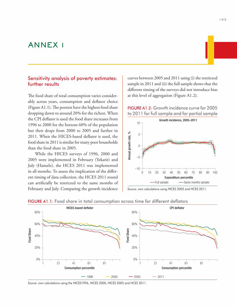
143
ANNEX 1
Sensitivity analysis of poverty estimates: further results
The food share of total consumption varies consider-ably across years, consumption and deflator choice (Figure A1.1). The poorest have the highest food share dropping down to around 20% for the richest. When the CPI deflator is used the food share increases from 1996 to 2000 for the bottom 60% of the population but then drops from 2000 to 2005 and further in 2011. When the HICES-based deflator is used, the food share in 2011 is similar for many poor households than the food share in 2005.
While the HICES surveys of 1996, 2000 and 2005 were implemented in February (Yekatit) and July (Hamele), the HCES 2011 was implemented in all months. To assess the implication of the differ-ent timing of data collection, the HCES 2011 round can artificially be restricted to the same months of February and July. Comparing the growth incidence
curves between 2005 and 2011 using (i) the restricted sample in 2011 and (ii) the full sample shows that the different timing of the surveys did not introduce bias at this level of aggregation (Figure A1.2).
FIGURE A1.1: Food share in total consumption across time for different deflators
1 21 41 61 81
Consumption percentile
0%
20%
40%
60%
80%
1 21 41 61 81
Consumption percentile
0%
20%
40%
60%
80%
Food
Sha
re
Food
Sha
re
1996 2000 2005 2011
HICES-based deflator CPI deflator
Source: own calculations using the HICES1996, HICES 2000, HICES 2005 and HCES 2011.
FIGURE A1.2: Growth incidence curve for 2005 to 2011 for full sample and for partial sample
–10
–5
0
5
10
Annu
al g
row
th ra
te, %
0 70605040302010 80 10090
Full sample Same months sample
Growth incidence, 2005–2011
Expenditure percentile
Source: own calculations using HICES 2005 and HCES 2011.
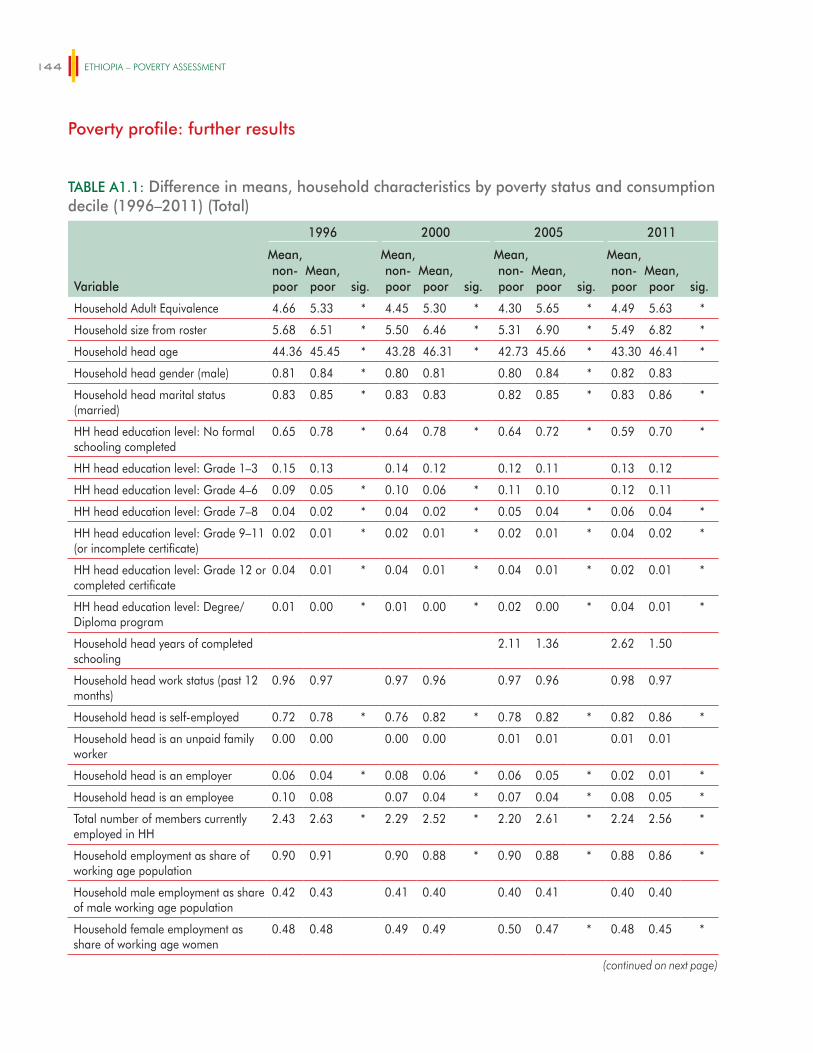
ETHIOPIA – POVERTY ASSESSMENT144
TABLE A1.1: Difference in means, household characteristics by poverty status and consumption decile (1996–2011) (Total)
Variable
1996 2000 2005 2011
Mean, non-poor
Mean, poor sig.
Mean, non-poor
Mean, poor sig.
Mean, non-poor
Mean, poor sig.
Mean, non-poor
Mean, poor sig.
Household Adult Equivalence 4.66 5.33 * 4.45 5.30 * 4.30 5.65 * 4.49 5.63 *
Household size from roster 5.68 6.51 * 5.50 6.46 * 5.31 6.90 * 5.49 6.82 *
Household head age 44.36 45.45 * 43.28 46.31 * 42.73 45.66 * 43.30 46.41 *
Household head gender (male) 0.81 0.84 * 0.80 0.81 0.80 0.84 * 0.82 0.83
Household head marital status (married)
0.83 0.85 * 0.83 0.83 0.82 0.85 * 0.83 0.86 *
HH head education level: No formal schooling completed
0.65 0.78 * 0.64 0.78 * 0.64 0.72 * 0.59 0.70 *
HH head education level: Grade 1–3 0.15 0.13 0.14 0.12 0.12 0.11 0.13 0.12
HH head education level: Grade 4–6 0.09 0.05 * 0.10 0.06 * 0.11 0.10 0.12 0.11
HH head education level: Grade 7–8 0.04 0.02 * 0.04 0.02 * 0.05 0.04 * 0.06 0.04 *
HH head education level: Grade 9–11 (or incomplete certificate)
0.02 0.01 * 0.02 0.01 * 0.02 0.01 * 0.04 0.02 *
HH head education level: Grade 12 or completed certificate
0.04 0.01 * 0.04 0.01 * 0.04 0.01 * 0.02 0.01 *
HH head education level: Degree/Diploma program
0.01 0.00 * 0.01 0.00 * 0.02 0.00 * 0.04 0.01 *
Household head years of completed schooling
2.11 1.36 2.62 1.50
Household head work status (past 12 months)
0.96 0.97 0.97 0.96 0.97 0.96 0.98 0.97
Household head is self-employed 0.72 0.78 * 0.76 0.82 * 0.78 0.82 * 0.82 0.86 *
Household head is an unpaid family worker
0.00 0.00 0.00 0.00 0.01 0.01 0.01 0.01
Household head is an employer 0.06 0.04 * 0.08 0.06 * 0.06 0.05 * 0.02 0.01 *
Household head is an employee 0.10 0.08 0.07 0.04 * 0.07 0.04 * 0.08 0.05 *
Total number of members currently employed in HH
2.43 2.63 * 2.29 2.52 * 2.20 2.61 * 2.24 2.56 *
Household employment as share of working age population
0.90 0.91 0.90 0.88 * 0.90 0.88 * 0.88 0.86 *
Household male employment as share of male working age population
0.42 0.43 0.41 0.40 0.40 0.41 0.40 0.40
Household female employment as share of working age women
0.48 0.48 0.49 0.49 0.50 0.47 * 0.48 0.45 *
(continued on next page)
Poverty profile: further results
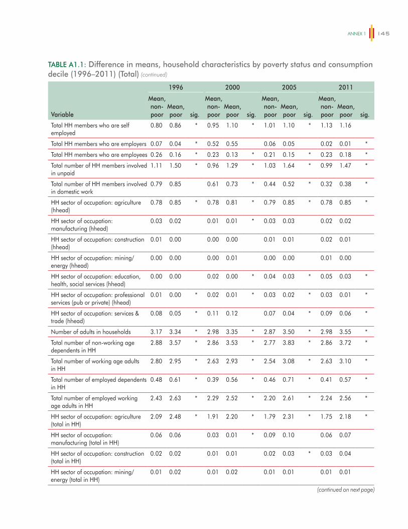
ANNex 1 145
TABLE A1.1: Difference in means, household characteristics by poverty status and consumption decile (1996–2011) (Total)
Variable
1996 2000 2005 2011
Mean, non-poor
Mean, poor sig.
Mean, non-poor
Mean, poor sig.
Mean, non-poor
Mean, poor sig.
Mean, non-poor
Mean, poor sig.
Total HH members who are self employed
0.80 0.86 * 0.95 1.10 * 1.01 1.10 * 1.13 1.16
Total HH members who are employers 0.07 0.04 * 0.52 0.55 0.06 0.05 0.02 0.01 *
Total HH members who are employees 0.26 0.16 * 0.23 0.13 * 0.21 0.15 * 0.23 0.18 *
Total number of HH members involved in unpaid
1.11 1.50 * 0.96 1.29 * 1.03 1.64 * 0.99 1.47 *
Total number of HH members involved in domestic work
0.79 0.85 0.61 0.73 * 0.44 0.52 * 0.32 0.38 *
HH sector of occupation: agriculture (hhead)
0.78 0.85 * 0.78 0.81 * 0.79 0.85 * 0.78 0.85 *
HH sector of occupation: manufacturing (hhead)
0.03 0.02 0.01 0.01 * 0.03 0.03 0.02 0.02
HH sector of occupation: construction (hhead)
0.01 0.00 0.00 0.00 0.01 0.01 0.02 0.01
HH sector of occupation: mining/energy (hhead)
0.00 0.00 0.00 0.01 0.00 0.00 0.01 0.00
HH sector of occupation: education, health, social services (hhead)
0.00 0.00 0.02 0.00 * 0.04 0.03 * 0.05 0.03 *
HH sector of occupation: professional services (pub or private) (hhead)
0.01 0.00 * 0.02 0.01 * 0.03 0.02 * 0.03 0.01 *
HH sector of occupation: services & trade (hhead)
0.08 0.05 * 0.11 0.12 0.07 0.04 * 0.09 0.06 *
Number of adults in households 3.17 3.34 * 2.98 3.35 * 2.87 3.50 * 2.98 3.55 *
Total number of non-working age dependents in HH
2.88 3.57 * 2.86 3.53 * 2.77 3.83 * 2.86 3.72 *
Total number of working age adults in HH
2.80 2.95 * 2.63 2.93 * 2.54 3.08 * 2.63 3.10 *
Total number of employed dependents in HH
0.48 0.61 * 0.39 0.56 * 0.46 0.71 * 0.41 0.57 *
Total number of employed working age adults in HH
2.43 2.63 * 2.29 2.52 * 2.20 2.61 * 2.24 2.56 *
HH sector of occupation: agriculture (total in HH)
2.09 2.48 * 1.91 2.20 * 1.79 2.31 * 1.75 2.18 *
HH sector of occupation: manufacturing (total in HH)
0.06 0.06 0.03 0.01 * 0.09 0.10 0.06 0.07
HH sector of occupation: construction (total in HH)
0.02 0.02 0.01 0.01 0.02 0.03 * 0.03 0.04
HH sector of occupation: mining/energy (total in HH)
0.01 0.02 0.01 0.02 0.01 0.01 0.01 0.01
(continued)
(continued on next page)
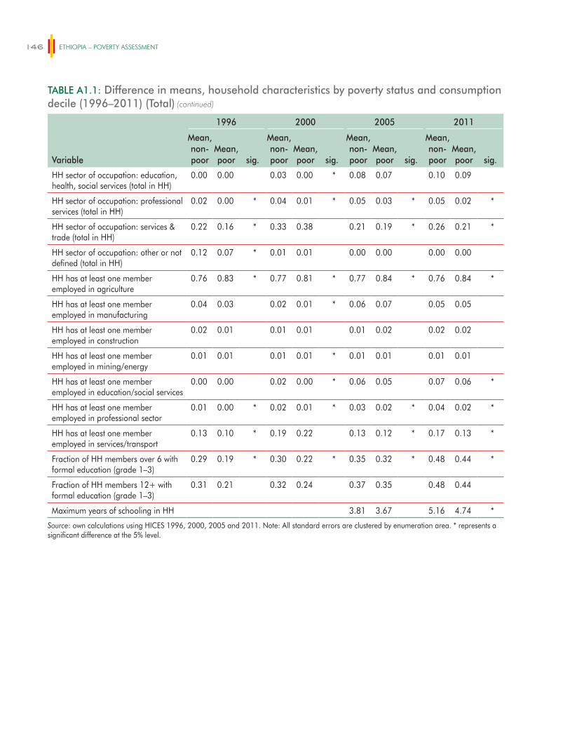
ETHIOPIA – POVERTY ASSESSMENT146
TABLE A1.1: Difference in means, household characteristics by poverty status and consumption decile (1996–2011) (Total)
Variable
1996 2000 2005 2011
Mean, non-poor
Mean, poor sig.
Mean, non-poor
Mean, poor sig.
Mean, non-poor
Mean, poor sig.
Mean, non-poor
Mean, poor sig.
HH sector of occupation: education, health, social services (total in HH)
0.00 0.00 0.03 0.00 * 0.08 0.07 0.10 0.09
HH sector of occupation: professional services (total in HH)
0.02 0.00 * 0.04 0.01 * 0.05 0.03 * 0.05 0.02 *
HH sector of occupation: services & trade (total in HH)
0.22 0.16 * 0.33 0.38 0.21 0.19 * 0.26 0.21 *
HH sector of occupation: other or not defined (total in HH)
0.12 0.07 * 0.01 0.01 0.00 0.00 0.00 0.00
HH has at least one member employed in agriculture
0.76 0.83 * 0.77 0.81 * 0.77 0.84 * 0.76 0.84 *
HH has at least one member employed in manufacturing
0.04 0.03 0.02 0.01 * 0.06 0.07 0.05 0.05
HH has at least one member employed in construction
0.02 0.01 0.01 0.01 0.01 0.02 0.02 0.02
HH has at least one member employed in mining/energy
0.01 0.01 0.01 0.01 * 0.01 0.01 0.01 0.01
HH has at least one member employed in education/social services
0.00 0.00 0.02 0.00 * 0.06 0.05 0.07 0.06 *
HH has at least one member employed in professional sector
0.01 0.00 * 0.02 0.01 * 0.03 0.02 * 0.04 0.02 *
HH has at least one member employed in services/transport
0.13 0.10 * 0.19 0.22 0.13 0.12 * 0.17 0.13 *
Fraction of HH members over 6 with formal education (grade 1–3)
0.29 0.19 * 0.30 0.22 * 0.35 0.32 * 0.48 0.44 *
Fraction of HH members 12+ with formal education (grade 1–3)
0.31 0.21 0.32 0.24 0.37 0.35 0.48 0.44
Maximum years of schooling in HH 3.81 3.67 5.16 4.74 *
Source: own calculations using HICES 1996, 2000, 2005 and 2011. Note: All standard errors are clustered by enumeration area. * represents a significant difference at the 5% level.
(continued)
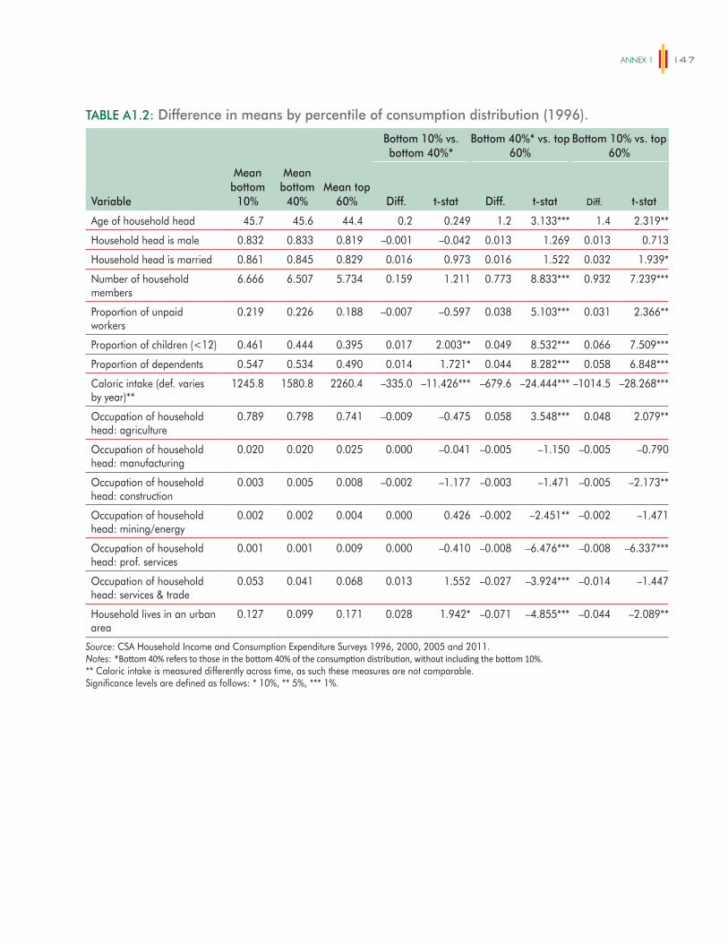
ANNex 1 147
TABLE A1.2: Difference in means by percentile of consumption distribution (1996).
Bottom 10% vs. bottom 40%*
Bottom 40%* vs. top 60%
Bottom 10% vs. top 60%
Variable
Mean bottom
10%
Mean bottom
40%Mean top
60% Diff. t-stat Diff. t-stat Diff. t-stat
Age of household head 45.7 45.6 44.4 0.2 0.249 1.2 3.133*** 1.4 2.319**
Household head is male 0.832 0.833 0.819 –0.001 –0.042 0.013 1.269 0.013 0.713
Household head is married 0.861 0.845 0.829 0.016 0.973 0.016 1.522 0.032 1.939*
Number of household members
6.666 6.507 5.734 0.159 1.211 0.773 8.833*** 0.932 7.239***
Proportion of unpaid workers
0.219 0.226 0.188 –0.007 –0.597 0.038 5.103*** 0.031 2.366**
Proportion of children (<12) 0.461 0.444 0.395 0.017 2.003** 0.049 8.532*** 0.066 7.509***
Proportion of dependents 0.547 0.534 0.490 0.014 1.721* 0.044 8.282*** 0.058 6.848***
Caloric intake (def. varies by year)**
1245.8 1580.8 2260.4 –335.0 –11.426*** –679.6 –24.444*** –1014.5 –28.268***
Occupation of household head: agriculture
0.789 0.798 0.741 –0.009 –0.475 0.058 3.548*** 0.048 2.079**
Occupation of household head: manufacturing
0.020 0.020 0.025 0.000 –0.041 –0.005 –1.150 –0.005 –0.790
Occupation of household head: construction
0.003 0.005 0.008 –0.002 –1.177 –0.003 –1.471 –0.005 –2.173**
Occupation of household head: mining/energy
0.002 0.002 0.004 0.000 0.426 –0.002 –2.451** –0.002 –1.471
Occupation of household head: prof. services
0.001 0.001 0.009 0.000 –0.410 –0.008 –6.476*** –0.008 –6.337***
Occupation of household head: services & trade
0.053 0.041 0.068 0.013 1.552 –0.027 –3.924*** –0.014 –1.447
Household lives in an urban area
0.127 0.099 0.171 0.028 1.942* –0.071 –4.855*** –0.044 –2.089**
Source: CSA Household Income and Consumption Expenditure Surveys 1996, 2000, 2005 and 2011.Notes: *Bottom 40% refers to those in the bottom 40% of the consumption distribution, without including the bottom 10%.** Caloric intake is measured differently across time, as such these measures are not comparable.Significance levels are defined as follows: * 10%, ** 5%, *** 1%.
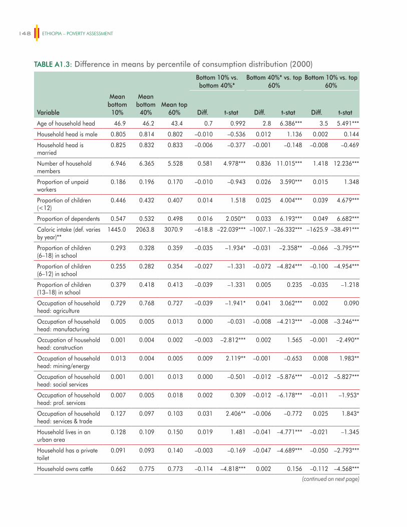
ETHIOPIA – POVERTY ASSESSMENT148
TABLE A1.3: Difference in means by percentile of consumption distribution (2000)
Bottom 10% vs. bottom 40%*
Bottom 40%* vs. top 60%
Bottom 10% vs. top 60%
Variable
Mean bottom
10%
Mean bottom
40%Mean top
60% Diff. t-stat Diff. t-stat Diff. t-stat
Age of household head 46.9 46.2 43.4 0.7 0.992 2.8 6.386*** 3.5 5.491***
Household head is male 0.805 0.814 0.802 –0.010 –0.536 0.012 1.136 0.002 0.144
Household head is married
0.825 0.832 0.833 –0.006 –0.377 –0.001 –0.148 –0.008 –0.469
Number of household members
6.946 6.365 5.528 0.581 4.978*** 0.836 11.015*** 1.418 12.236***
Proportion of unpaid workers
0.186 0.196 0.170 –0.010 –0.943 0.026 3.590*** 0.015 1.348
Proportion of children (<12)
0.446 0.432 0.407 0.014 1.518 0.025 4.004*** 0.039 4.679***
Proportion of dependents 0.547 0.532 0.498 0.016 2.050** 0.033 6.193*** 0.049 6.682***
Caloric intake (def. varies by year)**
1445.0 2063.8 3070.9 –618.8 –22.039*** –1007.1 –26.332*** –1625.9 –38.491***
Proportion of children (6–18) in school
0.293 0.328 0.359 –0.035 –1.934* –0.031 –2.358** –0.066 –3.795***
Proportion of children (6–12) in school
0.255 0.282 0.354 –0.027 –1.331 –0.072 –4.824*** –0.100 –4.954***
Proportion of children (13–18) in school
0.379 0.418 0.413 –0.039 –1.331 0.005 0.235 –0.035 –1.218
Occupation of household head: agriculture
0.729 0.768 0.727 –0.039 –1.941* 0.041 3.062*** 0.002 0.090
Occupation of household head: manufacturing
0.005 0.005 0.013 0.000 –0.031 –0.008 –4.213*** –0.008 –3.246***
Occupation of household head: construction
0.001 0.004 0.002 –0.003 –2.812*** 0.002 1.565 –0.001 –2.490**
Occupation of household head: mining/energy
0.013 0.004 0.005 0.009 2.119** –0.001 –0.653 0.008 1.983**
Occupation of household head: social services
0.001 0.001 0.013 0.000 –0.501 –0.012 –5.876*** –0.012 –5.827***
Occupation of household head: prof. services
0.007 0.005 0.018 0.002 0.309 –0.012 –6.178*** –0.011 –1.953*
Occupation of household head: services & trade
0.127 0.097 0.103 0.031 2.406** –0.006 –0.772 0.025 1.843*
Household lives in an urban area
0.128 0.109 0.150 0.019 1.481 –0.041 –4.771*** –0.021 –1.345
Household has a private toilet
0.091 0.093 0.140 –0.003 –0.169 –0.047 –4.689*** –0.050 –2.793***
Household owns cattle 0.662 0.775 0.773 –0.114 –4.818*** 0.002 0.156 –0.112 –4.568***
(continued on next page)
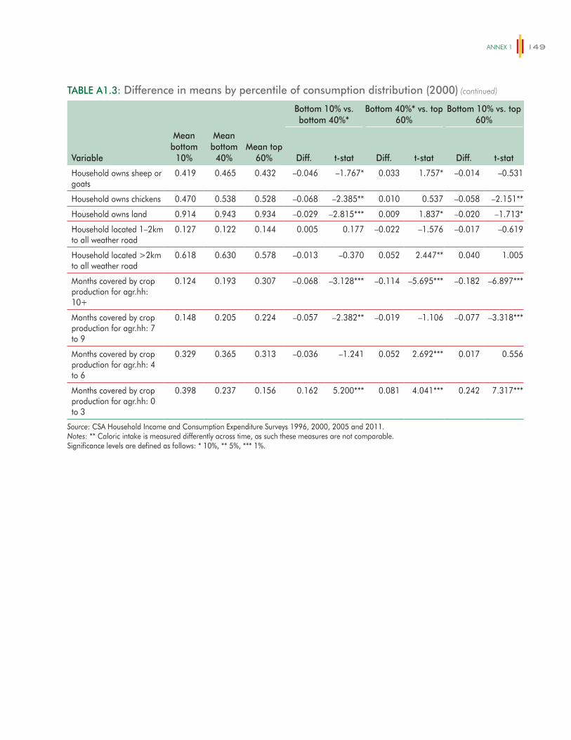
ANNex 1 149
TABLE A1.3: Difference in means by percentile of consumption distribution (2000)
Bottom 10% vs. bottom 40%*
Bottom 40%* vs. top 60%
Bottom 10% vs. top 60%
Variable
Mean bottom
10%
Mean bottom
40%Mean top
60% Diff. t-stat Diff. t-stat Diff. t-stat
Household owns sheep or goats
0.419 0.465 0.432 –0.046 –1.767* 0.033 1.757* –0.014 –0.531
Household owns chickens 0.470 0.538 0.528 –0.068 –2.385** 0.010 0.537 –0.058 –2.151**
Household owns land 0.914 0.943 0.934 –0.029 –2.815*** 0.009 1.837* –0.020 –1.713*
Household located 1–2km to all weather road
0.127 0.122 0.144 0.005 0.177 –0.022 –1.576 –0.017 –0.619
Household located >2km to all weather road
0.618 0.630 0.578 –0.013 –0.370 0.052 2.447** 0.040 1.005
Months covered by crop production for agr.hh: 10+
0.124 0.193 0.307 –0.068 –3.128*** –0.114 –5.695*** –0.182 –6.897***
Months covered by crop production for agr.hh: 7 to 9
0.148 0.205 0.224 –0.057 –2.382** –0.019 –1.106 –0.077 –3.318***
Months covered by crop production for agr.hh: 4 to 6
0.329 0.365 0.313 –0.036 –1.241 0.052 2.692*** 0.017 0.556
Months covered by crop production for agr.hh: 0 to 3
0.398 0.237 0.156 0.162 5.200*** 0.081 4.041*** 0.242 7.317***
Source: CSA Household Income and Consumption Expenditure Surveys 1996, 2000, 2005 and 2011.Notes: ** Caloric intake is measured differently across time, as such these measures are not comparable.Significance levels are defined as follows: * 10%, ** 5%, *** 1%.
(continued)

ETHIOPIA – POVERTY ASSESSMENT150
TABLE A1.4: Difference in means by percentile of consumption distribution (2005)
Variable
Mean bottom
10%
Mean bottom
40%Mean top
60%
Bottom 10% vs. bottom 40%*
Bottom 40%* vs. top 60%
Bottom 10% vs. top 60%
Diff. t-stat Diff. t-stat Diff. t-stat
Age of household head 46.4 45.4 42.7 1.0 1.850* 2.7 7.422*** 3.7 6.932***
Household head is male 0.843 0.835 0.797 0.008 0.510 0.039 4.349*** 0.047 3.150***
Household head is married
0.846 0.854 0.818 –0.008 –0.534 0.036 4.264*** 0.028 1.943*
Years of schooling of household head
1.097 1.441 2.124 –0.344 –2.903*** –0.683 –9.110*** –1.027 –8.327***
Number of household members
7.537 6.665 5.293 0.872 6.984*** 1.372 20.293*** 2.244 17.411***
Highest years of schooling in household
3.766 3.623 3.816 0.143 0.923 –0.193 –1.999** –0.050 –0.310
Proportion of unpaid workers
0.251 0.223 0.183 0.028 2.785*** 0.040 6.373*** 0.068 6.558***
Proportion of children (<12)
0.447 0.451 0.399 –0.004 –0.486 0.052 10.020*** 0.048 5.972***
Proportion of dependents 0.548 0.547 0.493 0.001 0.133 0.055 11.418*** 0.056 7.795***
Proportion of children (6–18) in school
0.371 0.388 0.415 –0.017 –1.093 –0.027 –2.733*** –0.044 –2.743***
Proportion of children (6–12) in school
0.283 0.322 0.377 –0.039 –2.209** –0.055 –4.629*** –0.094 –5.278***
Proportion of children (13–18) in school
0.530 0.528 0.524 0.002 0.087 0.004 0.236 0.006 0.241
Occupation of household head: agriculture
0.794 0.801 0.753 –0.008 –0.515 0.048 4.894*** 0.041 2.717***
Occupation of household head: manufacturing
0.033 0.028 0.029 0.005 0.921 –0.001 –0.446 0.004 0.712
Occupation of household head: construction
0.010 0.007 0.009 0.003 1.071 –0.002 –1.577 0.000 0.220
Occupation of household head: mining/energy
0.002 0.003 0.003 –0.001 –0.649 –0.001 –1.118 –0.001 –1.635
Occupation of household head: social services
0.021 0.027 0.035 –0.006 –1.454 –0.008 –2.116** –0.014 –3.475***
Occupation of household head: prof. services
0.014 0.013 0.025 0.001 0.135 –0.012 –4.934*** –0.011 –2.532**
Occupation of household head: services & trade
0.041 0.041 0.063 0.001 0.096 –0.023 –5.460*** –0.022 –3.767***
Household lives in an urban area
0.130 0.126 0.152 0.004 0.402 –0.026 –3.894*** –0.022 –1.918*
Household has a private toilet
0.157 0.200 0.234 –0.043 –2.411** –0.034 –2.908*** –0.077 –4.114***
Household owns cattle 0.628 0.683 0.660 –0.055 –2.361** 0.023 1.882* –0.032 –1.382
(continued on next page)
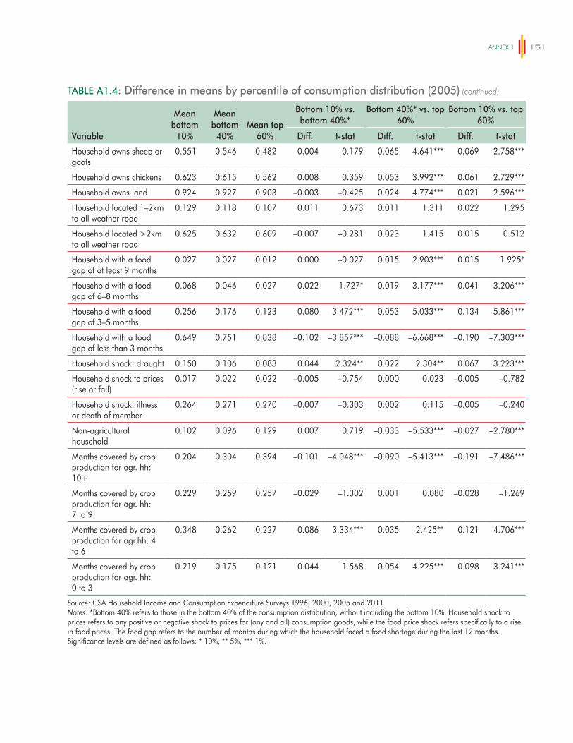
ANNex 1 151
TABLE A1.4: Difference in means by percentile of consumption distribution (2005)
Variable
Mean bottom
10%
Mean bottom
40%Mean top
60%
Bottom 10% vs. bottom 40%*
Bottom 40%* vs. top 60%
Bottom 10% vs. top 60%
Diff. t-stat Diff. t-stat Diff. t-stat
Household owns sheep or goats
0.551 0.546 0.482 0.004 0.179 0.065 4.641*** 0.069 2.758***
Household owns chickens 0.623 0.615 0.562 0.008 0.359 0.053 3.992*** 0.061 2.729***
Household owns land 0.924 0.927 0.903 –0.003 –0.425 0.024 4.774*** 0.021 2.596***
Household located 1–2km to all weather road
0.129 0.118 0.107 0.011 0.673 0.011 1.311 0.022 1.295
Household located >2km to all weather road
0.625 0.632 0.609 –0.007 –0.281 0.023 1.415 0.015 0.512
Household with a food gap of at least 9 months
0.027 0.027 0.012 0.000 –0.027 0.015 2.903*** 0.015 1.925*
Household with a food gap of 6–8 months
0.068 0.046 0.027 0.022 1.727* 0.019 3.177*** 0.041 3.206***
Household with a food gap of 3–5 months
0.256 0.176 0.123 0.080 3.472*** 0.053 5.033*** 0.134 5.861***
Household with a food gap of less than 3 months
0.649 0.751 0.838 –0.102 –3.857*** –0.088 –6.668*** –0.190 –7.303***
Household shock: drought 0.150 0.106 0.083 0.044 2.324** 0.022 2.304** 0.067 3.223***
Household shock to prices (rise or fall)
0.017 0.022 0.022 –0.005 –0.754 0.000 0.023 –0.005 –0.782
Household shock: illness or death of member
0.264 0.271 0.270 –0.007 –0.303 0.002 0.115 –0.005 –0.240
Non-agricultural household
0.102 0.096 0.129 0.007 0.719 –0.033 –5.533*** –0.027 –2.780***
Months covered by crop production for agr. hh: 10+
0.204 0.304 0.394 –0.101 –4.048*** –0.090 –5.413*** –0.191 –7.486***
Months covered by crop production for agr. hh: 7 to 9
0.229 0.259 0.257 –0.029 –1.302 0.001 0.080 –0.028 –1.269
Months covered by crop production for agr.hh: 4 to 6
0.348 0.262 0.227 0.086 3.334*** 0.035 2.425** 0.121 4.706***
Months covered by crop production for agr. hh: 0 to 3
0.219 0.175 0.121 0.044 1.568 0.054 4.225*** 0.098 3.241***
Source: CSA Household Income and Consumption Expenditure Surveys 1996, 2000, 2005 and 2011.Notes: *Bottom 40% refers to those in the bottom 40% of the consumption distribution, without including the bottom 10%. Household shock to prices refers to any positive or negative shock to prices for (any and all) consumption goods, while the food price shock refers specifically to a rise in food prices. The food gap refers to the number of months during which the household faced a food shortage during the last 12 months.Significance levels are defined as follows: * 10%, ** 5%, *** 1%.
(continued)
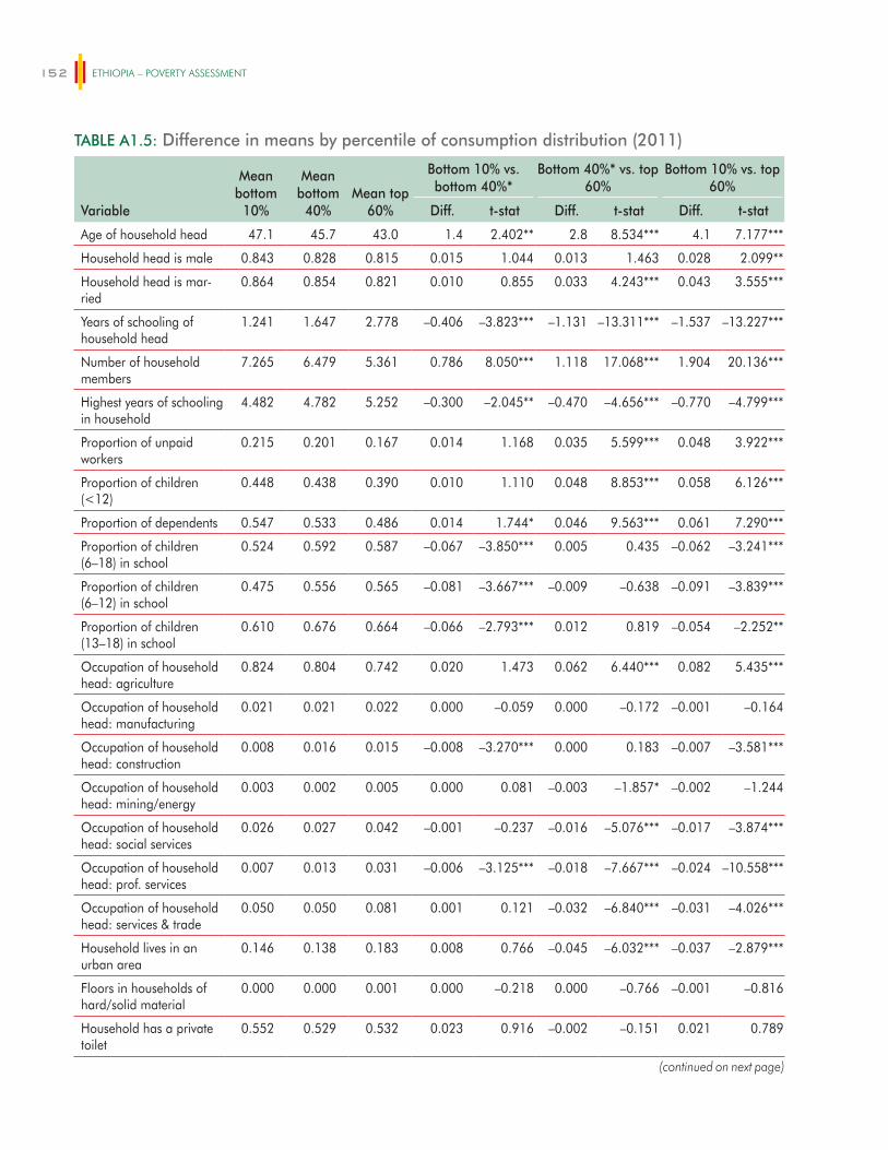
ETHIOPIA – POVERTY ASSESSMENT152
TABLE A1.5: Difference in means by percentile of consumption distribution (2011)
Variable
Mean bottom
10%
Mean bottom
40%Mean top
60%
Bottom 10% vs. bottom 40%*
Bottom 40%* vs. top 60%
Bottom 10% vs. top 60%
Diff. t-stat Diff. t-stat Diff. t-stat
Age of household head 47.1 45.7 43.0 1.4 2.402** 2.8 8.534*** 4.1 7.177***
Household head is male 0.843 0.828 0.815 0.015 1.044 0.013 1.463 0.028 2.099**
Household head is mar-ried
0.864 0.854 0.821 0.010 0.855 0.033 4.243*** 0.043 3.555***
Years of schooling of household head
1.241 1.647 2.778 –0.406 –3.823*** –1.131 –13.311*** –1.537 –13.227***
Number of household members
7.265 6.479 5.361 0.786 8.050*** 1.118 17.068*** 1.904 20.136***
Highest years of schooling in household
4.482 4.782 5.252 –0.300 –2.045** –0.470 –4.656*** –0.770 –4.799***
Proportion of unpaid workers
0.215 0.201 0.167 0.014 1.168 0.035 5.599*** 0.048 3.922***
Proportion of children (<12)
0.448 0.438 0.390 0.010 1.110 0.048 8.853*** 0.058 6.126***
Proportion of dependents 0.547 0.533 0.486 0.014 1.744* 0.046 9.563*** 0.061 7.290***
Proportion of children (6–18) in school
0.524 0.592 0.587 –0.067 –3.850*** 0.005 0.435 –0.062 –3.241***
Proportion of children (6–12) in school
0.475 0.556 0.565 –0.081 –3.667*** –0.009 –0.638 –0.091 –3.839***
Proportion of children (13–18) in school
0.610 0.676 0.664 –0.066 –2.793*** 0.012 0.819 –0.054 –2.252**
Occupation of household head: agriculture
0.824 0.804 0.742 0.020 1.473 0.062 6.440*** 0.082 5.435***
Occupation of household head: manufacturing
0.021 0.021 0.022 0.000 –0.059 0.000 –0.172 –0.001 –0.164
Occupation of household head: construction
0.008 0.016 0.015 –0.008 –3.270*** 0.000 0.183 –0.007 –3.581***
Occupation of household head: mining/energy
0.003 0.002 0.005 0.000 0.081 –0.003 –1.857* –0.002 –1.244
Occupation of household head: social services
0.026 0.027 0.042 –0.001 –0.237 –0.016 –5.076*** –0.017 –3.874***
Occupation of household head: prof. services
0.007 0.013 0.031 –0.006 –3.125*** –0.018 –7.667*** –0.024 –10.558***
Occupation of household head: services & trade
0.050 0.050 0.081 0.001 0.121 –0.032 –6.840*** –0.031 –4.026***
Household lives in an urban area
0.146 0.138 0.183 0.008 0.766 –0.045 –6.032*** –0.037 –2.879***
Floors in households of hard/solid material
0.000 0.000 0.001 0.000 –0.218 0.000 –0.766 –0.001 –0.816
Household has a private toilet
0.552 0.529 0.532 0.023 0.916 –0.002 –0.151 0.021 0.789
(continued on next page)
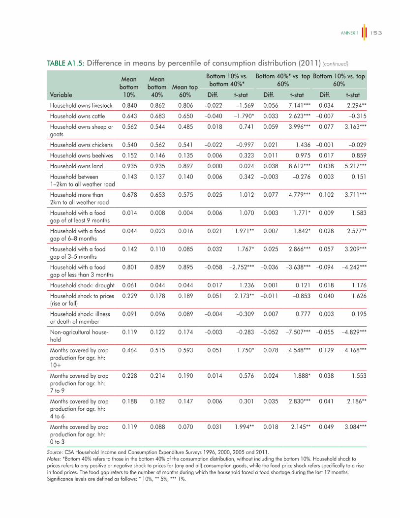
ANNex 1 153
TABLE A1.5: Difference in means by percentile of consumption distribution (2011)
Variable
Mean bottom
10%
Mean bottom
40%Mean top
60%
Bottom 10% vs. bottom 40%*
Bottom 40%* vs. top 60%
Bottom 10% vs. top 60%
Diff. t-stat Diff. t-stat Diff. t-stat
Household owns livestock 0.840 0.862 0.806 –0.022 –1.569 0.056 7.141*** 0.034 2.294**
Household owns cattle 0.643 0.683 0.650 –0.040 –1.790* 0.033 2.623*** –0.007 –0.315
Household owns sheep or goats
0.562 0.544 0.485 0.018 0.741 0.059 3.996*** 0.077 3.163***
Household owns chickens 0.540 0.562 0.541 –0.022 –0.997 0.021 1.436 –0.001 –0.029
Household owns beehives 0.152 0.146 0.135 0.006 0.323 0.011 0.975 0.017 0.859
Household owns land 0.935 0.935 0.897 0.000 0.024 0.038 8.612*** 0.038 5.217***
Household between 1–2km to all weather road
0.143 0.137 0.140 0.006 0.342 –0.003 –0.276 0.003 0.151
Household more than 2km to all weather road
0.678 0.653 0.575 0.025 1.012 0.077 4.779*** 0.102 3.711***
Household with a food gap of at least 9 months
0.014 0.008 0.004 0.006 1.070 0.003 1.771* 0.009 1.583
Household with a food gap of 6–8 months
0.044 0.023 0.016 0.021 1.971** 0.007 1.842* 0.028 2.577**
Household with a food gap of 3–5 months
0.142 0.110 0.085 0.032 1.767* 0.025 2.866*** 0.057 3.209***
Household with a food gap of less than 3 months
0.801 0.859 0.895 –0.058 –2.752*** –0.036 –3.638*** –0.094 –4.242***
Household shock: drought 0.061 0.044 0.044 0.017 1.236 0.001 0.121 0.018 1.176
Household shock to prices (rise or fall)
0.229 0.178 0.189 0.051 2.173** –0.011 –0.853 0.040 1.626
Household shock: illness or death of member
0.091 0.096 0.089 –0.004 –0.309 0.007 0.777 0.003 0.195
Non-agricultural house-hold
0.119 0.122 0.174 –0.003 –0.283 –0.052 –7.507*** –0.055 –4.829***
Months covered by crop production for agr. hh: 10+
0.464 0.515 0.593 –0.051 –1.750* –0.078 –4.548*** –0.129 –4.168***
Months covered by crop production for agr. hh: 7 to 9
0.228 0.214 0.190 0.014 0.576 0.024 1.888* 0.038 1.553
Months covered by crop production for agr. hh: 4 to 6
0.188 0.182 0.147 0.006 0.301 0.035 2.830*** 0.041 2.186**
Months covered by crop production for agr. hh: 0 to 3
0.119 0.088 0.070 0.031 1.994** 0.018 2.145** 0.049 3.084***
Source: CSA Household Income and Consumption Expenditure Surveys 1996, 2000, 2005 and 2011.Notes: *Bottom 40% refers to those in the bottom 40% of the consumption distribution, without including the bottom 10%. Household shock to prices refers to any positive or negative shock to prices for (any and all) consumption goods, while the food price shock refers specifically to a rise in food prices. The food gap refers to the number of months during which the household faced a food shortage during the last 12 months.Significance levels are defined as follows: * 10%, ** 5%, *** 1%.
(continued)

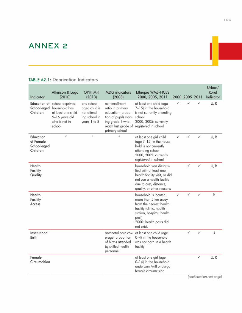
155
ANNEX 2
TABLE A2.1: Deprivation Indicators
IndicatorAtkinson & Lugo
(2010)OPHI MPI
(2013)MDG indicators
(2008)Ethiopia WMS-HCES 2000, 2005, 2011 2000 2005 2011
Urban/ Rural
Indicator
Education of School-aged Children
school deprived: household has at least one child 5–16 years old who is not in school
any school-aged child is not attend-ing school in years 1 to 8
net enrollment ratio in primary education; propor-tion of pupils start-ing grade 1 who reach last grade of primary school
at least one child (age 7–15) in the household is not currently attending school 2000, 2005: currently registered in school
U, R
Education of Female School-aged Children
“ “ “ at least one girl child (age 7–15) in the house-hold is not currently attending school 2000, 2005: currently registered in school
U, R
Health Facility Quality
household was dissatis-fied with at least one health facility visit, or did not use a health facility due to cost, distance, quality, or other reasons
U, R
Health Facility Access
household is located more than 5 km away from the nearest health facility (clinic, health station, hospital, health post) 2000: health posts did not exist.
R
Institutional Birth
antenatal care cov-erage; proportion of births attended by skilled health personnel
at least one child (age 0–4) in the household was not born in a health facility
U
Female Circumcision
at least one girl (age 0–14) in the household underwent/will undergo female circumcision
U, R
(continued on next page)
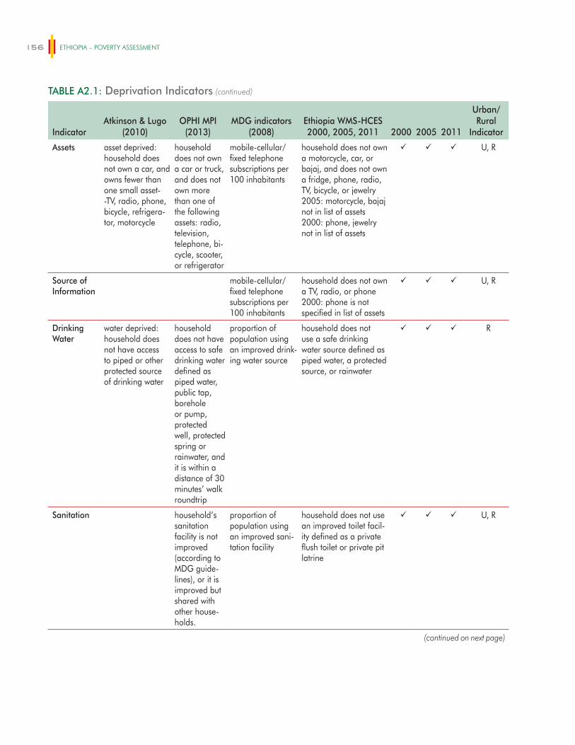
ETHIOPIA – POVERTY ASSESSMENT156
TABLE A2.1: Deprivation Indicators
IndicatorAtkinson & Lugo
(2010)OPHI MPI
(2013)MDG indicators
(2008)Ethiopia WMS-HCES 2000, 2005, 2011 2000 2005 2011
Urban/ Rural
Indicator
Assets asset deprived: household does not own a car, and owns fewer than one small asset--TV, radio, phone, bicycle, refrigera-tor, motorcycle
household does not own a car or truck, and does not own more than one of the following assets: radio, television, telephone, bi-cycle, scooter, or refrigerator
mobile-cellular/fixed telephone subscriptions per 100 inhabitants
household does not own a motorcycle, car, or bajaj, and does not own a fridge, phone, radio, TV, bicycle, or jewelry 2005: motorcycle, bajaj not in list of assets 2000: phone, jewelry not in list of assets
U, R
Source of Information
mobile-cellular/ fixed telephone subscriptions per 100 inhabitants
household does not own a TV, radio, or phone 2000: phone is not specified in list of assets
U, R
Drinking Water
water deprived: household does not have access to piped or other protected source of drinking water
household does not have access to safe drinking water defined as piped water, public tap, borehole or pump, protected well, protected spring or rainwater, and it is within a distance of 30 minutes’ walk roundtrip
proportion of population using an improved drink-ing water source
household does not use a safe drinking water source defined as piped water, a protected source, or rainwater
R
Sanitation household’s sanitation facility is not improved (according to MDG guide-lines), or it is improved but shared with other house-holds.
proportion of population using an improved sani-tation facility
household does not use an improved toilet facil-ity defined as a private flush toilet or private pit latrine
U, R
(continued)
(continued on next page)
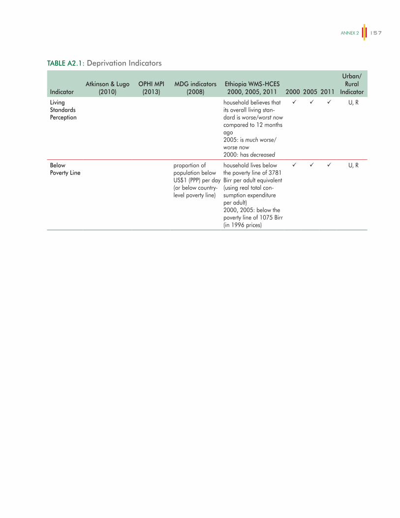
ANNex 2 157
TABLE A2.1: Deprivation Indicators
IndicatorAtkinson & Lugo
(2010)OPHI MPI
(2013)MDG indicators
(2008)Ethiopia WMS-HCES 2000, 2005, 2011 2000 2005 2011
Urban/ Rural
Indicator
Living Standards Perception
household believes that its overall living stan-dard is worse/worst now compared to 12 months ago 2005: is much worse/worse now 2000: has decreased
U, R
Below Poverty Line
proportion of population below US$1 (PPP) per day (or below country-level poverty line)
household lives below the poverty line of 3781 Birr per adult equivalent (using real total con-sumption expenditure per adult) 2000, 2005: below the poverty line of 1075 Birr (in 1996 prices)
U, R
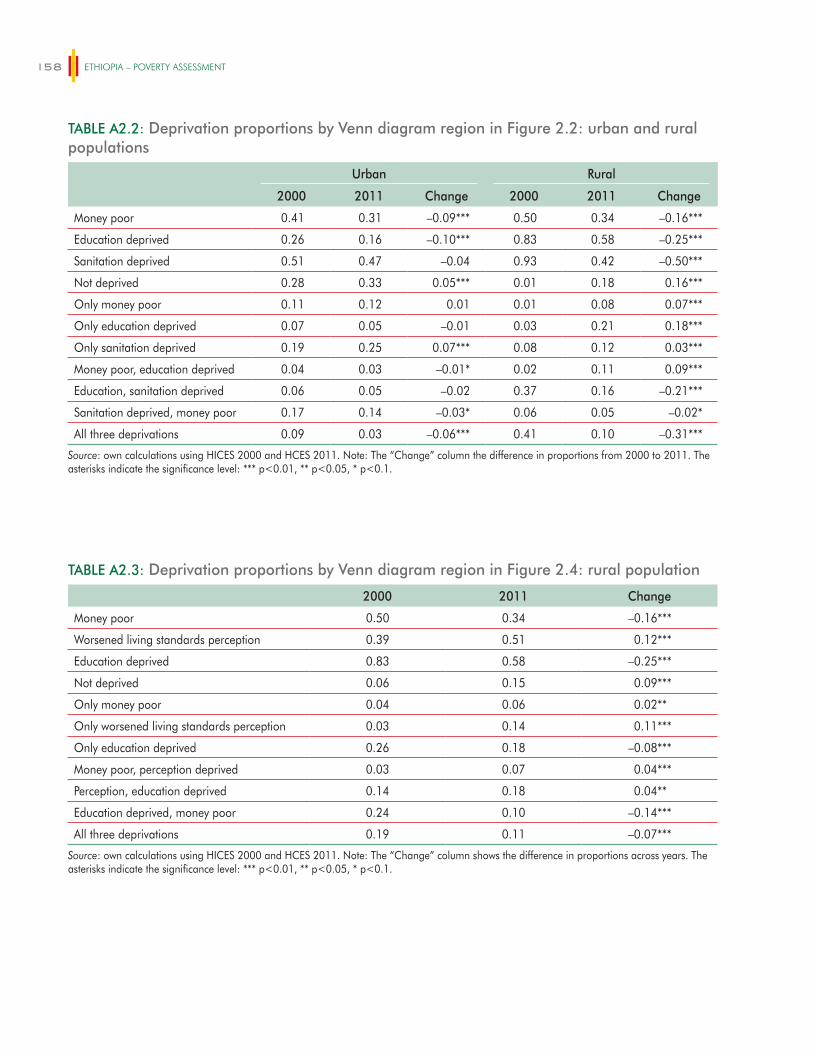
ETHIOPIA – POVERTY ASSESSMENT158
TABLE A2.2: Deprivation proportions by Venn diagram region in Figure 2.2: urban and rural populations
Urban Rural
2000 2011 Change 2000 2011 Change
Money poor 0.41 0.31 –0.09*** 0.50 0.34 –0.16***
Education deprived 0.26 0.16 –0.10*** 0.83 0.58 –0.25***
Sanitation deprived 0.51 0.47 –0.04 0.93 0.42 –0.50***
Not deprived 0.28 0.33 0.05*** 0.01 0.18 0.16***
Only money poor 0.11 0.12 0.01 0.01 0.08 0.07***
Only education deprived 0.07 0.05 –0.01 0.03 0.21 0.18***
Only sanitation deprived 0.19 0.25 0.07*** 0.08 0.12 0.03***
Money poor, education deprived 0.04 0.03 –0.01* 0.02 0.11 0.09***
Education, sanitation deprived 0.06 0.05 –0.02 0.37 0.16 –0.21***
Sanitation deprived, money poor 0.17 0.14 –0.03* 0.06 0.05 –0.02*
All three deprivations 0.09 0.03 –0.06*** 0.41 0.10 –0.31***
Source: own calculations using HICES 2000 and HCES 2011. Note: The “Change” column the difference in proportions from 2000 to 2011. The asterisks indicate the significance level: *** p<0.01, ** p<0.05, * p<0.1.
TABLE A2.3: Deprivation proportions by Venn diagram region in Figure 2.4: rural population
2000 2011 Change
Money poor 0.50 0.34 –0.16***
Worsened living standards perception 0.39 0.51 0.12***
Education deprived 0.83 0.58 –0.25***
Not deprived 0.06 0.15 0.09***
Only money poor 0.04 0.06 0.02**
Only worsened living standards perception 0.03 0.14 0.11***
Only education deprived 0.26 0.18 –0.08***
Money poor, perception deprived 0.03 0.07 0.04***
Perception, education deprived 0.14 0.18 0.04**
Education deprived, money poor 0.24 0.10 –0.14***
All three deprivations 0.19 0.11 –0.07***
Source: own calculations using HICES 2000 and HCES 2011. Note: The “Change” column shows the difference in proportions across years. The asterisks indicate the significance level: *** p<0.01, ** p<0.05, * p<0.1.
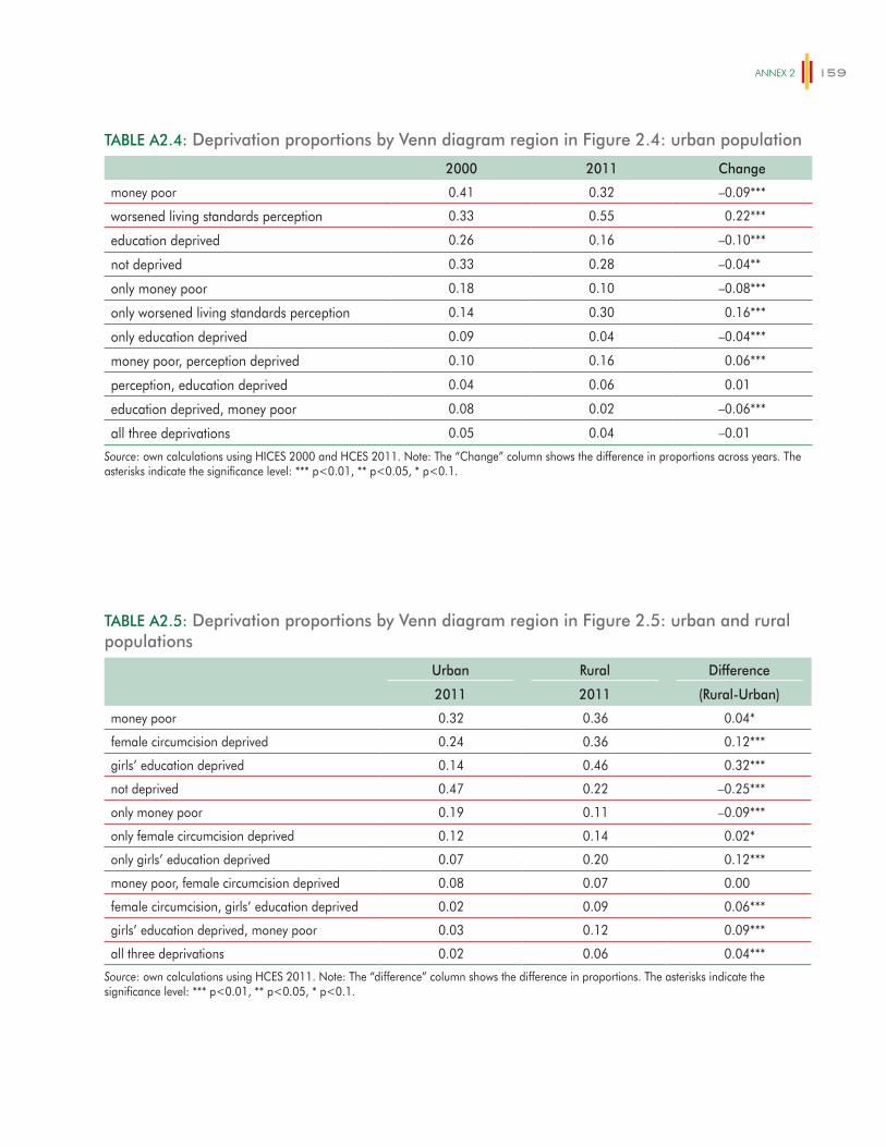
ANNex 2 159
TABLE A2.4: Deprivation proportions by Venn diagram region in Figure 2.4: urban population
2000 2011 Change
money poor 0.41 0.32 –0.09***
worsened living standards perception 0.33 0.55 0.22***
education deprived 0.26 0.16 –0.10***
not deprived 0.33 0.28 –0.04**
only money poor 0.18 0.10 –0.08***
only worsened living standards perception 0.14 0.30 0.16***
only education deprived 0.09 0.04 –0.04***
money poor, perception deprived 0.10 0.16 0.06***
perception, education deprived 0.04 0.06 0.01
education deprived, money poor 0.08 0.02 –0.06***
all three deprivations 0.05 0.04 –0.01
Source: own calculations using HICES 2000 and HCES 2011. Note: The “Change” column shows the difference in proportions across years. The asterisks indicate the significance level: *** p<0.01, ** p<0.05, * p<0.1.
TABLE A2.5: Deprivation proportions by Venn diagram region in Figure 2.5: urban and rural populations
Urban Rural Difference
2011 2011 (Rural-Urban)
money poor 0.32 0.36 0.04*
female circumcision deprived 0.24 0.36 0.12***
girls’ education deprived 0.14 0.46 0.32***
not deprived 0.47 0.22 –0.25***
only money poor 0.19 0.11 –0.09***
only female circumcision deprived 0.12 0.14 0.02*
only girls’ education deprived 0.07 0.20 0.12***
money poor, female circumcision deprived 0.08 0.07 0.00
female circumcision, girls’ education deprived 0.02 0.09 0.06***
girls’ education deprived, money poor 0.03 0.12 0.09***
all three deprivations 0.02 0.06 0.04***
Source: own calculations using HCES 2011. Note: The “difference” column shows the difference in proportions. The asterisks indicate the significance level: *** p<0.01, ** p<0.05, * p<0.1.

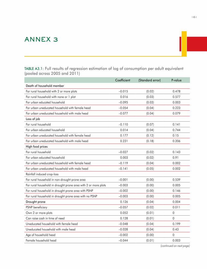
161
ANNEX 3
TABLE A3.1: Full results of regression estimation of log of consumption per adult equivalent (pooled across 2005 and 2011)
Coefficient (Standard error) P-value
Death of household member
For rural household with 2 or more plots –0.015 (0.02) 0.478
For rural household with none or 1 plot 0.016 (0.03) 0.577
For urban educated household –0.095 (0.03) 0.003
For urban uneducated household with female head –0.054 (0.04) 0.223
For urban uneducated household with male head –0.077 (0.04) 0.079
Loss of job
For rural household –0.110 (0.07) 0.141
For urban educated household 0.014 (0.04) 0.744
For urban uneducated household with female head 0.177 (0.12) 0.15
For urban uneducated household with male head 0.231 (0.18) 0.206
High food prices
For rural household –0.027 (0.02) 0.143
For urban educated household 0.003 (0.02) 0.91
For urban uneducated household with female head –0.119 (0.04) 0.002
For urban uneducated household with male head –0.141 (0.05) 0.002
Rainfall induced crop-loss
For rural household in non-drought prone area –0.001 (0.00) 0.539
For rural household in drought prone area with 2 or more plots –0.003 (0.00) 0.005
For rural household in drought prone area with PSNP –0.002 (0.00) 0.146
For rural household in drought prone area with no PSNP –0.003 (0.00) 0.005
Drought prone 0.126 (0.04) 0.004
PSNP beneficiary –0.057 (0.02) 0.011
Own 2 or more plots 0.052 (0.01) 0
Can raise cash in time of need 0.128 (0.01) 0
Uneducated household with female head –0.048 (0.04) 0.199
Uneducated household with male head –0.028 (0.04) 0.43
Age of household head –0.002 (0.00) 0
Female household head –0.044 (0.01) 0.003
(continued on next page)
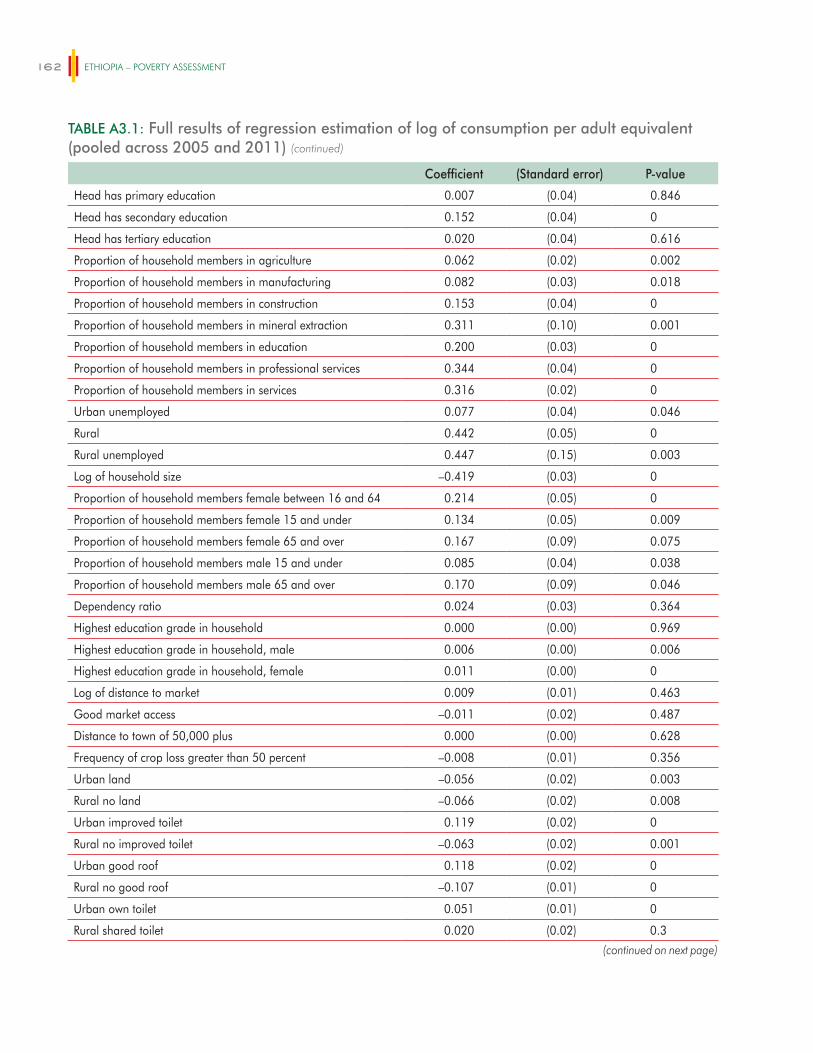
ETHIOPIA – POVERTY ASSESSMENT162
TABLE A3.1: Full results of regression estimation of log of consumption per adult equivalent (pooled across 2005 and 2011)
Coefficient (Standard error) P-value
Head has primary education 0.007 (0.04) 0.846
Head has secondary education 0.152 (0.04) 0
Head has tertiary education 0.020 (0.04) 0.616
Proportion of household members in agriculture 0.062 (0.02) 0.002
Proportion of household members in manufacturing 0.082 (0.03) 0.018
Proportion of household members in construction 0.153 (0.04) 0
Proportion of household members in mineral extraction 0.311 (0.10) 0.001
Proportion of household members in education 0.200 (0.03) 0
Proportion of household members in professional services 0.344 (0.04) 0
Proportion of household members in services 0.316 (0.02) 0
Urban unemployed 0.077 (0.04) 0.046
Rural 0.442 (0.05) 0
Rural unemployed 0.447 (0.15) 0.003
Log of household size –0.419 (0.03) 0
Proportion of household members female between 16 and 64 0.214 (0.05) 0
Proportion of household members female 15 and under 0.134 (0.05) 0.009
Proportion of household members female 65 and over 0.167 (0.09) 0.075
Proportion of household members male 15 and under 0.085 (0.04) 0.038
Proportion of household members male 65 and over 0.170 (0.09) 0.046
Dependency ratio 0.024 (0.03) 0.364
Highest education grade in household 0.000 (0.00) 0.969
Highest education grade in household, male 0.006 (0.00) 0.006
Highest education grade in household, female 0.011 (0.00) 0
Log of distance to market 0.009 (0.01) 0.463
Good market access –0.011 (0.02) 0.487
Distance to town of 50,000 plus 0.000 (0.00) 0.628
Frequency of crop loss greater than 50 percent –0.008 (0.01) 0.356
Urban land –0.056 (0.02) 0.003
Rural no land –0.066 (0.02) 0.008
Urban improved toilet 0.119 (0.02) 0
Rural no improved toilet –0.063 (0.02) 0.001
Urban good roof 0.118 (0.02) 0
Rural no good roof –0.107 (0.01) 0
Urban own toilet 0.051 (0.01) 0
Rural shared toilet 0.020 (0.02) 0.3
(continued on next page)
(continued)
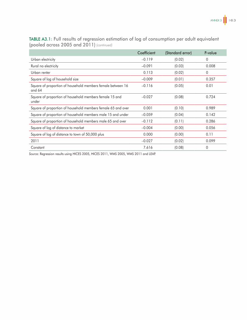
ANNex 3 163
TABLE A3.1: Full results of regression estimation of log of consumption per adult equivalent (pooled across 2005 and 2011)
Coefficient (Standard error) P-value
Urban electricity –0.119 (0.02) 0
Rural no electricity –0.091 (0.03) 0.008
Urban renter 0.113 (0.02) 0
Square of log of household size –0.009 (0.01) 0.357
Square of proportion of household members female between 16 and 64
–0.116 (0.05) 0.01
Square of proportion of household members female 15 and under
–0.027 (0.08) 0.724
Square of proportion of household members female 65 and over 0.001 (0.10) 0.989
Square of proportion of household members male 15 and under –0.059 (0.04) 0.142
Square of proportion of household members male 65 and over –0.112 (0.11) 0.286
Square of log of distance to market –0.004 (0.00) 0.056
Square of log of distance to town of 50,000 plus 0.000 (0.00) 0.11
2011 –0.027 (0.02) 0.099
Constant 7.616 (0.08) 0
Source: Regression results using HICES 2005, HICES 2011, WMS 2005, WMS 2011 and LEAP.
(continued)

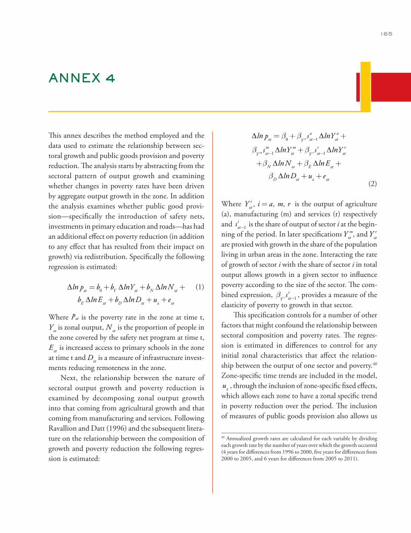
165
ANNEX 4
This annex describes the method employed and the data used to estimate the relationship between sec-toral growth and public goods provision and poverty reduction. The analysis starts by abstracting from the sectoral pattern of output growth and examining whether changes in poverty rates have been driven by aggregate output growth in the zone. In addition the analysis examines whether public good provi-sion—specifically the introduction of safety nets, investments in primary education and roads—has had an additional effect on poverty reduction (in addition to any effect that has resulted from their impact on growth) via redistribution. Specifically the following regression is estimated:
∆ln pzt = b0+bY ∆lnYzt +bN ∆lnN zt +
bE ∆lnEzt +bD ∆lnDzt +uz + ezt
(1)
Where ∆ln pzt = b0+bY ∆lnYzt +bN ∆lnN zt +
bE ∆lnEzt +bD ∆lnDzt +uz + ezt
is the poverty rate in the zone at time t, ∆ln pzt = b0+bY ∆lnYzt +bN ∆lnN zt +
bE ∆lnEzt +bD ∆lnDzt +uz + ezt
is zonal output, ∆ln pzt = b0+bY ∆lnYzt +bN ∆lnN zt +
bE ∆lnEzt +bD ∆lnDzt +uz + ezt
is the proportion of people in the zone covered by the safety net program at time t, ∆ln pzt = b0+bY ∆lnYzt +bN ∆lnN zt +
bE ∆lnEzt +bD ∆lnDzt +uz + ezt is increased access to primary schools in the zone at time t and
∆ln pzt = b0+bY ∆lnYzt +bN ∆lnN zt +
bE ∆lnEzt +bD ∆lnDzt +uz + ezt is a measure of infrastructure invest-
ments reducing remoteness in the zone.Next, the relationship between the nature of
sectoral output growth and poverty reduction is examined by decomposing zonal output growth into that coming from agricultural growth and that coming from manufacturing and services. Following Ravallion and Datt (1996) and the subsequent litera-ture on the relationship between the composition of growth and poverty reduction the following regres-sion is estimated:
∆ln pzt = b0+bY a szt-1a ∆lnYzt
a +
bY m szt-1
m ∆lnYztm+b
Y r szt-1r ∆lnYzt
r
+bN ∆lnN zt +bE ∆lnEzt +
bD ∆lnDzt +uz + ezt (2)
Where Yzti , i = a , m, r is the output of agriculture
(a), manufacturing (m) and services (r) respectively and szt-1
i is the share of output of sector i at the begin-ning of the period. In later specifications
∆ln pzt = b0+bY a szt-1a ∆lnYzt
a +
bY m szt-1
m ∆lnYztm+b
Y r szt-1r ∆lnYzt
r
+bN ∆lnN zt +bE ∆lnEzt +
bD ∆lnDzt +uz + ezt
, and
∆ln pzt = b0+bY a szt-1a ∆lnYzt
a +
bY m szt-1
m ∆lnYztm+b
Y r szt-1r ∆lnYzt
r
+bN ∆lnN zt +bE ∆lnEzt +
bD ∆lnDzt +uz + ezt
are proxied with growth in the share of the population living in urban areas in the zone. Interacting the rate of growth of sector i with the share of sector i in total output allows growth in a given sector to influence poverty according to the size of the sector. The com-bined expression, b
Y i szt-1i , provides a measure of the
elasticity of poverty to growth in that sector.This specification controls for a number of other
factors that might confound the relationship between sectoral composition and poverty rates. The regres-sion is estimated in differences to control for any initial zonal characteristics that affect the relation-ship between the output of one sector and poverty.40 Zone-specific time trends are included in the model, uz , through the inclusion of zone-specific fixed effects, which allows each zone to have a zonal specific trend in poverty reduction over the period. The inclusion of measures of public goods provision also allows us
40 Annualized growth rates are calculated for each variable by dividing each growth rate by the number of years over which the growth occurred (4 years for differences from 1996 to 2000, five years for differences from 2000 to 2005, and 6 years for differences from 2005 to 2011).
ETHIOPIA – POVERTY ASSESSMENT166
to control for a number of time-variant characteristics that may be important in determining the relation-ship between the pattern of growth and poverty. The inclusion of N, D and E also controls for a number of time-variant characteristics that may be important in determining poverty and which may affect the estimation of b
Y i .To address concerns about reverse causality,
growth in agriculture is instrumented with weather. Even with a fully specified model, the estimation strategy outlined is subject to a concern that reverse causation may be driving the results. In some papers on the relationship between sectoral growth and pov-erty this goes unaddressed, and in other papers it is addressed by instrumenting growth rates with growth rates of neighbors (Ligon and Sadoulet 2008, Loayza and Raddatz 2010) or lagged growth (Loayza and Raddatz 2010). Henderson et al. (2011) has explored the use of rainfall as a measure of exogenous variation in agricultural growth and the same approach is taken here using WRSI data available at the zonal level in Ethiopia from 1996–2011. Weather shocks (calculated as the sum of annual estimates of crop loss for the zone through a crop WRSI model) are used as an estimate of exogenous variation in agricultural growth. Ethiopia is characterized by both significant weather risk and significant heterogeneity in weather risk across space and time. It is likely that agricultural output is the main mechanism by which local weather shocks affect local livelihoods, and that increased market integration throughout this period limits the impact of small local weather shocks on prices and growth in other sectors. This is something that is tested empirically and found to hold true (see Hill and Tsehaye 2014 for full details).
Fifty zones are followed over a period of 15 years, covering nearly all of Ethiopia’s population. Zonal boundaries from 1996 are used and all aggregates are calculated using these zonal boundaries. Three pastoral zones in the Somali region were excluded from this analysis because no poverty data is available for them (three Somali zones are included). Afar’s five zones were excluded from the analysis because of missing agricultural data in some years. In addition, the three
zones in the Gambela region were not included in the analysis as poverty data is not available for 1996 or 2005 for this region. The following paragraphs detail the construction of the zonal panel. Table A4.1 pres-ents summary statistics.
Poverty estimates
The description of the sampling for the HICES indi-cates that enumeration areas are stratified by zone, with a similar number of EAs selected by zone in each year. Zonal level poverty estimates are reported for 1996, 2000, and 2005 in MOFED (2013). However, these zonal estimates are not often cited, and similar estimates were not presented for 2011. Although the sample is stratified by zone, the sampling strategy used in the HICES is not designed to sample enough house-holds to generate precise zonal level poverty estimates.
Poverty mapping can be used to generate small-area estimates of poverty (Elbers et al. 2003), and for the type of analysis conducted in this paper, poverty maps estimated at multiple points in time could pro-vide the required data. Although no official poverty map estimates exist for Ethiopia, the 2007 census has been used with the HICES 2011 data to generate zonal and woreda level poverty estimates (Sohnesen 2014). The poverty mapping report presents the cor-relation between poverty-map estimates at the zonal level with estimates calculated directly from the data. As indicated in Figure A2.1, which is taken from this report, although survey based estimates of poverty rates are perhaps noisier than those estimated using poverty mapping techniques they compare well. Until poverty-mapping estimates are available across time in Ethiopia, Figure A2.1 suggests that the zonal esti-mates can be used with some confidence for regression analysis. If measurement error in poverty estimates can be considered white noise, it will not affect coefficient estimates given poverty is the dependent variable.
In addition to using the HICES to estimate poverty for each zone, it is also used to estimate the number of people in each zone by aggregating the weights at the zonal level, and the number of people
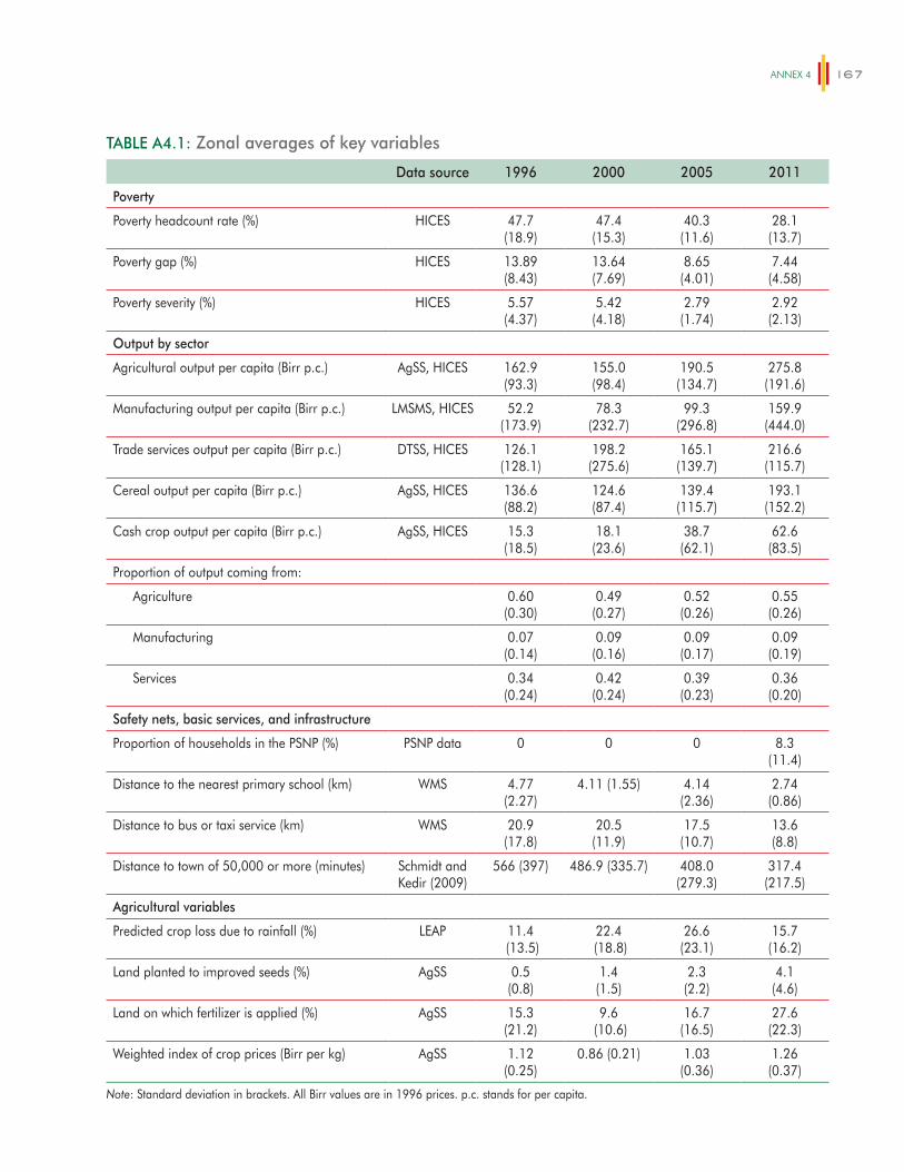
ANNex 4 167
TABLE A4.1: Zonal averages of key variables
Data source 1996 2000 2005 2011
Poverty
Poverty headcount rate (%) HICES 47.7(18.9)
47.4(15.3)
40.3(11.6)
28.1(13.7)
Poverty gap (%) HICES 13.89(8.43)
13.64(7.69)
8.65(4.01)
7.44(4.58)
Poverty severity (%) HICES 5.57(4.37)
5.42(4.18)
2.79(1.74)
2.92(2.13)
Output by sector
Agricultural output per capita (Birr p.c.) AgSS, HICES 162.9(93.3)
155.0(98.4)
190.5(134.7)
275.8(191.6)
Manufacturing output per capita (Birr p.c.) LMSMS, HICES 52.2(173.9)
78.3(232.7)
99.3(296.8)
159.9(444.0)
Trade services output per capita (Birr p.c.) DTSS, HICES 126.1(128.1)
198.2(275.6)
165.1(139.7)
216.6(115.7)
Cereal output per capita (Birr p.c.) AgSS, HICES 136.6(88.2)
124.6(87.4)
139.4(115.7)
193.1(152.2)
Cash crop output per capita (Birr p.c.) AgSS, HICES 15.3(18.5)
18.1(23.6)
38.7(62.1)
62.6(83.5)
Proportion of output coming from:
Agriculture 0.60(0.30)
0.49(0.27)
0.52(0.26)
0.55(0.26)
Manufacturing 0.07(0.14)
0.09(0.16)
0.09(0.17)
0.09(0.19)
Services 0.34(0.24)
0.42(0.24)
0.39(0.23)
0.36(0.20)
Safety nets, basic services, and infrastructure
Proportion of households in the PSNP (%) PSNP data 0 0 0 8.3(11.4)
Distance to the nearest primary school (km) WMS 4.77(2.27)
4.11 (1.55) 4.14(2.36)
2.74(0.86)
Distance to bus or taxi service (km) WMS 20.9(17.8)
20.5(11.9)
17.5(10.7)
13.6(8.8)
Distance to town of 50,000 or more (minutes) Schmidt and Kedir (2009)
566 (397) 486.9 (335.7) 408.0(279.3)
317.4(217.5)
Agricultural variables
Predicted crop loss due to rainfall (%) LEAP 11.4 (13.5)
22.4 (18.8)
26.6(23.1)
15.7(16.2)
Land planted to improved seeds (%) AgSS 0.5(0.8)
1.4(1.5)
2.3(2.2)
4.1(4.6)
Land on which fertilizer is applied (%) AgSS 15.3(21.2)
9.6 (10.6)
16.7(16.5)
27.6(22.3)
Weighted index of crop prices (Birr per kg) AgSS 1.12(0.25)
0.86 (0.21) 1.03(0.36)
1.26(0.37)
Note: Standard deviation in brackets. All Birr values are in 1996 prices. p.c. stands for per capita.
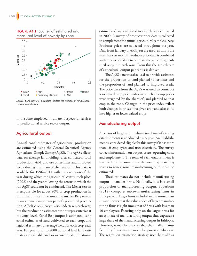
ETHIOPIA – POVERTY ASSESSMENT168
in the zone employed in different aspects of services to predict zonal service sector output.
Agricultural output
Annual zonal estimates of agricultural production are estimated using the Central Statistical Agency Agricultural Sample Survey (AgSS). The AgSS collects data on average landholding, area cultivated, total production, yield, and use of fertilizer and improved seeds during the main Meher season. This data is available for 1996–2011 with the exception of the year during which the agricultural census took place (2002) and the year following the census in which the full AgSS could not be conducted. The Meher season is responsible for about 80% of crop production in Ethiopia, but for some zones the smaller Belg season is an extremely important part of agricultural produc-tion. A Belg crop survey is also undertaken each year, but the production estimates are not representative at the zonal level. Zonal Belg output is estimated using zonal estimates of land cultivated to each crop, and regional estimates of average yield for each crop each year. For years prior to 2000 no zonal level land esti-mates are available and so we use trends in national
estimates of land cultivated to scale the area cultivated in 2000. A survey of producer price data is collected to complement the annual agricultural sample survey. Producer prices are collected throughout the year. Data from January of each year are used, as this is the main harvest month. Producer price data is combined with production data to estimate the value of agricul-tural output in each zone. From this the growth rate of agricultural output per capita is derived.
The AgSS data was also used to provide estimates for the proportion of land planted to fertilizer and the proportion of land planted to improved seeds. The price data from the AgSS was used to construct a weighted crop price index in which all crop prices were weighted by the share of land planted to that crop in the zone. Changes in the price index reflect both changes in prices for a given crop and also shifts into higher or lower valued crops.
Manufacturing output
A census of large and medium sized manufacturing establishments is conducted every year. An establish-ment is considered eligible for this survey if it has more than 10 employees and uses electricity. The survey collects information on output, assets, operating costs and employment. The town of each establishment is recorded and in some cases the zone. By matching towns to zones, zonal manufacturing output can be estimated.
These estimates do not include manufacturing output of smaller firms. Nationally, this is a small proportion of manufacturing output. Soderbom (2012) compares micro-manufacturing firms in Ethiopia with larger firms included in the annual cen-sus and shows that the value added of larger manufac-turing firms is eight times that of firms with less than 10 employees. Focusing only on the larger firms for an estimate of manufacturing output thus captures a large share of the manufacturing output in Ethiopia. However, it may be the case that the smaller manu-facturing firms matter more for poverty reduction. The regression estimation strategy used here allows
FIGURE A4.1: Scatter of estimated and measured level of poverty by zone
0
0.3
0.2
0.1
0.4
0.6
0.7
0.5
0.8
Mea
sure
d
0 0.2 0.4 0.80.6
Tigray Afar Amhara OromiaSomali Benishangui Gumuz SNNP
Estimated
Source: Sohnesen 2014.Bubbles indicate the number of HICES obser-vations in each zone.
ANNex 4 169
for the share of manufacturing output produced by small firms to vary across zones and to change with time, but it relies on the growth rate manufacturing output of small firms to be constant within a given zone across the full period 1996–2011.
Services
The most systematic survey of service industries is a survey of trade and distributive services that was con-ducted in 1995, 2002 and 2009. This survey allows regional estimates of productivity of service enterprises to be generated, but it is a sample survey and does not allow for an estimate of the zonal service output. It also does not include information on personal services such as hotel, restaurant, and domestic help. In order to generate a zonal estimate of service output data on the number of individuals engaged in trade and dis-tributive services in the zone from the HICE surveys is estimated and multiplied with national estimates of value added per worker to generate a measure of zonal output per worker from these surveys. The value of hotel and restaurants are however not captured in this measure of services output per capita.
Public goods provision: data on safety nets and access to basic services
The average distance to a primary school recorded at four points in time in the Welfare Monitoring Surveys (WMS) was used as a proxy for education and health investments. Secondly investments in roads are
measured using the Schmidt and Kedir (2009) esti-mates of time to travel (using type of road and distance to generate the estimates) to a town of 50,000 people in 1994 and in 2007. The distance at each square kilo-meter in the zone is averaged across the zone to prove a zonal average estimate. Finally administrative data on the number of PSNP beneficiaries per zone per year is used to estimate the proportion of households in the zone benefiting from the PSNP.
Weather shocks
The Livelihoods, Early Assessment and Protection project (LEAP) system, developed in 2008 by the Government of Ethiopia in collaboration with WFP, uses crop-modeling approaches to estimate rainfall-induced crop loss in woredas throughout Ethiopia. Water-balance crop models and yield reduction coef-ficients are defined for the crops grown in the zone. Evapotranspiration coefficients for the zone are used with data on decadal rainfall in a given year to gen-erate an estimate of the proportion of crop that was lost in a given year as a result of insufficient rainfall. These models essentially provide a weighted average of rainfall in which rainfall at times of the year in which the development of the crop is particularly moisture dependent is given a higher weight. The weights are provided by agronomic crop models. Crop loss esti-mates are generated for each 50 km by 50 km square. This is aggregated to generate a zonal estimate of crop-loss. The LEAP database contains crop loss estimates from 1996 to 2012 for both Belg and Meher seasons.

171
ANNEX 5
The incidence of direct and indirect taxes and subsidies can be calculated using either income or consumption (e.g., Abramovsky, Attanasio, and Phillips, 2011). In this incidence analysis, consumption was used as the basic welfare indicator because the household survey available for our analysis collects consumption expen-diture but no income data. Moreover, in the Ethiopian case (as in many low income countries), consumption is more accurately measured relative to income, and forms the basis for poverty measures.
The Commitment to Equity (CEQ) method of benefit incidence analysis developed by Lustig and Higgins (2012) was used. This method is applied on several countries in Latin America, Asia, and Africa. It analyzes the distributional impact of fiscal policy in a holistic and standardized way, facilitating comparison with other countries in which the CEQ methodology has been applied. The CEQ methodology defines dif-ferent income concepts of pre and post transfers and taxes so that the distributional impacts of transfers and taxes can be easily identified. These different income concepts are summarized in Figure A5.1.
These five income concepts are defined for Ethiopia as follows.
� Disposable income was set equal to household consumption expenditure.
� Moving up Figure A5.1 from disposable income, net market income was derived by subtracting direct transfers received by the household from disposable income. Direct transfers include trans-fers from the Productive Safety Net Program and food aid.
� To get market income, direct taxes and contribu-tory pensions were added to net market income. In the case of Ethiopia, direct taxes include
personal income tax, agricultural income tax, rental income tax, and rural land use fees. This measure of market income is meant to capture the value of Wages and salaries, income from capital, private transfers; before government taxes, social security contributions and transfers and contribu-tory pensions.
� Moving down Figure A5.1 from disposable income to post-fiscal income, indirect taxes were subtracted and subsidies added. In the Ethiopian case, the indirect taxes are VAT, sales tax, import duties, excise tax, stump duties, and SUR tax while the indirect subsidies are wheat, kerosene and electricity subsidies.
� Post fiscal income plus in-kind transfers (educa-tion and health) minus co-payment and user fees gives final income.
The following subsections detail the data sources used and the assumptions made in order to estimate taxes paid and transfers and subsidies received.
Data sources
The 2010/11 Household Consumption Expenditure Survey (HCES) and Welfare Monitoring Survey (WMS) data sources collected by the Central Statistical Agency (CSA) of Ethiopia were used. Household survey data are combined with data from National Income Accounts and public finance accounts from the Ministry of Finance and Economic Development. These accounts are used in order to obtain the public revenue and expenditures corre-sponding to the 2010/11 Ethiopian fiscal year. This information is complemented with data from the Productive Safety Net and Household Asset Building
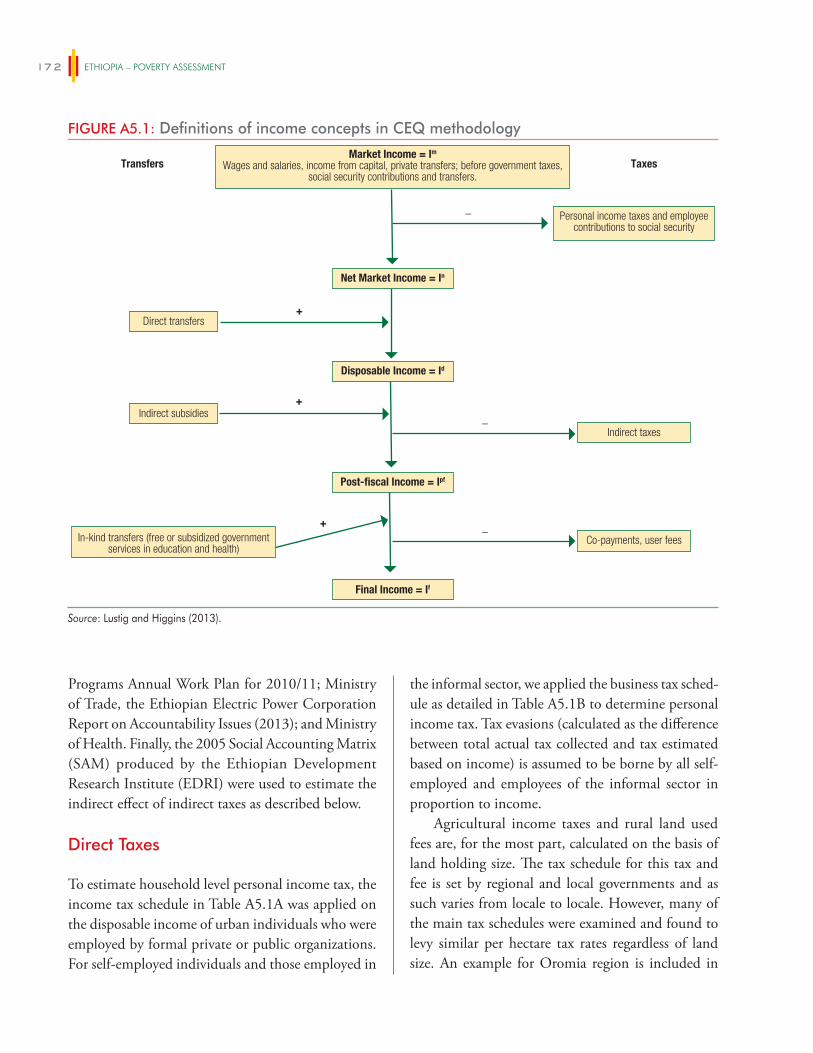
ETHIOPIA – POVERTY ASSESSMENT172
Programs Annual Work Plan for 2010/11; Ministry of Trade, the Ethiopian Electric Power Corporation Report on Accountability Issues (2013); and Ministry of Health. Finally, the 2005 Social Accounting Matrix (SAM) produced by the Ethiopian Development Research Institute (EDRI) were used to estimate the indirect effect of indirect taxes as described below.
Direct Taxes
To estimate household level personal income tax, the income tax schedule in Table A5.1A was applied on the disposable income of urban individuals who were employed by formal private or public organizations. For self-employed individuals and those employed in
the informal sector, we applied the business tax sched-ule as detailed in Table A5.1B to determine personal income tax. Tax evasions (calculated as the difference between total actual tax collected and tax estimated based on income) is assumed to be borne by all self-employed and employees of the informal sector in proportion to income.
Agricultural income taxes and rural land used fees are, for the most part, calculated on the basis of land holding size. The tax schedule for this tax and fee is set by regional and local governments and as such varies from locale to locale. However, many of the main tax schedules were examined and found to levy similar per hectare tax rates regardless of land size. An example for Oromia region is included in
FIGURE A5.1: Definitions of income concepts in CEQ methodology
Net Market Income = In
Disposable Income = Id
Post-fiscal Income = Ipf
Final Income = If
Transfers
Taxes Market Income = Im
Wages and salaries, income from capital, private transfers; before government taxes, social security contributions and transfers.
+
+
+
_
_
_
Personal income taxes and employee contributions to social security
Direct transfers
Indirect subsidies
In-kind transfers (free or subsidized government services in education and health)
Co-payments, user fees
Indirect taxes
Source: Lustig and Higgins (2013).
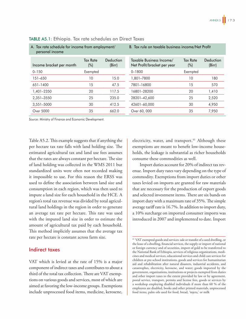
ANNex 5 173
electricity, water, and transport.41 Although these exemptions are meant to benefit low-income house-holds, the leakage is substantial as richer households consume these commodities as well.
Import duties account for 20% of indirect tax rev-enue. Import duty rates vary depending on the type of commodity. Exemptions from import duties or other taxes levied on imports are granted for raw materials that are necessary for the production of export goods and selected investment items. There are six bands on import duty with a maximum rate of 35%. The simple average tariff rate is 16.7%. In addition to import duty, a 10% surcharge on imported consumer imports was introduced in 2007 and implemented to date. Import
Table A5.2. This example suggests that if anything the per hectare tax rate falls with land holding size. The estimated agricultural tax and land use fees assumes that the rates are always constant per hectare. The size of land holding was collected in the WMS 2011 but standardized units were often not recorded making it impossible to use. For this reason the ERSS was used to define the association between land size and consumption in each region, which was then used to impute a land size for each household in the HCE. A region’s total tax revenue was divided by total agricul-tural land holdings in the region in order to generate an average tax rate per hectare. This rate was used with the imputed land size in order to estimate the amount of agricultural tax paid by each household. This method implicitly assumes that the average tax rate per hectare is constant across farm size.
Indirect taxes
VAT which is levied at the rate of 15% is a major component of indirect taxes and contributes to about a third of the total tax collection. There are VAT exemp-tions on various goods and services, most of which are aimed at favoring the low-income groups. Exemptions include unprocessed food items, medicine, kerosene,
TABLE A5.1: Ethiopia. Tax rate schedules on Direct Taxes
A. Tax rate schedule for income from employment/personal income
B. Tax rule on taxable business income/Net Profit
Income bracket per monthTax Rate
(%)Deduction
(Birr)
0–150 Exempted
151–650 10 15.0
651–1400 15 47.5
1,401–2350 20 117.5
2,351–3550 25 235.0
3,551–5000 30 412.5
Over 5000 35 662.0
Taxable Business Income/Net Profit/bracket per year
Tax Rate (%)
Deduction (Birr)
0–1800 Exempted
1,801–7800 10 180
7801–16800 15 570
16801–28200 20 1,410
28201–42,600 25 2,520
42601–60,000 30 4,950
Over 60, 000 35 7,950
Source: Ministry of Finance and Economic Development.
41 VAT exempted goods and services: sale or transfer of a used dwelling, or the lease of a dwelling, financial services, the supply or import of national or foreign currency and of securities, import of gold to be transferred to the National Bank of Ethiopia, services of religious organizations, medi-cines and medical services, educational services and child care services for children at pre-school institutions, goods and services for humanitarian aid and rehabilitation after natural disasters, industrial accidents, and catastrophes, electricity, kerosene, and water; goods imported by the government, organizations, institutions or projects exempted from duties and other import taxes to the extent provided by law or by agreement, postal service, transport, permits and license fees, goods or services by a workshop employing disabled individuals if more than 60 % of the employees are disabled, books and other printed materials, unprocessed food items, palm oils used for food, bread, ‘injera,’ or milk
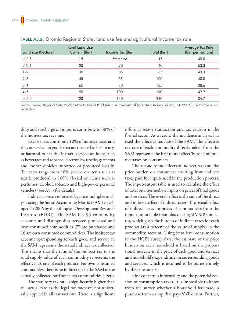
ETHIOPIA – POVERTY ASSESSMENT174
duty and surcharge on imports contribute to 30% of the indirect tax revenue.
Excise taxes contribute 12% of indirect taxes and they are levied on goods that are deemed to be ‘luxury’ or harmful to health. The tax is levied on items such as beverages and tobacco, electronics, textile, garments and motor vehicles imported or produced locally. The rates range from 10% (levied on items such as textile products) to 100% (levied on items such as perfumes, alcohol, tobacco and high-power personal vehicles) (see A5.3 for details).
Indirect taxes are estimated by price multiplier anal-ysis using the Social Accounting Matrix (SAM) devel-oped in 2006 by the Ethiopian Development Research Institute (EDRI). The SAM has 93 commodity accounts and distinguishes between purchased and own consumed commodities (77 are purchased and 16 are own consumed commodities). The indirect tax account corresponding to each good and service in the SAM represents the actual indirect tax collected. This means that the ratio of the indirect tax to the total supply value of each commodity represents the effective tax rate of each product. For own consumed commodities, there is no indirect tax in the SAM as the actually collected tax from such commodities is zero.
The statutory tax rate is significantly higher than the actual rate as the legal tax rates are not univer-sally applied in all transactions. There is a significant
informal sector transaction and tax evasion in the formal sector. As a result, the incidence analysis has used the effective tax rate of the SAM. The effective tax rate of each commodity directly taken from the SAM represents the first round effect/burden of indi-rect taxes on consumers.
The second round effects of indirect taxes are the price burden on consumers resulting from indirect taxes paid for inputs used in the production process. The input-output table is used to calculate the effect of taxes on intermediate inputs on prices of final goods and services. The overall effect is the sum of the direct and indirect effect of indirect taxes. The overall effect of indirect taxes on prices of commodities from the input-output table is simulated using SIMSIP simula-tor, which gives the burden of indirect taxes for each product (as a percent of the value of supply) in the commodity account. Using item level consumption in the HCES survey data, the estimate of the price burden on each household is based on the propor-tional increase in the price of each good and services and household’s expenditure on corresponding goods and services, which is assumed to be borne entirely by the consumers.
One concern is informality and the potential eva-sion of consumption taxes. It is impossible to know from the survey whether a household has made a purchase from a shop that pays VAT or not. Further,
TABLE A5.2: Oromia Regional State, land use fee and agricultural income tax rule
Land size (hectare)Rural Land Use Payment (Birr) Income Tax (Birr) Total (Birr)
Average Tax Rate (Birr per hectare)
< 0.5 15 Exempted 15 40.0
0.5–1 20 20 40 53.3
1–2 30 35 65 43.3
2–3 45 55 100 40.0
3–4 65 70 135 38.6
4–5 90 100 190 42.2
> 5.0 120 140 260 34.7
Source: Oromia Regional State, Proclamation to Amend Rural Land Use Payment and Agricultural Income Tax (No. 131/2007). The tax rate is own calculation.
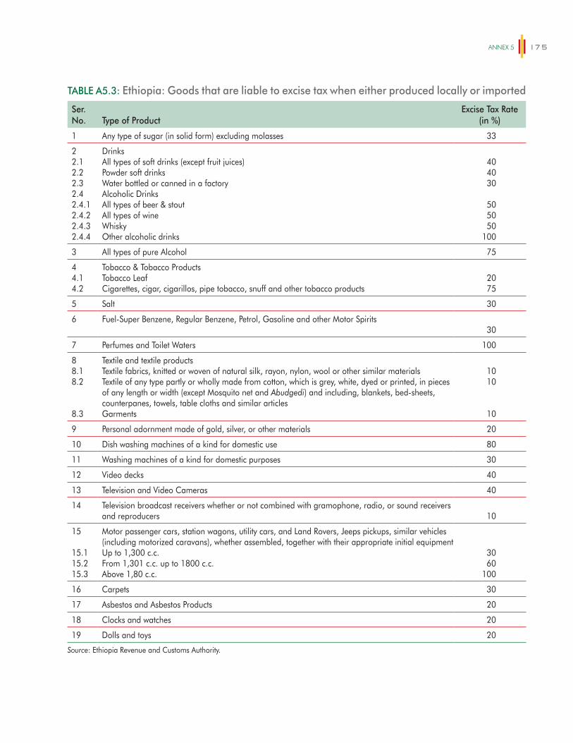
ANNex 5 175
TABLE A5.3: Ethiopia: Goods that are liable to excise tax when either produced locally or imported
Ser.No. Type of Product
Excise Tax Rate(in %)
1 Any type of sugar (in solid form) excluding molasses 33
22.12.22.32.42.4.12.4.22.4.32.4.4
DrinksAll types of soft drinks (except fruit juices)Powder soft drinksWater bottled or canned in a factoryAlcoholic DrinksAll types of beer & stoutAll types of wineWhiskyOther alcoholic drinks
404030
505050
100
3 All types of pure Alcohol 75
44.14.2
Tobacco & Tobacco ProductsTobacco LeafCigarettes, cigar, cigarillos, pipe tobacco, snuff and other tobacco products
2075
5 Salt 30
6 Fuel-Super Benzene, Regular Benzene, Petrol, Gasoline and other Motor Spirits30
7 Perfumes and Toilet Waters 100
88.18.2
8.3
Textile and textile productsTextile fabrics, knitted or woven of natural silk, rayon, nylon, wool or other similar materialsTextile of any type partly or wholly made from cotton, which is grey, white, dyed or printed, in pieces of any length or width (except Mosquito net and Abudgedi) and including, blankets, bed-sheets, counterpanes, towels, table cloths and similar articlesGarments
1010
10
9 Personal adornment made of gold, silver, or other materials 20
10 Dish washing machines of a kind for domestic use 80
11 Washing machines of a kind for domestic purposes 30
12 Video decks 40
13 Television and Video Cameras 40
14 Television broadcast receivers whether or not combined with gramophone, radio, or sound receivers and reproducers 10
15
15.115.215.3
Motor passenger cars, station wagons, utility cars, and Land Rovers, Jeeps pickups, similar vehicles (including motorized caravans), whether assembled, together with their appropriate initial equipmentUp to 1,300 c.c.From 1,301 c.c. up to 1800 c.c.Above 1,80 c.c.
3060
100
16 Carpets 30
17 Asbestos and Asbestos Products 20
18 Clocks and watches 20
19 Dolls and toys 20
Source: Ethiopia Revenue and Customs Authority.
ETHIOPIA – POVERTY ASSESSMENT176
in a standard competitive model, prices at shops that do not pay VAT would be the same as those at VAT-paying shops, with the benefits of non-payment going to the firm owner rather than to the govern-ment. Households suffer the incidence of the tax regardless of the tax status of the seller, though not all the benefits go to the fiscal authorities. In essence, the assumption here is that all households buy the same share of tax-paying goods so that the effects of tax avoidance or evasion on market prices are spread across the population in proportion to each house-hold’s expenditures.
A sensitivity analysis is also made using an alter-native way of estimating the impact of indirect taxes. In the benchmark estimate both the first and second round effects of all types of indirect taxes including VAT are included. This approach considers VAT to be similar to sales tax in which additional taxes are paid in each chain of the transaction. In the alterna-tive way, only the first effect of VAT on prices is esti-mated because in principle, producers and retailers are entitled for a refund of the VAT payments for input purchases making intermediate inputs tax-free. The only exceptions to this are items that are VAT exempt, which would have some indirect impact of VAT on intermediate goods. This is because if a good is VAT exempt, producers are not entitled for VAT refund for the inputs used in producing the item. As a result, in the sensitivity analysis, the first round effect of VAT is estimated for items on which VAT is levied, and then only the 2nd round effects is included for goods and services that are VAT exempt.
Since the sensitivity analysis excludes the second round effects of VAT on most items, the estimate of indirect tax burden using this method is slightly smaller than the estimate in the benchmark estimate. As a result, the associated income measures of post fis-cal income and final income become slightly higher in the sensitivity analysis. Apart from the slight change in level, the pattern of incidence of indirect taxes on the different income groups based on this method is similar to the pattern in the benchmark estimate. Thus the overall storyline of the relative burden of indirect
tax on different income groups does not change which-ever method is used.
Direct transfers
The 2011 HCES identifies households who received payment from the Productive Safety Net Program (PSNP) and households that receive food aid. Both PSNP payments and food aid payments were based on household size and so the beneficiary status of the households and the household size was used in conjunction with government PSNP and food aid expenditures to impute the value of transfers received by each household. We assume that Food Aid and PSNP transfers were distributed to all beneficiaries equally.
Subsidies
Item-level HCES data was used to estimate the amount of household’s consumption of wheat, kero-sene, and electricity. The subsidy per kg, liter and kilowatt-hours, for each good respectively was then applied to estimate the total value of the subsidy received by the household. The wheat subsidy was present in Addis Ababa City Administration only and so was only applied to households living in Addis Ababa. The wheat subsidy was 150 Birr per quintal. The electricity subsidy is provided in Table A5.4 and depends on the amount of electricity consumed. The tariff rate is progressive, but the rates in all ranges are below the unsubsidized tariff. The government regu-lates petroleum prices and kerosene was subsidized at Birr 2.17 per liter.
Education
The numbers of students enrolled in primary, second-ary and tertiary education recorded in the Welfare Monitoring Survey are used to determine the total number of individuals enrolled in primary, second-ary and tertiary education in each region. Unit costs of primary, secondary and tertiary education were
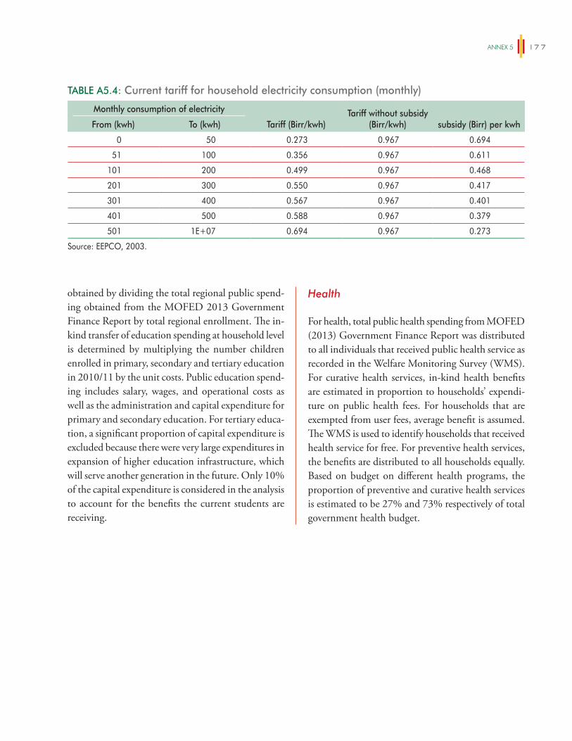
ANNex 5 177
obtained by dividing the total regional public spend-ing obtained from the MOFED 2013 Government Finance Report by total regional enrollment. The in-kind transfer of education spending at household level is determined by multiplying the number children enrolled in primary, secondary and tertiary education in 2010/11 by the unit costs. Public education spend-ing includes salary, wages, and operational costs as well as the administration and capital expenditure for primary and secondary education. For tertiary educa-tion, a significant proportion of capital expenditure is excluded because there were very large expenditures in expansion of higher education infrastructure, which will serve another generation in the future. Only 10% of the capital expenditure is considered in the analysis to account for the benefits the current students are receiving.
Health
For health, total public health spending from MOFED (2013) Government Finance Report was distributed to all individuals that received public health service as recorded in the Welfare Monitoring Survey (WMS). For curative health services, in-kind health benefits are estimated in proportion to households’ expendi-ture on public health fees. For households that are exempted from user fees, average benefit is assumed. The WMS is used to identify households that received health service for free. For preventive health services, the benefits are distributed to all households equally. Based on budget on different health programs, the proportion of preventive and curative health services is estimated to be 27% and 73% respectively of total government health budget.
TABLE A5.4: Current tariff for household electricity consumption (monthly)
Monthly consumption of electricity
Tariff (Birr/kwh)Tariff without subsidy
(Birr/kwh) subsidy (Birr) per kwhFrom (kwh) To (kwh)
0 50 0.273 0.967 0.694
51 100 0.356 0.967 0.611
101 200 0.499 0.967 0.468
201 300 0.550 0.967 0.417
301 400 0.567 0.967 0.401
401 500 0.588 0.967 0.379
501 1E+07 0.694 0.967 0.273
Source: EEPCO, 2003.

179
ANNEX 6
The Oaxaca-Blinder decomposition (introduced by Blinder (1973) and Oaxaca (1973) and hereon OB), on which the estimates presented in section 9.2 are based, estimates the following specifications:
YiM = X 'i
M bM (1)
YiF = X 'i
F b F (2)
Then, it decomposes the overall difference in Y in the following terms:
YM-Y
F= X i
MbM -X i
Fb F ± X i
FbM =
( X i
M-X i
F)bM + (bM -b F )X i
F
(3)
In this methodology, OLS estimations of equa-tions (1) and (2) are done using only male and female observations, respectively. Then, in equation (3) the counterfactual term (Y
M-Y
F= X i
MbM -X i
Fb F ± X i
FbM =
( X i
M-X i
F)bM + (bM -b F )X i
F
) is added and subtracted. This term represents the value of the dependent vari-able (Y) that females would obtain if they have the same returns to inputs (X) as males. The common support assumption is relevant at this point since the counterfactual term uses the results of an estima-tion done with male observations and employs it with the female observations. If the distribution of inputs (X) of either group has regions in which the other group has no observations, the counterfactual implies an extrapolation in the returns to inputs that may not be valid.
In the OB literature, equation (3) is interpreted as the addition of two terms: the endowment effect, ∆X = ( X i
M-X i
F)bM , which corresponds to the
part of the difference explained by the average differ-ence in the levels of inputs, and the structural effect,
∆O = (bM -b F )X i
F, which is usually referred to as
the “unexplained” part and corresponds to the differ-ence in the returns to inputs.
To solve this problem, Ñopo (2008) suggests the use of matching methods to divide the male and female samples in two parts: (i) the matched part of the sample, which corresponds to the observations that can be matched based on their input levels (X) with at least one observation of the other group, and (ii) the unmatched part of the sample, which corresponds to observations that cannot be matched. This method is employed in section 9.4. As a result, the unmatched individuals are those that have specific levels of inputs or characteristics (X) that are only found in one group. This would be the group out of the common support.
Once these groups are identified, the overall dif-ference in Y is decomposed in the following terms, which will be non-parametrically estimated following Ñopo’s methodology:
The components of the decomposition are the following:
1. Endowment effect:
∆X = EmM (Y |M )-Em
F (Y |M )
This component represents the difference in the aver-age level of the dependent variable (Y) that results from differences in the distribution of inputs. The sub-index m indicates that the estimation is only done using the matched observations (i.e. the sample in the common support). The term ∆X = Em
M (Y |M )-EmF (Y |M ) is the counterfactual
average income that females would receive if they were “paid as males.” The values for this component are calculated using matching methods. In summary,
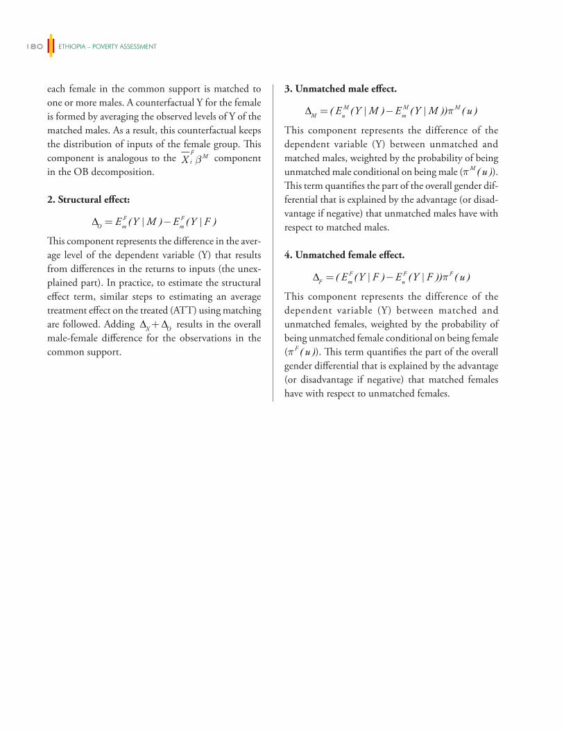
ETHIOPIA – POVERTY ASSESSMENT180
each female in the common support is matched to one or more males. A counterfactual Y for the female is formed by averaging the observed levels of Y of the matched males. As a result, this counterfactual keeps the distribution of inputs of the female group. This component is analogous to the X i
FbM component
in the OB decomposition.
2. Structural effect:
∆O = EmF (Y |M )-Em
F (Y |F )
This component represents the difference in the aver-age level of the dependent variable (Y) that results from differences in the returns to inputs (the unex-plained part). In practice, to estimate the structural effect term, similar steps to estimating an average treatment effect on the treated (ATT) using matching are followed. Adding ∆X+∆O results in the overall male-female difference for the observations in the common support.
3. Unmatched male effect.
∆M = ( EuM (Y |M )-Em
M (Y |M ))pM (u )
This component represents the difference of the dependent variable (Y) between unmatched and matched males, weighted by the probability of being unmatched male conditional on being male (∆M = ( Eu
M (Y |M )-EmM (Y |M ))pM (u )).
This term quantifies the part of the overall gender dif-ferential that is explained by the advantage (or disad-vantage if negative) that unmatched males have with respect to matched males.
4. Unmatched female effect.
∆F = ( EmF (Y |F )-Eu
F (Y |F ))pF (u )
This component represents the difference of the dependent variable (Y) between matched and unmatched females, weighted by the probability of being unmatched female conditional on being female (∆F = ( Em
F (Y |F )-EuF (Y |F ))pF (u )). This term quantifies the part of the overall
gender differential that is explained by the advantage (or disadvantage if negative) that matched females have with respect to unmatched females.
181
REFERENCES
Abramovsky, Laura, Orazio Attanasio, and David Phillips. 2011. A tax micro-simulator for Mexico (MEXTAX) and its application to the 2010 tax reforms.
Acemoglu, D. and R. Shimer. 2000. “Productivity gains from unemployment insurance.” European Economic Review 44(7), 1195–1224.
Aguilar, A., E. Carranza, M. Goldstein, T. Kilic, and G. Oseni. 2014. Decomposition of gender dif-ferentials in agricultural productivity in Ethiopia. Policy Research Working Paper Series 6764, The World Bank.
Alem, Yonas and Måns Söderbom. 2012. “Household-Level Consumption in Urban Ethiopia: The Effects of a Large Food Price Shock.” World Development, Elsevier, vol. 40(1), pages 146–162.
Alkire, Roche & Seth. 2013.: Multidimensional Poverty Index 2013.: Oxford Poverty & Human Development Initiative, University of Oxford.
Alkire, S. and J. Foster. 2007. “Counting and Multidimensional Poverty Measurements.” OPHI Working Paper No. 7, University of Oxford.
Alkire, S. and J.M. Roche. 2011. “How MPI Went Down: Dynamics and Comparisons.” Oxford Poverty & Human Development Initiative, University of Oxford.
Alkire, S. and M. E. Santos. 2013. “Measuring Acute Poverty in the Developing World: Robustness and Scope of the Multidimensional Poverty Index.” The Oxford Poverty & Human Development Initiative Working Paper No. 59, University of Oxford.
Alkire, S., A. Conconi, and S. Seth. 2014. “Multidimensional Poverty Index 2014: Brief Methodological Note and Results.” Oxford Poverty and Human Development Initiative, Oxford University. ophi.qeh.ox.ac.uk.
Alkire, S., J. M. Roche and A. Vaz. 2014. “Mult idimensional Pover ty Dynamics : Methodology and Results for 34 countries.” Oxford Poverty and Human Development Initiative, Oxford University. ophi.qeh.ox.ac.uk
Anttila-Hughes, Jesse K. and Solomon M. Hsiang. 2013. Destruction, Disinvestment, and Death: Economic and Human Losses Following Environmental Disaster. Mimeo. University of San Francisco.
Atkinson, A. B. 2003. “Multidimensional depriva-tion: Contrasting social welfare and counting approaches.” Journal of Economic Inequality, l (1): 51–65.
Atkinson, A. B. and M. A. Lugo. 2010. Growth, pov-erty and distribution in Tanzania. London School of Economics, London: International Growth Centre, Working Paper 10/0831.
Au, Chun-Chung and J. Vernon Henderson. 2006. “How migration restrictions limit agglom-eration and productivity in China.” Journal of Development Economics, Elsevier, vol. 80(2), pages 350–388, August.
Au, Chun-Chung and J. Vernon Henderson. 2006. “Are Chinese Cities Too Small?” Review of Economic Studies, Oxford University Press, vol. 73(3), pages 549–576.
Barrett, Christopher, Paswel Phiri Marenya, John Mcpeak, Bart Minten, Festus Murithi, Willis Oluoch-Kosura, Frank Place, Jean Claude Randrianarisoa, Jhon Rasambainarivo and Justine Wangila. 2006. “Welfare dynamics in rural Kenya and Madagascar.” Journal of Development Studies 42(2): 248–277.
Barrios, S., L. Bertinelli, and E. Strobl 2010. “Trends in rainfall and economic growth in Africa: A
ETHIOPIA – POVERTY ASSESSMENT182
neglected cause of the African growth tragedy.” The Review of Economics and Statistics.
Beegle, K. and G. Oseni. 2008. “Nonfarm Enterprises, Food Security, and Economic Shocks in Ethiopia.” Background paper for the Ethiopia Rural ICA.
Beegle, Kathleen, Joachim De Weerdt, and Stefan Dercon. 2011. “Migration and Economic Mobility in Tanzania: Evidence from a Tracking Survey.” The Review of Economics and Statistics.
Beneke, Margarita, Nora Lustig, and José Andrés Oliva. 2014. El impacto de los impuestos y el gasto social en la desigualdad y la pobreza en El Salvador. CEQ Working Paper No. 26, Center for Inter-American Policy and Research and Department of Economics, Tulane University and Inter-American Dialogue. Forthcoming.
Berhane, G. R.V. Hill, S. Dercon, and A. Seyoum Taffesse. 2014. The impact of insurance on agri-cultural investment: evidence from Ethiopia. Mimeo, IFPRI.
Bernard, Tanguy, Stefan Dercon, Kate Orkin, and Alemayehu Seyoum Taffesse. 2014. “The Future in Mind: Aspirations and Forward Looking Behavior in Rural Ethiopia.” Centre for Study of African Economies Working Paper 16, 1–48.
Besley, T. and T. Persson. 2011. “Public Finance and Development.” Draft chapter for the Handbook of Public Economics.
Bevan, Philippa, Catherine Dom, and Alula Pankhurst. 2011. Long Term Perspectives on Development Impacts in Rural Ethiopia: WIDE 3 Stage 1 Mixed Communities: Short summary, March 2011. Mokoro.
Bevan, Philippa, Catherine Dom, and Alula Pankhurst. 2013. Long Term Perspectives on Development Impacts in Rural Ethiopia: WIDE 3 Stage 2 Eight Food Insecure Communities: Short summary, March 2013. Mokoro.
Bevan, Philippa, Catherine Dom and Alula Pankhurst. 2014. Long Term Perspectives on Development Impacts in Rural Ethiopia: WIDE 3 Stage 3 Six Communities with Agricultural Potential: Short Summary, May 2014. Mokoro.
Bezu, Sosina, Christopher B Barrett, and Stein T. Holden. 2012. “Does the Nonfarm Economy Offer Pathways for Upward Mobility? Evidence from a Panel Data Study in Ethiopia.” World Development , Elsevier, vol. 40(8), pages 1634–1646.
Blinder, A. S. 1973. “Wage Discrimination: Reduced Form and Structural Estimates.” Journal of Human Resources, University of Wisconsin Press, vol. 8(4), pages 436–455.
Brockerhoff, Martin, and Ellen Brennan. 1998. “The Poverty of Cities in Developing Regions.” Population and Development Review 24, No. 1. (March).
Bucheli, Marisa, Nora Lustig, Máximo Rossi, and Florencia Amábile. 2014. “Social Spending, Taxes and Income Redistribution in Uruguay.” In Lustig, Nora, Carola Pessino and John Scott. 2014. Editors. The Redistributive Impact of Taxes and Social Spending in Latin America. Special Issue. Public Finance Review, May, Volume 42, Issue 3.
Buehren, N., M. Goldstein, T.A. Ketema, E. Molina, and A.Y Teklu. 2014. “The Impact of Strengthening Agricultural Extension Services: Evidence from Ethiopia.” Unpublished Manuscript.
Cabrera, Maynor, Nora Lustig, and Hilcías Morán. 2014. Fiscal Policy, Inequality and the Ethnic Divide in Guatemala. CEQ Working Paper No. 20, Center for Inter-American Policy and Research and Department of Economics, Tulane University and Inter-American Dialogue, April 2014. Forthcoming.
Canning, David, Sangeeta Raja, and Abdo Yazbeck. 2014. People powered growth for Africa’s Young Lions. World Bank Report, Africa Region.
Carranza, E. and J. Gallegos. 2013. Ethiopia Trends of Wellbeing 2000–2011. Poverty Reduction and Economic Management, Africa Region, World Bank.
Central Statistical Agency. 2013. Welfare Monitoring Survey-2011. Addis Ababa.
Central Statistical Agency [Ethiopia] and ICF International. 2012. Ethiopia Demographic and
ReFeReNCeS 183
Health Survey 2011. Addis Ababa, Ethiopia and Calverton, Maryland, USA: Central Statistical Agency and ICF International.
Central Statistics Agency. 2012. Inter-censal Population Survey, 2012.
Christiaensen, L., L. Demery, J. Kuhl. 2011. “The (evolving) role of agriculture in poverty reduc-tion—An empirical perspective.” Journal of Development Economics 96: 239–254.
Christiaensen, Luc, Punam Chuhan-Pole, and Aly Sanoh. 2013. “Africa’s Growth, Poverty and Inequality Nexus – Fostering Shared Prosperity.” World Bank, 2013, mimeo.
Dabalen, Andrew, Ambar Narayan, Jaime Saavedra-Chanduvi, and Alejandro Hoyos Suarez, with Ana Abras and Sailesh Tiwari. 2014. Do African Children Have an Equal Chance? A Human Opportunity Report for Sub-Saharan Africa. World Bank Report.
De Brauw, A., V. Mueller, and T. Woldehanna. 2013. “Motives to Remit: Evidence from Tracked Internal Migrants in Ethiopia.” World Development.
De Brauw, Alan. 2014. Migration, Youth and Agricultural Productivity in Ethiopia. Background Paper prepared for the Ethiopia Poverty Assessment.
Deininger, K., D. A. Ayalew, and T. Alemu. 2011. “Impacts of Land Certification on Tenure Security, Investment, and Land Market Participation: Evidence from Ethiopia.” Land Economics, University of Wisconsin Press, vol. 87(2), pages 312–334.
Deininger, Klaus, Jin, Songqing, and Xia, Fang. 2012. Moving off the farm: Land institutions to facilitate structural transformation and agricultural produc-tivity growth in China. Policy Research Working Paper Series 5949, The World Bank.
Dercon, Stefan. 2004. “Growth and Shocks: Evidence from Rural Ethiopia.” Journal of Development Economics 74 (2): 309–29.
Dercon, S. and A. Zeitlin. 2009. Rethinking Agriculture and Growth in Ethiopia: A Conceptual
Discussion. Paper prepared as part of a study on Agriculture and Growth in Ethiopia, March 2009.
Dercon, S. and R. V. Hill. 2009. Growth from Agriculture in Ethiopia: Identifying Key Constraints. Paper prepared as part of a study on Agriculture and Growth in Ethiopia, March 2009.
Dercon, S., Daniel O. Gilligan, John Hoddinott, and Tassew Woldehanna. 2009. “The Impact of Agricultural Extension and Roads on Poverty and Consumption Growth in Fifteen Ethiopian Villages.” American Journal of Agricultural Economics 91(4), pages 1007–1021.
Dercon, Stefan and Luc Christiaensen. 2011. “Consumption risk, technology adoption and poverty traps: Evidence from Ethiopia.” Journal of Development Economics 96(2), pages 159–173
Dercon, Stefan and Catherine Porter. 2012. “Live aid revisited: long-term impacts of the 1984 Ethiopian famine on children.” Journal of the European Economic Association.
Dercon, Stefan and Pramila Krishnan. 2000. “In Sickness and in Health: Risk Sharing within Households in Rural Ethiopia.” Journal of Political Economy, University of Chicago Press, vol. 108(4), pages 688–727, August.
Dercon, Stefan, John Hoddinott, and Tassew Woldehanna. 2005. “Shocks and consumption in 15 Ethiopian villages, 1999–2004.” Journal of African Economies
Development Planning and Research Directorate, Ministry of Finance and Economic Development (MOFED). 2013. Poverty and growth in Ethiopia (1995/96–2010/11): The poverty reduction legacy of Meles Zenawi and future challenges. MOFED, Addis Ababa.
Diao, Xinshen, Alemayehu Seyoum Taffesse, Paul A. Dorosh, James Thurlow, Alejandro Nin-Pratt, and Bingxin Yu. 2012. “Ethiopia.” in Xinshen Diao, James Thurlow, Samuel Benin, and Shenggen Fan (eds.), Strategies and priorities for African agricul-ture: Economy-wide perspectives from country stud-ies, Chapter 5, pp. 107–140, International Food Policy Research Institute (IFPRI).
ETHIOPIA – POVERTY ASSESSMENT184
Dorosh and Thurlow. 2013. Beyond Agriculture: Decomposing Non-Agricultural Growth Poverty Linkages.
Elbers, C., J.O. Lanjouw, and P. Lanjouw. 2003. “Micro-level Estimation of Poverty and Inequality,” Econometrica, 71(1):355–364.
Emran, M.S. and F. Shilpi. “The General Equilibrium Effect of Land Market Restriction on Labor Market: Evidence from Wages in Sri Lanka.” American Journal of Agricultural Economics, forthcoming.
Ethiopian Development Research Institute (EDRI). 2009. Ethiopian Social Accounting Matrix.
Fafchamps, M. and A. Quisumbing. 2005. “Assets at marriage in rural Ethiopia.” Journal of Development Economics, Elsevier, vol. 77(1), pages 1–25, June.
Fan, C. Cindy. 2008. China on the Move: Migration, the State, and the Household. London and New York, NY: Routledge.
FAO. 2011. “The State of Food and Agriculture 2010–2011: Women in Agriculture: Closing the Gender Gap for Development.” Rome.
Fay, M., and C. Opal. 2000. Urbanization without growth: a not-so-uncommon phenomenon. World Bank Policy Research Working Paper 2412
Federal Ministry of Health, 2013. Annual Performance Report 2012/13. Addis Ababa, Ethiopia.
Fei, J.C.H., and G. Ranis. 1964. Development of the Labor Surplus Economy: Theory and Policies. R. D. Irwin: Homewood, Ill.
Ferré, C., F.H.G. Ferreira, and Lanjouw, P. 2010. Is There a Metropolitan Bias? The Inverse Relationship between Poverty and City Size in Selected Developing Countries. Washington, DC: The World Bank, Policy Research Working Paper 5508.
Ferreira, F.H.G. 2010: Distributions in Motion: Economic Growth, Inequality, and Poverty Dynamics. World Bank.
Fer re i r a , F.H.G. and M.A. Lugo. 2012. Multidimensional Poverty Analysis: Looking for a Middle Ground. Policy Research Working Paper 5964.
Ferreria, F., P.G. Leite, and M. Ravallion. 2010. “Poverty reduction without economic growth? Explaining Brazil’s poverty dynamics.” 1985–2004. Journal of Development Economics 93(1): 20–36
Firpo, S., N. M. Fortin, and T. Lemieux. 2009. “Unconditional Quanti le Regress ions.” Econometrica, Vol. 77, No. 3, 953–973
Foster, J., J. Greer, and E. Thorbecke. 1984. “A class of decomposable poverty measures.” Econometrica Vol. 52: 761–766.
Fox, L. and M. Gaal. 2008. Working Out of Poverty. The World Bank, Washington DC.
Franklin, S. 2014. Work, Unemployment and Job Search among the Youth in Urban Ethiopia. Background Paper prepared for the Ethiopia Poverty Assessment.
Fullerton, D. and G. Metcalf. 2002. “Tax Incidence.” In Handbook of Public Economics 4, Auerbach, A. and Feldstein, M. (eds.), Elsevier Science, Amsterdam, 1787–1872.
Gilligan, D., J. Hoddinott, N. Kumar, A. Taffesse. 2010. Targeting food security interventions when “everyone is poor.” The case of Ethiopia’s Productive Safety Net Programme. International Food Policy Research Institute, Washington DC.
Gilligan, Daniel, John Hoddinot, and Alemayehu Seyoum Taffesse. 2009. “The Impact of Ethiopia’s Productive Safety Net Programme and its Linkages.” Journal of Development Studies 45(10), pages 1684–1706.
Gollin, D., R. Jedwab, and D. Vollrath. 2013. Urbanization with and without Industrialization. mimeo.
Gollin, Douglas, David Lagakos, and Michael Waugh. 2014. “The Agricultural Productivity Gap.” Quarterly Journal of Economics 129(2).
Haggblade S., P. Hazell, and T. Reardon. 2010. “The Rural Nonfarm Economy: Prospects for Growth and Poverty Reduction.” World Development, Vol. 38, No. 10, pp. 1429–1441.
Hassan, Ibrahim Worku and Alemayehu Seyoum Taffesse. 2014. Decomposing the Growth of
ReFeReNCeS 185
Household Consumption Expenditure to Identify the Contribution of Wellbeing Covariates in Ethiopia. ESSP Working Paper, forthcoming.
Headey, Derek, Fantu Bachewe Nisrane, Ibrahim Worku, Mekdim Dereje, and Alemayehu Seyoum Taffesse. 2012. Urban Wage Behavior and Food Price Inflation: The Case of Ethiopia. ESSP Working Paper 41.
Higgins, Sean and Claudiney Pereira. 2014. “The Effects of Brazil’s Taxation and Social Spending on the Distribution of Household Income.” In Lustig, Nora, Carola Pessino and John Scott. 2014. Editors. The Redistributive Impact of Taxes and Social Spending in Latin America. Special Issue. Public Finance Review, May, Volume 42, Issue 3.
Higgins, Sean and Nora Lustig, 2014. Measuring Fiscal Impoverishment. Dissertation Essay, Department of Economics, Tulane University, May.
Hill, R.V. and C. Porter. 2014. A vulnerability Assessment for Ethiopia. Background Paper pre-pared for the Productive Safety Net Programme and the Ethiopia Poverty Assessment.
Hoddinott, John, Alemayehu Seyoum Taffesse, and Yisehac Yohannes. 2014. Locus of control and economic behavior in rural Ethiopia. IFPRI Mimeo.
Hoddinott, John, Guush Berhane, Daniel O. Gilligan, Neha Kumar, and Alemayehu Seyoum Taffesse. 2012. The Impact of Ethiopia’s Productive Safety Net Programme and Related Transfers on Agricultural Productivity. Journal of African Economies 21(5): 761–786.
Inchauste, Gabriela, Nora Lustig, Mashekwa Maboshe, Ingrid Woolard. 2014. “The Distributional Impact of Fiscal Policy in South Africa” World Bank (forthcoming).
Jaramillo, Miguel. 2014. “The Incidence of Social Spending and Taxes in Peru.” In Lustig, Nora, Carola Pessino and John Scott. 2014. Editors. The Redistributive Impact of Taxes and Social Spending in Latin America. Special Issue. Public Finance Review, May, Volume 42, Issue 3.
Jellema, Jon, Matthew Wai-Poi, and Rythia Afkar. 2014. “The Distributional Impact of Fiscal Policy in Indonesia.” World Bank (forthcoming).
Jolliffe, Dean, Gbemisola Oseni, Ilana Seff. Alemayehu Ambel, Julia Kowalski, Alina Lipcan, Katie McIntosh, Remy Smida, and Signe Jung Sørensen. 2014. Nonfarm Enterprises in Rural Ethiopia: Improving Livelihoods by Generating Income and Smoothing Consumption? Background Paper prepared for the Ethiopia Poverty Assessment, World Bank.
Kakwani, N. 1993. Statistical inference in the mea-surement of poverty. Review of Economics and Statistics 75 (4): 632–639.
Kalwij, Adriaan and Arjan Verschoor. 2005. A Decomposition of Poverty Trends across Regions: The Role of Variation in the Income and Inequality Elasticities of Poverty, Working Paper Series RP2005/36, World Institute fo r Deve lopment Economic Resea rch (UNU-WIDER).
Khan, Qaiser M., Jean-Paul Faguet, Christopher Gaukler, and Wendmsyamregne Mekasha. 2014. Improving Basic Services for the Bottom Forty Percent: Lessons from Ethiopia. World Bank, Washington, DC.
Kilic, T., A. Palacios-Lopez, and M. Goldstein. 2013. Caught in a productivity trap: a distributional perspective on gender differences in Malawian agriculture. Policy Research Working Paper Series 6381, The World Bank.
Kondylis, F. and V. Mueller. 2012. Seeing is Believing? Evidence from a Demonstration Plot Experiment in Mozambique. MSSP working papers 1, International Food Policy Research Institute (IFPRI).
Kowalski, Julia, Alina Lipcan, Katie McIntosh, Remy Smida, Signe Jung Sørensen, Dean Jolliffe, Gbemisola Oseni, Ilana Seff and Alemayehu Ambel. 2014. Nonfarm Enterprises in Rural Ethiopia: Improving Livelihoods by Generating Income and Smoothing Consumption? Background paper prepared for the Ethiopia Poverty Assessment.
ETHIOPIA – POVERTY ASSESSMENT186
Lanjouw, P. and R. Murgai. 2009. “Poverty Decline, Agricultural Wages, and Non-Farm Employment in Rural India 1983–2004.” Agricultural Economics. 40(2): 243–263
Lewis, W. Arthur. 1954. “Economic Development with Unlimited Supplies of Labour,” The Manchester School 22(2): 139–191.
Ligon, E., and E. Sadoulet. 2007. Estimating the Effects of Aggregate Agricultural Growth on the Distribution of Expenditures. Background paper for the World Development Report 2008.
Loayza, N., and C. Raddatz. 2010. “The composition of growth matters for poverty alleviation.” Journal of Development Economics 93 (1): 137–151.
Loening, J. L., B. Rijkers, and M. Söderbom. 2008. Non-farm microenterprises and the investment climate: Evidence from rural Ethiopia. World Bank Policy Research working paper 4577
Lucas, Robert E.B., and Oded Stark (1985). “The New Economics of Labor Migration,” American Economic Review Papers and Proceedings 75(2): 173–178.
Lustig and Higgins. 2013. Measuring Impoverishment: An Overlooked Dimension of Fiscal Incidence. Tulane University Economics Working Paper 1315, New Orleans, Louisiana, April 2013 and CEQ Working Paper No. 14, New Orleans, Louisiana, April
Lustig, Nora and Carola Pessino. 2014. “Social Spending and Income Redistribution in Argentina in the 2000s: the Rising Role of Noncontributory Pensions.” Public Finance Review, May 2014, Volume 42, Issue 3.
Lustig, Nora and Sean Higgins. 2012. Fiscal Incidence, Fiscal Mobility and the Poor: a New Approach. CEQ Working Paper No. 4, September. Available at: http://stonecenter.tulane.edu/uploads/Lustig.Fiscal_Incidence,_Fiscal_Mobility_and_the_Poor-_A_New_Approach._April2012–1344004195.pdf
Lustig, Nora, Carola Pessino, and John Scott. 2014. “The Impact of Taxes and Social Spending on Inequality and Poverty in Latin America:
Argentina, Bolivia, Brazil, Mexico, Peru and Uruguay. Introduction to Special Issue,” Public Finance Review, May 2014, Volume 42, Issue 3, published online November 20, 2013
Lustig, Nora, et.al. 2013. Commitment to Equity: The Impact of Taxes and Social Spending in Inequality and Poverty in Argentina, Bolivia, Brazil, Mexico, Peru, and Uruguay: an Overview. CEQ working paper #13.
Lustig, Nora. 2014. Taxes, Transfers, Inequality and the Poor in the Developing World. Round 1. CEQ Working Paper No. 23, Center for Inter-American Policy and Research and Department of Economics, Tulane University and Inter-American Dialogue. Forthcoming.
Lustig, Nora. and Sean Higgins. 2013. Commitment to Equity Assessment (CEQ): Estimating the Incidence of Social Spending, Subsidies and Taxes. Handbook. CEQ Working Paper No. 1, Center for Inter-American Policy and Research and Department of Economics, Tulane University and Inter-American Dialogue.
Martins, P. 2014. Structural Change in Ethiopia: An Employment Perspective. World Bank Policy Research Working Paper No. 6749
Mekonnen, D. K., J. H. Dorfman, and E. G. Fonsah. 2013. Productivity and Efficiency of Small Scale Agriculture in Ethiopia. 2013 Annual Meeting, February 2–5, 2013, Orlando, Florida 143038, Southern Agricultural Economics Association.
Ministry of Finance and Economic Development. MOFED. 2006. Ethiopia: Building on Progress: A Plan for Accelerated and Sustained Development to End Poverty (PASDEP) 2005/06–2009/10, Addis Ababa, Ethiopia
Ministry of Finance and Economic Development (MOFED). 2008. Dynamics of Growth and Poverty in Ethiopia 1995/96–2004/05. Addis Ababa, Ethiopia.
Ministry of Finance and Economic Development (MOFED). 2010. Ethiopia Growth and Transformational Plan 2010/11–2014/15. Volume I, Main Text. Addis Ababa, Ethiopia.
ReFeReNCeS 187
Ministry of Finance and Economic Development (MOFED). 2012. Ethiopia’s Progress Towards Eradicating Poverty: An Interim Report on Poverty Analysis Study (2010/11). Addis Ababa, Ethiopia.
Ministry of Finance and Economic Development (MOFED). 2013. Development and Poverty in Ethiopia 1995/96–2010/11. Addis Ababa, Ethiopia
Minten, B., D. Stifel, and S. Tamru. 2012. Structural Transformation in Ethiopia: Evidence from Cereal Markets. ESSP 2 Working Paper 39.
Minten, B., B. Koro and D. Stifel. 2014. The Last Mile(s) in Modern Input Distribution: Evidence from Northwestern Ethiopia. ESSP 2 Working Paper 51.
Montalvo, Jose G. and Martin Ravallion. 2010. “The pattern of growth and poverty reduction in China.” Journal of Comparative Economics, Elsevier, vol. 38(1), pages 2–16, March.
Ñopo, H. 2008. “An extension of the Blinder-Oaxaca decomposition to a continuum of comparison groups.” Economics Letters, Elsevier, vol. 100(2), pages 292–296, August.
Oaxaca, R. 1973. “Male-Female Wage Differentials in Urban Labor Markets.” International Economic Review, vol. 14(3), pages 693–709, October.
Olinto, Pedro and Maya Sherpa. 2014. Targeting Assessment and Ex-Ante Impact Simulations of Addis Ababa Safety Net. Background Paper pre-pared for the Ethiopia Poverty Assessment.
Oseni, G., P. Corral, M. Goldstein, and P. Winters. 2014. Explaining gender differentials in agri-cultural production in Nigeria. Policy Research Working Paper Series 6809, The World Bank.
Oxfam. 2013. “Women’s Collective Action Unlocking the potential of agricultural markets,” Oxford: Oxfam International.
Oxford Poverty and Human Development Initiative. 2014. Global Multidimensional Poverty Index Databank. OPHI, University of Oxford.
Paz Arauco, Verónica, George Gray Molina, Wilson Jiménez Pozo, and Ernesto Yáñez Aguilar. 2014. “Explaining Low Redistributive Impact in
Bolivia.” In Lustig, Nora, Carola Pessino and John Scott. 2014. Editors. The Redistributive Impact of Taxes and Social Spending in Latin America. Special Issue. Public Finance Review, May, Volume 42, Issue 3.
Plavgo, Ilze, Martha Kibur, Mahider Bitew, Tesfayi Gebreselassie, Matusda Yumi, and Roger Pearson. 2013. Multidimensional child Deprivation Trend Analysis in Ethiopia, Further analysis of the 2000, 2005, and 2011 Demographic and Health Surveys. DHS Further analysis Reports No. 83. Calverton MD: ICF International.
Porter, Catherine. 2012. “Shocks, Consumption and Income Diversification in Rural Ethiopia.” Journal of Development Studies, Taylor & Francis Journals, vol. 48(9), pages 1209–1222, September.
Poschke, Markus. 2014. A model of Entrepreneurship and Employment in Ethiopia: Simulating the impact of an urban safety-net. Background Paper prepared for the Ethiopia Poverty Assessment.
PovcalNet. World Bank. http://iresearch.worldbank.org/PovcalNet/index.htm. Downloaded on June 4, 2014.
Ravallion, M. 1992. Poverty comparisons—A guide to concepts and methods. Living Standards Measurement Survey Discussion Paper 88. Washington, D.C.: World Bank.
Ravallion, Martin and Monika Huppi. 1991. “Measuring Changes in Poverty: A Methodological Case Study of Indonesia during an Adjustment Period.” World Bank Economic Review, World Bank Group, vol. 5(1), pages 57–82, January.
Ravallion, Martin, and Gaurav Datt. 1996. “How important to India’s poor is the sectoral com-position of economic growth?” The World Bank Economic Review 10 (1), 1–2
Rijkers, B. and R. Costa. 2012. Gender and Rural Non-Farm Entrepreneurship. World Development.
Rijkers, B. and M. Söderbom. 2013. The Effects of Risk and Shocks on Non-Farm Enterprise Development in Rural Ethiopia. World Development.
Robinson, S., K. Strzepek and R. Cervigni. 2013. The Cost of Adapting to Climate Change in Ethiopia:
ETHIOPIA – POVERTY ASSESSMENT188
Sector-Wise and Macro-Economic Estimates. ESSP2 Discussion Paper 53.
Schmidt, E. and M. Kedir. 2009. Urbanization and Spatial Connectivity in Ethiopia: Urban Growth Analysis Using GIS. ESSP2 Discussion Paper 3.
Scott, John. 2014. “Redistributive Impact and Efficiency of Mexico’s Fiscal System.” In Lustig, Nora, Carola Pessino and John Scott. 2014. Editors. The Redistributive Impact of Taxes and Social Spending in Latin America. Special Issue. Public Finance Review, May, Volume 42, Issue 3.
Serneels, Pieter. 2007. “The nature of unemployment among young men in urban Ethiopia.” Review of Development Economics.
Shilpi, Forhad and Jiaxiong Yao. 2014. Internal Migration in Ethiopia: Stylized Facts from Population Census, 2007. Background Paper prepared for the Ethiopia Poverty Assessment.
Söderbom, M. 2012. “Firm Size and Structural Change: A Case Study of Ethiopia.” Journal of African Economies, Vol. 21, AERC Supplement 2, pp. ii126–ii151
Sohnesen, Thomas P. 2013. 2011 Ethiopia Poverty Map Technical Report. Mimeo, World Bank, November, 2013
Spielman, David J., Derek Byerlee, Dawit Alemu, and Dawit Kelemework. 2010. “Policies to promote cereal intensification in Ethiopia: The search for appropriate public and private roles.” Food Policy, Elsevier, vol. 35(3), pages 185–194, June.
Stifel, D. B. Minten, and B. Koro. 2012. Economic Benefits and Returns to Rural Feeder Roads: Evidence from a Quasi-Experimental Setting in Ethiopia. ESSP 2 Working Paper 40.
Taffesse, A. S., P. Dorosh, S. and Asrat. 2011. Crop Production in Ethiopia: Regional Patterns and Trends. Ethiopia Strategy Support Program II Working Paper No. 0016.
Taylor, J. E. and P.L. Martin. 2001. Human capi-tal: Migration and rural population change. in G. Rausser and B. Gardner, eds., Handbook of Agricultural Economics. Elsevier Science Publishers, New York.
Teklu E., T. Mamo, S. Kidanu, and M. Abebe. 2000. Response of Some Durum Wheat Landraces to Nitrogen Application on Ethiopian Vertisols. Paper presented on the 11th Regional Wheat Workshop for Eastern, Central and Southern Africa Sept. 18–24, 2000. Addis Ababa, Ethiopia.
Thomas, Timothy, Luc Christiaensen, Quy Toan Do and Le Dang Trung. 2010. Natural Disasters and Household Welfare Evidence from Vietnam. World Bank Policy Research Working Paper Series 5491.
Tiruneh, A., T. Tesfaye, W. Mwangi, and H. Verkuijl. 2001. Gender Differentials in Agricultural Production and Decision-Making Among Smallholders in Ada, Lume, and Gimbichu Woredas of the Central Highlands of Ethiopia. EARO, CIMMYT, funded by the European Union.
United Nations Children’s Fund. 2013. Female Genital Mutilation/Cutting: A statistical overview and exploration of the dynamics of change. UNICEF, New York.
Vandercasteelen, Joachim, Mekdim Dereje, Bart Minten, and Alemayehu Seyoum Taffesse. 2013. Scaling-up adoption of improved technologies: The impact of the promotion of row planting on farmers’ teff yields in Ethiopia. LICOS Discussion Paper Series Discussion Paper 344/2013
Woldehanna, T. and A. Oskam. 2001. Income diver-sification and entry barriers: evidence from the Tigray region of northern Ethiopia. Journal of Food Policy.
Woldehanna, Tassew, Retta Gudisa, Yisak Tafere and Alula Pankhurst. 2011. Understanding Changes in the Lives of Poor Children: Initial Findings from Ethiopia. Young Lives Round 3 Survey Report.
World Bank & International Food Policy Research Institute. 2010. “Gender and governance in rural services: insights from India, Ghana, and Ethiopia. Washington.” Washington DC: The World Bank.
ReFeReNCeS 189
World Bank & The ONE Campaign. 2014. “Levelling the Field. Improving Opportunities for Female Farmers in Africa.” Washington DC: The World Bank.
World Bank. 2013. Ethiopia Economic Update II: Laying the foundation for achieving middle-income status.
World Bank. 2014. Final Report of “Powering Up: Social Empowerment for Vulnerable Girls.” A project of the Italian Trust Fund of Children and Youth in Africa (CHYAO).
World Bank. 2009. World Development Report 2009.World Bank. 2012. World Development Report 2012.Younger, Stephen D. and Artsvi Khachatryan. 2014.
Fiscal Incidence in Armenia. Background Paper for World Bank Armenia Public Expenditure Review. (forthcoming)
Yilma, Zelalem, Anagaw Mebratie, Robert Sparrow, Degnet Abebaw, Marleen Dekker, Getnet Alemu and Arjun S. Bedi. 2013. Coping with Shocks in rural Ethiopia. International Institute of Social Studies Working Paper 560, Rotterdam.

Related Documents


![Federal Democratic Republic of Ethiopia, Central …€¦ · federal democratic republic of ethiopia central statistical agency agricultural sample survey 2007/08 [2000 e.c.] volume](https://static.cupdf.com/doc/110x72/5b5f048a7f8b9a8b4a8d6df3/federal-democratic-republic-of-ethiopia-central-federal-democratic-republic.jpg)