Data Structure Visualization Vikrant Colaso Kunal Garach Anuj Shah

Data Structure Visualization
Jan 02, 2016
Data Structure Visualization. Vikrant Colaso Kunal Garach Anuj Shah. Why use animation for visualizing Data Structures?. Instead of students mentally running the algorithm, the animation helps rapid perception of the data structures. - PowerPoint PPT Presentation
Welcome message from author
This document is posted to help you gain knowledge. Please leave a comment to let me know what you think about it! Share it to your friends and learn new things together.
Transcript
Data Structure Visualization
Vikrant ColasoKunal GarachAnuj Shah
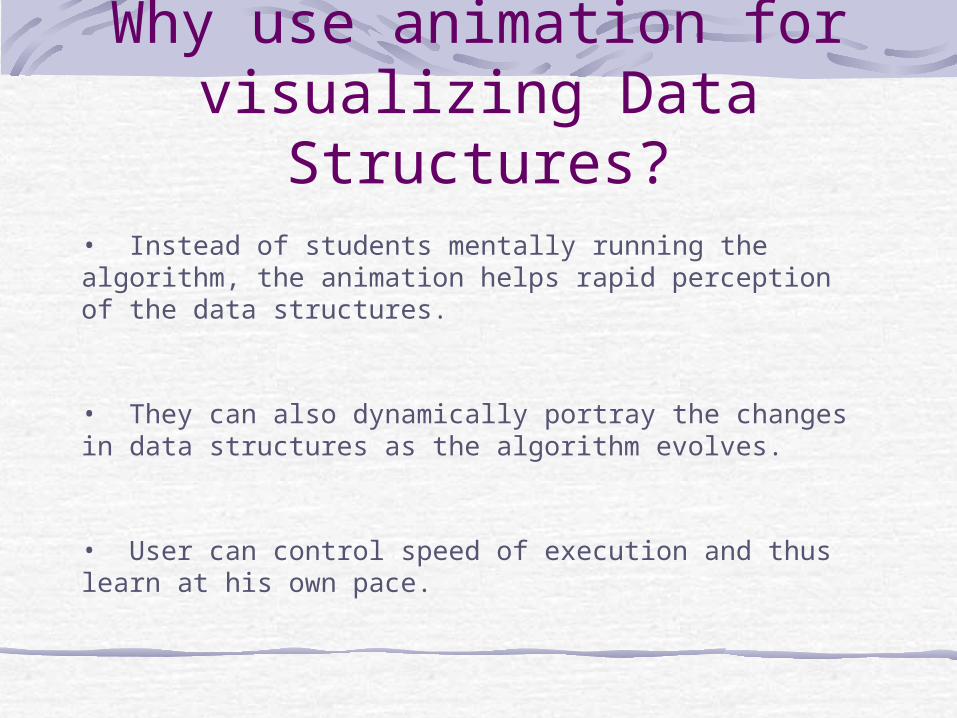
Why use animation for visualizing Data
Structures?• Instead of students mentally running the algorithm, the animation helps rapid perception of the data structures.
• They can also dynamically portray the changes in data structures as the algorithm evolves.
• User can control speed of execution and thus learn at his own pace.
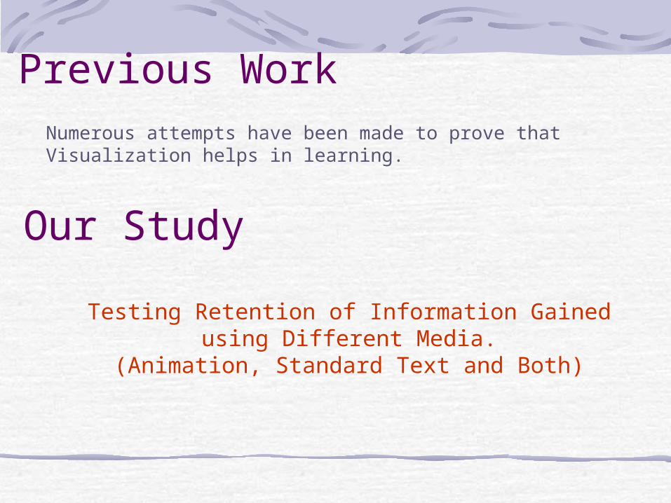
Previous WorkNumerous attempts have been made to prove that Visualization helps in learning.
Our Study
Testing Retention of Information Gained using Different Media.(Animation, Standard Text and Both)
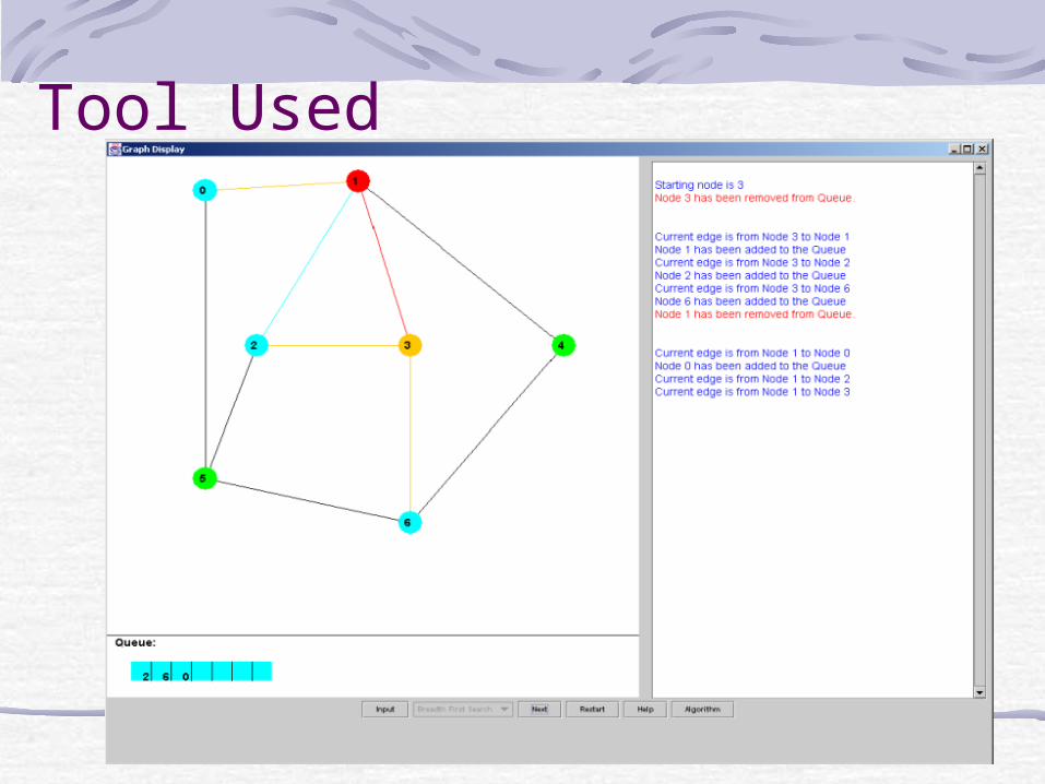
Tool Used
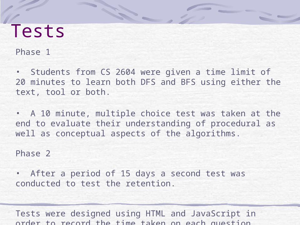
TestsPhase 1
• Students from CS 2604 were given a time limit of 20 minutes to learn both DFS and BFS using either the text, tool or both.
• A 10 minute, multiple choice test was taken at the end to evaluate their understanding of procedural as well as conceptual aspects of the algorithms.
Phase 2
• After a period of 15 days a second test was conducted to test the retention.
Tests were designed using HTML and JavaScript in order to record the time taken on each question.
Data Collected
Demographic Survey:Name, GPA, Prior knowledge of Graph and Graph searching techniques.
Post Test Questionnaire:Understanding of algorithms, prediction of score, helpfulness of presented
material, comments on the material.
Tests:Time taken on each question, total scored on each category of questions.
Data Analysis
• Using Spotfire and Excel.
• ANOVA, T- tests.
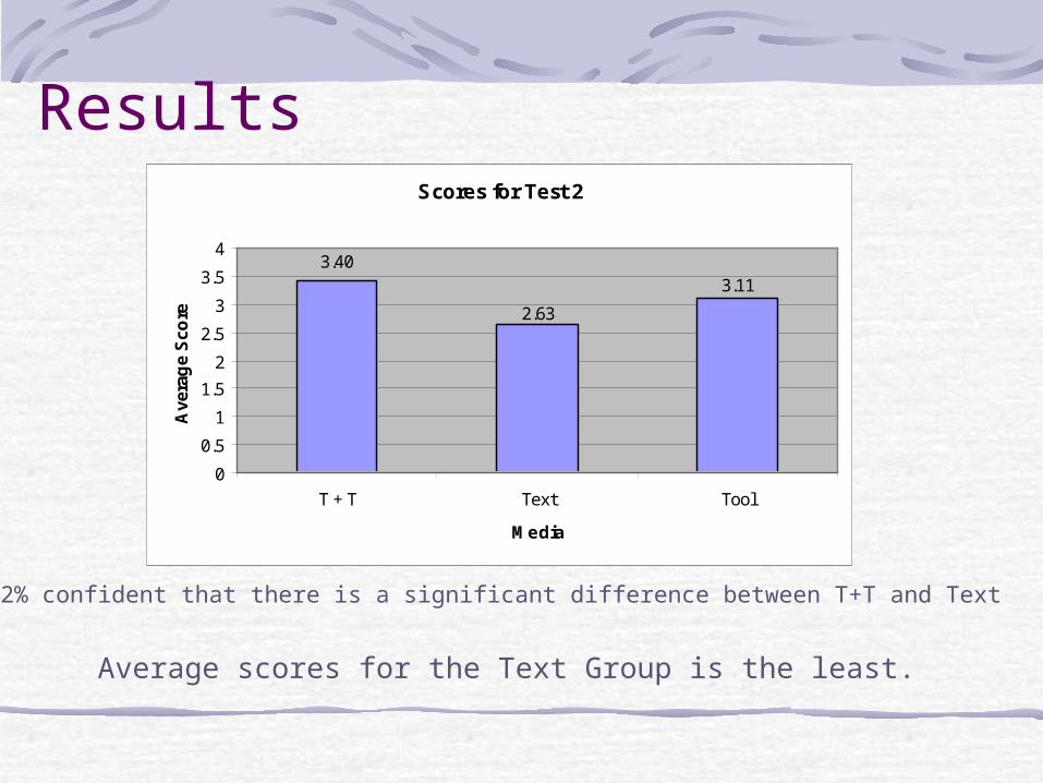
Results
Average scores for the Text Group is the least.
Scores for Test 2
3.40
2.63
3.11
0
0.5
1
1.5
2
2.5
3
3.5
4
T + T Text Tool
Media
Ave
rag
e S
core
82% confident that there is a significant difference between T+T and Text
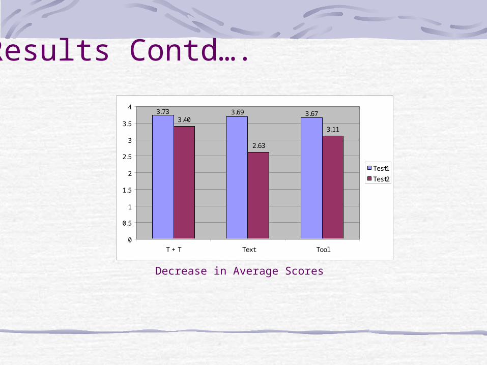
Decrease in Average Scores
3.40
2.63
3.11
3.673.693.73
0
0.5
1
1.5
2
2.5
3
3.5
4
T + T Text Tool
Test1
Test2
Results Contd….
Results Contd….
Better
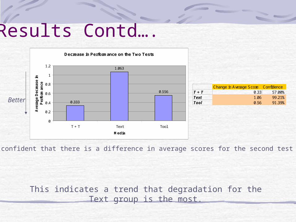
Decrease in Performance on the Two Tests
0.333
1.063
0.556
0
0.2
0.4
0.6
0.8
1
1.2
T + T Text Tool
Media
Ave
rag
e D
ecre
ase i
n
Per
form
ance Change in Average Score Confidence
T + T 0.33 57.00%Text 1.06 99.21%Tool 0.56 91.39%
79.83% confident that there is a difference in average scores for the second test
This indicates a trend that degradation for the Text group is the most.
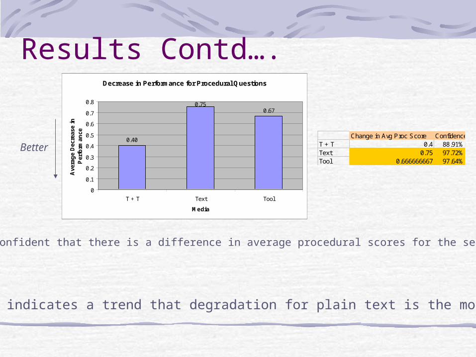
Results Contd….Decrease in Performance for Procedural Questions
0.40
0.670.75
0
0.1
0.2
0.3
0.4
0.5
0.6
0.7
0.8
T + T Text Tool
Media
Ave
rag
e D
ecre
ase
in
Per
form
ance
Better
This indicates a trend that degradation for plain text is the most.
Change in Avg Proc Score ConfidenceT + T 0.4 88.91%Text 0.75 97.72%Tool 0.666666667 97.64%
61.50% confident that there is a difference in average procedural scores for the second test
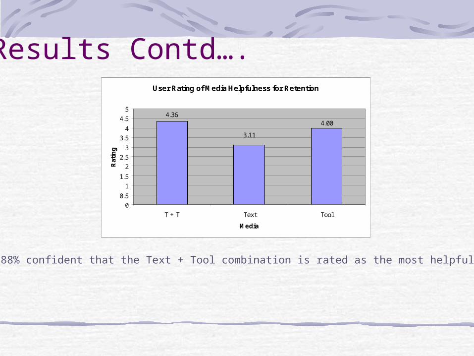
Results Contd….User Rating of Media Helpfulness for Retention
4.364.00
3.11
0
0.5
1
1.5
2
2.5
3
3.5
4
4.5
5
T + T Text Tool
Media
Rat
ing
99.88% confident that the Text + Tool combination is rated as the most helpful.
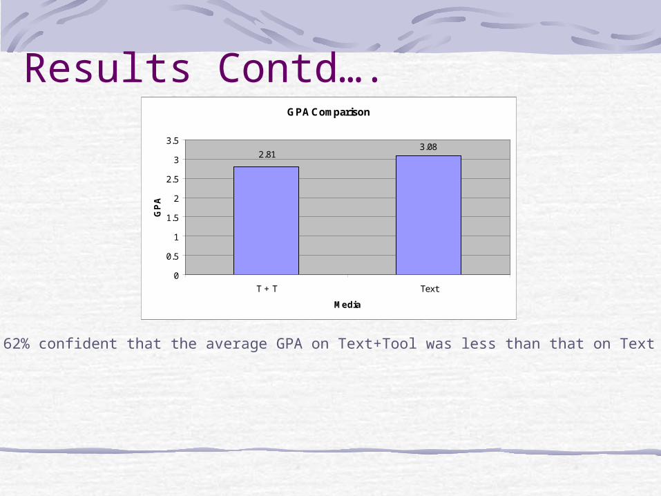
Results Contd….GPA Comparison
3.082.81
0
0.5
1
1.5
2
2.5
3
3.5
T + T Text
Media
GP
A
88.62% confident that the average GPA on Text+Tool was less than that on Text
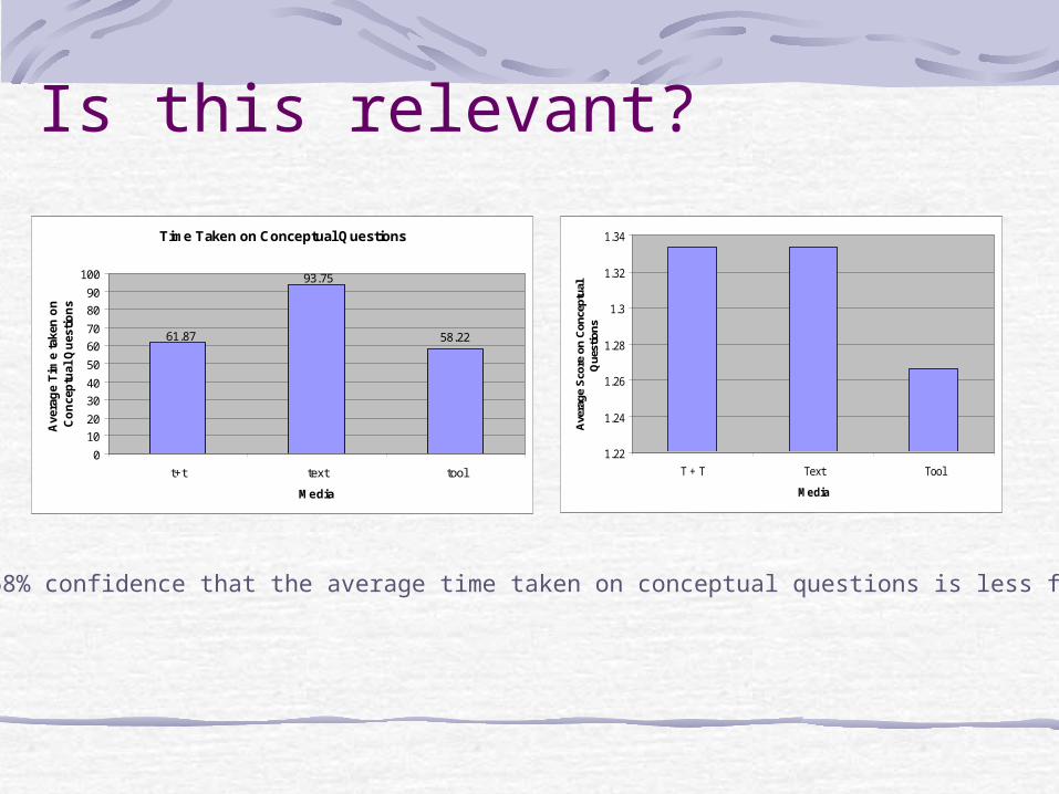
Is this relevant?
Time Taken on Conceptual Questions
58.22
93.75
61.87
0
10
20
30
40
50
60
70
80
90
100
t+t text tool
Media
Ave
rag
e T
ime
take
n o
n
Co
nce
ptu
al Q
ues
tio
ns
91.68% confidence that the average time taken on conceptual questions is less for tool.
1.22
1.24
1.26
1.28
1.3
1.32
1.34
T + T Text Tool
Media
Ave
rage
Sco
re o
n C
once
ptua
l Q
uest
ions
Summary of Trends in data
• A poor average score for those who used the text on the 2nd test.
• A poorer average score on procedural questions as well for those using the text.
• The textual material was the least appreciated.
• GPAs of students on the text were on an average higher than those using both the text and the tool.
Conclusions
General Comments:
• Almost all the students liked the Tool and felt that it was a novel method for teaching.
• Those who got the Text felt they may have done better with a graphical visualization of the data structures.
• Remembering the algorithms was difficult for almost all the students however those using the tool could remember some of the steps.
Further Work
Recommend that students be given a longer time/Assignments with the tool to notice a trend.
Recommend testing with review of material before taking the second test.
Recommend using a tool with speed control, history and other enhancements.
Studies should be conducted with a larger number of students and questions.
Related Documents