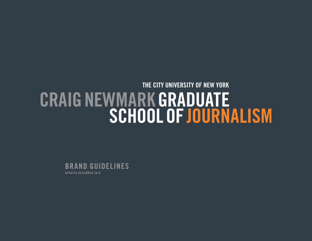
BRAND GUIDELINES UPDATED DECEMBER 2018

Welcome message from author
This document is posted to help you gain knowledge. Please leave a comment to let me know what you think about it! Share it to your friends and learn new things together.
Transcript
BRAND GUIDELINESUPDAT ED DECEMBER 2018
CR AIG NE W M A RK GR A DUAT E SCHOOL OF JOURN A L ISM / BR A ND GUIDEL INE S / 2
Just as every person has a unique identity, the Craig Newmark Graduate School of Journalism at the City University of New York has a unique personality. The Guidelines that follow are intended to define those elements and principles, both mandatory and optional.
Building our Brand
As the school grows and a growing number of people are involved with communications actions and decisions affecting perception of the school, it is important that we speak with one voice, in a distinctive, consistent and effective manner.
It is more than just the name and logo. In today’s fast-paced environment, immediate recognition is central and part of building the perception of a world-class and global brand. Every point of contact, through traditional or digital media, is an opportunity to reinforce our identity and build long-term preference and differentiation.

CR AIG NE W M A RK GR A DUAT E SCHOOL OF JOURN A L ISM / BR A ND GUIDEL INE S / 3TA BL E OF CON T EN T S
Basic Graphic Standards 4
1.1 GSJ Logo & Signatures
1.2 Use of University Identity
1.3 Color Palette
1.4 Display Principles
1.5 Supporting Type/Typography
Stationery System 13
2.1 Letterhead
2.2 Cards, Envelopes
2.3 Other applications
Print System 17
3.1 Print
3.2 Examples
3.3 Print System Typography
Digital & Social Media 20
4.1 Web
4.2 Social Media
Secondary Brands 25
5.1
5.2 Examples
Sign System 29
6.1 Family of Signs
6.2 Examples
6.3 Application Principles
Promotions & Events 33
7.1
7.2 Examples
CR AIG NE W M A RK GR A DUAT E SCHOOL OF JOURN A L ISM / BR A ND GUIDEL INE S / 4
1 BASIC GRAPHIC STANDARDS
BA SIC GR A PHIC S TA NDA RDS CR AIG NE W M A RK GR A DUAT E SCHOOL OF JOURN A L ISM / BR A ND GUIDEL INE S / 5
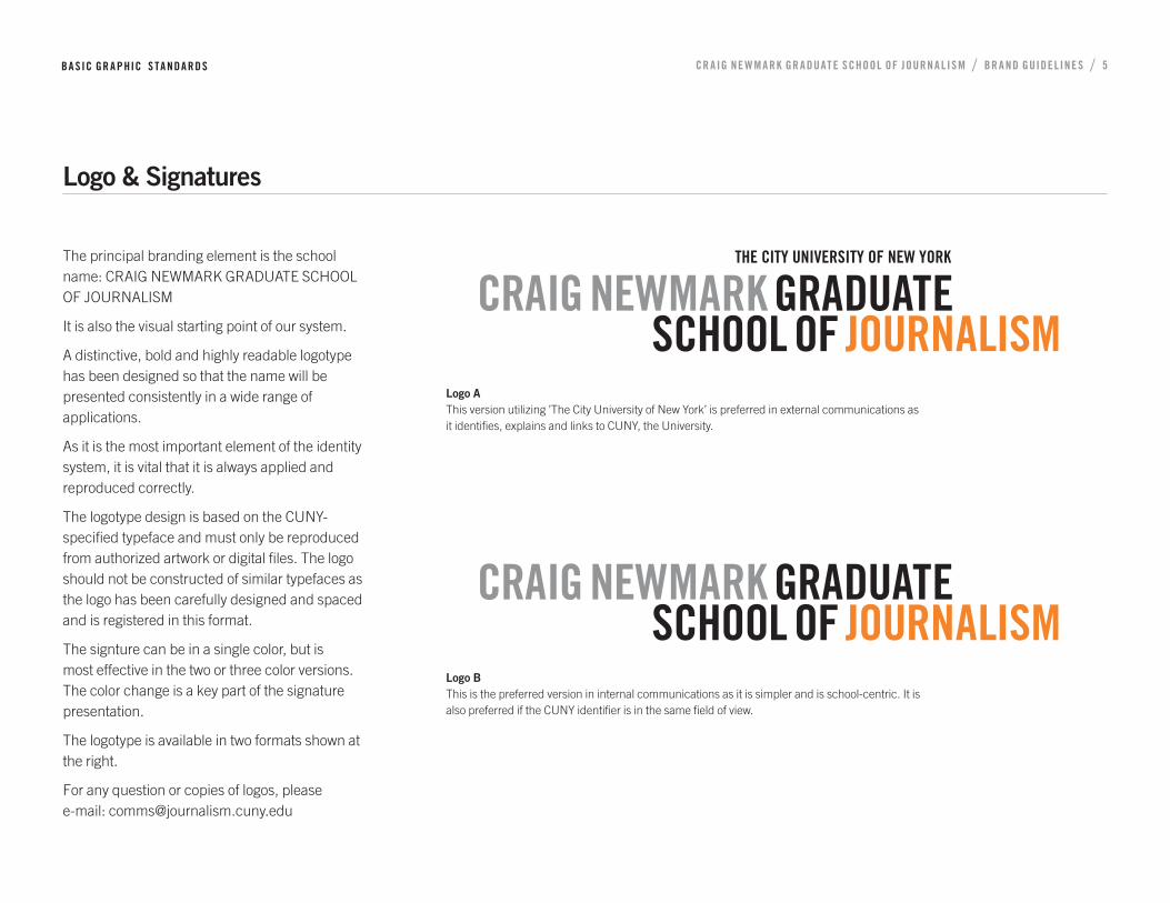
Logo & Signatures
The principal branding element is the school name: CRAIG NEWMARK GRADUATE SCHOOL OF JOURNALISM
It is also the visual starting point of our system.
A distinctive, bold and highly readable logotype has been designed so that the name will be presented consistently in a wide range of applications.
As it is the most important element of the identity system, it is vital that it is always applied and reproduced correctly.
The logotype design is based on the CUNY-specified typeface and must only be reproduced from authorized artwork or digital files. The logo should not be constructed of similar typefaces as the logo has been carefully designed and spaced and is registered in this format.
The signture can be in a single color, but is most effective in the two or three color versions. The color change is a key part of the signature presentation.
The logotype is available in two formats shown at the right.
For any question or copies of logos, please e-mail: [email protected]
Logo A This version utilizing ’The City University of New York’ is preferred in external communications as it identifies, explains and links to CUNY, the University.
Logo B This is the preferred version in internal communications as it is simpler and is school-centric. It is also preferred if the CUNY identifier is in the same field of view.

BA SIC GR A PHIC S TA NDA RDS CR AIG NE W M A RK GR A DUAT E SCHOOL OF JOURN A L ISM / BR A ND GUIDEL INE S / 6
Logo & Signatures: Classic
Monochrome logo
This version is the version to be preferred in internal communications as it is simple and is school-centric. It is also preferred if the CUNY identifier is in the same field of view. See section 1.2.
See letterhead examples, Section 2.
Reversed logo on dark background
The logo is equally acceptable on dark backgrounds with white, grey and orange.
Logo reversed
Logo monochrome
BA SIC GR A PHIC S TA NDA RDS CR AIG NE W M A RK GR A DUAT E SCHOOL OF JOURN A L ISM / BR A ND GUIDEL INE S / 7
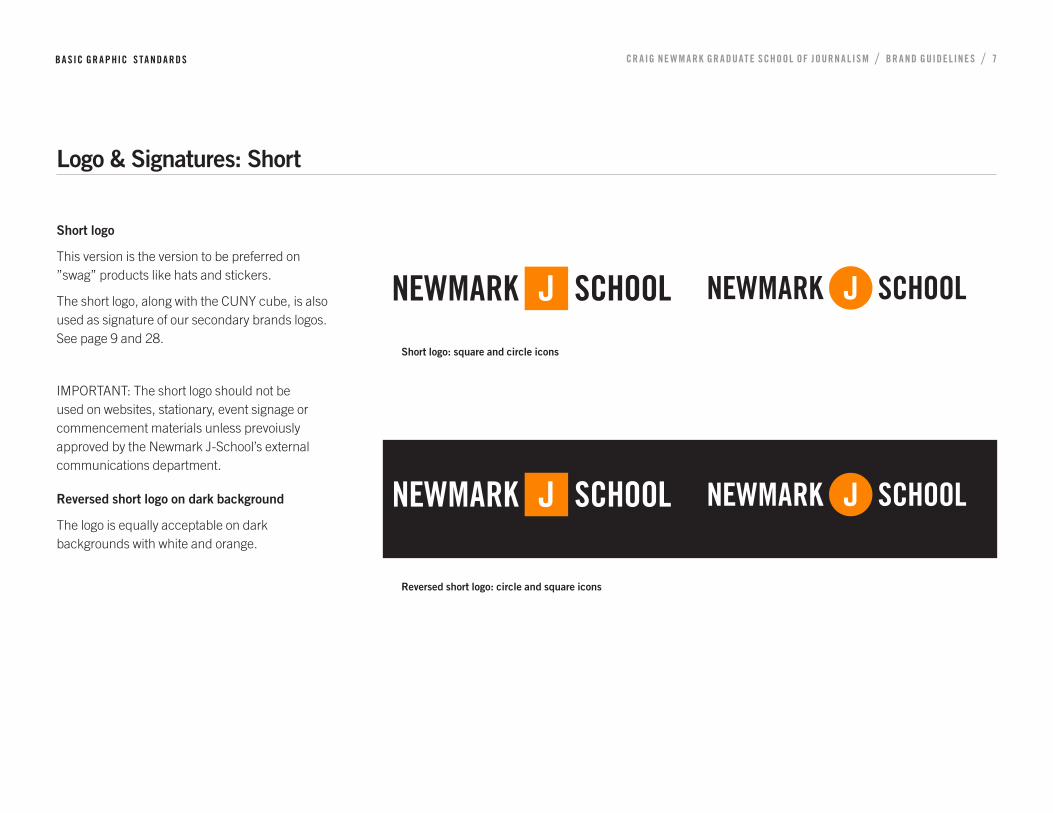
Logo & Signatures: Short
Short logo
This version is the version to be preferred on ”swag” products like hats and stickers.
The short logo, along with the CUNY cube, is also used as signature of our secondary brands logos. See page 9 and 28.
IMPORTANT: The short logo should not be used on websites, stationary, event signage or commencement materials unless prevoiusly approved by the Newmark J-School’s external communications department.
Reversed short logo on dark background
The logo is equally acceptable on dark backgrounds with white and orange.
Reversed short logo: circle and square icons
Short logo: square and circle icons
BA SIC GR A PHIC S TA NDA RDS CR AIG NE W M A RK GR A DUAT E SCHOOL OF JOURN A L ISM / BR A ND GUIDEL INE S / 8
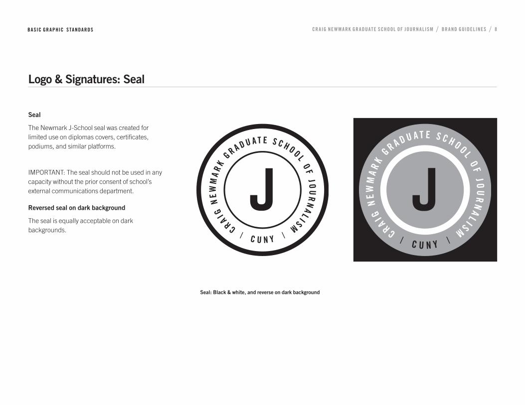
Logo & Signatures: Seal
Seal
The Newmark J-School seal was created for limited use on diplomas covers, certificates, podiums, and similar platforms.
IMPORTANT: The seal should not be used in any capacity without the prior consent of school’s external communications department.
Reversed seal on dark background
The seal is equally acceptable on dark backgrounds.
Seal: Black & white, and reverse on dark background
BA SIC GR A PHIC S TA NDA RDS CR AIG NE W M A RK GR A DUAT E SCHOOL OF JOURN A L ISM / BR A ND GUIDEL INE S / 9
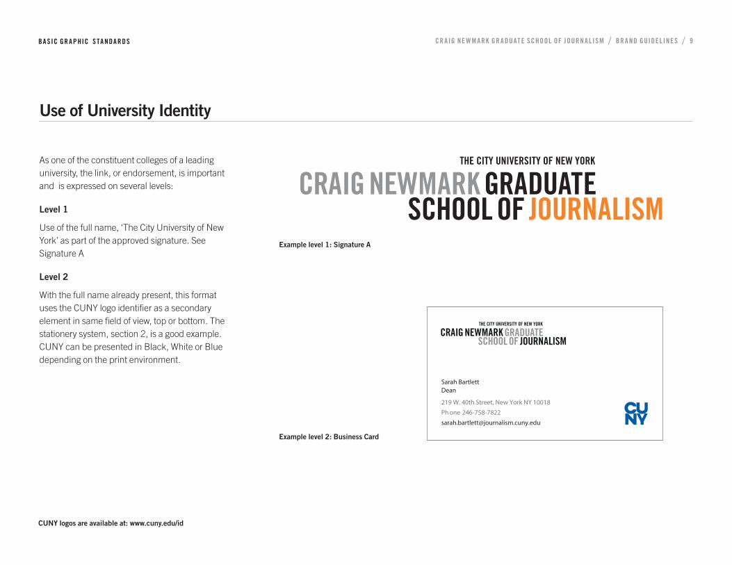
Use of University Identity
As one of the constituent colleges of a leading university, the link, or endorsement, is important and is expressed on several levels:
Level 1
Use of the full name, ‘The City University of New York’ as part of the approved signature. See Signature A
Level 2
With the full name already present, this format uses the CUNY logo identifier as a secondary element in same field of view, top or bottom. The stationery system, section 2, is a good example. CUNY can be presented in Black, White or Blue depending on the print environment.
Example level 1: Signature A
CUNY logos are available at: www.cuny.edu/id
Example level 2: Business Card
Sarah BartlettDean
219 W. 40th Street, New York NY 10018
Ph one 246-758-7822
BA SIC GR A PHIC S TA NDA RDS CR AIG NE W M A RK GR A DUAT E SCHOOL OF JOURN A L ISM / BR A ND GUIDEL INE S / 10
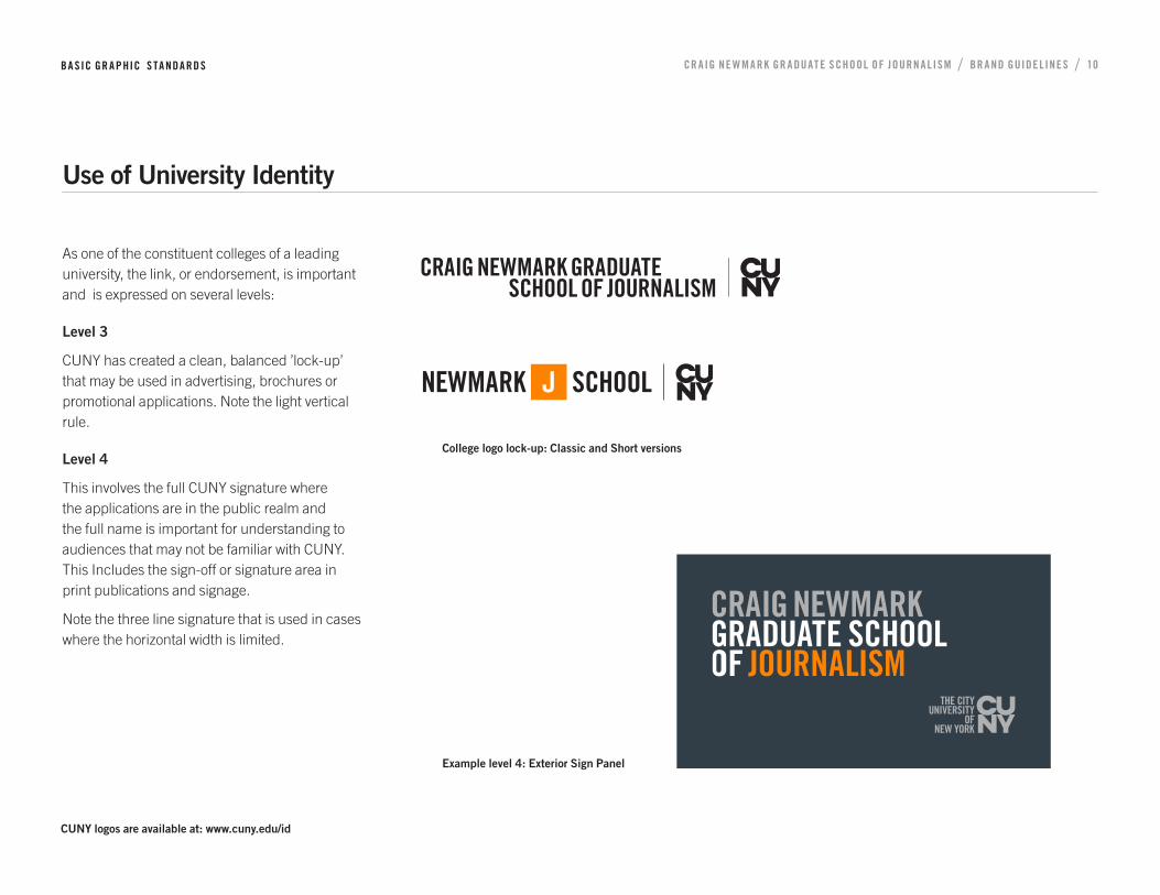
Use of University Identity
As one of the constituent colleges of a leading university, the link, or endorsement, is important and is expressed on several levels:
Level 3
CUNY has created a clean, balanced ’lock-up’ that may be used in advertising, brochures or promotional applications. Note the light vertical rule.
Level 4
This involves the full CUNY signature where the applications are in the public realm and the full name is important for understanding to audiences that may not be familiar with CUNY. This Includes the sign-off or signature area in print publications and signage.
Note the three line signature that is used in cases where the horizontal width is limited.
CUNY logos are available at: www.cuny.edu/id
Example level 4: Exterior Sign Panel
College logo lock-up: Classic and Short versions
BA SIC GR A PHIC S TA NDA RDS CR AIG NE W M A RK GR A DUAT E SCHOOL OF JOURN A L ISM / BR A ND GUIDEL INE S / 11
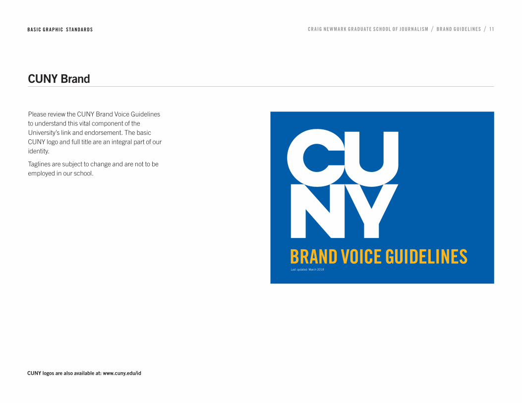
CUNY Brand
Please review the CUNY Brand Voice Guidelines to understand this vital component of the University’s link and endorsement. The basic CUNY logo and full title are an integral part of our identity.
Taglines are subject to change and are not to be employed in our school.
1
CUNY Brand Guidelines Section NameSub Section Name
BRAND VOICE GUIDELINESLast updated: March 2018
CUNY logos are also available at: www.cuny.edu/id
BA SIC GR A PHIC S TA NDA RDS CR AIG NE W M A RK GR A DUAT E SCHOOL OF JOURN A L ISM / BR A ND GUIDEL INE S / 12
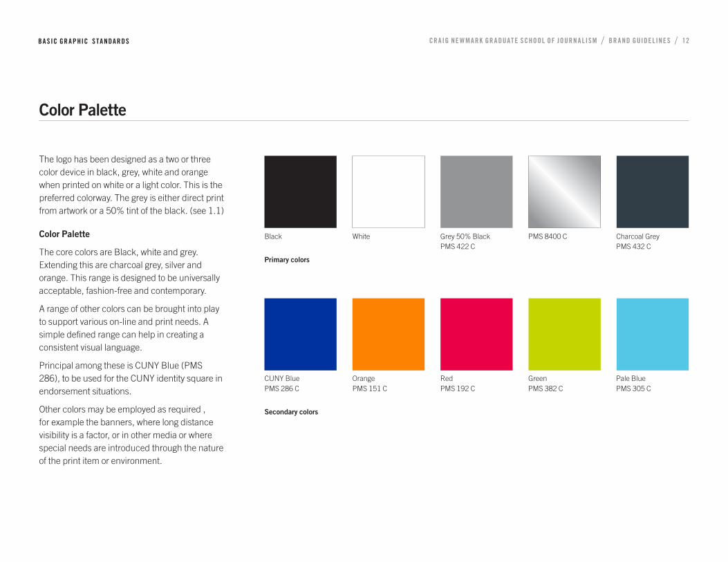
Color Palette
The logo has been designed as a two or three color device in black, grey, white and orange when printed on white or a light color. This is the preferred colorway. The grey is either direct print from artwork or a 50% tint of the black. (see 1.1)
Color Palette
The core colors are Black, white and grey. Extending this are charcoal grey, silver and orange. This range is designed to be universally acceptable, fashion-free and contemporary.
A range of other colors can be brought into play to support various on-line and print needs. A simple defined range can help in creating a consistent visual language.
Principal among these is CUNY Blue (PMS 286), to be used for the CUNY identity square in endorsement situations.
Other colors may be employed as required , for example the banners, where long distance visibility is a factor, or in other media or where special needs are introduced through the nature of the print item or environment.
Black
Primary colors
White Grey 50% Black PMS 422 C
PMS 8400 C Charcoal Grey PMS 432 C
CUNY Blue PMS 286 C
Secondary colors
Orange PMS 151 C
Red PMS 192 C
Green PMS 382 C
Pale Blue PMS 305 C

BA SIC GR A PHIC S TA NDA RDS CR AIG NE W M A RK GR A DUAT E SCHOOL OF JOURN A L ISM / BR A ND GUIDEL INE S / 13
Typography
The CUNY-approved family of typefaces is Trade Gothic. This face is used for titles, headlines and subtitles in print, signage and other college applications. It offers compatibility with the logotype and is available in a wide range of sizes and weights. Do not use the CUNY logo typeface for other words or phrases as this weakens logo recognition.
Shown at right are Trade Gothic Bold Condensed 20 (caps only), Trade Gothic Light and Trade Gothic Bold 2. Also acceptable are the Oblique versions of the above, plus Roman and Roman Oblique.
Note: Documents in the faces above should be saved as pdf’s before e-mailing as few computers will have Trade Gothic resident. The nearest universal typeface is Verdana.
The use of upper and lower case letters for most messages will improve logo stand-out rather than all upper case, as this can compete with and distract from the logo. See also 3.2 and 3.3. The full name may be capitalized in text to give it the importance it deserves.
Text or chart applications may require other unique typefaces. PT Serif is the preferred option.
Trade Gothic Bold Condensed 20A B C D E F G H I J K L M N O P Q R S T U V W X Y Z1 2 3 4 5 6 7 8 9 0
Trade Gothic LightA a B b C c D d E e F f G g H h I i J j K k L l M m N nO o P p Q q R r S s T t U u V v W w X x Y y Z z1 2 3 4 5 6 7 8 9 0
Trade Gothic Bold 2Aa Bb Cc Dd Ee F f Gg Hh I i J j Kk L l Mm NnOo Pp Qq R r Ss T t Uu Vv Ww Xx Y y Z z1 2 3 4 5 6 7 8 9 0
PT Serif regularA a B b C c D d E e F f G g H h I i J j K k L l M m N nO o P p Q q R r S s T t U u Vv Ww X x Yy Zz1 2 3 4 5 6 7 8 9 0
CR AIG NE W M A RK GR A DUAT E SCHOOL OF JOURN A L ISM / BR A ND GUIDEL INE S / 14
2 STATIONERY SYSTEM
CR AIG NE W M A RK GR A DUAT E SCHOOL OF JOURN A L ISM / BR A ND GUIDEL INE S / 15
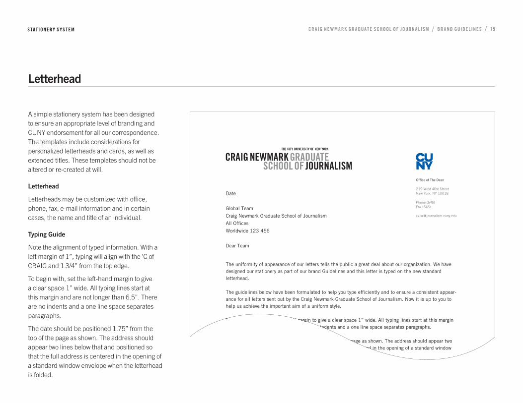
A simple stationery system has been designed to ensure an appropriate level of branding and CUNY endorsement for all our correspondence. The templates include considerations for personalized letterheads and cards, as well as extended titles. These templates should not be altered or re-created at will.
Letterhead
Letterheads may be customized with office, phone, fax, e-mail information and in certain cases, the name and title of an individual.
Typing Guide
Note the alignment of typed information. With a left margin of 1”, typing will align with the ’C of CRAIG and 1 3/4” from the top edge.
To begin with, set the left-hand margin to give a clear space 1” wide. All typing lines start at this margin and are not longer than 6.5”. There are no indents and a one line space separates paragraphs.
The date should be positioned 1.75” from the top of the page as shown. The address should appear two lines below that and positioned so that the full address is centered in the opening of a standard window envelope when the letterhead is folded.
Letterhead
S TAT IONERY SYS T EM
Office of The Dean
219 West 40st StreetNew York, NY 10018
Phone (646)Fax (646)
Date
Global Team
Craig Newmark Graduate School of Journalism
All Offices
Worldwide 123 456
Dear Team
The uniformity of appearance of our letters tells the public a great deal about our organization. We have designed our stationery as part of our brand Guidelines and this letter is typed on the new standard letterhead.
The guidelines below have been formulated to help you type efficiently and to ensure a consistent appear-ance for all letters sent out by the Craig Newmark Graduate School of Journalism. Now it is up to you to help us achieve the important aim of a uniform style.
To begin with, set the left-hand margin to give a clear space 1” wide. All typing lines start at this margin and are not longer than 6.5”. There are no indents and a one line space separates paragraphs.
The date should be positioned 1.75” from the top of the page as shown. The address should appear two lines below that and positioned so that the full address is centered in the opening of a standard window envelope when the letterhead is folded.
CR AIG NE W M A RK GR A DUAT E SCHOOL OF JOURN A L ISM / BR A ND GUIDEL INE S / 16
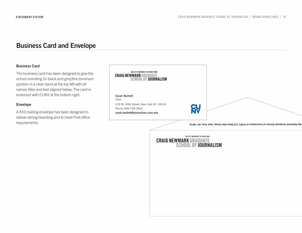
Business Card
The business card has been designed to give the school branding (in black and grey)the dominant position in a clear band at the top left with all names titles and text aligned below. The card is endorsed with CUNY at the bottom right.
Envelope
A #10 mailing envelope has been designed to deliver strong branding and to meet Post office requirements.
Business Card and Envelope
S TAT IONERY SYS T EM
Sarah BartlettDean
219 W. 40th Street, New York NY 10018
Phone 246-758-7822
Craig Newmark Graduate School of Journalism at CUNY, 219 West 40th Street, New York, NY 10018
CR AIG NE W M A RK GR A DUAT E SCHOOL OF JOURN A L ISM / BR A ND GUIDEL INE S / 17
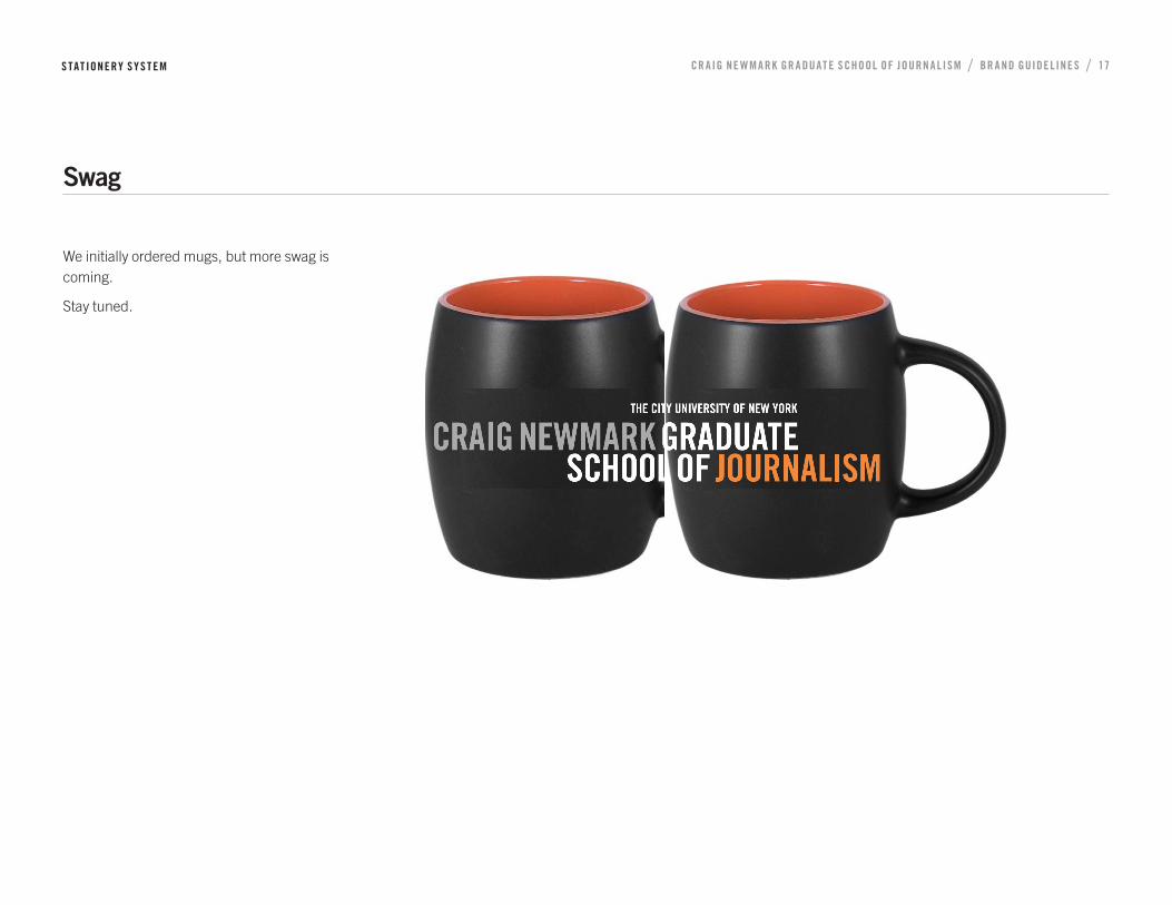
We initially ordered mugs, but more swag is coming.
Stay tuned.
Swag
S TAT IONERY SYS T EM
CR AIG NE W M A RK GR A DUAT E SCHOOL OF JOURN A L ISM / BR A ND GUIDEL INE S / 18
3 PRINT SYSTEM
CR AIG NE W M A RK GR A DUAT E SCHOOL OF JOURN A L ISM / BR A ND GUIDEL INE S / 19
Print and on-line communications for the CRAIG NEWMARK GRADUATE SCHOOL OF JOURNALISM AT CUNY have not been designed to conform to a grid. This offers the greatest range of options to permit each application to target specific audiences and obtain maximum impact. However, it is important to follow certain principles in logo, type and color use to ensure that there is some consistency and to give a family ‘look’. See also Section 1
Signature
Generally, the school logo will be at the top left or bottom right, not centered. This creates a dynamic. The logo may be positive, negative or over a photograph if sufficient contrast exists and the background is not too complex. For many people, the web site is the first point of contact. The logo treatment on the web is a positive example and makes a good first impression.
Print system
PRIN T SYS T EM

CR AIG NE W M A RK GR A DUAT E SCHOOL OF JOURN A L ISM / BR A ND GUIDEL INE S / 20
Graphics. Solid areas with horizontal divisions or panels offer the simplest vocabulary. Other effects can be created through the use of tints, or tinted panels over photographs.
Photography is a powerful tool and can be employed to reinforce the idea of New York and to communicate the nature, energy and diversity of the school. Ideally photographs will be inspirational, spontaneous and engaging, ‘newsworthy’ in other words.
Images may be in full color, duotone, one color or in black and white.
The logo may also be reversed out of dark photographs, or overprinted over light photographs, providing care is taken to avoid strong patterns or textures that might inhibit legibility.
Graphic Language
PRIN T SYS T EM
CR AIG NE W M A RK GR A DUAT E SCHOOL OF JOURN A L ISM / BR A ND GUIDEL INE S / 21
4 DIGITAL & SOCIAL MEDIA
CR AIG NE W M A RK GR A DUAT E SCHOOL OF JOURN A L ISM / BR A ND GUIDEL INE S / 22
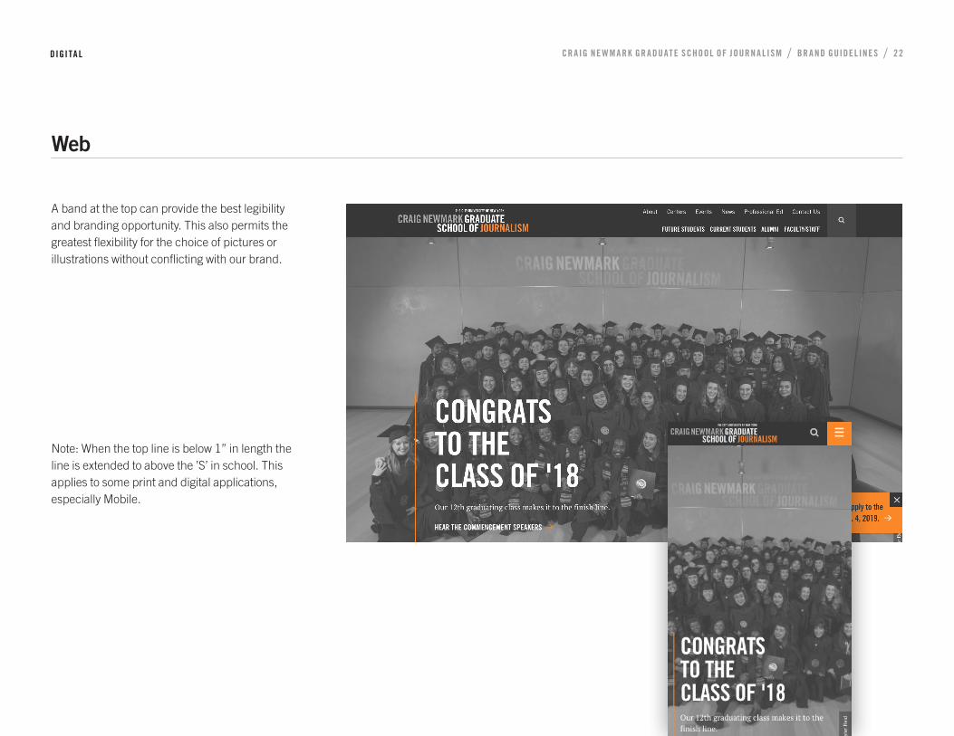
A band at the top can provide the best legibility and branding opportunity. This also permits the greatest flexibility for the choice of pictures or illustrations without conflicting with our brand.
Note: When the top line is below 1” in length the line is extended to above the ’S’ in school. This applies to some print and digital applications, especially Mobile.
DIGITA L
Web

CR AIG NE W M A RK GR A DUAT E SCHOOL OF JOURN A L ISM / BR A ND GUIDEL INE S / 23
Social Media Accounts General Use
Newmark J-School’s main social media accounts (e.g. Facebook, Twitter) are managed and maintained by staff.
Sub-brands (e.g. programs, student chapter organizations) are maintained by faculty, staff and students on a volunteer basis.
Newmark J-School reserves the right to remove administrators or editors and remove content that does not comply with the school’s Code of Ethics and Conduct and other applicable policies of social media platforms.
Links to content or other websites should not be construed as an endorsement of the organizations, entities, views or content of the j-school. We are not responsible for the content of those external web sites.
DIGITA L
Social Media
CR AIG NE W M A RK GR A DUAT E SCHOOL OF JOURN A L ISM / BR A ND GUIDEL INE S / 24
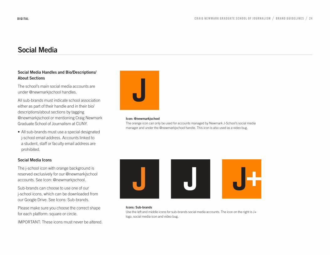
Social Media Handles and Bio/Descriptions/About Sections
The school’s main social media accounts are under @newmarkjschool handles.
All sub-brands must indicate school association either as part of their handle and in their bio/descriptions/about sections by tagging @newmarkjschool or mentioning Craig Newmark Graduate School of Journalism at CUNY.
• All sub-brands must use a special designated j-school email address. Accounts linked to a student, staff or faculty email address are prohibited.
Social Media Icons
The j-school icon with orange background is reserved exclusively for our @newmarkjschool accounts. See Icon: @newmarkjschool.
Sub-brands can choose to use one of our j-school icons, which can be downloaded from our Google Drive. See Icons: Sub-brands.
Please make sure you choose the correct shape for each platform: square or circle.
IMPORTANT: These icons must never be altered.
DIGITA L
Social Media
Icon: @newmarkjschool The orange icon can only be used for accounts managed by Newmark J-School’s social media manager and under the @newmarkjschool handle. This icon is also used as a video bug.
Icons: Sub-brands Use the left and middle icons for sub-brands social media accounts. The icon on the right is J+ logo, social media icon and video bug.

CR AIG NE W M A RK GR A DUAT E SCHOOL OF JOURN A L ISM / BR A ND GUIDEL INE S / 25
Use of Photography / Cover Photos
Photos should comply with each platform’s recommended sizes and dimensions
Photos must display one of the following in this preferred order:
• Our diverse student body
• J-School building facade or newsroom
• Skyline photos of Manhattan
Cover images can be in black & white or full color
Social Media
DIGITA L

CR AIG NE W M A RK GR A DUAT E SCHOOL OF JOURN A L ISM / BR A ND GUIDEL INE S / 26
5 SECONDARY BRANDS

CR AIG NE W M A RK GR A DUAT E SCHOOL OF JOURN A L ISM / BR A ND GUIDEL INE S / 27
Unified design can unify our applications and save time, money and headaches, rather than several silos and individual efforts.
Newmark J-School family of sub-brands the same type as our brand logos but in title case. These
The Newmark J-School logo must always appear on the same field of vision as any of the secondary logos.
SECONDA RY BR A NDS
Secondary Brands
NYCITY NewsService
Tow-Knight Center for Entrepreneurial Journalism
Center for
Community and Ethnic Media
McGraw Center for Business Journalism
Ravitch Fiscal Reporting
News Integrity Initiative
219W Stories of the City
AudioFiles Sounds of the City

CR AIG NE W M A RK GR A DUAT E SCHOOL OF JOURN A L ISM / BR A ND GUIDEL INE S / 28
The short form name being used in rapid communications is now a useful designation.
Use these versions whenever it’s not possible to display the j-school logo on the same field of vision as the secondary brand’s.
SECONDA RY BR A NDS
Secondary Brands
NYCITY NewsService
Tow-Knight Centerfor Entrepreneurial Journalism
Center for
Community and Ethnic Media
McGraw Center for Business Journalism
RavitchFiscal Reporting
219W Stories of the City
AudioFiles Sounds of the City

CR AIG NE W M A RK GR A DUAT E SCHOOL OF JOURN A L ISM / BR A ND GUIDEL INE S / 29
This another option for usage of secondary brand logos whenever it’s not possible to display the j-school logo on the same field of vision as the secondary brand’s.
SECONDA RY BR A NDS
Secondary Brands
NYCITY NewsService
Tow-Knight Centerfor Entrepreneurial Journalism
Center for
Community and Ethnic Media
McGraw Center for Business Journalism
RavitchFiscal Reporting
219W Stories of the City
AudioFiles Sounds of the City

CR AIG NE W M A RK GR A DUAT E SCHOOL OF JOURN A L ISM / BR A ND GUIDEL INE S / 30
6 SIGN SYSTEM
CR AIG NE W M A RK GR A DUAT E SCHOOL OF JOURN A L ISM / BR A ND GUIDEL INE S / 31
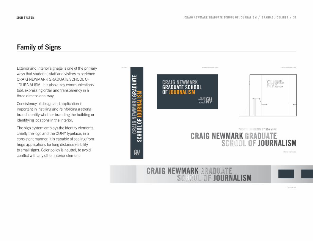
Exterior and interior signage is one of the primary ways that students, staff and visitors experience CRAIG NEWMARK GRADUATE SCHOOL OF JOURNALISM. It is also a key communications tool, expressing order and transparency in a three dimensional way.
Consistency of design and application is important in instilling and reinforcing a strong brand identity whether branding the building or identifying locations in the interior.
The sign system employs the identity elements, chiefly the logo and the CUNY typeface, in a consistent manner. It is capable of scaling from huge applications for long distance visibility to small signs. Color policy is neutral, to avoid conflict with any other interior element
SIGN SYS T EM
Family of Signs
Interior wall signs
Banners Exterior entrance signs
Entrance wall
Entrance security desk
material to be 1/4” stainless steel with fi ne horizontal brushed
fi nish. Ease all edges.
CR AIG NE W M A RK GR A DUAT E SCHOOL OF JOURN A L ISM / BR A ND GUIDEL INE S / 32
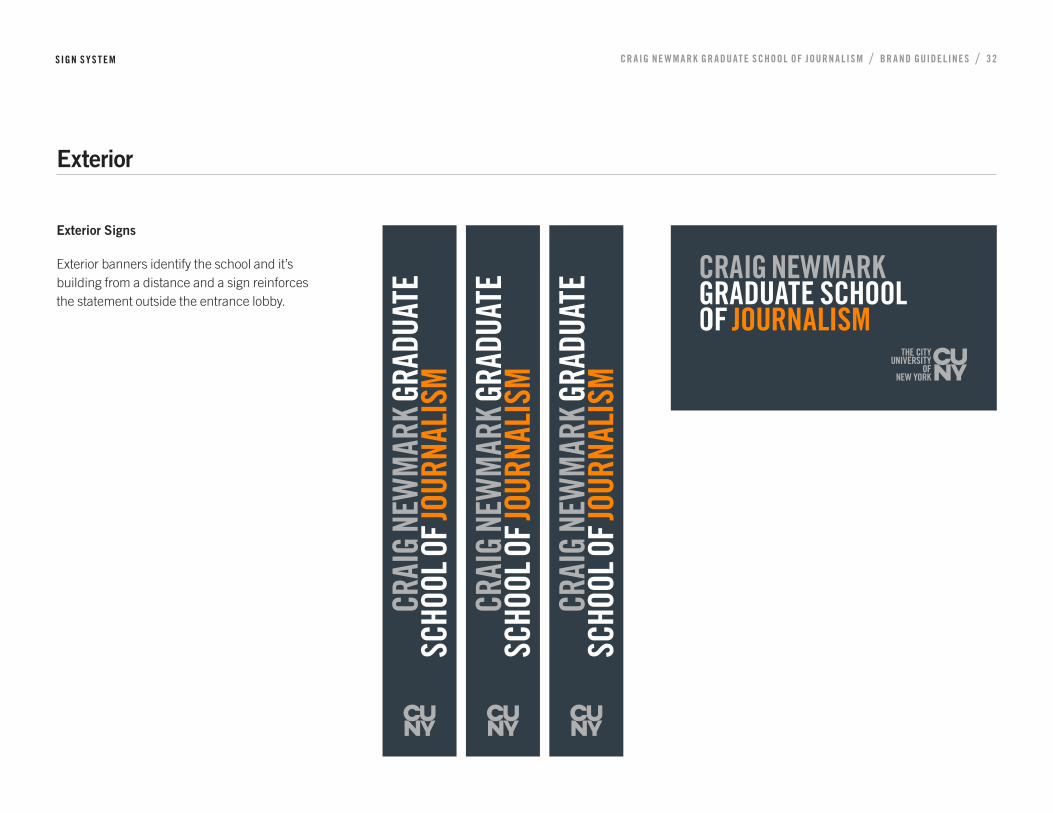
Exterior Signs
Exterior banners identify the school and it’s building from a distance and a sign reinforces the statement outside the entrance lobby.
SIGN SYS T EM
Exterior
CN CUNY-J Banner artwork 50%.pdf 1 03/09/2018 11:07 CN CUNY-J Banner artwork 50%.pdf 1 03/09/2018 11:07 CN CUNY-J Banner artwork 50%.pdf 1 03/09/2018 11:07
CR AIG NE W M A RK GR A DUAT E SCHOOL OF JOURN A L ISM / BR A ND GUIDEL INE S / 33
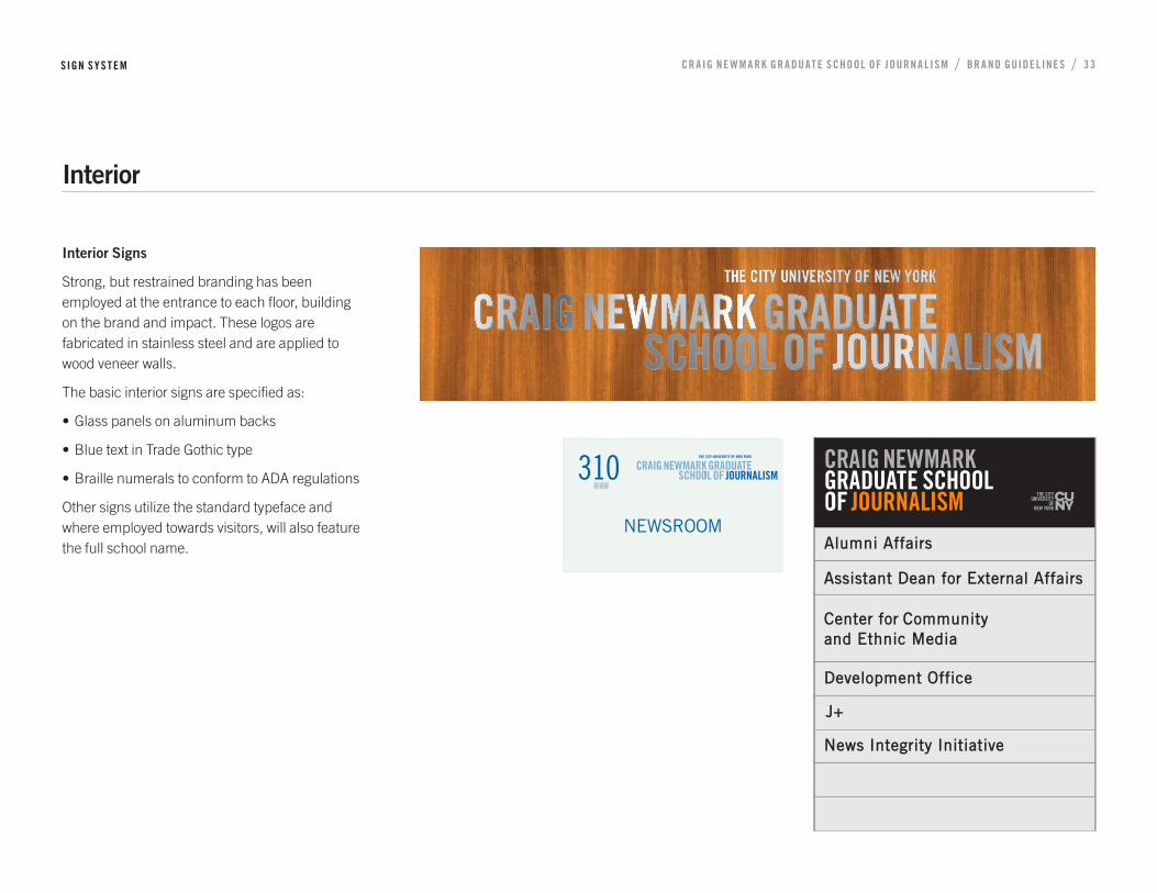
Interior Signs
Strong, but restrained branding has been employed at the entrance to each floor, building on the brand and impact. These logos are fabricated in stainless steel and are applied to wood veneer walls.
The basic interior signs are specified as:
• Glass panels on aluminum backs
• Blue text in Trade Gothic type
• Braille numerals to conform to ADA regulations
Other signs utilize the standard typeface and where employed towards visitors, will also feature the full school name.
SIGN SYS T EM
Interior
FULL SIZE

CR AIG NE W M A RK GR A DUAT E SCHOOL OF JOURN A L ISM / BR A ND GUIDEL INE S / 3 4
PROMOTIONS & EVENTS7
CR AIG NE W M A RK GR A DUAT E SCHOOL OF JOURN A L ISM / BR A ND GUIDEL INE S / 35
CN CUNY-J rollup_color_white_background.pdf 1 07/09/2018 11:08
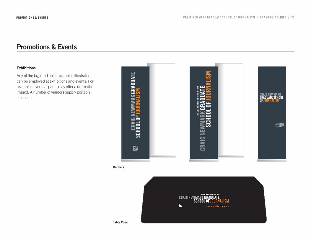
Exhibitions
Any of the logo and color examples illustrated can be employed at exhibitions and events. For example, a vertical panel may offer a dramatic impact. A number of vendors supply portable solutions.
PROMO TIONS & E V EN T S
Promotions & Events
Table Cover
CN CUNY-J Banner artwork 50%.pdf 1 03/09/2018 11:07
Banners
Related Documents