@techconf #tech13 Thomas Kugler Website Administrator ASAE [email protected] @tom8gem 202-326-9515 Adaptive Design: The Next Generation of Responsive Stardate: 12.05.2013 Time: 0900 Hashtag: #tech13 LM6 John Mills Manager, Digital Strategy PMMI [email protected] @kesseljunkie 571-612-3206

Adaptive Design: The Next Generation of Responsive
Jul 15, 2015
Welcome message from author
This document is posted to help you gain knowledge. Please leave a comment to let me know what you think about it! Share it to your friends and learn new things together.
Transcript

@techconf #tech13
Thomas KuglerWebsite [email protected]@tom8gem202-326-9515
Adaptive Design:The Next Generation of Responsive
Stardate: 12.05.2013Time: 0900Hashtag: #tech13 LM6
John MillsManager, Digital Strategy
@kesseljunkie571-612-3206
John MillsManager, Digital Strategy
PMMI: The Association for Packaging and Processing
@kesseljunkie571-612-3206

@techconf #tech13@techconf #tech13
The basic formula
{[Adaptive (Responsive) Design] + Adaptive Content} = ☺

@techconf #tech13
{Adaptive [Responsive] Design}, Adaptive Content
• Adaptive Design: A layered approach to deliver a baseline experience which grows richer as limitations are removed.
• Responsive Design: A subset of Adaptive Design; method to optimize the viewing experience across a wide device range.
• Adaptive Content: Flexible content which adapts to different screen sizes/contexts and device capabilities.
“Content is king”
@techconf #tech13
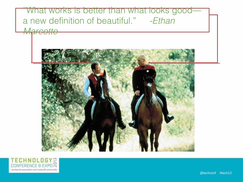
“What works is better than what looks good—a new definition of beautiful.” -Ethan Marcotte

@techconf #tech13
• Determine context and adapt UX. • Successive layers:
1. Text (Web-optimized Copy)2. Semantics (HTML/Markup)3. Style (CSS)4. Interactivity (JavaScript)5. Accessibility
• Progressive Enhancement > Graceful Degradation All experiences created w/ Progressive Enhancement will degrade
gracefully.** not all experiences created w/ Graceful Degradation are progressively enhanced
Progressive Enhancement:The Strategies

@techconf #tech13
Semantics (HTML/Markup):• Well-written copy• Semantic HTML• Use microformats • Use classification to group like
elements (via “class”) • Identify landmark elements (via “id”)
Style (CSS):• Order matters• Hide advanced rule sets from old
browsers (@media)• Use conditional comments for IE• Account for alternate media
Progressive Enhancement: The Mechanics
Interactivity (JavaScript)• Content is accessible
and tasks can be completed without scripts
• Deliver scripts á la carte when possible
Accessibility:• Use ARIA landmarks,
roles and states• Use Tabindex to control
user’s journey through page
@techconf #tech13
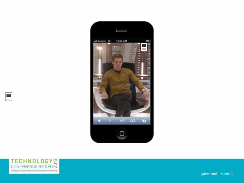
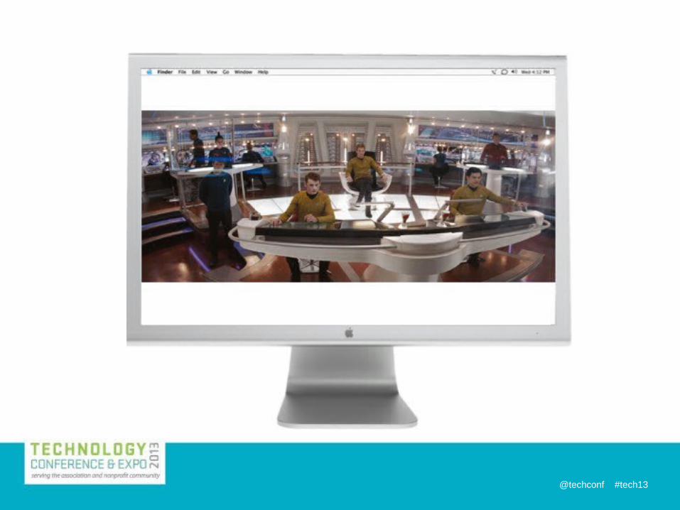
John Mills, 11/24/2013
Captain Kirk is the well-written content.
John Mills, 11/24/2013
Use the home video/aspect ratio example to talk about these things.Letterboxing is a great example of forcing the issue. - it was forcing the wrong context.

@techconf #tech13

@techconf #tech13
@techconf #tech13

@techconf #tech13
Design—Screen Size is Not Enough• Screen Width/Resolution doesn’t tell us input capabilities
(cursor/keyboard, touch, D- pad, combinations of these)• Nor does it tell us User Posture (e.g., distance from
screen: ~1’ for phone, ~10’ for TV)• Various Device Widths: you can’t target them all—be
“device-width agnostic”!
Luke Wroblewski, Multi-Device Web Design & Beyond
“If there’s a coming zombie apocalypse of devices, TVs are the likely next wave.”
-Jason Grigsby

@techconf #tech13
Design for Various Contexts:Style Tiles (p. 1)
Samantha Warren, Style Tiles and How They Work
More precise than mood boards, less precise than full mockups; they set a common visual language for use across multiple interfaces. Create systems, not pages .
Option 1: Option 2: Option 3:
John Mills, 12/02/2013
Because you’re dealing with a fragmented environment you have to use a fragmented strategy.Each medium has its own rhythm and its own flow. - Tom Kugler

@techconf #tech13
Style Tiles (p. 2)
Samantha Warren, Style Tiles and How They Work
Option 1: Option 2: Option 3:
Final Tile—Defines styles for multi-device design
John Mills, 12/02/2013
Building Blocks - or a starship! Style tiles are escape pods. They let you slide out of tight situations.

@techconf #tech13
Adaptation

@techconf #tech13
Adaptation
John Mills, 11/24/2013
Is it time to change your thinking?YES!PACKEXPO.com as a failed ads discussionAvoid the mobile stack! (Although sometimes you have to live with it.)Discussion point? As it applies to the ads stacking - avoid it. But that bleeds into the contractual thing - are the advertisers expecting to appear NO MATTER WHAT?

@techconf #tech13
Adaptive Content“Chunk Your Blobs”
Karen McGrane, Adapting Ourselves to Adaptive Content
• Content Parity = Everything for Everyone
• Pages can no longer be one inseparable blob of content; we must identify chunks in the blob and put them in appropriate, predefined places.
• These chunks can then be reused in many contexts and managed in one place; a system of content objects to use flexibly.
“You don’t get to choose how users access your site. They do.”
-Karen McGrane

@techconf #tech13
Adaptive Content (p. 2)• One Code Base, One Content Set• Don’t double your workload, or fork your content• Structure and Metadata attached to content determines
how it responds to various devices• Serve different versions to different contexts, e.g., for
article descriptions, the “short version” displays on phones while the “long version” displays on desktop
• This also applies to images, not only per size/resolution but crops as well.
“The good news: you only need one web design, a multi-device one. The bad news: it’s a new & different way of doing design.”
-Luke Wroblewski
John Mills, 12/02/2013
But what about Internet Explorer

@techconf #tech13@techconf #tech13
Adaptive Content (p. 3)Reusable Content, Alternative Content
Karen McGrane, Content Strategy for Mobile
The short version—√ “Truncation is not a content strategy”
@techconf #tech13@techconf #tech13
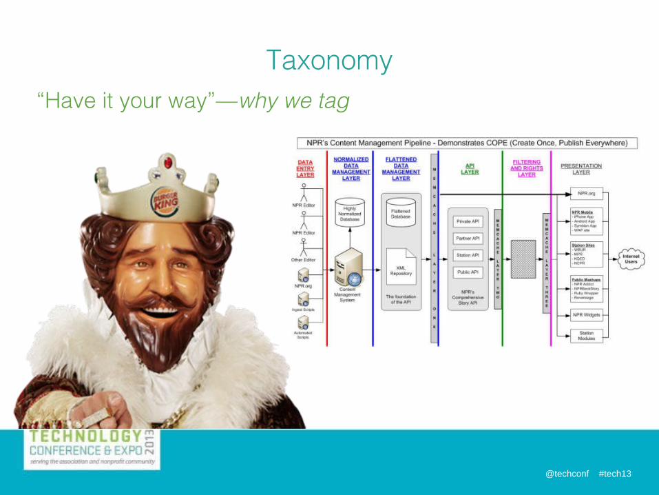
“Have it your way”—why we tag
Taxonomy

@techconf #tech13@techconf #tech13
• Responsive Frameworks: e.g., Foundation by Zurb, Bootstrap, Squarespace, WordPress
• SASS: Syntactically Awesome Style Sheets • CMS:1.Detect & Display: URL tied to content layer, not display
layer, allowing CMS to detect the device and choose the right display layer for the device.
2.Hybrid: RWD with some detect & display page elements built in.
3.
Tools
@techconf #tech13@techconf #tech13
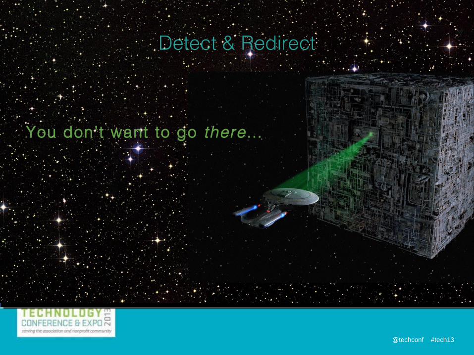
Detect & Redirect
You don’t want to go there…
@techconf #tech13
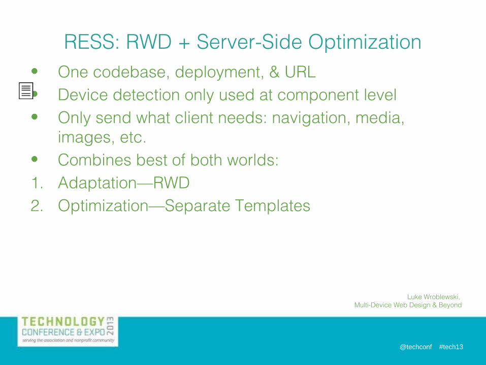
• One codebase, deployment, & URL• Device detection only used at component level• Only send what client needs: navigation, media,
images, etc.• Combines best of both worlds:1. Adaptation—RWD2. Optimization—Separate Templates
RESS: RWD + Server-Side Optimization
Luke Wroblewski, Multi-Device Web Design & Beyond
John Mills, 11/24/2013
“At this point, we’re all figuring this out as we go along.”-Kristina Halvorson“If there’s a coming zombie apocalypse of devices, TVs are likely the next wave.”-Jason Grigsby“The good news: you only need one web design, a multi-device one. The bad news: it’s a new & different way of doing design.-Luke Wroblewski“You don't get to choose what device users view your site on; they do.”-Karen McGrane

@techconf #tech13@techconf #tech13
Generations
Images Copyright 1966-2013 Paramount Pictures

@techconf #tech13
Resources
Content Strategy for Mobile-Karen McGrane
Adaptive Web Design-Aaron Gustafson
Responsive Web Design-Ethan Marcotte

@techconf #tech13
http://asae.conferences.io/sessions/66
Share Your Thoughts

@techconf #tech13
Thomas KuglerWebsite [email protected]
John MillsManager, Digital StrategyPMMI: The Association for Packaging and Processing [email protected]@kesseljunkie571-612-3206Bat Signal also acceptable.
Contact Us
Related Documents