Visual Communication Design GA 3 Exam © VICTORIAN CURRICULUM AND ASSESSMENT AUTHORITY 2015 1 2014 Examination Report 2014 Visual Communication Design GA 3: Examination GENERAL COMMENTS The 2014 VCE Visual Communication Design examination assessed a range of key knowledge and key skills across Units 3 and 4. The 2014 examination included two rendering tasks. The resource book did not contain the same amount of information as it did in 2013 and students should be prepared for format and content changes from year to year. Students and teachers should continue to refer to the Technical Drawing Specifications Resource document, available on the VCAA website, when preparing for the examination. Students who were awarded high marks: used relevant terminology from the study design attempted all questions and allocated their time appropriately were able to interpret what each question was asking and then respond appropriately to all parts of the question supported written responses with reference to the visual communication being analysed or evaluated. The following should be noted: Students need to be able to discuss legal obligations with regard to intellectual property, drawing upon the knowledge gained in Unit 3, Outcome 2. Students are encouraged to practise rendering objects using tone and texture to enhance form under time constraints. Similarly, it would be beneficial to practise developing design concepts for design-based questions or briefs under time constraints. Questions 3 and 7 asked students to use colour; in this study, black is not a colour. SPECIFIC INFORMATION Note: Student responses reproduced in this report have not been corrected for grammar, spelling or factual information. This report provides sample answers or an indication of what the answers may have included. Unless otherwise stated, these are not intended to be exemplary or complete responses. Question 1 Students mostly found this question strai ghtforward, although there were many who chose ‘contrast’ for part e. 1a. x-height 1b. environmental 1c. cropping 1d. isometric 1e. shape 1f. development of concept Question 2a. Students who were awarded full marks provided a highly effective discussion of how type and shape were used, and how these design elements assisted in communicating the event. Low-scoring responses tended to describe type and shape without referencing the event.

Welcome message from author
This document is posted to help you gain knowledge. Please leave a comment to let me know what you think about it! Share it to your friends and learn new things together.
Transcript
Visual Communication Design GA 3 Exam © VICTORIAN CURRICULUM AND ASSESSMENT AUTHORITY 2015 1
2014 Examination
Report
2014 Visual Communication Design GA 3: Examination
GENERAL COMMENTS The 2014 VCE Visual Communication Design examination assessed a range of key knowledge and key skills across
Units 3 and 4. The 2014 examination included two rendering tasks. The resource book did not contain the same amount
of information as it did in 2013 and students should be prepared for format and content changes from year to year.
Students and teachers should continue to refer to the Technical Drawing Specifications Resource document, available
on the VCAA website, when preparing for the examination.
Students who were awarded high marks:
used relevant terminology from the study design
attempted all questions and allocated their time appropriately
were able to interpret what each question was asking and then respond appropriately to all parts of the question
supported written responses with reference to the visual communication being analysed or evaluated.
The following should be noted:
Students need to be able to discuss legal obligations with regard to intellectual property, drawing upon the
knowledge gained in Unit 3, Outcome 2.
Students are encouraged to practise rendering objects using tone and texture to enhance form under time
constraints. Similarly, it would be beneficial to practise developing design concepts for design-based questions
or briefs under time constraints.
Questions 3 and 7 asked students to use colour; in this study, black is not a colour.
SPECIFIC INFORMATION Note: Student responses reproduced in this report have not been corrected for grammar, spelling or factual
information.
This report provides sample answers or an indication of what the answers may have included. Unless otherwise stated,
these are not intended to be exemplary or complete responses.
Question 1
Students mostly found this question straightforward, although there were many who chose ‘contrast’ for part e.
1a.
x-height
1b.
environmental
1c.
cropping
1d.
isometric
1e.
shape
1f.
development of concept
Question 2a.
Students who were awarded full marks provided a highly effective discussion of how type and shape were used, and
how these design elements assisted in communicating the event. Low-scoring responses tended to describe type and
shape without referencing the event.
Visual Communication Design GA 3 Exam Published: 26 March 2015 2
2014 Examination
Report
The following is an example of a possible response.
The designer’s decision to include a white circular shape in the ground effectively represents a full moon or spotlight making
reference to the time of the event. The title White Night has been represented in a typeface that is a continuous tube-like style and
appears to represent the city skyline mentioned in the brief.
Question 2b.
High-scoring responses referred to both Figures 2 and 3 with reference to the specific features of the ticket pouch while
explaining how the communication need had been interpreted. There were students who were confused as to what a
communication need is. Many discussed purposes, constraints and expectations rather than communication needs. Full
marks were awarded to students who discussed specific features with reference to the images while explaining how the
identified need had been interpreted. Discussions about sustainability or recycling were not accepted as this
communication need could not be confirmed by looking at Figures 2 and 3.
The following is an example of a possible response.
Communication need 1 – to incorporate the Southbank building
Discussion – The designer may have been asked to create imagery for the ticket pouch that can be visually associated with the
MTC Southbank building. The ticket pouch design features a pattern that repeats the geometric structural shapes of the
Southbank building.
Communication need 2 – include the MTC logo
Discussion – The client may have requested that the MTC logo be featured on the ticket pouch. The logo is clearly featured on
the right hand side of the pouch with the colour combination of red and white reversed as seen on the front of the Southbank
building.
Question 2c.
The focus of this question was on identifying two specific characteristics of the possible target audience and discussing
which features of the design supported the answer. Students’ responses were, at times, very general, with some students
not making a clear distinction between their two chosen characteristics. Listing ‘gender’ (instead of ‘female’) and ‘age’
(instead of ‘15–30 years’) as a response did not gain students full marks. Some students discussed the characteristics of
the shoes rather than the target audience.
The following is an example of a possible response.
Characteristic 1 – females
Characteristic 2 – those interested in handmade shoes
Discussion – The style and shape of the shoes and the imagery featured on them would primarily target a female audience. The
shoes are also featured on female feet – another indication of the target audience. The style of the red shoes with the large hand
stitching and bold shapes may indicate that these shoes were handmade and would appeal to those who like this style.
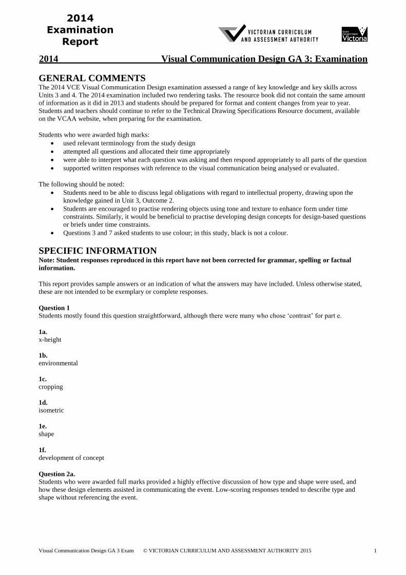
Question 3
High-scoring responses showed a deliberate and effective use of pattern, contrast and the use of one colour. Students
who considered the template as an actual screen to place their design on did better than those who used it simply as an
answer space. The responses varied greatly, with students producing realistic, abstract, geometric or organic motifs.
Many students placed a pattern on the motif rather than creating a pattern with the motif. Those students who produced
their solution in black could not be awarded full marks.
Visual Communication Design GA 3 Exam Published: 26 March 2015 3
2014 Examination
Report
The following are examples of high-scoring responses.
Visual Communication Design GA 3 Exam Published: 26 March 2015 4
2014 Examination
Report
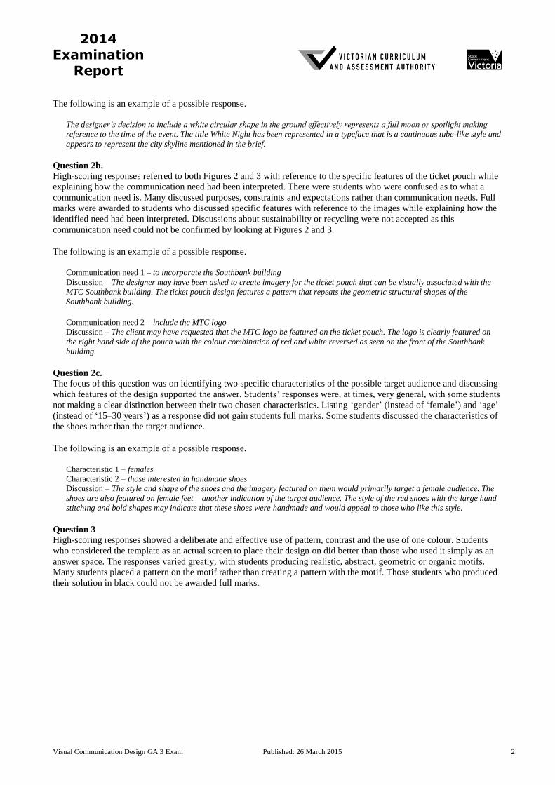
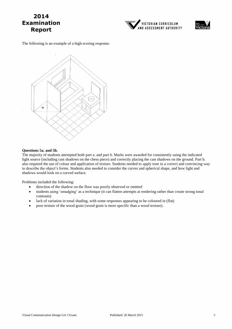
Question 4
Students’ understanding of planometric drawing conventions and how to interpret a 2D drawing as a 3D drawing were
assessed.
Marks were awarded for:
the correct view, planometric conventions (45°/45° or 30°/60°), correct scale and floor tiles
including the shower (correct size and placement), shower screen (including the thickness of the glass) and
placement of the water outlet
including the bath (depth and plughole)
including the vanity unit (drawers, cupboard door, basin [shape and depth] and vanity mirror [including
thickness])
window (including placement and depth) and window glass recessed in the frame.
Most students attempted this question and were able to draw the basic form and objects of the bathroom. However,
many found it difficult to include all of the required details. These details included the tiles, shower screen and mirror
thickness. Most windows were drawn as rectangles, with only a few students including the depth and window glass
recessed in the frame. The plugholes and basin needed to be drawn as circles and not as ellipses because of the
conventions of planometric drawing. A few students used the isometric drawing method, but this was incorrect.
Visual Communication Design GA 3 Exam Published: 26 March 2015 5
2014 Examination
Report
The following is an example of a high-scoring response.
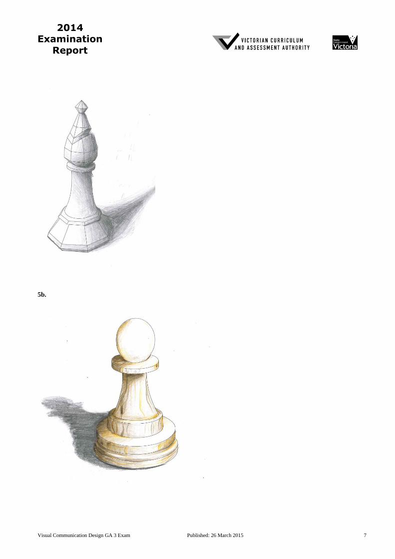
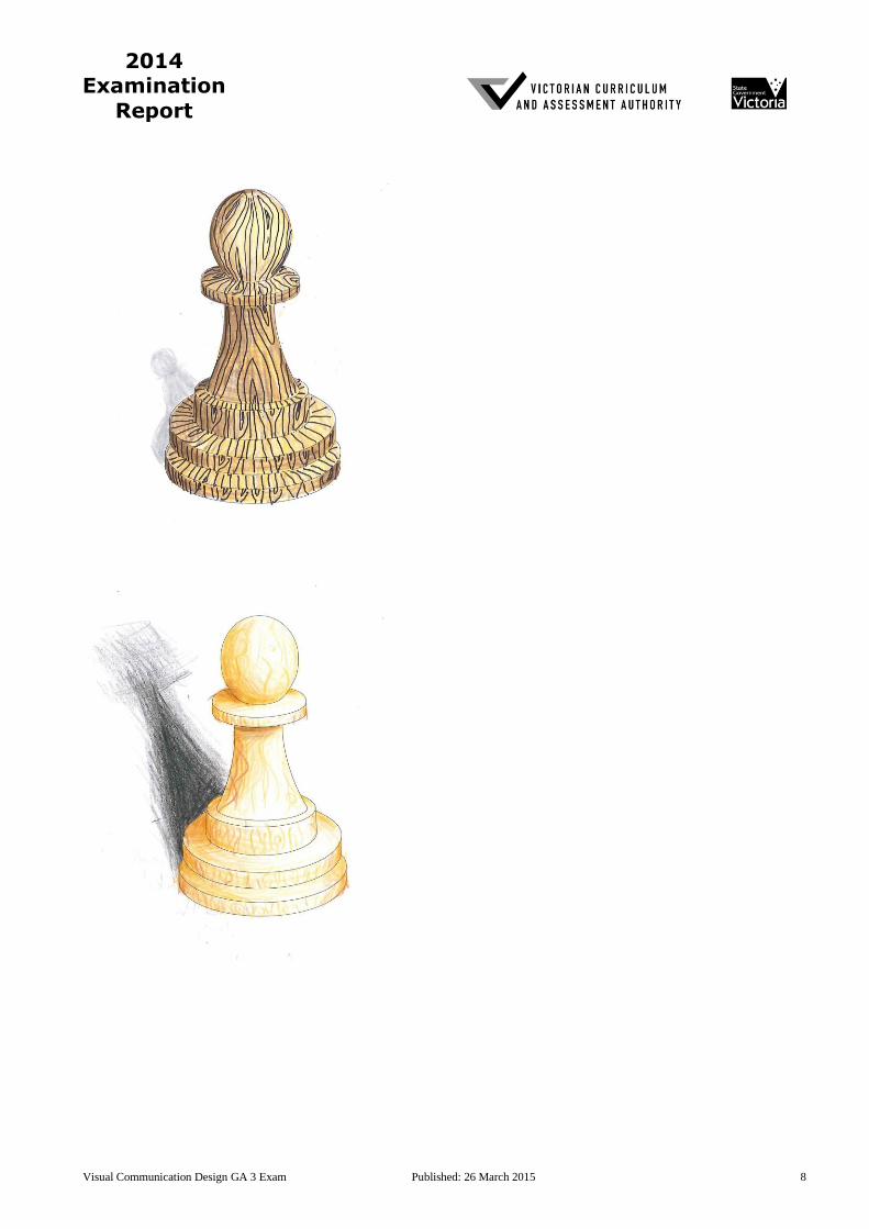
Questions 5a. and 5b.
The majority of students attempted both part a. and part b. Marks were awarded for consistently using the indicated
light source (including cast shadows on the chess piece) and correctly placing the cast shadows on the ground. Part b.
also required the use of colour and application of texture. Students needed to apply tone in a correct and convincing way
to describe the object’s forms. Students also needed to consider the curves and spherical shape, and how light and
shadows would look on a curved surface.
Problems included the following:
direction of the shadow on the floor was poorly observed or omitted
students using ‘smudging’ as a technique (it can flatten attempts at rendering rather than create strong tonal
contrasts)
lack of variation in tonal shading, with some responses appearing to be coloured in (flat)
poor texture of the wood grain (wood grain is more specific than a wood texture).
Visual Communication Design GA 3 Exam Published: 26 March 2015 6
2014 Examination
Report
The following are examples of high-scoring responses.
5a.
Visual Communication Design GA 3 Exam Published: 26 March 2015 7
2014 Examination
Report
5b.
Visual Communication Design GA 3 Exam Published: 26 March 2015 8
2014 Examination
Report
Visual Communication Design GA 3 Exam Published: 26 March 2015 9
2014 Examination
Report
Question 6a.
Marks were awarded to those students who provided a clear explanation of how the type enhanced the visual
communication message. These students evaluated the use of type with evidence from the image provided. For
example, many acknowledged the mismatched, industrial type or ransom note style as a connection to the ‘Lost Thing’.
The question did not require a discussion on the conventions of type.
The following is an example of a possible response.
The title of the book on the front cover is made up of a collection of different typefaces with an industrial appearance that appear
to be collected and randomly put together. This enhances the message or theme of the book as the letters themselves appear to
have come from a collection of lost things.
Question 6b.
In part bi., students were asked to describe the use of scale, while part bii. asked students to discuss the effect created by
the use of scale. Many students could not differentiate between these two questions and thus produced responses that
overlapped, changed sequence or were repetitive. Those students who discussed the incorrect image could not be
awarded any marks. High-scoring students were able to provide specific links to the image being analysed while first
describing the use of scale and then considering the effect that scale had on the image.
Question 6bi.
The following is an example of a possible response.
The artist has deliberately used scale in this illustration. The ‘thing’ has been drawn at a large scale in comparison to the human
figure. The cogs and pipes in the foreground have been drawn in a large and unnatural scale in comparison to the buildings.
Question 6bii.
The following is an example of a possible response.
This use of dramatic scale emphasises the feeling of a city made up of looming industrial objects and lack of human and organic
features. The large scale of the ‘thing’ further alienates its existence within the story.
Question 6c.
Most students identified greylead pencil as the media. High-scoring responses were able to discuss how greylead pencil
was an appropriate choice to generate ideas quickly, to achieve tonal variations, to build up layers and to edit mistakes
easily with an eraser. Full marks were awarded to those who could clearly refer to a stage of the design process and link
the media successfully.
Some students incorrectly discussed the method of drawing and not the media of pencil.
The following is an example of a possible response.
Stage of the design process – development of concepts
Explanation – This image may have been produced during the development of concepts and would have been completed with
grey lead pencil. Using grey lead pencil would have allowed Tan to create tonal variations, texture through cross-hatching and
to be able to easily erase or amend errors with an eraser. Grey lead pencil can be flexible when developing concepts and can
allow the artist to work quickly.
Question 6d.
Students were required to discuss two legal obligations that the theatre company needed to consider with regard to
Tan’s intellectual property. The question asked students to think about legal obligations and what the theatre company
was obliged to do. Most students were able to discuss one legal obligation – most commonly this was copyright – but
struggled to name a second obligation that could be discussed with clarity.
The following is an example of a possible response.
Obligation 1 – Respecting his exclusive rights. They would have needed to seek permission to use his work including how it was
intended to be used. For example, Tan may have agreed to allow them to use his story but not the design of the characters. He
may have certain conditions, as part of the agreement such as the length of time the theatre company would be using his work.
Visual Communication Design GA 3 Exam Published: 26 March 2015 10
2014 Examination
Report
Obligation 2 – Moral rights – The theatre company would need to respect Tan’s moral rights such as not altering the story plot
without his consent and attributing Tan as the creator of the story.
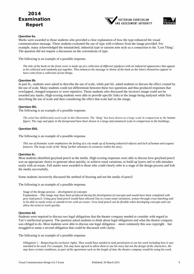
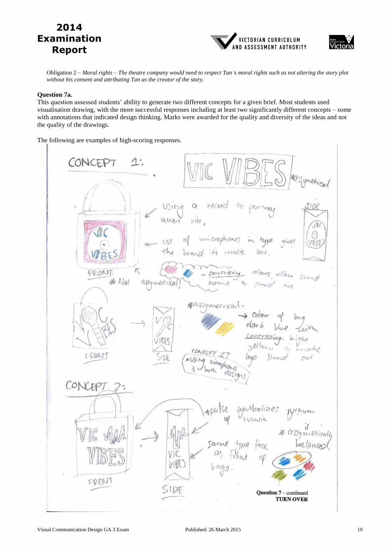
Question 7a.
This question assessed students’ ability to generate two different concepts for a given brief. Most students used
visualisation drawing, with the more successful responses including at least two significantly different concepts – some
with annotations that indicated design thinking. Marks were awarded for the quality and diversity of the ideas and not
the quality of the drawings.
The following are examples of high-scoring responses.
Visual Communication Design GA 3 Exam Published: 26 March 2015 11
2014 Examination
Report
Visual Communication Design GA 3 Exam Published: 26 March 2015 12
2014 Examination
Report
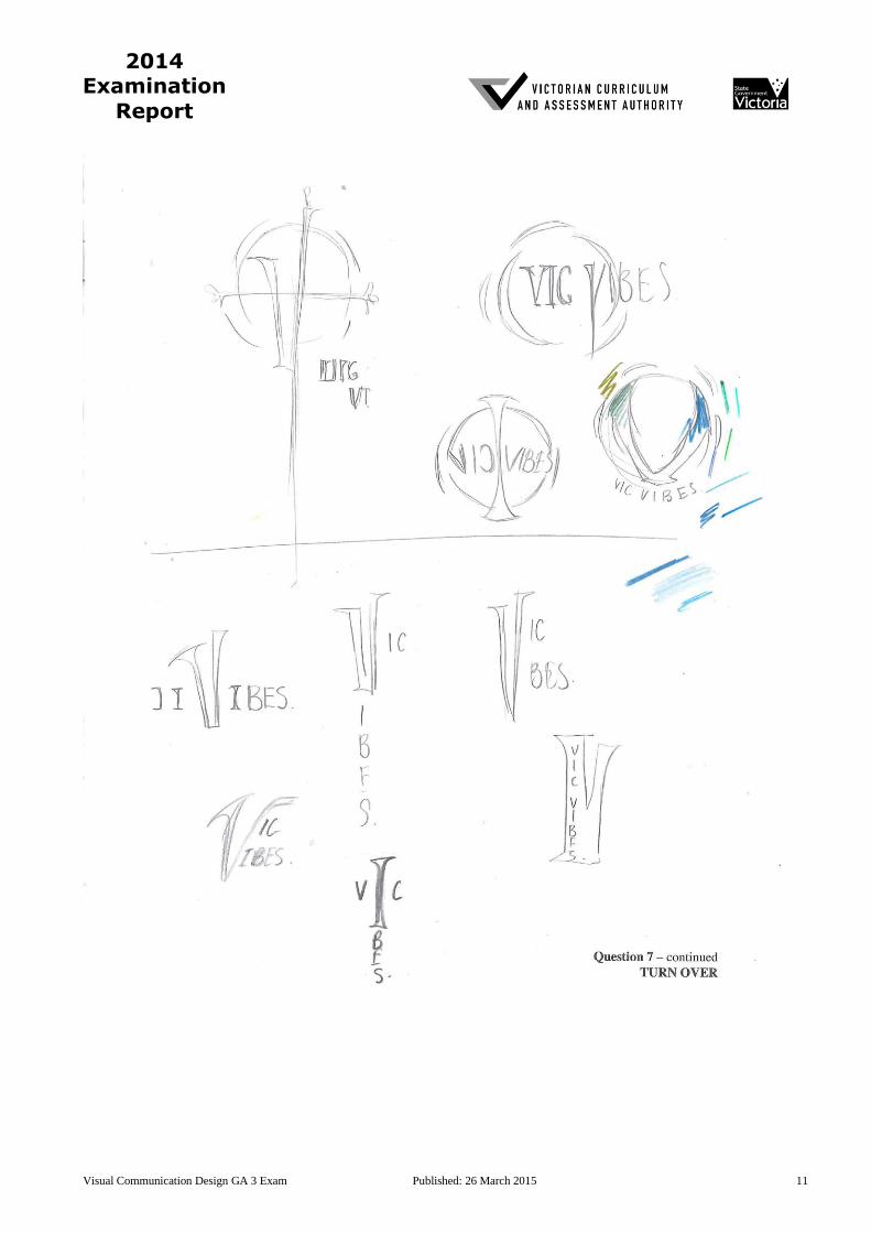
Question 7b.
This question was generally well answered and full marks were awarded to those students who addressed all of the dot
points in the brief. This included using two colours (if black was used, marks were not deducted as long as two
additional colours were used) and considering the entire format of the bag. Cropping and contrast needed to be
deliberate, with no ambiguity present. The application of type needed to be considered and suited to both the target
audience and presentation format.
The following are examples of high-scoring responses.

Visual Communication Design GA 3 Exam Published: 26 March 2015 13
2014 Examination
Report
Question 7c.
This question assessed students’ knowledge and skills based on Unit 4, Outcome 3. Full marks were awarded to those
who provided a comprehensive explanation that effectively addressed how the concept met the requirements of the
brief. Students needed to draw attention to aspects of their designs that would attract the target audience and discuss
how their concept would promote the music company. Those who restated the brief did not meet the requirements of
this question.
The following are examples of high-scoring responses:
This design meets the needs of the brief as it only uses two colours that effectively contrast against one another, allowing the
emphasis on the logo ‘Vic Vibes’. The design is assymetrical while having the main focus on the type.
Blue is currently very associated with the youger generation due to social media (facebook, twitter, skype, tumblr) all using blue
themes. The ripples coming out from the circular ‘V’ suggest the vibes. Using the serif font remind audience of popular bands
such as Nirvinea and Metallica logos. The cursive ‘Vibes’ add some gentleness which work with the water ripples and blue. The
large ‘V’ is rotated and more on one side to create an assymetrical balance.
Question 7d.
This question encouraged students to think about how their concept could be applied to other presentation formats. The
circle swing tag was the most popular format, with the majority of students copying their larger bag design into the new
format without considering layout or adapting it to a new shape. High-scoring responses showed a deliberate and
creative application of design principles, such as cropping or scale, to ensure that the integrity of their final bag design
was maintained.
The following are examples of high-scoring responses.
Question 7e.
A clear explanation of the decisions made was required. However, most students explained the changes they made
without relating them to the new format and, therefore, could not receive full marks. Responses that commented on the
effectiveness of the design but not on any changes did not answer the question. Many of these comments were
statements of fact only.
The following is an example of a high-scoring response.
The text is enlarged as swing tags are smaller. The ‘V’ shape is recognisable and creates an identifiable theme with the bag. The
‘V’ shape has been orientated to fit the swing tag. The ‘V’ is cropped in to keep the idea of an asymmetrical design.
Related Documents