1 Using SPSS: Descriptive Statistics Department of Operations Weatherhead School of Management

1 Using SPSS: Descriptive Statistics Department of Operations Weatherhead School of Management.
Dec 17, 2015
Welcome message from author
This document is posted to help you gain knowledge. Please leave a comment to let me know what you think about it! Share it to your friends and learn new things together.
Transcript

1
Using SPSS: Descriptive Statistics
Department of Operations
Weatherhead School of Management
The Frequency Table
Open the file SoftDrink.xls and you will have the following data view.
2
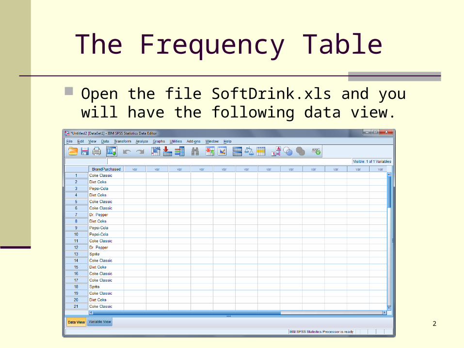
The Frequency Table (Cont.)
3
Click “Analyze” in Menu Bar.
Then click “Descriptive Statistics”.
Then click “Frequencies”.
The Frequency Table (Cont.)
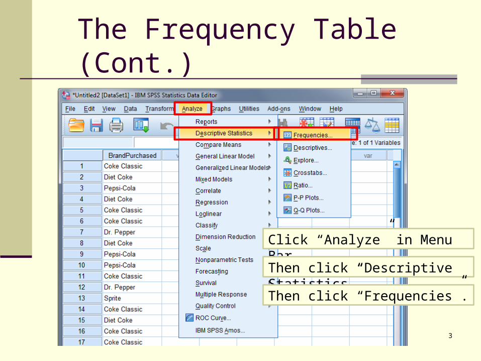
Then you will get the “Frequencies” menu.
4
Select a variable from the list on the left.
Click on the purple arrow button.
Click
OR double click the variable from the list on the left.
Double Click
The Frequency Table (Cont.)
5
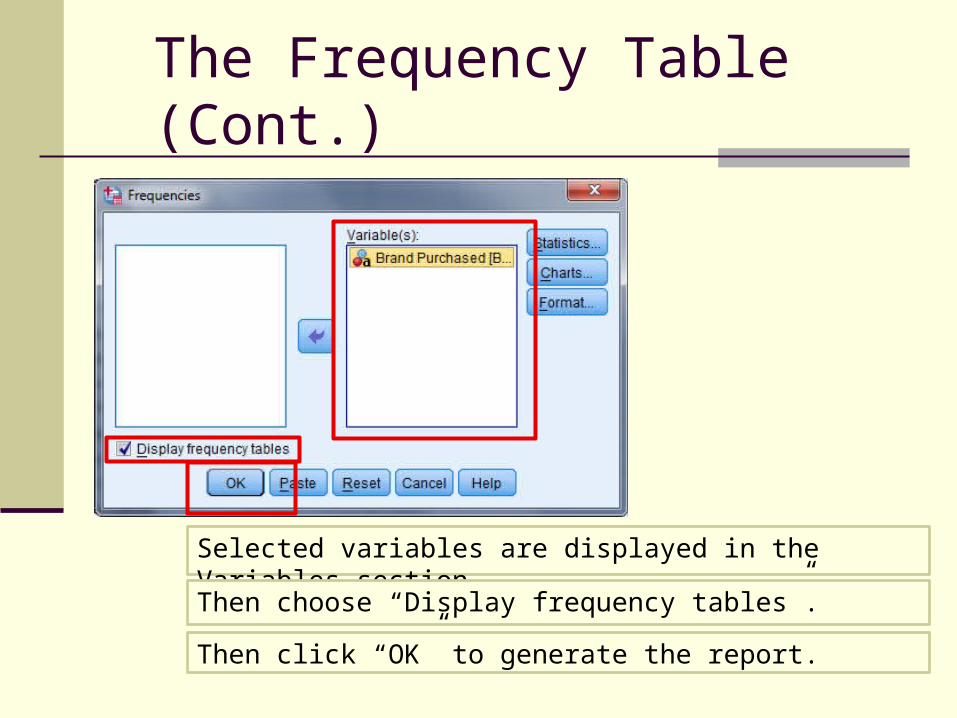
Selected variables are displayed in the Variables section.
Then choose “Display frequency tables”.
Then click “OK” to generate the report.

The Frequency Table (Cont.)
Then in the viewer window, you will see the following report.
6
The Bar Graph for SoftDrink.xls
7
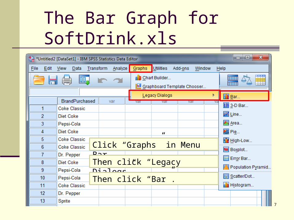
Click “Graphs” in Menu Bar.
Then click “Legacy Dialogs”.
Then click “Bar”.

The Bar Graph (Cont.)
Then you will get the “Pie Charts” menu.
8
Click on “Summaries for groups of cases”
Click “Define”
Select “Simple”
The Bar Graph (Cont.)
Then you will get the “Define” menu.
9
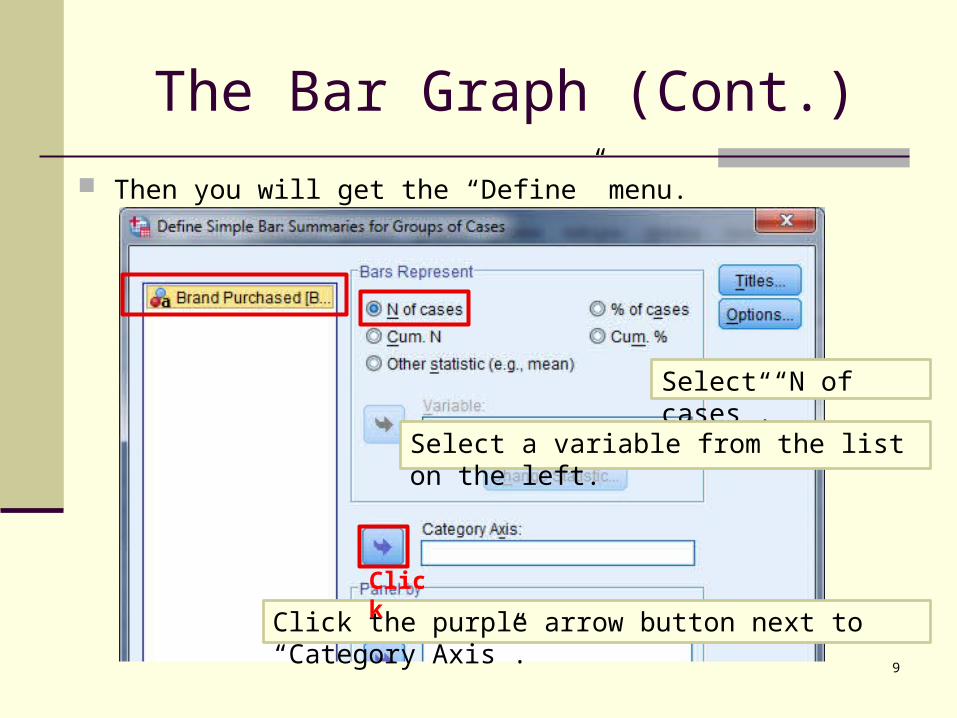
Select “N of cases”.
Select a variable from the list on the left.
Click the purple arrow button next to “Category Axis”.
Click

The Bar Graph (Cont.)
10
The selected variables are displayed in the “Category Axis” section.
Then click “OK” to generate the graph.
The Bar Graph (Cont.)
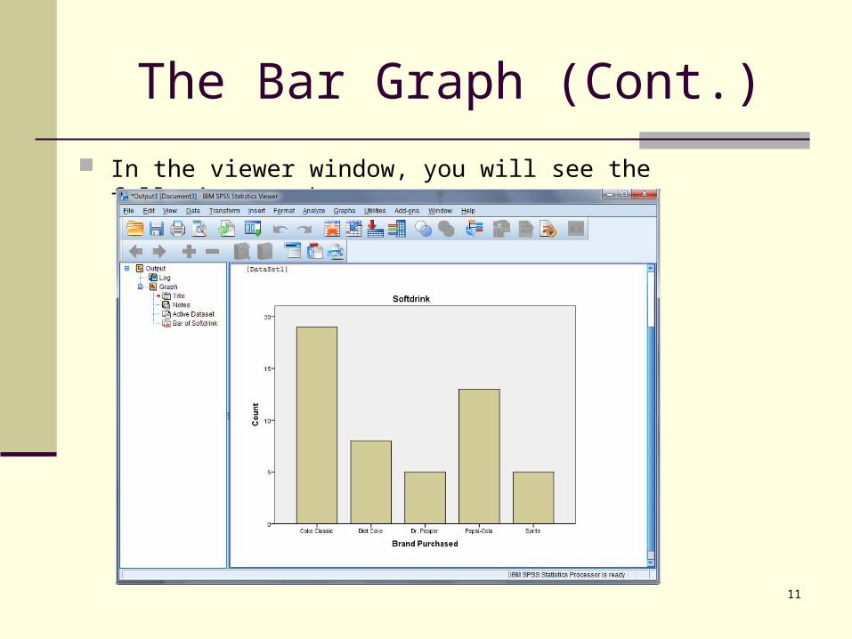
In the viewer window, you will see the following graph.
11

The Bar Graph (Cont.)
In the “Define” menu, you can also select “% of cases”
12
Select “% of cases”.
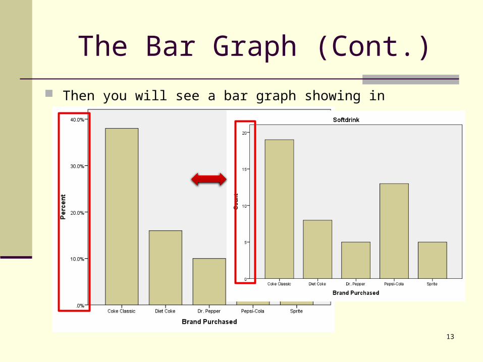
The Bar Graph (Cont.)
Then you will see a bar graph showing in percentage.
13
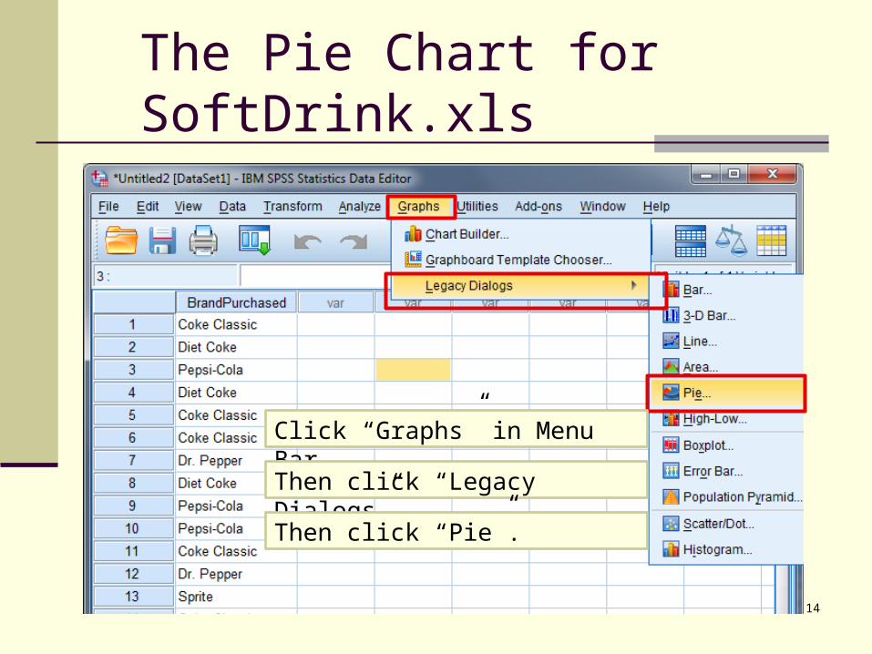
The Pie Chart for SoftDrink.xls
14
Click “Graphs” in Menu Bar.
Then click “Legacy Dialogs”.
Then click “Pie”.

The Pie Chart (Cont.)
Then you will get the “Pie Charts” menu.
15
Click on “Summaries for groups of cases”
Click “Define”

The Pie Chart (Cont.)
Then you will get the “Define” menu.
16
Select “% of cases”.
Select a variable from the list on the left.
Click the purple arrow button next to “Define Slices by”.
Click
The Pie Chart (Cont.)
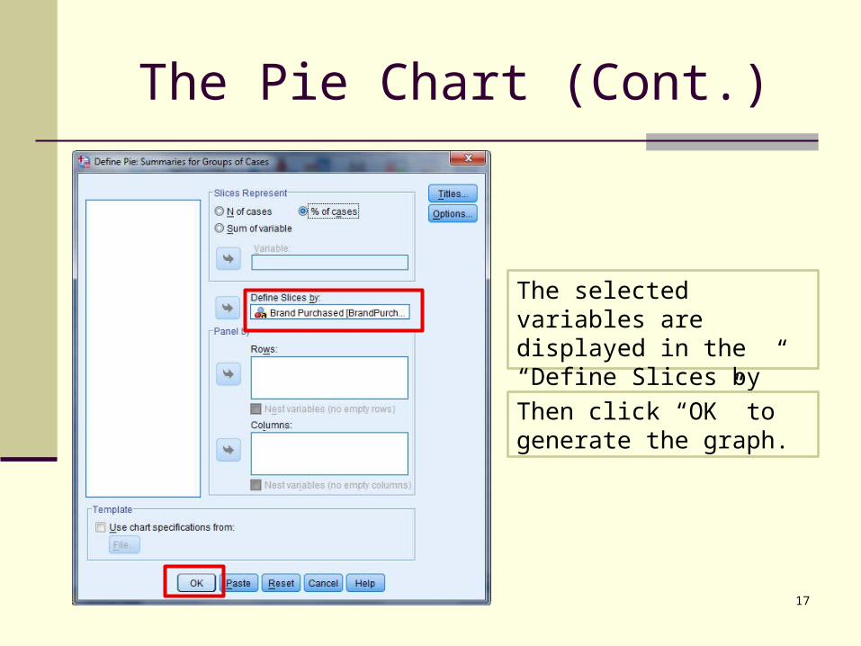
17
The selected variables are displayed in the “Define Slices by” section.
Then click “OK” to generate the graph.

The Pie Chart (Cont.)
In the viewer window, you will see the following graph.
18
Double Click
Double Click on the chart to open the Chart Editor.
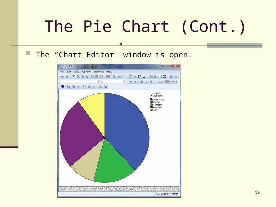
The Pie Chart (Cont.)
The “Chart Editor” window is open.
19
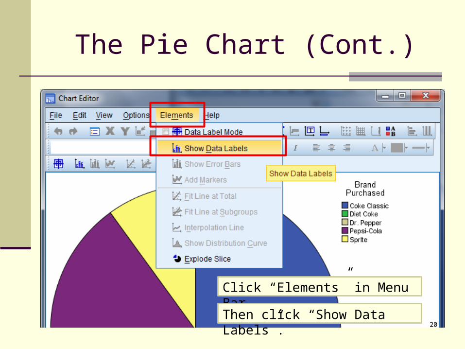
The Pie Chart (Cont.)
20
Click “Elements” in Menu Bar.
Then click “Show Data Labels”.
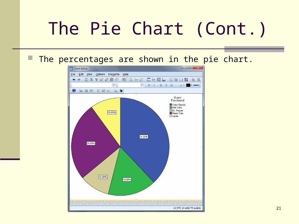
The Pie Chart (Cont.)
The percentages are shown in the pie chart.
21
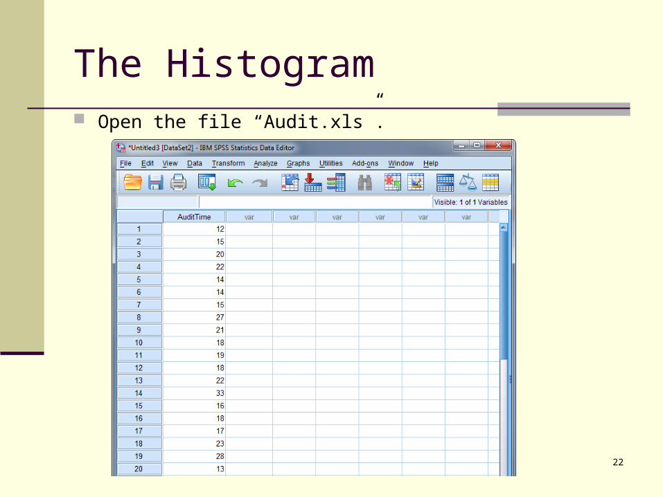
The Histogram
22
Open the file “Audit.xls”.

The Histogram (Cont.)
23
Click “Graphs” in Menu Bar.
Then click “Legacy Dialogs”.
Then click “Histogram”.

The Histogram (Cont.)
Then you will get the “Histogram” menu.
24
Select a variable from the list on the left.
Click the purple arrow button next to “Variable”.
Click

The Histogram (Cont.)
25
The selected variable is displayed in the “Variable” section.
Then click “OK” to generate the graph.
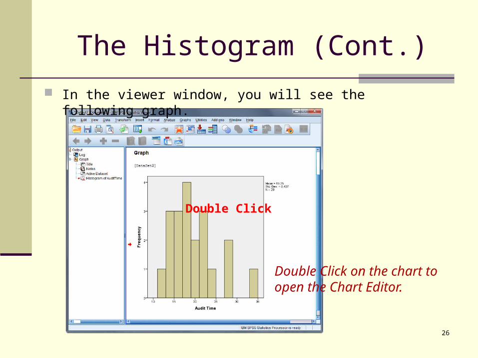
The Histogram (Cont.)
In the viewer window, you will see the following graph.
26
Double Click
Double Click on the chart to open the Chart Editor.

The Histogram (Cont.)
Right click on any column to open the menu.
Right Click

The Histogram (Cont.)
28
Click “Properties Window” in the menu.

The Histogram (Cont.)
29
Click the “Binning” tab.
Then click “Custom” in “X Axis” panel.
Then click “Number of Intervals” and type in the number of intervals you want to have.
Then click “Apply”.

The Histogram (Cont.)
Here is the new histogram after changing the number of intervals.
30

Descriptive Statistics
31
Open the file “Salary.xls”.

Descriptive Statistics (Cont.)
32
Click “Analyze” in Menu Bar.
Then click “Descriptive Statistics”.
Then click “Frequencies”.
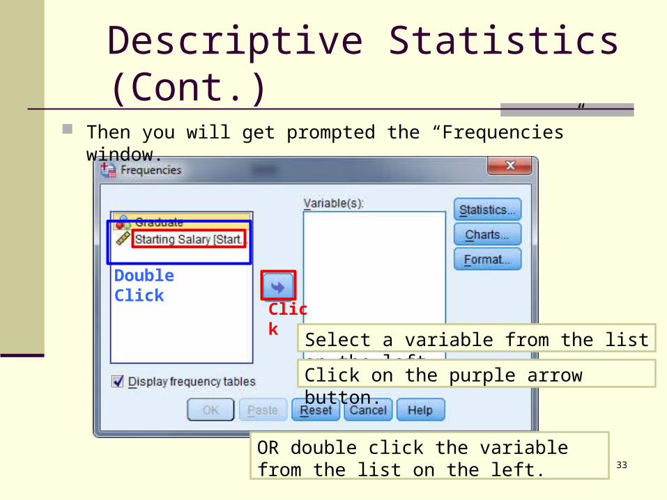
Descriptive Statistics (Cont.)
Then you will get prompted the “Frequencies” window.
33
Select a variable from the list on the left.
Click on the purple arrow button.
Click
OR double click the variable from the list on the left.
Double Click

Descriptive Statistics (Cont.)
34
Selected variables will display on the right variables section.
Then click “Statistics”.
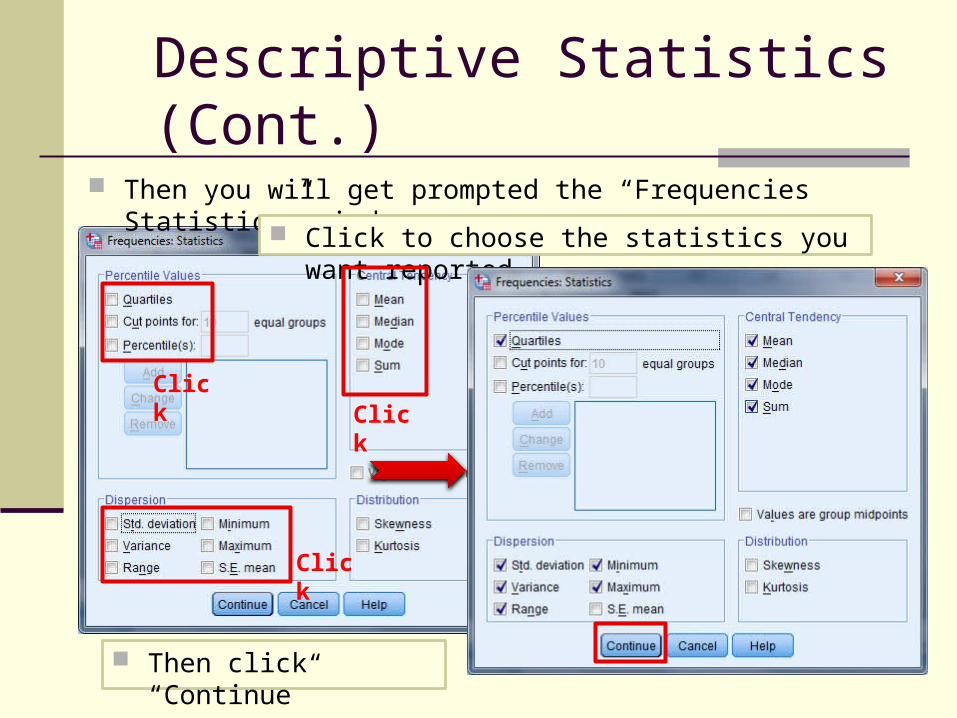
Descriptive Statistics (Cont.)
Then you will get prompted the “Frequencies Statistics” window.
35
Click to choose the statistics you want reported
Click
Click
Click
Then click “Continue”
Descriptive Statistics (Cont.)
36
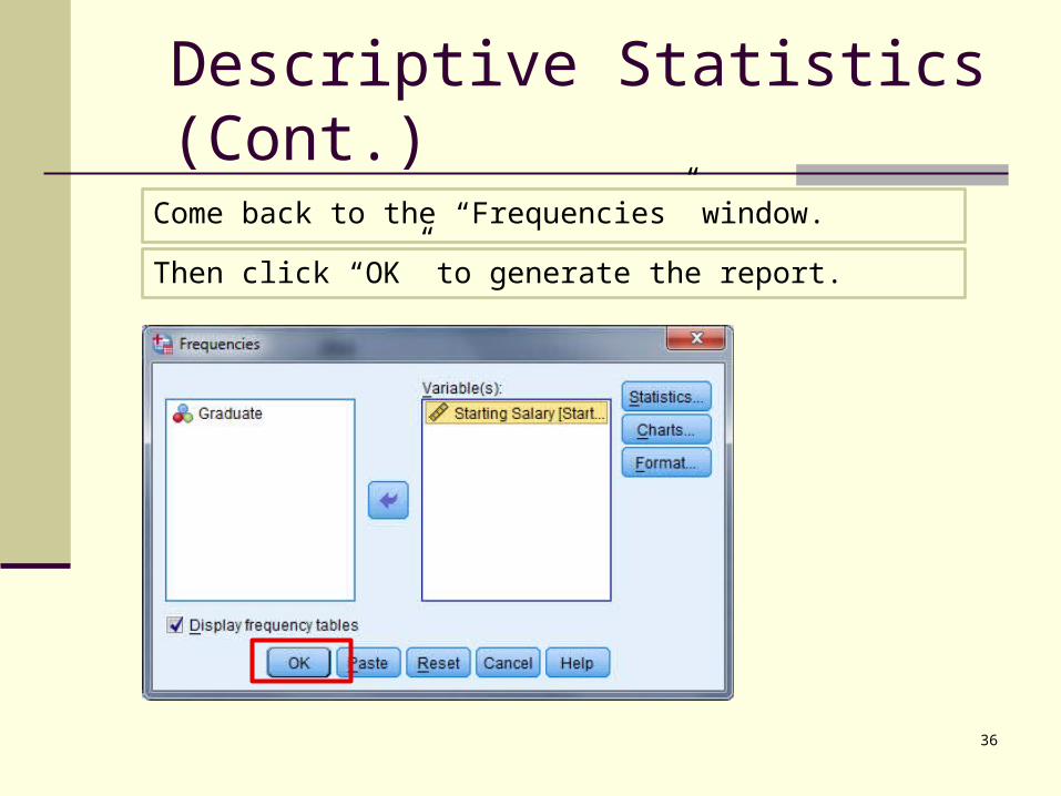
Come back to the “Frequencies” window.
Then click “OK” to generate the report.
Descriptive Statistics (Cont.)
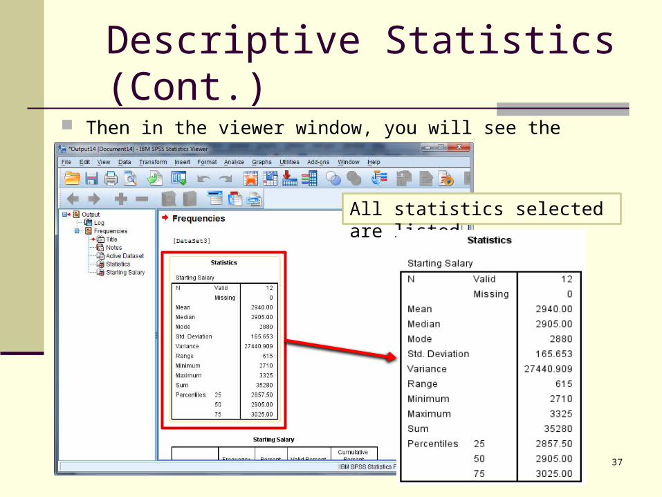
Then in the viewer window, you will see the report like following.
37
All statistics selected are listed.
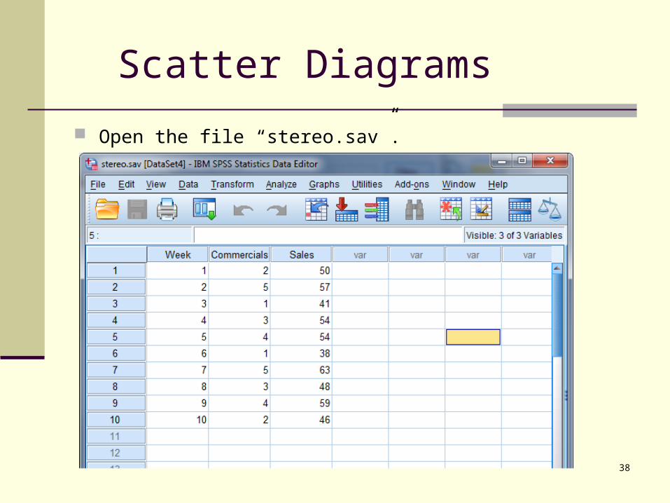
Scatter Diagrams
38
Open the file “stereo.sav”.
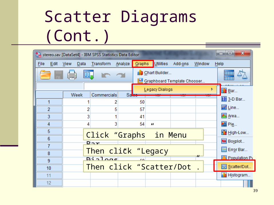
Scatter Diagrams (Cont.)
39
Click “Graphs” in Menu Bar.
Then click “Legacy Dialogs”.
Then click “Scatter/Dot”.
Scatter Diagrams (Cont.)
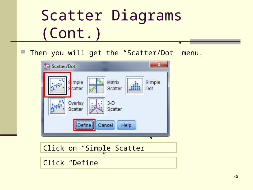
Then you will get the “Scatter/Dot” menu.
40
Click on “Simple Scatter”
Click “Define”
Scatter Diagrams (Cont.)
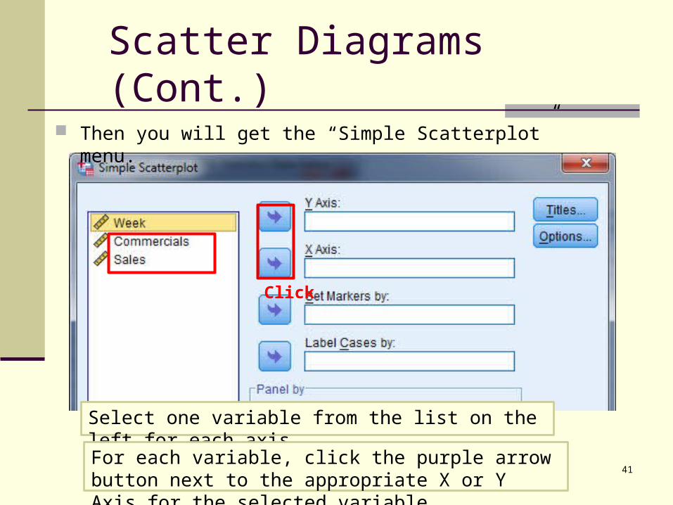
Then you will get the “Simple Scatterplot” menu.
41
Select one variable from the list on the left for each axis.For each variable, click the purple arrow button next to the appropriate X or Y Axis for the selected variable.
Click

Scatter Diagrams (Cont.)
42
In this case, number of Commercials on the x-axis;
Sales levels on the y-axis.
Then click “OK” to generate the graph.

Scatter Diagrams (Cont.)
In the viewer window, you will see the following graph.
43

Correlation and Covariance
44
Use the same “stereo.sav” file.
Correlation and Covariance (Cont.)
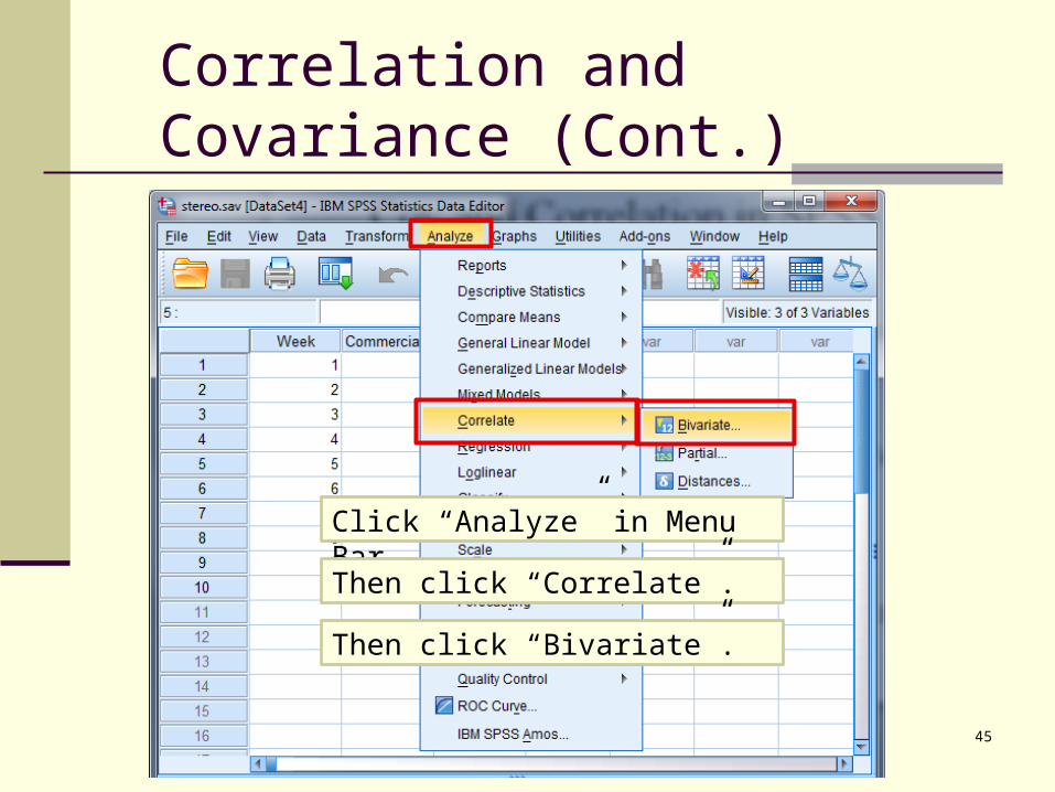
45
Click “Analyze” in Menu Bar.
Then click “Correlate”.
Then click “Bivariate”.

Correlation and Covariance (Cont.)
Then you will get the “Bivariate Correlation” menu.
46Click the “Options” button.
In the “Options” window, click “Cross-product deviations and covariances”.
Click ”Continue” to come back.

Correlation and Covariance (Cont.)
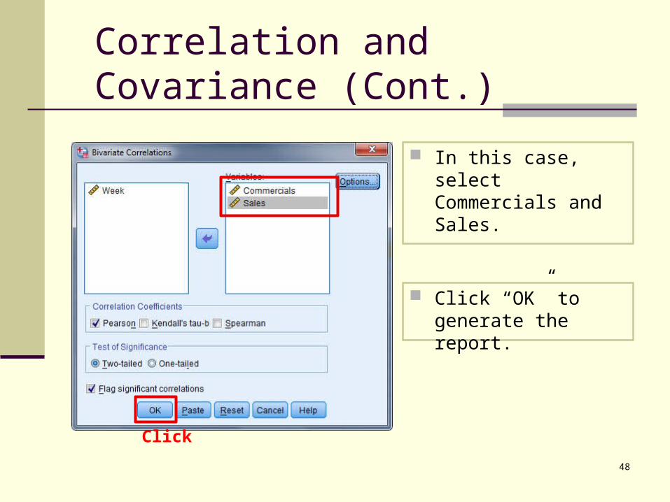
47
Select the two variables from the list on the left.
Click the purple arrow button to move each variable to the variables section on right.
Click
Correlation and Covariance (Cont.)
48
In this case, select Commercials and Sales.
Click “OK” to generate the report.
Click
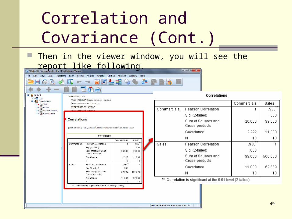
Then in the viewer window, you will see the report like following.
49
Correlation and Covariance (Cont.)
Related Documents